|
| Group |
Round |
C/R |
Comment |
Date |
Image |
| 77 |
Jul 22 |
Reply |
LINDA!!!
|
Jul 18th |
| 77 |
Jul 22 |
Comment |
Hi Carol and again, welcome to the group! I'm so pleased to see your helpful comments, and I like your current image. Indeed, I find it pleasing, relaxing and flawless -- well captured and well processed.
I can imagine a somewhat tighter crop, so that the stem does not come straight out of the corner, but that might just be a matter of taste. I expect you considered a totally black background, either for the original or the B&W. I think pitch black could work well for either.
|
Jul 18th |
| 77 |
Jul 22 |
Comment |
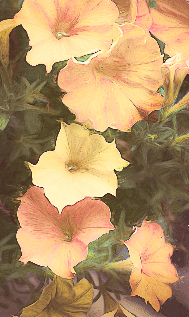
Such nice flowers to enjoy -- right at home, and I can see why you loved the cascading flow of them.
I do quite a bit of processing in Topaz2, and the software is powerful and fun to play with. But for me, it is hard to achieve the result I want without quite a bit of experimentation, and then for me there is always some follow-up work in PS.
Your processing here, in my opinion, ended up too contrasty to achieve the peace and softness you were aiming for. I took your original and put it into Lightroom, tried to lighten the colors and contrast, and remove the blue and magenta colors from the darkest parts, as well as from the bottom. I didn't get to where I wanted to go with this, but perhaps it shows a start�� |
Jul 18th |
 |
| 77 |
Jul 22 |
Comment |
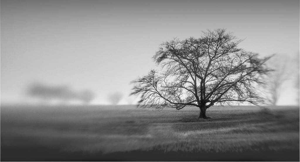
I'm a fan of lensbaby images. Indeed, I got my first one back in the day when they had screws and springs��
In this image, I find the overlapping tree at the right a bit distracting, and am drawn to the only black in the image, which is the ground. To fix that, I've lightened that area by painting over it on a separate layer with white, then using the" lighter color" blend mode, and setting the layer opacity at 20%. Then a levels adjustment resulted in some nice black on the subject tree. |
Jul 17th |
 |
| 77 |
Jul 22 |
Comment |
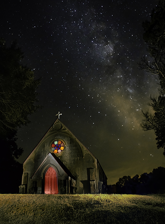
Mary, I like this image a lot. Great job combining the stacked church with the wonderful capture of the sky, and getting it to feel like it belongs together. I would definitely tone down the foreground green, and brighten / colorize the church door. I've also worked to limit the keystone. Here's a version with these changes to consider.
|
Jul 17th |
 |
| 77 |
Jul 22 |
Reply |
Denise, thanks for your comments. See response above... |
Jul 17th |
| 77 |
Jul 22 |
Reply |
Carol, thanks for your comments. See response above... |
Jul 17th |
| 77 |
Jul 22 |
Reply |
Thank you for your thoughtful and helpful comments. In part I added the text for the story, but also to add some interest aside from the otherwise centered gauge. I've played with this image a bit more after removing the text -- a bunch of textures in various blend modes and a different crop. |
Jul 17th |
 |
4 comments - 4 replies for Group 77
|
4 comments - 4 replies Total
|


