|
| Group |
Round |
C/R |
Comment |
Date |
Image |
| 77 |
Jun 22 |
Reply |
Connie, thanks so much. I do agree that softening is a definite plus for this colorful background. Also, I like Michael's simplification, down a different path. |
Jun 29th |
| 77 |
Jun 22 |
Reply |
Denise,
Your crop really makes the story pop. Thanks so much for the input! |
Jun 29th |
| 77 |
Jun 22 |
Reply |
Michael. thanks for your comments and example. It does look a lot better! |
Jun 29th |
| 77 |
Jun 22 |
Comment |
Mary, Such a lovely location...
I'm thinking your final photo needs some blacks, since it seems overly bright. I like Linda's take on this, including the crop.
Since the image seems to be a little soft, I would suggest trying a painterly look, something like oil paint in PS, or some of the filters in Topaz Studio. |
Jun 19th |
| 77 |
Jun 22 |
Comment |
Denise, I'm thinking this was fun to create, and commend you for taking that step out.
I really like your idea for the image: "the starburst had sent out multiple stars into the night sky and left streams of star trails". With this in mind, I would like to see the starburst well-fined w/o anything overlapping it, and having it POP!, perhaps via intensity or color, or clarity...
|
Jun 19th |
| 77 |
Jun 22 |
Reply |
I really like what you've done here. |
Jun 5th |
| 77 |
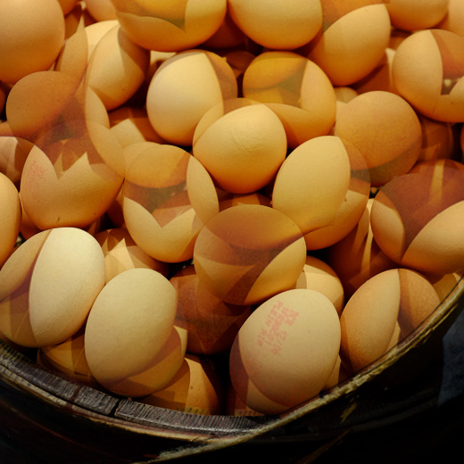
Jun 22 |
Comment |
So, I'm totally jealous that you've had such a great adventure. How special to do this.
However, I am a bit surprised this is the photo you chose to share. IMHO it is a "grab" shot, which could be part of a larger group of photos about the market, but as a fine art photo it does not excite me.
Still I had a bit of fun with it making it into a triple exposure... |
Jun 3rd |
 |
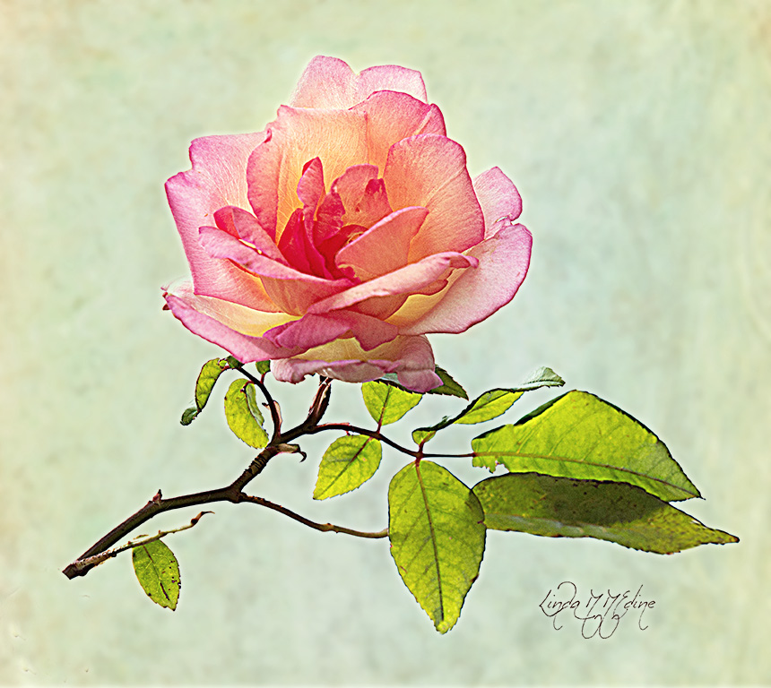
| 77 |
Jun 22 |
Comment |
I love Lisa Langell -- she has so many great ideas, and high key is one of them. I'm even considering going to Alaska with her...
The start image that you captured is lovely, and clearly works well as is. With the camera pointed at sun, I assume you added a big + of exposure compensation to get the flower bright, and with detail?
As for the aded textures, IMHO, they compete, so to me they distract. On the other hand I sure do like a bit more yellow and orange here.
In this version, I used a much simpler and more muted green texture (actually a blurred texture). I added the yellow to the rose using a soft large yellow brush on a separate layer, then changing to the overlay blend mode. |
Jun 2nd |
 |
4 comments - 4 replies for Group 77
|
4 comments - 4 replies Total
|


