|
| Group |
Round |
C/R |
Comment |
Date |
Image |
| 77 |
Dec 21 |
Reply |
See revised image and comments below. |
Dec 23rd |
| 77 |
Dec 21 |
Comment |
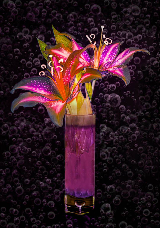
Thank you all for your helpful comments.
I wanted to see how your suggestions would work out. It's always complicated to try to recreate an image that has had a lot of processing applied, since it's hard to remember all the steps. In this case, I decided to just work on the bottom half of the original photo and to add that rework to the final image.
I think it does look better with the vase bottom included, but as so often is the case, it would have been a good idea to work harder on the original arrangement and to fill the glass portion of the vase. "Patience grasshopper."
|
Dec 22nd |
 |
| 77 |
Dec 21 |
Reply |
See revised image and comments below. |
Dec 22nd |
| 77 |
Dec 21 |
Reply |
See revised image and comments below. |
Dec 22nd |
| 77 |
Dec 21 |
Reply |
See revised image and comments below. |
Dec 22nd |
| 77 |
Dec 21 |
Comment |
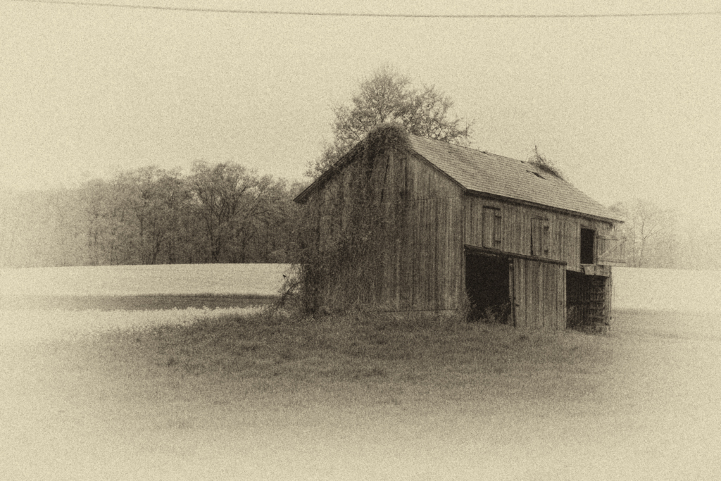
Connie, I too like what you've done here. The antique effect works well for this old barn. And the birds are a really nice addition.
I'll be the chorus that repeats -- I'd like to see more detail in the wood and the growth on the barn's side. I tried adding a curves layer to just that area trick, then did the NIK processing... |
Dec 22nd |
 |
| 77 |
Dec 21 |
Comment |
Michael, I really like your photo and its composition, with the various subjects and their excellent arrangement. In my opinion, your textures have added a lot of depth and nuance to this still life. The colors and types of the textures you chose mesh so well with the subject.
As for improvements, to me it looks like the black area between the corns is totally without detail, so that area might print poorly. Next time you might try using a flashlight to add a little fill light. For projection purposes, I would consider adding a narrow golden stroke, since the upper edges of the vignetted image are close to being black. Alternatively, you could consider lowering the opacity of the vignette a tad at the top.
|
Dec 8th |
| 77 |
Dec 21 |
Comment |
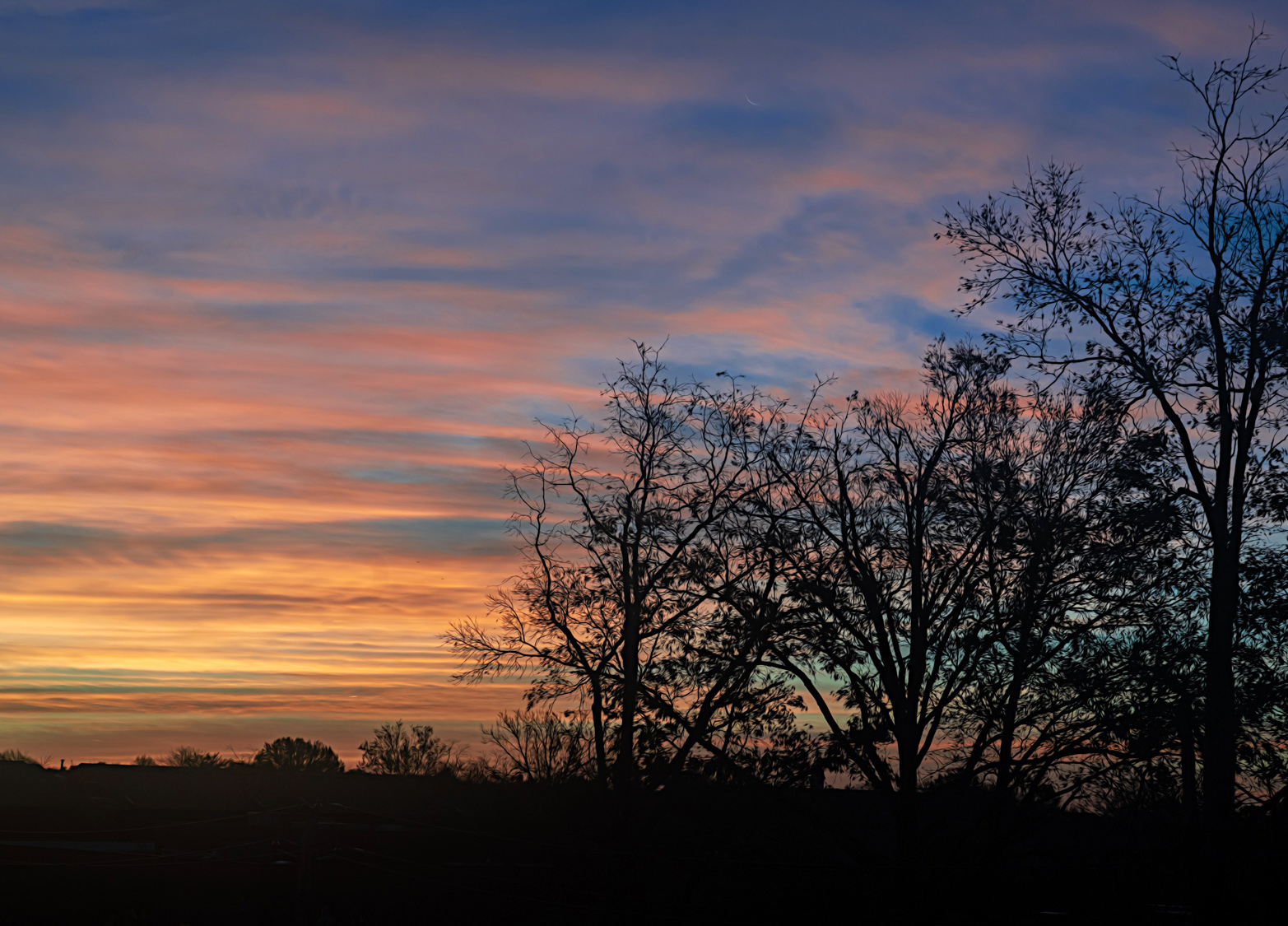
This image is nice. I like the silhouetted trees against the early sunrise, and I think the Topaz adjustment you made to the trees works well.
In my opinion the image could still use more oomph and focus. I tried cropping some of the trees on right side to make the sky a larger portion of the picture. Then enhancing the color a bit more using a "color lookup" adjustment layer in PS, choosing the 3DLUT file, named 3strip.look. It was applied at 60 % opacity.
|
Dec 8th |
 |
| 77 |
Dec 21 |
Comment |
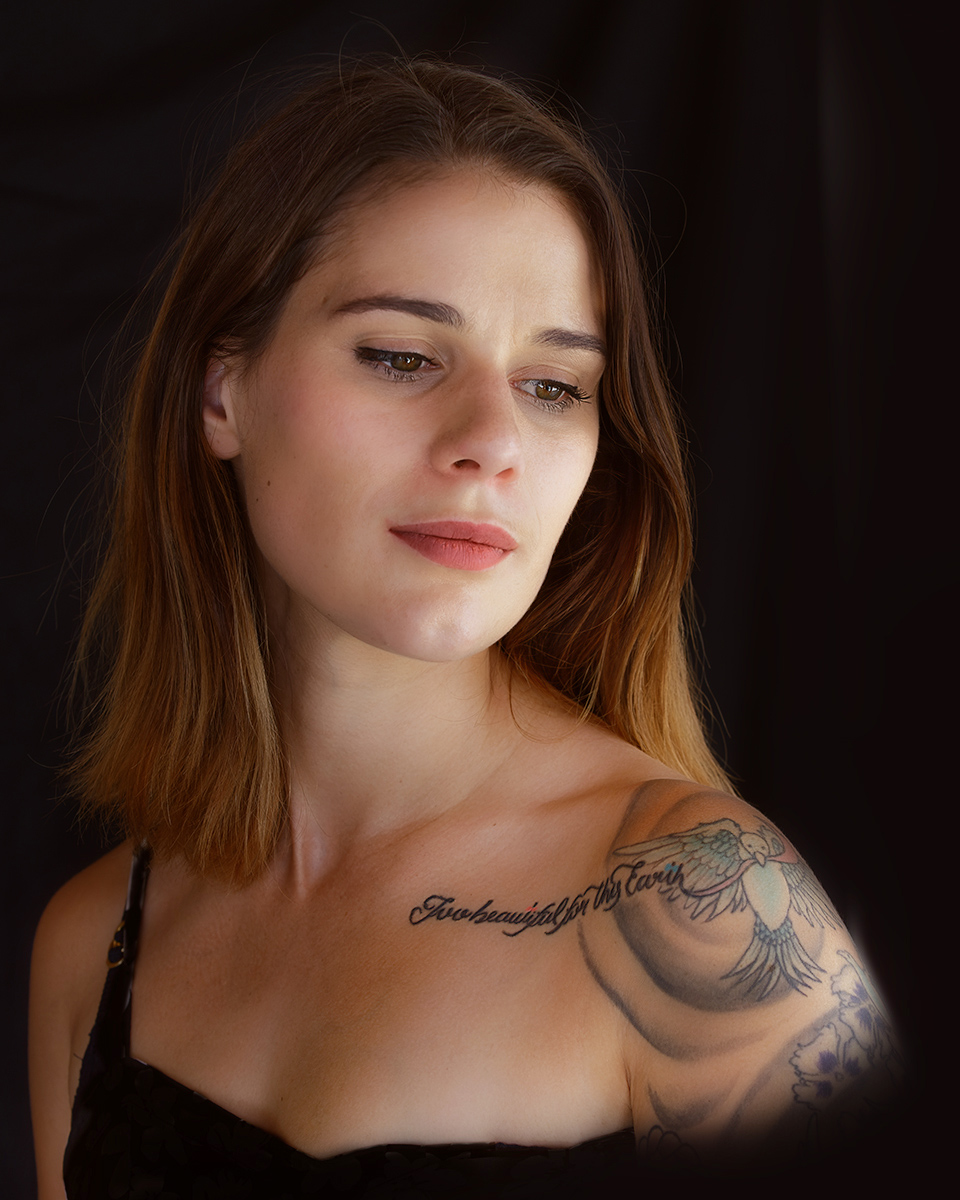
This is a lovely portrait of a beautiful woman. You've done a wonderful job of making this photo look like a professional portrait.
Although the window light was really nice, I think it could be enhanced. I tried lightening the black places in her hair and digitally adding a hair light to the top of her hair to better separate Jess from the background. Also added some light on her bodice. For this version, I used two separate levels adjustment layers at reduced opacity in PS, with masks.
|
Dec 8th |
 |
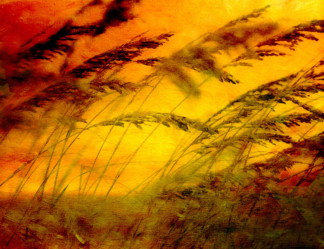
| 77 |
Dec 21 |
Comment |
Linda, this as a warm, dreamy and pleasing image. I really like that you flipped it and the colors and texture you chose. I also think the abstractness adds to the scene and the feel.
To my eye, the black portions in the right bottom corner and the left upper edge are a little too dark, so I've did a little cloning on a separate layer to see how that would turn out. |
Dec 8th |
 |
6 comments - 4 replies for Group 77
|
6 comments - 4 replies Total
|


