|
| Group |
Round |
C/R |
Comment |
Date |
Image |
| 77 |
Oct 21 |
Reply |
This is stronger, I think. There are so many way to do things in PS. My thought was to have less of the "improved" sharper, contrasty, etc result on the petals and flowers of the plant, EXCEPT for on the center flower.
One way to do this is by adding a layer with the original photo on top at say 5-20% opacity, then mask away the central flower on this orig flower layer. The underlying layer detail and glow are thereby 100% visible on that central flower, while the other parts are softer. The focus is thus a bit more on that best flower. |
Oct 10th |
| 77 |
Oct 21 |
Comment |
Connie, I think you've done a great job of making this flower pop with your processing. I love the detail and improved simple background.
I find the outside stroke in the final image to be rather bright, so would suggest greying it down. Also, I wonder if overlaying your original photo on a new layer at LOW opacity and masking away the dark background and the central "best" flower on that layer would help emphasize and thus rest the eye on that best flower. |
Oct 10th |
| 77 |
Oct 21 |
Comment |
A creative take on this hidden gem. Thanks for the detailed and clear explanation, and also for the idea of using the background (sans subject) as a texture. I too would eliminate the dark part of the rock texture -- maybe just expand/ transform in PS. |
Oct 10th |
| 77 |
Oct 21 |
Comment |
Denise, fall mums are such a treat, and the coloring here is so delicate. I like what you've done to produce a lovely, soft and painterly image.
To my eye, it could use a bit more to complete the arty look. So, in PS I transformed the flower larger and used it as a texture (two different times / layers, with rotation), masking the original flower with a graduated (radial) filter. I also added a stroke, frame and drop shadow to "finish" off the image.
P.S. After posting, I realize the pink frame is hard to see on this light gray background. |
Oct 10th |
 |
| 77 |
Oct 21 |
Comment |
A lovely image that the sky replacement has made even stronger as it has added those warm tones to contrast with the cool ones. In my opinion the water blur (probably both the amount and type of blur) is not a plus, so I prefer your original image, which also has those warm tones. Here's a version with more saturation, levels, and a warming photo filter added to enhance the reds, yellows and oranges. |
Oct 9th |
 |
| 77 |
Oct 21 |
Comment |
This is a VERY pleasing composition, with an excellent choice of texture (hopefully one of your own photos) and tones. If it were my photo, I would work to tone down or partly clone away the bright highlight on th vase, since it pulls my eye so strongly. |
Oct 9th |
| 77 |
Oct 21 |
Comment |
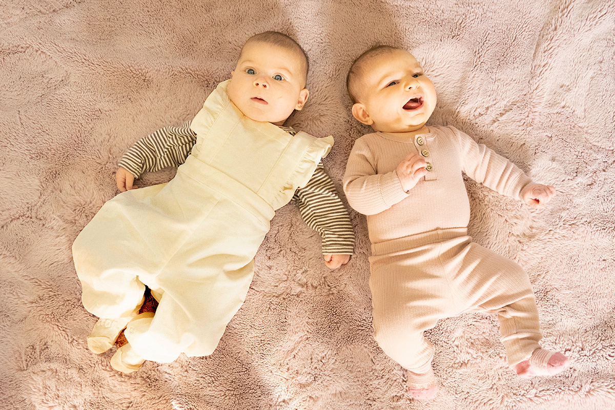
Here's a thought: In PS, add a new layer; fill it with a dark beige brown; use color burn blend mode. Select outfit, and mask everything but the white clothing. Then clip a desat adj layer to the color burn layer and totally desat. Adjust the opacity and FILL amounts of the color burn layer. Here's what I got�� |
Oct 9th |
 |
6 comments - 1 reply for Group 77
|
6 comments - 1 reply Total
|


