|
| Group |
Round |
C/R |
Comment |
Date |
Image |
| 77 |
Sep 21 |
Reply |
See reply below. |
Sep 17th |
| 77 |
Sep 21 |
Reply |
See reply below. |
Sep 17th |
| 77 |
Sep 21 |
Reply |
Linda, thanks for the "flip the image" thought. I do prefer it.
Georgianne, thanks for your comment on the background dots; I agree they are distracting.
Denise -- it's hard to know why I take a photo (it is mostly because I enjoy being out there doing it.) In this instance it was because he looked like an interesting "Character", he had a uniqueness about him. Also, he was in a location where I could easily blur the background with my camera settings. So, that was step 1. Now for the why of the processing... for me it usually starts with a "play-around", letting my tools and skills try things, almost unconsciously. In the end, I wanted to emphasize a grittiness that I associated with his distinct look, the scruffiness of his hat and hair and coarse beard.
I have worked on this image some more, given your helpful comments. I'm thinking about putting this revised version into the NWCCC competition late next week. |
Sep 17th |
 |
| 77 |
Sep 21 |
Reply |
Linda, I like what you've done here. Fit's my eye. |
Sep 17th |
| 77 |
Sep 21 |
Comment |
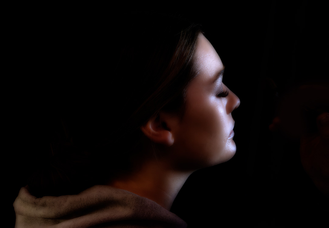
A mysterious portrait that forces one to wonder what is she doing, thinking?
I love the moodiness you have added and feel it works really well. I do miss having just a little definition at the top of her hair, and I prefer the warmer facial coloring of the original.
Here's a warmed up crop. I used a warming photo filter (adj layer) in PS, brightened her face a tad, and eliminated the vestiges of the make-up brush. |
Sep 11th |
 |
| 77 |
Sep 21 |
Comment |
This is a lovely image and your arrangement and lighting is very pleasing. It's great you still have all these toys. Your adjustments are subtle on my screen but work well.
Memories can be anything from hazy to sharp to vivid. This photo which is already nice and sharp seems a bit muted, so I would go for some more vivid in this case. A bit of H&S in PS on just the Raggedy Ann's body parts, and a selectively-masked, levels adjustment would get you here. |
Sep 4th |
 |
| 77 |
Sep 21 |
Comment |
This is a excellent capture that you have processed to a tee. So well done!
Like Georgianne, I would appreciate a bit more about the processing, for example, how you got the antenna separated from the darkened background.
As for improvements, I'm thinking the underside of the butterfly is too white/bright, especially given the rotated crop, so it could be toned down.
|
Sep 4th |
| 77 |
Sep 21 |
Comment |
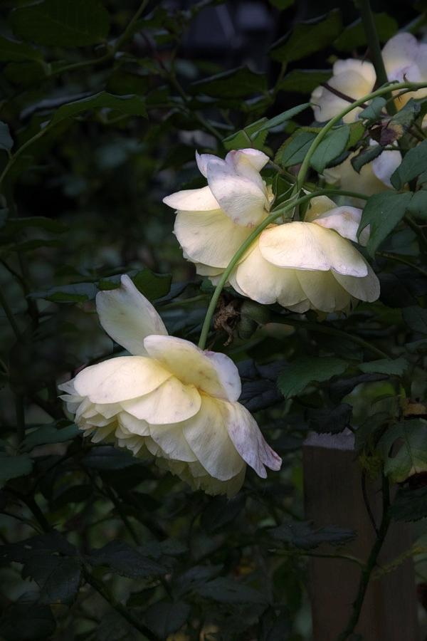
Connie, as you note, this rose was a bit past its prime. Yet still beautiful in a wabi-sabi way. That faded beauty really hits home with this 75 year old.
Like Georgianne, I felt the background in your processing was too prominent. Here's a version where I used TS2 glow and duo-tone on the original photo and then darkened the background in PS. I like the "glow"idea for this photo. |
Sep 4th |
 |
| 77 |
Sep 21 |
Comment |
Georgianne, I like your original photo a lot. What is appealing to me, aside from the lovely water reflection, is the contrast between the delicate color of the lily petals and the dark water. Your processing has muted that contrast, while adding your desired ethereal painterly look.
In my opinion, even with all your efforts, I feel that the lily flower has been lost in the shuffle. I have not tried adding textures to a dark background, so no helpful thoughts there. Instead, I wondered about a different crop and enhancing the flower, especially the center, as an alternative starting point for your processing. |
Sep 4th |
 |
| 77 |
Sep 21 |
Comment |
This is a wonderful and fun image. I love the stacked detail in your original, and the creative way you have made it into art. I think your post-processing to convert the background to white and to add the watercolor effect works really well. If I were to hang this on the wall, it would work well and I might not change a thing.
On the other hand as a card, there are some options you could consider if you wanted to make the image more fun. These include a light texture behind the caterpillar (since there is so much "white-space"), and a fanciful frame around the image. This frame was created by expanding the canvas, applying a gradient adjustment layer to the selected expansion and adding a stroke. Then the canvas was expanded a second time and filled with color to make the outer frame.
|
Sep 4th |
 |
6 comments - 4 replies for Group 77
|
6 comments - 4 replies Total
|


