|
| Group |
Round |
C/R |
Comment |
Date |
Image |
| 34 |
Aug 21 |
Comment |
This is a super composite, really well done. |
Aug 8th |
1 comment - 0 replies for Group 34
|
| 54 |
Aug 21 |
Comment |
This is a great image that tells an interesting story - whatever that story may be for the viewer.
I feel the new sky is too strong for the image, since it competes with you and with the church (the subjects) for my attention.
|
Aug 27th |
1 comment - 0 replies for Group 54
|
| 56 |
Aug 21 |
Comment |
I like the crop you chose and the way you made the background disappear. Looks quite natural. |
Aug 27th |
| 56 |
Aug 21 |
Comment |
WOW!!! A beautiful image.
|
Aug 27th |
2 comments - 0 replies for Group 56
|
| 77 |
Aug 21 |
Reply |
I like the way Linda's crop simplifies this photo. I do agree with Michael, the shadows are quite strong. I might try using shadow and highlight, and then mask (or blend if) the result onto just those dark areas.
|
Aug 16th |
| 77 |
Aug 21 |
Reply |
See reply below. Thanks. |
Aug 11th |
| 77 |
Aug 21 |
Reply |
Thanks for your comments Michael and Connie. They were very helpful. I've been wanting to rework this image, as I plan to enter it in a competition at the end of this month. Here's a second version... |
Aug 11th |
 |
| 77 |
Aug 21 |
Comment |
Linda, this is a pleasing image. I like the image rotation and the crop that you chose; it brings the rose close. Also the choice of texture and texture color work well, especially to tone down the distraction of the red roses in the background.
The rose has an imperfection (maybe in the eye of this beholder?) on the right side that I would have wanted to fix before doing any artistic processing.
In my opinion, the dark outer edges of the rose at the top and right sides appear over-done (to me they say photoshopped), so perhaps there's an opportunity for improvement there via more natural-looking masking.
As you noted, the wind -- along with your capture settings and the resulting limited depth of field -- have resulted in a soft image. Have you considered building on that softness with some glow or other ethereal processing techniques? I'm thinking that approach might make for a stronger image.
|
Aug 8th |
| 77 |
Aug 21 |
Comment |
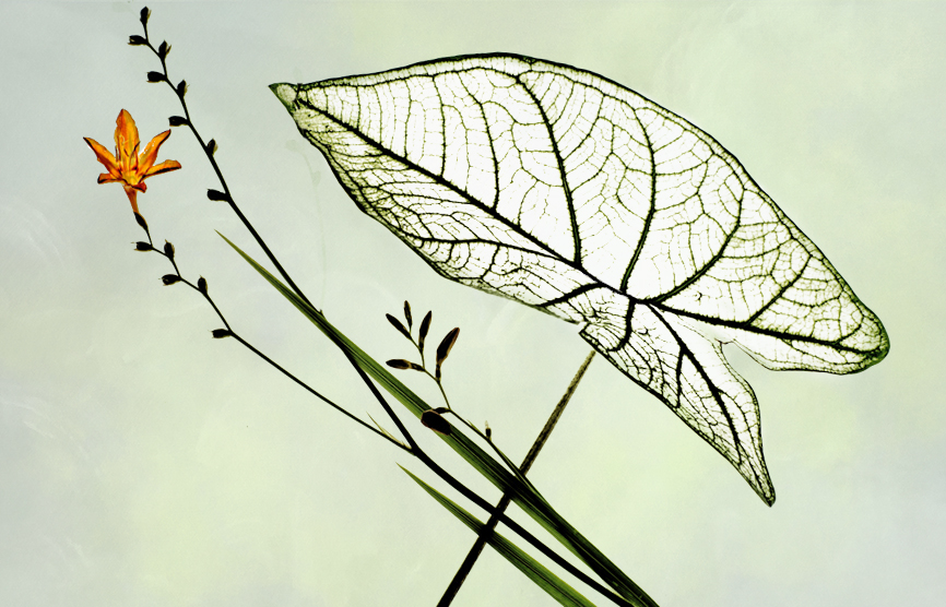
This is a pleasing image that has quite a bit of interest. The detail on the leaf is eye-catching, making for a great subject.
Choosing a texture to complement the subject can be tricky. I like the one you have chosen and the way you've colored it, though it may have a few areas that are too black.
In my opinion, the area for improvement is the added leaf shadow. It is a dead giveaway that the image was photoshopped. Your original photo of the leaf shows the location of the real shadow. The light direction is also clear from the bumps on the leaf. The added drop shadow conflicts with the light on the leaf, so I would try putting it behind the leaf.
|
Aug 8th |
| 77 |
Aug 21 |
Comment |
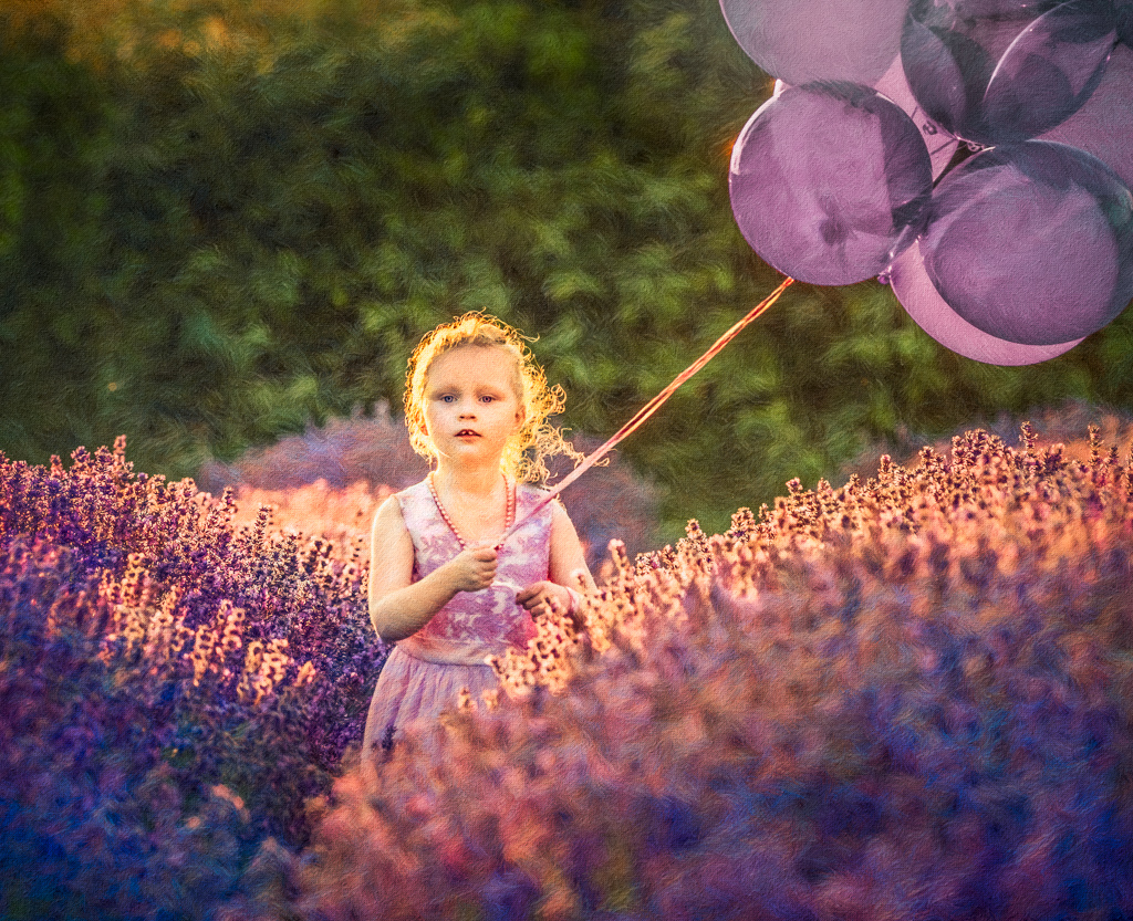
This is stunning -- moody and warm, with lovely colors and light. How wonderful to have this out your door!
If it were my photo I would try blending in a bit of "blue sky" (from this or another photo) at very low opacity over the white area on the top right, as that corner is so bright. |
Aug 8th |
| 77 |
Aug 21 |
Comment |
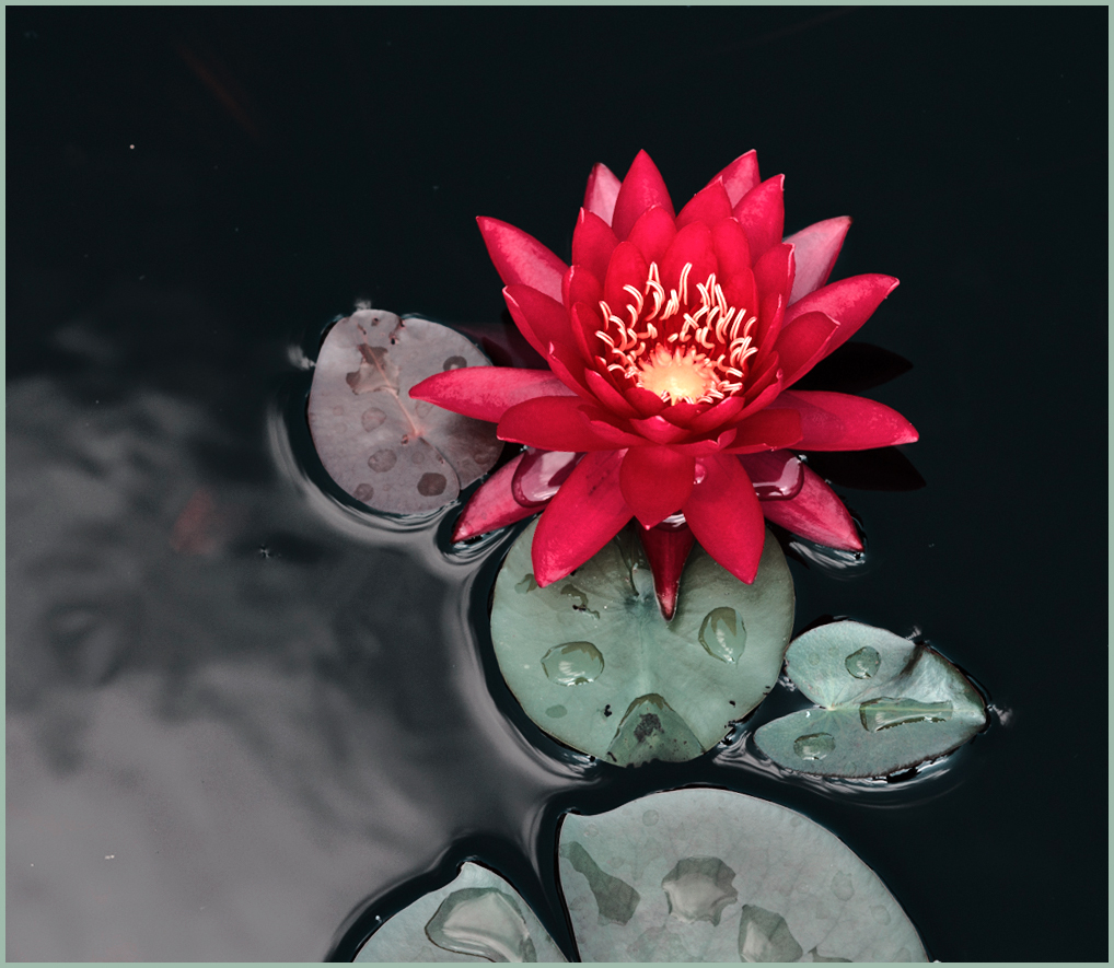
This photo has a lot of pop, with the black water and the large water drops on the leaves and flower. It also has a really pleasing amount of simplicity. The perspective feels unusual, which is perhaps a plus.
It occurred to me to flip the image and thus slightly modify the crop.
I do not particularly like magenta as a color, especially next to that bright green leaf. So I tried using a "2-strip.look" from the color lookup adjustment layer option in PS, to convert the colors to the ones in this version.
|
Aug 8th |
 |
| 77 |
Aug 21 |
Comment |
Georgianne Giese -Thank you for sharing this photo and the light box info. Perhaps you could share your husband as well- just for a few days at our place to build me one?
This is a really interesting photo. I like the way you've arranged the botanical bits, as well as the contrast and interest provided by that colorful flower.
Looking at the result after the second set of processing, I decided I prefer the start photo over the final. So, starting with it, I cloned away the stem that overlaps the leaf, rotated and cropped the image, and added a little black line to the center of the leaf. Then I tried adding a low opacity texture to the "background".
PS. Love your photo in Group 34�� |
Aug 8th |
 |
5 comments - 3 replies for Group 77
|
| 90 |
Aug 21 |
Comment |
Well done, especially given the story.
|
Aug 27th |
1 comment - 0 replies for Group 90
|
10 comments - 3 replies Total
|


