|
| Group |
Round |
C/R |
Comment |
Date |
Image |
| 77 |
Jul 21 |
Comment |
Screen shot... Perhaps a bit heavy handed. |
Jul 20th |
 |
| 77 |
Jul 21 |
Comment |
Mary, congratulations on the new grandchild!!! How fortunate that you were able to create and capture this scene. I really like the way you have arranged the subjects and the lines in the image. Such a good story here��
I
n my opinion, the opportunity to improve is about recovering detail in the shadows, emphasizing her belly, and if you have it, recovering a little detail in her hair. I started with Georgianne's version and darkened the door with a levels adj. layer and a gradient on the mask so it just affected the door. Then I stamped up and used the shadow and highlights adjustment at settings that I will append. Finally a little contrast on the baby stuff�� |
Jul 20th |
 |
| 77 |
Jul 21 |
Comment |
Nicely done! I like original 2 and your Final about equally well. One thought is to put one on top of the other in PS, and see if modifying the opacity of the one on top gives you a result you prefer. An off-center crop is another possibility.
|
Jul 7th |
| 77 |
Jul 21 |
Comment |
This is sweet; I like the way you have added the pink all around the outside. If it were my photo, I would continue in that vein and work to modify the residual green/grey that's still left around the peony. |
Jul 7th |
| 77 |
Jul 21 |
Reply |
Thanks Georgianne, a good catch. Will do. |
Jul 3rd |
| 77 |
Jul 21 |
Comment |
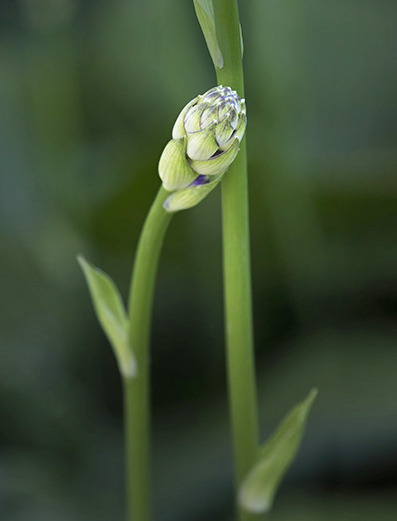
I like the idea here. The connection between the hosta buds makes for a lovely intimate little story. You've done a great job removing or minimizing some of the distracting bright areas. The really dark areas could use some similar help, since they are so dark they pull my eye away from the buds.
For me, the softness of the tall bud is problematic. I think the large difference is sharpness between the buds almost negates your story about the interacting buds. Since I see no way to fix that, I tried a crop leaving only one bud. To simplify, I painted over the remaining top of the tall hosta in green on a separate layer and used the darker color blend mode. |
Jul 3rd |
 |
| 77 |
Jul 21 |
Comment |
The second way... |
Jul 2nd |
 |
| 77 |
Jul 21 |
Comment |
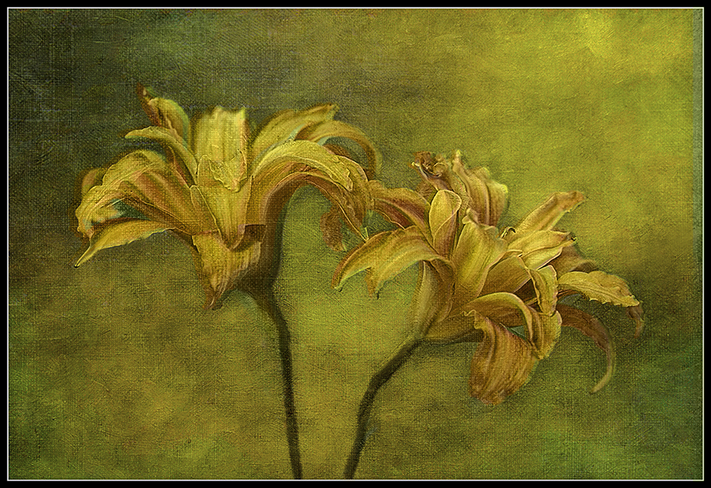
What a great result to make this photo so painterly. I love the way the composition fills the frame, and your capture, with soft background made for a great start for adding the textures.
For me, adding back a little of the original orange color of the daylily would add a bit of" pop" to the flowers. I tried this two ways - one was to simply paint-in some color onto the petals on top of your final result. ( I used two blank layers, one with a purple brush, the other with a blue brush, both in the soft light blend mode.)
Then, as an alternative, I tried adding the color of your original photo's flower petals. (See pic below). This was done by selecting the day lilies using the Select Subject command in PS on your start photo and copying that selection onto a new layer The resulting "lilies only" photo was place in a layer on top of your final photo in the "color" blend mode; 65% opacity looked good to me.
|
Jul 2nd |
 |
| 77 |
Jul 21 |
Comment |
Georgianne, I'm SO pleased to see you joining us. Welcome back!
It has to be an awful side-effect, things tasting terrible, especially as eating is now more possible. I love interesting foods and especially chocolate deserts; like you , I would definitely miss them both.
I like your minimalist image, full of interesting textures and lines in the sand. Those NM white sand dunes are indeed amazing. I remember we slid down them on a piece of discarded cardboard some many years ago; it was fun!
So, about improving the photo - in my opinion, I feel the driftwood needs some tidying up (cloning away the stray bits of grass and finding (or creating) a little detail in the blacks. I imagine it being a fish going upstream to spawn (as the salmon do here in Sequim). Therefore, I've made the "banks" of the stream darker by adding separate levels adj layers on each sides of the center (in the luminosity blend mode, so the color doesn't change). I also added a bit of contrast into the bright area at the bottom left corner to make it look like the fish's wake.
|
Jul 2nd |
 |
| 77 |
Jul 21 |
Comment |
Imagine it big, on the wall... |
Jul 2nd |
 |
9 comments - 1 reply for Group 77
|
9 comments - 1 reply Total
|


