|
| Group |
Round |
C/R |
Comment |
Date |
Image |
| 77 |
Jun 21 |
Reply |
Thanks!!! I love to experiment in the digital darkroom, and sometimes the results come together really well... Other results are less successful, so these are rejected and discarded. As it turns out my friend's wall is brick colored, so I changed the photo to blues and purples. |
Jun 22nd |
 |
| 77 |
Jun 21 |
Comment |
Looks like the group has done some nice work coming up with some ideas. Here's another one to consider as well. I this case I took the seed head, expanded it and added it in the lighter color blend mode as a texture to your black background. |
Jun 19th |
 |
| 77 |
Jun 21 |
Reply |
Connie, thank you so much for that very special little girl comment -- it made my day. (Maybe my week!)
As for the color variations at the sides, I felt the image was too mono-chromatic and needed some more (albeit subtle) interest. So I tried to change the side colors a little. The blue and purple colors used for for the graduated filters were found by experimentation. |
Jun 6th |
| 77 |
Jun 21 |
Comment |
|
Jun 6th |
 |
| 77 |
Jun 21 |
Comment |
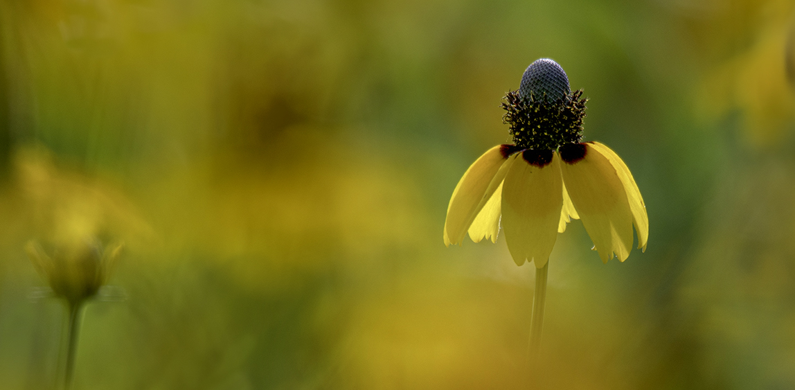
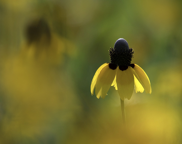
The light on this wildflower is lovely and the softness of the surrounding image helps bring it into focus. Your processing and crop have gone a long way to making this a fine art image. In my opinion, there's still a little too much in the photo that pulls away from the subject. To In particular, I would try to minimize the impact of that really bright golden blobby area below the flower, which is both larger than the flower and brighter (I do realize it's an out-of focus flower). So here are two possible crops. In both I added soft splotches of gold at low opacity on a new layer to help tell the prairie field story while also drawing attention away from that bright gold blob.
|
Jun 6th |
 |
| 77 |
Jun 21 |
Comment |
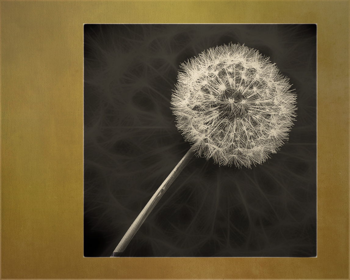
I LOVE the detail in your 7-image-stacked photo. And thanks for the Weeylite tip; it clearly works well. Putting the photo on the diagonal is a plus, as is not having the stem come out of the corner.
Although simplicity can be a plus, I wonder if there is more that can be done to help bring this into the next level of fine art photography? I have some thoughts, but perhaps you'd like to give it a go first? |
Jun 3rd |
| 77 |
Jun 21 |
Comment |
Imagine it BIG! |
Jun 2nd |
| 77 |
Jun 21 |
Comment |
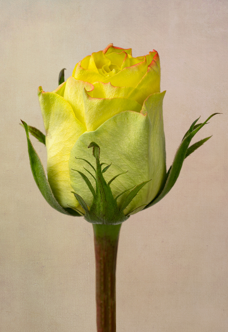
This is a strong photo of an unusually-colored rose created with wonderful attention to detail. I think your choice to have her standing straight up is great. And your delicate texture adds to the image. Well done!
I tried a quick play on this photo in PS, in part because I think the texture's rose-color, rather than orange) luminescence at the bottom pulls my eye away from the rose. First I elongated the canvas and made the rose taller (content-aware fill), and cropped slightly off-center. I added a texture (masking the rose) and then a purple photo-filter adj layer to contrast the rose colors with an opposite color on the color wheel, and an orange photo filter - combining these two photo filter layers into a PS "group" so I could use a gradient mask (diamond mode) to mix them. Like you, I also made sure the light in the texture layers came in from the upper left.
Denise, I don't think my texture treatment is an improvement over yours, but I do prefer the longer rose stem and overall photo dimensions. |
Jun 2nd |
 |
| 77 |
Jun 21 |
Comment |
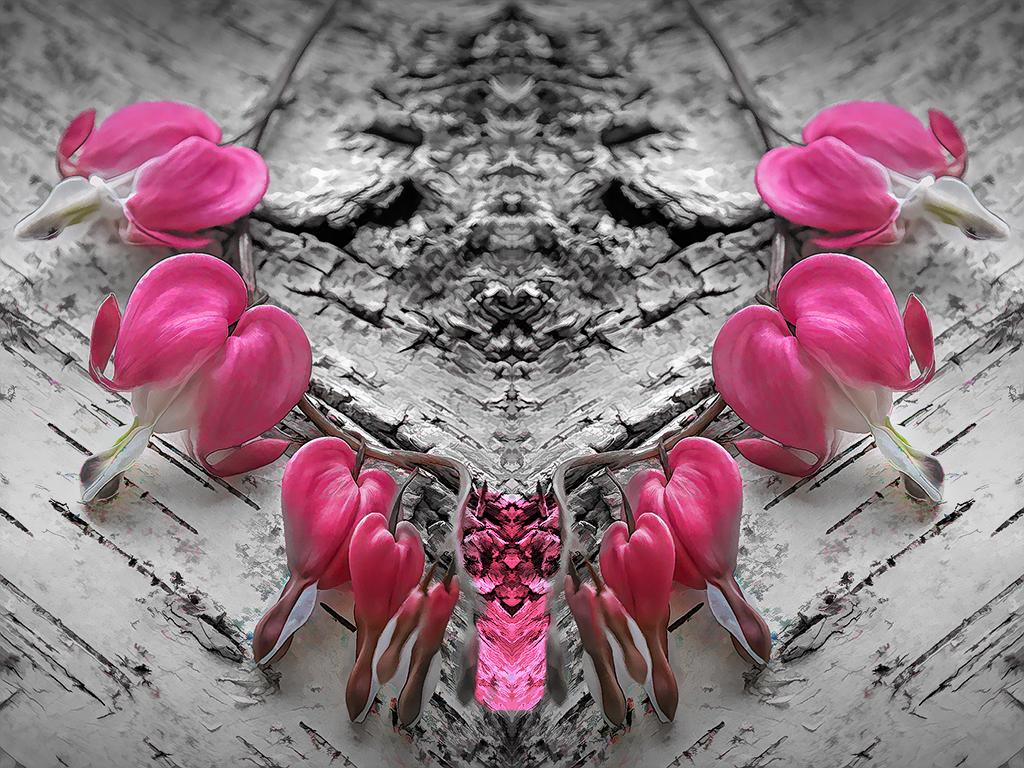
Connie, I had a hard time with this image. In particular, the contrast between the soft delicate flowers and the super rough wood doesn't seem like a good combination to me, since they both pull the eye but in such opposite directions. The depth of field is very good; the composition is straightforward�� As for those colorful "artifacts" that you like so well, I find them distracting. What to suggest? How about this necklace? It was pretty easy to create (duplicate layer, expand canvas, flip duplicated layer horizontal, move to meet at center, and adjust colors, vignette��This version has the advantage of making the rough wood an integral part of the story. |
Jun 2nd |
 |
| 77 |
Jun 21 |
Comment |
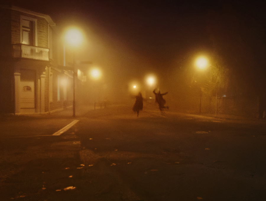
Mary, how cool that this couple was "partying" in the street. Phone capture is indeed a great option when that's what's right there with you, and it seems to have done a great job.
I think that to take this photo to the next level, it would be good to emphasize the couple. So, first off, a more aggressive crop to remove most of the areas w/o info; then a bit of minor cloning to remove some stray lights near the figures. A shadow and highlight layer was used to add a bit of detail to the dark areas, I noticed that the light on the storefront was a different temperature, so I fixed that by painting over it on a new layer with an amber color. Finally, a new vignette was added. I definitely prefer the color version, but in the end I felt the color was a bit strong, so I used a H&S layer to bring it down a bit.
Thanks for the tip on Halide, looks like a great app. |
Jun 1st |
 |
8 comments - 2 replies for Group 77
|
8 comments - 2 replies Total
|


