|
| Group |
Round |
C/R |
Comment |
Date |
Image |
| 20 |
May 21 |
Comment |
What a great composite. I'm sure it helped make her day. Sending hugs to you both. |
May 9th |
1 comment - 0 replies for Group 20
|
| 41 |
May 21 |
Comment |
This is a wonderful composite. I love the idea and the execution. I'm thinking a bit of puppet warp on the standing you's to make them ever so slightly different...
|
May 9th |
1 comment - 0 replies for Group 41
|
| 77 |
May 21 |
Comment |
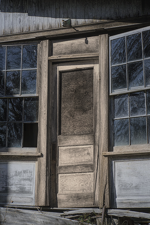
Thanks for that interesting bit of history. The dilapidated entrance to this old house has some appealing features in that there is still glass in the windows that they have an unusual texture and blue color. Your processing was aimed at accentuating the textures and perhaps also downplaying the sunny day to get a bit more moodiness. I'm liking the emphasis on the texture; I think that worked well.
On the other hand, in part because of the strong shadow from the light(?) over the door and as well as in other places, I think the overall darkening, and lack of tonal range (no highlights) does not do justice to the scene. That's because, in my view, it is a disconnect- dark, when clearly the photo was taken in bright sun.. Additionally, the processing has produced a very black amorphous blob at the left middle edge that draws my eye. I prefer Denise's B&W version. It might be interesting to try some "split toning" on it. Another option is to purposely emphasize/add color, as I have done in this version where I focused on the now brown door as the subject. (For the how details, I can send you the psd.)
|
May 12th |
 |
| 77 |
May 21 |
Comment |
Denise, you've done an excellent job getting this tulip to sit up and glow. It's just beautiful. In my opinion, your processing has taken the photo that extra step. This is a lovely image that would look great on a wall. I definitely prefer the final image with its warm, green, textured background. It shouts "springtime" and makes me happy.
|
May 8th |
| 77 |
May 21 |
Comment |
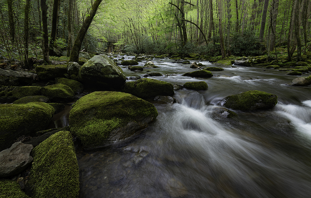
Linda, you've turned this lovely scene into fine art. The cloning and green painting add a lot (though IMHO the sky may have just a tad too much green paint). The curved trees are definitely an interesting feature, but at the same time they draw my eye away from the foreground water that you've captured perfectly and all those great mossy rocks.
I thought I'd try using content aware fill in PS to make the curved trees disappear, and that worked well. The resulting layer was then duplicated, and, using the "camera raw "filter in PS, I added a bit more tilt to the scene. This was done by adding a plus number to the vertical setting in the Geometry, Manual Setting, Vertical area section of the filter. What do you think?
|
May 8th |
 |
| 77 |
May 21 |
Comment |
Composites are quite an adventure to create, and it's hard to make them feel whole and therefore believable. At the same time, it's also important to be focused on composition esthetics and photography details. Here your original photo had all the action on one side, with the barn situated right behind the fence, thus overlapping and partially obscuring one of the subjects. As for details, that bright blue cylinder sticking out from behind the fence's right edge draws my eye, and could easily be cloned away.
One thought: perhaps consider adding the moon to the left side, rather than put it in the already-busy right side. This would help balance the photo. |
May 8th |
4 comments - 0 replies for Group 77
|
6 comments - 0 replies Total
|


