|
| Group |
Round |
C/R |
Comment |
Date |
Image |
| 77 |
Mar 21 |
Reply |
Thanks Linda. It's great to see another interpretation of the photo. I've now entered my edited version above in an International competition -- theme flowers. Will see how it does... |
Mar 29th |
| 77 |
Mar 21 |
Reply |
Thanks for your comments. I've softenedthe flowers a bit, and modified the background. See photo in my reply comment above. |
Mar 22nd |
| 77 |
Mar 21 |
Reply |
Thanks for your input. I've tried a different version: removed the sprinklers, brightened the couch a bit and added a bit of bokeh at low opacity... |
Mar 22nd |
 |
| 77 |
Mar 21 |
Comment |
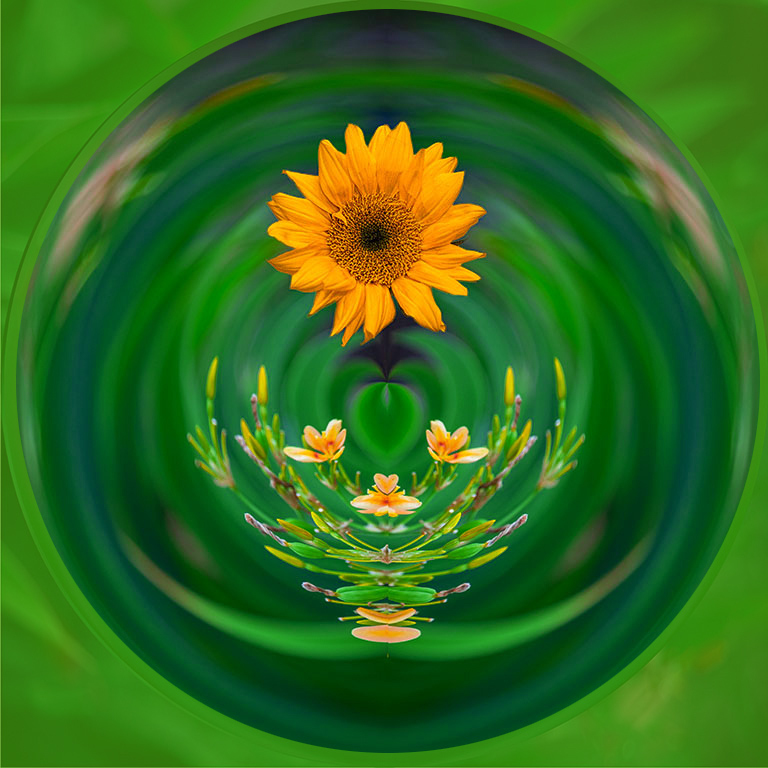
These sorts of images sure are fun to play with, and the added dimension of the overlaid sunflower is a plus. To keep the image centered I often (partially) darken or modify the color of the area outside the sphere. As for the sunflower, it was a good idea, but the lighting doesn't quite seem to mesh up. To help I tried a 3-strip lookup adjustment layer, and then a levels adj layer on the sunflower part, with some partial brushing in.
|
Mar 22nd |
 |
| 77 |
Mar 21 |
Comment |
Mary, it's an interesting image, especially given your history with the locale. This little cubbyhole has an awful lot to look at. I'm drawn to the light around the window frame and the two things on the window sill. I like the muted colors as they add another dimension. Old photos often have noise, but the noise, especially at the bottom, pulls my eye down and into "not much". It's hard to decide what is the subject here, and where should the eye rest...
|
Mar 22nd |
| 77 |
Mar 21 |
Comment |
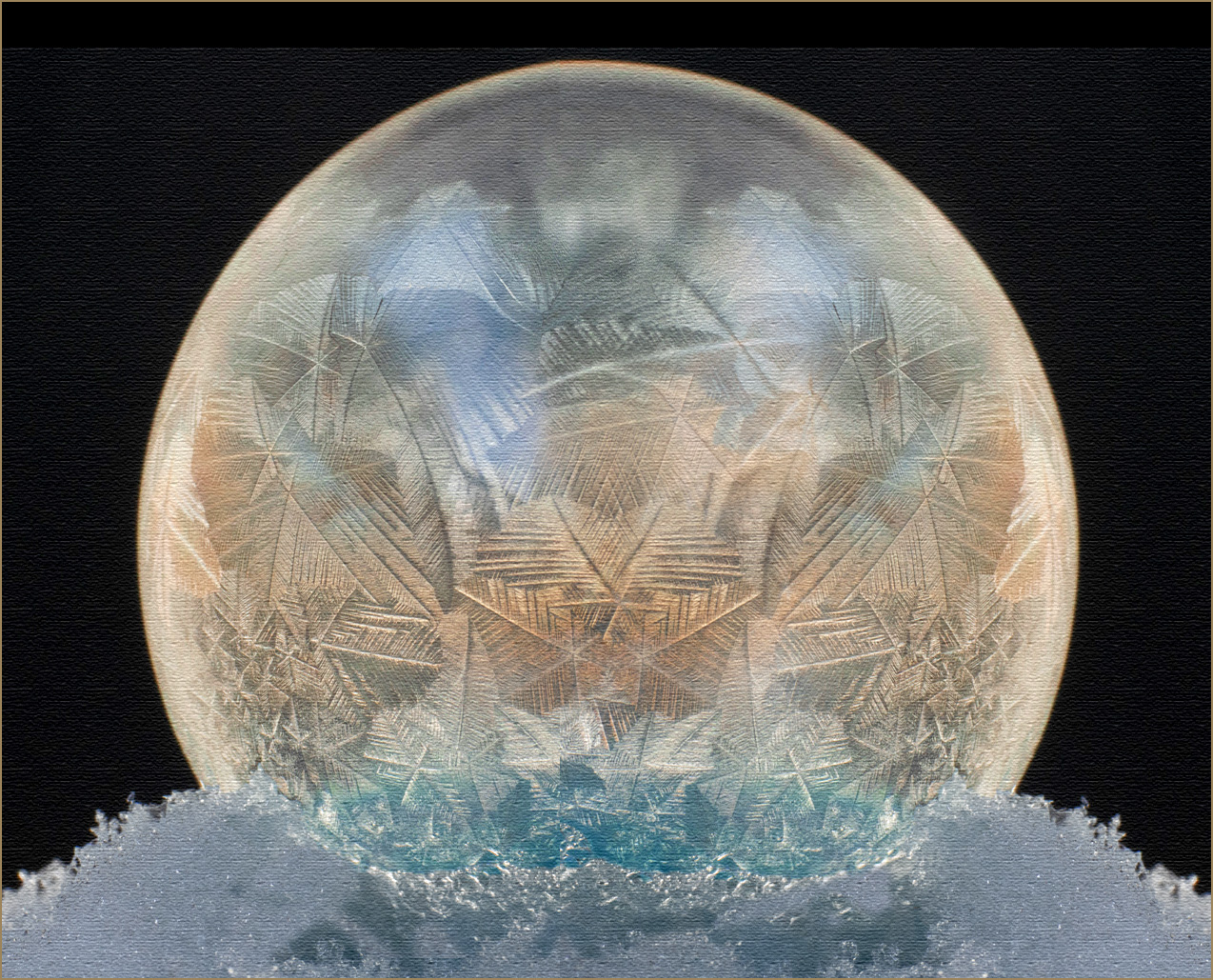
Denise , this is very cool! I love all the frozen details in the bubble and think your lighting has been well done to capture it. Although the B&W version is nice, I find the grittiness of your processing a bit harsh. Also I feel the white at the border is a bit too thick, since it is the brightest part of the image and pulls my eye.
I quite like yoir color version, so I took it out for a spin, making it into a full ball. Just another thought�� |
Mar 2nd |
 |
| 77 |
Mar 21 |
Comment |
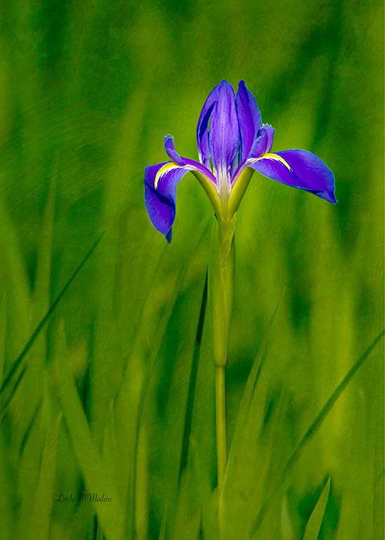
Linda, this is a lovely reminder of spring.
A couple of thoughts - the one dark reed on the left that meets the iris is distracting (I copied and moved it) and the IMHO the greens could pop just a little more, perhaps with an emerald color. To make the image "artier", I tried adding a texture to the grasses. Might be a plus��
|
Mar 2nd |
 |
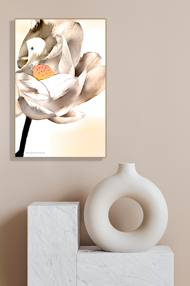
| 77 |
Mar 21 |
Comment |
Georgianne, as always, thanks for the info on how you achieved the transformation from start to final. I haven't used the dry brush filter (there are SO many), so thanks for the heads up. It provided you with an interesting result.
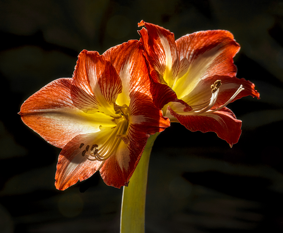
In this photo, it's not clear to me what your objective was. I assume it was "Arty"; therefore it seems to me that once you move away from "reality", it would be nice to clone away the fly, since to me it seems to be a distraction. I think the pale yellows from the texture layer, which bring out the yellow in the flower center are a big plus. For fun,I've added your photo to a wall�� |
Mar 2nd |
 |
5 comments - 3 replies for Group 77
|
5 comments - 3 replies Total
|


