|
| Group |
Round |
C/R |
Comment |
Date |
Image |
| 77 |
Feb 21 |
Reply |
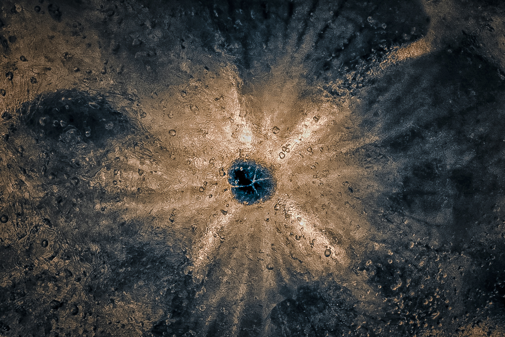
Thank you Georgianne! This is just the sort of thinking and play I was hoping for.
I like the way your work has combined the colors, and the way the NIK filters add contrast and sharpness to the bubbles in the ice.
I've had a little play myself, adding more blue and sharpness, contrast. |
Feb 24th |
 |
| 77 |
Feb 21 |
Reply |
I like this colorful version with the blurring and colors adjusted to keep the eye centered. I like the way the purples and blues add to the moodiness.
|
Feb 21st |
| 77 |
Feb 21 |
Reply |
Linda, please post an updated image in the comments, if you get a chance. I am looking forward to seeing what you do. |
Feb 5th |
| 77 |
Feb 21 |
Comment |
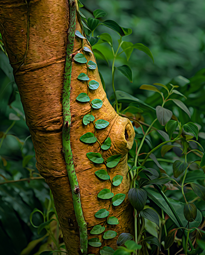
This is an interesting photo, and you've done well with DOF to keep the background soft. Like you, I'm taken with the vines on the trunk and the contrast in colors there. Your processing has certainly added oomph to the colors, especially the gold in the tree trunk, the purple in the leaves, and the blue in the background.
For me, "fantasy" forest begs for something MORE unusual, with more non-realistic processing than you've done so far. Since I don't know what would move this forward with your vision, I took a diverging approach.
An alternative way of processing this photo would be to de-emphasize the nearby foliage and the background, and put all the interest on the trunk and vine. Here's an example of what that might look like. |
Feb 4th |
 |
| 77 |
Feb 21 |
Comment |
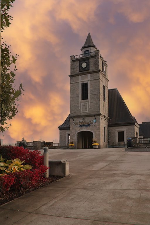
An interesting enough clock. The textures do add a feeling of "old"
To me, the areas where the clock ends and the textures begin seem haphazard, and perhaps the clock could be transformed to be rounder. |
Feb 4th |
| 77 |
Feb 21 |
Comment |
That look is indeed worth capturing, especially, as you note ,it is one you often see. You sure got her eyes sharp! You've done well removing the distracting man in the background . Unfortunately dealing with Lily's hair on the left has resulted in some "photoshopped-ness., and so much bright on the left side pulls away.
I've tried a tighter crop, and since I assume that it is her father holding her, I emphasized his tattoo a little. Then I overlaid the B&W version with the color one (at 25% opacity) and masked away everything but Lily's face and hair. Not that her look needed any emphasis, it is just something fun to consider artistically. Lastly, a strong vignette and an inside stoke were added.
|
Feb 4th |
 |
| 77 |
Feb 21 |
Comment |
Georgianne, this impressionist result does look a little like a Renoir, with its color range and interesting splotchy strokes. However, to me, the blur on the man's face is problematic, so distracting. Also all the motors in the boat and the upright silver thing hiding his legs take away from what might otherwise be a bucolic scene.
Perhaps just use the right side of the image, either as an abstract or a texture?
|
Feb 4th |
| 77 |
Feb 21 |
Comment |
Connie - an interesting building and lots of drama in the sky, so I can see why you wanted to capture it. You did a great job of dropping in the darker sky, without any of those tell tale edges showing up. But, in my opinion, the picture as a whole looks "fake". Perhaps it is because I would expect this wide range of sky colors to show up as a light/dark "reflections" in the stones of the foreground.
Just for fun, I used the new Sky Replacement tool in PS and dropped in one of my sunset skies to go with the yellows in your original photo. This tool often does a good job of adjusting the colors of the foreground and other non-sky image parts. |
Feb 4th |
 |
5 comments - 3 replies for Group 77
|
| 96 |
Feb 21 |
Comment |
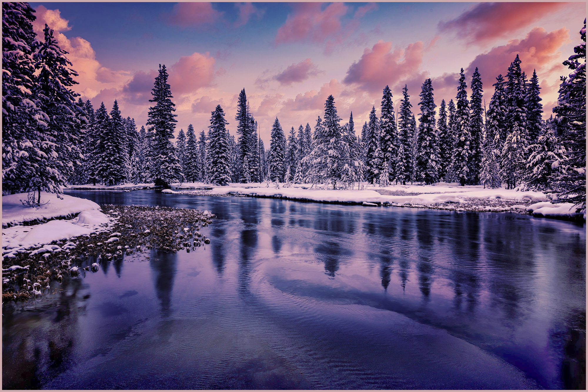
What a wonderful photo! Well worth the cold, I think.
This processing seems a bit too Blue on my monitor, so I added a few adjustment layers to add warmth... (a warming photo filter 85 at 25%; a filmstock_50.3 color lookup adjustment layer, and then some levels). And then a stoke. |
Feb 4th |
 |
1 comment - 0 replies for Group 96
|
6 comments - 3 replies Total
|


