|
| Group |
Round |
C/R |
Comment |
Date |
Image |
| 4 |
Nov 20 |
Comment |
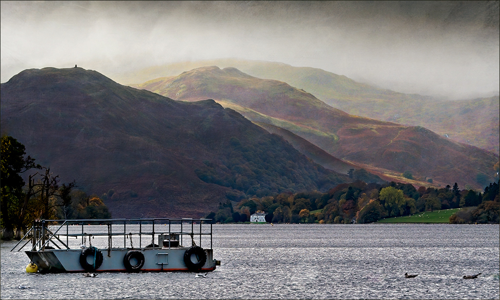
Just checking in and saying hi! This is a nice image, and I'm glad you got out to take it. I like the layers in the hills, the fog and the boat.
I'm thinking there's room to go a bit further with mood, so I tried adding two textures using the Adobe Texture Pro that comes with PS (via Window/ Extensions). I added Atlantic at 75% opacity in overlay mode to darken the hills, masking the foreground and Sakura Skies at 10 % in overlay mode to warm up the scenes. I also brighten the foreground water and boat using levels, but not the trees at the left. Finally I toned down that house, since in my opinion it is too small. |
Nov 8th |
 |
1 comment - 0 replies for Group 4
|
| 5 |
Nov 20 |
Comment |
Hi Barbara, so sorry to hear about your injury...
I love your idea here of using pearls, flowers and drapery. And the drapery here is soft and exquisite. The dark vase clearly draws the eye, and is a nice contrast to all the sepias. In my opinion, there could be a little more room at the top, and I would prefer to see a narrower and sepia-tined frame, since the white is so stark against this delicate composition.
|
Nov 8th |
1 comment - 0 replies for Group 5
|
| 77 |
Nov 20 |
Comment |
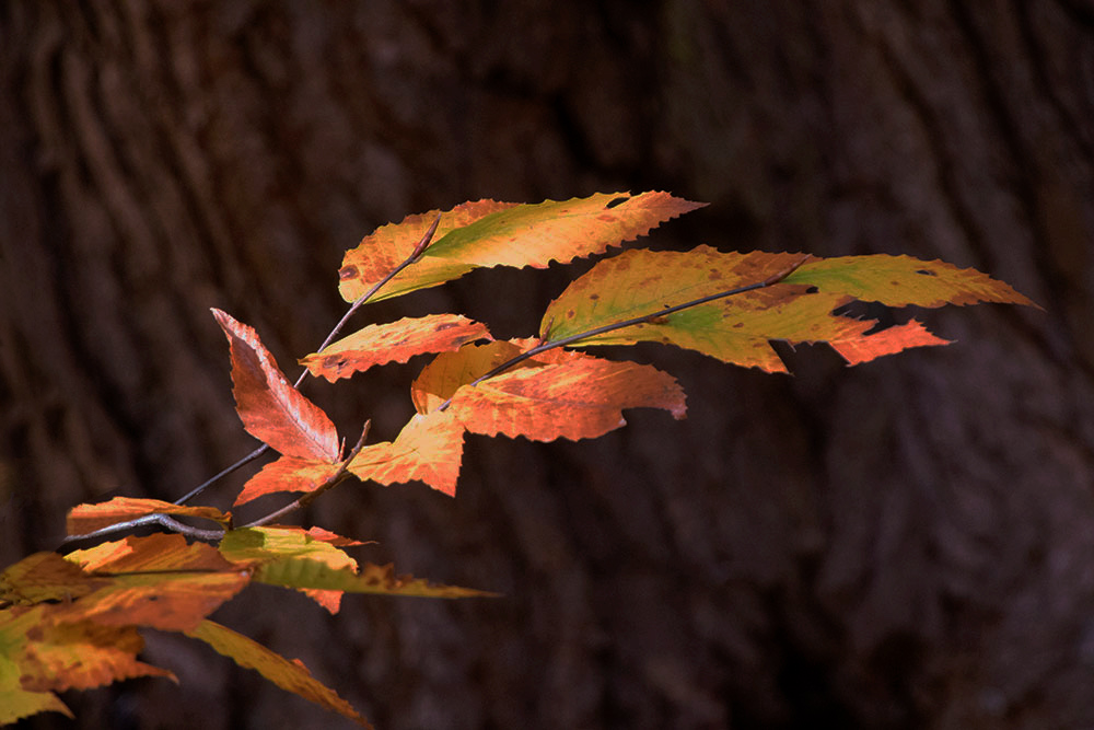
Colorful autumn leaves are always a joy to behold. And the bark as the backdrop was an excellent choice that helps with the story.
My color preference is for reds and oranges, so I shifted your photo in that direction. I started with your original and in PS added 3 adjustment layers: Levels, H&S (masked onto the leaves), and Brightness and Contrast (lowering both values). I also cloned away some of the distractions in the left hand corner. Not the reality, but��
? |
Nov 5th |
 |
| 77 |
Nov 20 |
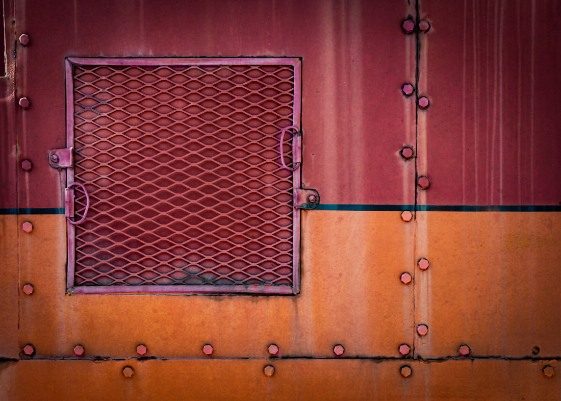
Comment |
Denise, you've brought out some lovely colors here and the straightening surely helps a lot.. I agree that upper right hand corner needs toning down, but what else would be fun here? I decided to emphasize some of the details - the bolts and the "window frame". I used a levels adj layer to brighten, masking everything but those portions. Also, I made some color shifts in those areas, using a hue and saturation layer with the same mask. It does seem to add a bit more wow... |
Nov 5th |
 |
| 77 |
Nov 20 |
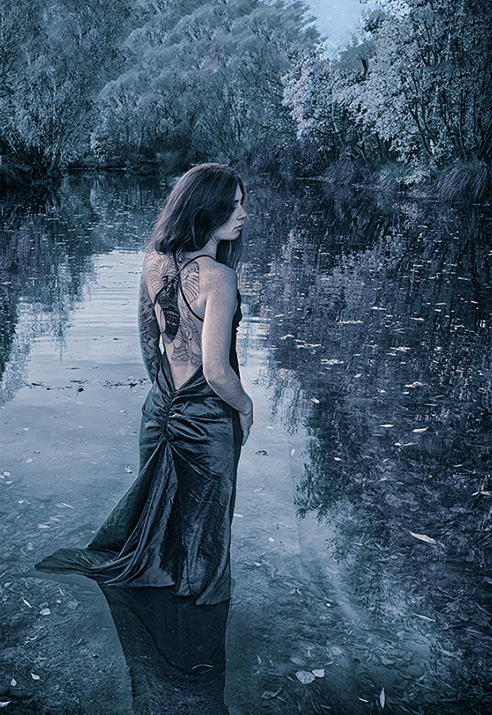
Comment |
Mary , if only models would jump in front of my camera! Your original capture is lovely, and I prefer it to the more saturated version where the greens and yellow are so dominant. I think removing the bridge is an excellent idea, and those bits you've cleaned up definitely make for a stronger photo. I like your monochrome /cyanotone version, but, in my opinion, a blue face is not inviting, and the processing does not emphasis her tattoos, which are quite interesting. Therefore, starting with Georgianne's edit, I added some warmth by using both a red photo filter on her face and body at 20% opacity, and also adding the Late Sunset LUT adjustment layer selectively to the portions of the photo at 20%. |
Nov 5th |
 |
| 77 |
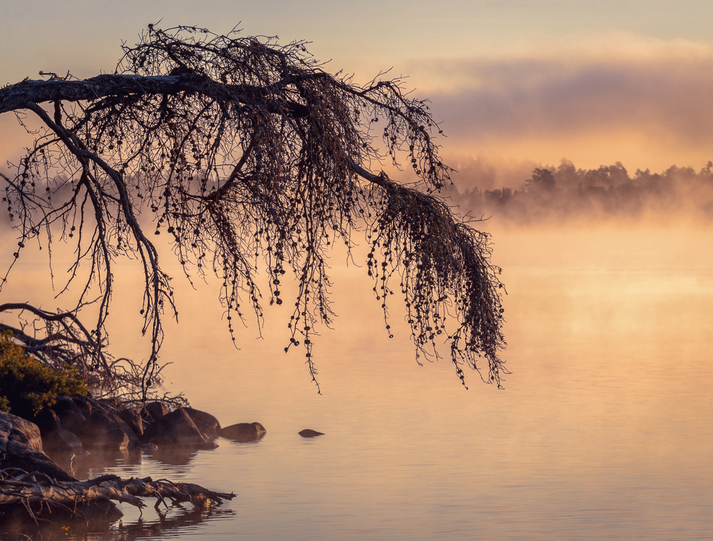
Nov 20 |
Comment |
Cecilia, I'm really enamored of trees and this drooping one is especially attractive. The misty morning made the background soft which is a great contrast to the detailed foreground. I like what you did with the sky color, and what you have done to add pop to this photo. At the same time, I'm thinking maybe some areas could be toned down, and the whole color modified. Your processing has added saturation to the rocks and weeds in the lower left, which seems a bit over-strong. Therefore I tried desaturating that potion. In addition, I selectively added some contrast to the water to the right of the tree, so it was a point of interest. I also tried to desaturate the whole image, but didn't like that. Instead I found that adding a Color Lookup adjustment layer in PS was more to my taste. I used the 3DLut File named Late Sunset.3DL that comes with PS for this adjustment here. What do you think?
|
Nov 5th |
 |
| 77 |
Nov 20 |
Reply |
Image, adjustments, photo filter. Or (better) click the icon for adj filters the bottom of the layers palette and select it . |
Nov 5th |
| 77 |
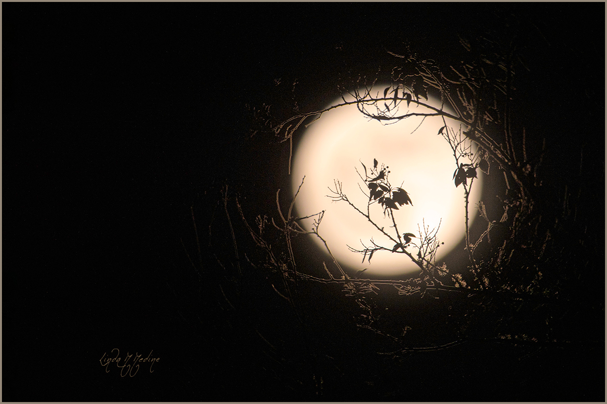
Nov 20 |
Comment |
Welcome Linda.
I love those center leaves that you placed in front of the moon. They are quite intriguing, reminding me of ballet dancers in elaborate costumes. And thanks for the stroke, it sure helped define the canvas.
To me, a significant crop would be a plus, moving the moon to a corner and away from the center. In addition, in my opinion, a little more color in the moon would help with interest; I used a PS Photo Filter adjustment layer, #85 at 40% opacity. And just a bit more moon glow�� Here's the result.
|
Nov 4th |
 |
| 77 |
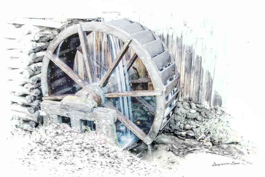
Nov 20 |
Comment |
Hi Georgianne, I'm so pleased to see this. Glad you're back "working".
I like what you've done here - the high key and desaturation work well for this photo. However, I personally love the wonderful blue of the water, so I thought I would try leaving that area with some saturation. Here's the result. I also whited out a bit at the top of the wheel, and some at the right bottom to keep the eye returning to the wheel. |
Nov 4th |
 |
6 comments - 1 reply for Group 77
|
| 79 |
Nov 20 |
Comment |
This is definitely a striking image that leaves the viewer wondering... It is a little reminiscent of smoke images, but this is way more powerful in color and in definition.
|
Nov 5th |
1 comment - 0 replies for Group 79
|
9 comments - 1 reply Total
|


