|
| Group |
Round |
C/R |
Comment |
Date |
Image |
| 77 |
Sep 20 |
Reply |
Bunny, it is indeed a question of why you chose this photo to share with our group and also perhaps what you were ultimately planning to do with it.
Telling a true story -- photojournalism -- is quite important. (Especially in these times.)
Nonetheless, we are a "fine arts" group. This, in my mind, encompasses a rather different mindset from photojournalism -- one that allows for many possible changes and variations to the photo. I look forward to getting those ideas. (Indeed, I see them as gifts.) Also, our group's comments are a way for me to find out about the emotional impact of my images. Those sorts of inputs are what I hope you and others will provide for my images. Inputs, of course, can be used or not.
At the same time, I agree with you: cleaning up the scene before taking the photo is much preferred to cloning. |
Sep 25th |
| 77 |
Sep 20 |
Reply |
Denise, thanks so much for your thoughtful reply.
The wonderful thing about photography AND the critiques in this study group is that we all see things differently. Feelings and emotional connections are so important in creating fine art photography, and these definitely influence how the maker "works-up" their photographs. At the same time, viewers come with their own perspectives, which may change as we change. These other viewpoints provide opportunities to re-affirm or re-evaluate the decisions we have made, as you have done here. |
Sep 8th |
| 77 |
Sep 20 |
Comment |
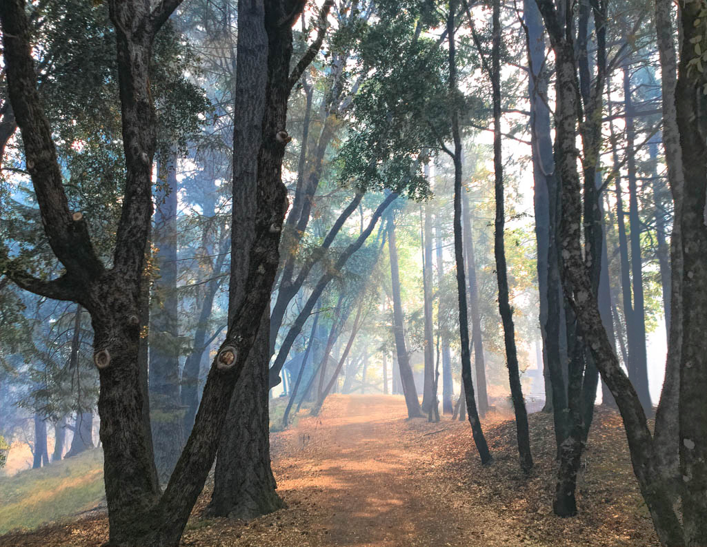
Bunny - the smoke in your image looks like fog so I think it's a real plus and the autumnal colors are wonderful. I'm ready to walk that pathway.
You've made some improvements increasing the tonal range that really help the mood of the photo. If it were my photo I would do a little cloning and content aware filling to remove some of the distractions, thereby simplifing the image. I would also lighten the tree on the right edge, since it's so dark it pulls my eye away from the path. Here's a cloned version. I then used a curves adj. layer and put a B&W vertical gradient on the layer mask to lighten just the right side.
|
Sep 2nd |
 |
| 77 |
Sep 20 |
Comment |
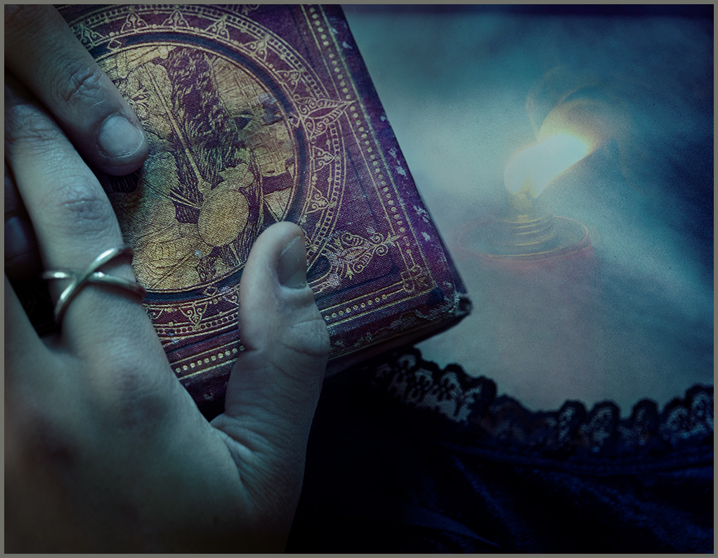
Mary - This image has a nice feel and there's lots for the eye to enjoy. The addition of the candle makes for an interesting story. For me, it is also a bit confusing -- perhaps because the model's lace dress along her neckline fills up so much of the frame. So, I thought a more focused crop, a narrow grey stroke on the edge (which is invisible here), and a bit of toning would be pluses. To tone I combined your original at 45% opacity with your final (masking the candle area and adding a bit of levels adjustment.)
|
Sep 2nd |
 |
| 77 |
Sep 20 |
Comment |
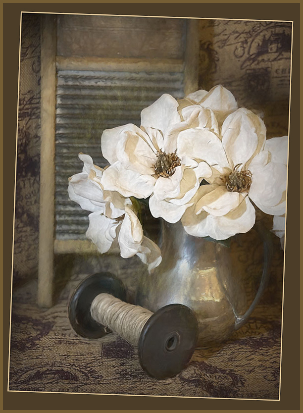
Connie, you wrote: "Perhaps if the image requires this much work, I should choose another image." An interesting thought�� In my mind, it asks: can the camera or mother nature produce fine art images? Or are they made by the "artist"using their skills and their vision? As you can probably guess, I believe artists make fine art.
I really like the image you chose this month. Great DOF, lots of interesting objects and textures, a lovely muted color range, and excellent lighting. On the other hand, it seems to me that the flowers (the main subject) look synthetic, rather than real. I also find the angle of the washboard problematic - neither vertical nor enough off-vertical to make it seem purposeful.
So, here's a creative straightening job - a double frame, since I didn't want to cut off any of the flowers. Also, I added a "plastic wrap filter" (masked) only on the flowers (at 30% opacity) to add some "texture" so they looked more real to me. BTW, I found this filter while checking out the "underpainting filter" that you had written about. Thanks for sharing. |
Sep 2nd |
 |
| 77 |
Sep 20 |
Comment |
Georgianne, I love this a powerful and heart-felt fine art image. It feels like wabi sabi exemplified. I can only think of one idea for improvement - a vignette to darken those light bits at the corners. WELL DONE!
|
Sep 2nd |
| 77 |
Sep 20 |
Comment |
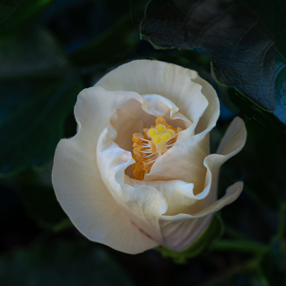
Denise -- Such an attractive flower and especially the way you captured the whites-this is clearly one of your skills. I find the leaf in the upper right distracting, so I tried moving it in your final image. (I had to clone-in a bit of new flower) Also your processing made it as prominent as the flower, so I decided to darken and desaturate it. As a final touch I added a hint more color/brightness to the yellow stamens - it's where my eye ends up, and I wanted them brighter and sharper. With a macro lens, focus stacking to increase DOF can often be a plus. |
Sep 2nd |
 |
| 77 |
Sep 20 |
Comment |
Cecilia -Wow! Such an interesting photo, and you've done an amazing job with this final image. All your work helps tell such a wonderful, surrealistic story. A few thoughts: 1) the different stonework at the bottom middle distracts and could be cloned away with content-aware fill. 2) have you considered over-laying the original photo to see if leaving some color in her hair and on the hair band would be a plus? and 3) maybe some "god-rays emanating from her?
Reading the other comments now, I do like the way Stephen's mirrored sky works its way up from the wings. |
Sep 2nd |
6 comments - 2 replies for Group 77
|
6 comments - 2 replies Total
|


