|
| Group |
Round |
C/R |
Comment |
Date |
Image |
| 20 |
Aug 20 |
Comment |
I love this! The texture choice was perfect! |
Aug 29th |
1 comment - 0 replies for Group 20
|
| 56 |
Aug 20 |
Comment |
I love this! A super job of hand painting. As for the eyes, I wonder: should the catchlights be the same size, and should they be equally sharp? |
Aug 29th |
1 comment - 0 replies for Group 56
|
| 77 |
Aug 20 |
Reply |
I'm not at all surprised you left the brown petal there purposely. It's not something you would likely have overlooked. Yet I failed to consider wabi sabi. Wabi sabi is an interesting concept, though oftentimes difficult to pull off in a photo. When I think about this concept, I tend to think of a larger portion of the scene than just one petal. I generally consider muted or faded colors, or an inter-twining of the vibrant perfection of youth and the imperfections of aging... |
Aug 8th |
| 77 |
Aug 20 |
Reply |
See triptych below... |
Aug 8th |
| 77 |
Aug 20 |
Reply |
See triptych below... |
Aug 8th |
| 77 |
Aug 20 |
Reply |
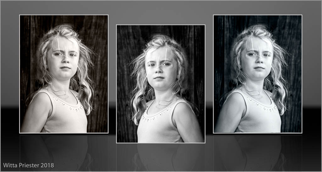
SINCE I HAVE A TRIPTYCH ACTION, I wanted to try Bunny's and Denise's ideas.
Unfortunately I only have the one photo of this girl... It would work better with 3 slightly different photos of her... |
Aug 8th |
 |
| 77 |
Aug 20 |
Reply |
I was thinking penis here!
|
Aug 7th |
| 77 |
Aug 20 |
Reply |
Thanks. Your version definitely adds quite a bit of drama, and the darkening and high contrast help make it clear where the viewer should focus.
|
Aug 7th |
| 77 |
Aug 20 |
Comment |
Denise - you've done a great job of simplifying this photo and cleaning it up. I love the delicate details in the petals and the great tonal range - so well done! I find the stoke around the edge draws my eye away, so would suggest using a thin gray stroke, rather than white. |
Aug 7th |
| 77 |
Aug 20 |
Comment |
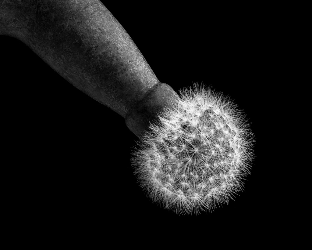
Bunny - this is a wonderful image with great detail, texture and tonal range. I especially like the contrast between the well-worn bottle texture and the sharp brilliant dandelion. Here's a flipped version that has the light coming from the top, and makes the subject look manly.
|
Aug 7th |
 |
| 77 |
Aug 20 |
Comment |
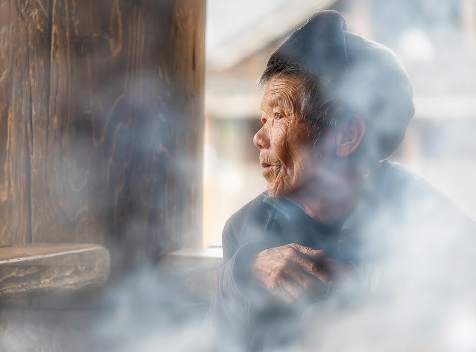
Cecilia -What a wonderful capture with her looking off into the distance, the interesting light and the moody smoke. You have done a great job of bringing up the light on her face and making those adjustments look natural. In my opinion, the left side of the photo still provides an opportunities for improvement. I have cropped away a bit, deemphasized the details, and added some smoke (large soft white brush on a separate layer at low opacity). Here's a version... |
Aug 7th |
 |
| 77 |
Aug 20 |
Comment |
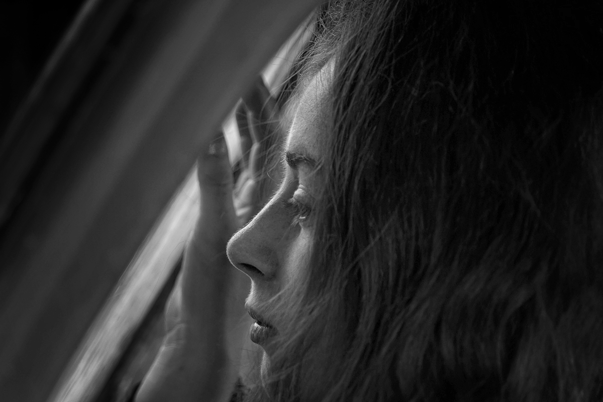
Mary -- I like this photo of her looking into the window light. It does need a narrow gray stroke at the edges to see where the photo ends. As for other thoughts, I think it is almost always a plus to clone away stray hairs, and I would darken the light on her forehead, except for the backlight part. Also, I would like to see more of her hand, and just a bit more of the tones in the upper left, more of her lips and chin, and more of her hair - all of these say at 10% opacity -- so just a TAD more, but enough to keep the viewer looking longer around the photo. Here's a version��
|
Aug 7th |
 |
| 77 |
Aug 20 |
Comment |
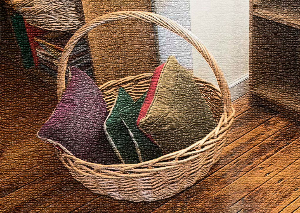
Connie-- An interesting story to go with this basket. I do like the texture you've chosen, and indeed, having looked it up, I recently tried playing with it a little. I think your choice is spot on for this photo. A few thoughts for improvement - the photo seems a little off angle so it could be straightened/distorted. It would be nice to have more space above or below the basket (I used content-aware-fill in PS, but maybe you have more in the original), and the brightness at the lower edge of the basket pulls the eye and seems "fake", so I would darken. Finally I think the brightest wall portion behind the basket could be toned down a little. Here's a version with these changes.
|
Aug 7th |
 |
| 77 |
Aug 20 |
Comment |
Georgianne, I'm partial to agapanthus, so am definitely drawn to this photo. You've got good depth of field here and have done an excellent job of minimizing the background and balancing the brightness at the bottom with the rest of the flower. To my eye, the one brown area and the Van Gogh treatment on the lowest flower petals are distracting. To improve, I would try a bit of cloning or content-aware fill on the brown area and then partially masking the effect on those lower petals from the topaz image. |
Aug 7th |
6 comments - 6 replies for Group 77
|
| 79 |
Aug 20 |
Comment |
I like the creativity -- the way you put the panorama together backwards. Years ago I drove the road past the ponds on several occasions in the summertime. With the sun setting, the telephone wires on those poles can light up magically. You are so fortunate to have such wonderful scenery nearby. |
Aug 29th |
1 comment - 0 replies for Group 79
|
9 comments - 6 replies Total
|


