|
| Group |
Round |
C/R |
Comment |
Date |
Image |
| 54 |
Jul 20 |
Comment |
This is really well done! |
Jul 2nd |
1 comment - 0 replies for Group 54
|
| 66 |
Jul 20 |
Comment |
Charles, what a fantastic photo! I love the experimentation and the result.
One thought -- it seems you lost some detail in her eyes during processing and those catchlights would a plus. |
Jul 2nd |
1 comment - 0 replies for Group 66
|
| 67 |
Jul 20 |
Comment |
Obviously worth the hike -- well done!
|
Jul 2nd |
1 comment - 0 replies for Group 67
|
| 77 |
Jul 20 |
Reply |
Thanks Georgianne for continuing to engage and comment. I appreciate it!
|
Jul 17th |
| 77 |
Jul 20 |
Reply |
I too like this one -- the meet-up with the sage to make a triangle...
|
Jul 17th |
| 77 |
Jul 20 |
Reply |
I agree with Georgianne, well done! |
Jul 17th |
| 77 |
Jul 20 |
Reply |
Plans for Dancing Forks???
I created it about 6 weeks ago as part of my Camera Club's daily challenge (the dining room) where I photographed the original forks. Then I had a creative play, as mentioned in my previous comment.
I will likely enter the image into the NorthWest Council of Camera Club's annual open competition, which I enter most years; they have a "creative" medal, which I have won in the past. I've already entered it into a local juried city art show, "Fluidity". It just happen to fit the thene. It was accepted and is currently part of a 3-month Sequim City on-line exhibition (https://www.sequimwa.gov/705/Current-Exhibit, as well as running on monitors facing the street in city hall.
Cecilia, please let me know if you have any suggestions of what to do with it. |
Jul 17th |
| 77 |
Jul 20 |
Reply |
Diana, Thanks for visiting. I'm pleased you like the image. Forks are fun! A mirror makes for even more fun.
I use Topaz Restyle for modifying colors, but photoshop's Color Lookup and Gradient map (at low opacity) adjustment layers are other good options. As for the play, it was done with the polar coordinates filter and the liquify filters. I'm sure, even given the beginning photo, I could not recreate this image... |
Jul 16th |
| 77 |
Jul 20 |
Reply |
Thanks Guy. Both of your ideas are good ideas. I'm currently experimenting with B&W toning, and with split toning on a bunch of photos. Trying to understand how these options could enhance the mood and story of a photo.
|
Jul 16th |
 |
| 77 |
Jul 20 |
Comment |
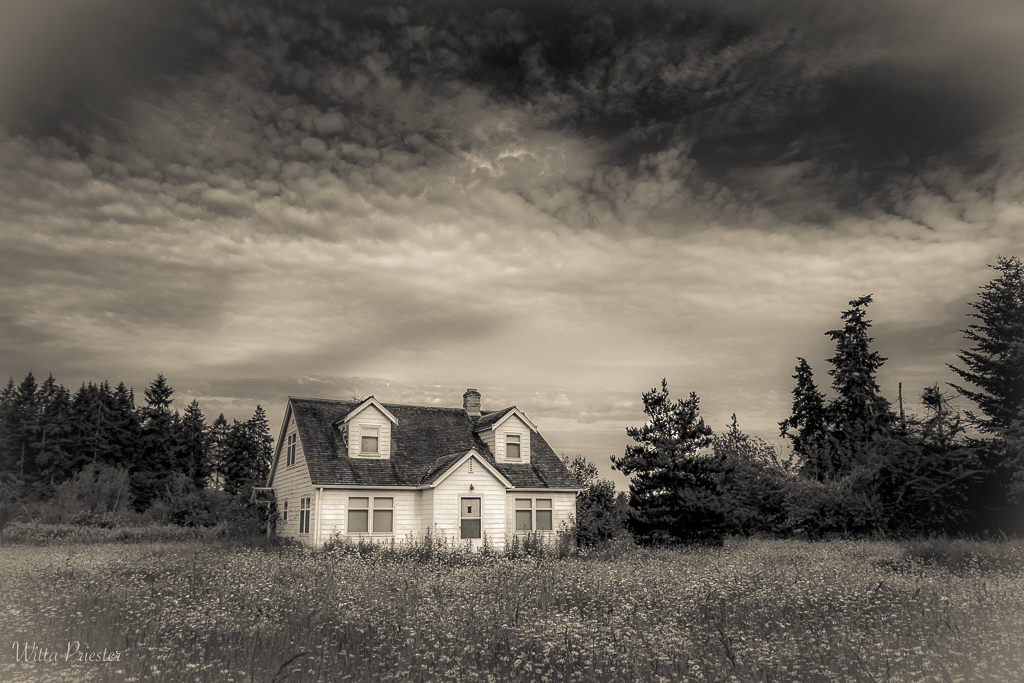
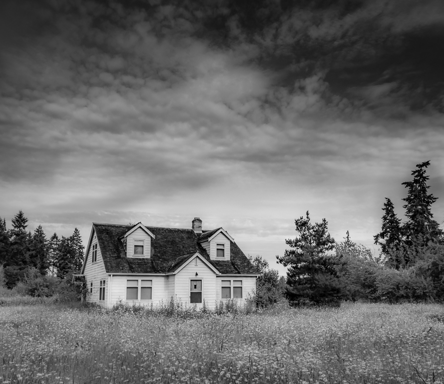
The texture IS subtle, bit it is visible on the larger image, adding just a little hint of "something" to the background (only). Here's it at 100%. |
Jul 3rd |
 |
| 77 |
Jul 20 |
Reply |
Georgianne, I like your crop. Thanks!
BTW, the sky was not changed, but the processing does emphasis some parts.
I've gone back and reprocessed the image to get rid of the blocked up darks and the squiggles... Here's the current version. |
Jul 3rd |
 |
| 77 |
Jul 20 |
Comment |
|
Jul 3rd |
 |
| 77 |
Jul 20 |
Comment |
I'm so pleased to be part of a group that likes to play and to share and to spend time helping each other. Denise, here's another version, I had to invent more stem, and then added the texture (which is much like the front petal texture, but dark) by using the lighten blend mode. |
Jul 3rd |
| 77 |
Jul 20 |
Reply |
I'm having a hard time figuring out what you mean by the sharp softness, so yes, a side by side with a std. lens one of these days would be educational for me. Another thought for the background is a simple gray to w gradient, again at a low opacity...
|
Jul 2nd |
| 77 |
Jul 20 |
Comment |
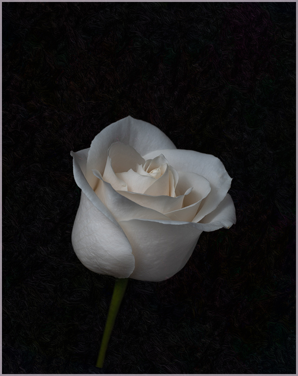
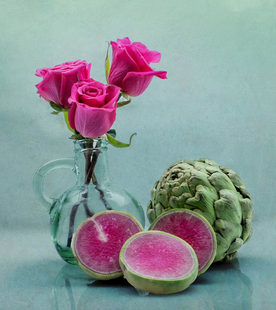
Denise, I love the subtle colors of this rose, and clearly your lighting has made its details come through, especially the textures on the front petals, which are amazing. I'm confused by your choice of a Lensbaby, since I feel this would be a super image with the rose tack sharp from front to back. In the alternative, I could also imagine way MORE lensbaby blur. I was going to write about the border, but I see you've got it! As for your crop, I like both, but could see adding a very subtle texture to the black to make the background less uniform, especially in the off-center image. Bunny's tight crop is also a good idea, though I would go out a small amount so as have some space at the photo edges. |
Jul 2nd |
| 77 |
Jul 20 |
Comment |
Bunny, taking classes is a super way to learn new skills, but also a reason to try out new subjects and ideas. I might have to take that class!
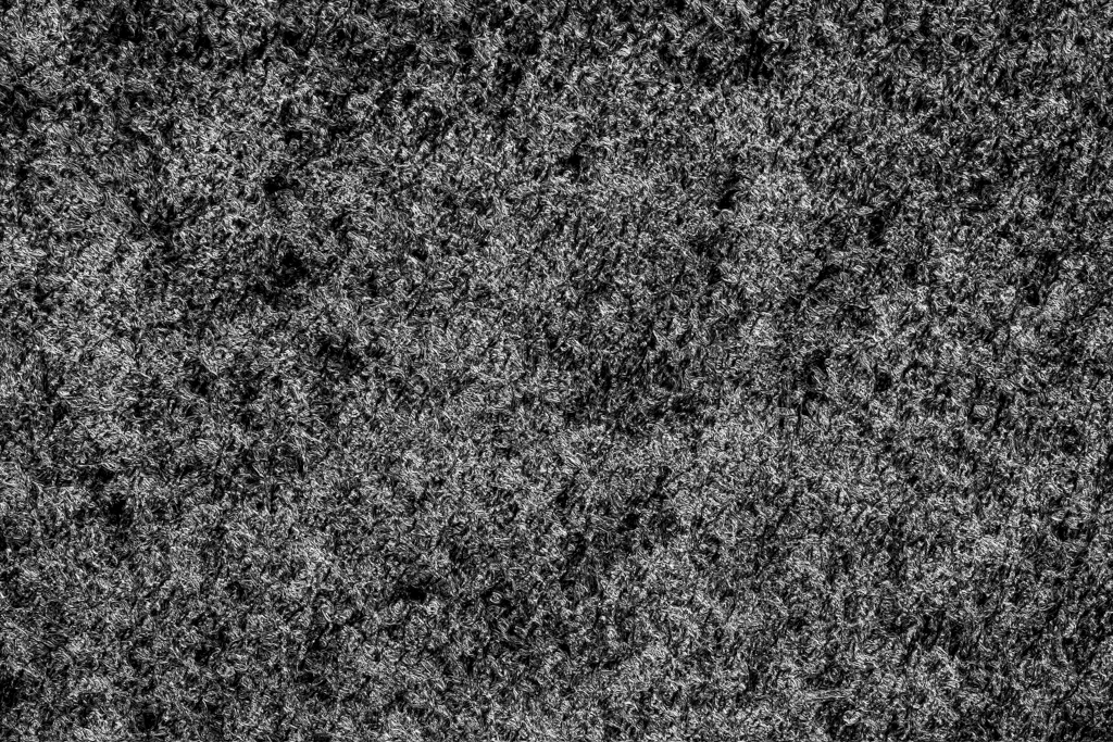
The subjects /colors you chose are really good together and the composition and DOF work. In my opinion, this photo is crying out for a lightly textured background, even though its effect would be subtle. Here's an example��
|
Jul 2nd |
 |
| 77 |
Jul 20 |
Comment |
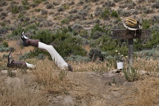
I love the way the HDR came together and especially the added sun rays, which add a lot of WOW to this photo. (Though I did ask myself, would there be sun rays in this situation?)
Regrettably, I find the "sculpture" totally confusing. Indeed, I went to the internet to get another view..(attached). In the end, I don't think those legs add. Perhaps if the two boots were still the same, AND the base of the legs were still buried or at least below the photo's bottom edge, AND there was a head of some sort��
|
Jul 2nd |
 |
| 77 |
Jul 20 |
Comment |
Mask... |
Jul 2nd |
 |
| 77 |
Jul 20 |
Comment |
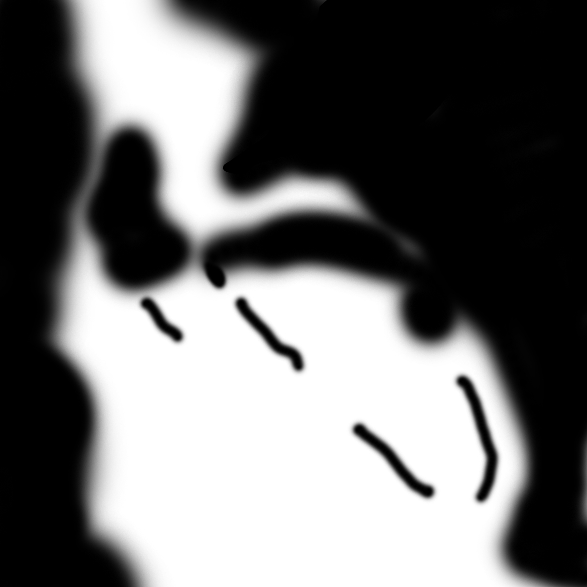
What a special photo to have; it will be a historic memory as well as great conversation piece. And talk about having stuff around the house!
I worked your image a bit This version has 1) added a little detail to the burned out area using content aware fill in PS. (On a duplicate layer, 5 small bites of the apple worth, then blended at 10 percent opacity), 2) emphasized Pete a bit more with a masked curves adjustment layer (mask below) especially since I felt the straight lines needed toning down, and 3) added a bit of matching color to his left hand and the pot, using a colored brush on a separate layer at low opacity in the color blend mode. Another thought is to also consider a LUT (color look up table) adjustment layer at low opacity.
|
Jul 2nd |
 |
| 77 |
Jul 20 |
Comment |
This is a lovely image. I like the colorful flowers and the grungy-ness of the rest of the scene. I wish you had tried to process the photo again, especially as I expect your editing and visualization skills have improved. For example, I note that the brightest spot is on the wall...
|
Jul 2nd |
| 77 |
Jul 20 |
Comment |
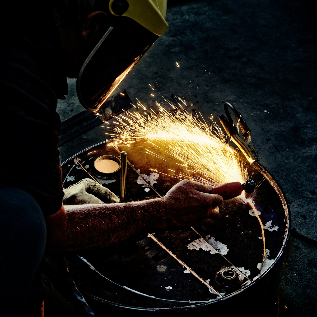
WOW -what a creative and colorful image. I love the background and think it's wonderful that you are making your own. Clearly, you're having fun with it. Thanks for the detailed write-up - an example of how much thought and skill it takes to put something like this together.
As for improvements, I think the vignette is too dark and too gray - perhaps a green vignette instead -- and I would clone way the reds at the bottom edge. Also, I wonder if the image would be stronger if the opacity of the texture on the dark lily stem was reduced.
|
Jul 2nd |
10 comments - 8 replies for Group 77
|
13 comments - 8 replies Total
|


