|
| Group |
Round |
C/R |
Comment |
Date |
Image |
| 77 |
Jun 20 |
Reply |
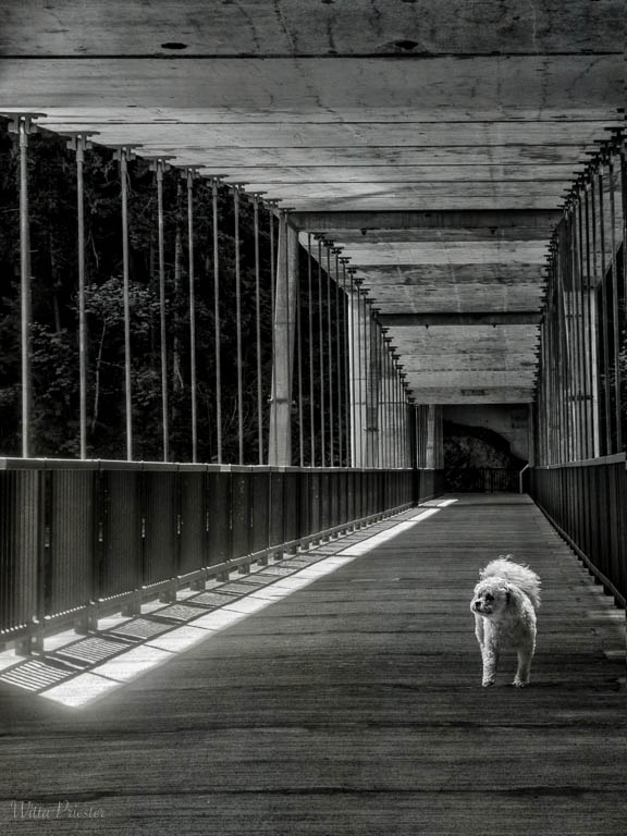
Connie, here's a white dog image (above)... It's funny, I went for a walk today and what do I find but a cute white dog... |
Jun 19th |
| 77 |
Jun 20 |
Reply |
And here's one with Connie's white dog... |
Jun 19th |
 |
| 77 |
Jun 20 |
Reply |
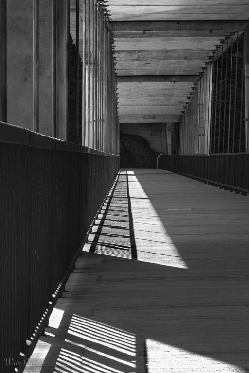
Thanks Georgianne. I hadn't thought about the patterns in the ceiling. See below for a related photo taken two weeks later. |
Jun 19th |
| 77 |
Jun 20 |
Reply |
Thanks Bunny! I agree with you. See below for a related photo taken two weeks later. |
Jun 19th |
| 77 |
Jun 20 |
Reply |
See below for a related photo... |
Jun 19th |
| 77 |
Jun 20 |
Reply |
Connie, I love the way you think. A model with a flowing gown or a dog would definitely make this more interesting. Maybe I'll try to composite one in...
As for the time of day, I lucked out here. I went back a couple of weeks later and the morning sun had moved quit a bit... |
Jun 19th |
 |
| 77 |
Jun 20 |
Reply |
Stephen, Thanks for visiting the group and your comments on the various photos.
|
Jun 10th |
| 77 |
Jun 20 |
Comment |
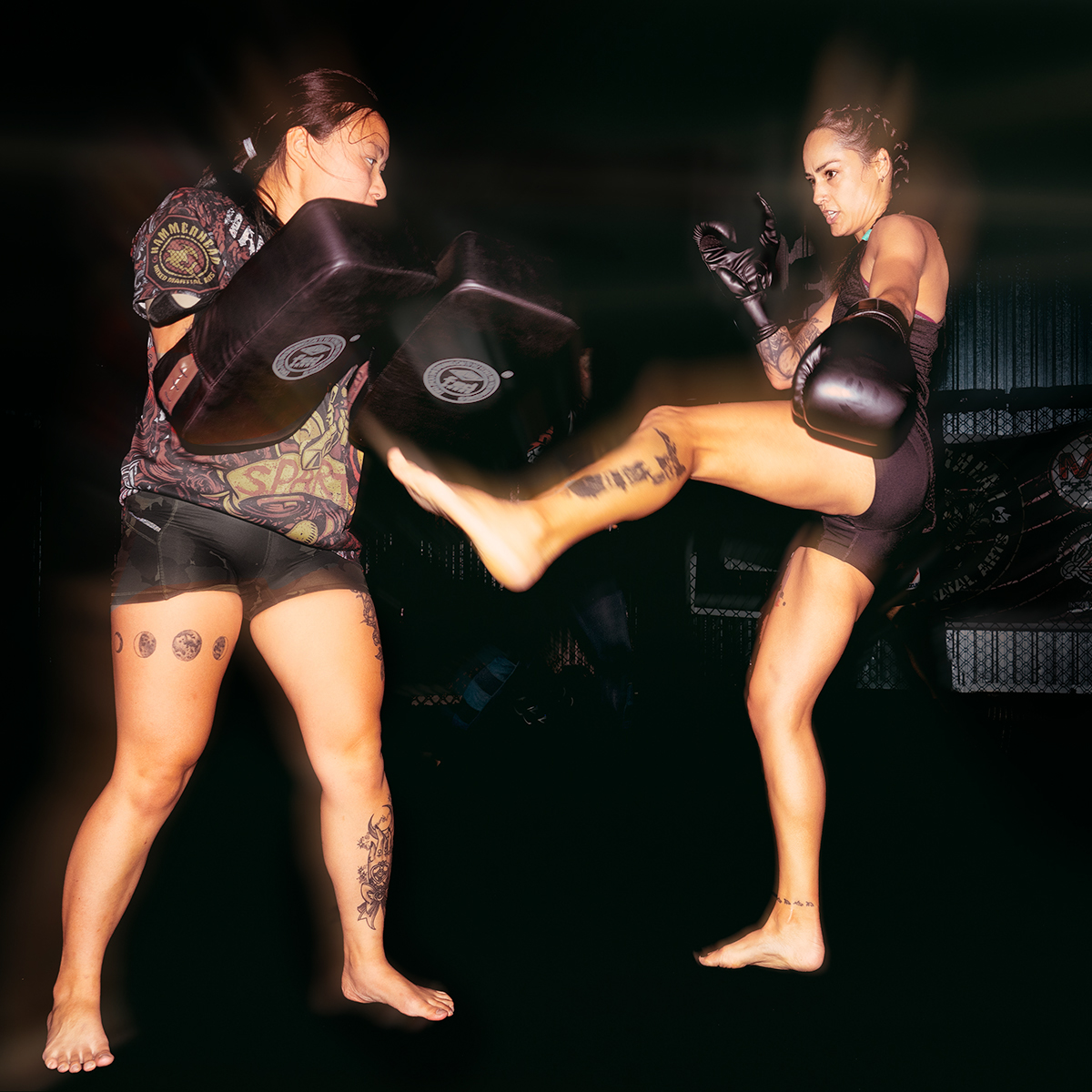
Another excellent action shot...
Here's my take. Since I agree the shirt is distracting, desaturate it and the red bits on the protectors. In addition the LH women is not moving much so she needs less motion., and she's a tad too bright, taking the focus off our hero. |
Jun 10th |
 |
| 77 |
Jun 20 |
Comment |
Bunny, this is a nice image that you have indeed built up from quite a dark capture. The more I examine it, the more I like it. There are lots of interesting objects to look at as my eye wanders around the photo -- places to linger.
It's not clear where you want my eye to rest - maybe the sheet music? I think replacing the window was an excellent idea. Another option would have been to create an HDR using 3 exposures, thus eliminating the need for the window change, though what you did works really well. I can't decide if I like the keystone distortion of the photo on the left, or the prescence of the objects underneath it.
|
Jun 2nd |
| 77 |
Jun 20 |
Comment |
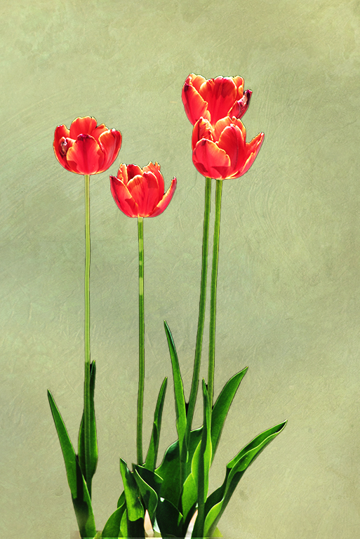
What a fun idea to try to combine the two flowers. But in my opinion it doesn't quite come together. The dark parts of the sunflower don't seem to add to the image for me; indeed I think the leaf on the right detracts. Perhaps a nice texture is what you were looking for?
I love to combine photos, so I photograph textures all the time and have a library of over 2000 photos. (And, it's easy to change the color of a texture in PS as desired with a Hue and Saturation adjustment layer clipped to the texture).
But there's another good option. As it turns out, PS has a wonderful free add-on for textures. It's called Adobe Paper Texture Pro, and it probably is still a free download that you can search for. I've had it for a long time. Once downloaded, it lives under Window / Extensions in PS. Aside from providing some very nice textures (which you can replace with your own), it also does much of the work (resizing, blend mode adjustment, and adding a mask) of applying one or more textures to a photo. This image was created using the pistachio texture.
|
Jun 2nd |
 |
| 77 |
Jun 20 |
Comment |
Georgianne -You've put together an interesting composite. It was done a manner similar to how I often to do my composites: using images taken on the same day as inspiration.
I really like the space you added on the right as it suggest a wider perspective, maybe rolling the wheel that way. To me, it definitely looks like the boy and the wheel were always together. The shirt color change and the texture made it all come together well.
A few thoughts on how I would modify/improve: change the color of the red in the shoes so it doesn't attract the eye, make a little more room at the bottom, and reduce the opacity of or selectively remove the texture on the boy by using a layer mask.
I note Bunny's comment on the hand, I don't mind the band-aid, but perhaps you can puppet warp his hand so it better fits around the wheel.
|
Jun 2nd |
| 77 |
Jun 20 |
Comment |
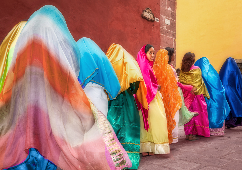
Cecilia, I love this photo. I think it is a special capture and very striking -- an award winner! The colors, and the lovely girl looking at the camera - oolala!
There's not a lot I would do change, but here are some minor tweaks. I like your crop, but I would go just a bit further and cut more off the left (even though it puts the girl in the center), since I think all that gold on the left is too eye-catching . Indeed, I feel the colors, much as I love them, are a tad too bright overall. Instead, I would want to emphasize the girl more, so I would selectively reduce the saturation on everything BUT the girl, and then perhaps brighten her face a tad. In addition, I would add a little color to the gray floor, and mute or modify the colors in the shawl on the left. Here's how that might look... |
Jun 2nd |
 |
5 comments - 7 replies for Group 77
|
5 comments - 7 replies Total
|


