|
| Group |
Round |
C/R |
Comment |
Date |
Image |
| 5 |
Apr 20 |
Comment |
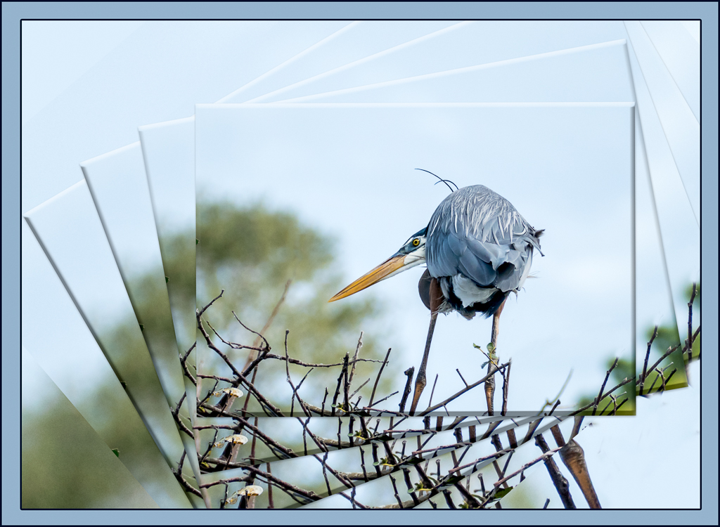
Barbara, what fun indeed! You picked a great photo for your play -- not much happening at the edges, simple, and filling the frame, which I think made this work extremely well.
I followed your instructions, sort of, and had a play myself. Not as good a start image, but I didn't want a flower. Here's the result.
Thanks for sharing! |
Apr 9th |
 |
1 comment - 0 replies for Group 5
|
| 18 |
Apr 20 |
Comment |
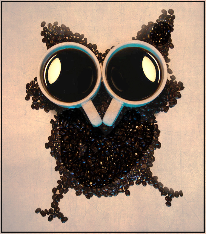
Mark, I love the whimsy and the creativity here. It is really well done!
I wondered if a texture or a bit of background color would enhance the image. Here is an example with a bit of texture added. |
Apr 11th |
 |
1 comment - 0 replies for Group 18
|
| 27 |
Apr 20 |
Comment |
Creative and so timely! |
Apr 9th |
1 comment - 0 replies for Group 27
|
| 34 |
Apr 20 |
Comment |
I love this!!! -The whimsy as well as the imagination and execution are wonderful.
A couple of thoughts -- is the barmaid the right size? and where is her shadow?
Also, how to connect the two sides of this image -- similar colors? closer together? a cheshire cat jumping between? maybe her hand reaching out?
SO fun! |
Apr 9th |
1 comment - 0 replies for Group 34
|
| 41 |
Apr 20 |
Comment |
This is quite an wonderful image, both the start and the final. I love the vibrance and the beautiful light, and the position of the subject, and the star. In the final, I really like the painterliness, especially that hint of the buildings.
A few minor suggestions: the very front bottom, clone way the sidewalk, and the two cars are still visible, so perhaps a bit more work... |
Apr 17th |
1 comment - 0 replies for Group 41
|
| 77 |
Apr 20 |
Reply |
G-- See comment at bottom. |
Apr 9th |
| 77 |
Apr 20 |
Reply |
See comment below. |
Apr 9th |
| 77 |
Apr 20 |
Comment |
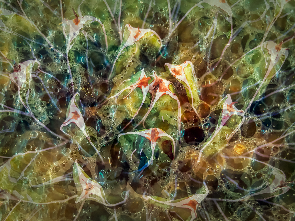
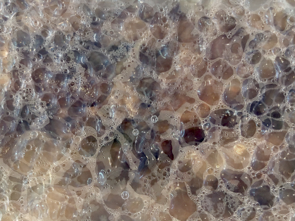
Thanks for your comments and ideas. G -- I cloned away some of the larger (more distracting) bubbles. M -- I removed the texture at the tips as you suggested. Both ideas definitely helped improve the image. |
Apr 9th |
 |
| 77 |
Apr 20 |
Comment |
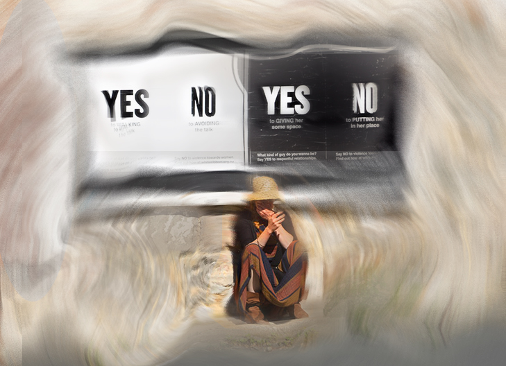
I love the idea here. "Indecision" with that billboard in B&W and W&B. Cool!
You've made some great changes, like moving the woman, and the spinning idea. But I would do more. Like a tighter crop; removal of the cell phone; cleaning up the sign top edge before processing.
Like Georgianne, I like to play. My version has gone a bit too far, but I always think it's worth trying "more" and then backing off. The main thing I was thinking about when processing was how to show a swirl of thoughts in the woman's head, while at the same time showing the billboard clearly enough, so one knows what she is thinking about.
In PS, I copied the sign onto a new layer, so it was ready to put on top (at whatever opacity) when I wanted it to be readable. I used surface blur, and then like you spin blur, in each instance masking the woman (using a smart object here would work well). Then to add more spin, I stamped up, and used the twirly part of liquify, at a low twirl rate.
This is not a great result, but maybe it will give you a useful thought... |
Apr 8th |
 |
| 77 |
Apr 20 |
Reply |
Re "print only tiff files", here's a link I had found in my earlier search. I expect the result depends on the type of printer, as well as the range of colors it can produce. https://www.richardphotolab.com/blog/post/jpeg-vs-tiff-a-photographers-guide
I recently saw this articled by Kelby (who is NOT my favorite) . Never use Tiff. https://lightroomkillertips.com/dont-use-tiff-for-anything-ever/ |
Apr 6th |
| 77 |
Apr 20 |
Reply |
Thanks Georgianne and Cecilia. Your comments are much appreciated.
G -- the three images are just like original 2, but offset a bit, either in distance (right to left, or height) or in angle. Here's what the combined texture looked like. I do agree it would be a plus to tone down a few of those bubbles. |
Apr 6th |
 |
| 77 |
Apr 20 |
Reply |
You wrote: "I have noticed that contrast increases/changes when I convert my tiff image to a jpeg file. When I look at the tiff image, there isn't such an unnatural brightness. The only way for me to know if it isn't right is to print. "
As I understand it, you're saying the tiff and the jpeg look different on your screen? If so, do they also print differently? Of course the print is the real deal; is the tiff version is the one that prints WYSIWYG?
I've tried to find some info on this w/o any luck. I was thinking a colorspace issue, but nothing popped up.
|
Apr 5th |
| 77 |
Apr 20 |
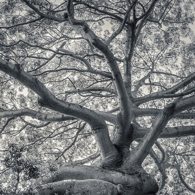
Comment |
I love trees and this is a wonderful example of why - so much to look at and so many wonderful aspects. You've done an excellent job of getting detail into the dark areas without burning out the whites. I would have used HDR blending of your bracketed exposures for this situation, but you have made it work so well using just the one exposure. I like the conversion to B&W, it really works. To me, the vignetting has made the sky behind the tree seem a bit too bright (relative to the rest of the sky) to be natural, so I would add a radial adjustment layer over that area in LR and darken only the lights with a range mask. I also tried a square crop, but I think I like your crop better.
On a different note, I wonder if others find the details of adjustment settings useful? I mostly ignore all the edit settings info, and actually don't care much about camera settings, unless they are unusual. If others don't need the detailed edit settings, then, it would save you the effort of documenting them for us. Mostly, I am interested in understanding WHAT you chose to adjust, and WHY - your reasons for choosing those changes/settings.
As an example, something like the following would have been perfect for me. You included all these parts, but it could have been simplified.
Adjusted the image in LR, and cropped the bottom slightly to remove the sliver of light below the bottom horizontal limb. Thereby Original 2, which was exported to Luminar 4, and treated with "Cold Forest 2" profile because I liked the bit of glow it provided. Back in LR I made some additional adjustments:
Converted from color to Black and White ("auto" for color mix.); with the scrubby arrow I selected some of the leafy areas for lightening. Then to make a lighter shadow of the tree trunk darker I moved the blue B&W slider from +9 to -28. Then cropped the left side to give more focus to the Quipo's branches. Finally I used the brush to darken that lowest horizontal branch, purposely leaving the upper portion of the branch lighter for separation.
|
Apr 3rd |
 |
| 77 |
Apr 20 |
Comment |
This is a timely image to me, since it evokes the scariness of zombies all around us. I love your choice of B&W with spot coloring. Since I find both the gal on the right and the hat on the left distracting, so I would suggest darkening them even more. Perhaps even copying the mask on the right onto the lady on the left and distorting it to make it less identical Alternatively, you could crop the left side and just darken the right. In addition, I would emphasize those teeth.
|
Apr 3rd |
| 77 |
Apr 20 |
Comment |
You've done a lot with this photo that has made it a stronger and more interesting image. I especially like the stars on the candle lights and the detail both in the glass hemisphere and the ceiling. To improve, I would suggest darkening the top edge significantly, a little more straightening ( in PS, edit distort), cloning some light into the burned out candle, and adding stars to ALL the candles (cloning again?).
Although I like ceiling, I find it keeps pulling my eye away from the lights, making it hard for me to decide where to rest.
|
Apr 3rd |
| 77 |
Apr 20 |
Comment |
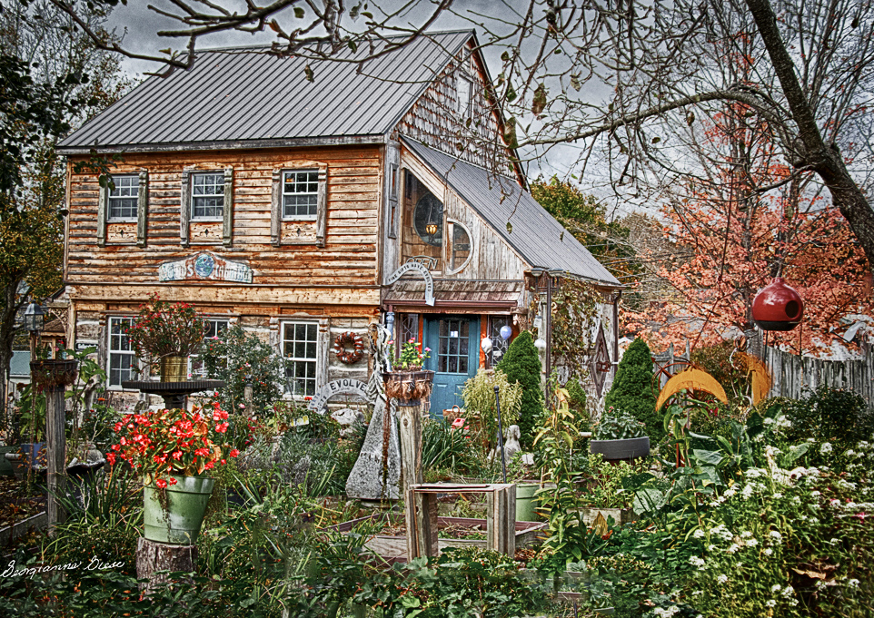
This is a great bit of Americana, and I can see why you chose it. It has lots for the eye to look at and so keeps one interested in exploring for quite a while. You've done some really nice things here, but in my opinion, there's room for more.
First I would crop away the left side to mostly eliminate the background building and to get farther away from having a "centered" image. Then I might a) tone down the greens and enhance the reds (especially on the germaniums, which lead in) using two different hue and saturation layers; b) clone away the front fence, since it blocks entry into the image; c) add a bit more vignetting, d) darken the wooden thing dead center, so it's less eye-catching; e) brightening the blue and red door and f) make it more painterly, maybe by over-sharpening. See attached version.
|
Apr 3rd |
 |
6 comments - 5 replies for Group 77
|
| 79 |
Apr 20 |
Comment |
This is a fascinating photo. Thanks for the informative write-up (without helps) put it into reality. I like Judith's thought on the earth bubble, and wonder if changing the colors would make that story pop. |
Apr 26th |
1 comment - 0 replies for Group 79
|
12 comments - 5 replies Total
|


