|
| Group |
Round |
C/R |
Comment |
Date |
Image |
| 4 |
Mar 20 |
Comment |
Well done! I love the detail and the grittiness here, and the way the lamps sparkle. Most interesting. Have you considered toning down the building in the back right; I think it might help keep your eye inside the image. |
Mar 10th |
1 comment - 0 replies for Group 4
|
| 36 |
Mar 20 |
Comment |
Hi Larry, thought I'd chirp in... Here's yet another version. I used Shadow and highlight in PS to bring back some tonal range in the darks. If you had taken this as a HDR, then there would be detail in the blacks rather than so many areas without detail. The black horizon can be fixed in many ways, and would be a plus, especially as it is at the halfway point. So I cropped it. Finally I see several visible dust spots... |
Mar 19th |
 |
1 comment - 0 replies for Group 36
|
| 77 |
Mar 20 |
Reply |
Thanks Guy. I do remember us heading out there!
As for what to share, I do try to put forth my best recent work, but I always hope others have ideas for improvement, or other suggestions. So often, an outside perspective is a big plus. |
Mar 22nd |
| 77 |
Mar 20 |
Reply |
Georgianne, your comments are always thoughtful, helpful, and insightful. Thanks you for sharing your expertise and for being our admin.
With the immediate future full of more time spent indoors at home, I plan to learn even more about my editing software, try some new techniques, do some table-top photography, and work on cleaning up computer. I have ordered a new MacBook Pro and getting it set up is high on my "to-do" list. |
Mar 20th |
| 77 |
Mar 20 |
Reply |
Larry, thanks for your comments and your thoughts. Much appreciated!
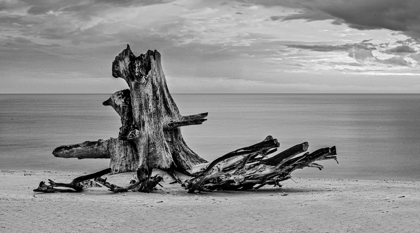
I do use long exposure on occasion, and have a 4x variable Neutral density filter in my bag. The "ripples" in the foreground are sand. But perhaps with a longer exposure the tree reflections might soften, and the sky might look wispier, could work. As for time spent processing: 1) I enjoy it; 2) I'm pretty skilled; and 3) if I'm sharing the photo with others, I want it to be the best I can do. |
Mar 19th |
| 77 |
Mar 20 |
Comment |
Cecilia, I really like what you've done here.
It's often a question of what to emphasize -- what's the subject?
There's really quite a bit going on in this scene, which makes for a variety of crops and interpretations. |
Mar 13th |
| 77 |
Mar 20 |
Comment |
A requirement of most (all?) exhibitions is that the entrant certify that "the images entered are the original work of the entrant". IMHO, if you are incorporating a jpeg image (or equivalent thereof) from another (whether purchased, donated, or found on the internet) you cannot so certify. Whether you use a created or photographed texture, or a line drawing as in your image, or a dog or cat cut out from a stock image, these are all someone else's work (that they could and perhaps have copyrighted). Even though the final product is strongly based on your photographs, your choices, and your skills and vision, the inclusion of an image "by another" means that the final result is, in part, the work of another. Thus, the end product is (again, at least in part) NOT the original work of the entrant.
Those black leaves in your image are presumably from the purchased texture, and clearly those portions of your final image are not your original work. (Indeed, in this case, it could easily be determined that your image includes the work of another. Thus, the image might well be DQ'd, if the judges were aware of this, and in a worst case scenario might perhaps even result in sanctions.
Disclaimer: Some years ago, I tried to get the PSA to make the use of textures "from another" clearly not allowed. I was not successful. The problem is more complex than in this case where the obvious bits from another are clearly evident. |
Mar 12th |
| 77 |
Mar 20 |
Comment |
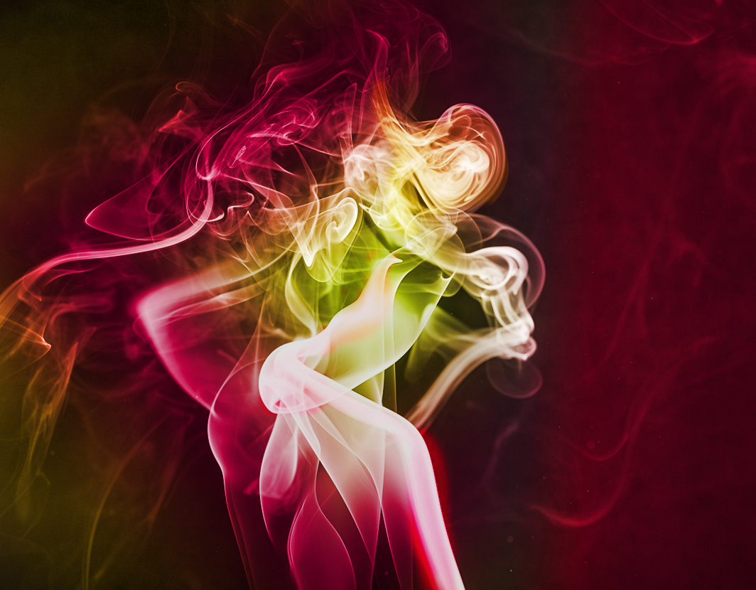
I have enjoyed many happy hours with incense and smoke. I like that you've combined several photos, and I like your thought about the Furies. But in my opinion the result seems a little busy. Each part has equal weigh, equal depth, equal tonal range. And in the end, where to focus? Is there a place you want my eye to rest?
A couple of fascinating opportunities for additional smoke play using software include adding color in PS, and also doing reflections (copy and flip), both vertically and horizontally. As an example, I've added some color to one of your base images using a gradient adjustment layer in PS. |
Mar 10th |
 |
| 77 |
Mar 20 |
Comment |
Georgianne, this is an interesting image with lots to look at. I like the way you put together the 3 flowers, and the way you got the coloring to match and therefore make them look like they were photographed together. The crinkle texture and the line drawings definitely add a lot of interest.
However, as a PSA image, I believe this image has a fatal flaw. Using some else's textures is essentially adding a jpeg to your image that someone else photographed. This, in my opinion, is not dissimilar to adding a dog or a cat from a stock photo. I believe it is clearly not permitted by the PSA standards. So, my suggestion is to go out and photograph your own textures and add these instead.
FYI, I LOVE textures and teach a course on how to apply them. I have well over 2000 texture photos that I've captured or created.
|
Mar 10th |
| 77 |
Mar 20 |
Comment |
Connie, this is a really pleasing image with a great subject, an excellent leading line and a lovely flower frame. I like what you've done to warm it up. I love the blossoms on the top and would be tempted to even clone in a few more.
(One nit-pick - I think the rock(?) at the right side greenery could be darkened or cloned away, as it pulls my eye to the edge.)
|
Mar 10th |
| 77 |
Mar 20 |
Comment |
Bunny, these are lovely, colorful flowers, and your processing has added some very nice, definitive, edge effects to the petals. The idea of the iridescent sheet is an interesting one that I had not heard of, but, in my opinion, it does not quite work for this composition. It seems to have dulled the flowers, which might for example work with a sad, withered bouquet, but I feel this image needs a bit more pop�� Moreover the interesting kettle, which is almost half of the photo, seems to have faded into the background and could have more definition.
|
Mar 10th |
6 comments - 3 replies for Group 77
|
8 comments - 3 replies Total
|


