|
| Group |
Round |
C/R |
Comment |
Date |
Image |
| 32 |
Feb 20 |
Comment |
An interesting image that has a lot of potential.
Might be time to upgrade your software.
Lightroom (and of course PS) would really be a step up -- as you note with dehaze, but also with other things like the sky darkening. There are lots of tools to convert specific colors in the original capture to different shades of grey. Like Tom, I would suggest a crop, and like Diana I would enjoy seeing a little more of the face of the guy right in front -- a reward for looking closer. |
Feb 6th |
1 comment - 0 replies for Group 32
|
| 34 |
Feb 20 |
Comment |
Thanks for sharing. This one is really fun, with so much to look at. I think the B&W helps make all the parts come together. |
Feb 1st |
1 comment - 0 replies for Group 34
|
| 77 |
Feb 20 |
Reply |
I have to admit, I had forgotten that technique -- thanks Guy. |
Feb 28th |
| 77 |
Feb 20 |
Reply |
Guy, of course I remember you and Paula. That very special trip to the Palouse with Chip, and an opportunity to get to know you both. I also remember how you were able to readily balance on one foot... |
Feb 27th |
| 77 |
Feb 20 |
Comment |
WELL DONE Georgianne! I really like what you've done to make this a great image. |
Feb 22nd |
| 77 |
Feb 20 |
Comment |
Thanks Cecilia. This movement was done free-hand, but it did take quite a few tries to get it the way I wanted it... |
Feb 22nd |
| 77 |
Feb 20 |
Comment |
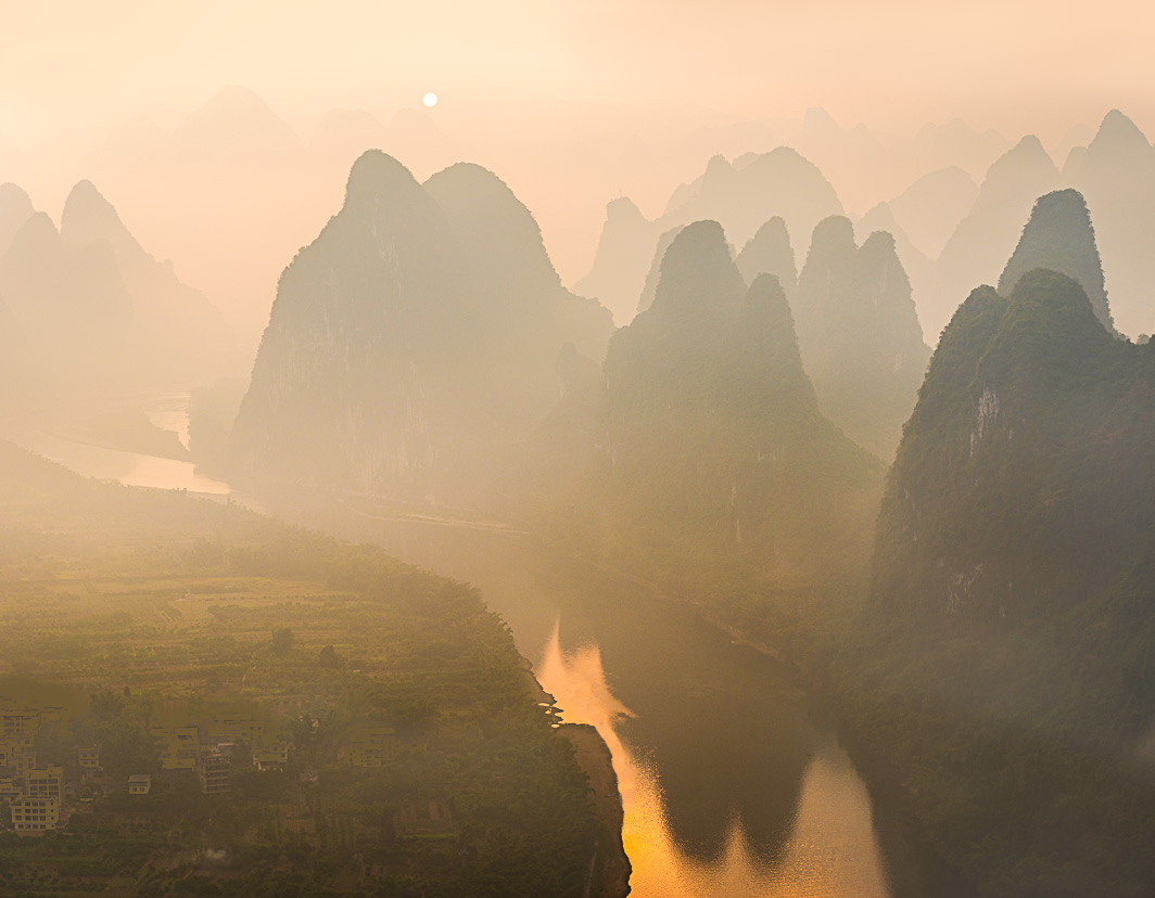
WELCOME Cecilia! I'm so glad you have joined our group. I'm sure your experience and expertise will be a wonderful addition to our critiques and discussions.
This is a wonderful image. Those layers and layers of mountains are such a treat to see and the fog really helped make them special. I love what you have done to the image by adding a bit more sky and a sun. Also, I think warming it up has added a lot of drama.
If this were my photo I would do three things. First I would clone away whatever is in the center water, since I find it distracting and a bit more gold is a plus; second add a new layer in PS and paint with white to add some fog to the mountain on the front right and the foreground left, since the darknesses pull the eye away from the focal points. Then on a new layer set to the darker color blend mode at about 50% opacity, I would paint with an olive green on top of the buildings to make them less prominent. Attached is a version... |
Feb 16th |
 |
| 77 |
Feb 20 |
Comment |
I too love the approach you took. It made for quite a captivating photo.
If it were my photo, I do think I would go farther.
I had a quick play with your final image and 1) on a separate layer I painted with white to lighten all those dark orange edges; blended at 80% opacity. Then I would emphasize the hand and lace using a bit of levels, and then sharpening, only applying to those areas with a mask. |
Feb 14th |
 |
| 77 |
Feb 20 |
Reply |
Ian, Thanks for the visit and your very kind comments. |
Feb 13th |
| 77 |
Feb 20 |
Reply |
Thanks for your comment Jean. |
Feb 5th |
| 77 |
Feb 20 |
Reply |
Thanks for the visit to our group. |
Feb 5th |
| 77 |
Feb 20 |
Comment |
This is very cool! The two sea lions with the same pose is a great eye stopper. Your processing has worked really well, since the image looks quite sharp on my screen. To improve, I would suggest you clone away or tone down the guano on the rocks behind, as the brightness pulls my eye away from the subjects. I personally like your narrow stroke on this image because it is so dark at the edges; I would use it for everything but a print. However, I might make it a tad less saturated, so it is less eye-catching |
Feb 1st |
| 77 |
Feb 20 |
Comment |
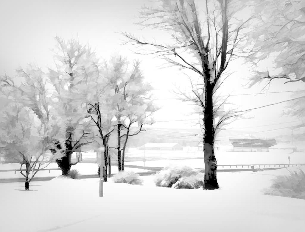
To have this snowy image right outside your door must have been a treat. I like the processing, especially the watercolor effect and the range of tones. If this were my photo I would add a bit more fog/snow, and thereby fade the buildings in the background a bit. This version has a new layer applied at 50% opacity with soft white brushstrokes where desired. Then I added a curves adjustment layer.
|
Feb 1st |
 |
| 77 |
Feb 20 |
Comment |
This photo is dramatic and lovely. That added sky sure makes for a wonderful, moody image, and I think the colors work really well together. I am a little concerned about the blacks, especially if you want to print this. They look really dark; maybe a shadow and highlight layer would bring out a little detail in the darks? My other concern is "where's the light coming from?" The light on the trees is clearly coming from the right side, but the sky you chose has the light behind - makes for a disconnect.��You could stretch the sky, so it is brightest at the right side. |
Feb 1st |
7 comments - 5 replies for Group 77
|
9 comments - 5 replies Total
|


