|
| Group |
Round |
C/R |
Comment |
Date |
Image |
| 77 |
Nov 19 |
Comment |
Mary, thanks. I expect you have hit upon what is missing here -- or rather why this is not a better photo. I attempted a quick update, trying to decide what to emphasize, but that was problematic for me. There are nine tools in the photo, and in many ways they have equal weight. I like the lines formed by the diagonal pitchfork and rake and their associated strong shadows. But there's too much else overlapping or adjacent to them that is distracting. Choosing and separating the keys ones is quite a bit of work, and in the end still leaves the overlap concern. Here I've desaturated the 4 of the tools and saturated the diagonals. |
Nov 28th |
 |
| 77 |
Nov 19 |
Reply |
Thanks for your comments Mary. I like the idea of having a plan for the eye to move around the image, but don't know what the term "circle of interest" means. Is it a way to apply light (like a spotlight, or a number of spotlights?) or perhaps vignette or darken part of the background in a specific way? Do tell...
|
Nov 26th |
| 77 |
Nov 19 |
Reply |
Bunny, I agree with you, and think the border is a bit overpowering, Thanks for your input and version. |
Nov 26th |
| 77 |
Nov 19 |
Comment |
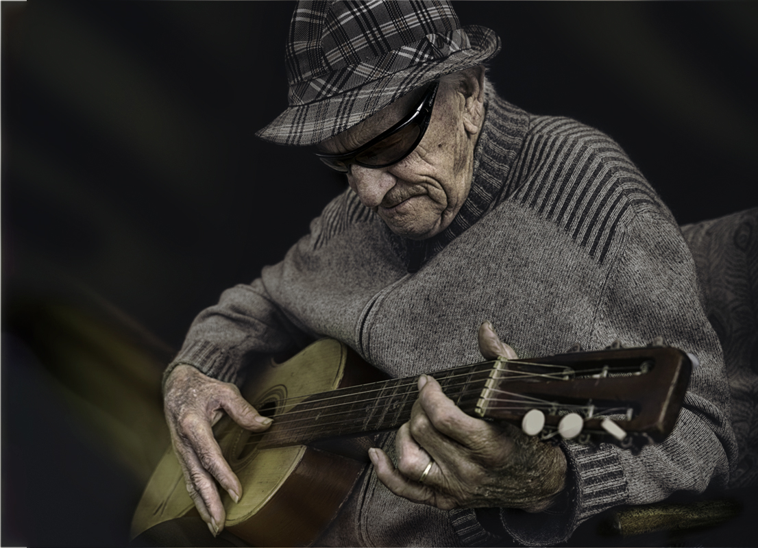
So wonderful to have captured this special moment; it does seem memorable. I think you have come a long way in the processing, and I especially love the added light leak on the guitar. There are some more things that I tried to try to make the photo stronger, see the attached. For this version the top of the hat is darker so as to help focus to the subject. The coloring was shifted with a turq-sepia lut in PS, applied to all but the hands, face and light leak, all of which were warmed a bit to provide some complementary color. I also cropped the right side and added a bit of space to the left of Opa Jack, using content -aware fill. |
Nov 8th |
 |
| 77 |
Nov 19 |
Comment |
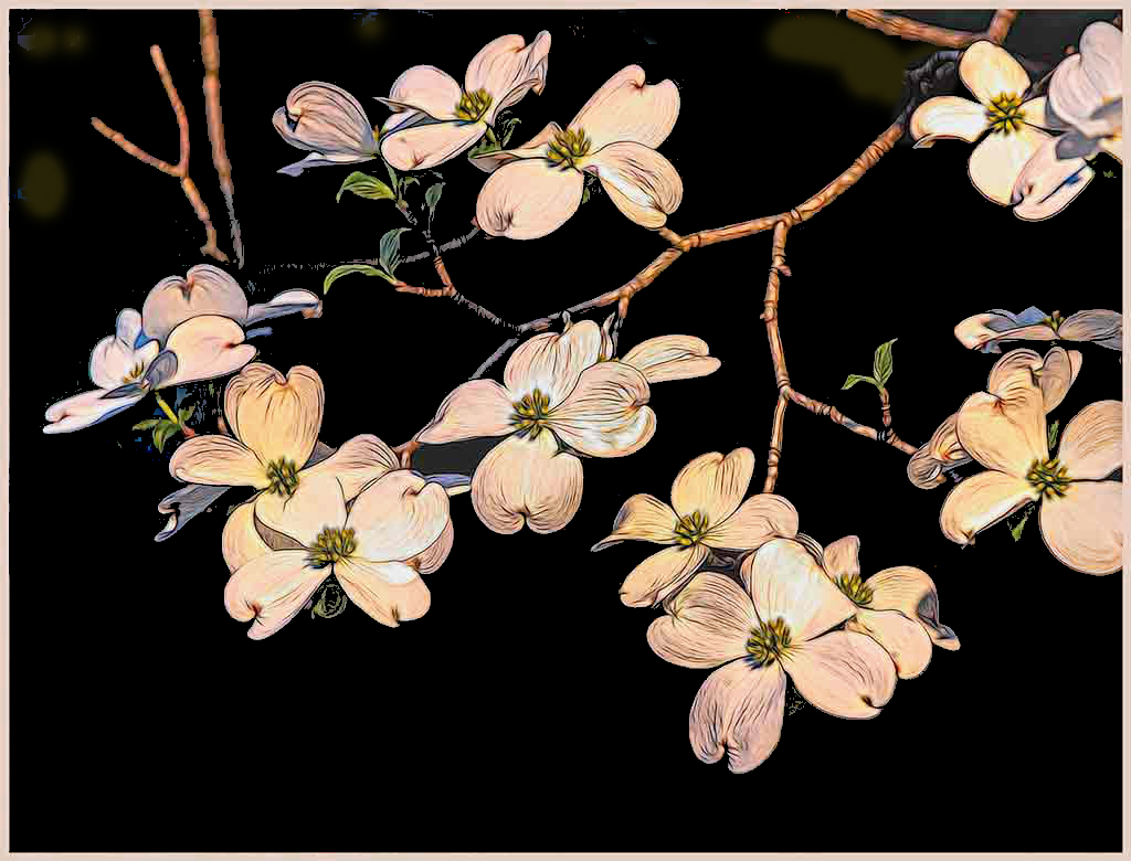
I love what you've done with this photo. You've managed to get quite a bit of detail into the flower petals, which adds a lot of interest. And I like the colors that also add interest. You've left behind a number of the blue background highlights; I think making them disappear would make the image stronger. Also the border could be less saturated, so it would not compete with the image. Here's how that would look. |
Nov 8th |
 |
| 77 |
Nov 19 |
Reply |
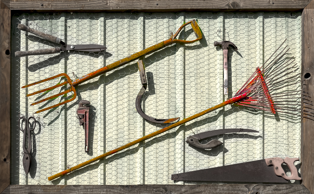
Thanks Georgianne. As you note, aesthetic appeal is indeed subjective. The definition of aesthetic is "giving or designed to give pleasure through beauty; of pleasing appearance." I'd be interested if others in the group find this image is beautiful / pleasing.
Regarding the chicken wire, aside from the added texture aspect, I see its emphasis as showing yet another "tool" , adding to the story of a working farm, now hung up and thus (perhaps) no more. |
Nov 6th |
| 77 |
Nov 19 |
Comment |
Bunny - it is indeed a pleasure to set up and arrange a tabletop composition - it's one of my favorite things to do. Your arangement is super, with the diagonal line from bottom left to top right. I'm intrigued by your choice to convert the yellow flowers to white / pink, but I do like it. This white balance shift seems to have lightened the background, as well as making the vase brighter, both of which I feel could be toned down (for example using a black brush at low opacity in a blend mode). As for your crop, if you chose to darken the lights in the vase some, then I would look to add a bit more of the flowers on the left side to balance the photo. |
Nov 6th |
| 77 |
Nov 19 |
Comment |
It IS a lovely landscape and your processing has really made it special. On my screen, the colors are a bit over-saturated to be "real", so I might back off just a tad. I also wonder if the light direction is consistent throughout, as your work-up has emphasized various parts of the image.
I can see this photo as a stunning B&W as well. Here creating the tonal drama would be a big plus.
|
Nov 6th |
| 77 |
Nov 19 |
Comment |
What an adventure to get this photo! And such a shame that the other photographers were not more obliging, especially since I expect they all snapped away as your friend modeled. The photo has great potential. I love the way her hand is out there, as if it is a branch, and the wonderful red dress in the generally muted landscape. You didn't mention any processing details. Have you done much to the raw photo?
There are several things I would suggest to improve the image, if it were mine. For example, I would tone down or desaturate the brighter greens, especially on the left to keep the eye from being drawn away from the subject. Also I would emphasize the flowing dress by painting in red over the bottom of the dress using the "color "blend mode. I would love to see a more "worked" photo, if you create one.
|
Nov 6th |
| 77 |
Nov 19 |
Comment |
Jim, the street's hustle and bustle are indeed full-on here. And the brick buildings with their metal balconies are quite interesting, with even some people on one. Good DOF as well. I do wish there were a few people bustling in the street in the foreground to create a focal point. If it were my photo, I would perhaps crop some off the tree on the left, and a bit from the bottom - that way the focus stays on the best parts of the photo. |
Nov 6th |
7 comments - 3 replies for Group 77
|
7 comments - 3 replies Total
|


