|
| Group |
Round |
C/R |
Comment |
Date |
Image |
| 13 |
Oct 19 |
Comment |
This image does give me a good idea about the environment in which you live. I think the high noise-level adds a sort of gritty inner-city vibe and the blur of the taxi captures a sense of motion that is always part of a city street. I would suggest that if you have Lightroom, you use the Transform tool to straighten out the lines in the image. |
Oct 14th |
| 13 |
Oct 19 |
Comment |
I feel the juxtaposition of the ferry-ramp ruins with the bridge that replaced it is quite nice. I like the wonderful clouds and the backdrop they provide. My only suggestion would be to include the sky in the top third of the image. This might have been achieved by taking a lower stance when shooting, although that might have foreshortened the river too much. It doesn't look like it would take much for that river to flood! |
Oct 14th |
| 13 |
Oct 19 |
Comment |
Having once lived in Chicago, this image hits an emotional nerve in me and gives it good initial impact. Millennium Park was not there when I live there in the early 80's so it is fun to see something new superimposed on some buildings that I recognize. I feel that you have picked a good perspective to shoot from as you have captured how the sculpture interacts with the skyline. You were wise to use the Transform feature in Lightroom as it has done a great job of removing any perspective distortion that shots like this often have. My only suggestion is that I might have tried brightening the green grass a little bit and darkening the blue sky a little bit to help differentiate the buildings. On the other hand, what you show does a good job of giving me the feeling of being in Chicago on a cold winter day. |
Oct 14th |
| 13 |
Oct 19 |
Comment |
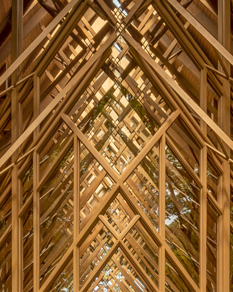
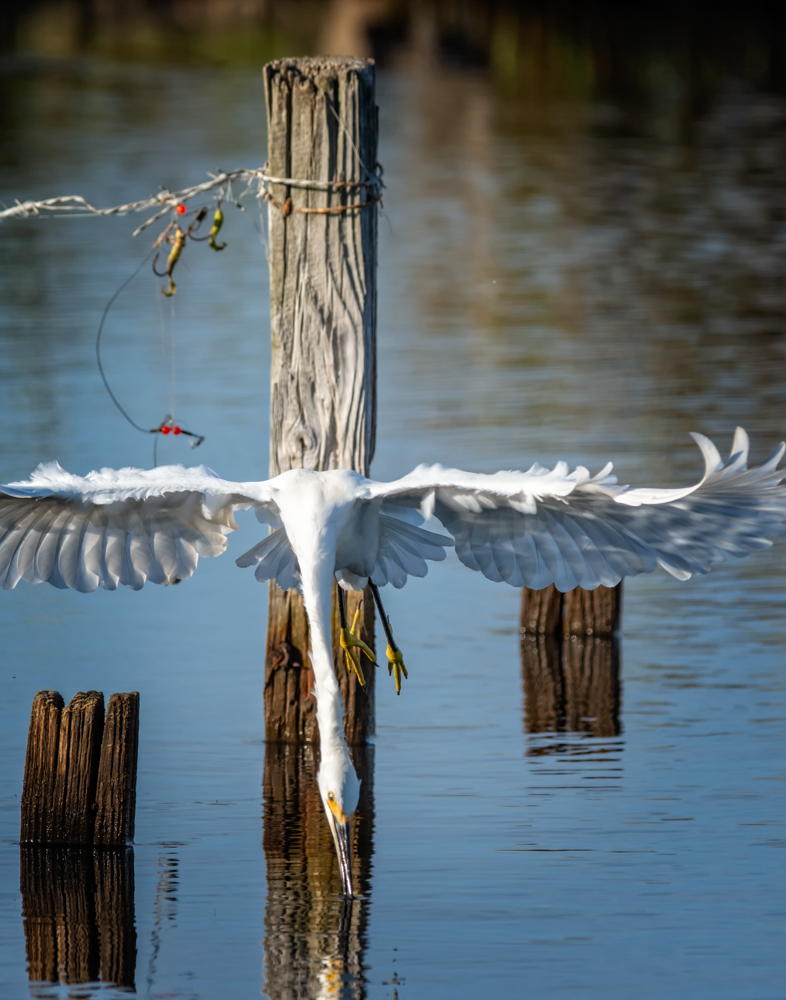
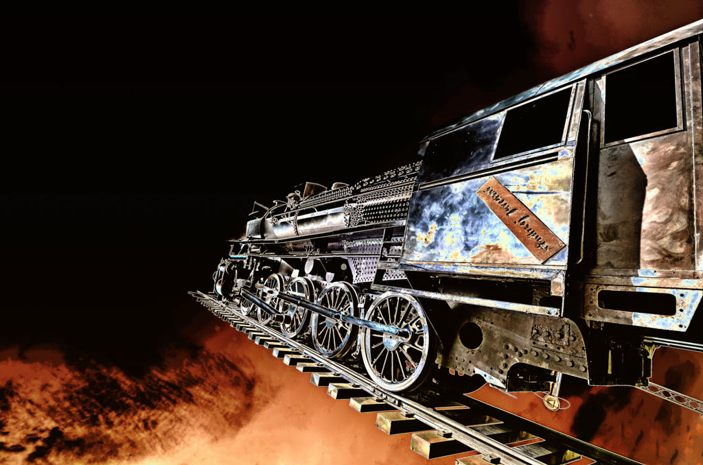
I feel that there are so many interesting things to look at in this image. On a basic level I love the vertical lines that are moving upwards into a dark empty space. While the locked chain is a good central point I really like the strings and wires that are randomly attached to the doors and it makes me curious as to what they are for. The blue green paint contrasts well with the reddish brown wood color. I like the way the slightly tilted middle two panels give the overall image a 3D effect. |
Oct 14th |
| 13 |
Oct 19 |
Comment |
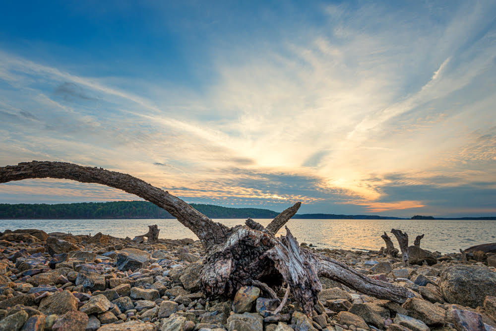
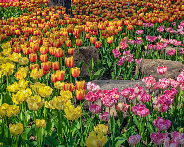
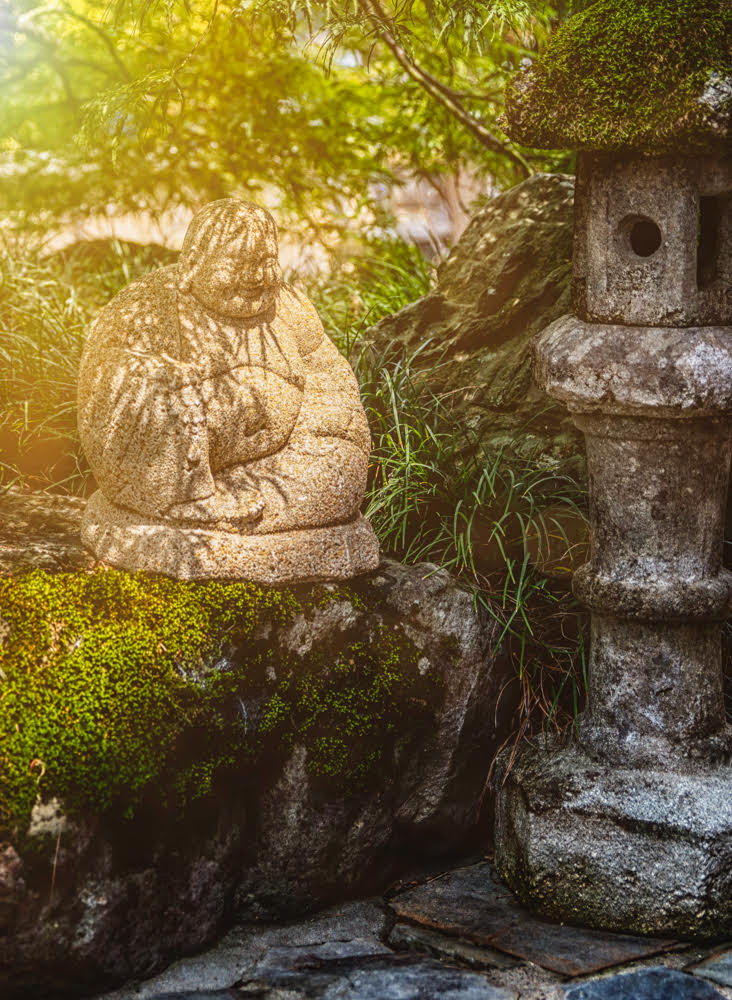
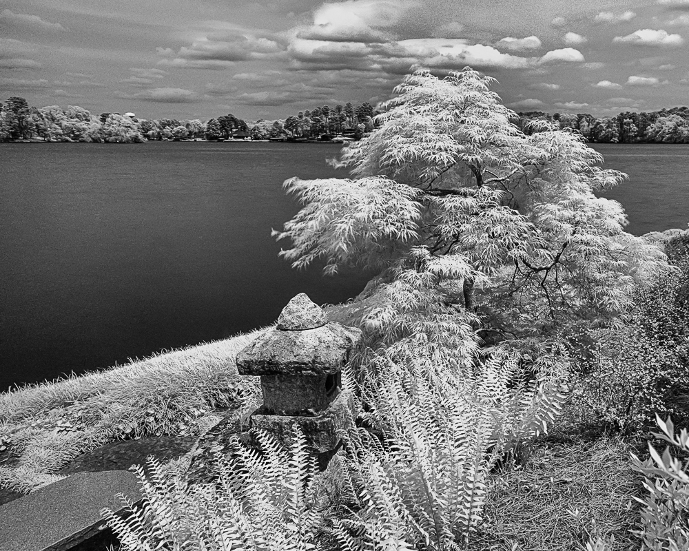
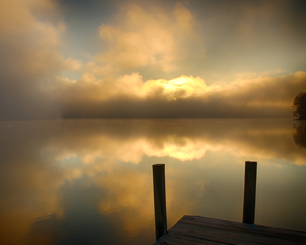
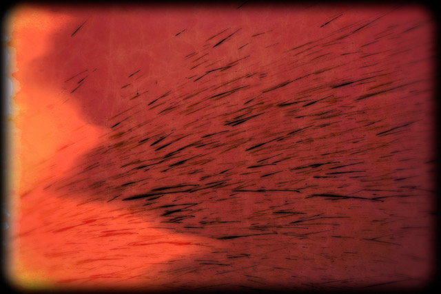
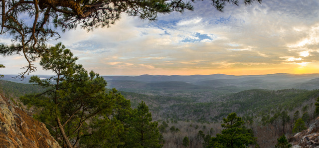
In my opinion this image has strong initial impact in that I am immediately calmed by the scene as well as trying to recognize where it is from. I'm a lover of rocks as used in Japanese gardens and this grouping and composition is exactly what Japanese garden designers are trying to capture. I like the way the rocks create a couple of framing spots, to the left the low horizon sun and to the right the nearby forest. I think the almost monochromatic sky compliments the subdues tones of the landscape and it reminds me of a painted landscape.
My only suggestion would be to try lightening up the back of the large rock as to me it is so dark that you cannot easily see the contrast of what appears to be an interesting surface. Perhaps a luminosity mask might be a good way to select that area or use a reflection filter in a program like NIK Efex Pro 2. |
Oct 8th |
| 13 |
Oct 19 |
Comment |
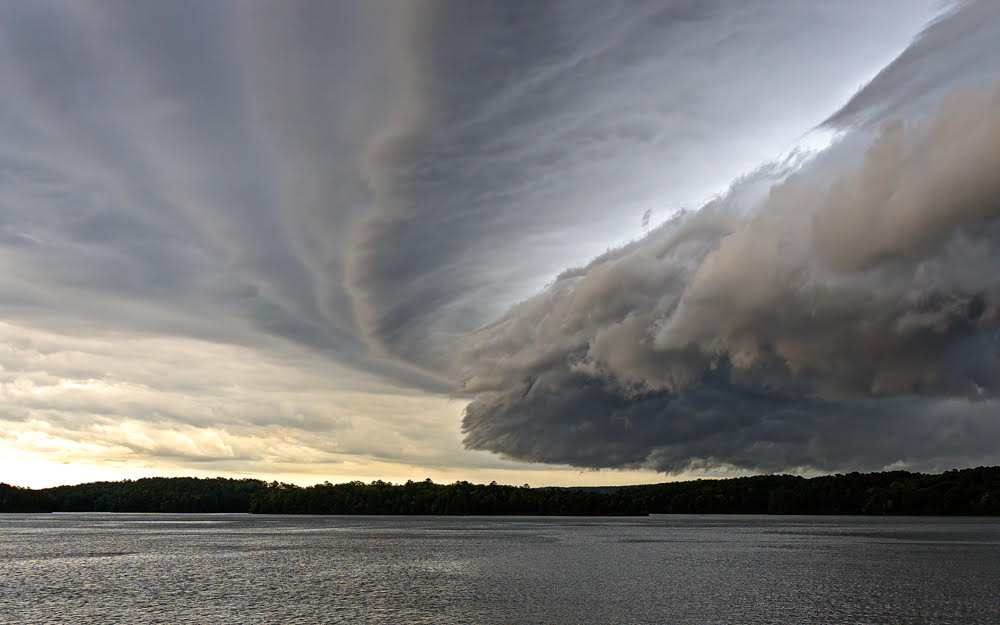
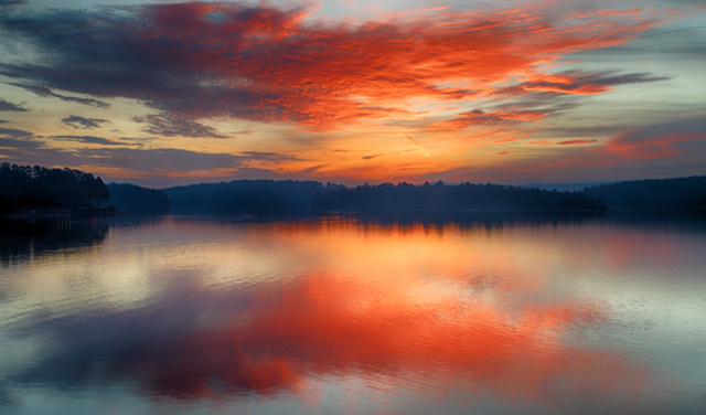
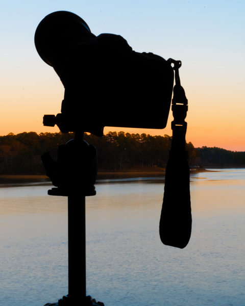
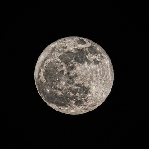
Thanks for the input. It is actually a sunrise and I've never seen another one quite like it where I live but I'll keep an eye out for it. |
Oct 7th |
| 13 |
Oct 19 |
Comment |
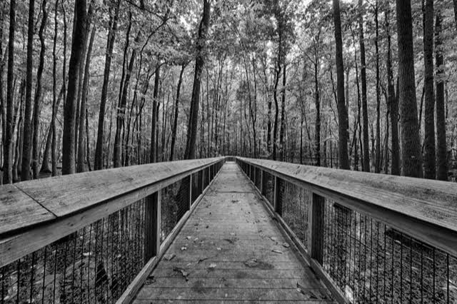
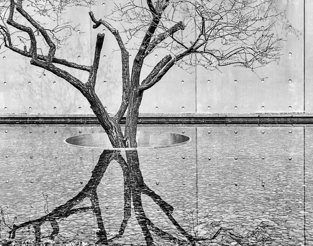
The tree indicates the point where my best friend lives but I guess it is just a distraction for everyone else - thanks |
Oct 4th |
7 comments - 0 replies for Group 13
|
7 comments - 0 replies Total
|