|
| Group |
Round |
C/R |
Comment |
Date |
Image |
| 13 |
Aug 19 |
Reply |
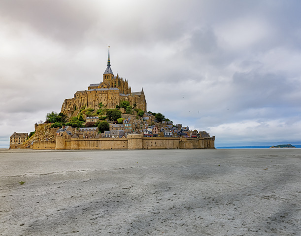
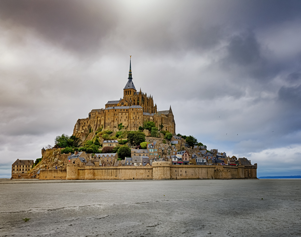
I also took photos that did not include much sand but I thought it left out the feeling of how isolated the place is. To add interest to the sand I tried a number of things, including cutting out some footprints from other photos and placing them so it seemed like they headed from the bottom of the image to the town, but I could not make them look very good so I gave up on that. |
Aug 14th |
| 13 |
Aug 19 |
Reply |
I had never heard of St Michael's Mount in Cornwall but now that I've looked it up it is on my list of places to visit. Thanks for the information. |
Aug 14th |
| 13 |
Aug 19 |
Reply |
Thanks Barbara. Actually I tried Photoshopping a ruined boat into the bottom right corner but I could never make it look real. Then I tried adding a big boulder but it didn't add any interest to the overall composition - thus lots of sand at low tide. |
Aug 14th |
| 13 |
Aug 19 |
Reply |
Thanks Sharon. I took your advice and I think it helped. The ND filter didn't add too much noise. |
Aug 14th |
| 13 |
Aug 19 |
Comment |
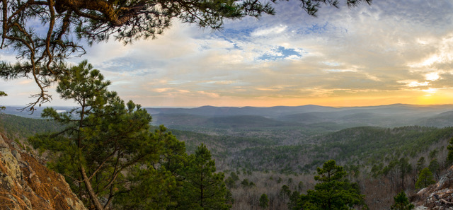
In my opinion the initial impact of this image captures both the wonder of standing in the middle of amazing ruins surrounded by the cold stormy weather of Scotland. I played golf at St. Andrews one April and there was sleet blowing sideways. I've always "respected" the weather there. Compositionally I love the use of the line of what must have been where the internal columns rested. That compositional elements adds to the story of "what did this thing look like". The warm color of the stones contrasts nicely with the verdant lawn. My only suggestion would be to try and dramatize the sky (see my photo entry for the same suggestion) using an ND filter. I think it improved my photo when I updated it. |
Aug 14th |
| 13 |
Aug 19 |
Comment |
To me the initial impact is of a very good composition of a crosswalk photograph where the emphasis is on cartoon of where a pedestrian is supposed to be. The use of only three colors helps simplify the composition. I might have left the cigarette butt to give it a more gritty, city story - or even better you could have moved the cigarette butt to where it would be lying where is mouth would be. |
Aug 14th |
| 13 |
Aug 19 |
Comment |
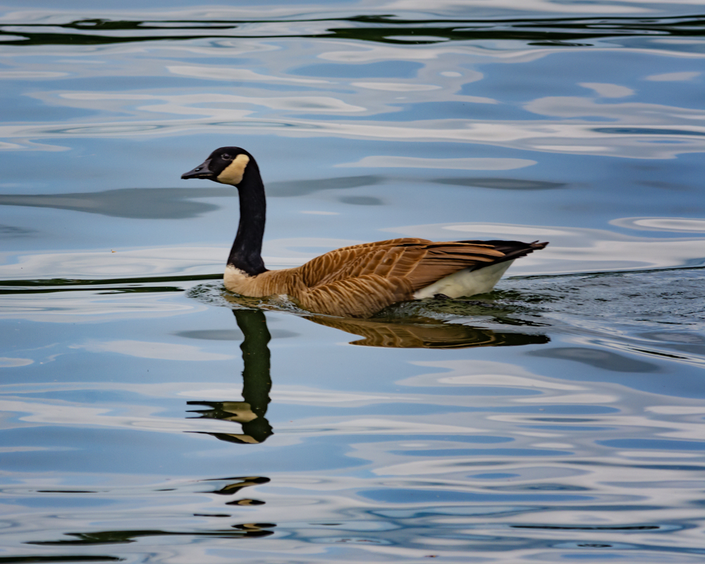
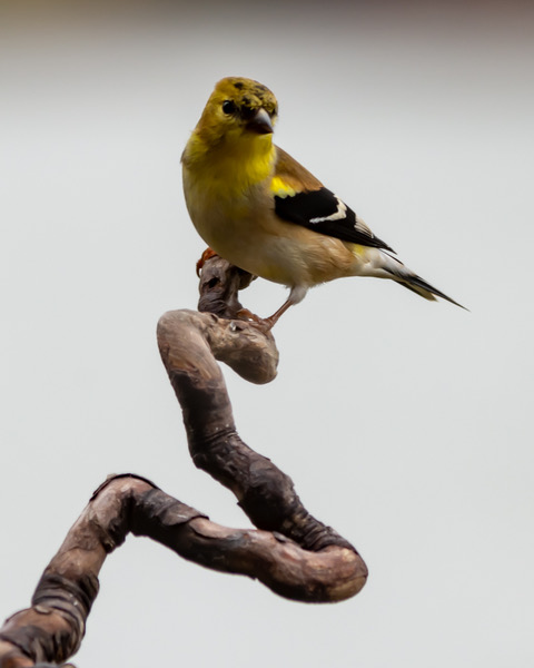
My initial impression was that I was looking at a travel poster for wildlife refuge - and I was ready to plan a trip there. As far as composition goes, I think the incorporation of the name of the photo location in a curved fashion that juxtaposes the empty space in the image as well as complements the piece of wood works very well. In my opinion the warm colors of the landscape work well to highlight the beautiful coloring of the birds. Technically I think that the image appears to be noisy probably because the ISO was quite high and I would suggest seeing if you can reduce it without losing too much detail. |
Aug 14th |
| 13 |
Aug 19 |
Comment |
I find that the initial impact of the image is amplified by the bright red and gold colors. I think the focus is perfect with good use of aperture to produce a pleasing bokeh quality. I like that there are a number of leading lines from the arms and the draped clothing that lead to the point of interest. I do find that the bright areas of the hands and arms draw my attention away from the bride-to-be's face. My only suggestion for improving the image would be to try and use a burn tool to reduce the brightness of the arms and to shine some light on the girl's face, subtly so that the light direction seems natural. |
Aug 14th |
| 13 |
Aug 19 |
Comment |
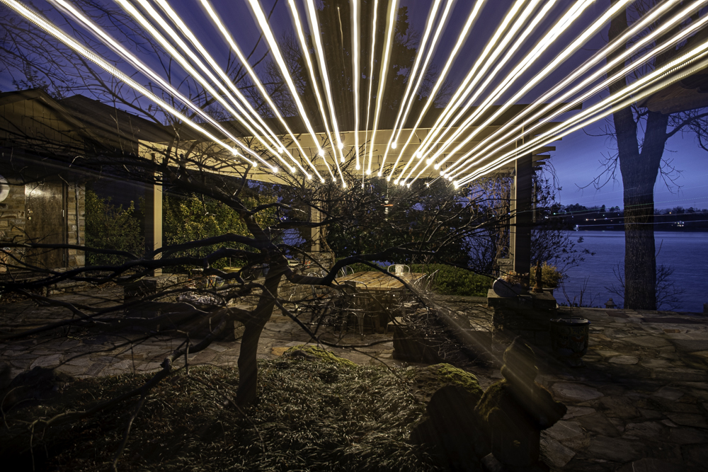
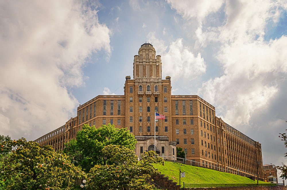
I found that the initial impact was very powerful as the image captures both the motion of people around a stationary building. In a sense you have captured the fourth dimension of time very succinctly with a good contrast between the sense of time of humans versus an inanimate object. 100 years from now those people will no longer exist but the building will - 300 years from now the building probably won't be here either. I like the use of B&W to reduce the point of the image to time and motion representation and your use of a radial filter to highlight the building is the icing on the cake in my opinion. |
Aug 14th |
| 13 |
Aug 19 |
Comment |
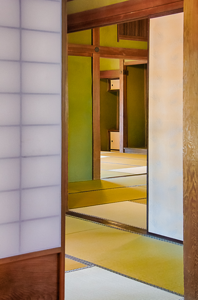
Rebecca and the door provide a great first impact, the coloring and Rebecca's clothing provide a great story along with the mysterious door. Good job. |
Aug 12th |
| 13 |
Aug 19 |
Comment |
Sorry for the delay but I've been traveling...I've cut out some sand and added an ND filter from Color Efex. |
Aug 12th |
 |
7 comments - 4 replies for Group 13
|
7 comments - 4 replies Total
|