|
| Group |
Round |
C/R |
Comment |
Date |
Image |
| 26 |
Apr 20 |
Comment |
I like both the B/w and the color but my final vote goes to the B/W which seems to make the picture more dramatic and reflexes more of the overall content of the picture. There are some wires in the upper left of the picture that are enhanced in the black and while version that I find distracting. |
Apr 14th |
| 26 |
Apr 20 |
Comment |
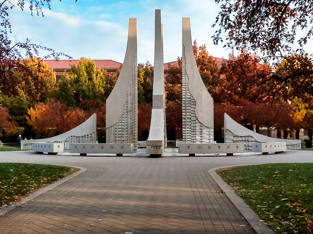
What I find intriguing about your photo is the point at which you have cropped the top. I keep going back to that point in the picture wondering what is just beyond the top of the picture. It sure works to keep my engaged in the picture. You have a great eye for architecture. Good Job. |
Apr 14th |
| 26 |
Apr 20 |
Comment |
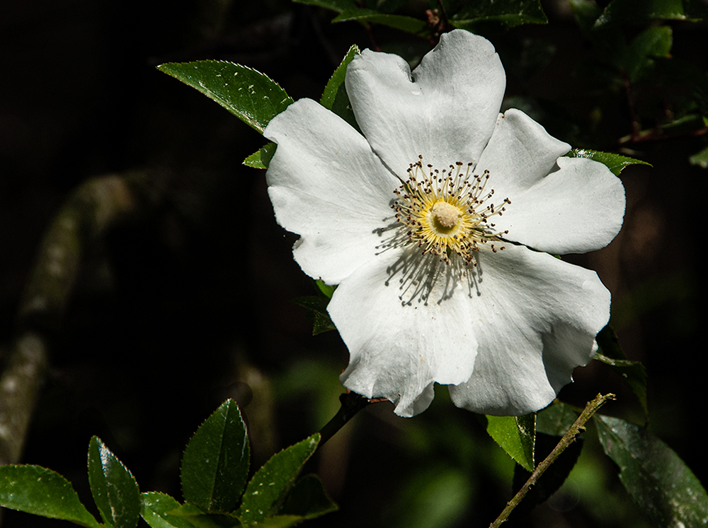
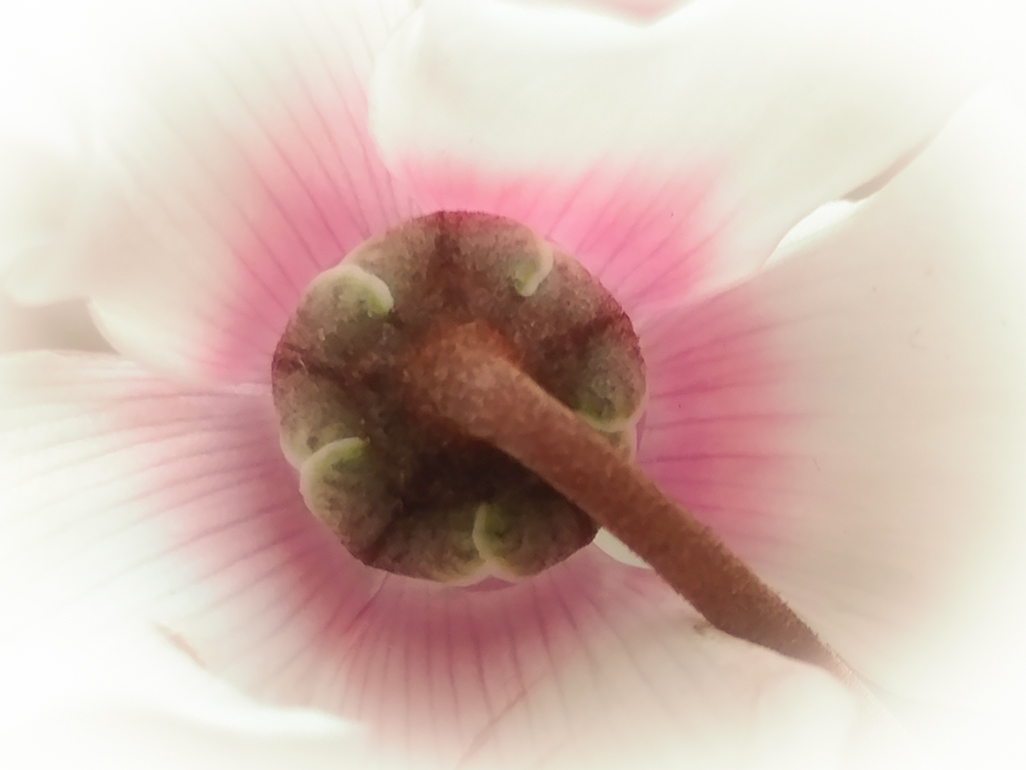
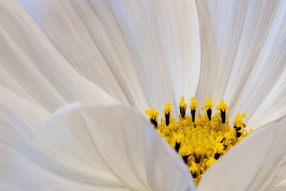
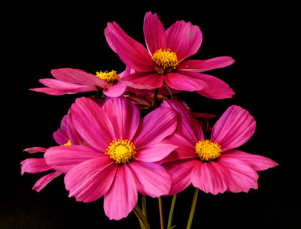
I like the color version and the S curve. I agree that the house is distracting but am not sure what you can do about it now. Did you use a slightly different shot for the black and white picture than the colored one. It seems to me that there is a natural break in the color photo just below the two forward facing flowers with the darker centers. I don't see that there in the black and white picture. I was wondering if cropping the BW picture to that point might improve the photo. |
Apr 14th |
| 26 |
Apr 20 |
Comment |
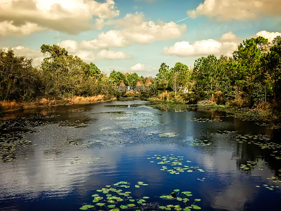
I like the composition of this picture and find that the dark building and it's roof make a nice leading line when combined with trees on the mountain on the right side. The colors are great and the reflection of the balloons in the water really add to the picture. The one thing I notice on my laptop is that when you view the picture as it first opens, before enlarging it, it seems to be sharper than the full size picture. |
Apr 14th |
4 comments - 0 replies for Group 26
|
4 comments - 0 replies Total
|