|
| Group |
Round |
C/R |
Comment |
Date |
Image |
| 24 |
Oct 18 |
Comment |
I am a visitor from Group 26. The first thing that caught my attention on your picture is how well it is divided into thirds with the bottom third and the upper third reflecting similar colors while the middle third is highly contrasting. The picture is much improved over the original with good detail. I also like how the clouds both provide a barrier to your eye wandering off the top of the picture as well as their shape bringing your eye to the center of the picture. It is certainly a picture that would be worth hanging on a wall in one's home. |
Oct 2nd |
1 comment - 0 replies for Group 24
|
| 26 |
Oct 18 |
Comment |
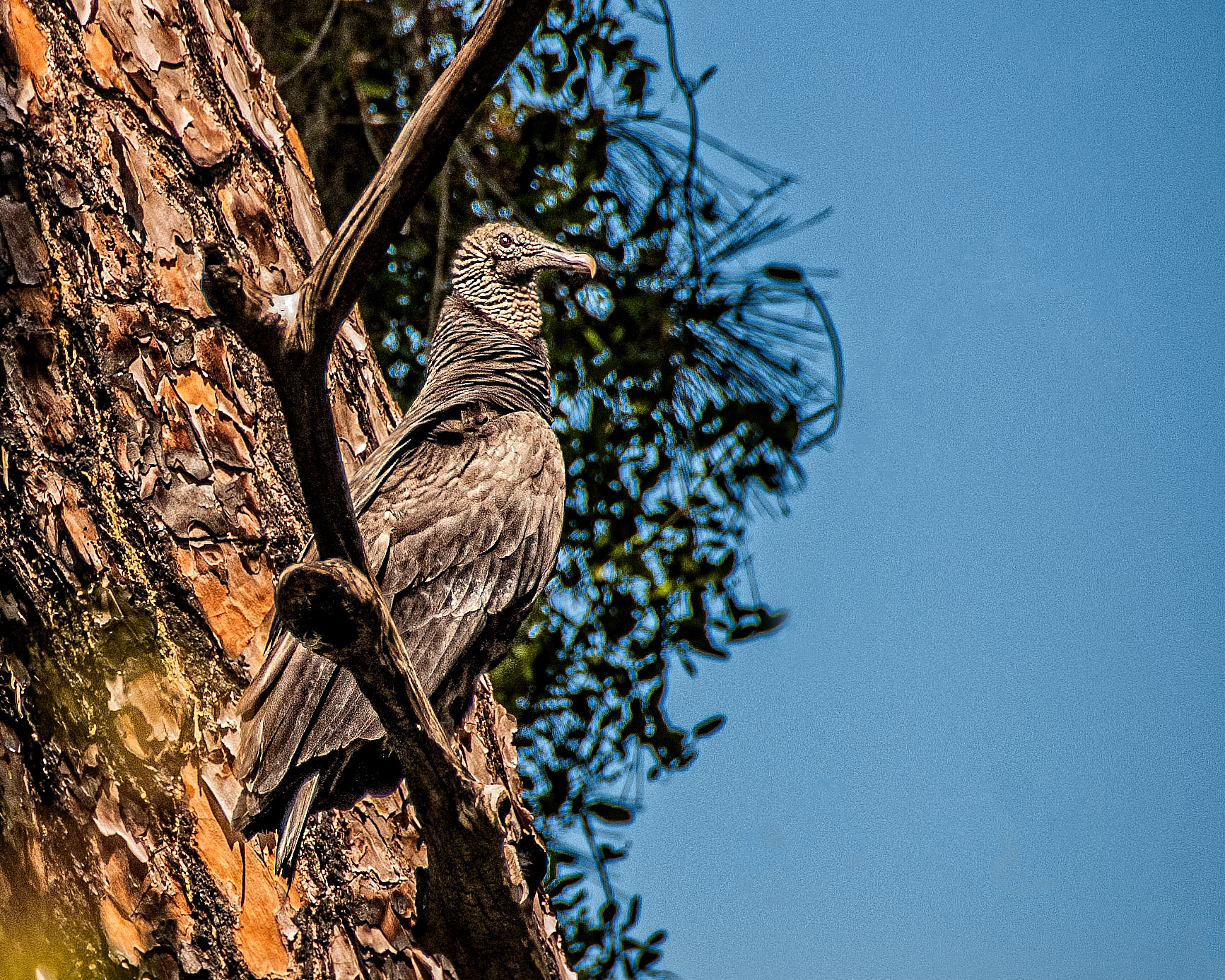
On my first look the blue sky at the top in the middle of the picture was distracting although I have to admit that it is better than the white in the original. The more I view the picture the less it bothers me. I wonder how the picture would look with some haze reduction in Lightroom. You did a great job capturing the rainbow something that I find hard to do. I love how the beach and the mountains combine to bring you to a focal point that demands you see the rainbow. |
Oct 16th |
| 26 |
Oct 18 |
Comment |
I agree about cropping and think up to the first tree on the left and the leaning tree on the right as Bob did gives it a more intimate feeling. I like the idea of the light rays but might have them appear to go behind the tree trunks instead of in front of them. Not having an object on the path as a focal point does not bother me as I see the trail it's self providing the focal point. |
Oct 16th |
| 26 |
Oct 18 |
Comment |
I too find the red at the top distracting. I think it could be cropped out without hurting the overall quality of the picture. The bright spot on the right does not bother me but I might try to eliminate the white spots underneath the train in the middle of the picture. |
Oct 16th |
| 26 |
Oct 18 |
Comment |
I really like this picture and can't think of anything I would change. I love the inclusion of the colorful table on the left and feel it brings some life to the picture that otherwise would not be there. The detail is fantastic. |
Oct 16th |
| 26 |
Oct 18 |
Comment |
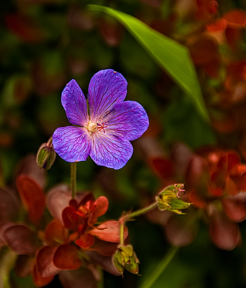
I love the colors. Not too much pink for me. The white against the prink is a real eye catcher. I might consider cropping the picture to remove the bright pink wall on the left side as Bob suggested. |
Oct 16th |
| 26 |
Oct 18 |
Comment |
My first reaction on opening up the picture was one of being overwhelmed by the tree on the right. At first I thought it was just too much of the tree but the more I look at it I think part of it is it's brightness as well. My personal preference would be to have it darker. I wonder if toning down the water at the bottom would bring out more detail. |
Oct 16th |
| 26 |
Oct 18 |
Reply |
I'll give it a try and thanks for the suggestion. |
Oct 16th |
| 26 |
Oct 18 |
Reply |
I like it very much Bob. Thanks for the suggestion. |
Oct 16th |
6 comments - 2 replies for Group 26
|
7 comments - 2 replies Total
|