|
| Group |
Round |
C/R |
Comment |
Date |
Image |
| 32 |
Nov 19 |
Comment |
Dear all - this has to be one of those images that gets so many different attitudes going so I will stick to the technicalities only. We all seem to have differing opinions on what to leave in or kick out and what has wow factor or doesn't (sorry Gloria, but some other people I know would disagree, but this is where subjectives come in) and this is one of the reasons that I love photography. However..................sticking to technicality. I totally accept about haze and this is where I am glad of the suggestions. In fact Tom your 'dehaze' use came at a perfect moment and I am so glad that you bought that up BEFORE I start working on a batch of photographs that I captured in Florence in Italy where I was exhibiting some of my creative images at the Florence Biennial. Your timing couldn't have been better! Thanks all for the input. I really do appreciate it |
Nov 11th |
| 32 |
Nov 19 |
Comment |
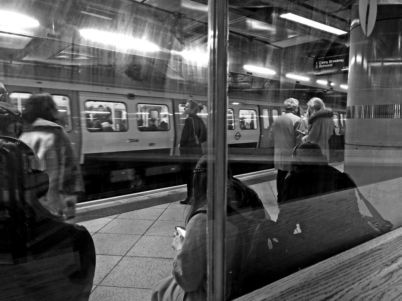
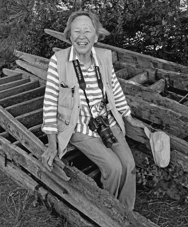
Well done for going to the sepia filter - it gives just a hint of age. Apart from being a tad too bright for me (here we go to personal taste) I like the reflections as it gives depth to the location and leaves me asking questions about the hut, its' use and the location itself - I like pictures that do that. |
Nov 11th |
| 32 |
Nov 19 |
Comment |
Excuse me while I throw a jealousy scene! I have never managed to get that level of quality and sharpness on bird photography. What happened to the color version - on second thaoughts it is not relevent. This is an excellent image. |
Nov 11th |
| 32 |
Nov 19 |
Comment |
Well spotted Stephen - I did not notice them until you said so. I was too busy looking at the over-all effect and totally agree with all you have said. |
Nov 11th |
| 32 |
Nov 19 |
Comment |
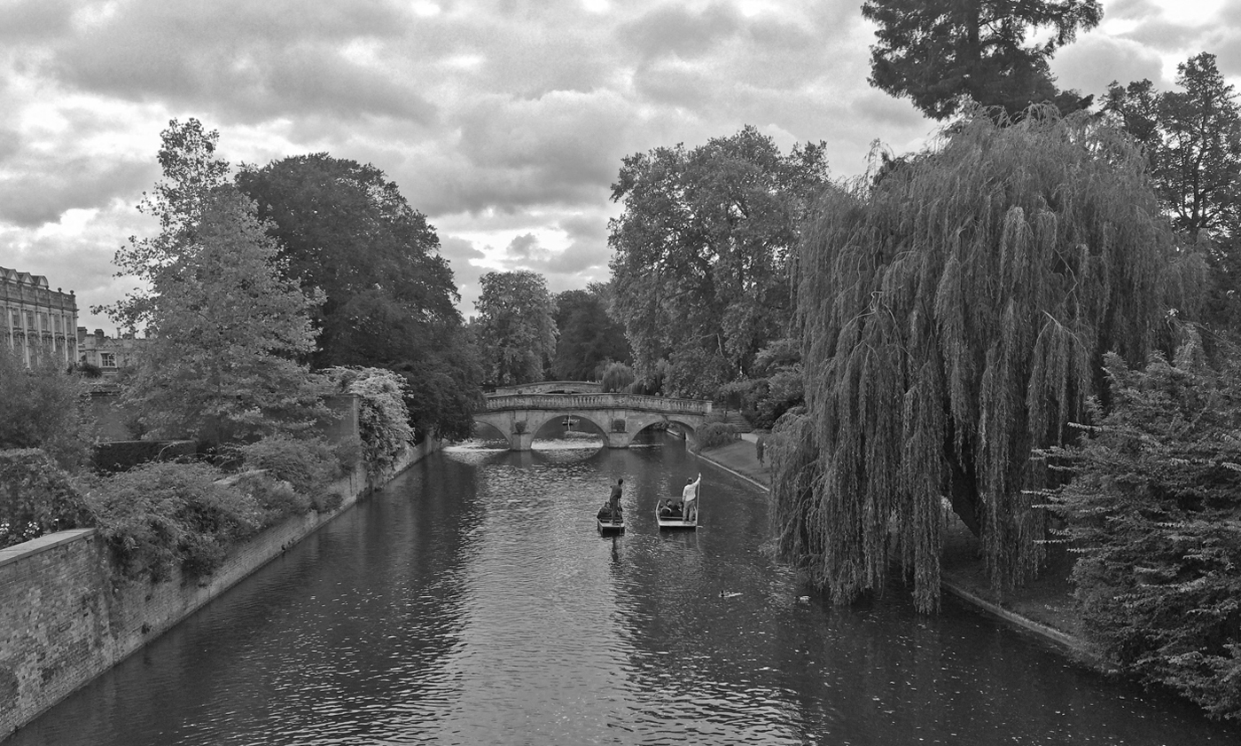
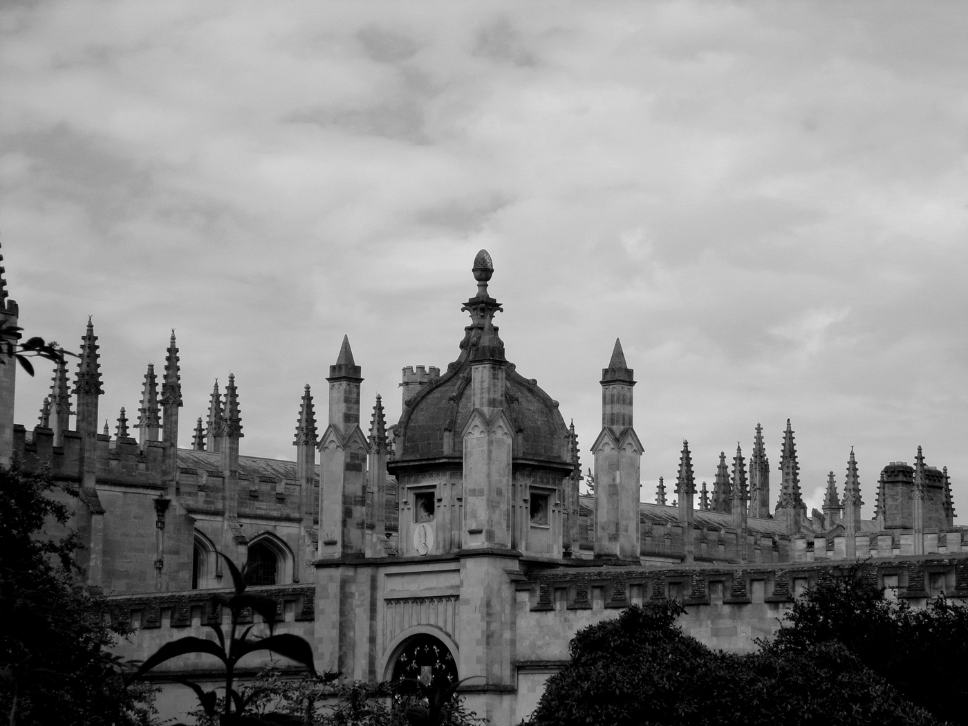
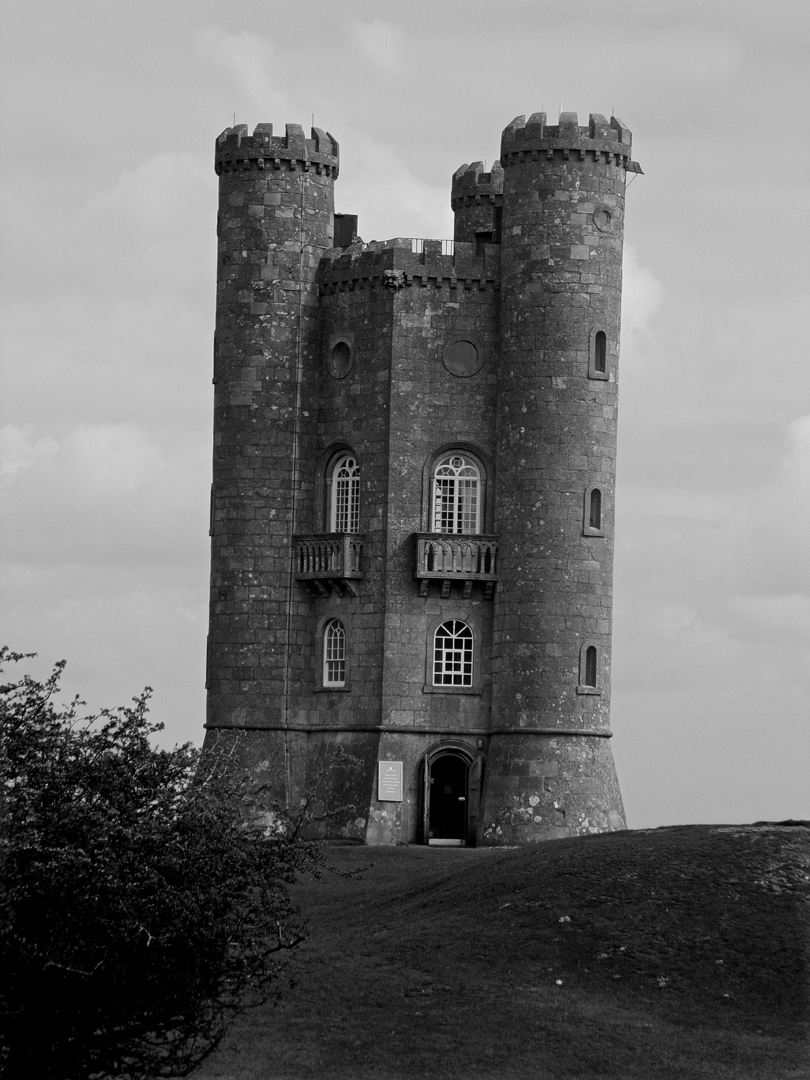
I love the B&W version for two reasons - firstly the textures on the building come to the fore in the B&W more than they do in the colour version and secondly the clouds are more dramatic. Superb treatment that adds character to the image. |
Nov 2nd |
| 32 |
Nov 19 |
Comment |
Not much of a comment from me. I have tried such an image myself a while back and I did not get such an excellent result. I will not say more as it will sound like a touch of jealousy on my part. Oh alright - I'll admit it. Your image is brilliant. And I agree with Lance |
Nov 2nd |
| 32 |
Nov 19 |
Comment |
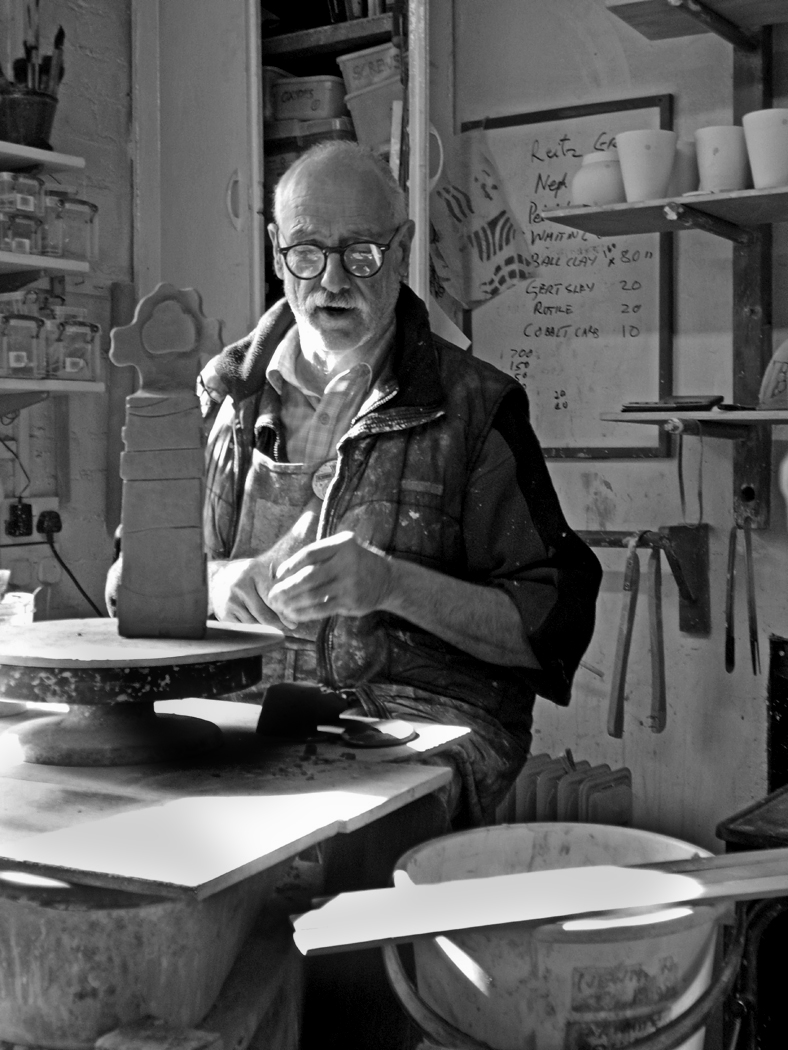
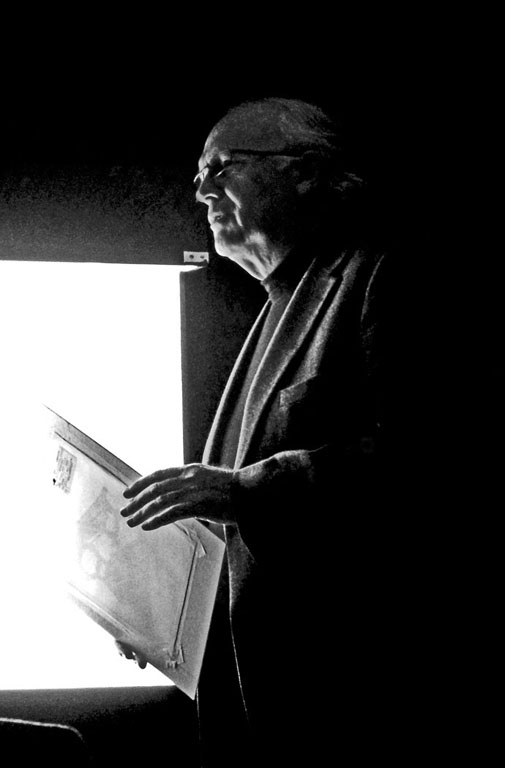
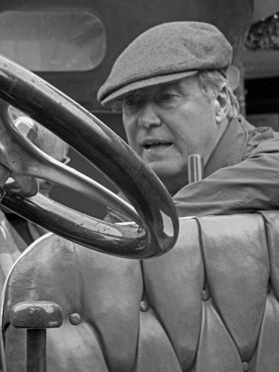
Wow! The B&W is far superior for one reason in my opinion. In the colour version, the face is getting lost because of the brightness and colour of the clothing. In the B&W version, you have removed that distraction and the face of Lucas now shows personality. I do have to agree with suggestions made by Lance, but the decision to go for B&W is an excellent choice. |
Nov 2nd |
| 32 |
Nov 19 |
Comment |
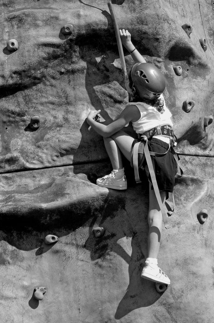
Stephen and Lance - thanks for both of your comments as both of you have seen things that I did want to achieve. Stephen - the 'off-center' was definitely intentional as I always find that exact geometry is a distraction to the atmosphere of such an image. Lance - thanks to you too. I did wonder if I had left too much in the image to keep the perspective, but I am glad you picked up on it and made a positive comment. I appreciate it.
Thanks again to both of you. |
Nov 2nd |
8 comments - 0 replies for Group 32
|
8 comments - 0 replies Total
|