|
| Group |
Round |
C/R |
Comment |
Date |
Image |
| 32 |
Mar 18 |
Reply |
I've just looked at Carol's work on Cara - thanks for the reminder of vignette! It nicely surrounds Cara's face. Another good tip worth trying. Thanks |
Mar 27th |
| 32 |
Mar 18 |
Comment |
Dear Diana and Jennifer
Thanks both of you for your comments clarifying things. I am beginning to think that perhaps thoughts in the USA can be (at times) radically different to UK. It was the use of the word 'dreadful' and remarks from previous rounds where background was not exactly in for good comments (leaving one of my images totally out of context) that got me a bit disappointed. As I said - constructive critiques are ALWAYS welcome. I do agree Jennifer that it would be worth toning down the background. I will give that a try. Thanks again. |
Mar 26th |
| 32 |
Mar 18 |
Comment |
How about NOT always saying the backgrounds are dreadful. So far the colour version has been accepted in 5 different PSA recognized salons so the background cannot be all that dreadful! This is not the first time that background has been in for negativity and not just on my images. I am totally in favour of constructive critiques and helpful suggestions, but not when it is (or appears to be) outright put-downs. I have also been put down for a 'thought' I had about the background of another members' image. This is a bit disheartening so I am left wondering if I should just forget about uploading any more images here and look locally for B&W workshops who will help me with further improvements without the need for put-downs |
Mar 23rd |
| 32 |
Mar 18 |
Reply |
Hi Diana - thanks for the input. I like the suggestions and I will definitely try it out later (both the lightening and the eyes). I guess the background is a matter of taste, but I was concentrating more on the model in the given circumstances. Once I have got that better, I will see how things go with the background blacked out. Thanks again |
Mar 22nd |
| 32 |
Mar 18 |
Comment |
Hi - the camera I was using at the time was a simple Hitachi 161E bridging camera with a x40 zoom lens. Nothing fancy. It is something I use for running around when I cannot be bothered to carry my Pentax MV (a 1982 film SLR). It's a bit like having a Land Rover, and then driving around in a Nissan Micra! |
Mar 19th |
| 32 |
Mar 18 |
Comment |
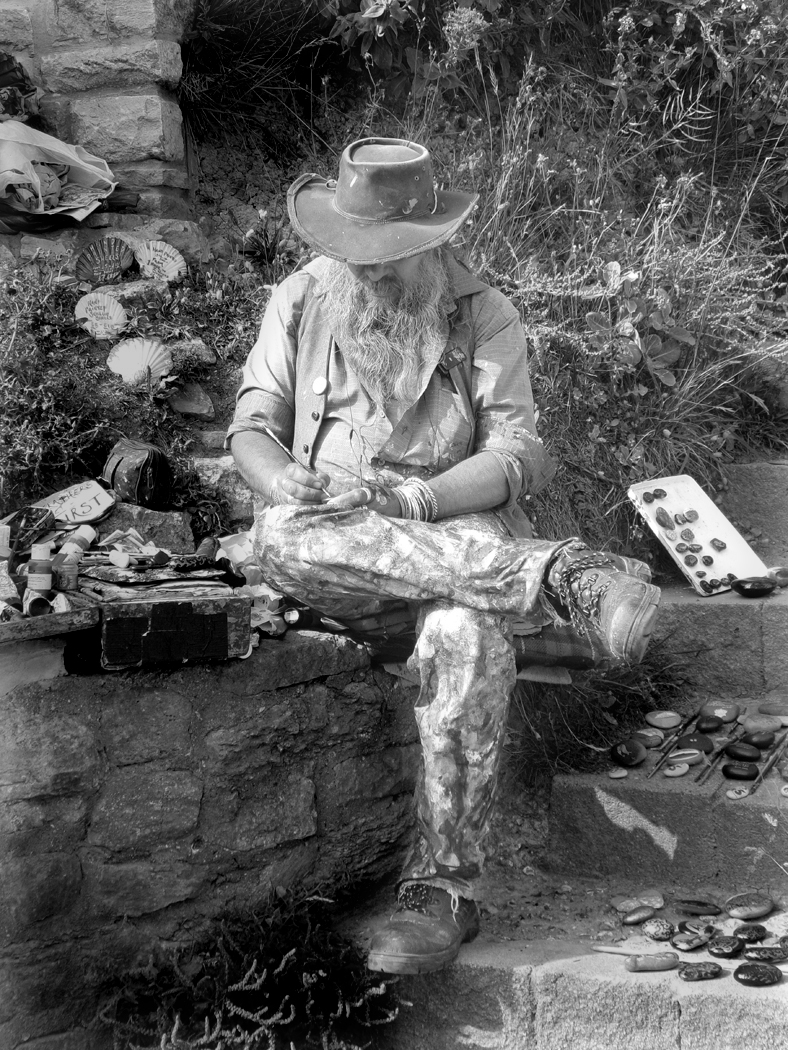
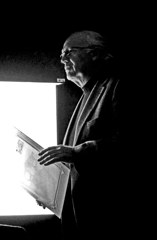
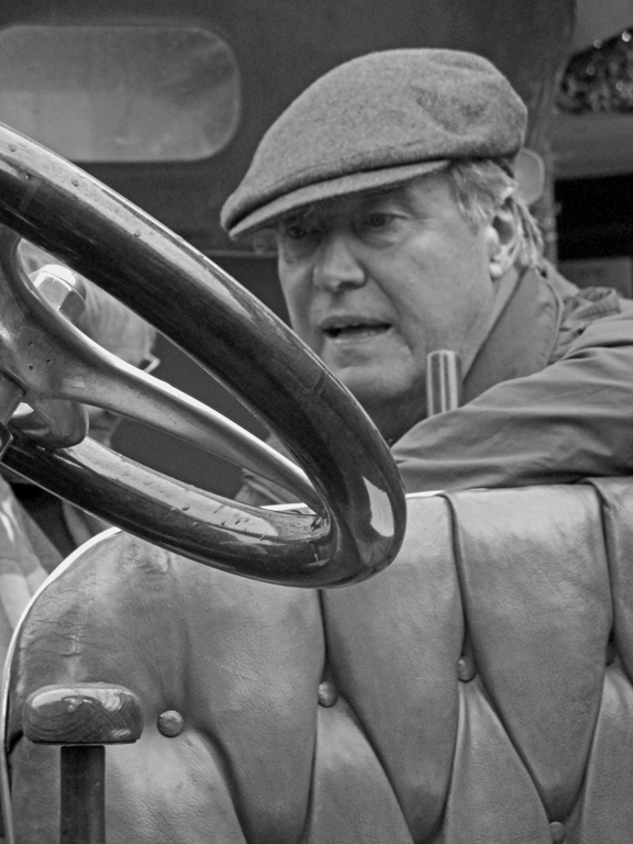
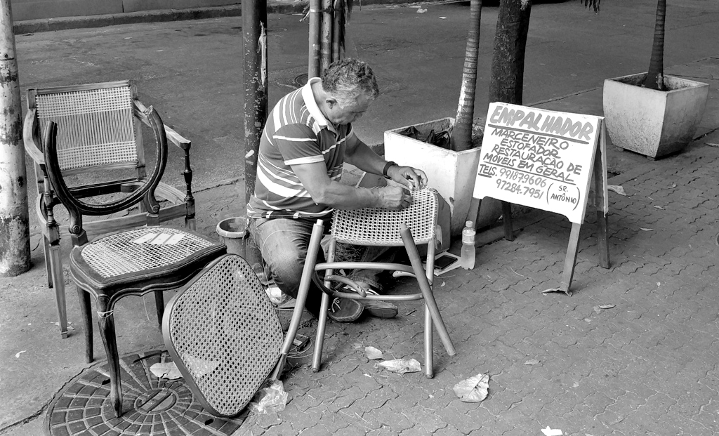
Hi - I would not crop anything - but that is a matter of personal taste. I am someone who loves street photography so like a bit of surrounding detail to keep the subject in location. I did think about the balance of the lighting, so I tried to tone down the foreground so I could lighten the shadows of the background. As for not getting enough of his face, you did well to get enough of his face to capture the concentration of what he was doing, therefore your image is believable and not posed. You did well to get the image - certainly one I would have captured given the chance. |
Mar 19th |
 |
| 32 |
Mar 18 |
Reply |
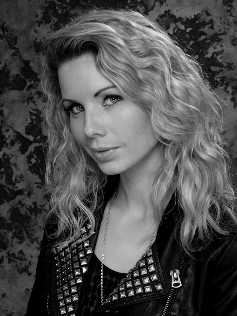
Hi Stephen - you are totally correct about lighting - I did not take advantage of reflectors or umbrellas as I just wanted to check the capabilities of the camera without added help. It was a great exercise! I did get rid of the blush in the mono as it just looked like I spilled coffee on it! It had to go - and I am so glad that you think it is a good result as that was part of my worry and the reason why I chose this shot for critique. As for distance - the lights were about six feet away (strength I cannot remember as they were set up for us) and I was standing at a similar distance.Thanks again |
Mar 19th |
| 32 |
Mar 18 |
Comment |
Weird - I love it! |
Mar 9th |
| 32 |
Mar 18 |
Comment |
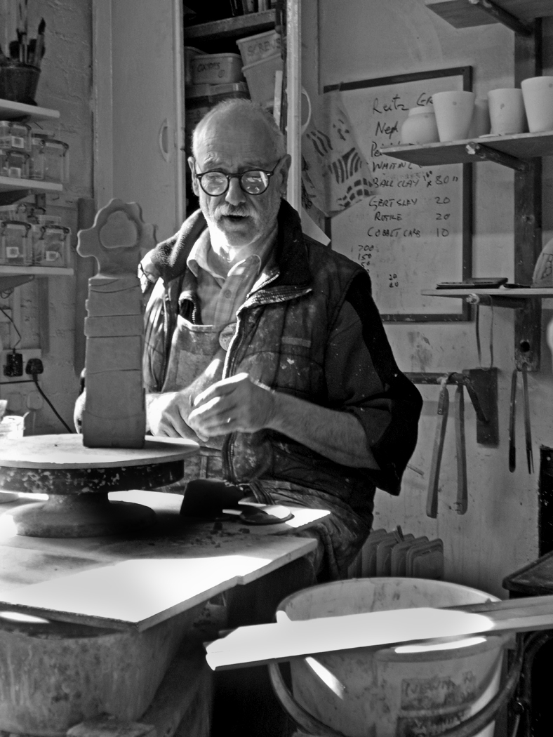
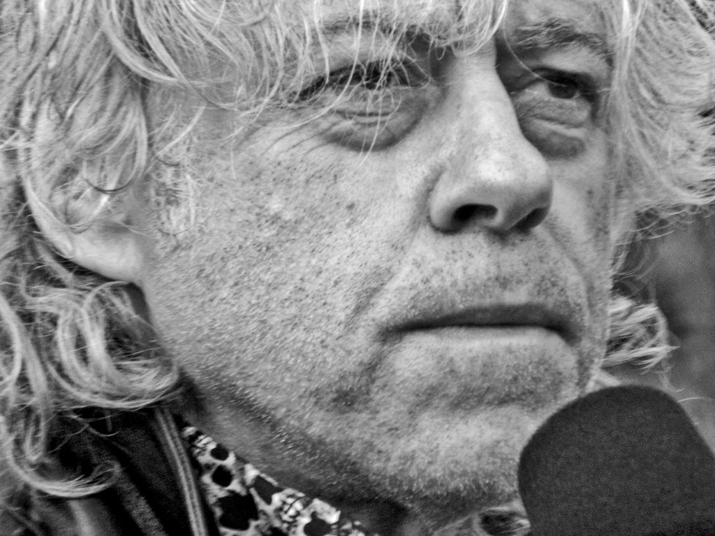
Much better in monochrome - did you reduce the shadows as there seems to be more texture in the mono version? |
Mar 9th |
| 32 |
Mar 18 |
Comment |
Certainly the image is much better in monochrome - the detail and clarity is much cleaner and the lighting seems to be more even than in the colour versions |
Mar 9th |
7 comments - 3 replies for Group 32
|
7 comments - 3 replies Total
|