|
| Group |
Round |
C/R |
Comment |
Date |
Image |
| 19 |
Sep 19 |
Comment |
Hi Everyone,
Thanks for all of your feedback! I'm traveling with limited internet access, so I won't reply individually. I'll experiment with your suggestions!
|
Sep 19th |
| 19 |
Sep 19 |
Reply |
Hi Norm,
I hadn't thought about that kind of crop, but I'll give it a try! |
Sep 7th |
| 19 |
Sep 19 |
Comment |
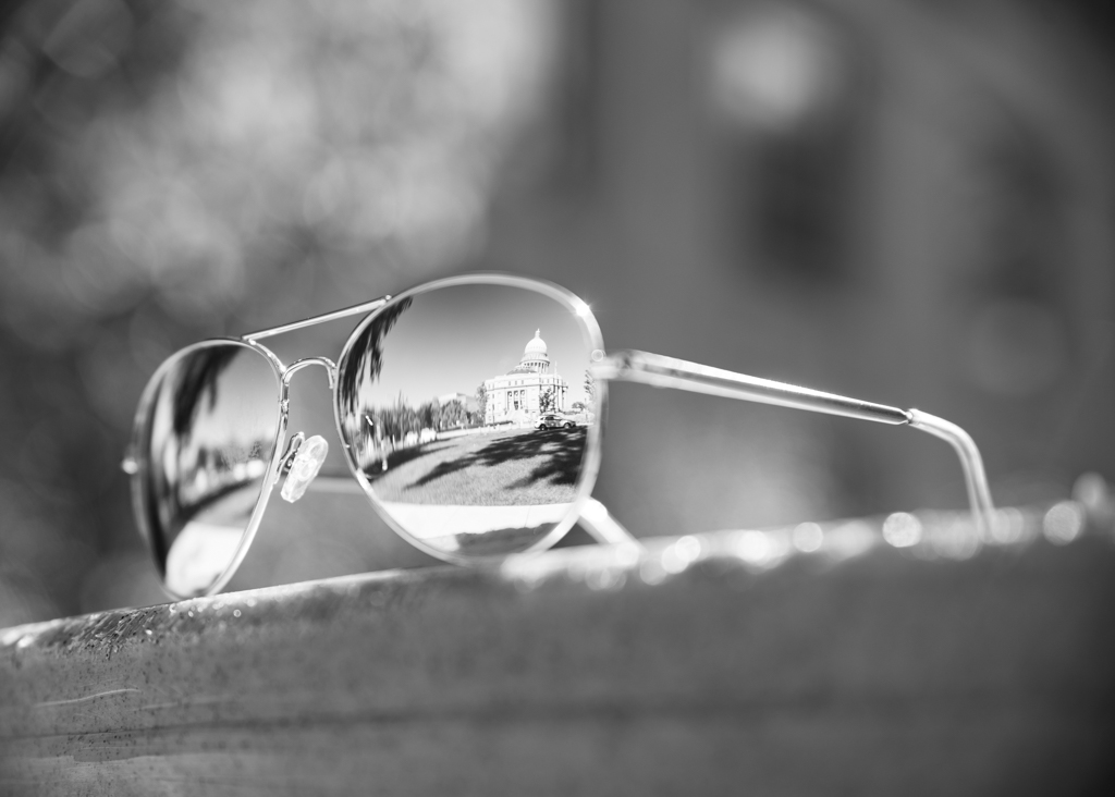
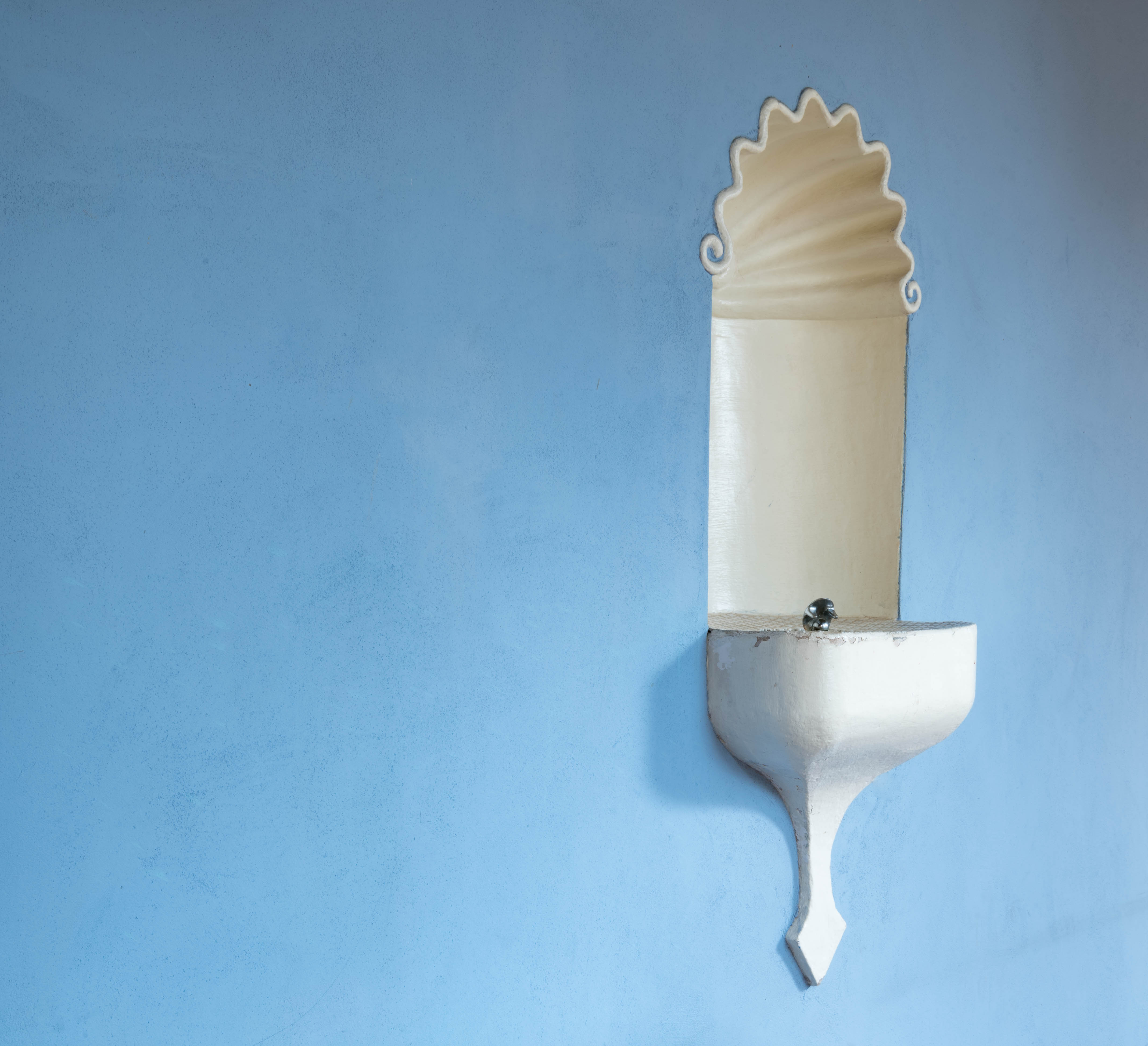
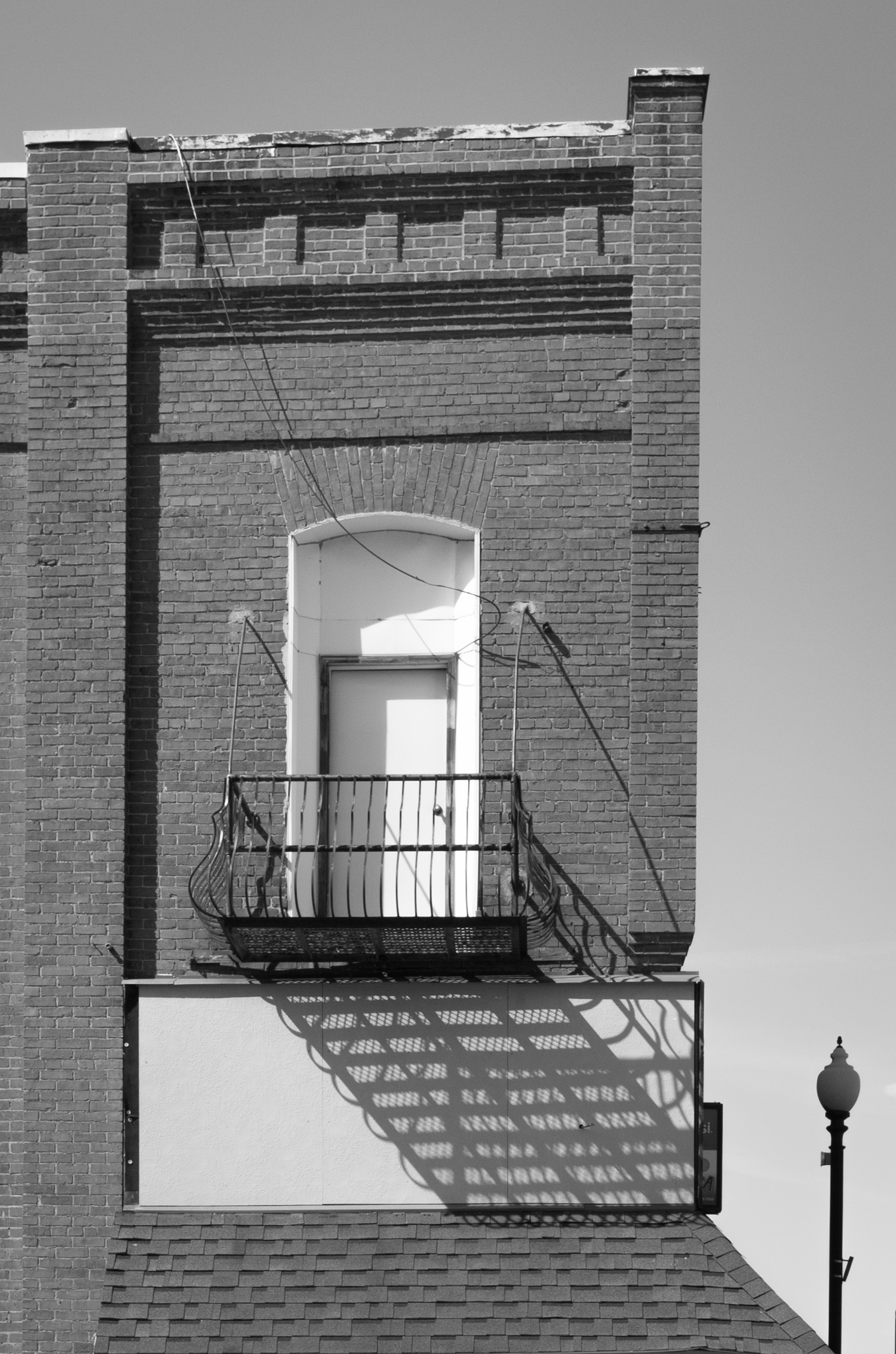
Beautiful! I especially like that small edge of lighting on the bottom right of the arch--it creates a nice defining detail. |
Sep 7th |
| 19 |
Sep 19 |
Comment |
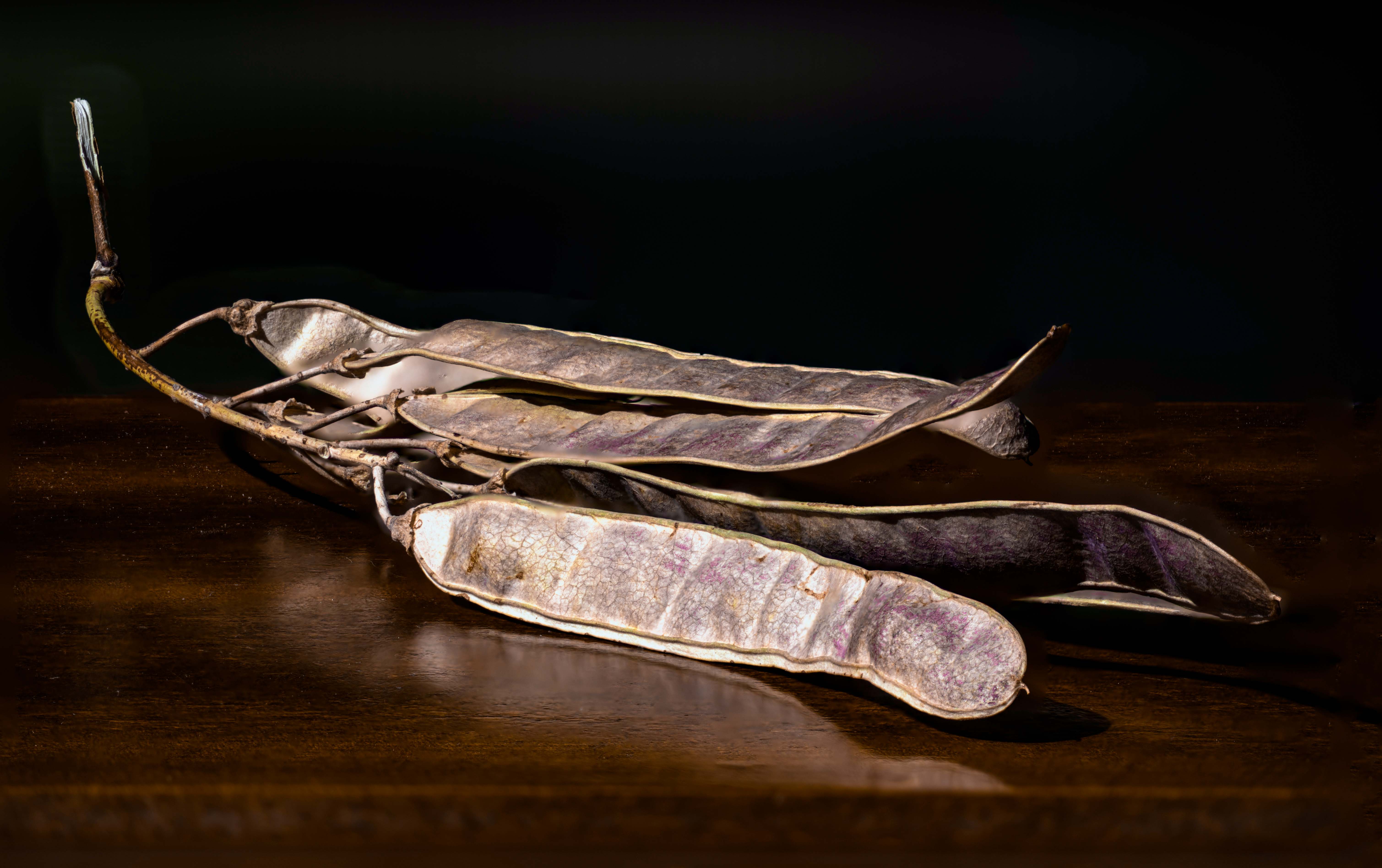
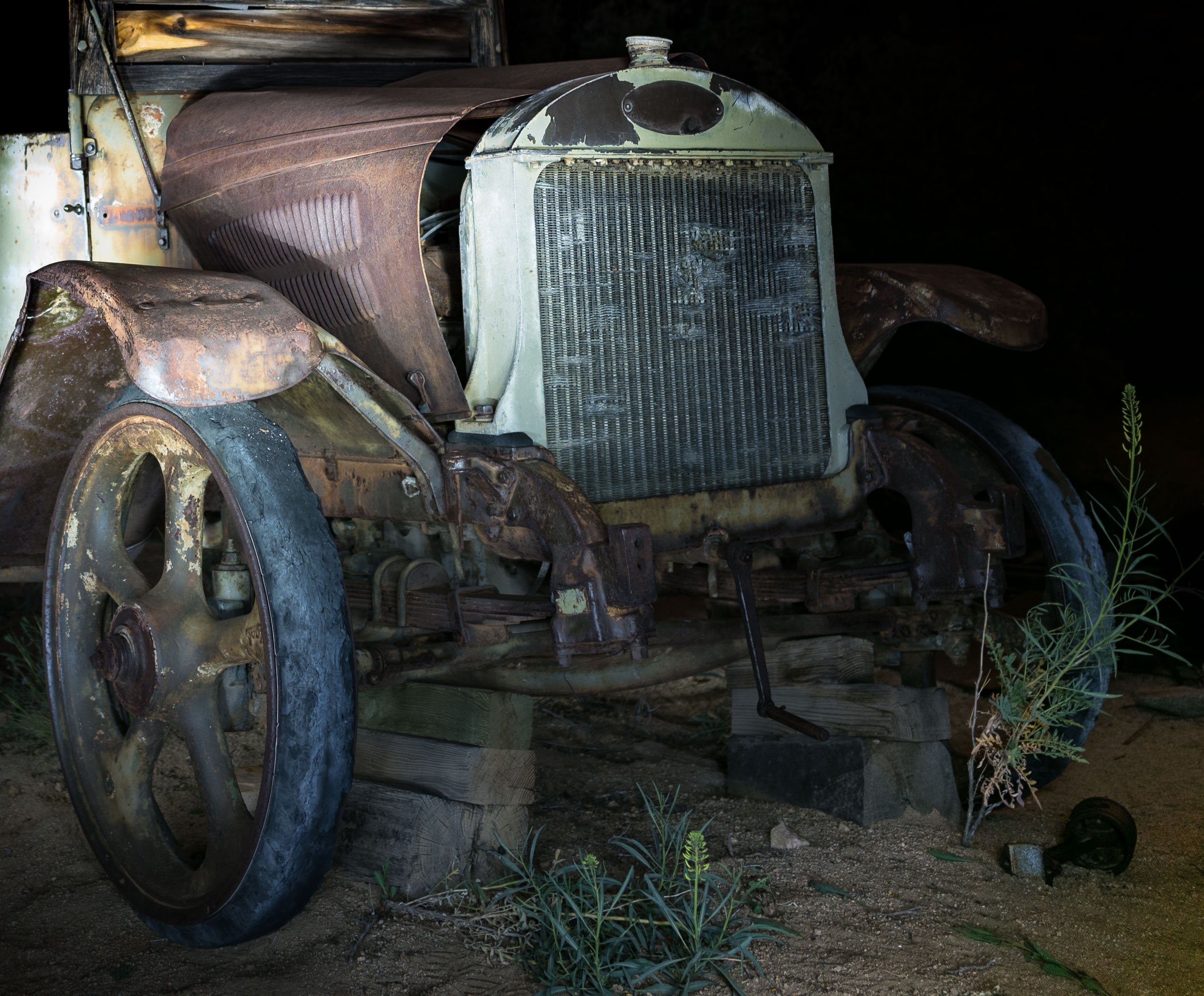
A very nice nostalgic image! I agree with Norm on the cropping in a bit. It looks like there may be something odd in the upper left corner? It looks like bokeh, but maybe not? It draws my attention a bit, which I'm not sure is wanted in that corner. Otherwise, the position of the trike and the handlebars creates a nice almost circular motion in the image which helps keeps me focused on the trike. I like the somewhat subdued coloring--it adds to the nostalgic feel of the image. A nice find for you on your walk! |
Sep 7th |
| 19 |
Sep 19 |
Comment |
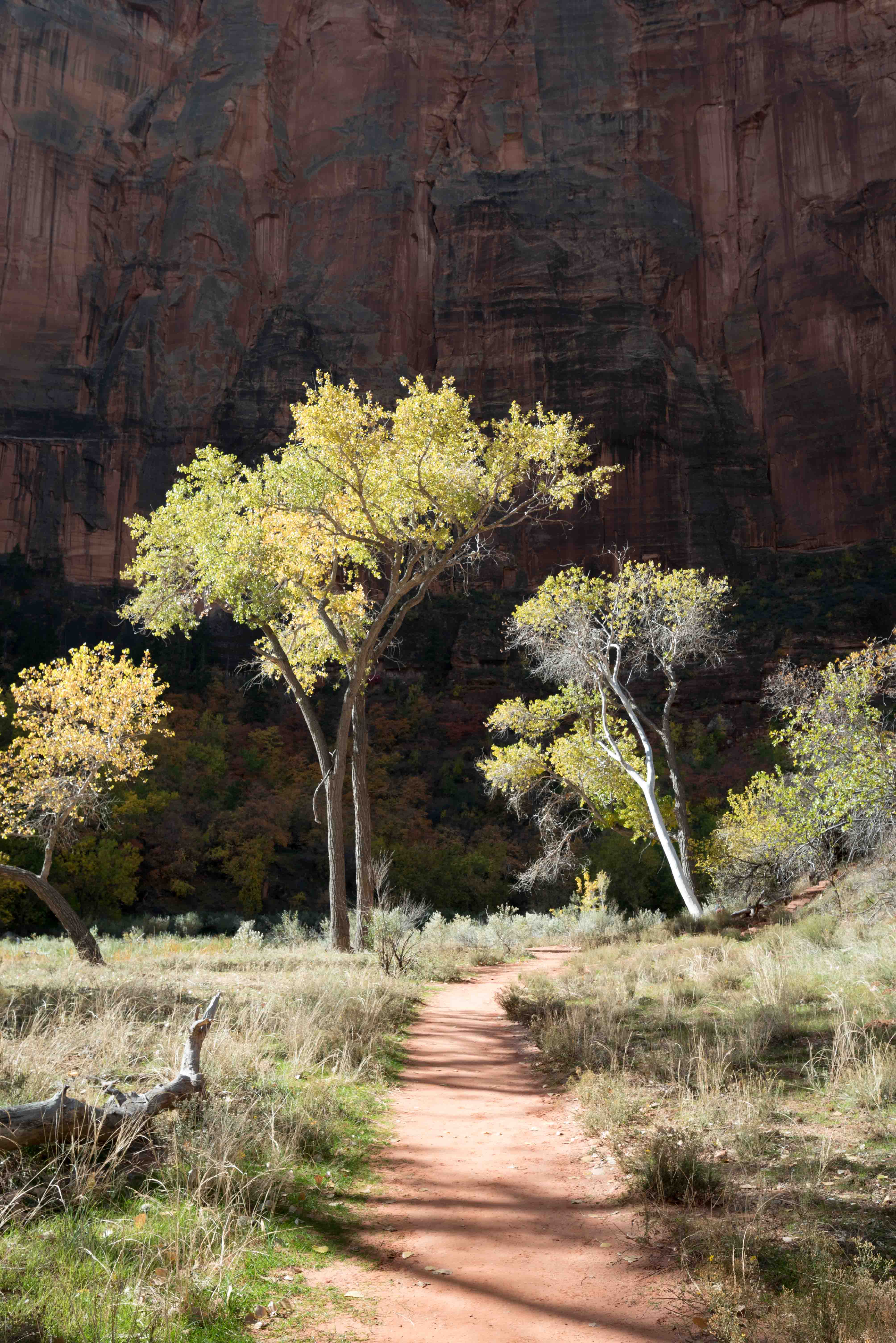
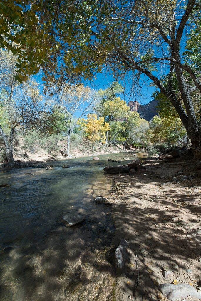
Wow! Beautiful image. I especially like how the motion of the cliffs on the left/foreground and the clouds is in the same direction--sweeping right and somewhat upward. You've also got some nice color in the bend of the river, which I know can be a challenge with canyons often being in dark shadow. No suggestions for improvement! |
Sep 7th |
| 19 |
Sep 19 |
Comment |
Hi Stan,
What a fabulous place! I can see why the Canadian flag was so appealing--that burst of red against the background is a nice focal point, and the flag itself helps tell the story of the place. I agree with Norm's comment about the composition, but otherwise really like the image. |
Sep 7th |
| 19 |
Sep 19 |
Comment |
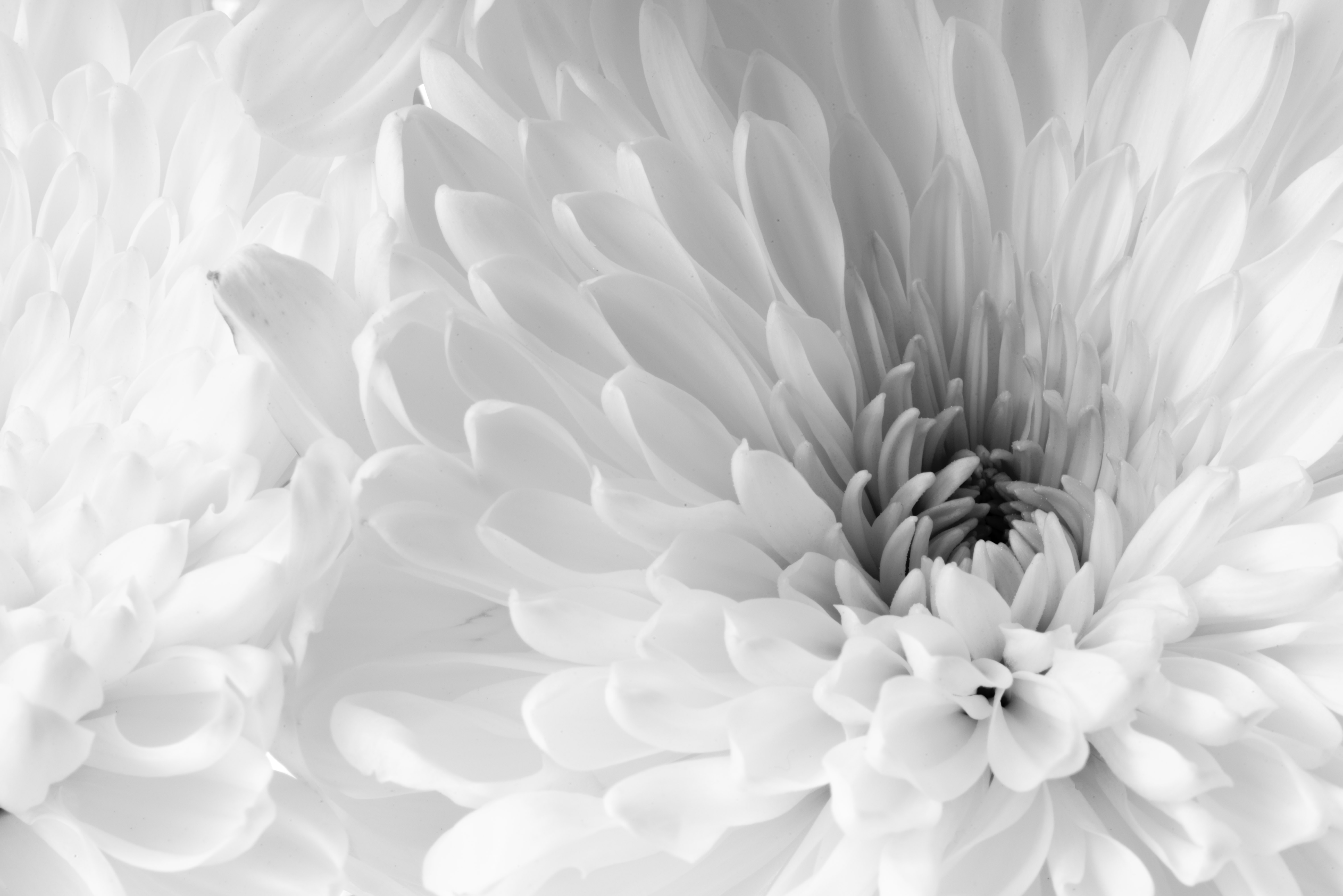
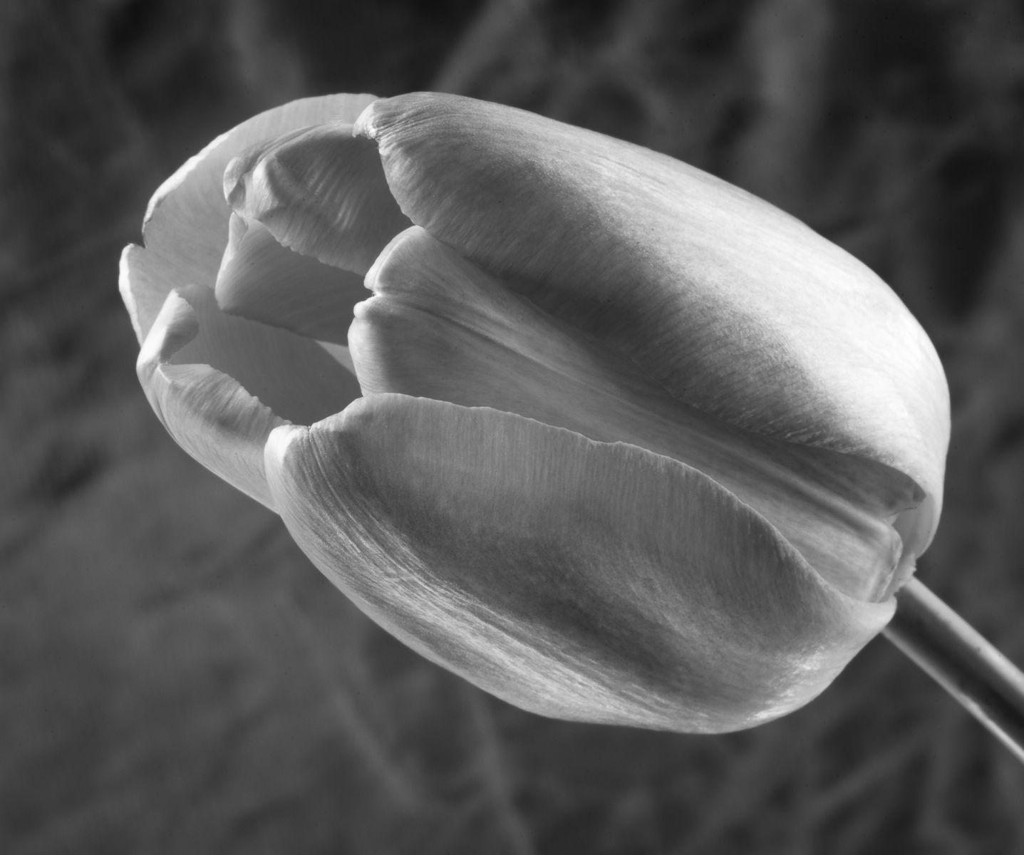
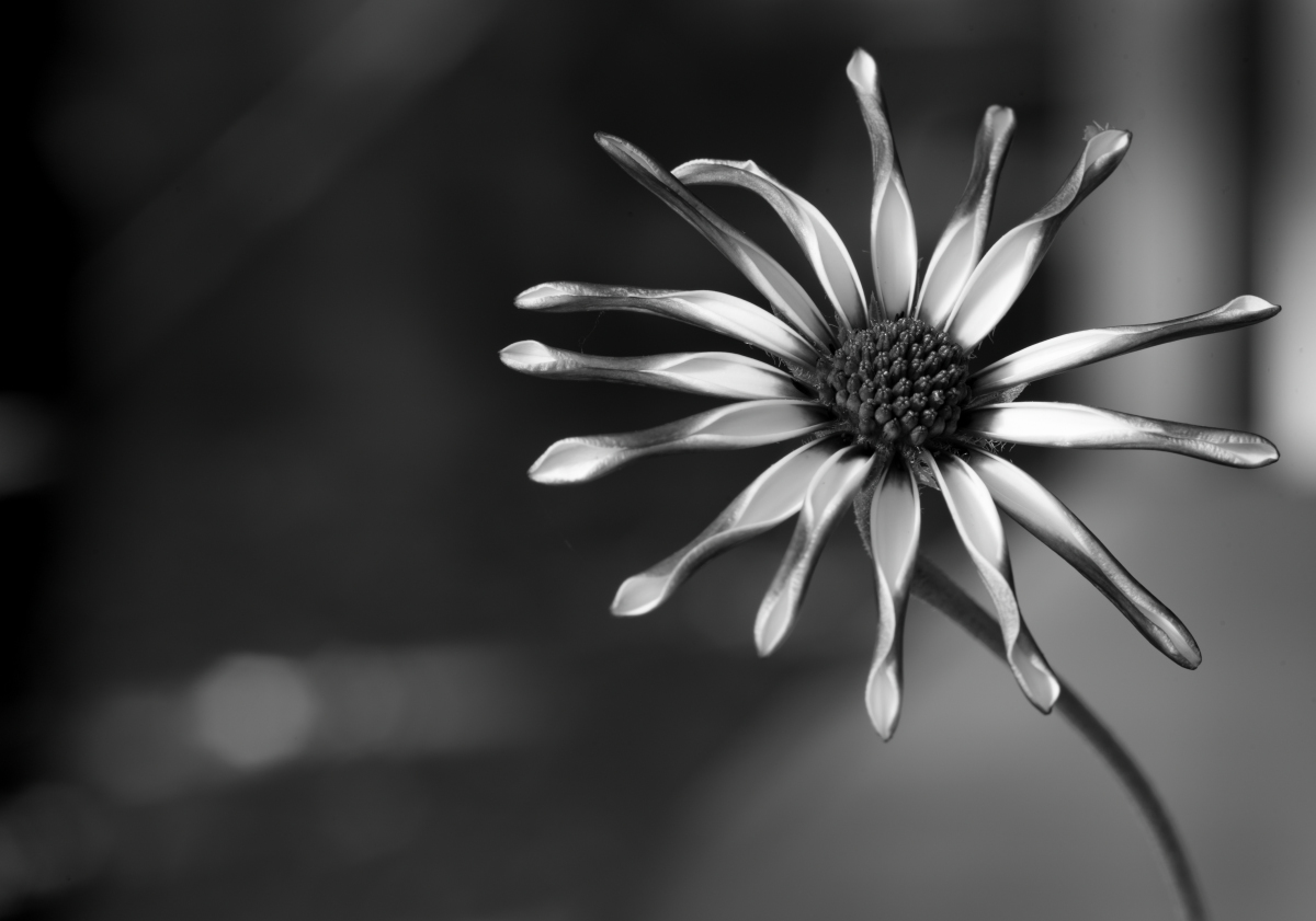
Hi Harriet,
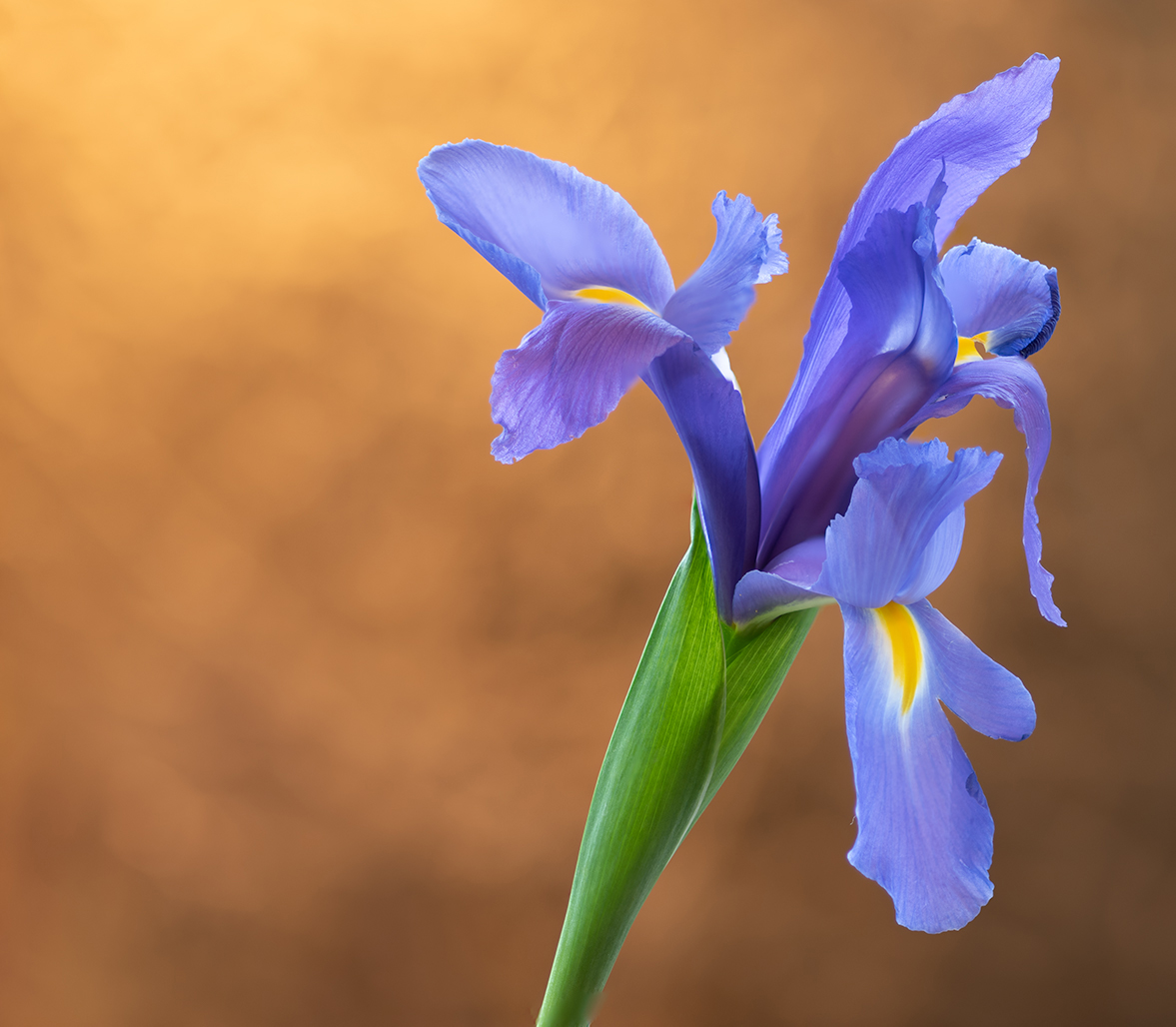
This is an interesting image with the flower appearing almost downcast with the hopeful bud (?) above it (the flower that hasn't yet opened). The colors in the flower are beautiful, and there are hints of that orange/red in other parts of the image to create a harmonious composition. Very nice! |
Sep 7th |
| 19 |
Sep 19 |
Comment |
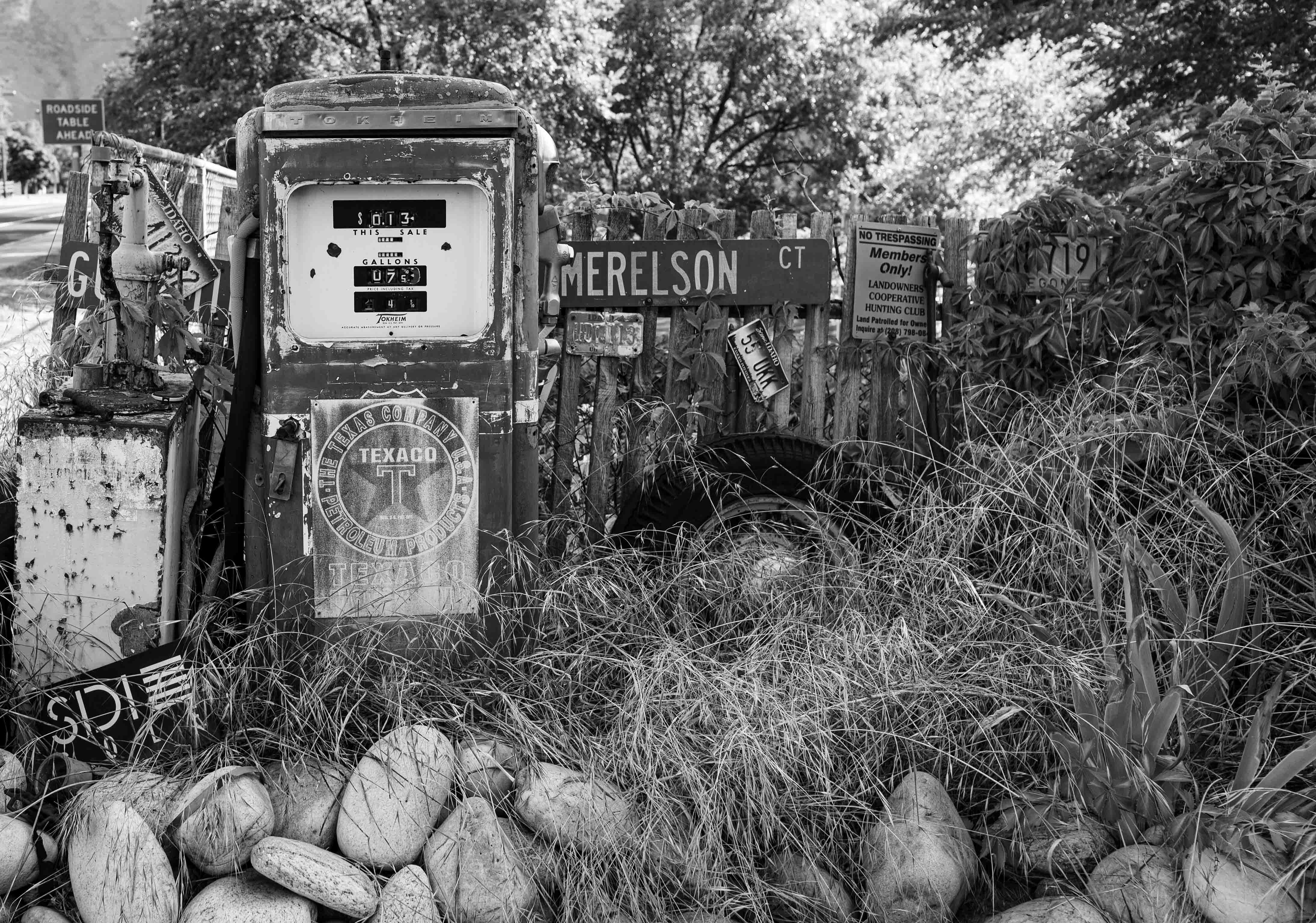
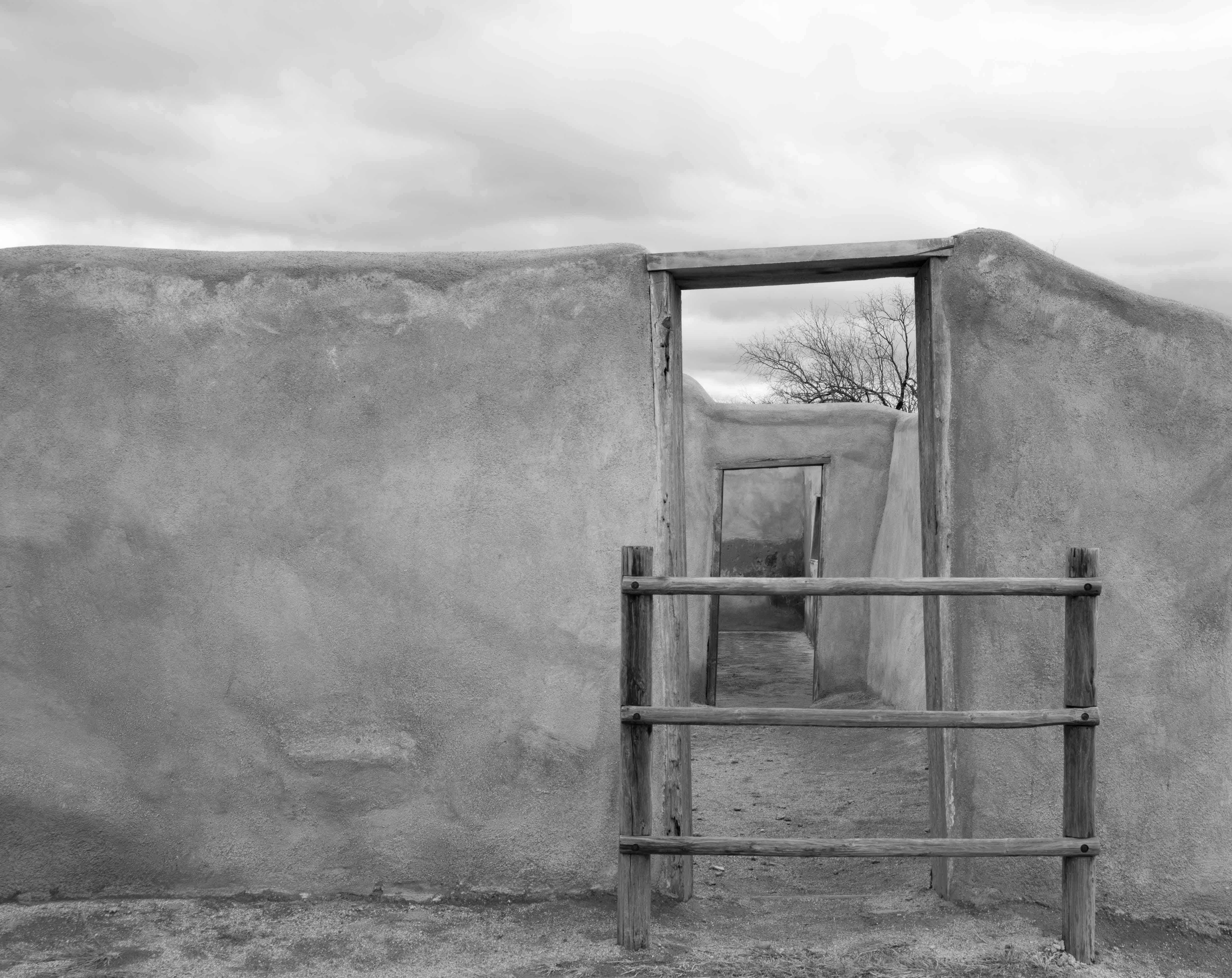
An intriguing composition! It's almost a monochrome except for the sign and the barber pole, which makes the red color in the sign/pole pop. The sign and the pole are also nicely balanced with each other in the image. The layering/receding edges of the wall on the left add interest as well. Nicely done! |
Sep 7th |
7 comments - 1 reply for Group 19
|
7 comments - 1 reply Total
|