|
| Group |
Round |
C/R |
Comment |
Date |
Image |
| 19 |
Mar 19 |
Reply |
Thanks, Harriet! |
Mar 29th |
| 19 |
Mar 19 |
Reply |
Thanks, Carroll! |
Mar 29th |
| 19 |
Mar 19 |
Reply |
Thanks, John! |
Mar 29th |
| 19 |
Mar 19 |
Reply |
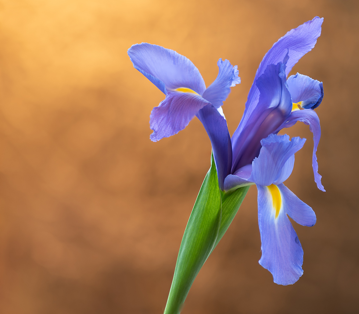
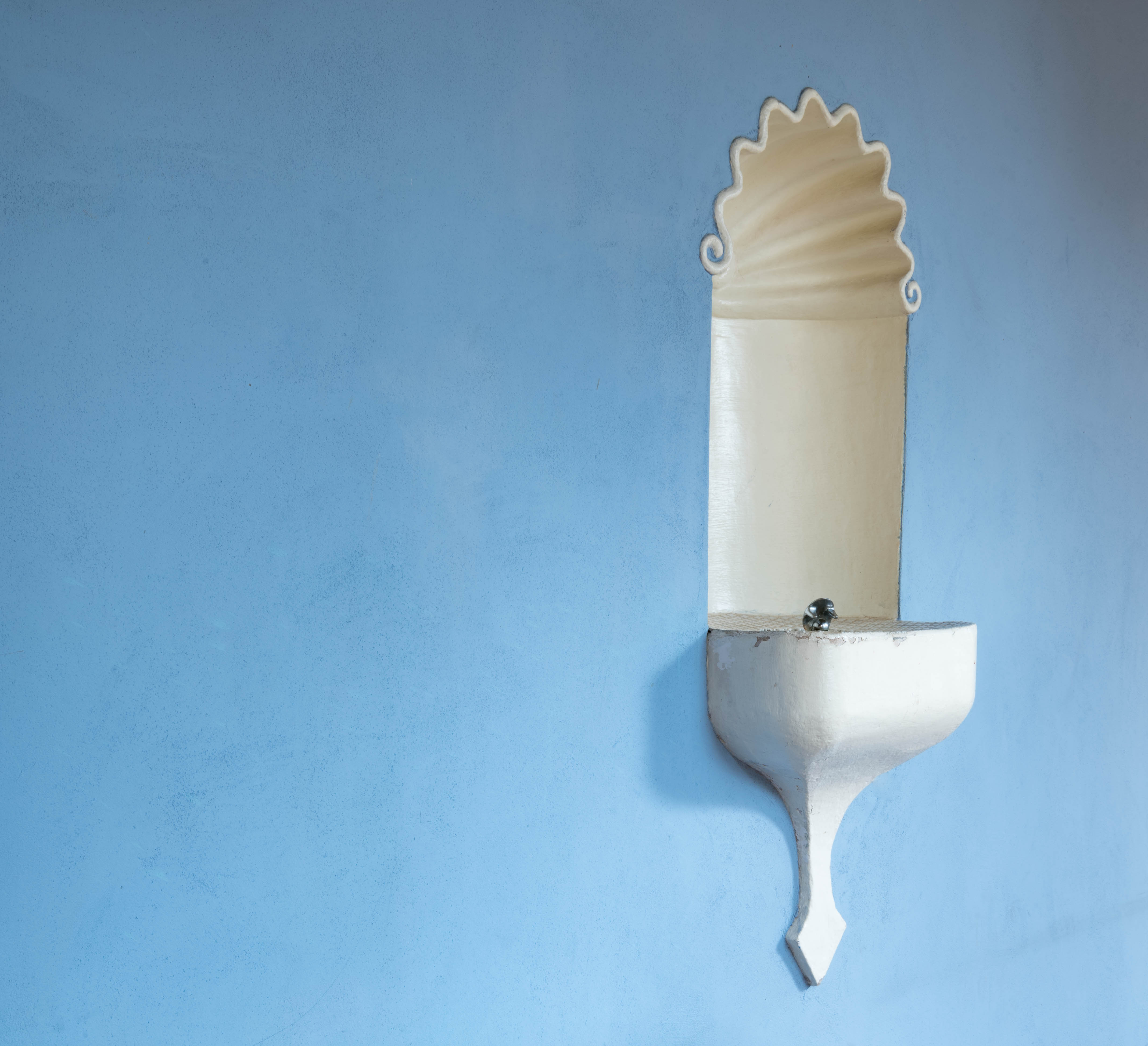
Hi Marcela, I agree, I like to see what works in others' photos--it helps me understand my own shots better so I can make progress at improving. I'm definitely going to straighten the fountain out. I thought I had, but apparently I either didn't straighten it enough, or I posted the wrong version of the shot :-( |
Mar 11th |
| 19 |
Mar 19 |
Reply |
Hi Stan, I hadn't thought about the negative space making the fountain look sort of lonely--and I like that analogy. I've been leaning toward keeping that expanse of wall because I felt the fountain had a physical "weight" to it--and I wanted something in the image to help balance that weight. Thanks for your comments! |
Mar 11th |
| 19 |
Mar 19 |
Reply |
Hi Isaac, thank you for your comments! I appreciate your posting the edited image. I thought I had straightened the fountain in my shot, but your image is definitely straighter. I'm wondering if I posted the wrong one of my images--I'll have to go back and check. But definitely it looks better straightened! Thanks! |
Mar 11th |
| 19 |
Mar 19 |
Comment |
Hi Carroll,
The detail in this is amazing! And the lighting on the hawks is beautiful. Have you tried cropping in a bit on the right edge? That might draw attention to the right hawk's talons more. I don't know if that would result in a nice composition, but might be something to experiment with. |
Mar 9th |
| 19 |
Mar 19 |
Comment |
Hi Marcela, How fortunate you are to have this venue close to you! Your image is beautiful. My only suggestion for this shot would be maybe to tone down the column leading off the upper right edge of the frame--my eye kind of follows it's path. If you have a chance to go back and shoot this another time, you might try bracketing the image so the windows in the center have more detail--however, I'm not sure that would improve the shot, just something to experiment with. The windows as they are in this shot are fine as they give the impression of the strong light coming through. |
Mar 9th |
| 19 |
Mar 19 |
Comment |
Wow! Gorgeous! Love how the detail in the fur stands out--how the backlighting of the ears appears, and that beautiful light around the muzzle (jaw?). This is really an outstanding image! I have only two very minor suggestions--one is to remove the small whitish sliver along the left upper edge of the frame (about halfway between snow and top edge). The other would be to consider removing the very small white "x" upper right, about 1/3 from top and about halfway from the right edge to the wolf's face. |
Mar 9th |
| 19 |
Mar 19 |
Comment |
Hi Stan, this is beautiful! The focus is spot on, and it's lovely how the gold in the temple is a color that is distributed throughout the photo in the reflections in the water, the ground at bottom left, the gold tones of the island and the yellowish-gold in the trees. The result is a really harmonious image--the building stands out, and yet it feels part of the surroundings. My only suggestion would be to clone out the tiny white cloud upper third center in the sky. |
Mar 9th |
| 19 |
Mar 19 |
Comment |
Hi Harriet--so neat that you have all of these wonderful and unique subjects to post pictures of from your home! What I especially like is how everything is in good focus--and how if you really examine the straw, it has coloring that complements/coordinates with the coloring of the eggs--the straw isn't just "blond." As Norm suggests, you might experiment with cropping--I'd keep that upper right corner of straw, since it has such lovely colors in it. |
Mar 9th |
| 19 |
Mar 19 |
Comment |
Hi John, this is an engaging composition! I like how the shadows from the railing are dark and crisp across the tiling and the steps--it gives the image a feeling that this was a hot day, and as Norm mentions--makes one want to jump right in! My only suggestion would be to crop a wee bit at the top--giving the top ball enough headroom, but bringing that top edge down a bit. |
Mar 9th |
| 19 |
Mar 19 |
Reply |
Hi Norm, thanks for your suggestions! I'll give that cropping a try. I was shooting on a tripod--I don't recall why I was shooting at f/20. I usually like to be in the mid-range--it was probably a setting leftover from shooting exterior buildings of the park. I was kind of flustered since I was set up in the middle of a pathway and I was trying not to get in the way of the few tourists coming through, so I may have just forgotten to readjust the f-stop. |
Mar 8th |
6 comments - 7 replies for Group 19
|
| 83 |
Mar 19 |
Reply |
Hi Graham (Charles)--thank you for your comments! I'll give the vignette a try and see how I like it... Best,Tracy |
Mar 29th |
| 83 |
Mar 19 |
Reply |
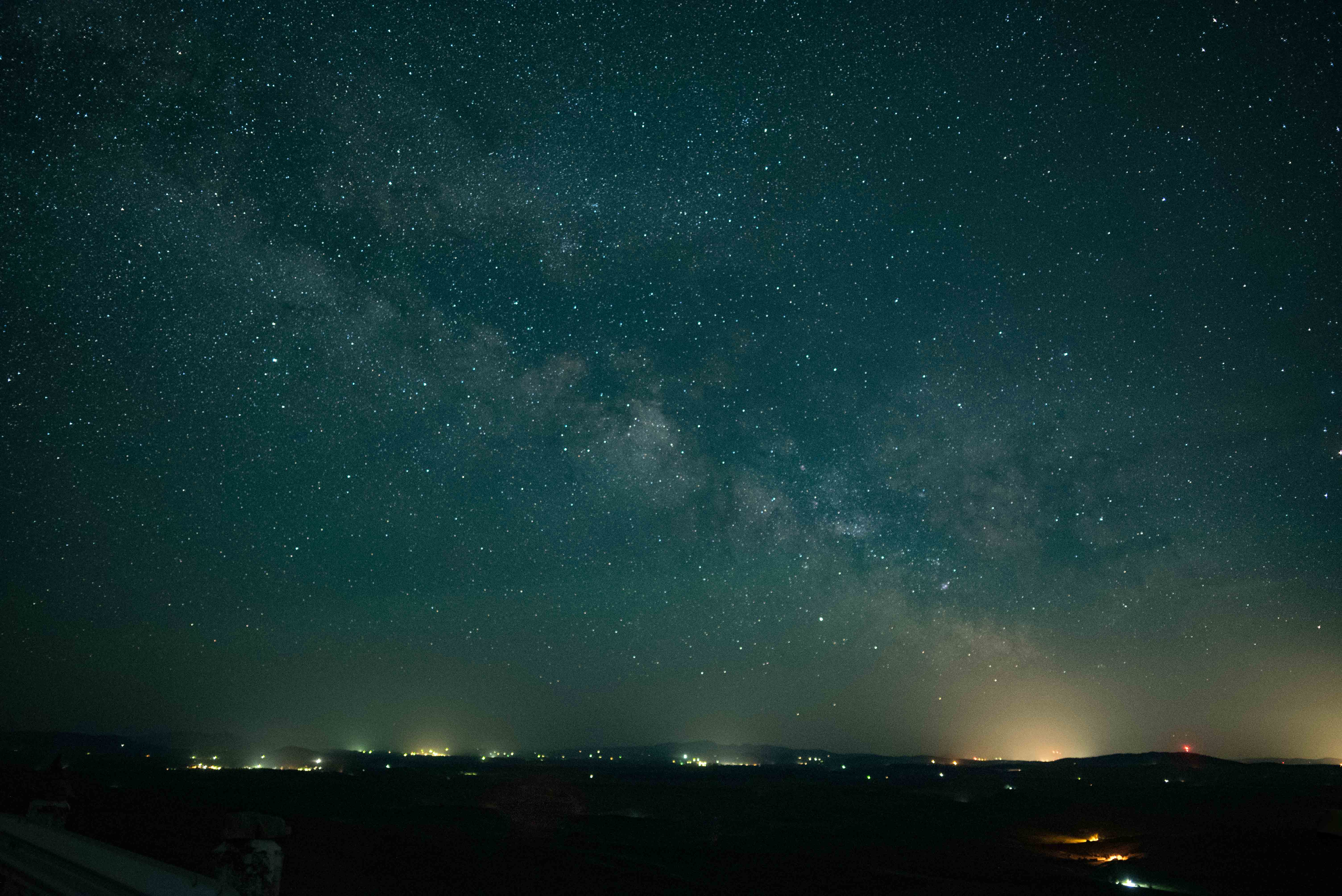
Hi Stephen--thank you for your comments! As it turns out, I was deliberately going for an Ansel Adams look as the monthly assigned subject for a camera club I'm in! |
Mar 29th |
| 83 |
Mar 19 |
Reply |
Hi Jane, Thank you for your thoughts! |
Mar 29th |
| 83 |
Mar 19 |
Reply |
Hi Judith--if the windows are blown out, adjusting the exposure won't bring in any of the detail, it will just make the windows darker. Using an HDR approach can bring in some possible detail, adding depth to the image. |
Mar 12th |
| 83 |
Mar 19 |
Comment |
Hi Graham (Charles)--This is a beautiful find! I almost wish the bottles were liquor bottles to provide a humorous contrast with the more family-oriented posters for the events ;-). I do like the contrast between the rounded-edged bottles and the more graphical/sharp-edged lines of the posters--if there was an element to bridge the two sections that might help tie the composition together, but I know you shot what was there. I wouldn't make any changes to this. |
Mar 12th |
| 83 |
Mar 19 |
Comment |
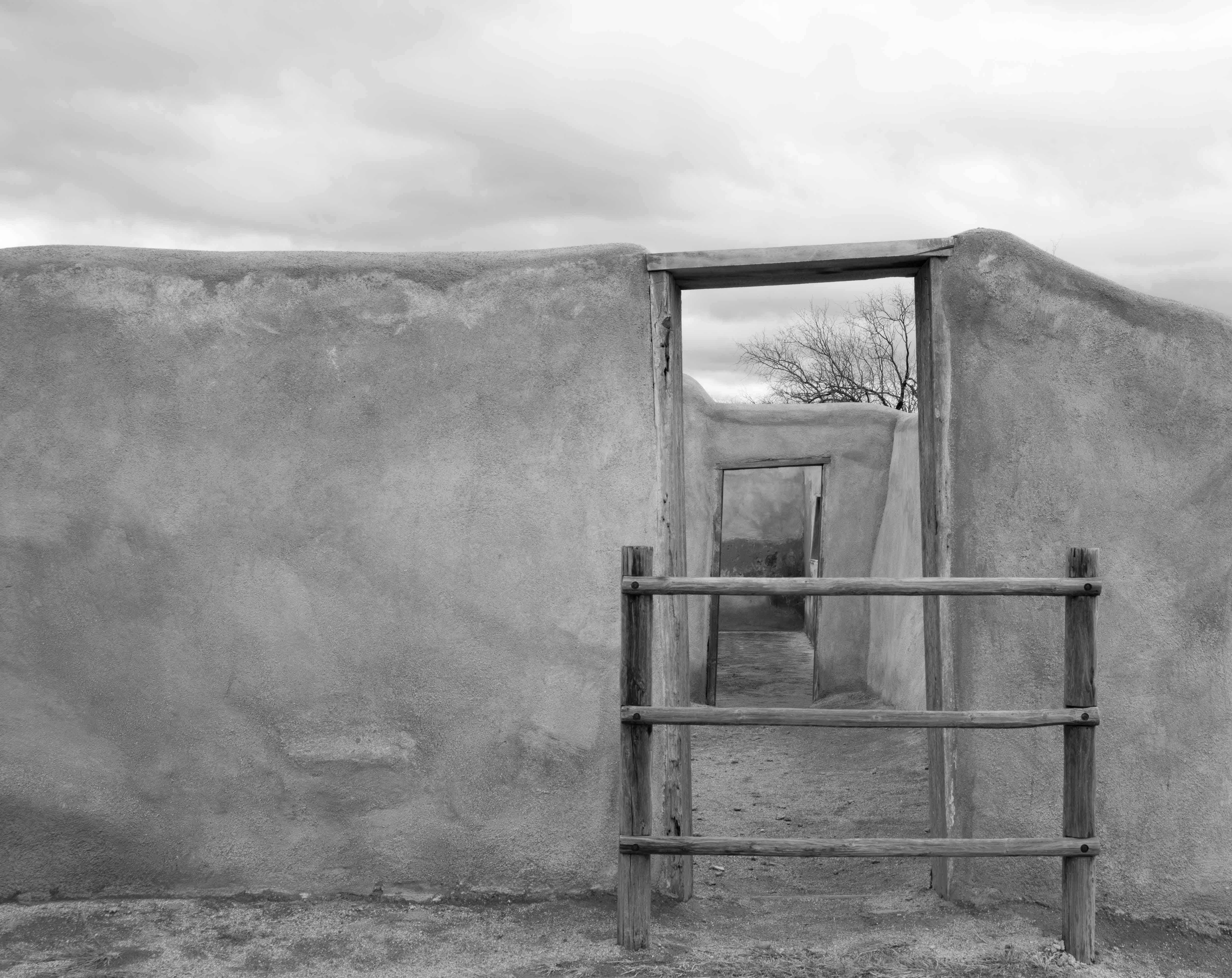
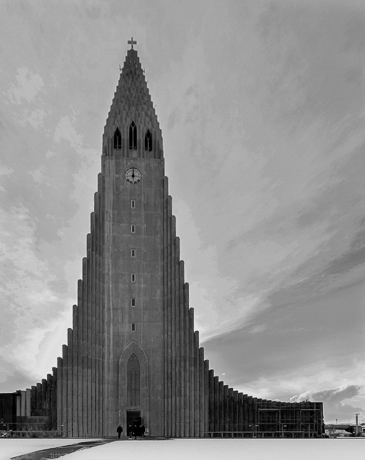
Hi Jane, you have a beautiful building here! I can see why you were captivated by it. I agree with Judith that the perspective of the building could be improved by making it more vertical. There are sliders in LR and PS (Camera Raw Filter) which can do that--I'm sure other editing programs offer that as well. In addition, I might suggest playing around with the cropping a bit. The composition is fine with the building in the center and the clouds appearing to spread out behind it--however, an off-center composition might be more interesting? I'm providing an example. When I downloaded your file it came across rather pixelated, so the focus on my edits is not sharp--you can just get an idea of my edits overall. I adjusted dehaze (to sharpen), vertical, exposure (lighter), contrast (more), highlights (less), shadows (less), whites (more), blacks (more), exposed the foreground more to brighten it, and exposed the figures in front of the building even more--to make them stand out. I also adjusted the contrast, etc. in the clouds by using the spot edit tool. Let me know if you have any questions about what I did! I hope you find my changes useful. |
Mar 12th |
 |
| 83 |
Mar 19 |
Reply |
Hi Judith, regarding your second comment--I think that's an important consideration. We're all doing our best to provide thoughtful feedback--and the process of providing that feedback in itself is a useful learning tool for each of us! And as contributors (of our photos), we need to have an ability to accept the feedback and then use it how it suits our vision. Even if I might disagree with how a photo might be edited (not that I necessarily do in this case) it's useful for me to learn how the edits were done. This is all a learning exercise, in many ways! And I'm grateful for feedback on my shots. |
Mar 8th |
| 83 |
Mar 19 |
Reply |
Hi Judith, thanks for your instructions! I like what you did with the sky very much--I was having a hard time getting that look with the other things I tried. I also like how you created that lighter "path" through the doors. In my (not shown) edited image, I also lightened the very distant wall at the end of the doorways to create more depth. I did manage to expand my image to create more room at the bottom and agree that it works better as a composition. So much to learn! |
Mar 6th |
| 83 |
Mar 19 |
Reply |
Hi Peter, thanks for your tips! I'll give those a try. I found a way to do this as well, by selecting crop and expanding the image and using content aware. I'm really happy with my results! I'm still learning PS one step at a time, so this was a neat (and very useful) thing to learn! |
Mar 6th |
| 83 |
Mar 19 |
Reply |
Hi Peter, I can't imagine what those experiences were like (yours, your daughter's, and her friend's). I know a few people who assisted in the rescue and aid work, but I myself was far from NY at the time (living in Spokane then). Even being as removed as I was from it, it still triggers an emotional response. Thanks for sharing your experience! |
Mar 6th |
| 83 |
Mar 19 |
Comment |
Hi Jose,
The lighting on this man's face, upper body, and hands is wonderful. I especially like how there is a softness of lighting in the face, and more detail in the lighting of his forearms and hands. I feel as if at first my eye is directed to the man's face (as a point of interest) and then led to the hands which are forming the pottery (because of the intricacy in lighting there)--which is the important story in the shot--nicely done. I prefer the cropped image others have suggested, because in the full image I feel as though the man's boot and lower leg is not connected to the man himself--which is a bit disconcerting. I really like the soft focus on the round bowls in front--they give nice depth to the image. |
Mar 4th |
| 83 |
Mar 19 |
Comment |
Hi Peter, it looks as though you've gotten some good feedback on your photo and so I'll add only a few minor comments. I see from one of your comments above that you agree you're not happy with the addition of the plane--and that is the only thing I'd like to mention in terms of my eval. I can't see a NY skyline with a plane in it without thinking of 911. Even if the composition worked with that plane included, I would suggest not including it--too many bad memories. I really appreciate that you've posted a photo that you have questions about--that's the intent of these groups! To post something we may not be 100% happy with in order to learn from each other. And I love the sky in your second image! |
Mar 4th |
| 83 |
Mar 19 |
Comment |
Hi Judith, this is a beautiful image--and what appeals to me most are the angles and lines in the shot, and the graphic (triangular/square) shapes. You've got all of these nice hard edges (tending to point inward) and then the center of focus is a human, with soft lines. I agree with the comment to darken the area your husband is walking into a tad--but other than that I have no suggestions. It's a cool shot! |
Mar 4th |
| 83 |
Mar 19 |
Comment |
Hi Dirk, You are so fortunate to have this nearby, so you can experiment with your shots! Your composition is really nice, with the diagonal floor at the bottom, the diagonal sweep of the candles across the top, and the almost circular movement of the chairs at bottom left. The image creates movement within it which is really appealing. My only suggestion would be to work on the lighting of those two upper left windows. You might try bracketing to get images you can combine into HDR--shooting three shots: 1) at an exposure to get the windows in detail (very low exposure for the rest of the room), 2) then a mid-range exposure, 3) then something like two stops up from the mid-range. I'm sure you're familiar with this technique, but if you aren't there are plenty of online videos for it. This is how some (very professional) real estate photographers shoot for upscale houses, so as not to have the windows blown out. All in all, it's an intriguing image. |
Mar 4th |
| 83 |
Mar 19 |
Reply |
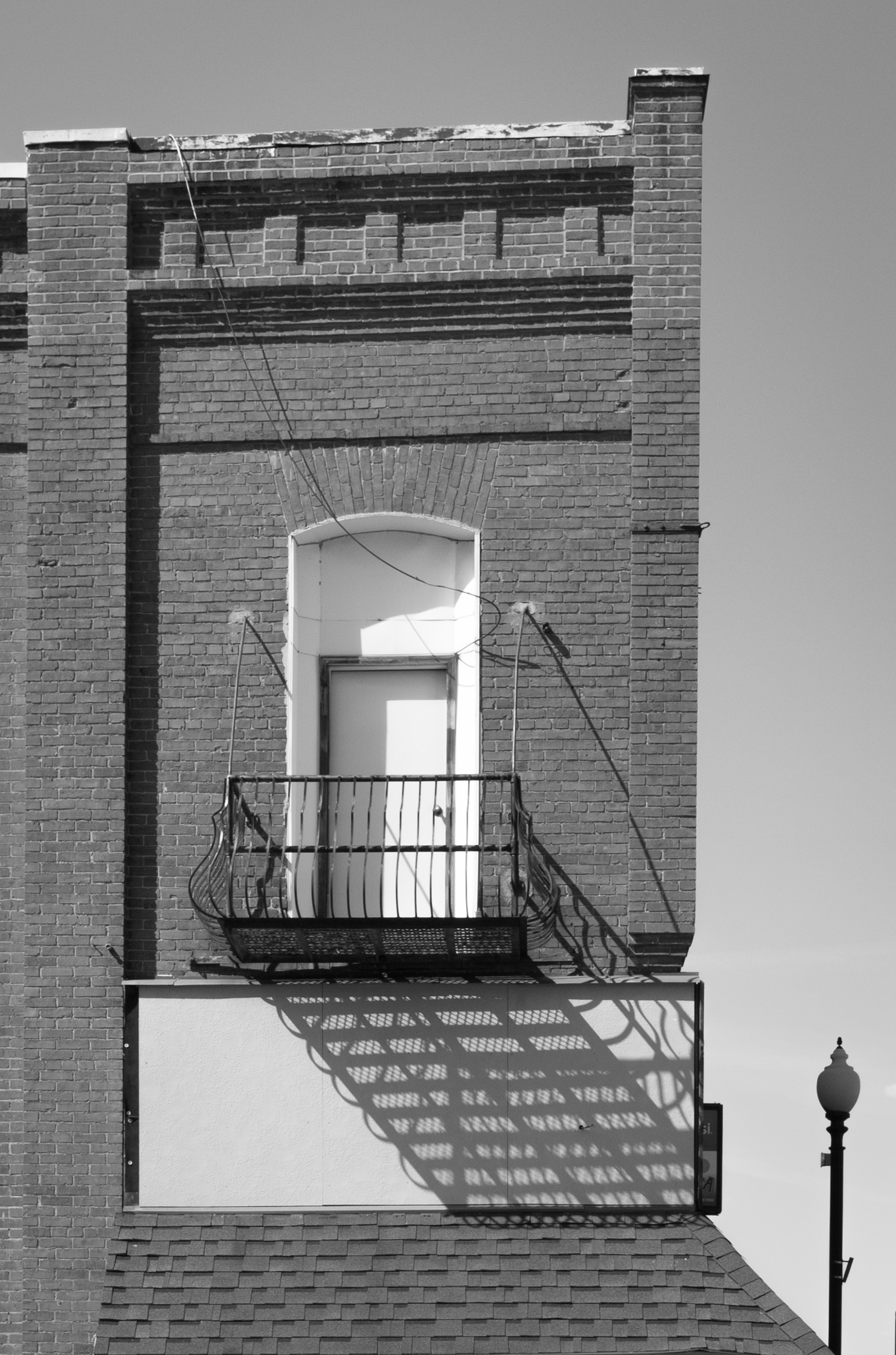
Hi Peter, thank you for your comments! I really struggled with the exposure on this--not sure whether I was getting it too light or too dark. My desire was to have that left side of the image include the blank wall to balance out the detail in the door frames--I'm glad you found the tonal variety in the wall to be interesting--I was going for that! I agree the bottom is too cramped. The issue I had was that there was a sidewalk-ish path with a curb in the bottom of the image, and I thought it distracted from the image so I cropped it out. I'm new to LR and PS, and it was too much for me to try and clone/heal. However, I've learned a new technique for expanding an image in Photoshop and I'll give that a try to create more space in the bottom of the image. I like your changes to the exposure in the sky. Thanks for your feedback! |
Mar 4th |
| 83 |
Mar 19 |
Reply |
Hi Jose, thank you for your feedback--I appreciate your suggestions! Please see my response to Peter below regarding the composition... |
Mar 4th |
6 comments - 10 replies for Group 83
|
12 comments - 17 replies Total
|