|
| Group |
Round |
C/R |
Comment |
Date |
Image |
| 19 |
Jan 19 |
Comment |
Thanks, Everyone! I really appreciate your suggestions and I'll play around with this a bit more. I wish I had a chance to go back there and reshoot this now! |
Jan 14th |
| 19 |
Jan 19 |
Comment |
I really like the intensity of the man's gaze, and the slightly upward-looking angle of it. The catchlights in his eyes are very nice. I find motion in photographs very appealing and I like how my eye moves around within this image with the sweeping curve/angles of the man's wrap, and the curved lines of his turban. Very nice! |
Jan 10th |
| 19 |
Jan 19 |
Comment |
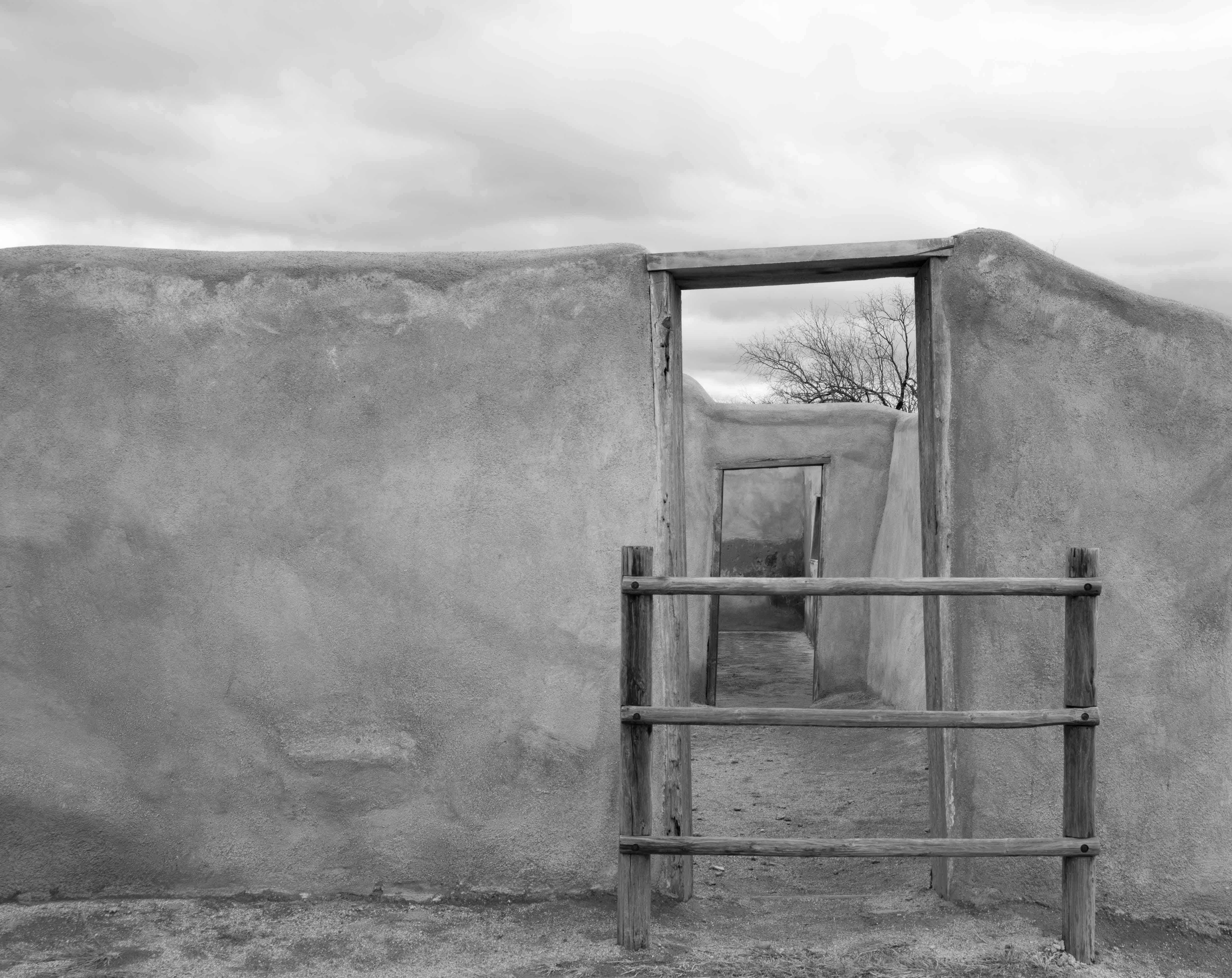
Love the tone of the colors, with the blue on the door standing out a bit but also blending in. This reminds me of an Escher print with the doorway leading out on the right and then the closet (?) doorway appearing to lead in, along with the angles of the moldings, floor, and door. There's a lot of motion in the image which is really appealing. |
Jan 10th |
| 19 |
Jan 19 |
Comment |
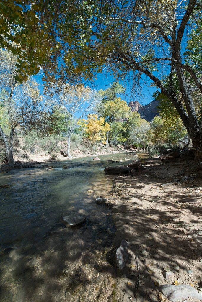
Beautiful! My only suggestion might be to darken the left bottom corner. At first I didn't realize there was the tree trunk there and I think the image might be stronger without that... but it's a minor consideration only. Nicely done. |
Jan 10th |
| 19 |
Jan 19 |
Comment |
Nice motion in the horse! I like the painterly effect the filter introduced. No suggestions... |
Jan 10th |
| 19 |
Jan 19 |
Comment |
I like this image with the diagonals keeping my eye in the frame, and the interplay between the red ball and flag. I can't tell if the writing on the ball reads "RIP" or something else--the "RIP" caught my attention and made me wonder about the purpose of the ball and flag. Not sure if that was your intent, but it is intriguing! |
Jan 10th |
6 comments - 0 replies for Group 19
|
| 83 |
Jan 19 |
Comment |
Hi Everyone,
Thanks so much for your comments! I'll take a look at this again and see how I can improve it based on your suggestions.
Best,
Tracy |
Jan 14th |
| 83 |
Jan 19 |
Comment |
I like the composition, however it seems that the clarity of focus is on the water rather than on the surfer. I think this would be a stronger shot with the clarity on the surfer, and the water being blurred more. |
Jan 12th |
| 83 |
Jan 19 |
Comment |
Hi Graham (Charles), I like the posturing of these two men and the B&W treatment of the scene. The right hand of the gentleman on the left is a bit disturbing to me since he has it clenched so. It seems as if the gentleman on the right is relaxed and non-worried, and the smiling face of the left-hand guy goes along with that vibe, so the clenched hand on the right-hand guy seems a bit out of sorts. Maybe his hand isn't clenched, maybe he's just moving his fingers, but the tension in that part of the image doesn't work for me... I really like the rest of it, though. |
Jan 12th |
| 83 |
Jan 19 |
Comment |
How fortunate you were to see this building! I really like the shot--my only comment is that the facade with the painting of the face looks rather weathered and yet the side of the building to the left looks new. I know you didn't have any control over this, but those two appearances (weathered and new) make the image appear to me as if it is a composition of two images with one superimposed--and I find that a bit distracting. Again, nothing you would have had any control over, and the uniqueness of the facial painting is intriguing. |
Jan 12th |
| 83 |
Jan 19 |
Comment |
Your creativity is inspiring! I'm not sure I understand the significance of the oval shapes on the left of the image--and perhaps they detract from the central figure of the woman. I like the crop that Judith did which presents the woman's face as a central feature. I'm very impressed by your photo editing skills! I have a lot to learn in that regard. |
Jan 12th |
5 comments - 0 replies for Group 83
|
11 comments - 0 replies Total
|