|
| Group |
Round |
C/R |
Comment |
Date |
Image |
| 19 |
Dec 18 |
Comment |
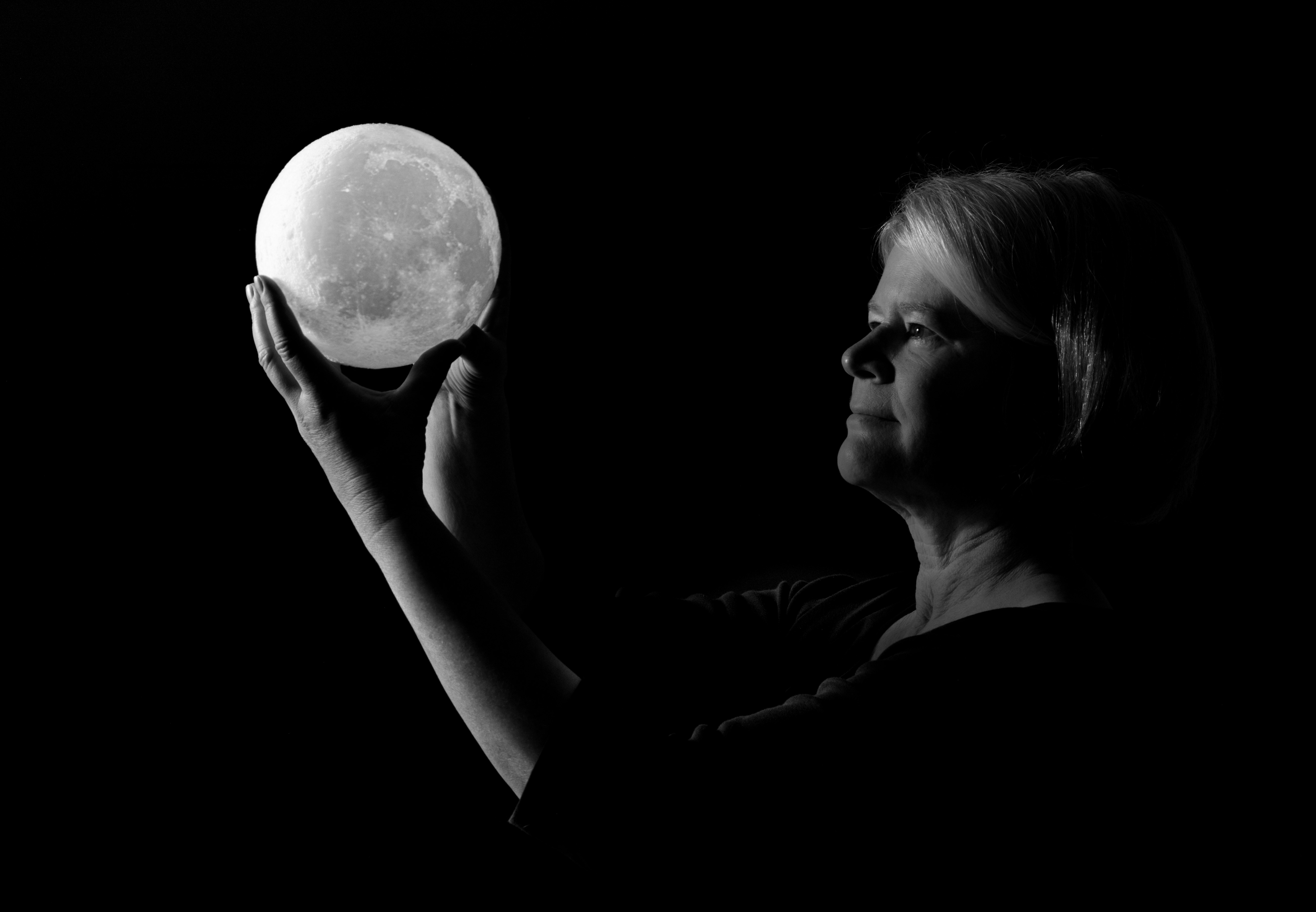
Thanks everyone! Your suggestions are helpful. This may be an image I continue experiment with. |
Dec 19th |
| 19 |
Dec 18 |
Reply |
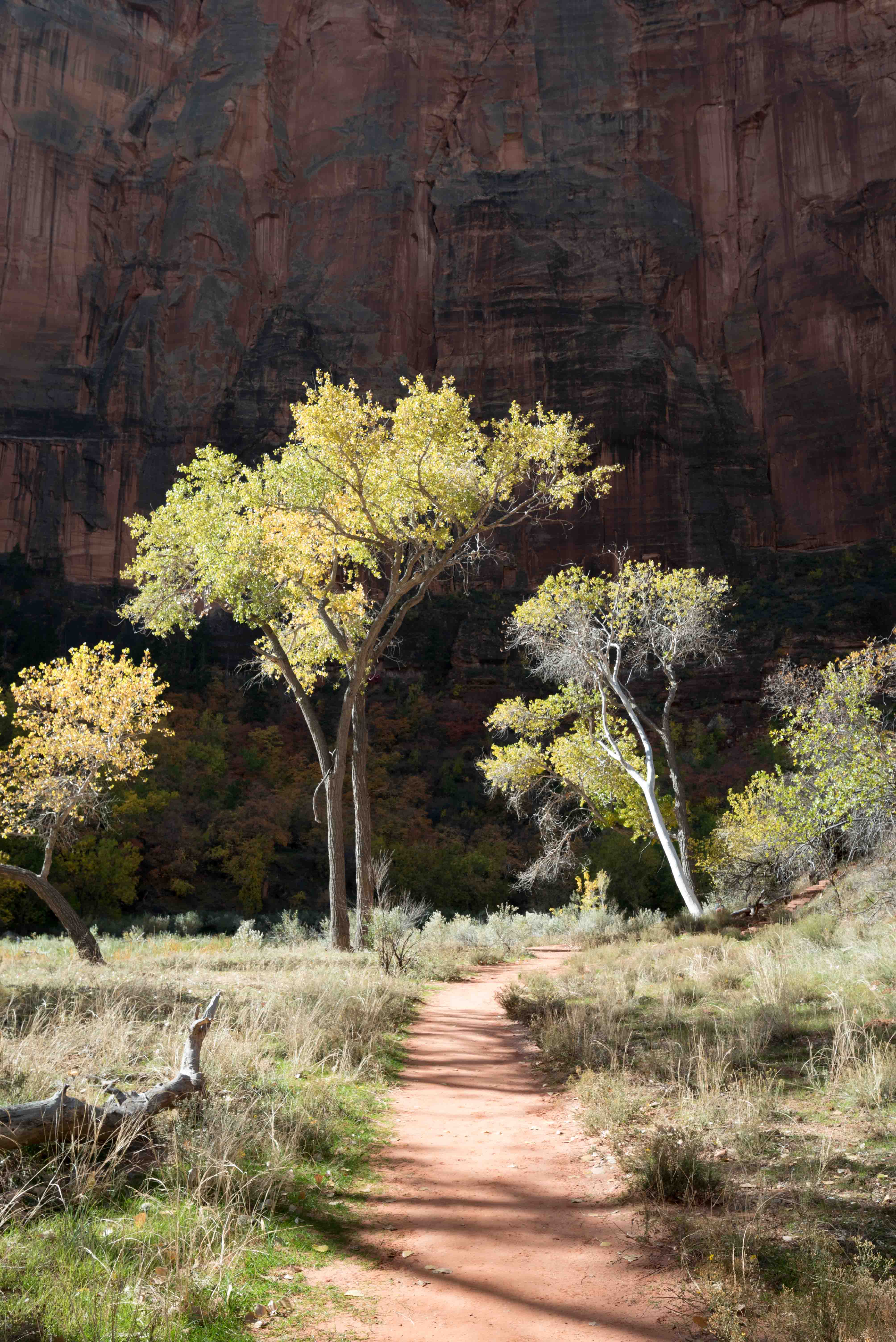
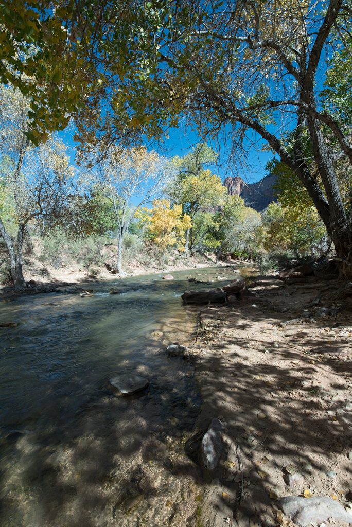
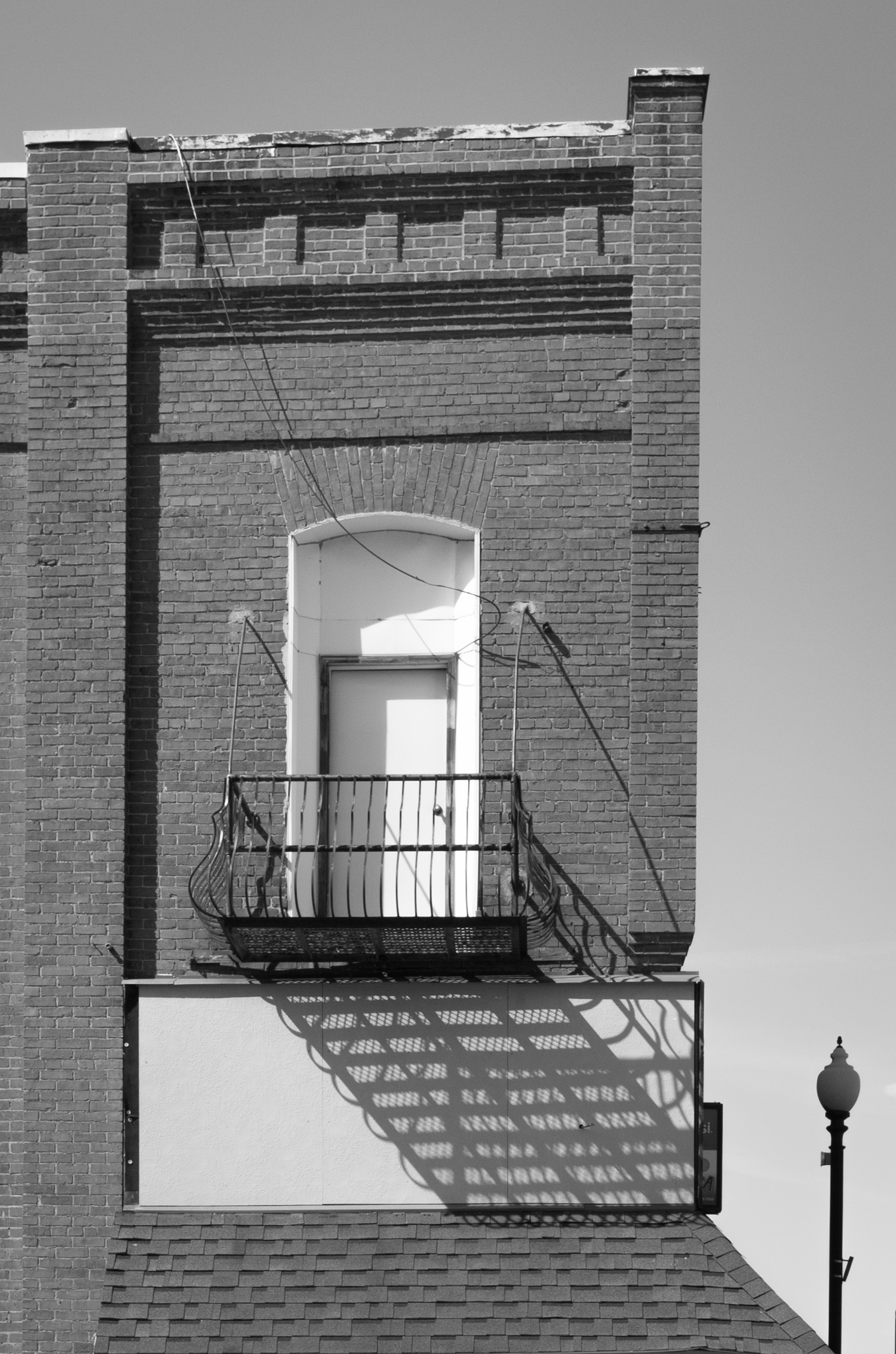
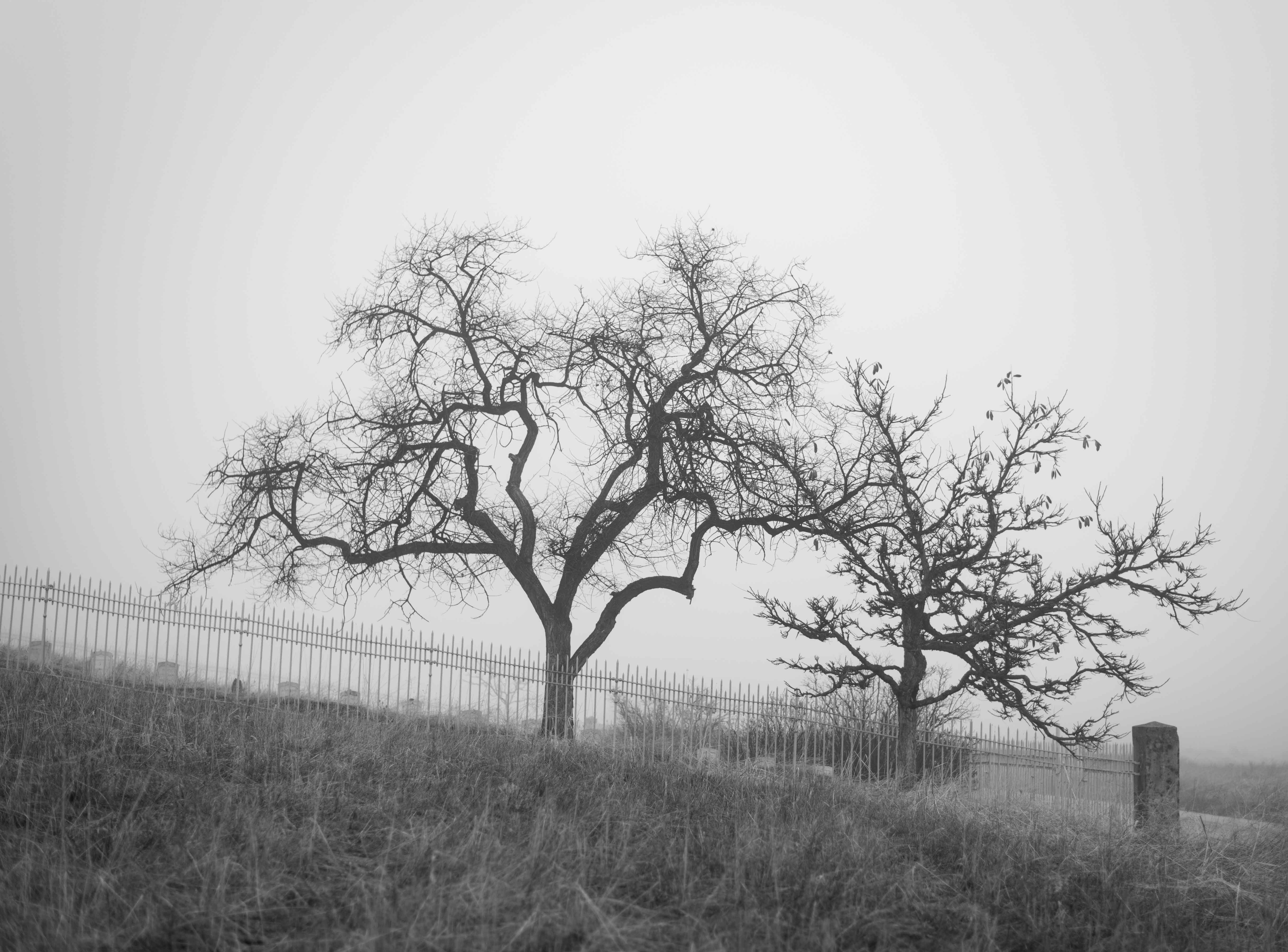
Hi Stan, I might go back and shoot from different locations on the street to experiment some more. A challenge with the site was that there were some trees with low overhanging branches that I had to work around--if I remember correctly, I found them in the way of my "best perspective." When I can, I'm going to go back and reshoot--following everyone's ideas. Thanks for your suggestions! (and it just may be a shot that won't get better--but that's okay, I'm chalking this up to "learning curve"! :-) ) |
Dec 9th |
| 19 |
Dec 18 |
Reply |
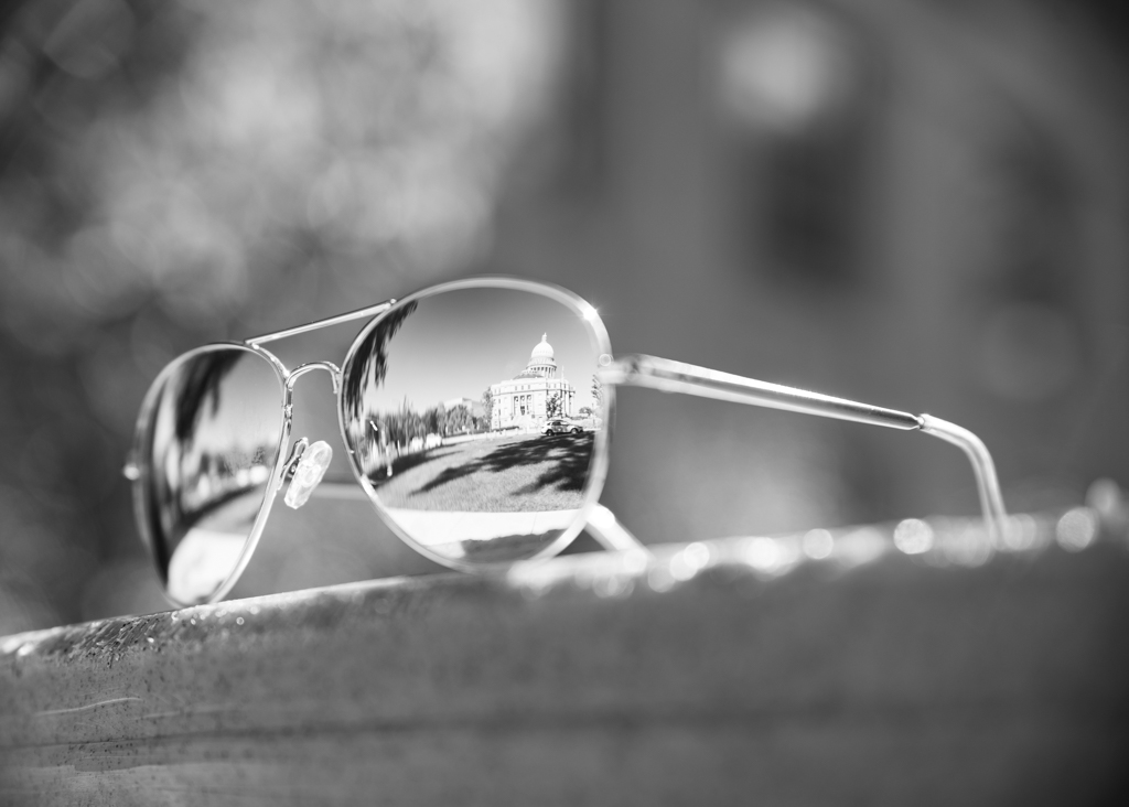
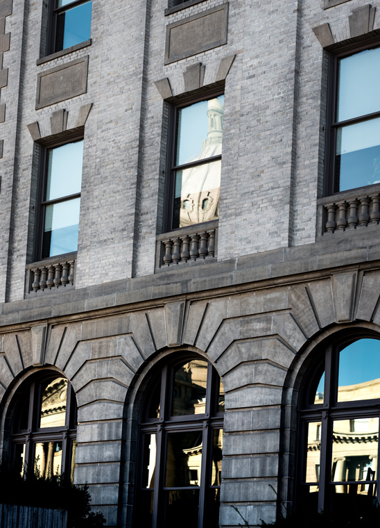
Hi Norm, thanks for your suggestions! In fact, the capitol building is across the street from the building I shot, and it has public access with windows--so I could explore that as an option, although I'm not sure about the success shooting through windows (haven't tried that yet--but could be a fun experiment). |
Dec 9th |
| 19 |
Dec 18 |
Comment |
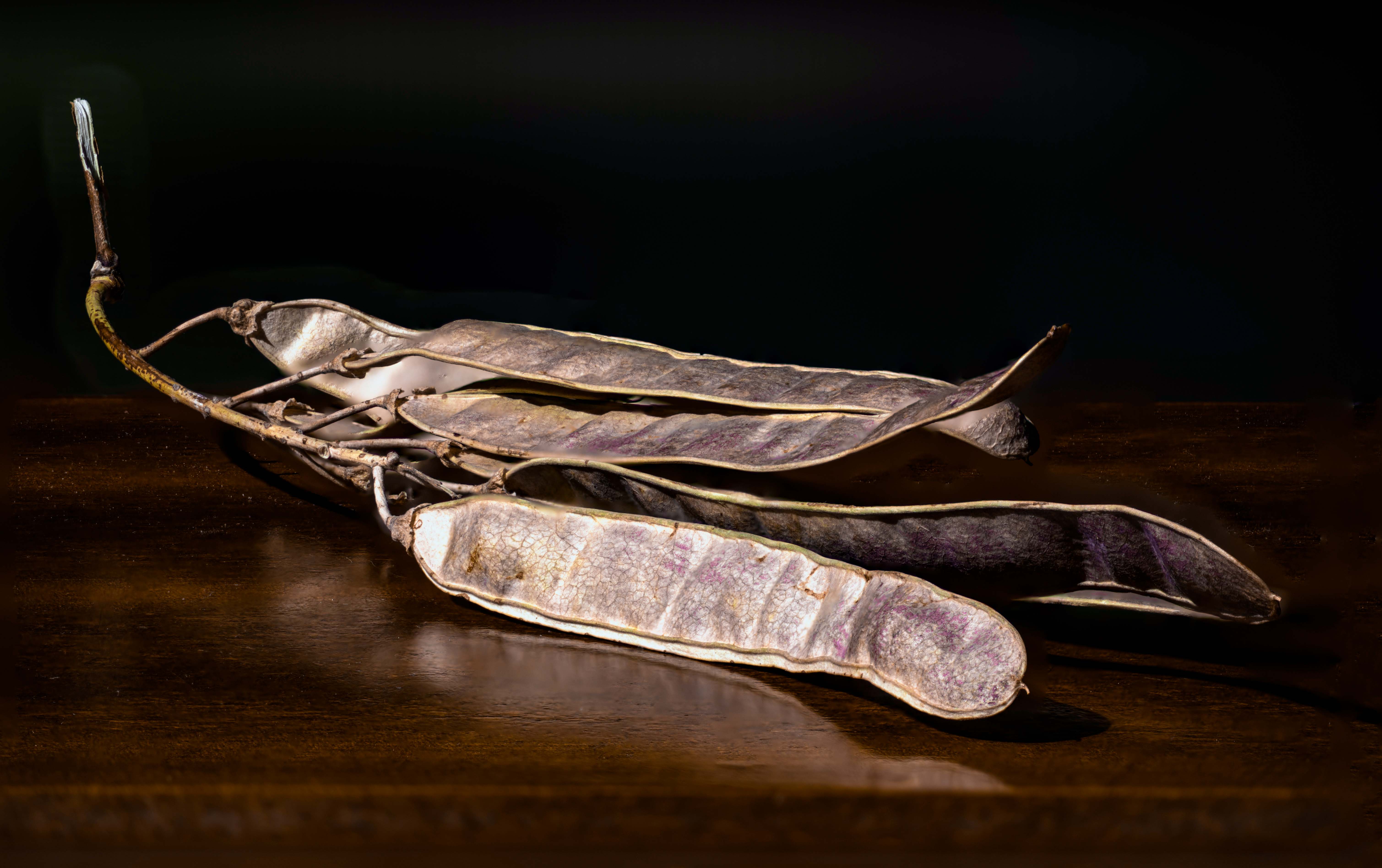
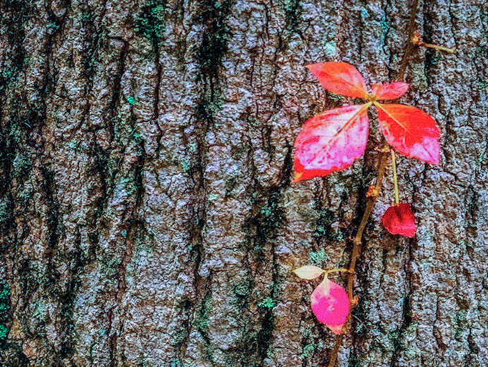
I like this as a nature shot--however, I'm wondering if there is a bit of busyness with the texture of the bark competing with the red leaves. Would cropping in to keep just the larger set of leaves and maybe the leaf set below it help bring more attention to the leaves? Attaching an example of a crop, with a bit of white balance modified. |
Dec 8th |
 |
| 19 |
Dec 18 |
Comment |
Lovely shot! The candle lighting the gentleman's face is beautiful, and the glimmer of candlelight at the bottom edge of his hat is perfect. I don't have any suggestions, although I like Norm's ideas about cropping a wee bit. |
Dec 8th |
| 19 |
Dec 18 |
Comment |
Wow! What I especially like about this is that you've captured the beauty and shimmer of the gold architecture, and my eye is immediately drawn to the center light and the tower above it--then, as I look at the details of the image closer, I find the people on the right who are praying--it's sort of a combination of opulence and humility which is engaging. No suggestions for improvement upon this... |
Dec 8th |
| 19 |
Dec 18 |
Comment |
I love the sharp/brilliant detail of the yellow wings against the bright red flowers at top--the wee bit of orangey-red in the bottom part of the butterfuly, and the muted red echoed in the flower beneath the left tip of the butterfly. As well as the other splotches of red in the image. The butterfly is sharp and colorful--and anchored to the rest of the image with that carry-through of the red. Maybe experiment with cropping a bit off the bottom? I'm not sure the image needs it, but eliminating the right spots along the bottom edge? |
Dec 6th |
| 19 |
Dec 18 |
Comment |
Lovely! I like how there is an S-shaped circular pattern between the shaded side of the rose on top and the shaded side of the rose on the bottom. That, combined with the lighter sides of each rose really keeps my eye in the image. Nicely done! |
Dec 6th |
| 19 |
Dec 18 |
Comment |
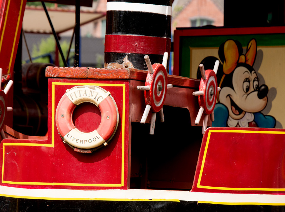
A very fun image! I like the red-and-white circles repeated in the ship's wheels and the life preserver; as well as the black-and white-striping in the tower and the lower part of the image. My only suggestion would be to crop in a wee bit vertically and on the right edge. |
Dec 6th |
 |
| 19 |
Dec 18 |
Reply |
Thanks, Bob! Your comments are really helpful. I'm looking forward to giving it another try, taking your suggestions into account. |
Dec 6th |
7 comments - 3 replies for Group 19
|
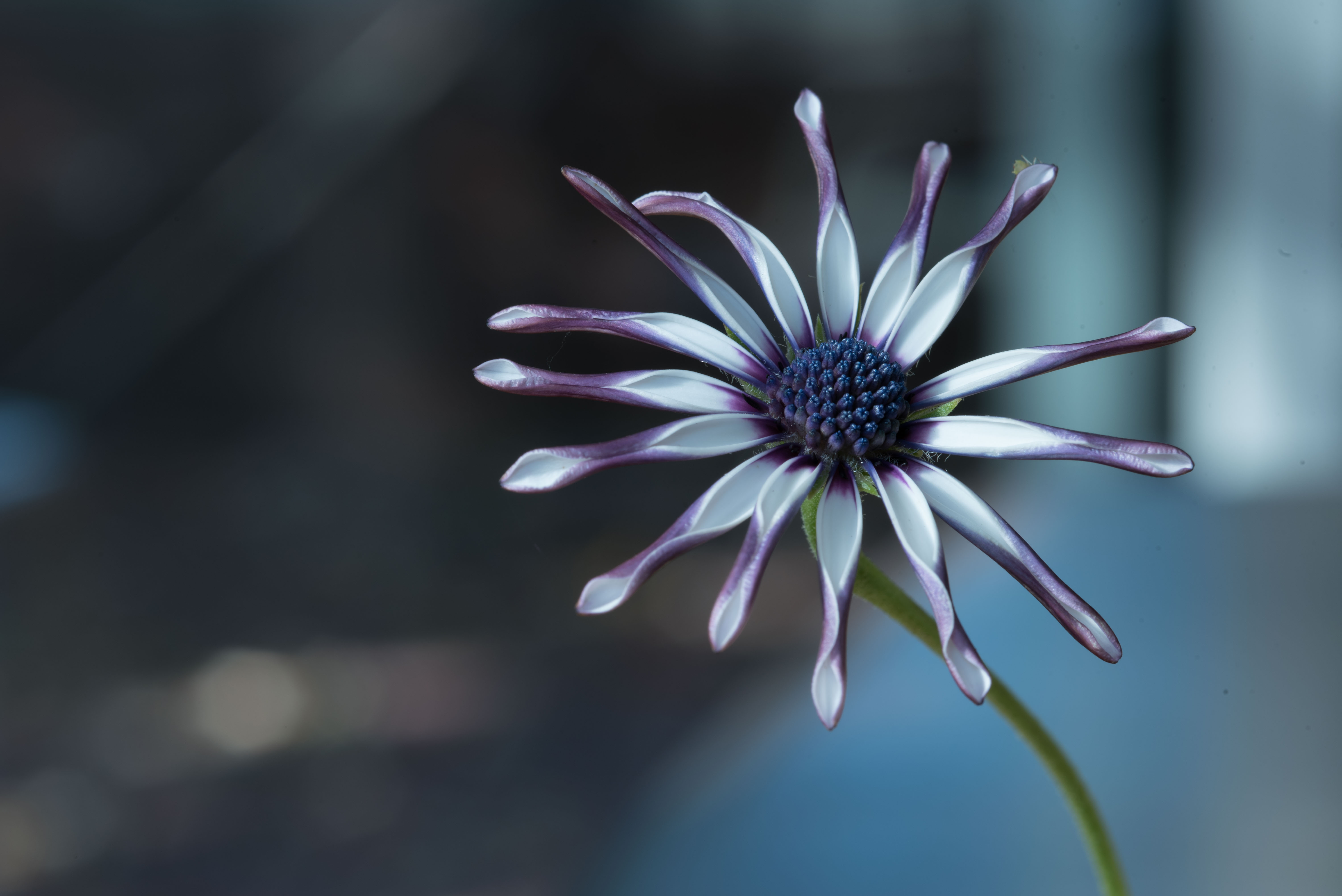
| 83 |
Dec 18 |
Reply |
Hi Jane,
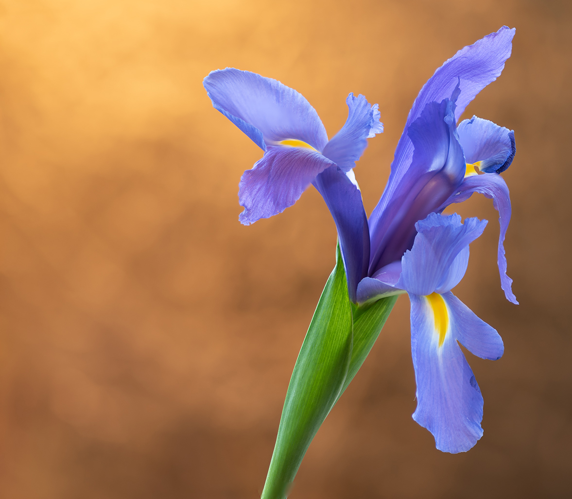
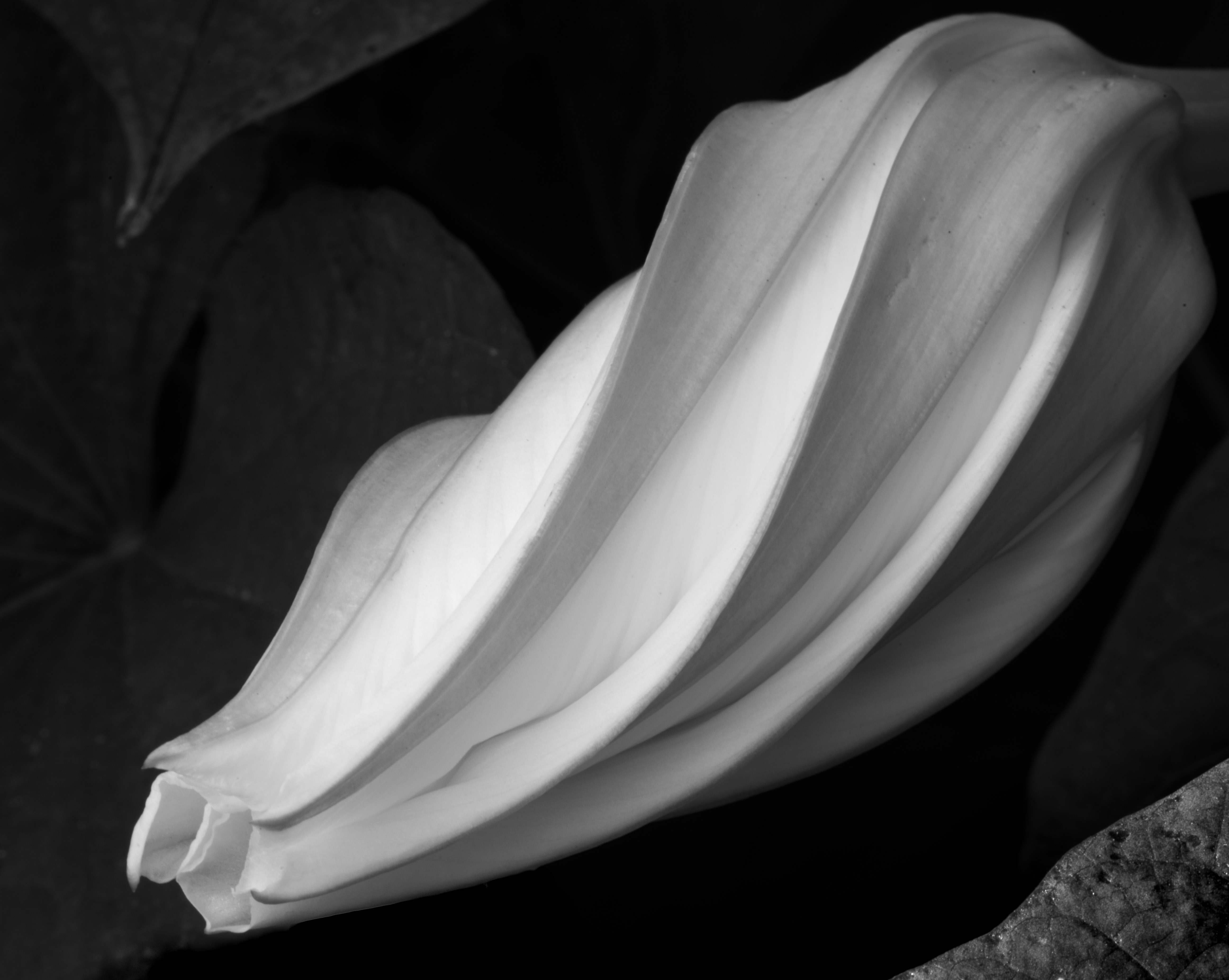
Thank you for your feedback! I'm afraid I don't know what I did especially to make the flower look metallic. However, the color image had quite a bit of lavender/purple-ish color in it, and that lavender color was next to areas in the leaves which were very bright white. I thank that lavender/white combination may have contributed to the"metallic" look!
|
Dec 19th |
| 83 |
Dec 18 |
Reply |
Hi Judith, thanks so much for your suggestions, and for the example edited image! I like what you've done with it and agree it improves the shot. |
Dec 7th |
| 83 |
Dec 18 |
Reply |
Hi Peter, thanks for posting the cropped image for comparison. I agree--I like the cropped image better. I think this may have been what Stephen was suggesting as well--formatting the shot as a square image. Thanks for the suggestion! |
Dec 6th |
| 83 |
Dec 18 |
Comment |
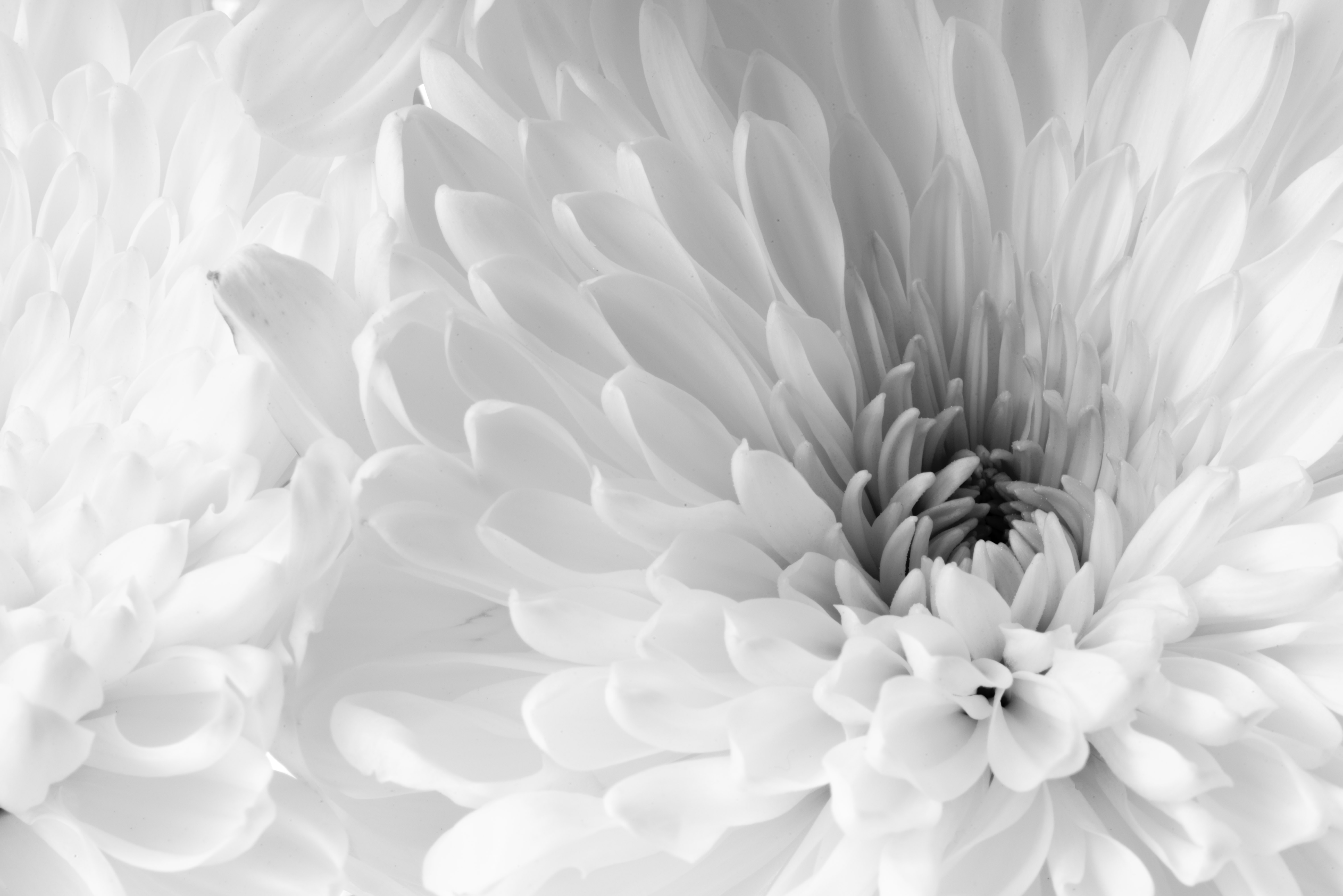
Hi Graham (Charles), Thanks for your comments! I did fairly minimal post on this in LR. After converting to Black & White, I cropped a bit and cleaned up some spots from the lens. I did a small amount of Dehaze (+22), and adjusted the Highlights (+39) and Whites (+7) to within the limits of the histogram. I've included the original image here. |
Dec 4th |
 |
| 83 |
Dec 18 |
Reply |
Hi Stephen, I'll give that square format and black background a try! Thanks for the suggestion. |
Dec 4th |
| 83 |
Dec 18 |
Reply |
Hi Peter, I don't know that I'd call your handling of the image "sloppiness" ;-) It's a very cool shot and it works really well in B&W. I don't have any experience with Nik software--I do all my mono adjustments in LR--but maybe I should give Nik a try!
I looked at the RAW image in LR, and I think what I was mistakenly calling pixelation is a softness of focus on the wing feathers, which in the B&W image looked a bit like pixelation to me. My mistake!
|
Dec 2nd |
| 83 |
Dec 18 |
Reply |
Hi Dirk-Olaf, probably what I was referring to as pixelation is rather an out-of-focus-ness of the underside of the feathers on the wings. It looks a bit pixelated, but it probably isn't actually. |
Dec 2nd |
| 83 |
Dec 18 |
Comment |
This is a beautiful image of the pelican landing! I'm wondering, though, if the Nik effects are doing justice to the image? There's quite a bit of distortion/pixelation in the wings which might be blurred better not using Nik? Do you have an original image to share to compare this against? It's a sweet moment of the Pelican sweeping the water--just wondering if there are other editing optiosn which might help the display of the wing tips!
|
Dec 1st |
| 83 |
Dec 18 |
Comment |
Hi Graham,
You did a great job capturing the reflections in the logo!
What focal length and aperture were you using? This might have worked best with a macro lens, zoomed in on the logo itself and not including the area to the sides. I think the reflections in the emblem are what make the image here!
|
Dec 1st |
| 83 |
Dec 18 |
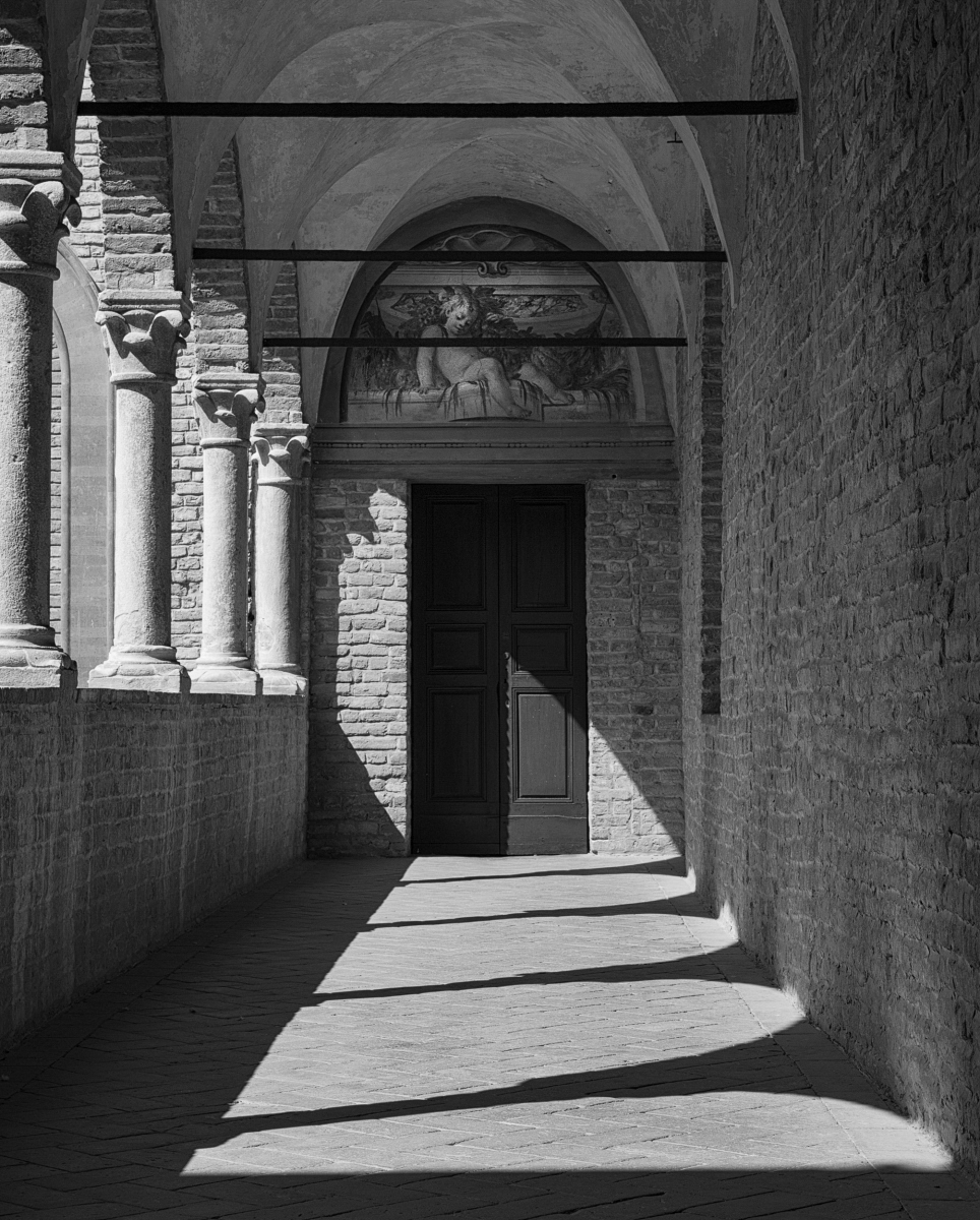
Comment |
Beautiful! And how fortunate you were to be in Italy to get the shot! I don't mind the three bars in the ceiling being included--they mimic the shadows on the flooring, and it might seem strange without them to see the shadows without something apparent to be casting the shadows.
I like how the shadows on the floor point downward to the left, and the similarly lit columns rise from the left upward--creates a nice flow in the image to keep one's eye in the frame.
My only suggestion would be to pump up the contrast a bit so the bricks are more defined... Sample included here.
Very nice shot! |
Dec 1st |
 |
| 83 |
Dec 18 |
Comment |
Very nice! I really like the motion in the image which sweeps around with the horizontal and diagonal angles. The contrast between the soft clouds and the sharp lines of the building is also intriguing. |
Dec 1st |
| 83 |
Dec 18 |
Comment |
Both of these are lovely photos. The softness in the clouds and in the reflection in the water are very nicely captured. I also like the movement between the silhouette of the dark tree against the clouds and the tree on the left which appears white against the darker treed background. These create a nice triangle with the lighter water in the foreground. My only suggestion would be to see how the image looks cropping in some on the sides and may brighten the whites a bit. Sample edit included here. |
Dec 1st |
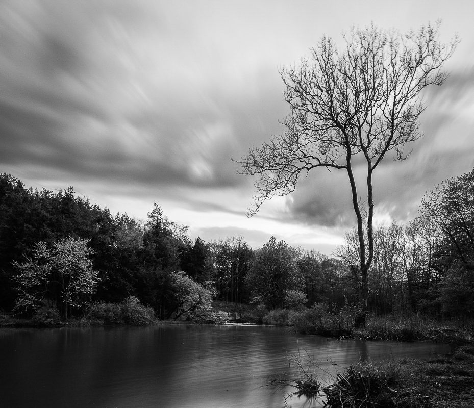 |
6 comments - 6 replies for Group 83
|
13 comments - 9 replies Total
|