|
| Group |
Round |
C/R |
Comment |
Date |
Image |
| 19 |
Nov 18 |
Reply |
Thanks, Norm! I'll give that a try. |
Nov 9th |
| 19 |
Nov 18 |
Comment |
Beautiful image! The colors of the orange in the robes and the oranges in the fire work really well. I also like the serenity in the monk's gaze, and the languid draping of the monk's right arm. I know this isn't something you had any control over, but the sharp bend in the monk's left wrist is a bit disturbing to me...I think because at first glance I can't tell whether this is a hand clasped on his right knee, or a hand which is deformed at the wrist, and the tension in that hand posture conflicts with the relaxed posture of the monk otherwise. |
Nov 8th |
| 19 |
Nov 18 |
Comment |
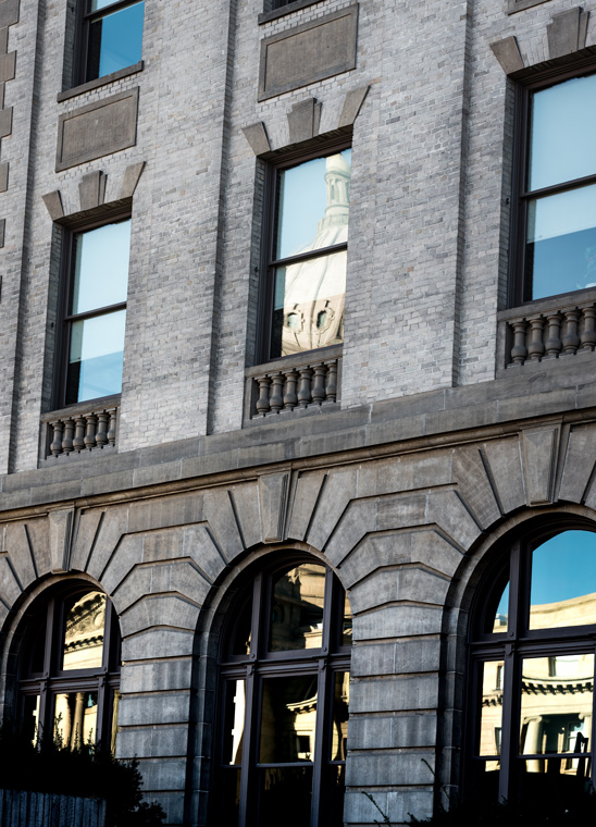
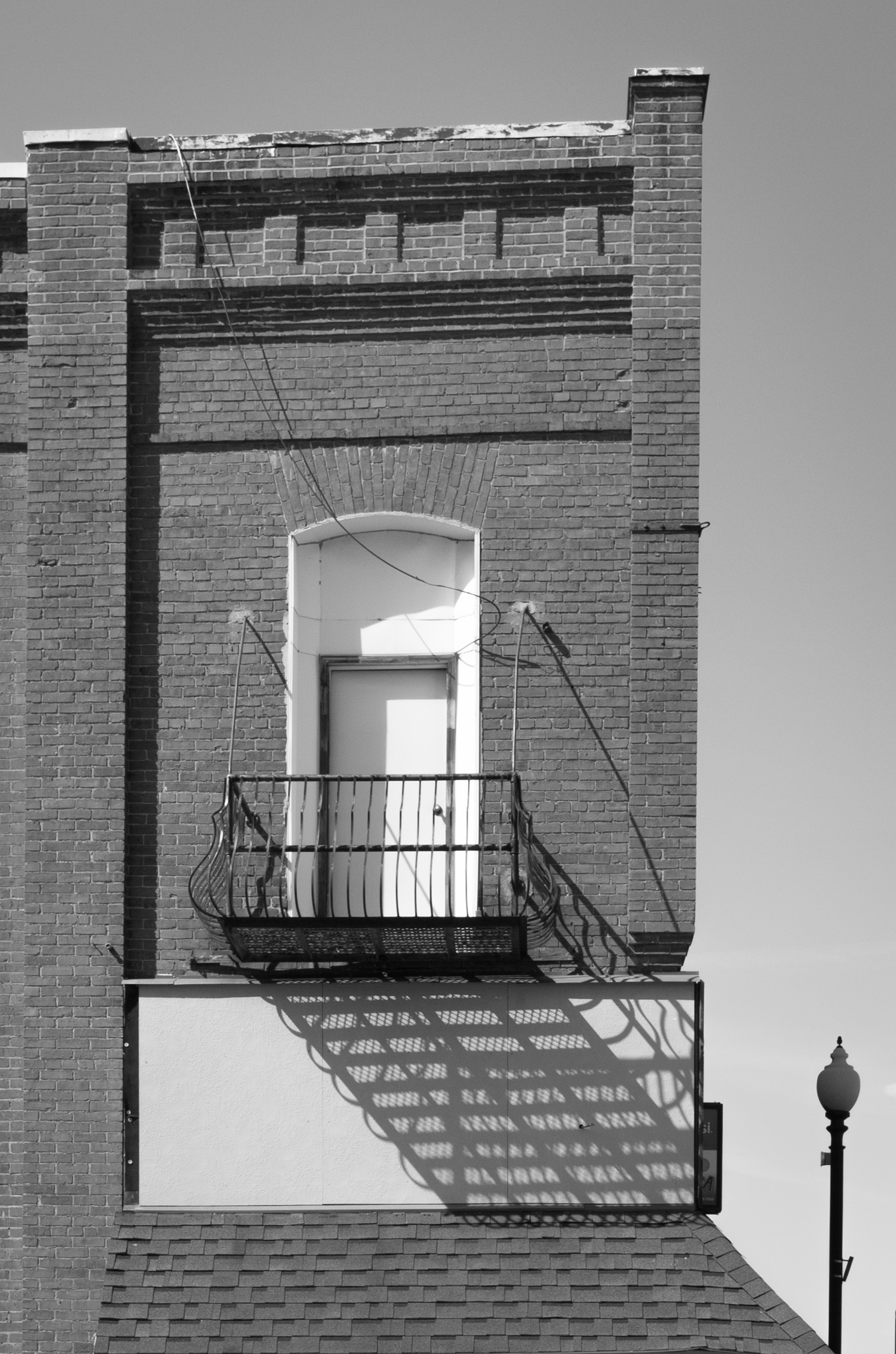
Very cool shot! My only thoughts might be to crop a bit from the right and decrease the saturation just a wee bit to tone down the reds in the gentleman's cap and newspaper? The beautiful, subtle colors of the brickwork in the upper left corner of the frame are so nice that I'd like to see the model's colors blending in a bit more with those. However, the juxtaposition of the real guy with the statue is also powerful--so maybe toning down the saturation wouldn't help--but might be something to experiment with. |
Nov 8th |
| 19 |
Nov 18 |
Comment |
Love this! The position of the chair off-center and facing to the left adds a lot of tension/drama to the image. I think we'd normally expect to see the chair on the right side of the frame, facing left, as we would a portrait, so the position on the left side of the frame adds to it's importance and creates drama in the space behind it. The room being almost monochrome and the view beyond the windows being in color add to the story as well. Knowing this was taken at Ellis Island, I can read a story into the image of the hardship of those crossing over to Ellis Island (the "monochrome" of this room), and the (colorful/hopeful) life beyond this room. I may be reading more into the image than you expected, but that's the kind of image it is--it gives one a lot to think about! Which is very desirable! |
Nov 8th |
| 19 |
Nov 18 |
Comment |
Hi Stan,
There's a really nice play here between the red and white of the boat, and the red and white of the building. I don't have any suggestions for improvement, other than to maybe play around with some cropping (perhaps on the sides) to amplify the connection between the reds and whites in the house and the boat? Just something to experiment with... |
Nov 8th |
| 19 |
Nov 18 |
Comment |
She looks like a very sweet dog! The photo captures a sweet personality (or "dogality"). The vignetting works well. Like Norm, I question the focus of the eyes. I think if anything needs to be tack sharp in a portrait, it needs to be the eyes--it looks as if her nose is perfectly in focus, however, the eyes are a little soft. I also think the leaves are a bit distracting, but I understand this was a shot of her in the garden--maybe reduce the exposure on the leaves so they don't draw as much attention? That might be something to play around with... |
Nov 8th |
| 19 |
Nov 18 |
Comment |
Very nice! I like the movement of light and dark in the image, and the interesting details, such as the clothes clips and the gentleman's ink-stained fingers. The movement of the wheel in the foreground adds a nice sense of time passing. I'm in favor of Norm's cropping suggestions--I think they might add to the intimacy of the image. |
Nov 8th |
| 19 |
Nov 18 |
Reply |
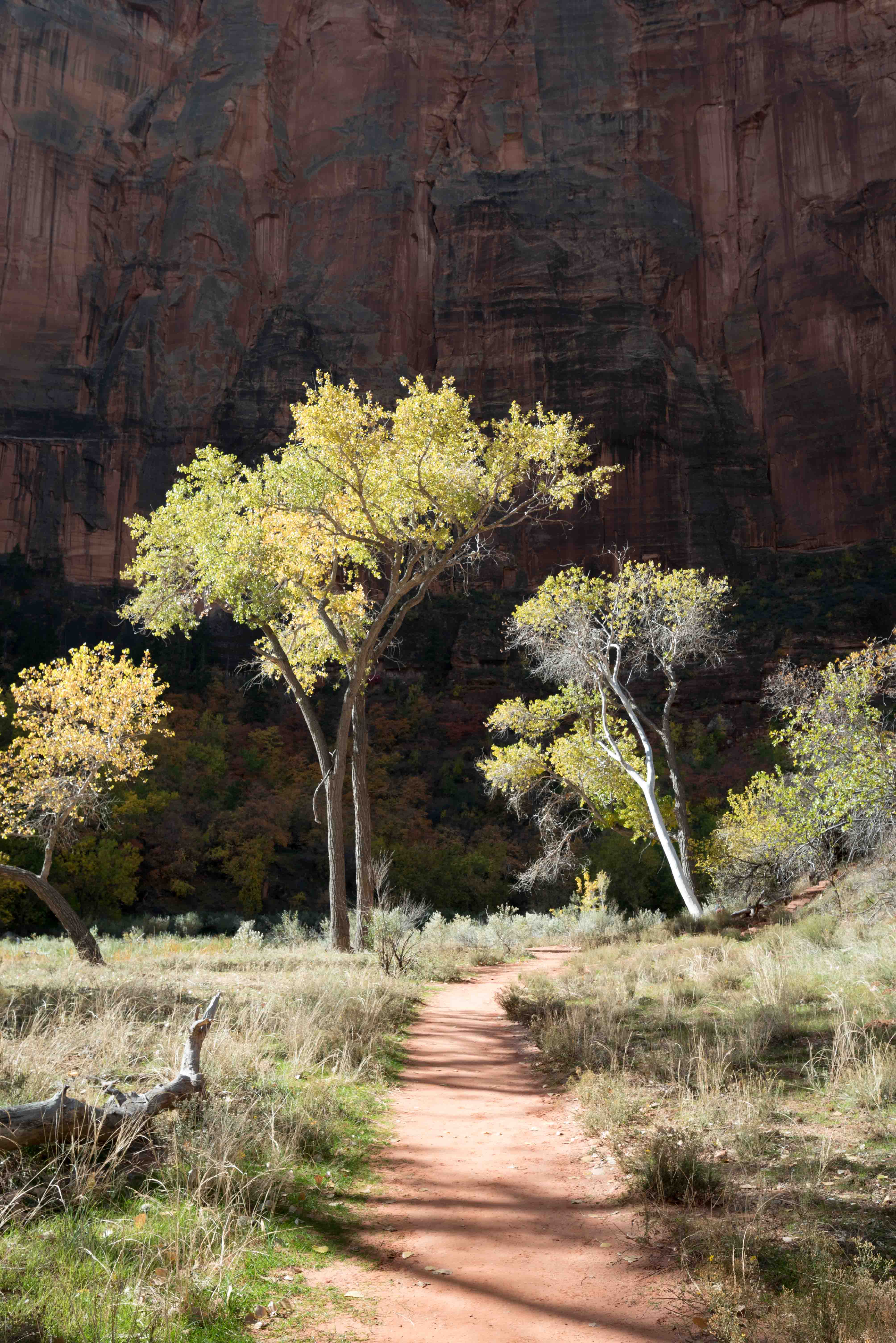
Hi Norm,
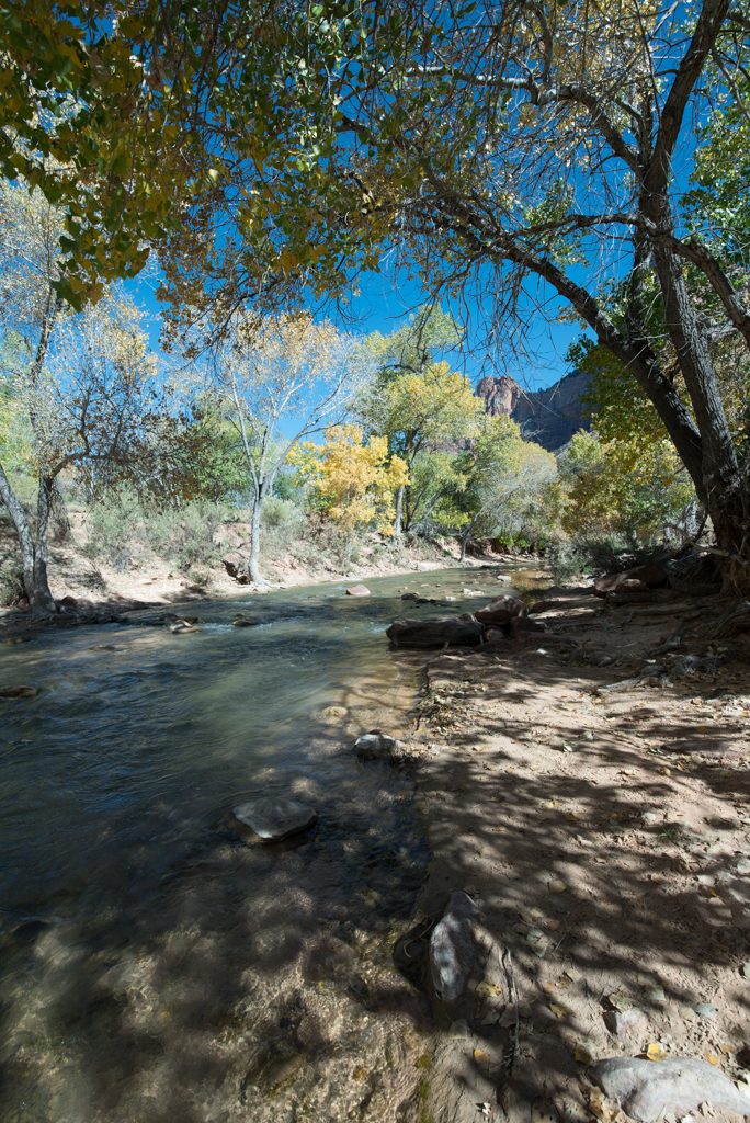
I did want to work with a longer exposure for the silky water shot, but I hadn't brought my tripod with me and I can't handhold my camera steady enough without it. If I remember correctly, my focus was placed almost dead center, where the yellow tree is. I'd love to go back and shoot this again, to experiment more with it, but I'm back in Boise now... |
Nov 8th |
6 comments - 2 replies for Group 19
|
6 comments - 2 replies Total
|