|
| Group |
Round |
C/R |
Comment |
Date |
Image |
| 19 |
Aug 18 |
Reply |
Thank you, Bob! I'm very excited about the improvement myself. And I learned a lot while making the changes! :-) |
Aug 11th |
| 19 |
Aug 18 |
Reply |
And I should clarify that my notice of the floors was only after looking at the shot and analyzing it quite a bit--a hazard in evaluating photos. It's a beautiful shot, and the floors probably don't need adjustment... |
Aug 9th |
| 19 |
Aug 18 |
Comment |
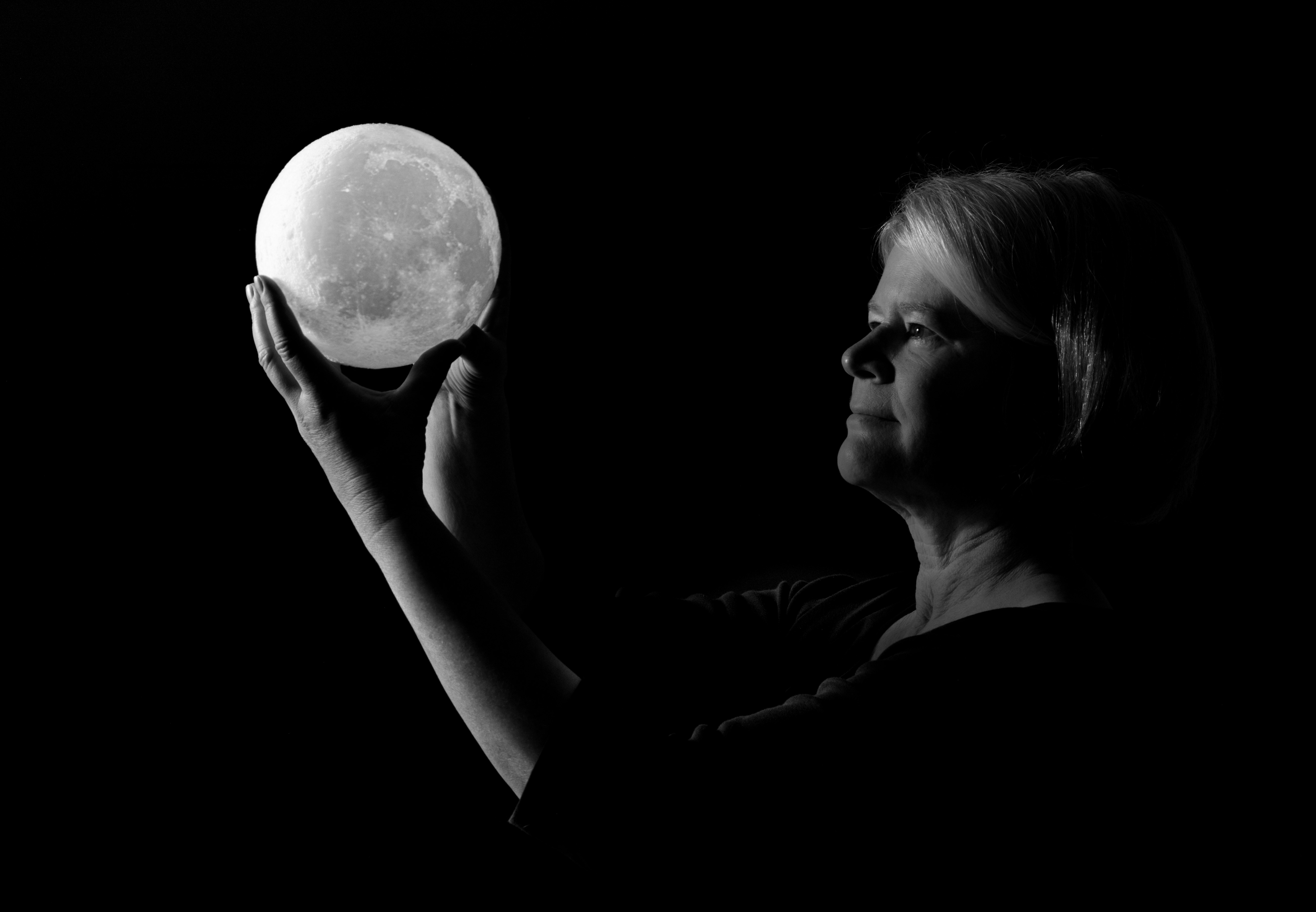
I love this shot! The motion of the petals is beautiful, even if I hadn't known (from your description) what they were. What really captures my attention is that there is so much motion in the image--and yet I feel as if the man's gaze is stopped in time and looking directly at me. It's a combination of motion and frozen time which is very appealing. |
Aug 9th |
| 19 |
Aug 18 |
Comment |
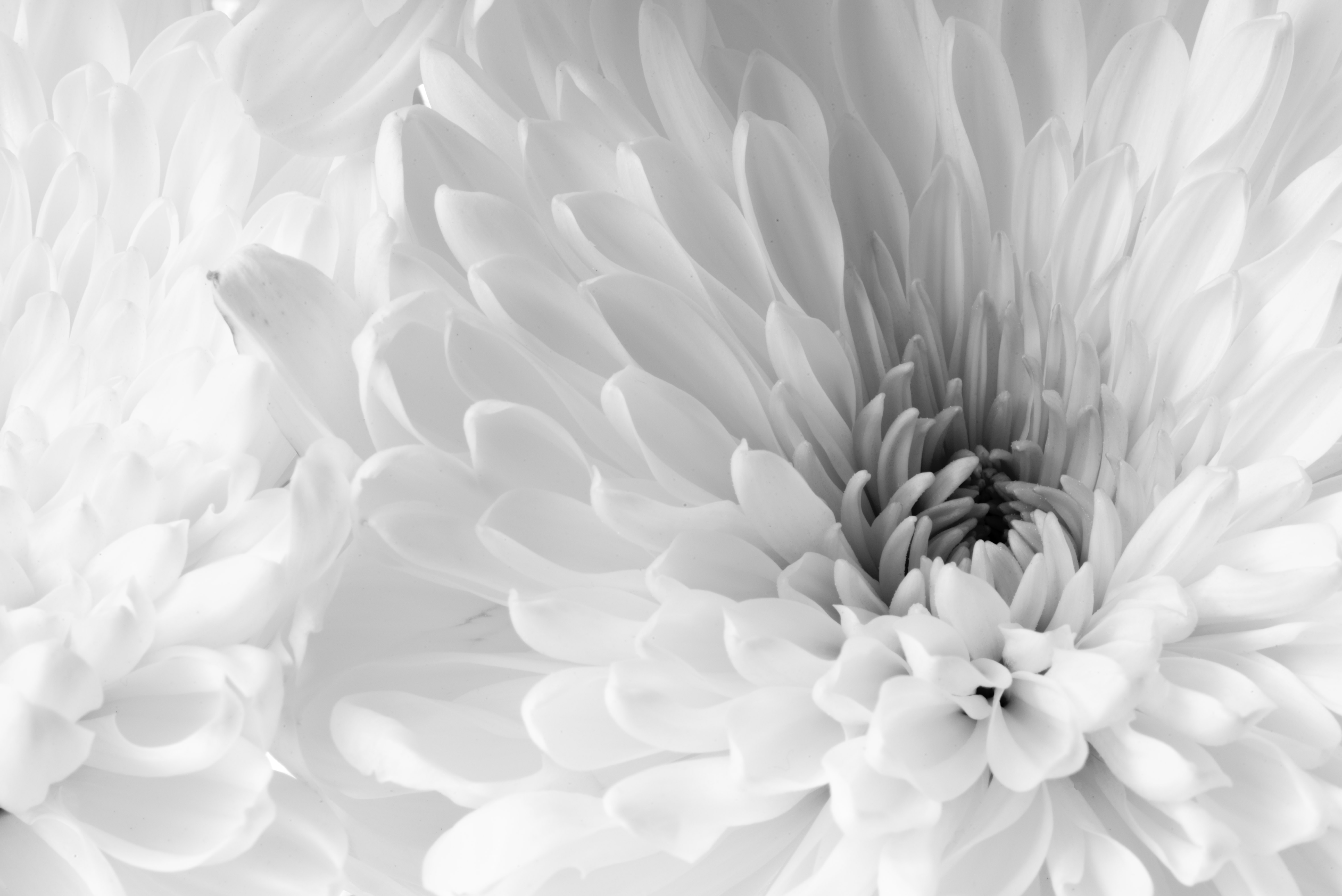
Hi Bob, I agree with Norm and Carroll regarding the skin touch-up; but aside from that I like the position of the model in the frame, and her expression and the natural look of her hair make this an intriguing shot--and she does look lovely. The only suggestion I have is that there appear to be two almost heart-shaped whispy things off to the right side of the model's face--maybe these are leaves in the background? I notice them only when really examining the photo, but maybe a treatment to help them blend into the background? The lighting on her face and neck is beautiful... |
Aug 9th |
| 19 |
Aug 18 |
Reply |
Hi Norm, I've adjusted the white/brightness--the new image is posted as a reply under Carroll's post. I think it does look better with the enhanced lightness. |
Aug 9th |
| 19 |
Aug 18 |
Reply |
Hi Carroll, Thanks for your suggestions! I've made some more adjustments and the new image shows the highlights and white sliders moved to the right... And I darkened the leaf a bit... |
Aug 9th |
 |
| 19 |
Aug 18 |
Comment |
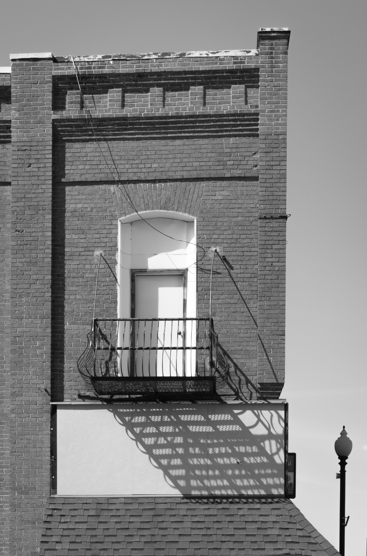
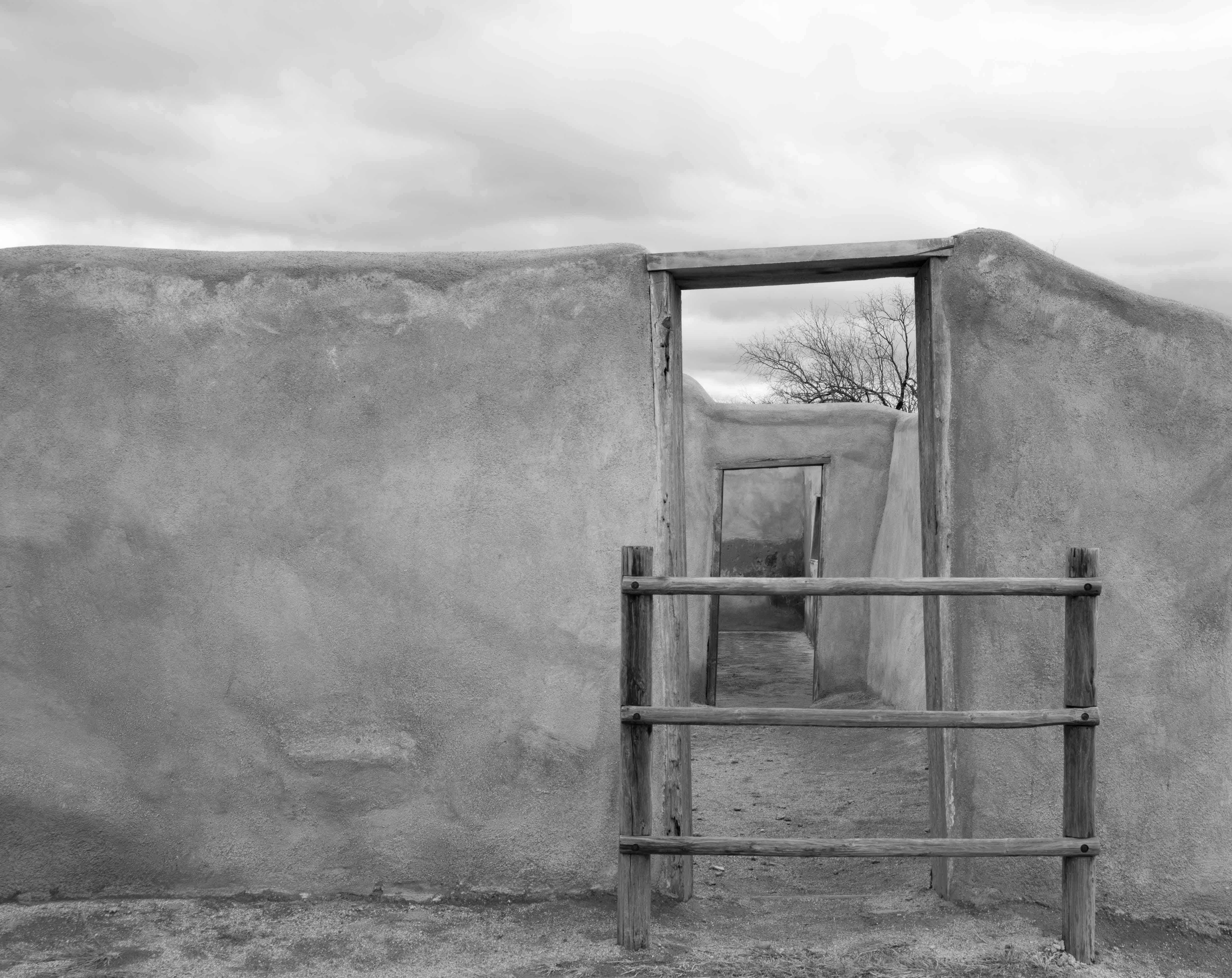
Hi Norm, I love this on many levels! The colors work really well together to create a harmony between the colors on the front door (with white accents) and the white wall behind (with the same-colored accents) and then the repetition of the same colors beyond that. And then the straight vertical/horizontal lines intersecting and creating interesting spaces. My only suggestion would be to experiment with the treatment of the floor--it almost appears as if the floor is more realistic and therefore not part of the same scene as the doors. I'm not sure how you'd go about doing that, just a thought... |
Aug 8th |
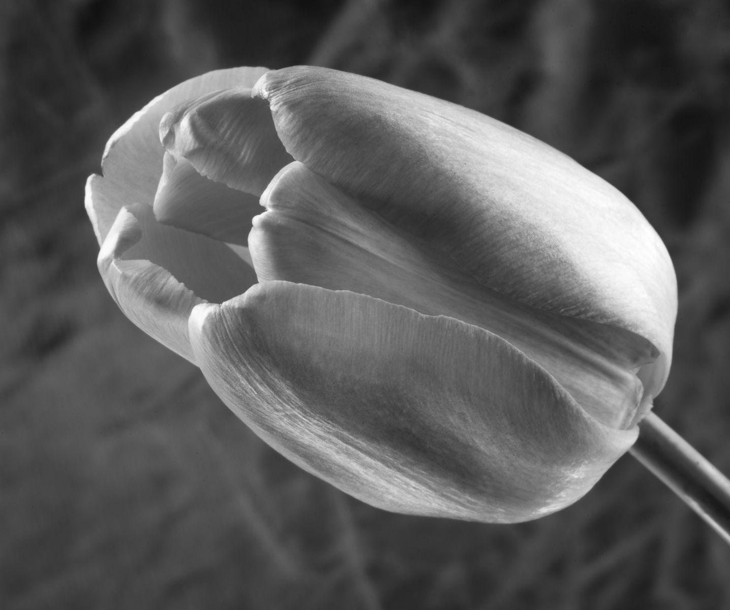
| 19 |
Aug 18 |
Comment |
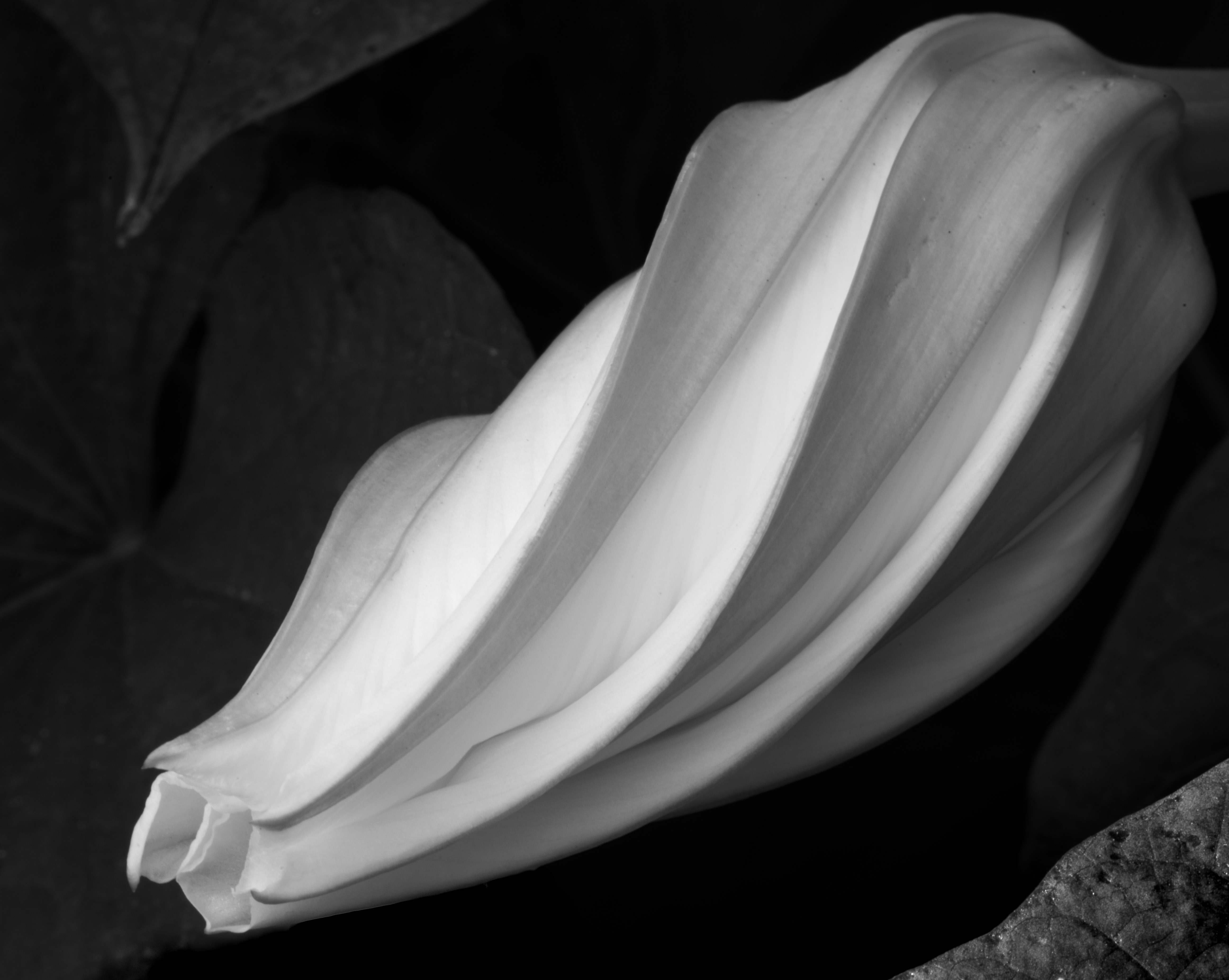
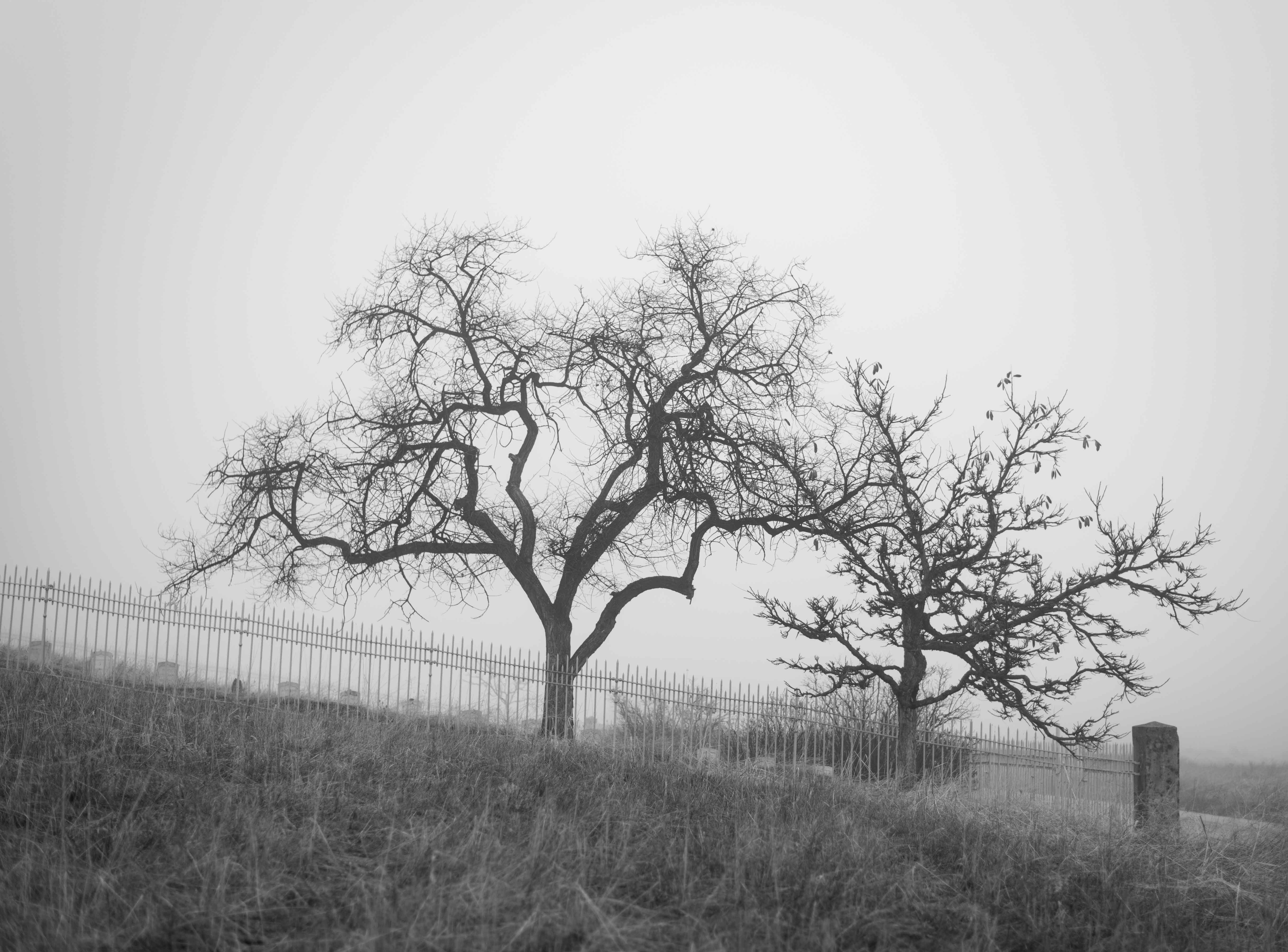
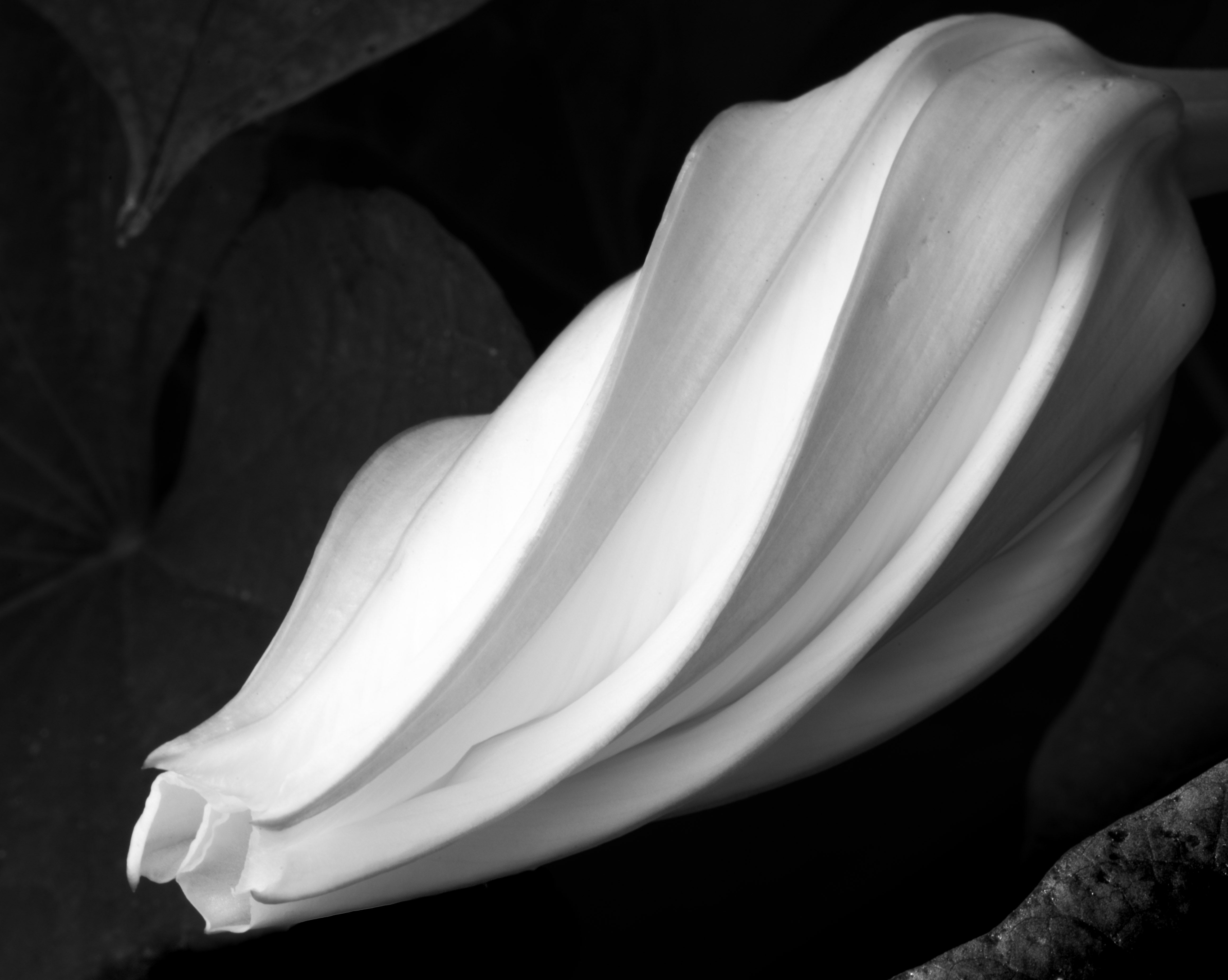
Stan, this is lovely! How fortunate you were to find these flowers. If the foreground were a bit more in focus than the leaves behind the flower that might be nice to keep the eye on the flower, but then the almost magical softness of that bulbous pink part might be lost if it became too sharp... Nicely done as is. |
Aug 8th |
| 19 |
Aug 18 |
Comment |
I agree with Norm, Wow!! Cropping the water lily pad worked well. This is beautiful! |
Aug 8th |
| 19 |
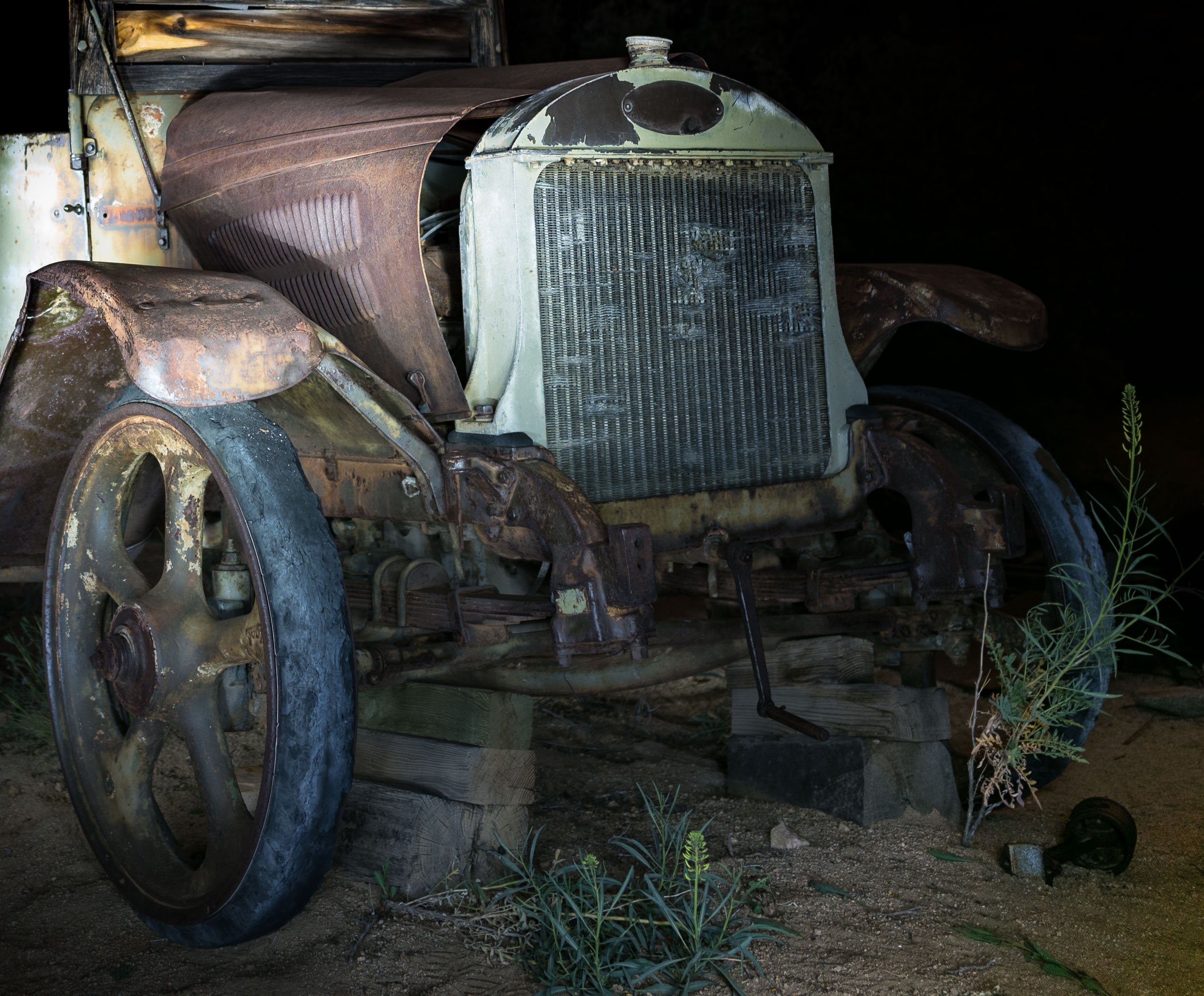
Aug 18 |
Comment |
Hi John,
This photo has a wonderful sense of nostalgia to it--the subject matter is what really captures my attention and makes me wonder about the contrast between the days when children played with hobby horses like these, and nowadays when they're playing video games on their parents' cellphones. It's very nicely done in B&W and with the composition.Maybe crop more on the left and right to achieve a more vertical image, just to try? But really very nice as is. |
Aug 8th |
| 19 |
Aug 18 |
Reply |
Thanks, Norm! I did experiment with the white and highlight sliders, but it seemed they got the image too white for my liking. I have my monitor calibrated, but I may need to fine-tune it more--and maybe I need to view more B&W photographs to get a better understanding of the desirable "whiteness."
I'll definitely check out that website you mention! Thanks for suggesting it! |
Aug 8th |
6 comments - 5 replies for Group 19
|
6 comments - 5 replies Total
|