|
| Group |
Round |
C/R |
Comment |
Date |
Image |
| 19 |
Apr 18 |
Reply |
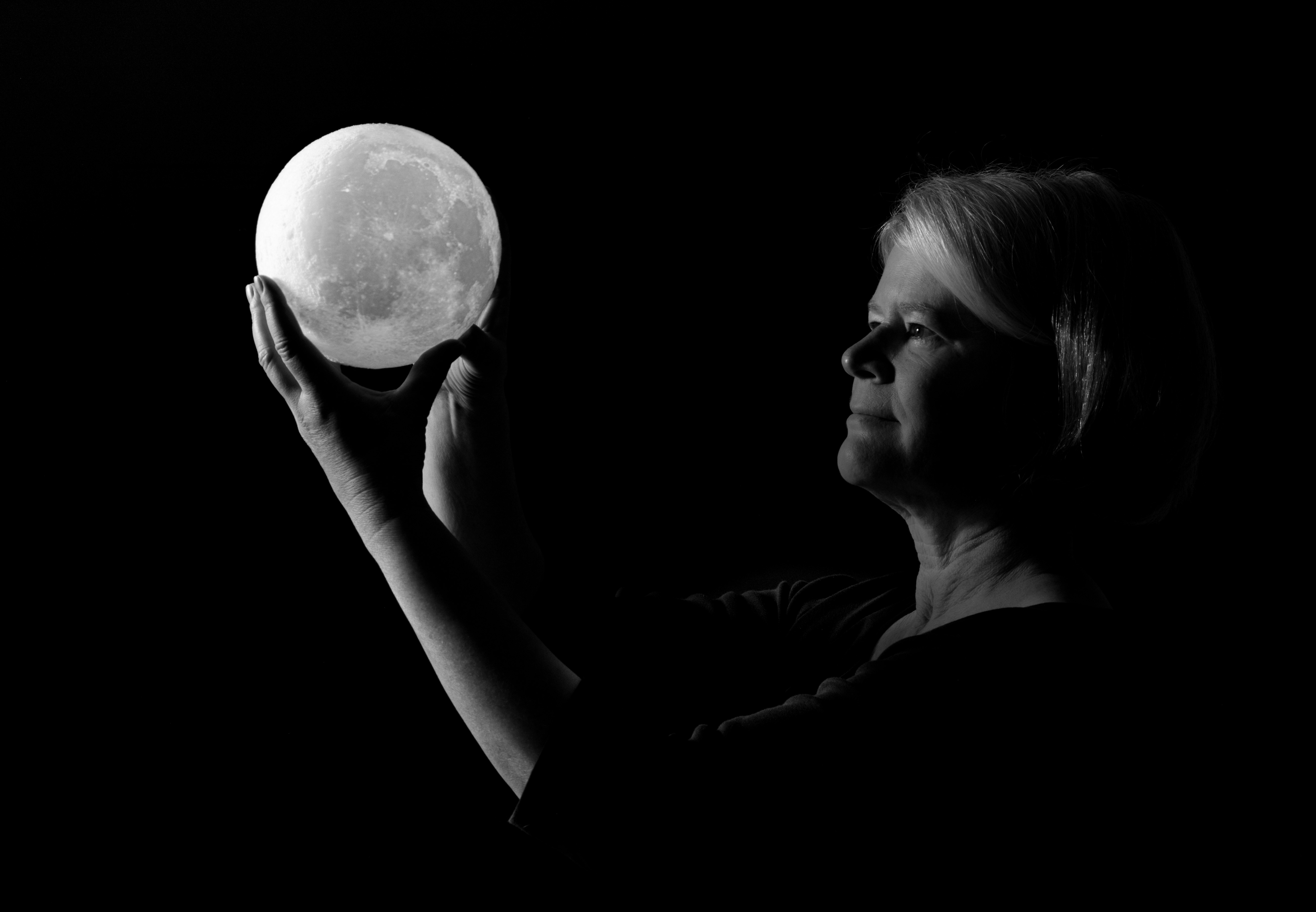
Thanks, Carroll! I didn't think I'd like light painting, but I've found I really enjoy it for some subjects. I almost feel as if I'm a sculptor, wielding a flashlight instead of a chisel. |
Apr 17th |
| 19 |
Apr 18 |
Reply |
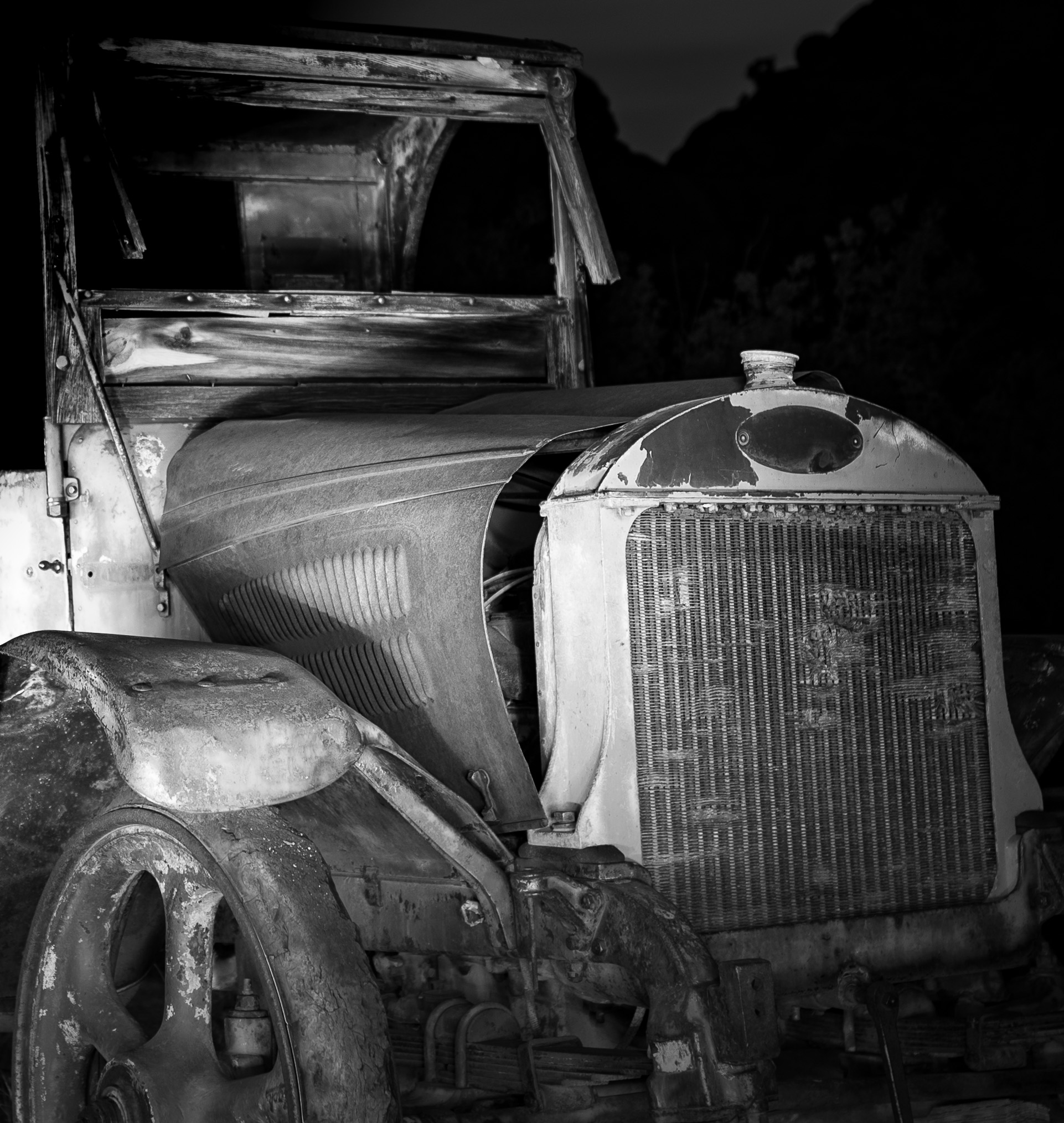
Hi Bob, I'm going to experiment with removing the greenery and adjusting the bright spot on the fender... I'll post an update!
Thanks,
Tracy |
Apr 15th |
| 19 |
Apr 18 |
Reply |
Thanks, Stan! I'll play around with the saturation a bit and see how that looks. I agree that it's valuable to get opinions from several people--the feedback is really helpful. |
Apr 15th |
| 19 |
Apr 18 |
Reply |
Thanks, John! I think I'm partial to the mono one now as well--but that may be because I love monochrome in general. I'm glad for the suggestion to give monochrome a try! |
Apr 15th |
| 19 |
Apr 18 |
Comment |
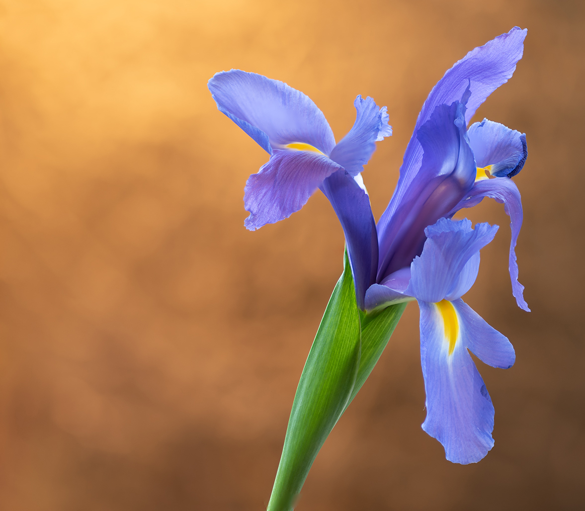
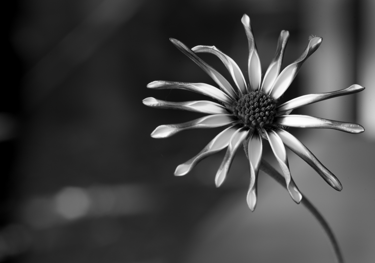
Beautiful shot! The yellow in the orchids helps tie the flowers in to the greens of the background, which allows the pinks and purples to really pop--but prevents them from being disengaged from the rest of the image. I also like the fortuitous water drop! The composition works for me, but I see how Norm's question about cropping might be something to play with. |
Apr 9th |
| 19 |
Apr 18 |
Comment |
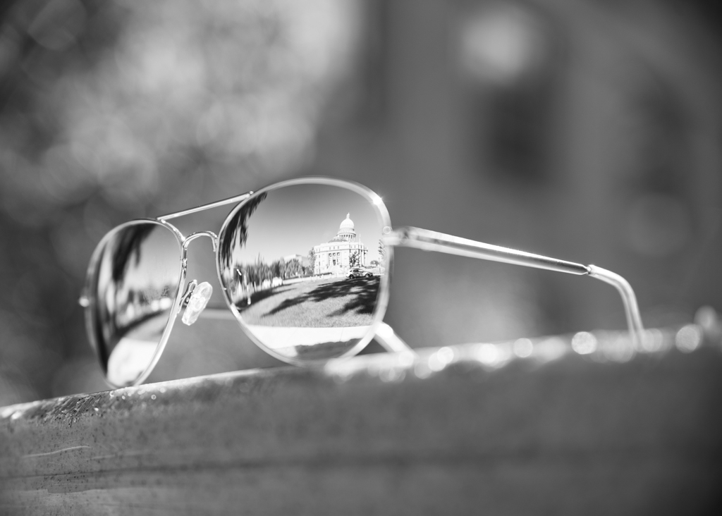
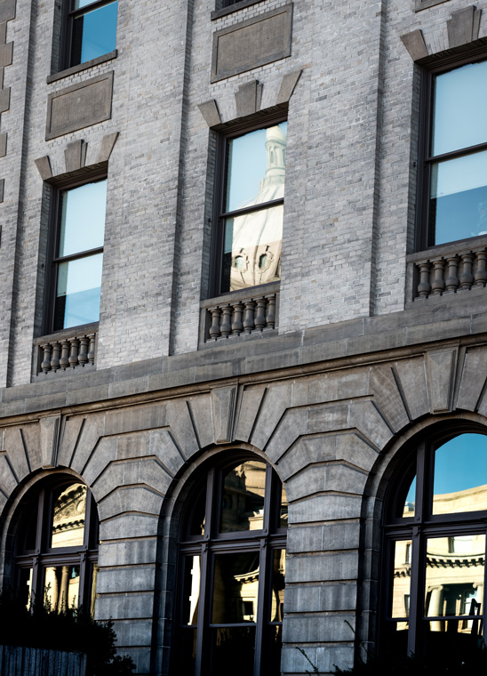
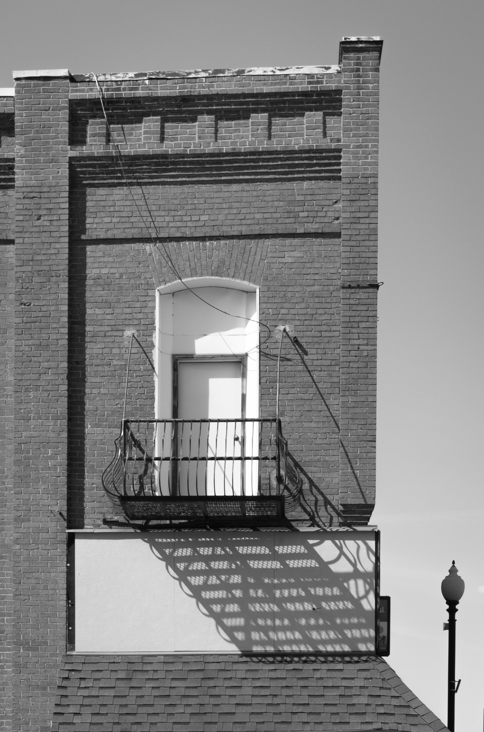
This is an intriguing shot with the replication of patterns in the rounded part of the building structure, the grid-like pattern of the front of the building structure, and the swirling pattern of the cone. I agree with Norm that maybe cropping to exclude some of the bottom of the image would be worth experimenting--although I know that would lose some of the nice "bulbous-ness" of the cone. |
Apr 9th |
| 19 |
Apr 18 |
Comment |
This has a very magical quality to it! I especially like how the subject is making eye contact (or appears to be) with the viewer--that gives it a nice personal connection. I agree with Norm that perhaps cropping out the audience might be worth experimenting with... |
Apr 9th |
| 19 |
Apr 18 |
Comment |
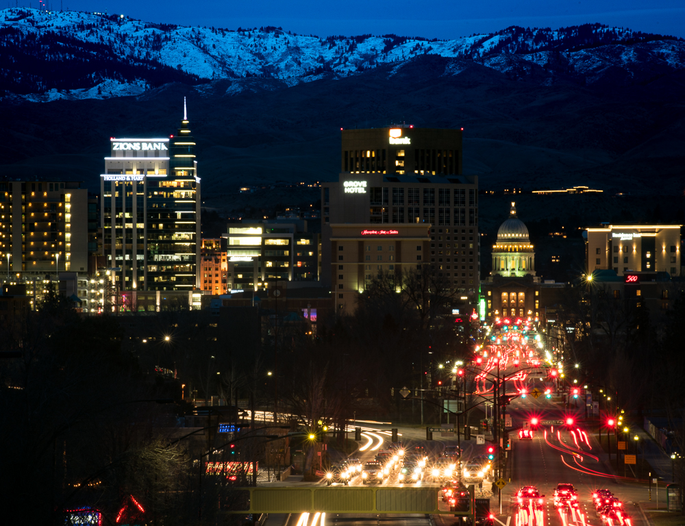
I really like the contrast of the golden glow of the tower against the fairly even-toned gray of the city and sky--with the city showing hints of glowing lights throughout to tie in to the glow of the tower. There also appears to be a downswell of rain to the left of the tower (?) which is a nice contrast to the tower pointing upward. I don't have any suggestions other than to see how the image would look cropped a wee bit on the right edge... |
Apr 9th |
| 19 |
Apr 18 |
Comment |
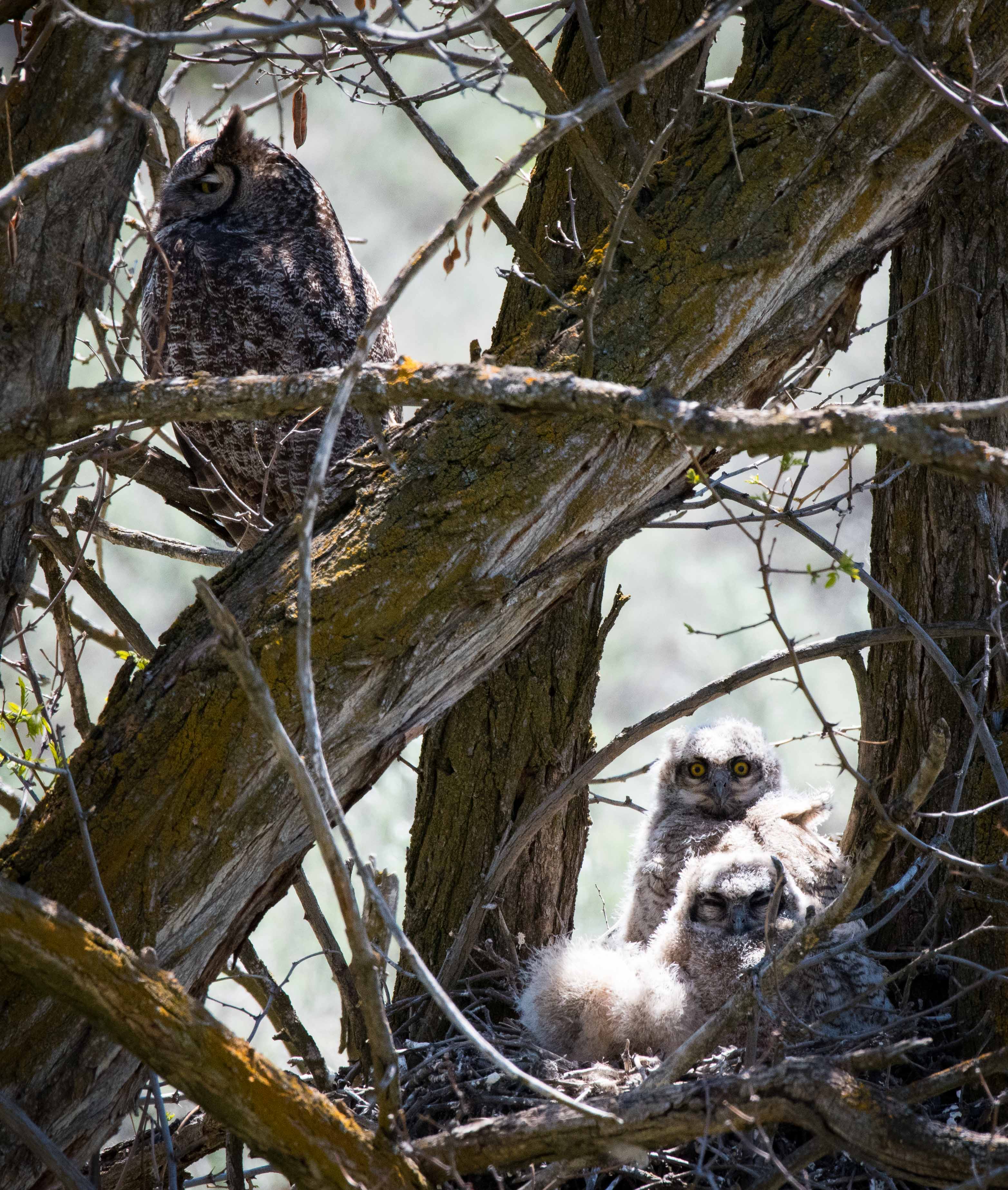
This is wonderful! I especially like the little one who is peeking out with the dark background behind him/her. There isn't anything I can think of that would improve upon this! |
Apr 9th |
| 19 |
Apr 18 |
Comment |
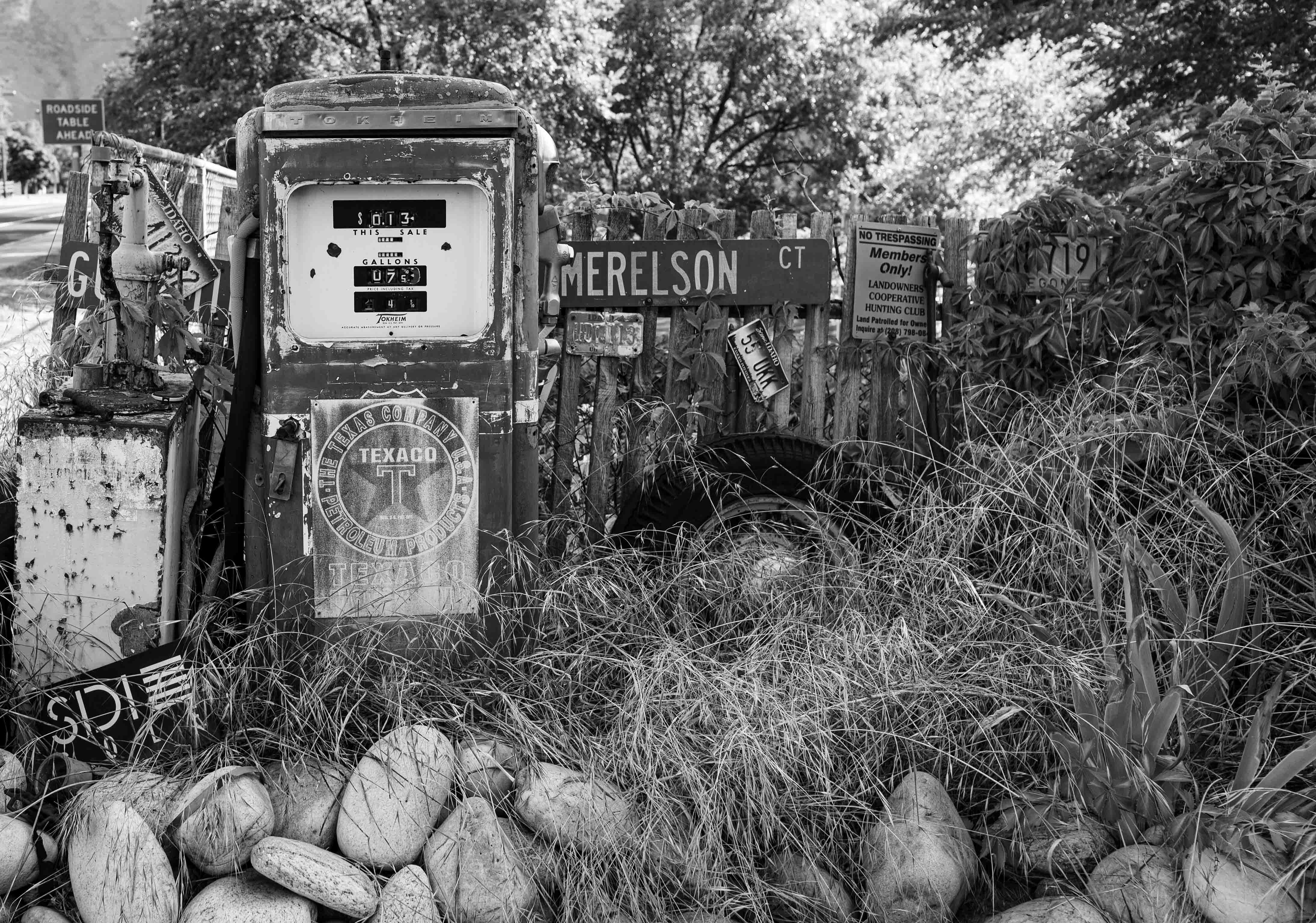
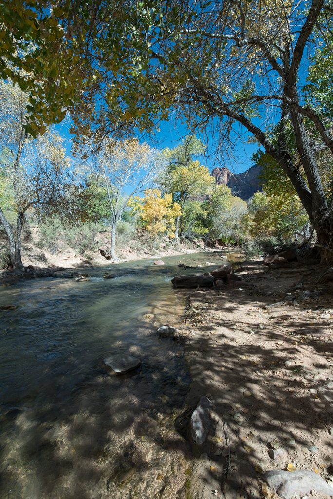
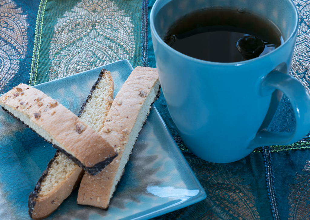
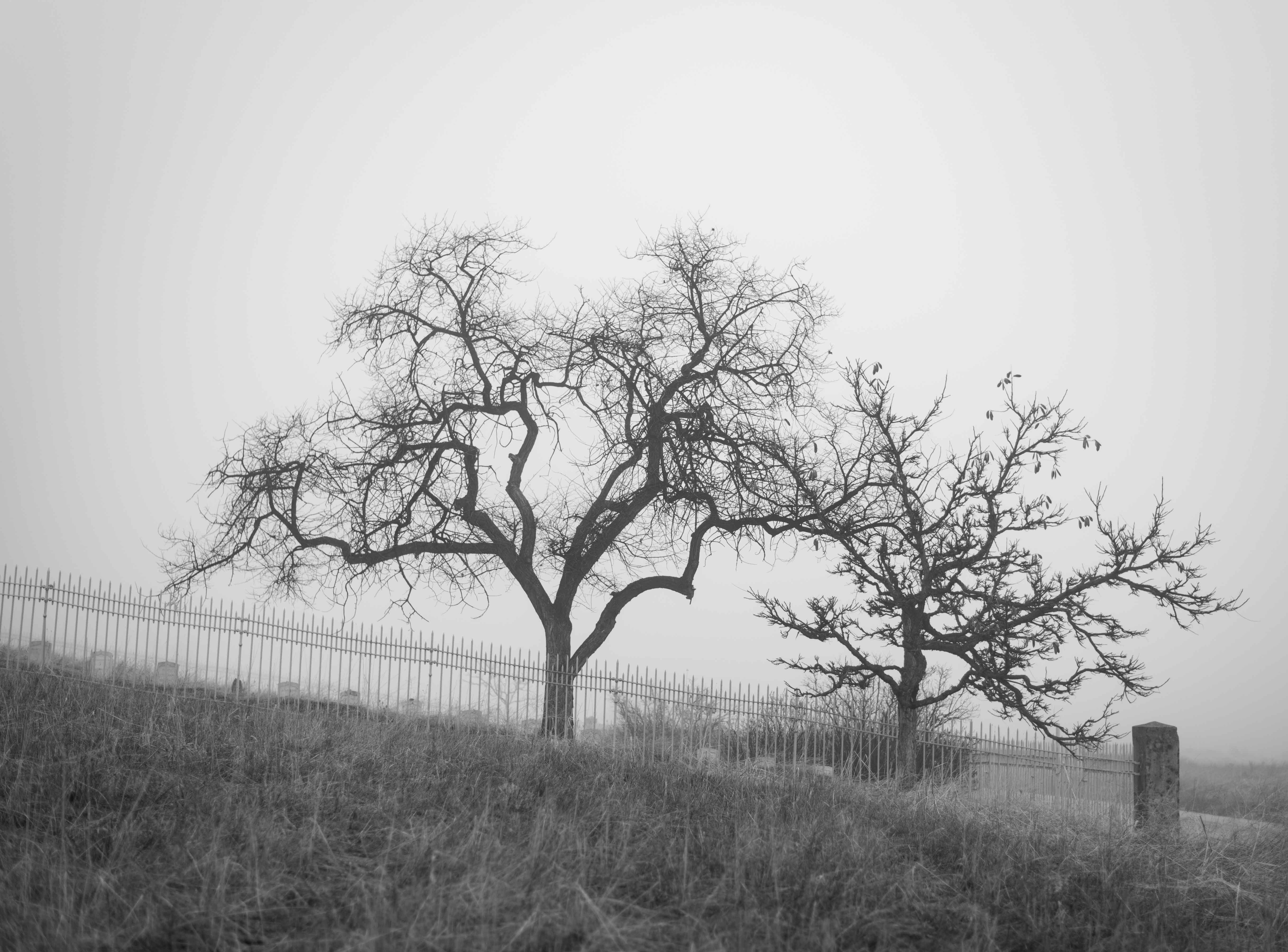
Thanks, Norm! I've played around with the cropping suggestions you've made, resulting in quite a few new images that I like. I've also experimented with them in B&W. The original image was cropped quite a bit, and by including more of the original and cropping out the plants I've arrived at this new image, which I prefer over the one I first posted: |
Apr 9th |
 |
6 comments - 4 replies for Group 19
|
6 comments - 4 replies Total
|