|
| Group |
Round |
C/R |
Comment |
Date |
Image |
| 71 |
Feb 23 |
Reply |
Thanks, John. |
Feb 10th |
| 71 |
Feb 23 |
Reply |
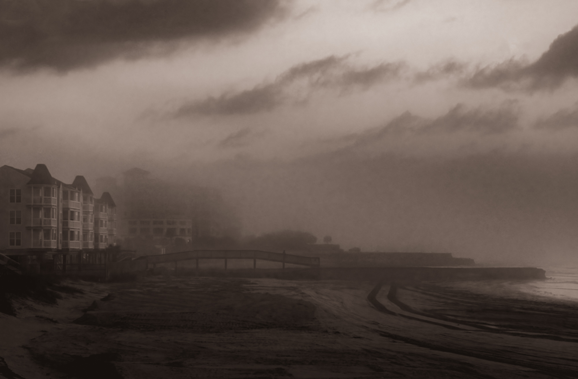
Thanks, Tom. You did a good job getting rid of the tracks. |
Feb 10th |
| 71 |
Feb 23 |
Reply |
Thanks, Nigel. I like your version too. |
Feb 10th |
| 71 |
Feb 23 |
Reply |
Here's the sepia version. |
Feb 10th |
 |
| 71 |
Feb 23 |
Reply |
Thank you for your comments, Mike. I hadn't noticed the bit of light breaking through the fog on the staircase.
The beach was thoroughly trashed and closed for the construction. That was one of the reasons I took the image. |
Feb 10th |
| 71 |
Feb 23 |
Comment |
Great image and video, John. I love this image. The building in the middle of the stream could easily be overlooked but, for me, really adds to the image. |
Feb 9th |
| 71 |
Feb 23 |
Comment |
If there are lots of images better than your, I didn't find them.
I like the composition and the sky provides a lot of drama.
There seems to be a band of much lighter sky along the horizon and there is a bit of sensor dust in the dark cloud at the top in the middle.
Personally, I really like this image and would consider spending some time adding contrast to the sky and rocks. |
Feb 9th |
| 71 |
Feb 23 |
Comment |
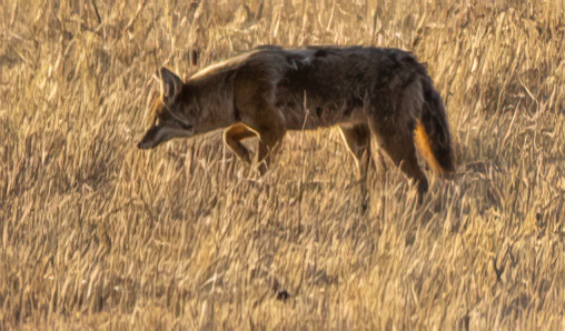
I agree with everyone else about what a great story this image shows and the composition. I think the colors are realistic for at least the coyote and the grass (I've never seen Sandhill cranes up close).
I find the coyote's stance particularly interesting and would consider creating a second image focusing just on it. The attached file was cropped from the original and run through Gigapixel AI. You can probably create a better image from the original. |
Feb 9th |
 |
| 71 |
Feb 23 |
Comment |
This is a beautiful image, Michele, and I like where you've gone with it. My only suggestion (and it is nit-picking) is to try reducing the texture in the water to make it less grainy and bring out the pink reflection.
I'm jealous! |
Feb 9th |
| 71 |
Feb 23 |
Comment |
Great travel image! Everything - the colors, the edge of the sidewalk, the vertical lines of the walls, and the man's gaze direct my eyes to the car. I think the car is perfectly lit and the image overall really gives a taste of the place. It looks to me like you did a good job of straightening out the walls too.
You might be able to go a little further with bringing out the man's face, but if it's pushed too far, it won't look realistic. I'd also lighten the arm with the umbrella a bit to even out the shadows. |
Feb 8th |
5 comments - 5 replies for Group 71
|
5 comments - 5 replies Total
|