|
| Group |
Round |
C/R |
Comment |
Date |
Image |
| 71 |
Dec 21 |
Comment |
Thanks, Paul. |
Dec 31st |
| 71 |
Dec 21 |
Reply |
Thanks for the feedback, John |
Dec 19th |
| 71 |
Dec 21 |
Comment |
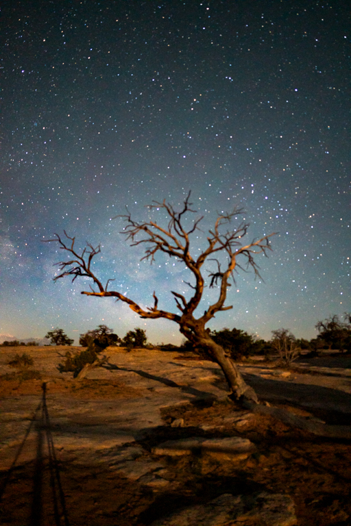
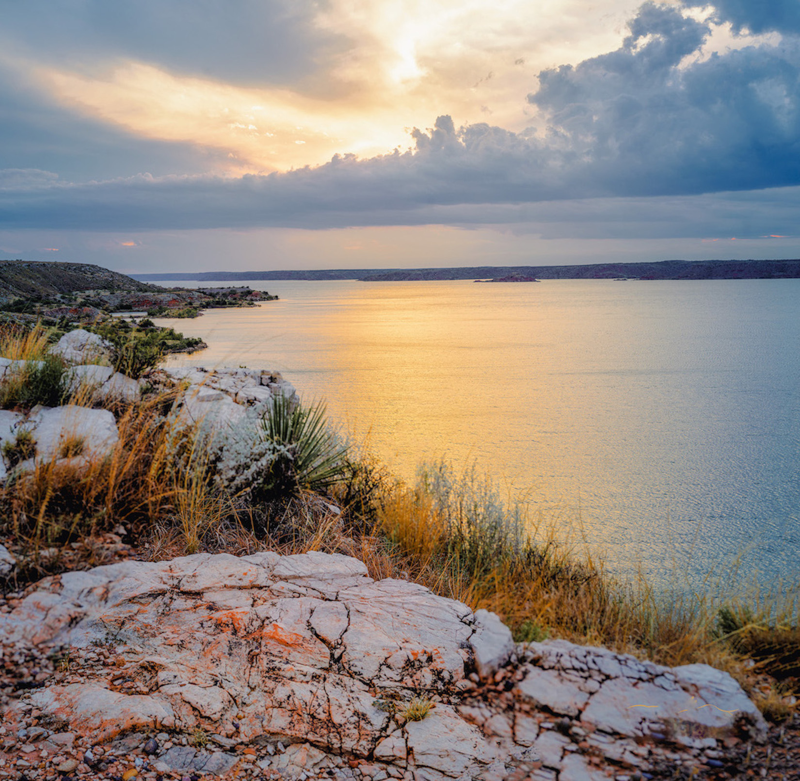
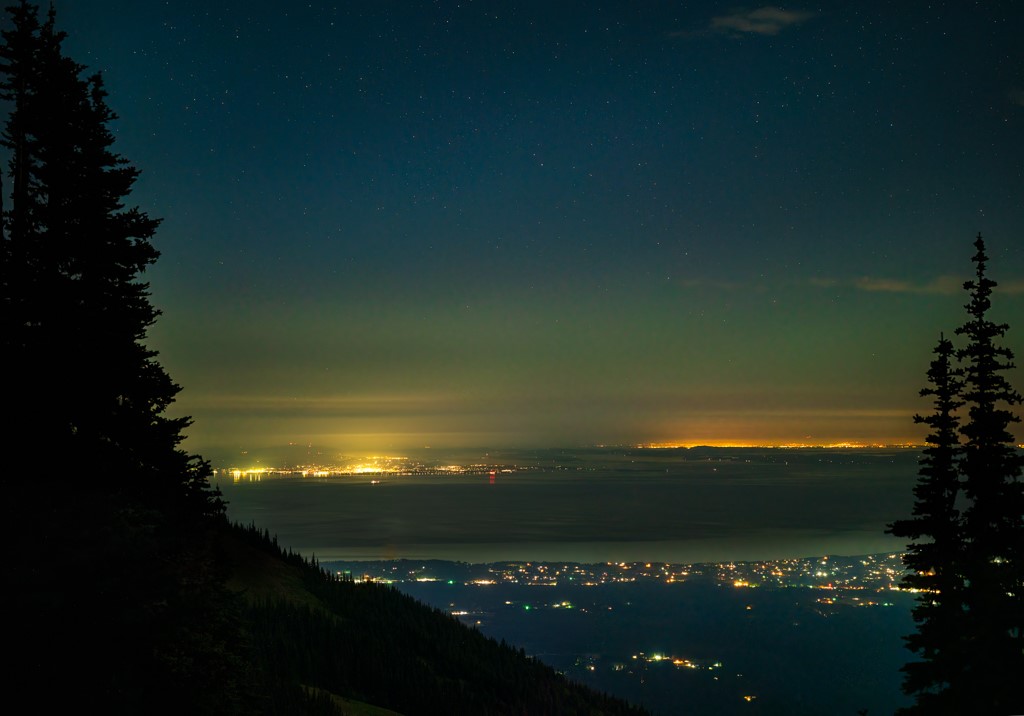
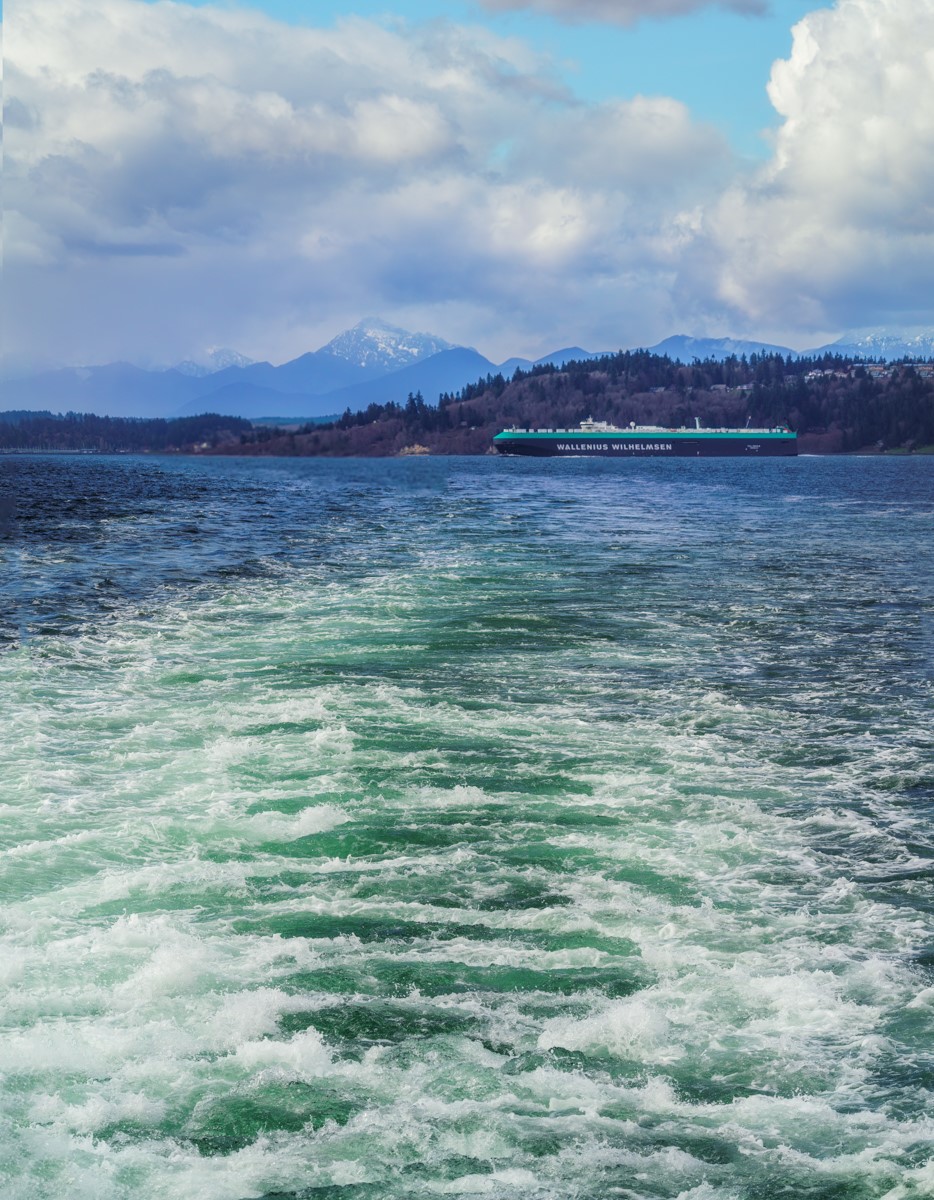
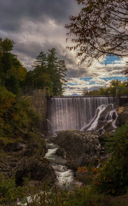
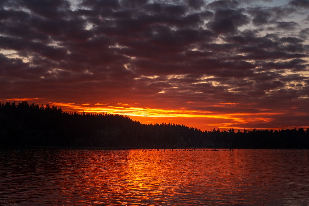
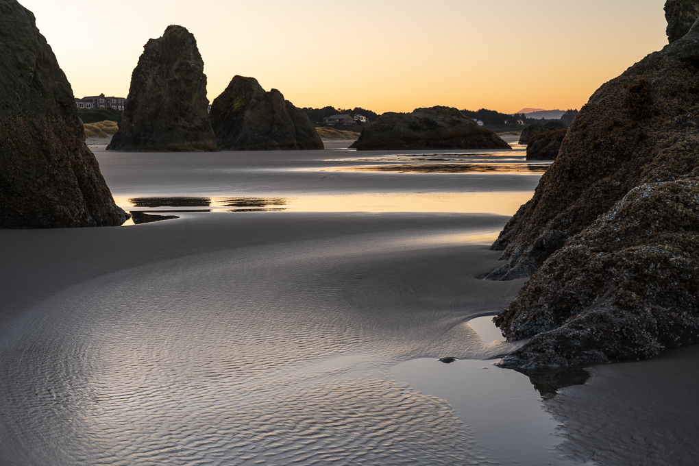
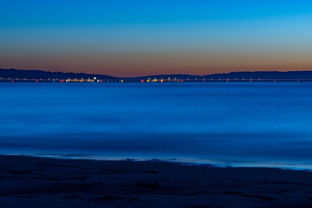
I love the the layers of color in this image, the similarity of the red rock in the foreground to the red rock just below the subject and the way that continuity is broken up by the vibrant greens and yellows of the tree.
The only thing I might try to do would be to try to bring some of the texture in brightest highlights.
Well done! |
Dec 10th |
| 71 |
Dec 21 |
Comment |
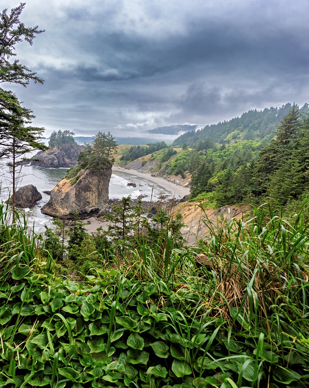
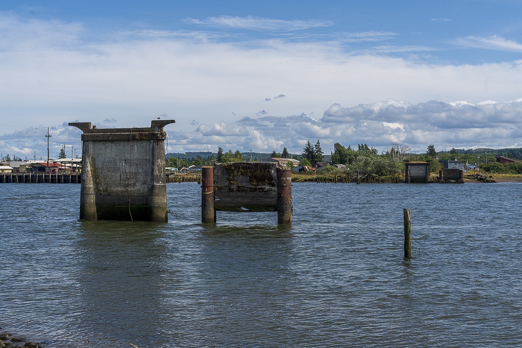
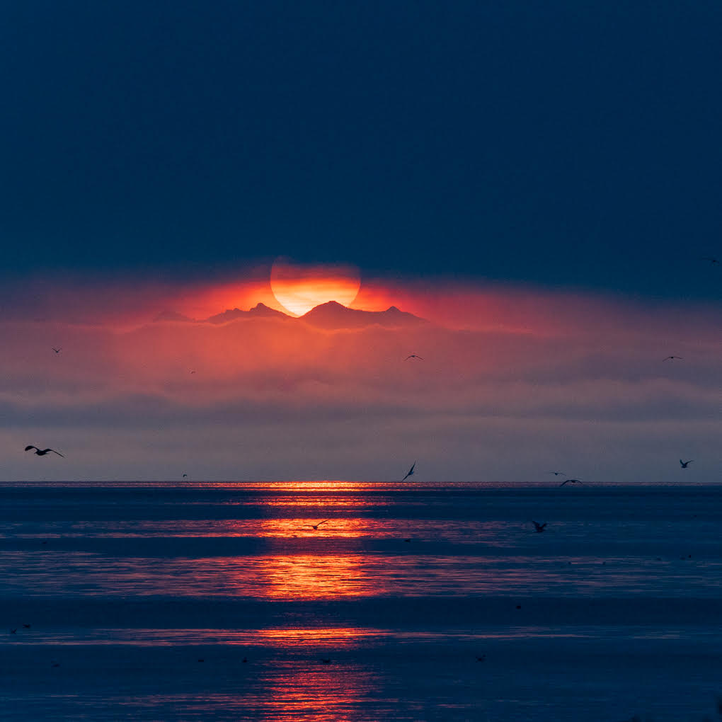
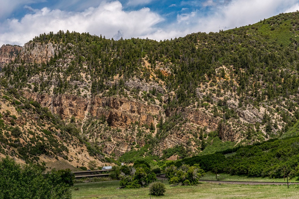
I like all three images but find myself a bit confused. I like the geometric shapes in the background of the submitted image but don't see them in either the original or Stephen's version. Am I missing part of the original? |
Dec 10th |
| 71 |
Dec 21 |
Comment |
I like all three images but find myself a bit confused. I like the geometric shapes in the background of the submitted image but don't see them in either the original or Stephen's version. Am I missing part of the original? |
Dec 10th |
| 71 |
Dec 21 |
Comment |
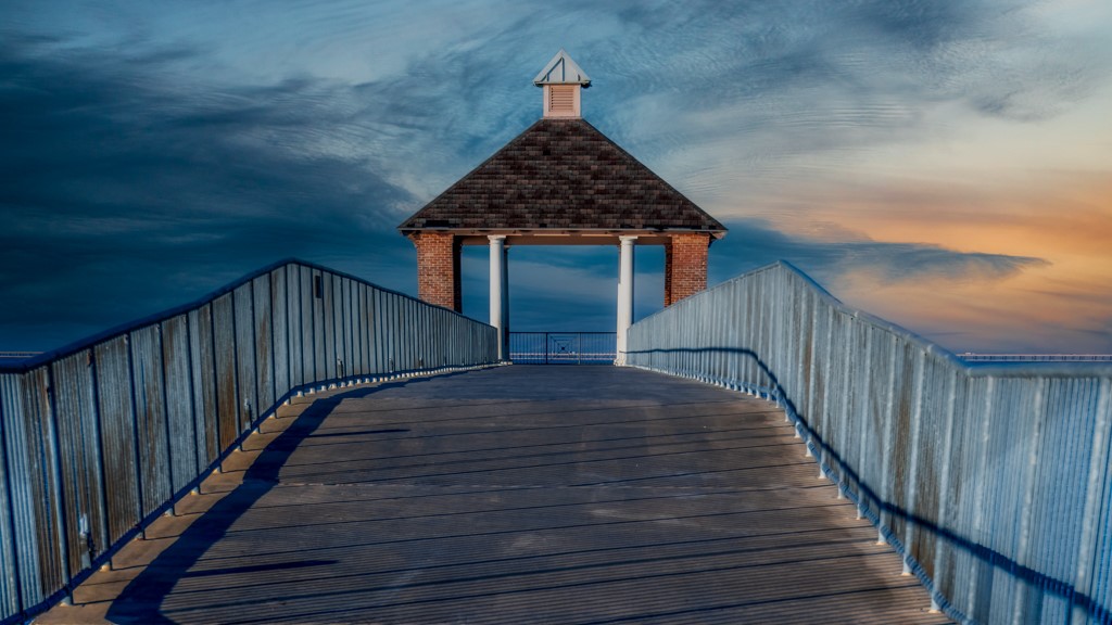
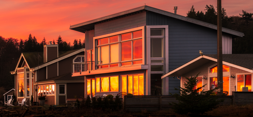
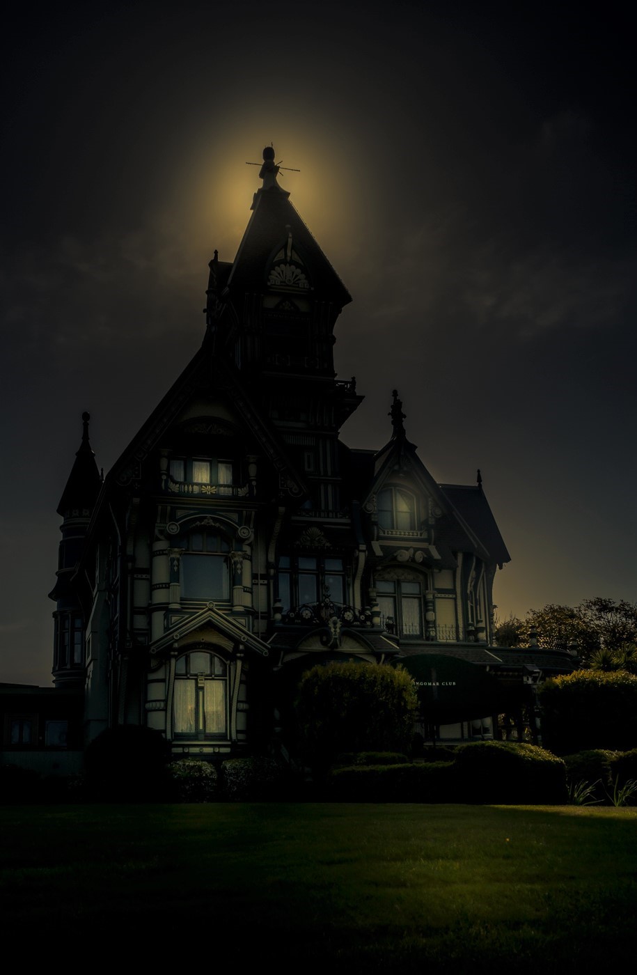
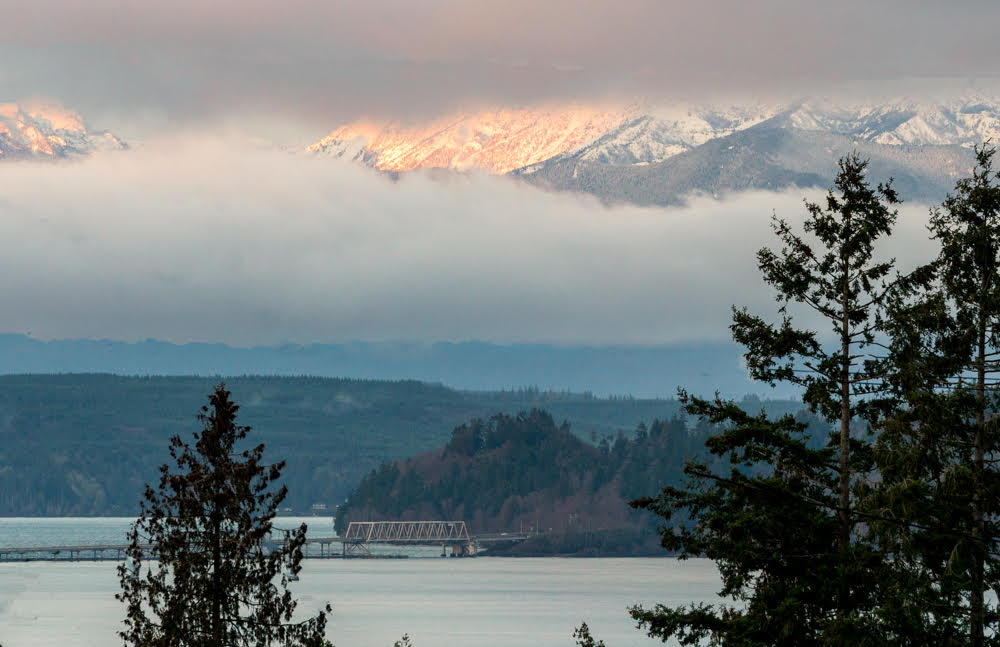
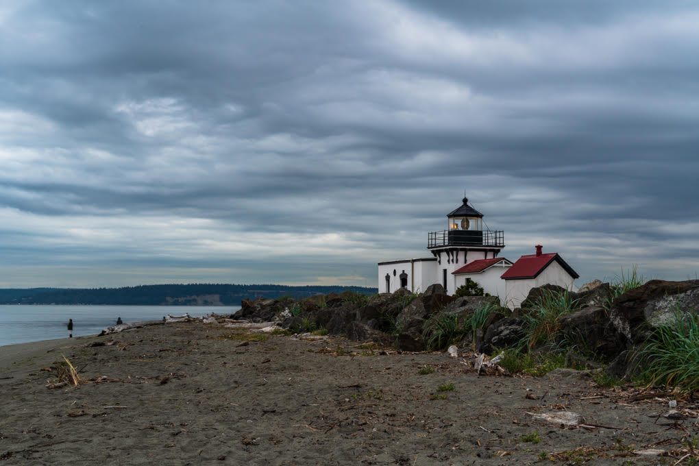
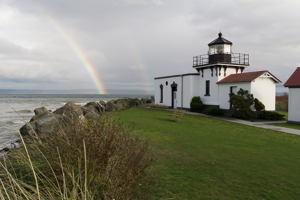
Nicely done, Mike! The colors are especially nice and I like the way the blue in the background makes the building pop and balances the warm tones in the foreground.
I find the power lines that are barely there and the post to the left of the building distracting. |
Dec 10th |
| 71 |
Dec 21 |
Comment |
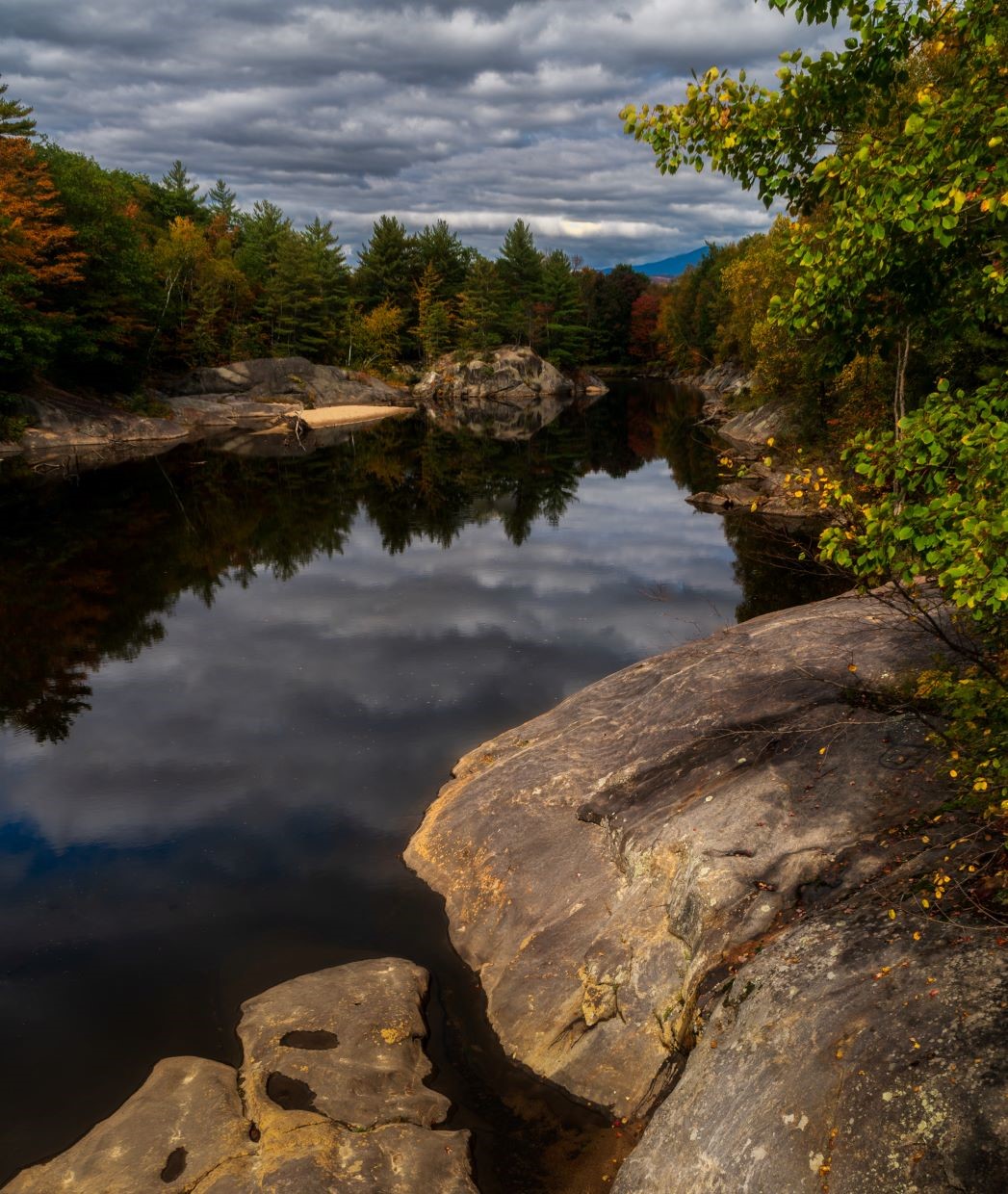
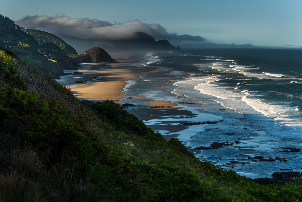
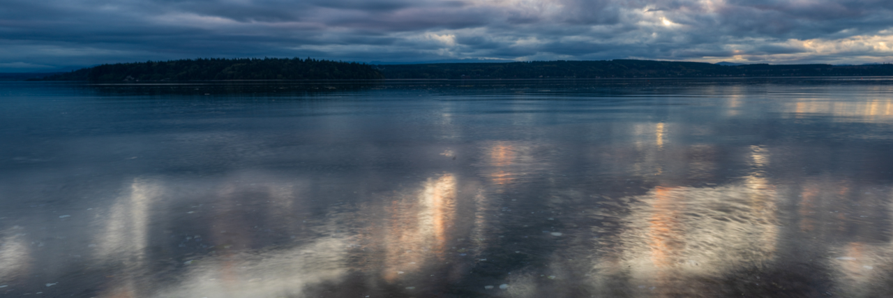
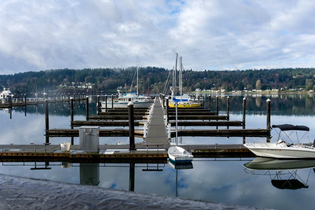
I love reflections! This is a beautiful image. I like the tree on the left because it as a different shape than the rest and I prefer the submitted image because it has more color.
While I admire your desire to get it right in camera, I agree that a bit of clean-up (at least the sensor dust) would benefit it. |
Dec 10th |
| 71 |
Dec 21 |
Comment |
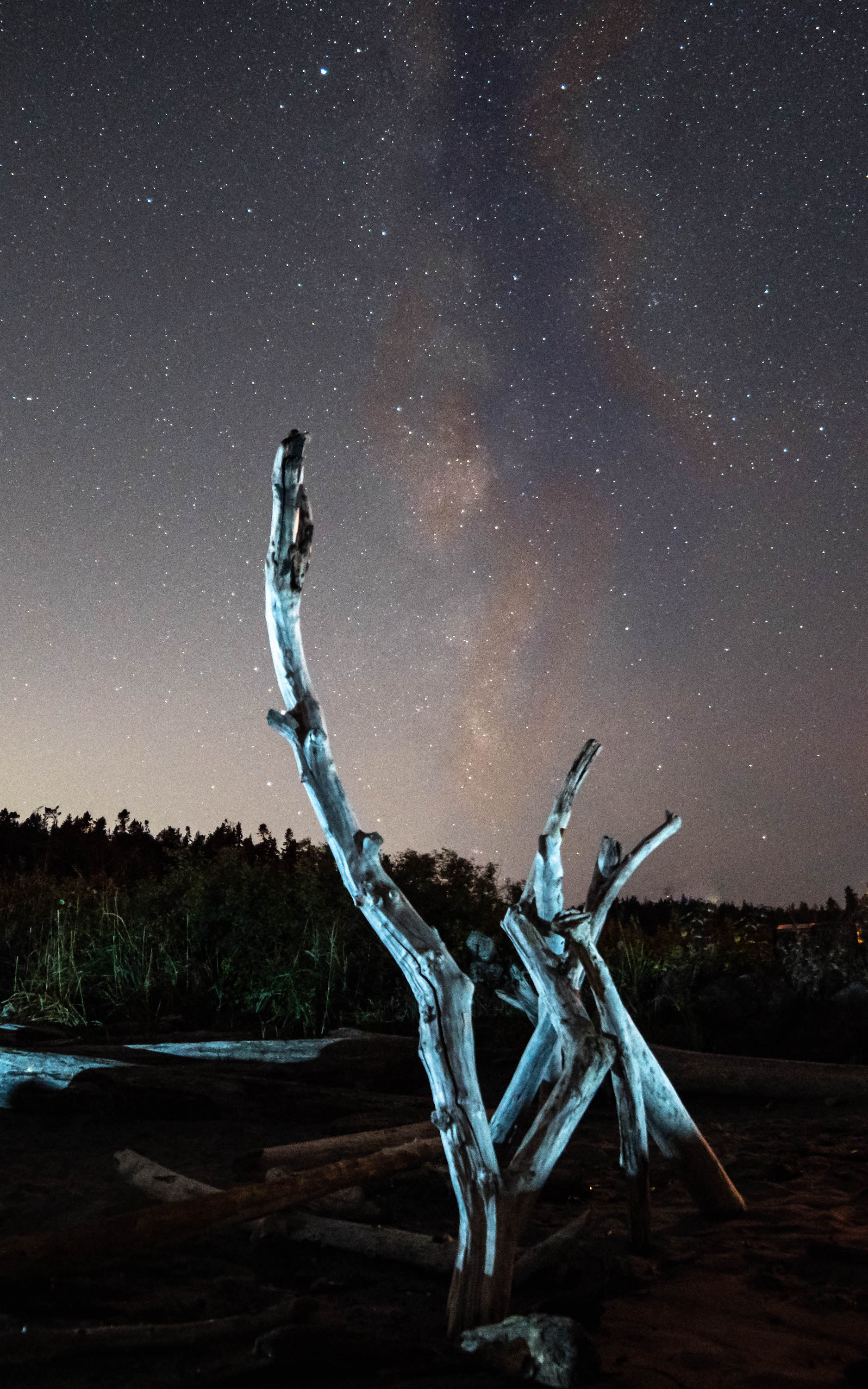
I think the ice blend successfully makes the image feel colder. It's a noticeable difference in the bottom of the frame. To me, the trees in the final image are a tad too red and the snow has gone more gray. Maybe a bit more blue tone would help? Or just try going monochrome, as has been suggested.
I don't mind the bit of blur and graininess, as they add to the surreal feel. I like the image. |
Dec 10th |
| 71 |
Dec 21 |
Reply |
I like that, Nigel. Thanks! |
Dec 8th |
| 71 |
Dec 21 |
Reply |
Thanks, Mike! This was one of those places I kept going back to, waiting for the right light. |
Dec 6th |
8 comments - 3 replies for Group 71
|
8 comments - 3 replies Total
|