|
| Group |
Round |
C/R |
Comment |
Date |
Image |
| 71 |
Dec 18 |
Reply |
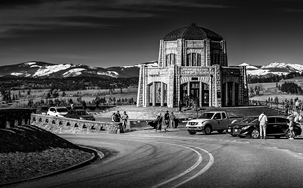
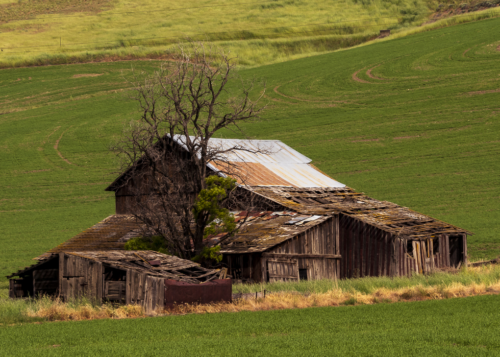
Thanks, John. I will try removing the buildings but I'm not good at Photoshop. |
Dec 29th |
| 71 |
Dec 18 |
Reply |
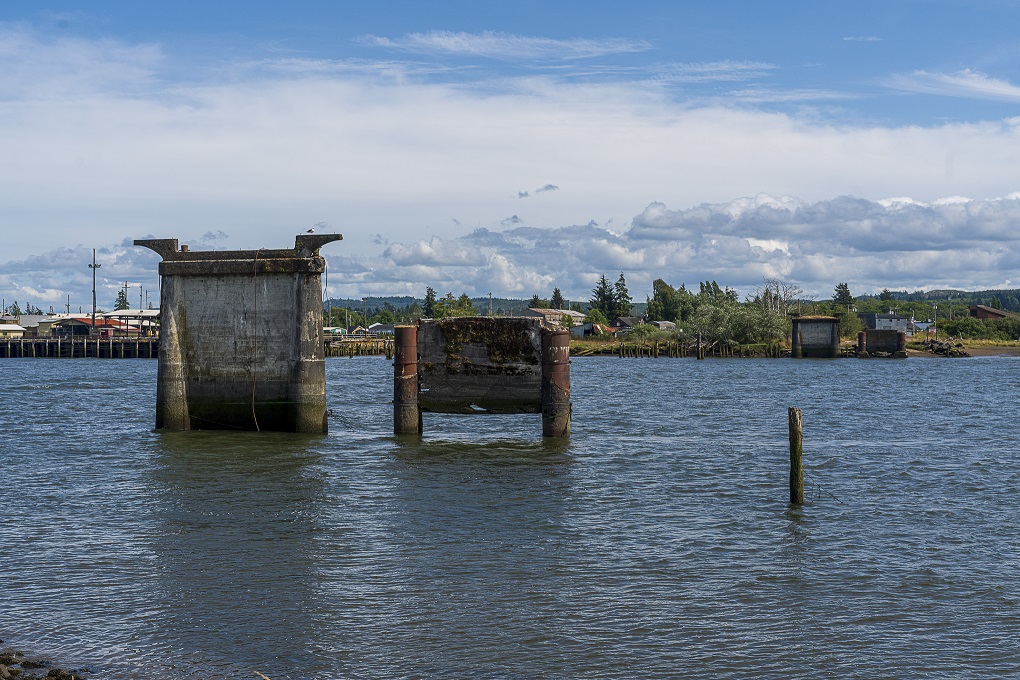
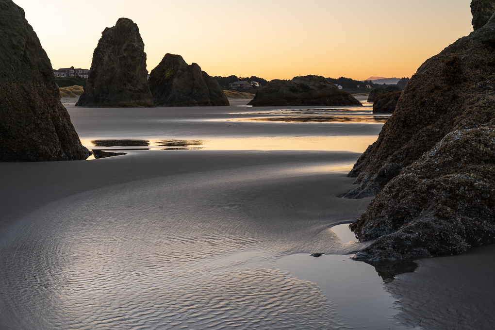
Thanks, Trinda. The pattern in the sand was pristine because the water just had receded. |
Dec 29th |
| 71 |
Dec 18 |
Comment |
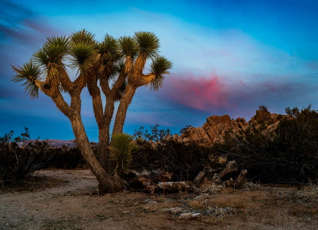
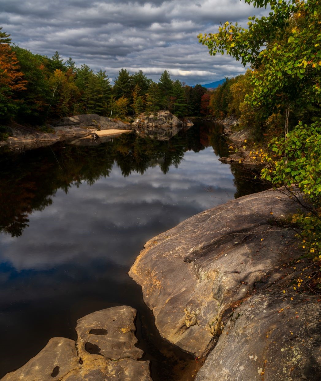
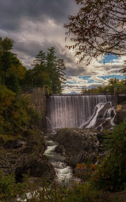
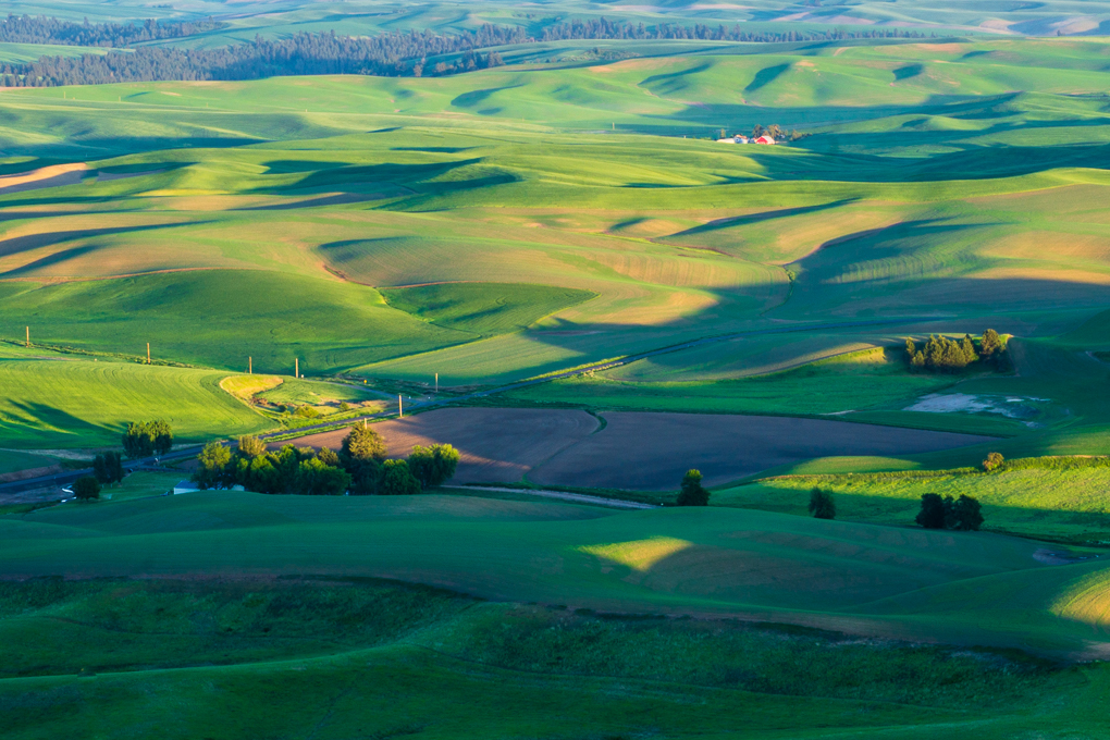
I feel that the striations in light and dark areas draws my eye to the shapes created by the smaller plants and their reflections in the center of the frame. Mike's crop is nice but it loses some of the darker oranges along the top treeline. Having said that, I agree that the upper left corner needs some work to clarify if it's showing a snowy slope or a rocky slope. Either way it's provides a stark contrast to the bright autumn leaves. |
Dec 20th |
| 71 |
Dec 18 |
Comment |
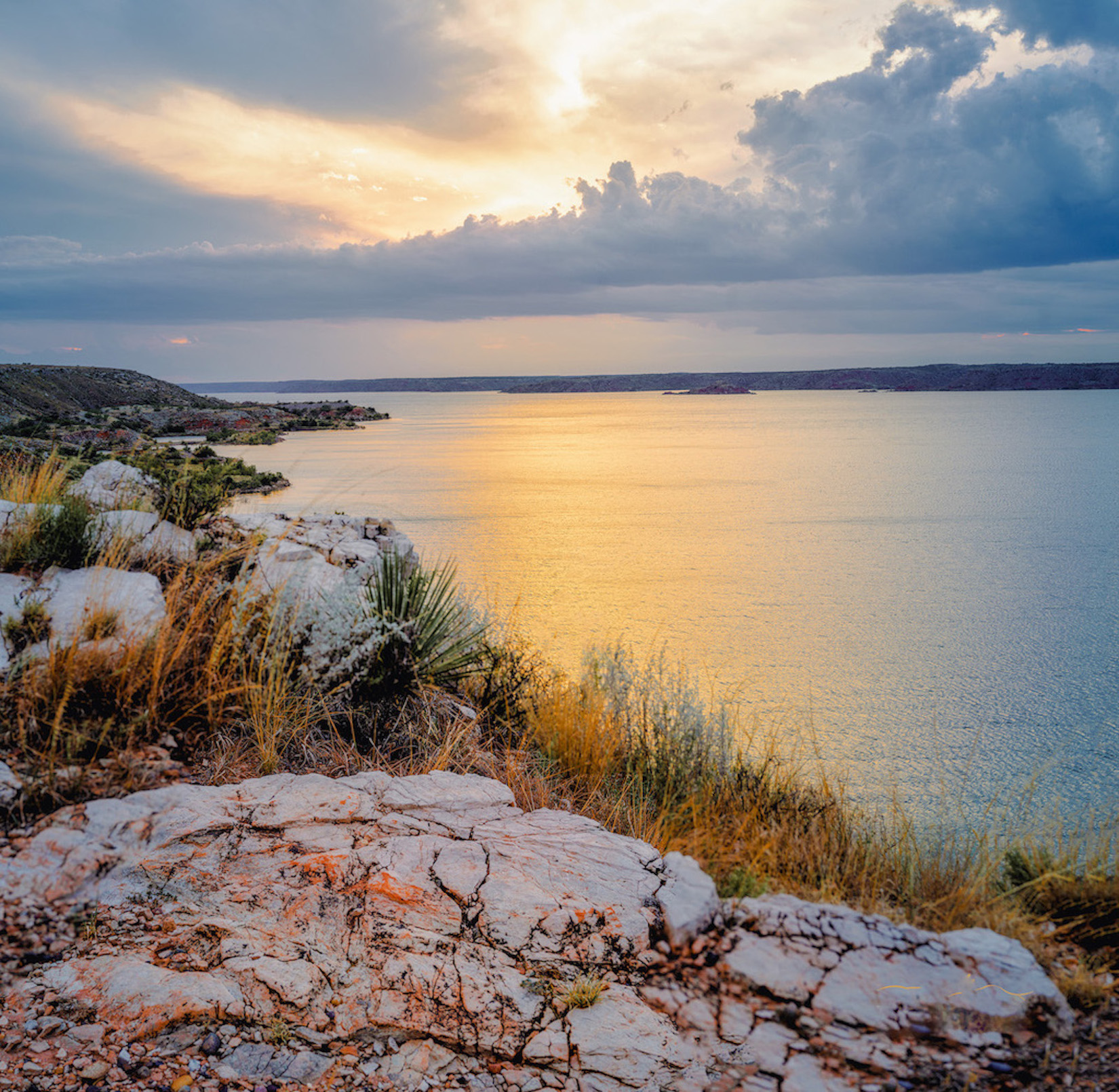
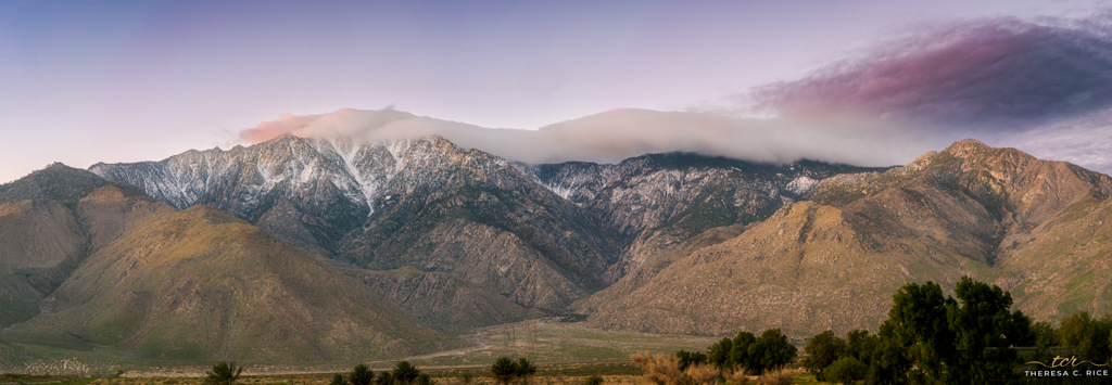
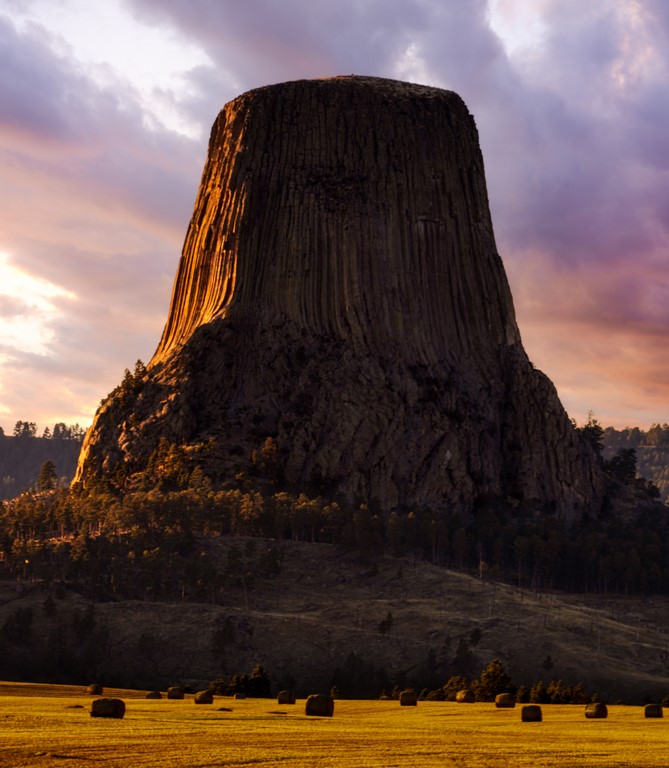
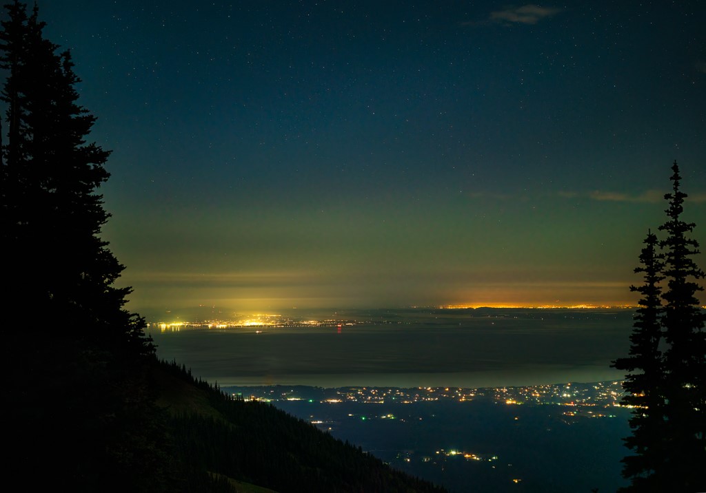
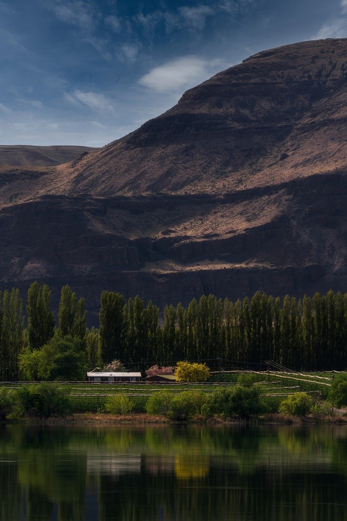
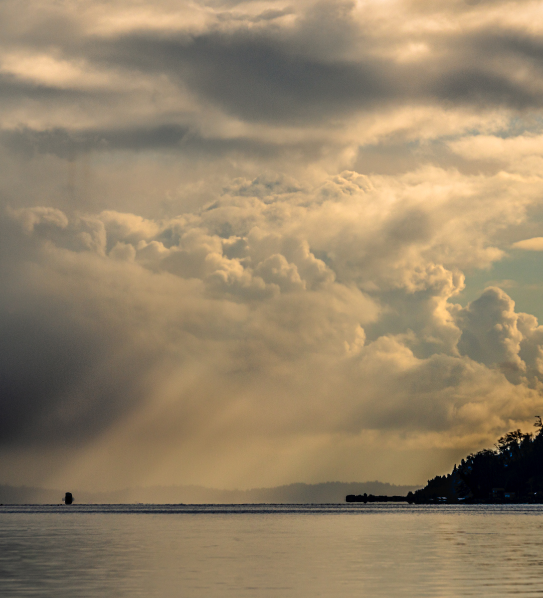
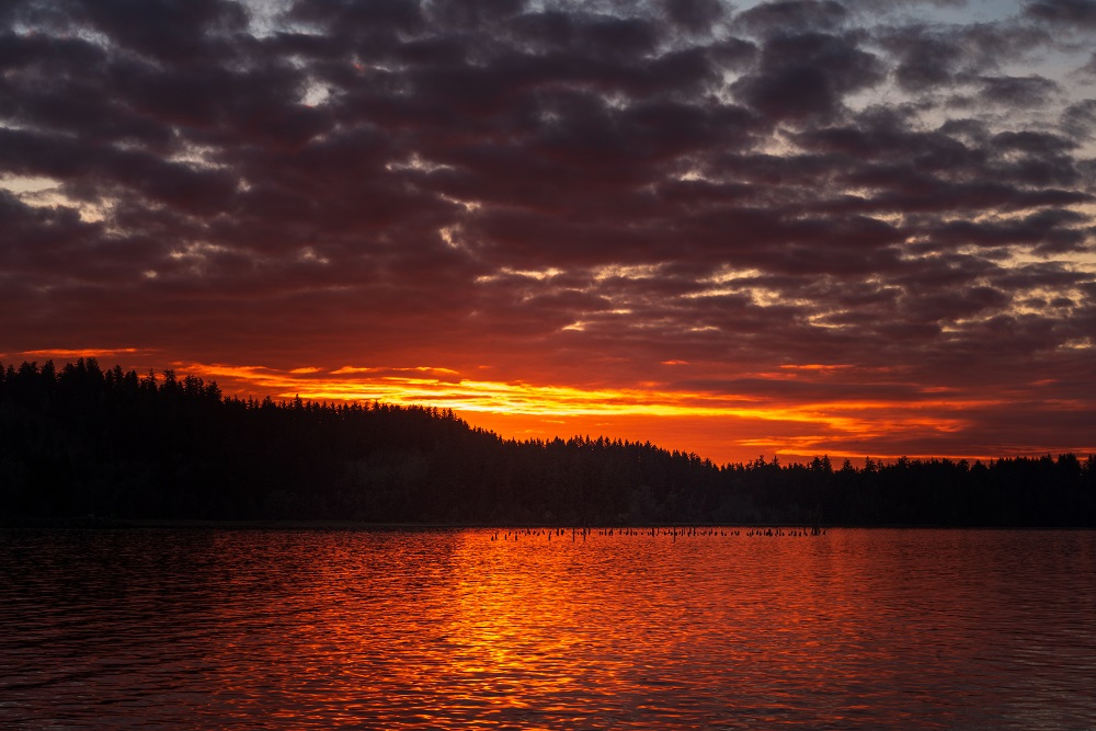
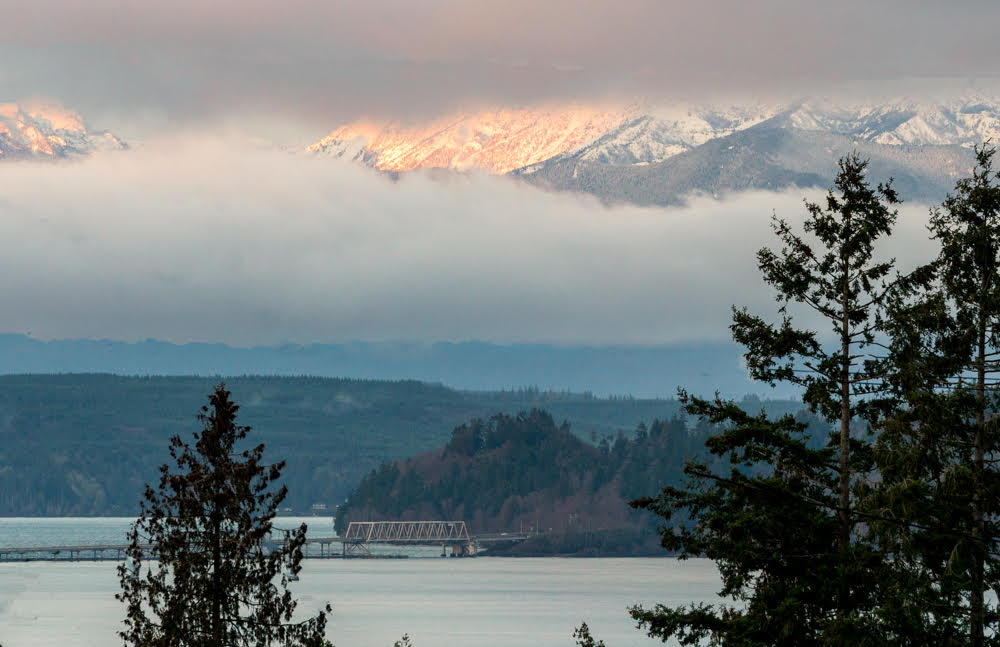
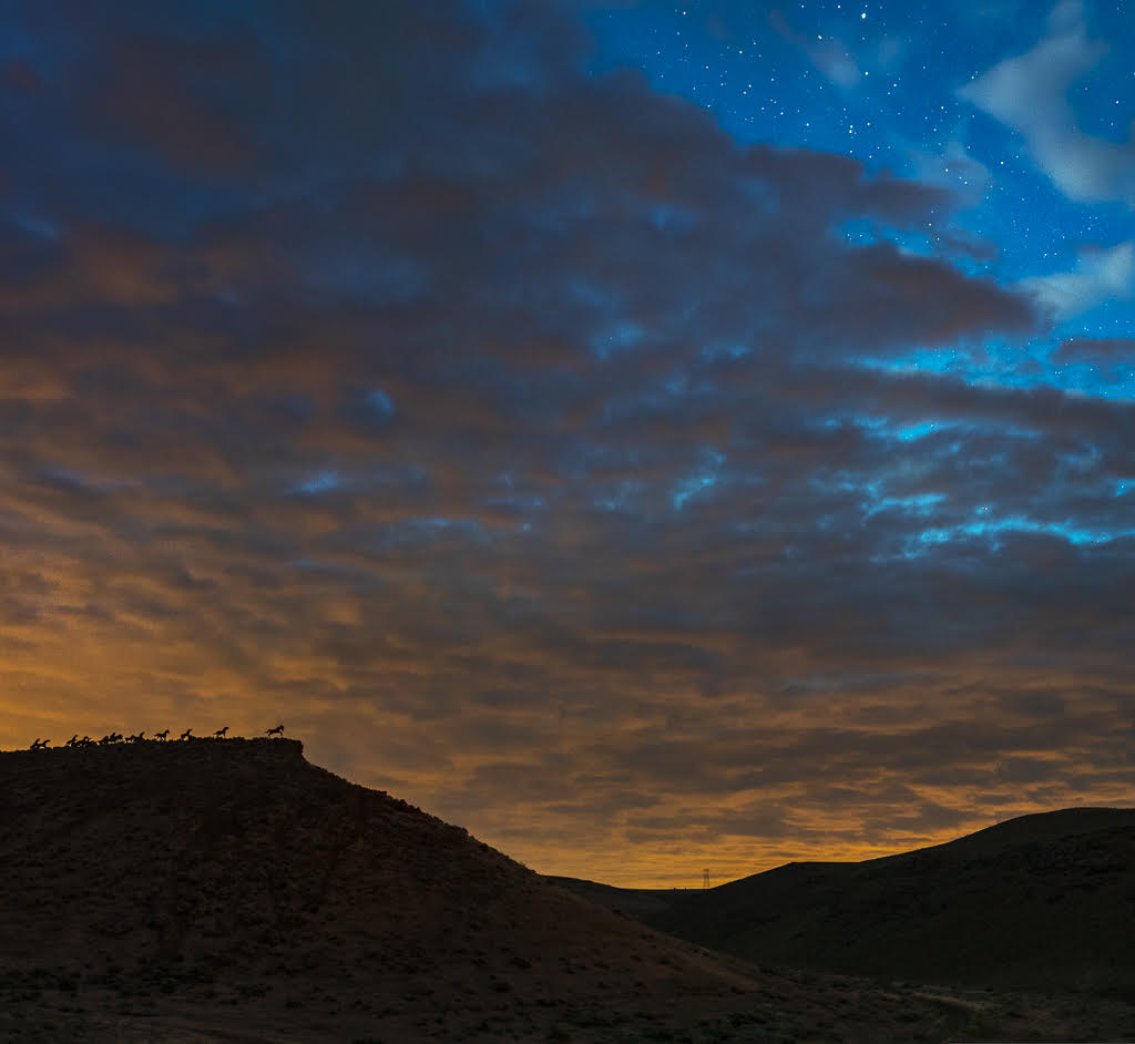
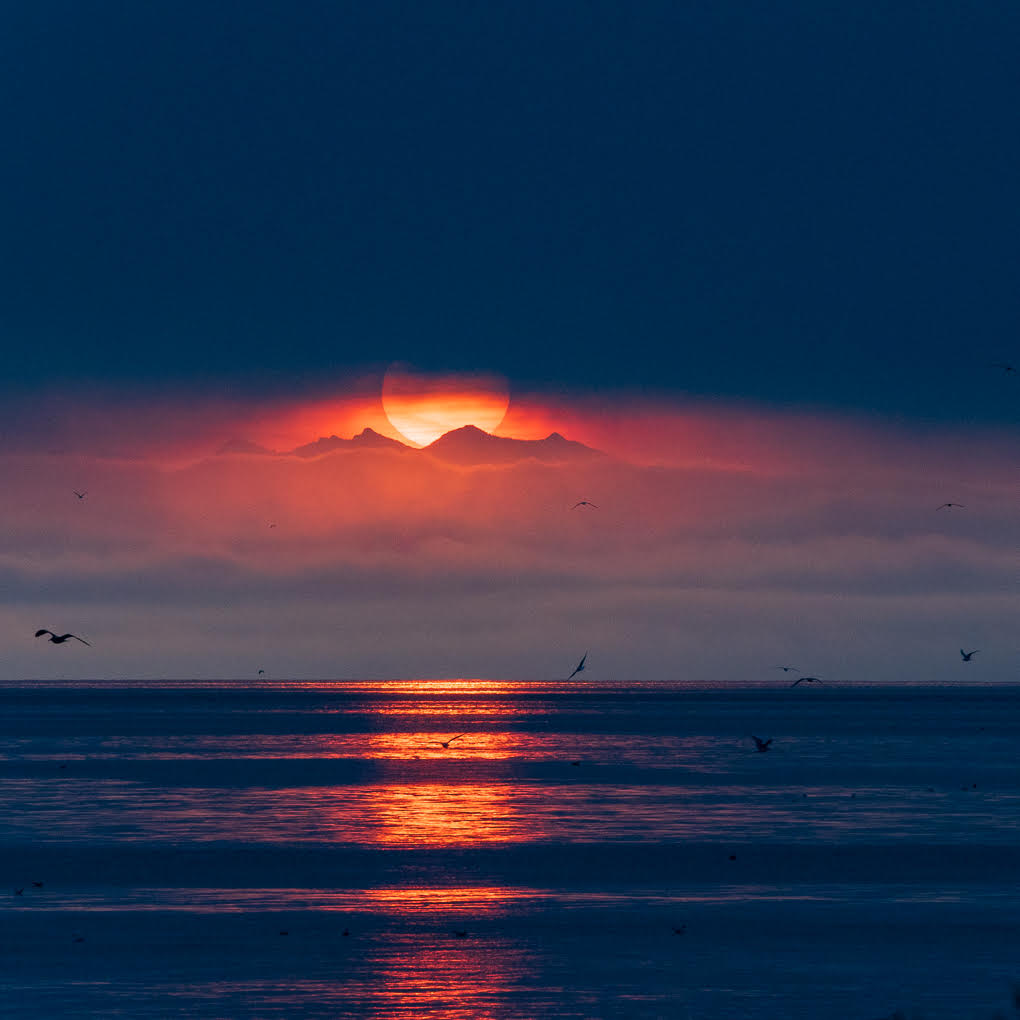
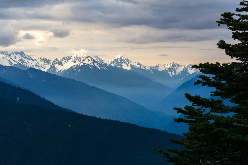
I don't know about your club but straight natural landscapes do not fare well in the judging in ours. I've found that many people (including one son and my husband) find landscapes without people or something associated with people to lack interest. However, I love this image too. The dark areas on the top and bottom really draw my eye to the golden glow around the mountain. That contrast and the way only certain clouds are lit makes this a very dramatic image. I also like the layering of the trees, smaller hills, and the mountain. You might try lightening the upper portion a bit, but I love it as is! |
Dec 20th |
| 71 |
Dec 18 |
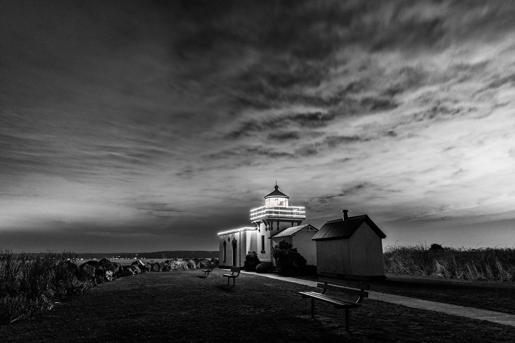
Comment |
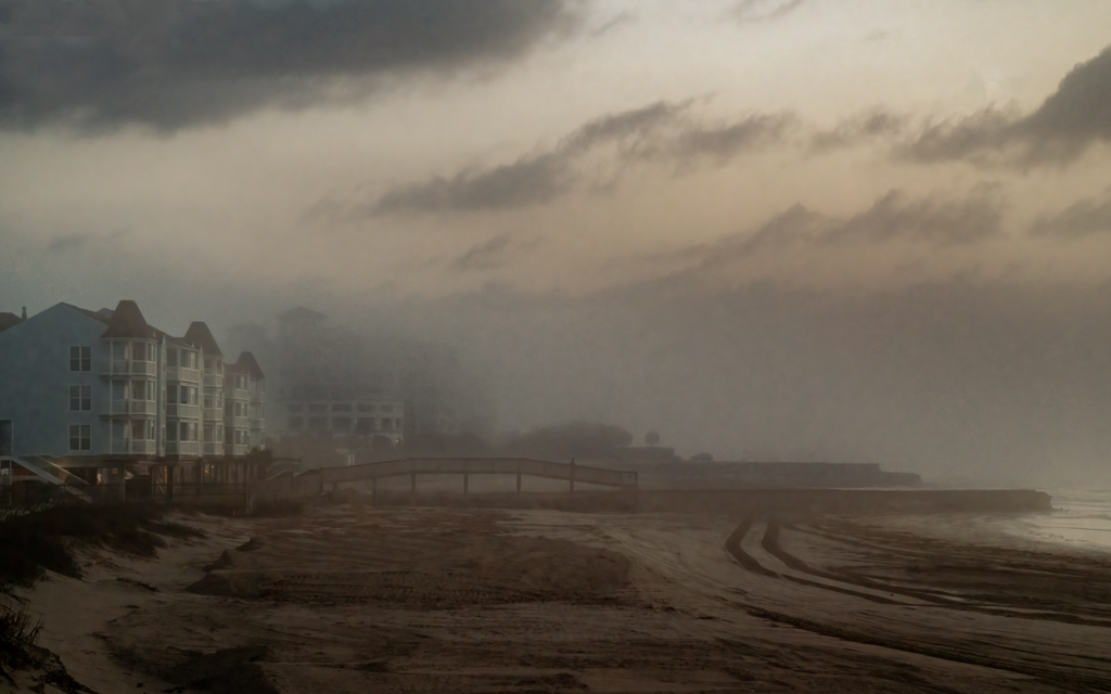
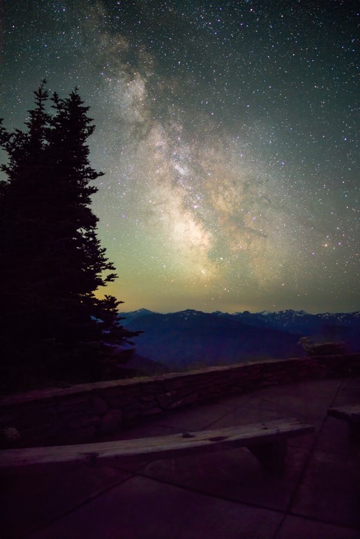
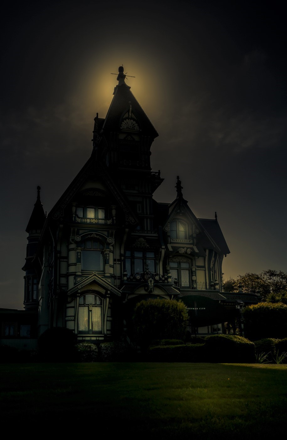
I think the point-of-view, depth of field, and tonality of this image brilliantly creates the crisp, quiet tranquility of a misty winter morning. As Marla pointed out, the light above the door is the brightest point in the image so you may want to try toning it down a bit, but it also attracts my eye to the chapel so that it doesn't completely fade into the background.
Great image - I love it and would gladly hang it in my house. |
Dec 20th |
| 71 |
Dec 18 |
Comment |
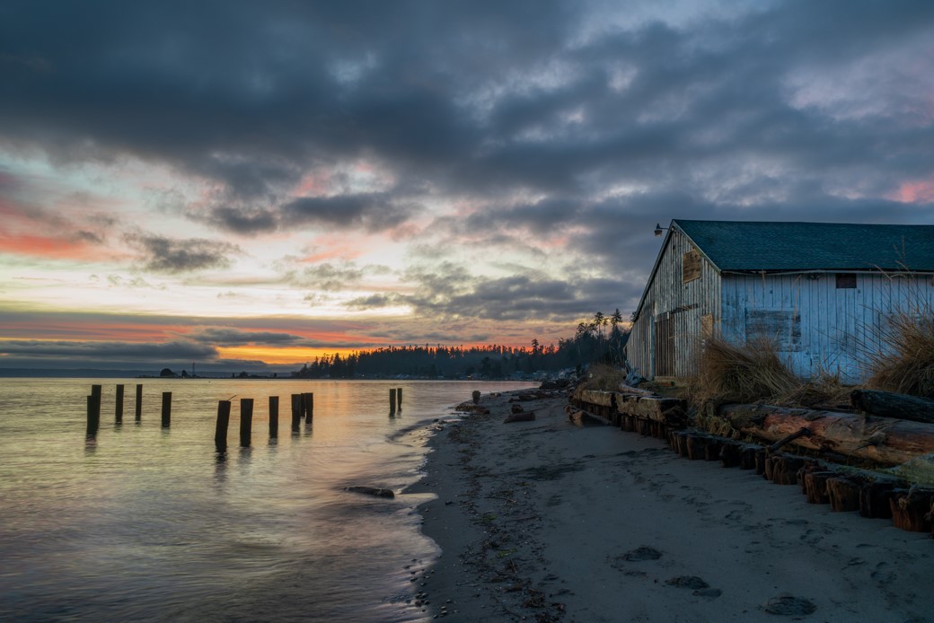
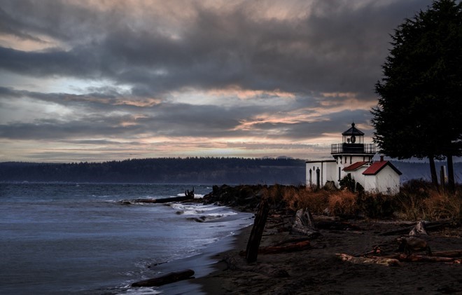
Both versions are nice, but for me the frost on the ground and dusting of snow shows up better in the color version. However, the orange posts along the road that distract me in the color version are not noticeable in the black and white and the road is more of a focal point in that image. Good job of stretching the image - I may have to try playing with that. |
Dec 20th |
| 71 |
Dec 18 |
Reply |
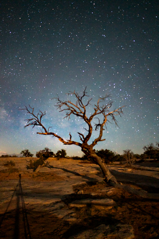
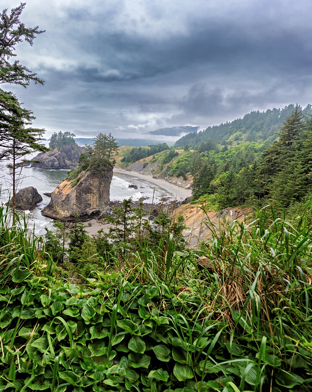
Thanks for the feedback. The truth is that I only found this shot because I started to walk between those rocks until I saw the pristine pattern. I think I'm going to play with it a bit and see what works. |
Dec 15th |
| 71 |
Dec 18 |
Reply |
I considered that but hadn't tried it. Maybe I will. Thanks for the feedback. |
Dec 14th |
| 71 |
Dec 18 |
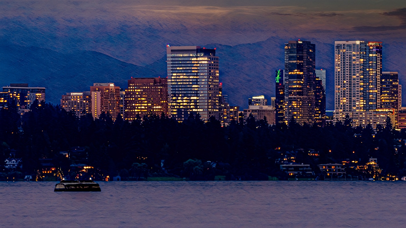
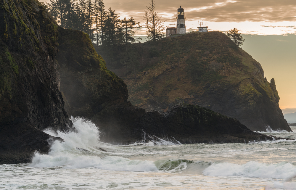
Comment |
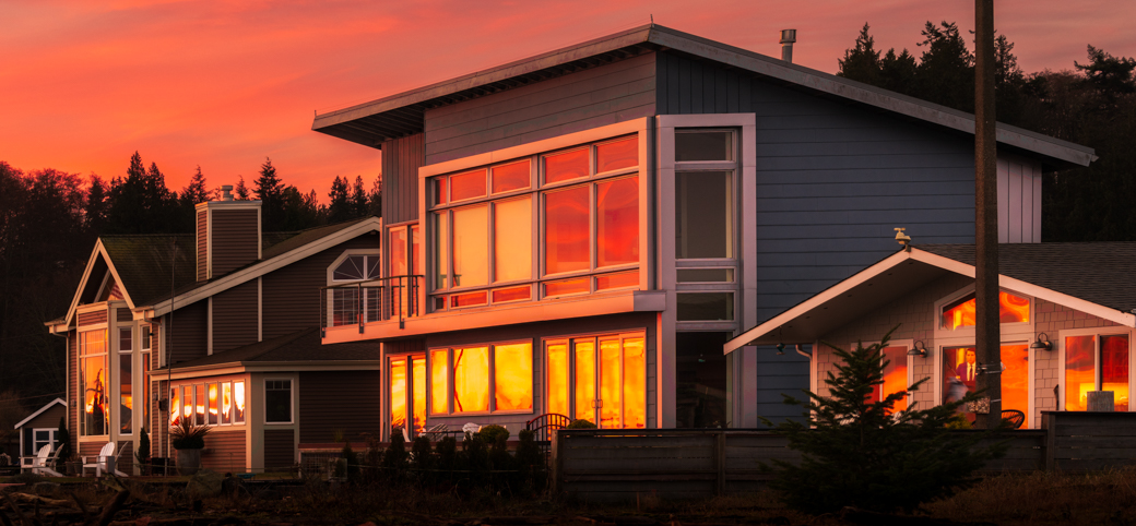
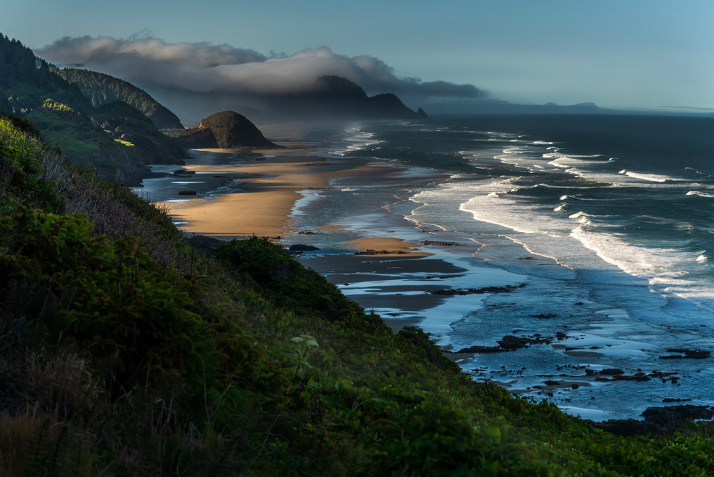
Epic sunrise and great shot! For me the foreground is so dark that the image looks warped (maybe it's just the cataracts?) so I agree with Mike about lightening that. I agree that the trees are a tad distracting too, although you might try leaving the center ones to see how that looks. |
Dec 4th |
| 71 |
Dec 18 |
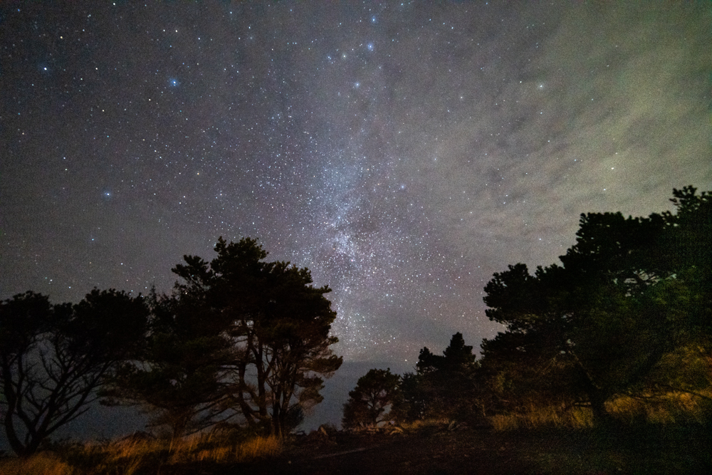
Reply |
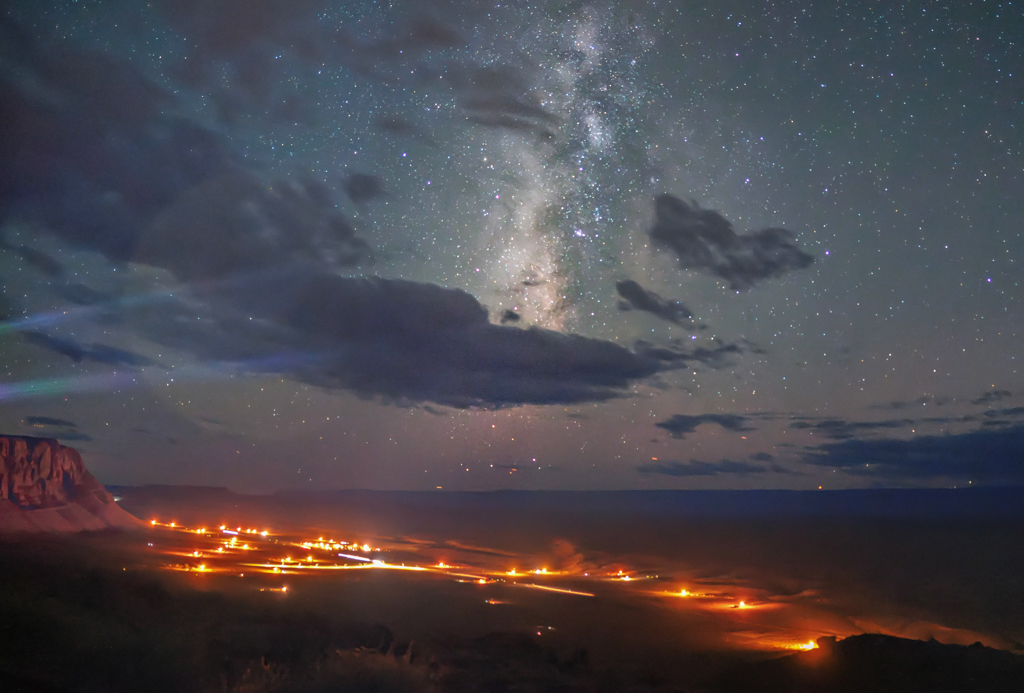
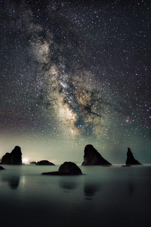
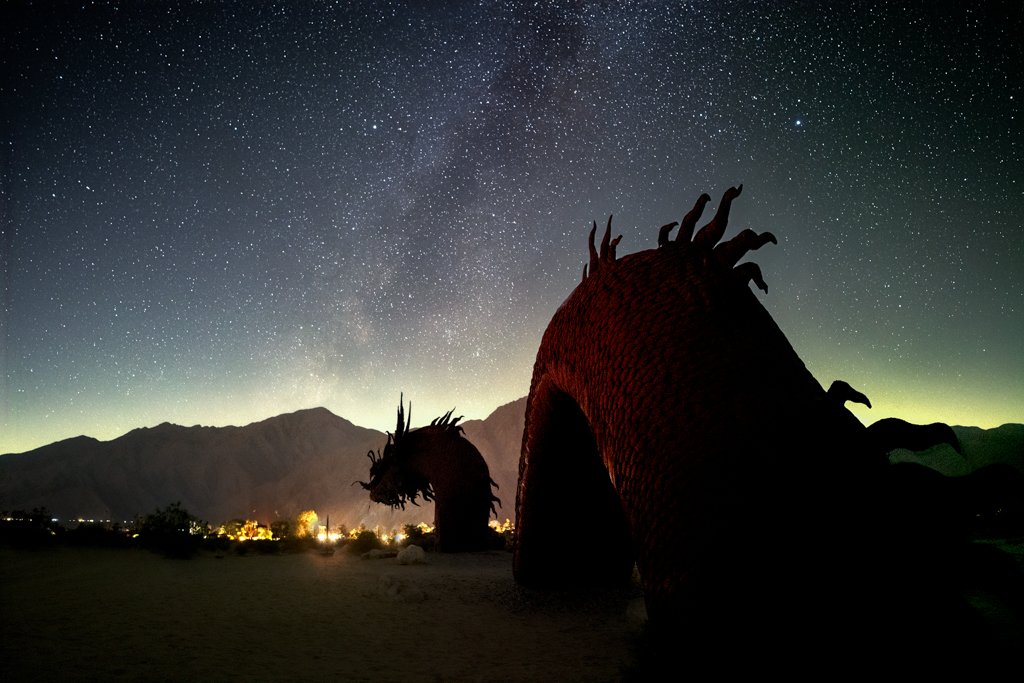
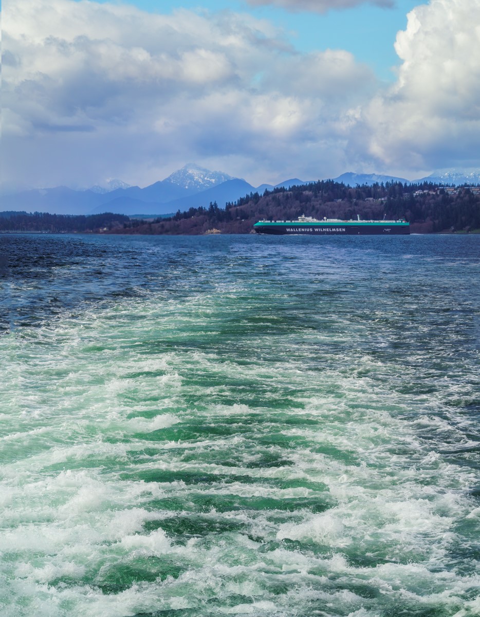
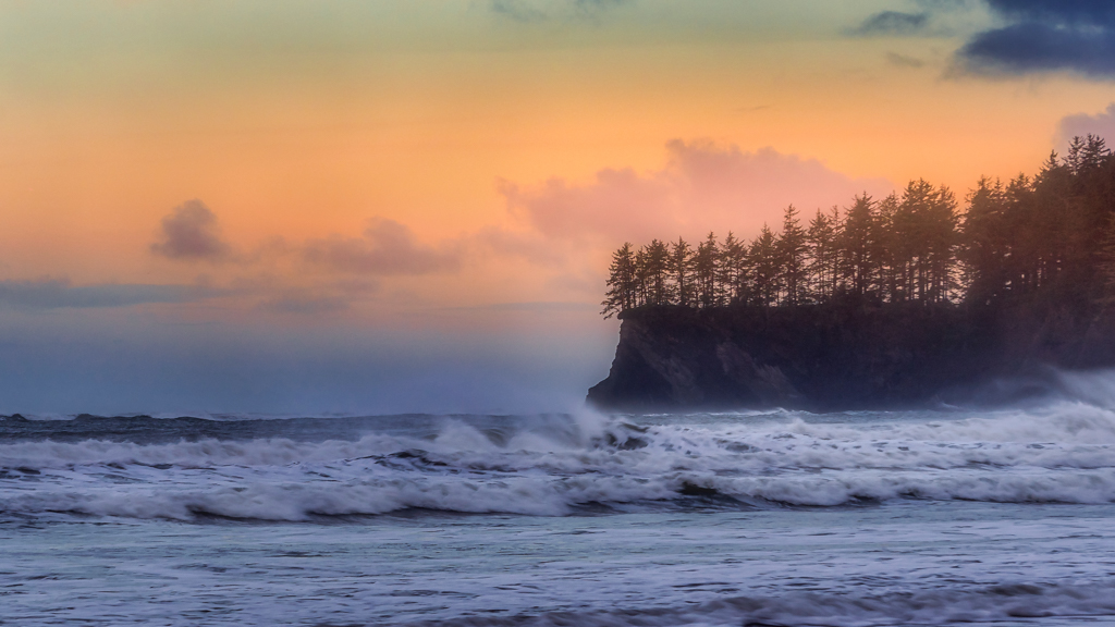
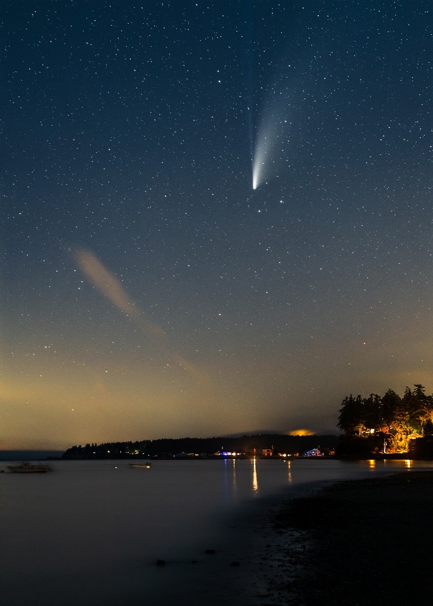
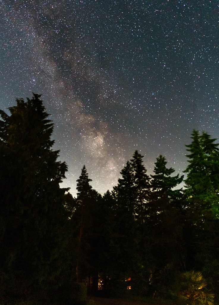
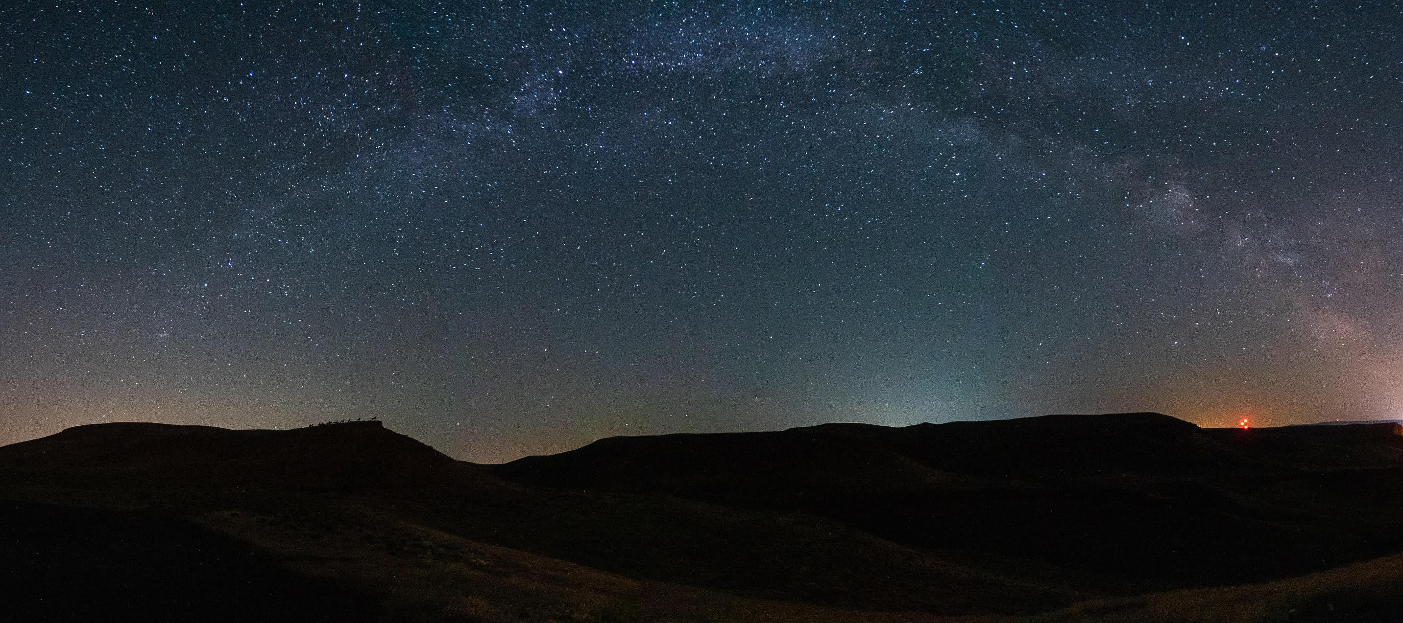
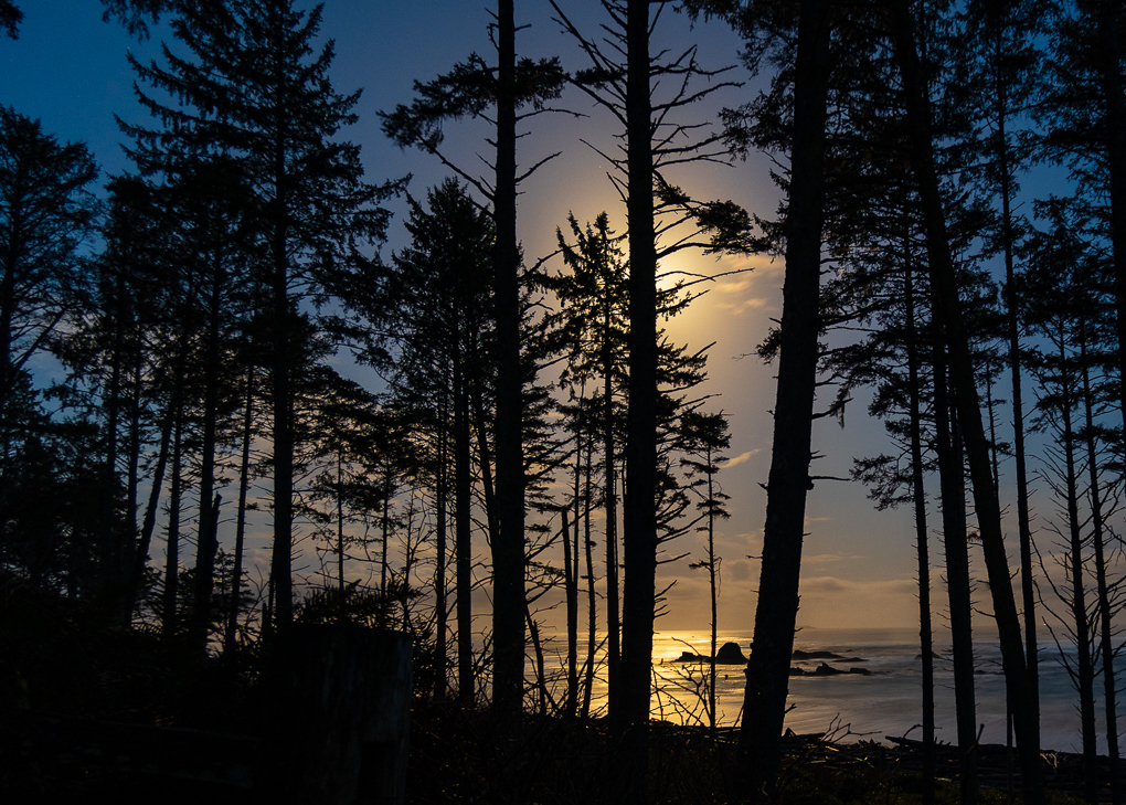
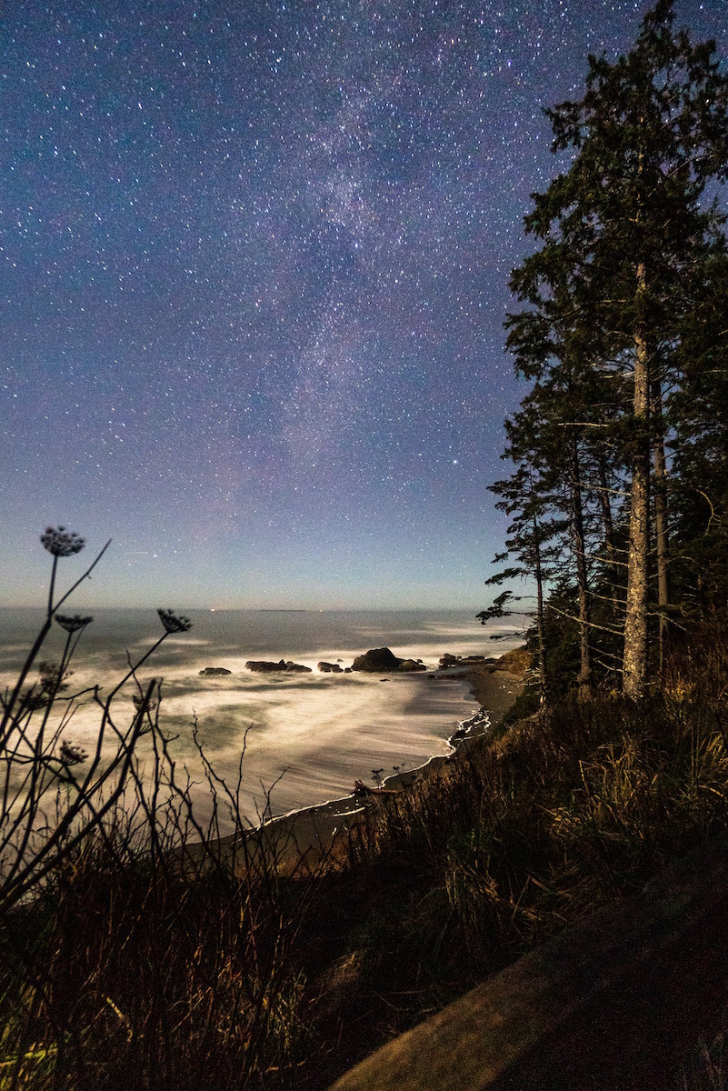
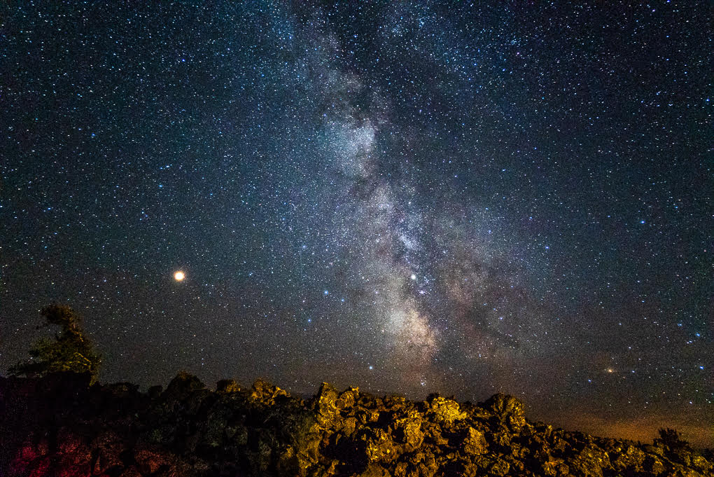
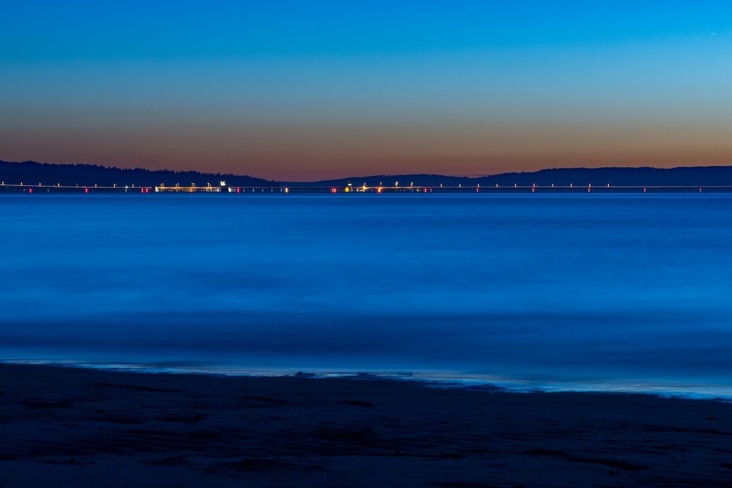
Thanks, Mike. I actually started with the close up of the ripples and found that I preferred the wider shot. We did sunset on the other side of the point the night before and I came away with so many images (including one of my all-time favorite milky way shots), it was hard to choose just one or two. |
Dec 4th |
5 comments - 5 replies for Group 71
|
5 comments - 5 replies Total
|