|
| Group |
Round |
C/R |
Comment |
Date |
Image |
| 10 |
Mar 26 |
Reply |
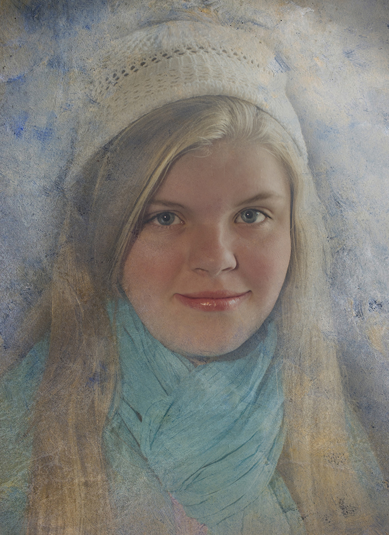
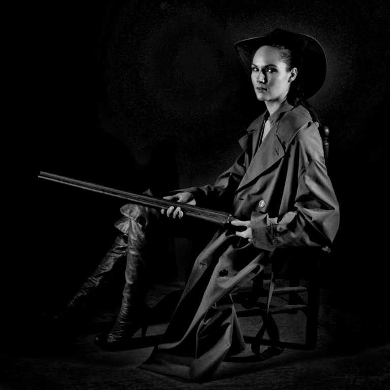
OH, I LOVE that !! What a great way to get an interesting expression on her face. Perfect !! I'll have to try that when shooting some portraits/candids some time ! Thank you for sharing. |
Mar 12th |
| 10 |
Mar 26 |
Reply |
OH, I LOVE that !! What a great way to get an interesting expression on her face. Perfect !! I'll have to try that when shooting some portraits/candids some time ! Thank you for sharing. |
Mar 12th |
| 10 |
Mar 26 |
Comment |
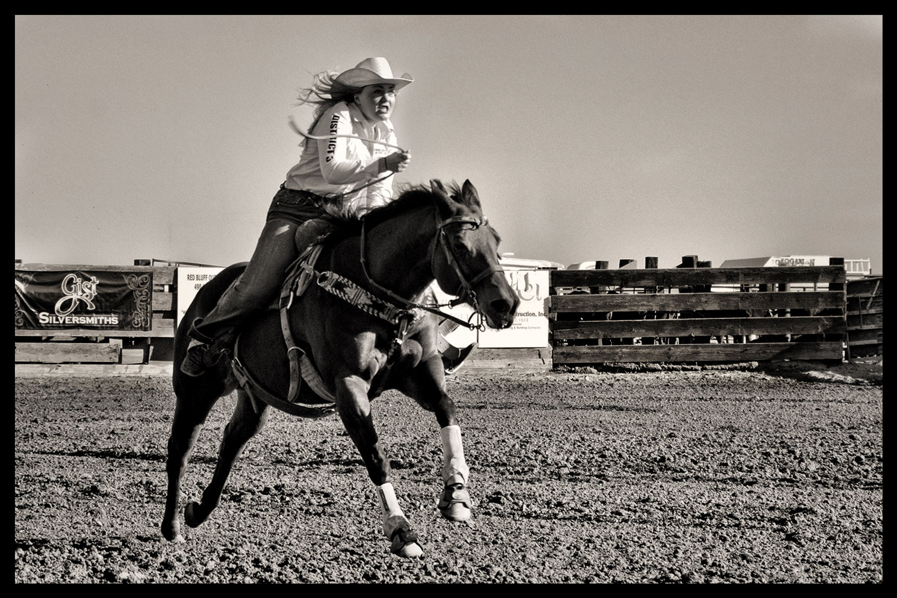
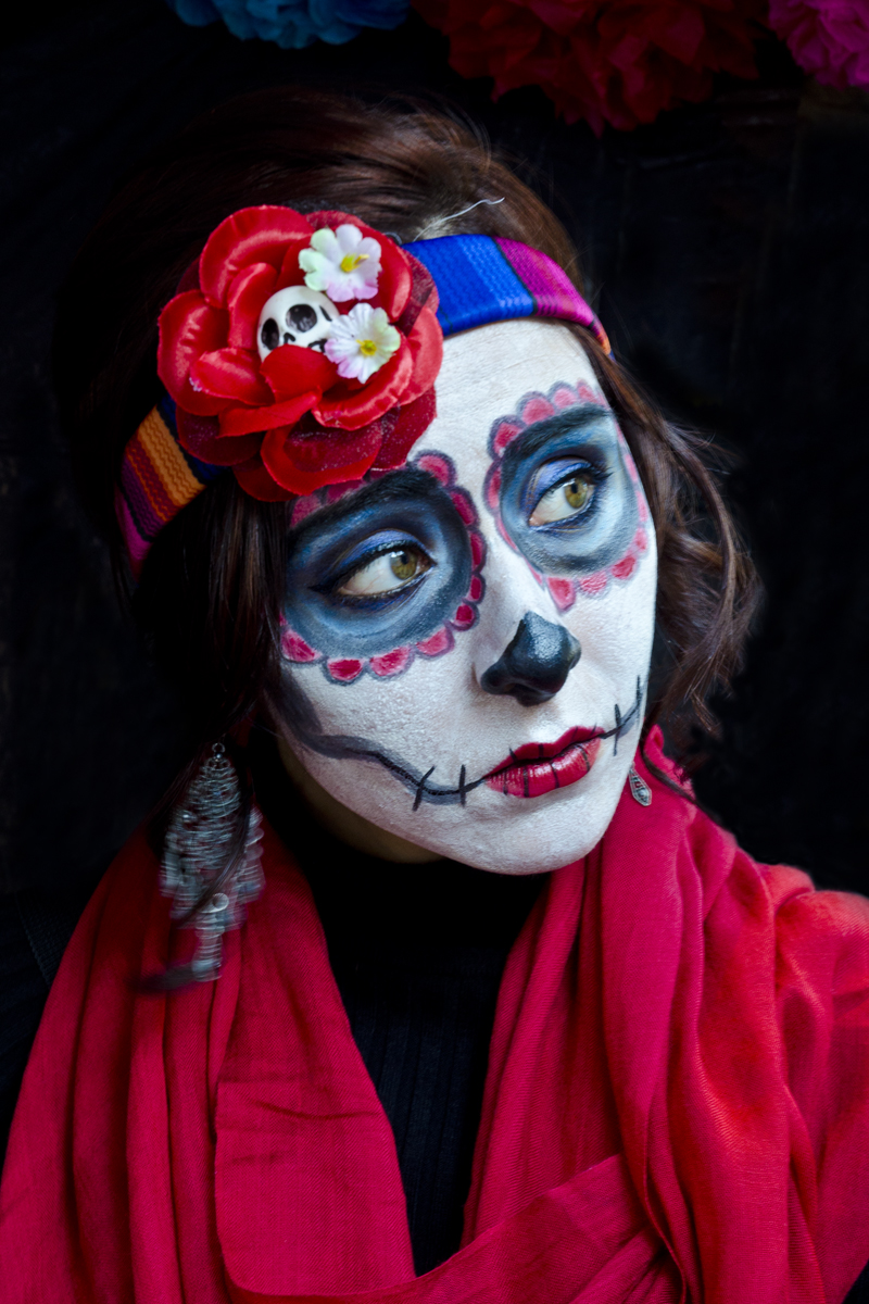
HI Peter, thank you for sending in your color image.
The reason I asked for it was: would this image be more effective/enjoyable if it were in color? I found the black and white took away what I think of Venice -- that it's romantic, colorful, etc. I do love your composition here ! The canal winding its way through these buildings is great. Good eye !
But I do prefer the color image, it's so the way I think of Venice. I actually played with your black and white image in PS before you sent your color image and came up with something so similar to your original. Thank you again for sending that. |
Mar 11th |
| 10 |
Mar 26 |
Comment |
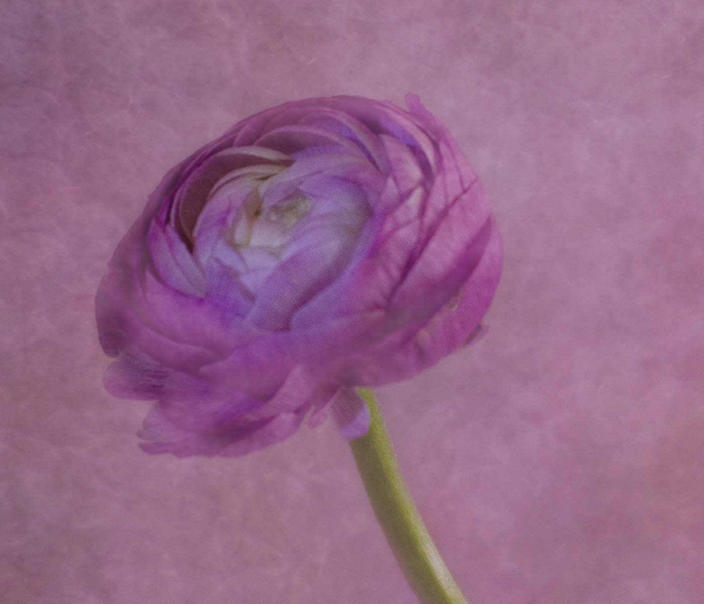
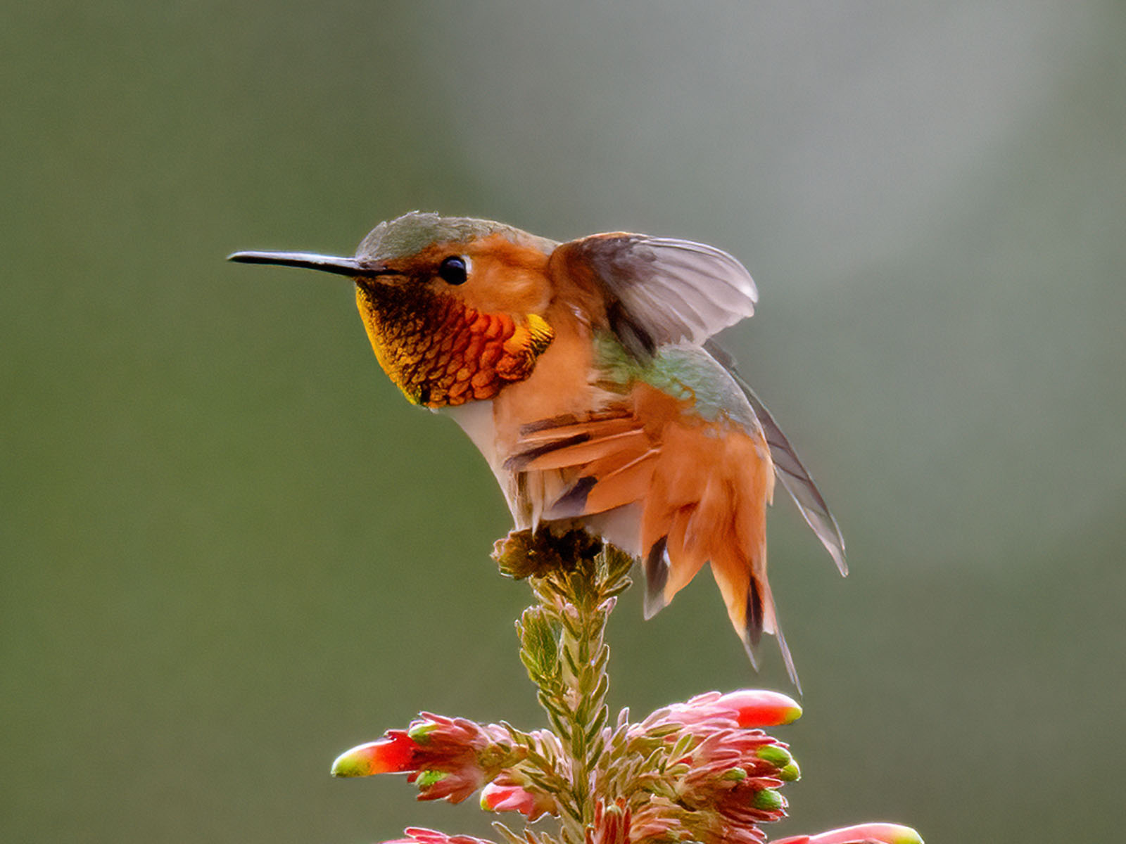
Wow, gorgeous. I love this image. Don't know where to find Black Glass but I will look into it ! Yes, I think toning down the upper right of the feather would help but I didn't notice it until I saw others' comments. I really think you did a great job with this !!! |
Mar 11th |
| 10 |
Mar 26 |
Comment |
Beautiful. I Love the colors, and I'm so curious as to what she might have been saying/thinking as you took her picture. I would remove the white jar or at least make it less noticeable below the mirror. The colors are so striking, and great composition, how wonderful. |
Mar 11th |
| 10 |
Mar 26 |
Comment |
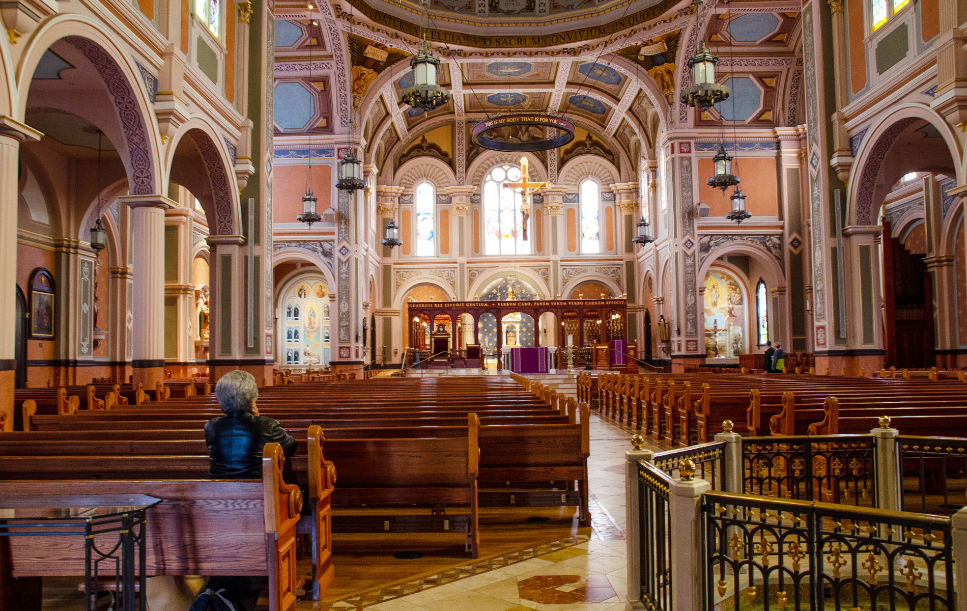
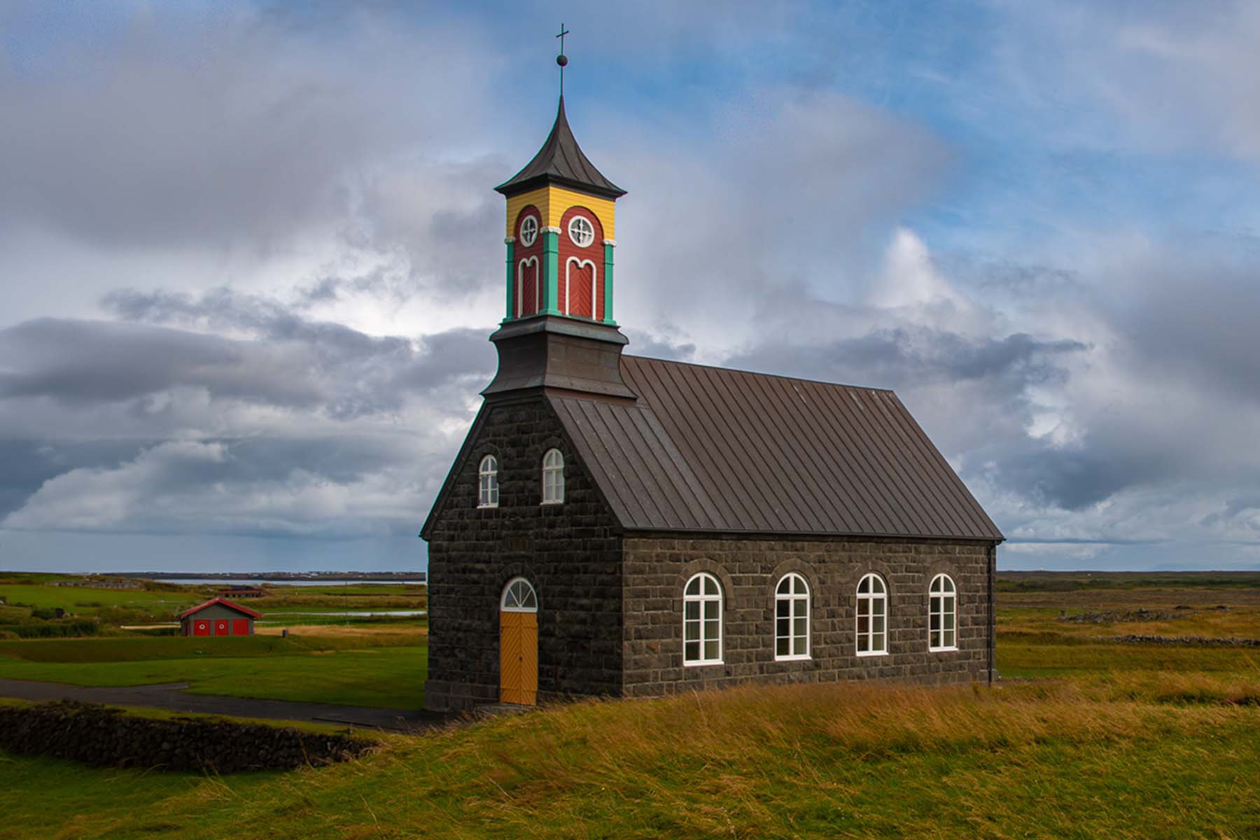
It's a lovely church; I love the steeple, doors, windows, the grasses. How lovely. I wish I could afford a trip to Iceland !
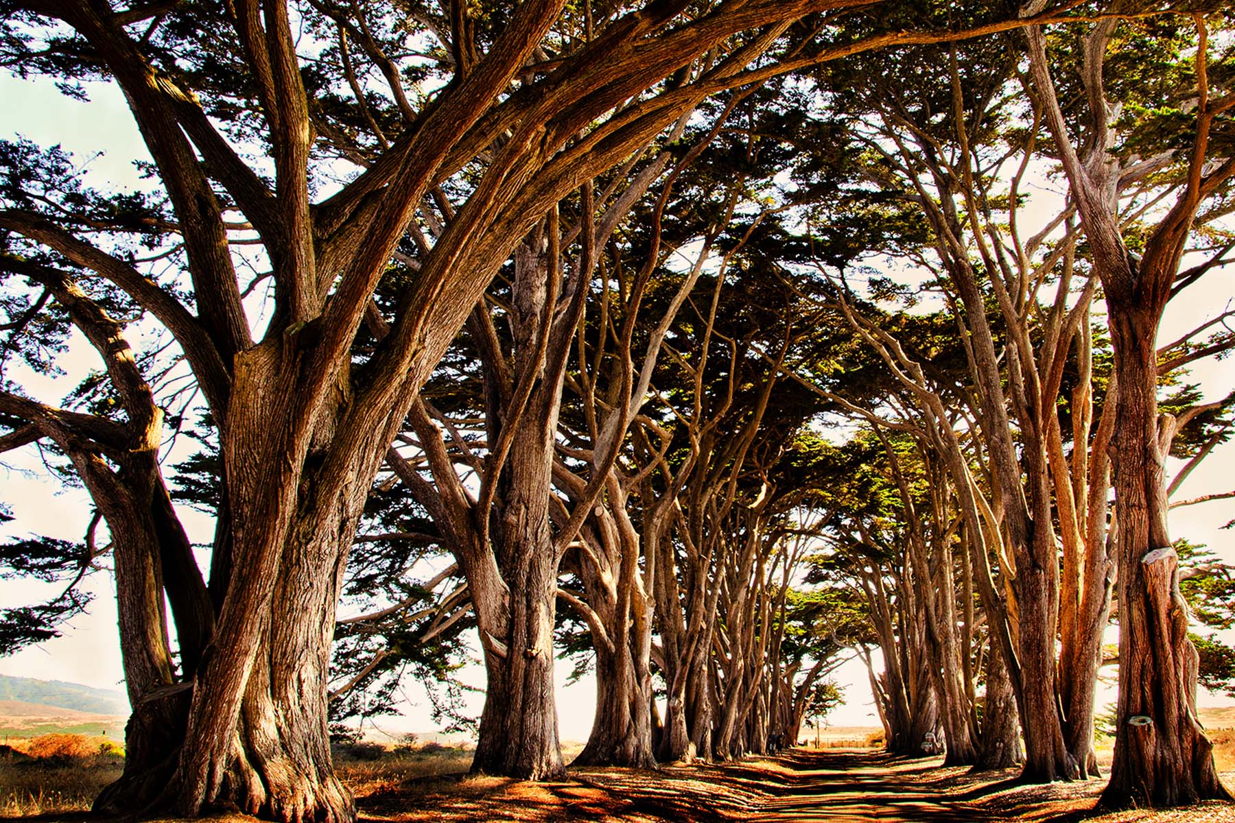
I do agree with the other comments about the placement of the church. You could do a Generative expand, crop off some of the right side, remove distractions and have a different look. Do you mind if I did this? I love to play with the pictures. Here's what I came up with, see what you think. |
Mar 11th |
 |
| 10 |
Mar 26 |
Comment |
HI Doug, Oh gosh. I know you have a different eye than mine -- I looked at it and thought it had a lot of digital noise -- is it the texture of the column or is it digital noise? I can't tell. The colors are fabulous. The leaning makes it a bit abstract, very cool idea. I wouldn't have thought of that. I wouldn't mind seeing a bit of the top cropped off -- even though you probably wanted to capture all the color, I don't think that much of the top is needed. Very creative image ! |
Mar 11th |
| 10 |
Mar 26 |
Comment |
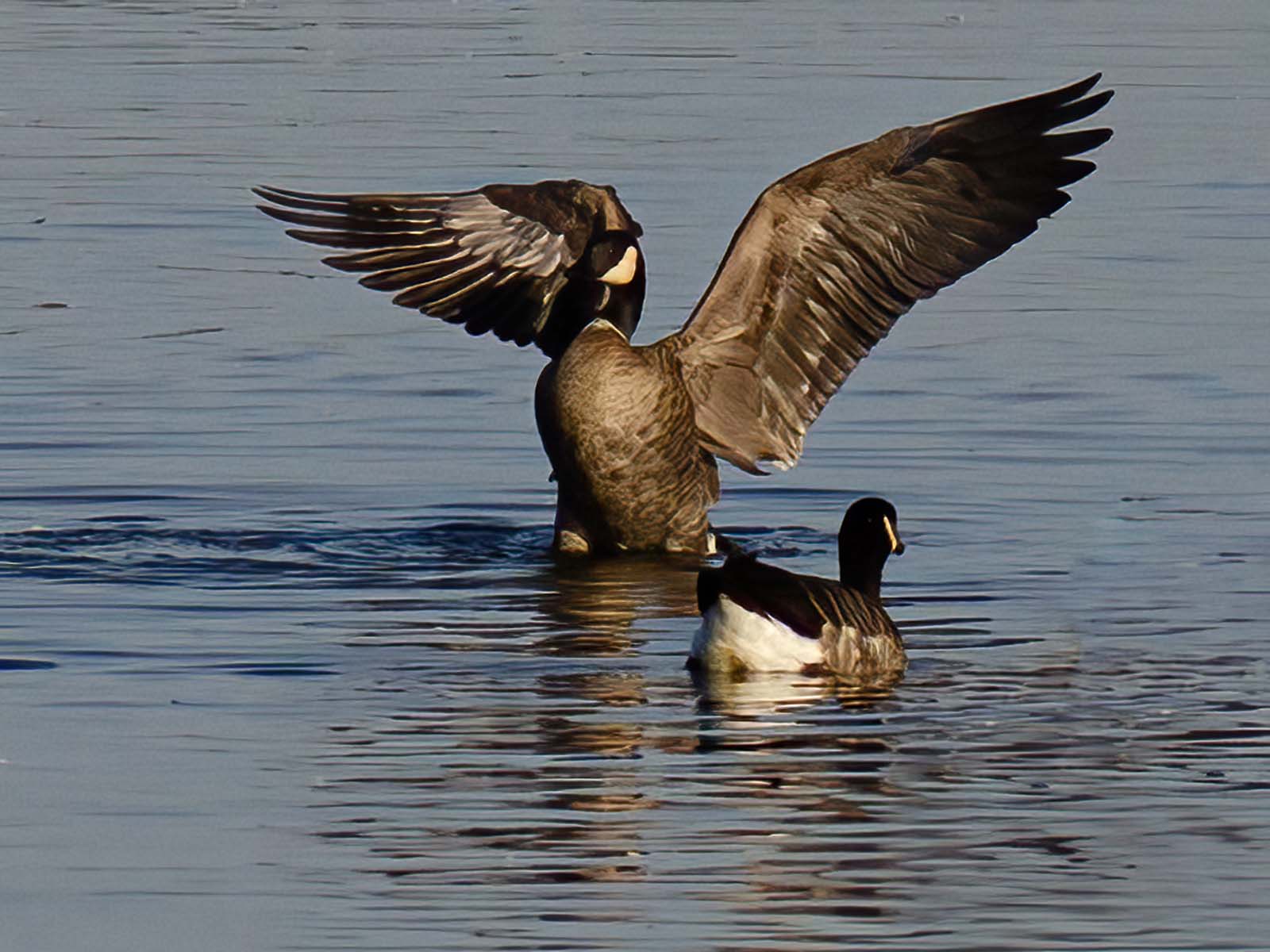
Hi Mark, What a great shot. I've been to Alaska twice and never got a shot like that. Seems the whales weren't where we were !
I love the water movement, falling off the tail, and the turbulence in the water. The mountains in the back are just in the right place ! What a gem.
The only thing that struck me to look at is the color balance - to me it looks a bit purple, can you make it a little more blue? That's the only thing I would play around with in PS. |
Mar 11th |
| 10 |
Mar 26 |
Reply |
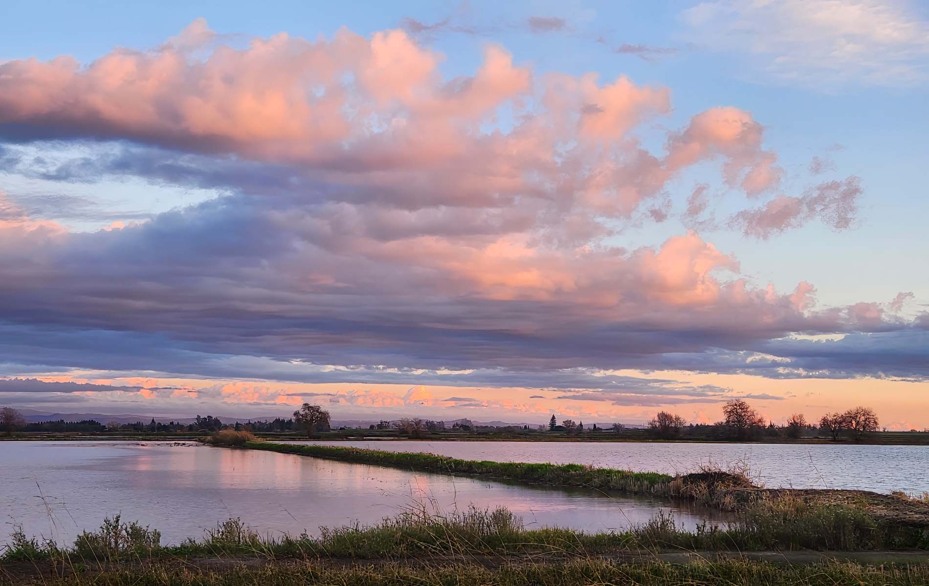
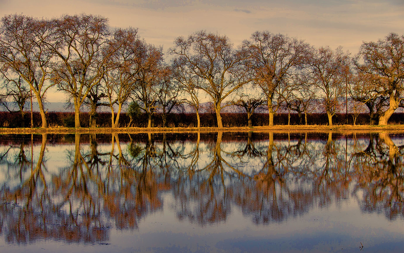
Thanks Frans for your suggestions. I actually was looking at the sky and wanting it to be the main subject, with reflection in the water. I did an edit and posted it on Meredith's suggestion area. So many ways to edit a landscape !
Donna |
Mar 11th |
| 10 |
Mar 26 |
Reply |
Hi Meredith, Yes I would have loved to remove the grasses. But that was as close as I could get to the water.
Here is an edited version -- tell me if you like this better? I took Bob's advice and increased vibrance, cropped in, and used the Generative Remove tool to get rid of the grasses in front. What do you think?
Thank you for your ideas. D |
Mar 11th |
 |
| 10 |
Mar 26 |
Reply |
Love the idea of moving closer, but if I did I would have landed in a ditch. About five feet down. Thanks for your ideas ! Much appreciated. I did an edit, as you suggested, and cropped up from the bottom, used the remove tool for some of the grasses, and increased the vibrance. I do think it makes a better image.
Thank you ! |
Mar 11th |
6 comments - 5 replies for Group 10
|
6 comments - 5 replies Total
|