|
| Group |
Round |
C/R |
Comment |
Date |
Image |
| 10 |
Feb 26 |
Reply |
Peter, I've never heard the expression "add sloth". What does that mean? Thanks, Donna |
Feb 26th |
| 10 |
Feb 26 |
Reply |
Yes, I like this better.
Are you sure that using the tool that straightens your lines in Lightroom removes pixels? I've never been told that.
|
Feb 26th |
| 10 |
Feb 26 |
Reply |
Thanks !! |
Feb 13th |
| 10 |
Feb 26 |
Comment |
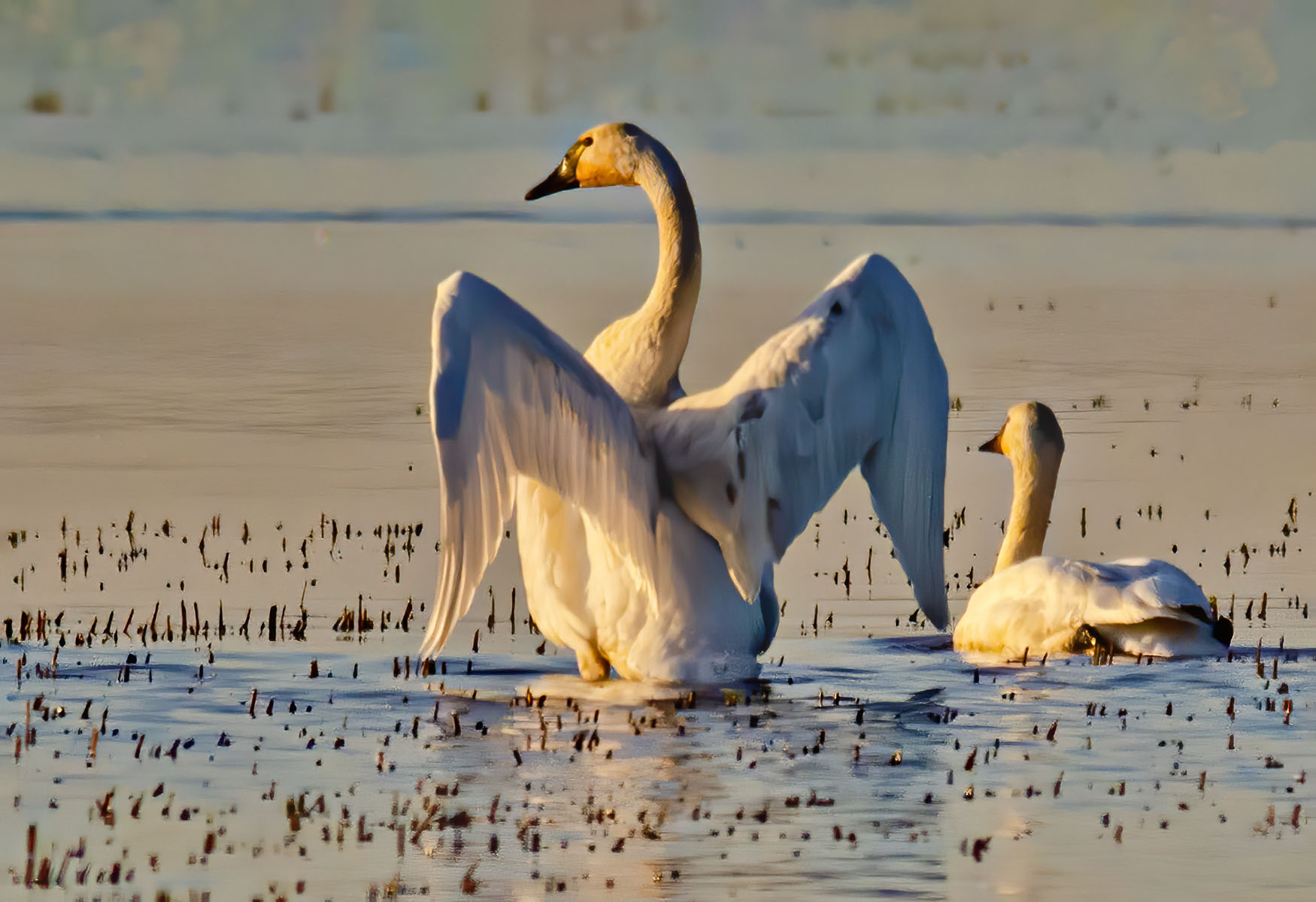
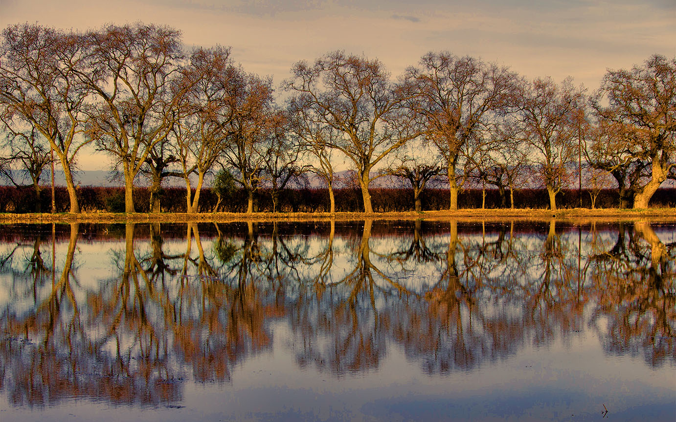
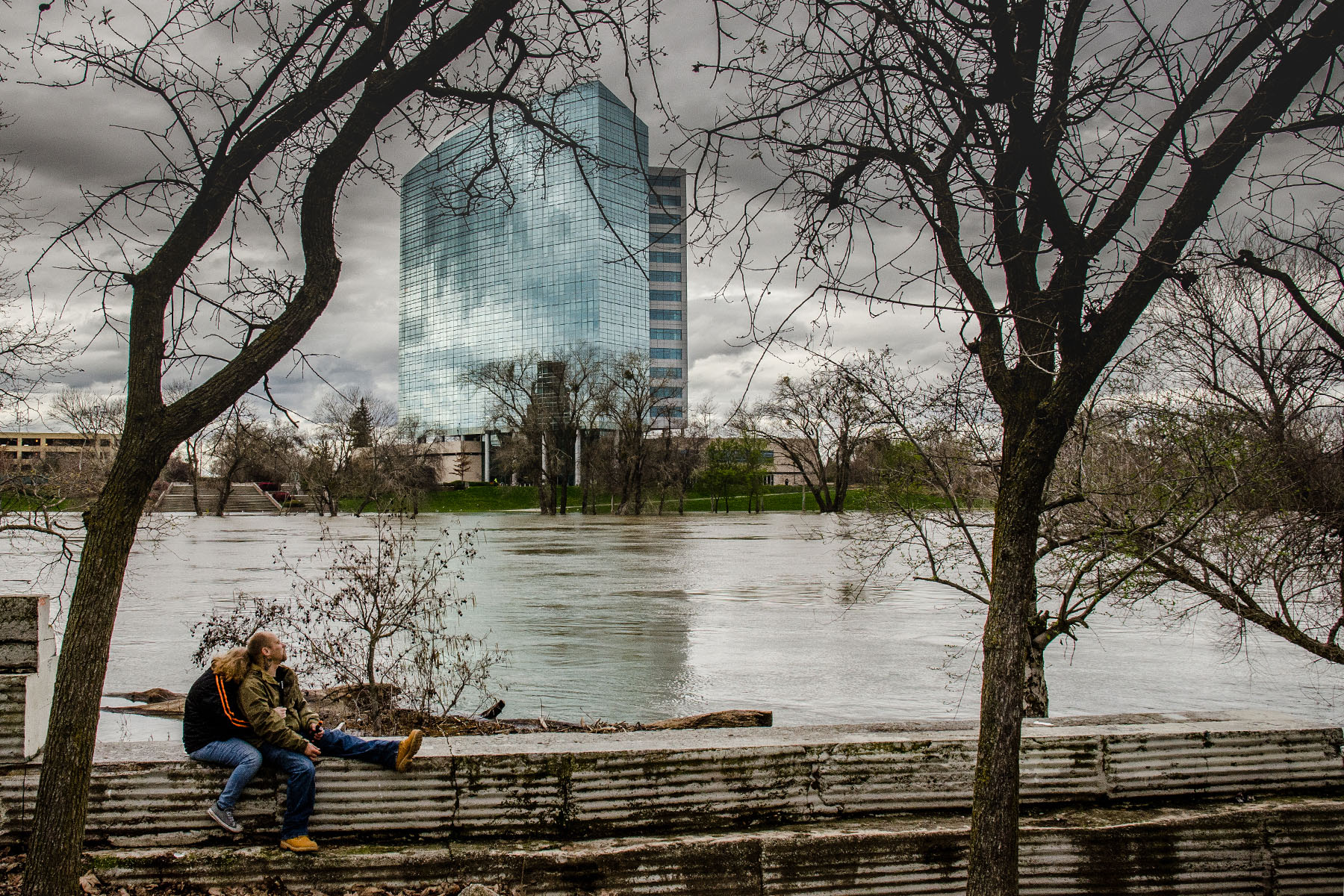
OMG, I've been swimming along the sea channels in Cape May NJ many years ago. The water was so smooth, I was in heaven. I do miss the NJ coastline !!
So, your image is really fascinating to me. I think your post edits are really good but I agree with Meredith that the right horizon could be cleaned up.
What is this thing in the water? It's almost surreal. Like a submarine telescope or -- what ??? Oh, I see above that it's a buoy. Fascinating.
Did you want the buoy to be right in the middle? I know in competitions, judges will often criticize things that are right in the middle of the image and I wonder if taking a bit off the left side would be a possibility -- the left side doesn't have much color and doesn't add that much to the picture so you wouldn't miss it. But it really is a fascinating shot, very creative and mysterious ! I love it. |
Feb 13th |
| 10 |
Feb 26 |
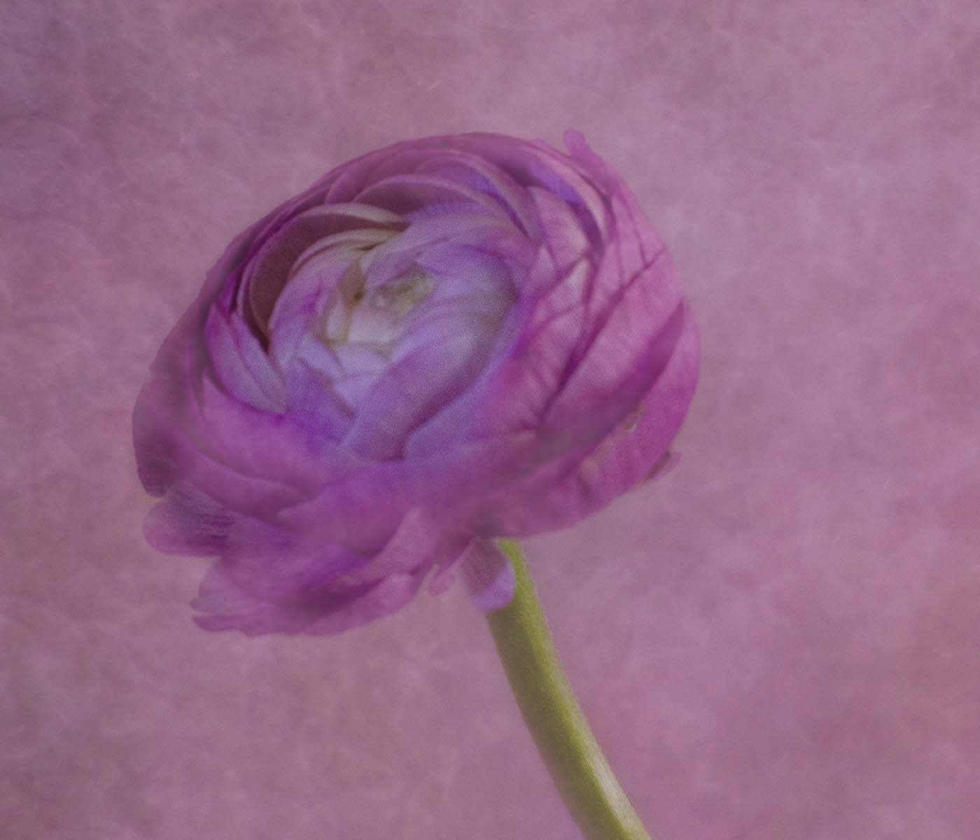
Comment |
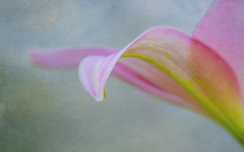
Hi Meredith, what a lovely image. I think your post-processing really added depth and texture to it. I would darken or remove the -- what is it? -- a part of a root maybe - at the very lowest left side of your image. It's a bit bright. Maybe even darken the bit of sky at top, so your brightest part of the image is the waterfall.
But other than that, lovely. Makes me want to go there !
Donna |
Feb 13th |
| 10 |
Feb 26 |
Comment |
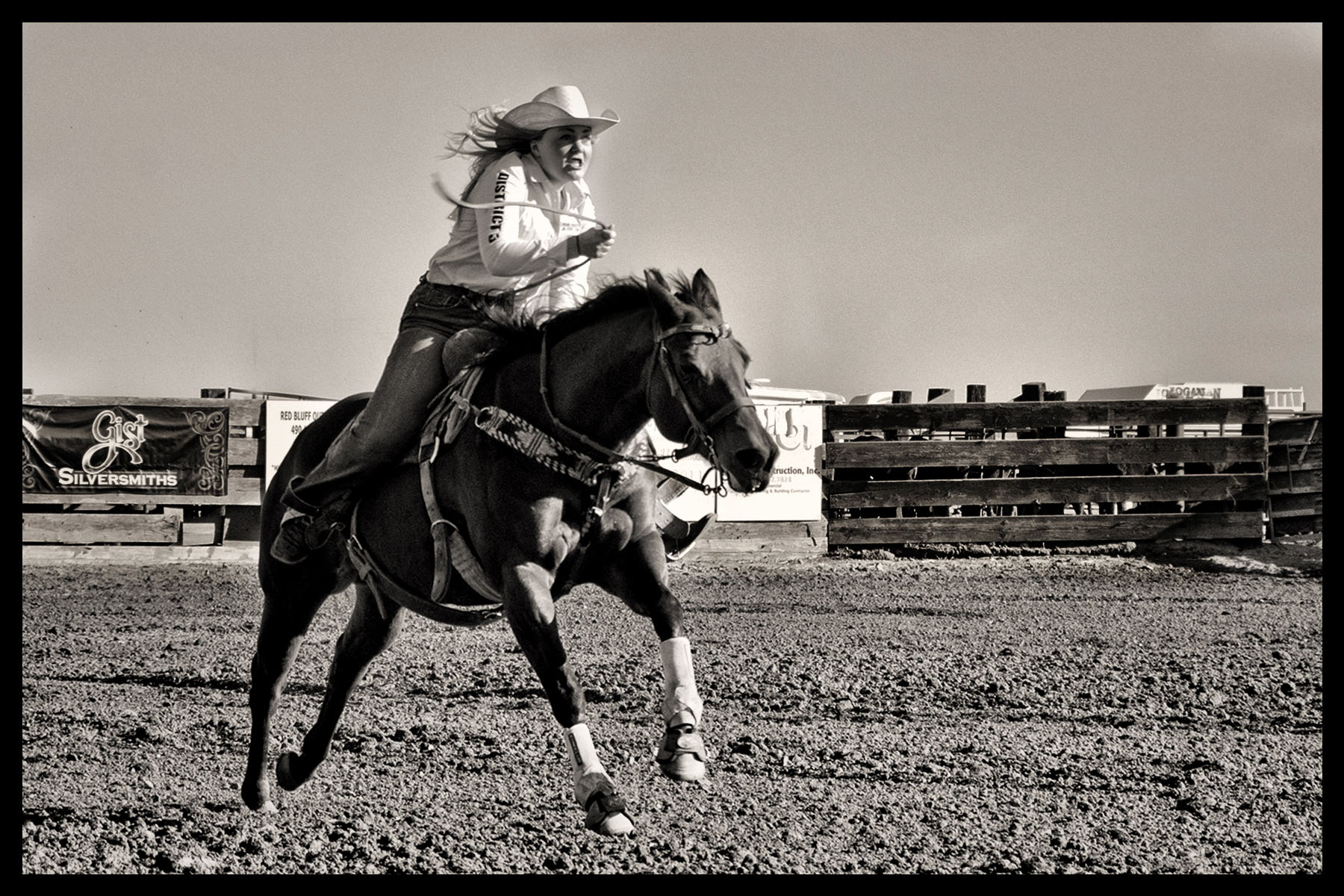
Beautiful, I love the colors and textures and the way you captured the water splashing. I hope they don't harm the animals. I - if it were my picture - might crop down from the top a bit but that would mean cropping some of his rope/whip. I know a lot of images like this are staged, not sure if your was one of those, but it is really striking to look at. |
Feb 13th |
| 10 |
Feb 26 |
Comment |
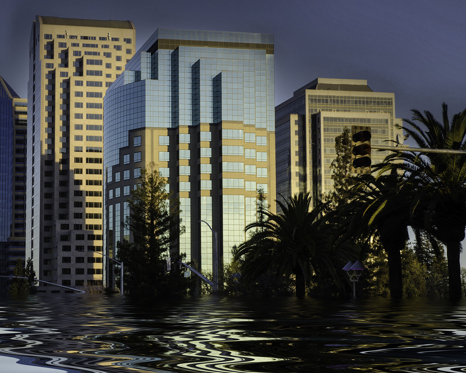
This is really great, my favorite colors and I love the design of your image -- the swirls are great. I would love to have been there and see how you created that. You could crop a tad off the top but otherwise I love it. |
Feb 13th |
| 10 |
Feb 26 |
Comment |
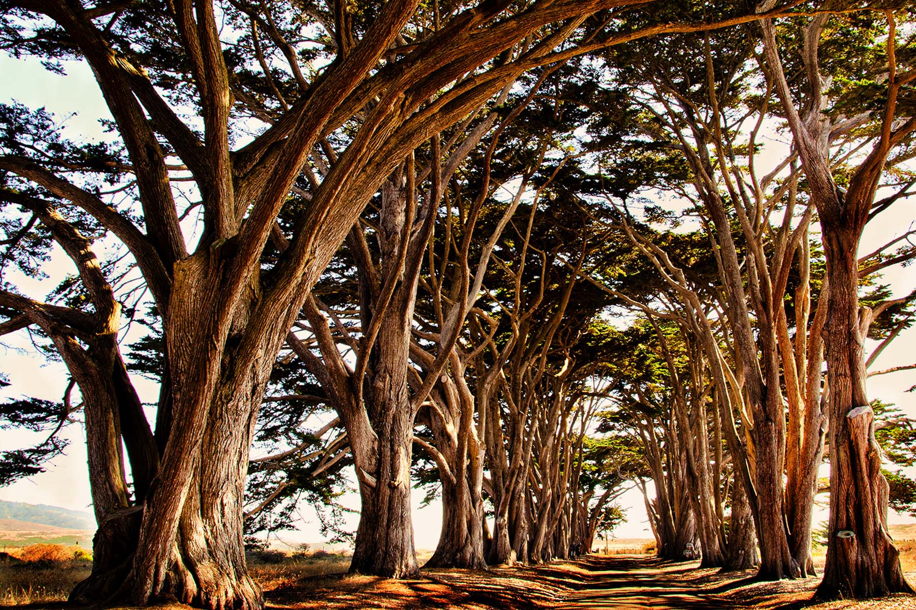
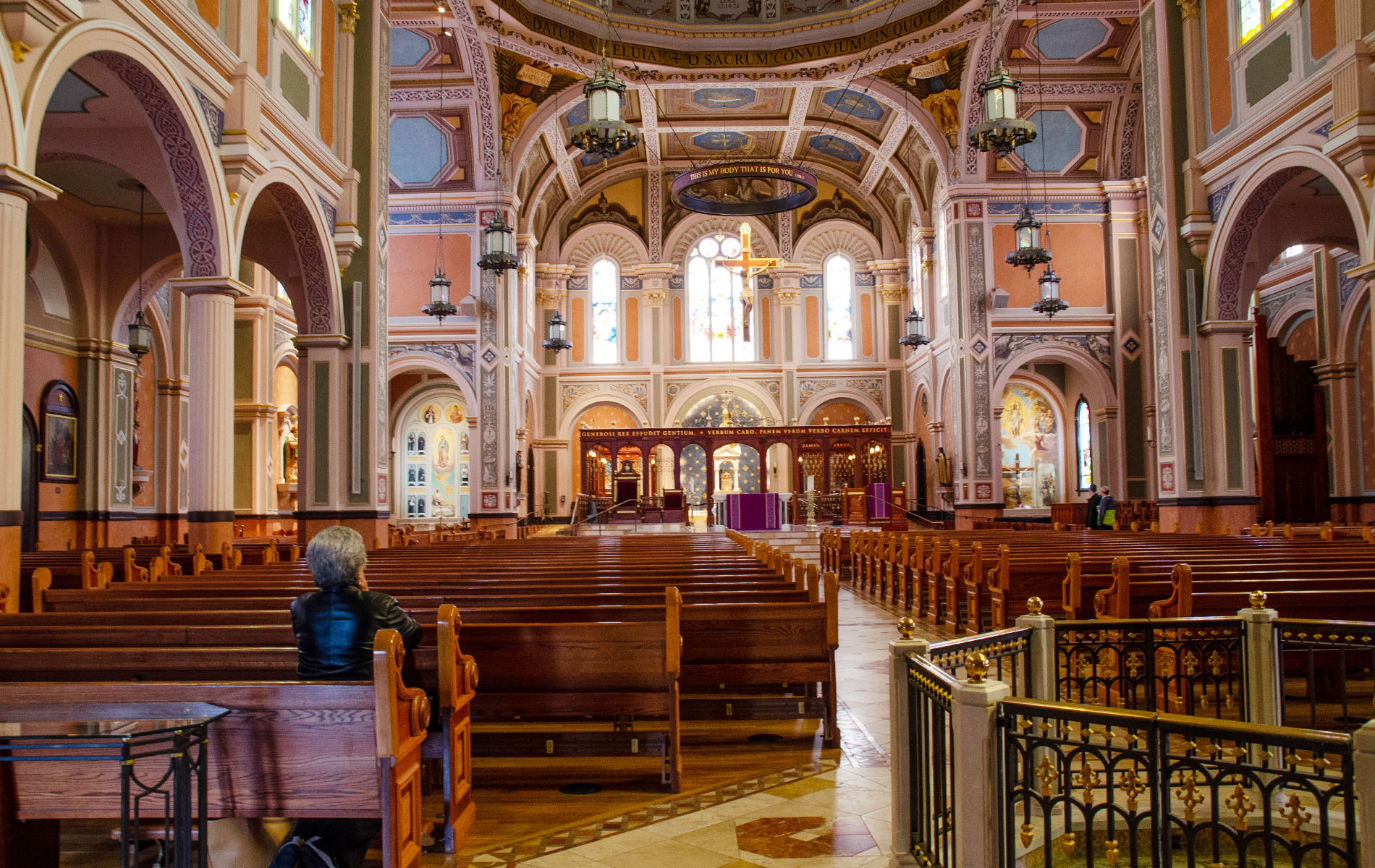
Wow, this is a tough image ! First, the colors are lovely and the building itself is amazing. The thing I notice most is that your columns lean in on all three of your images. That's a distraction and takes away from the beauty of the Cathedral.
If you have Lightroom, you can straighten these colums so they don't lean in that way. Actually I think if you had stood closer to middle of the room you might have had a more impactful image. I love the people walking on the left, that's a great focal point. I think your original was the one I like best. |
Feb 13th |
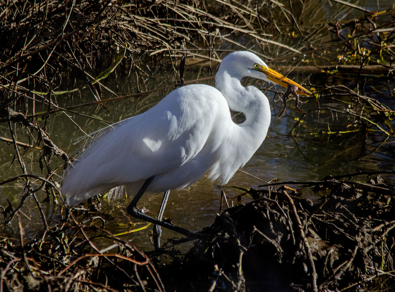
| 10 |
Feb 26 |
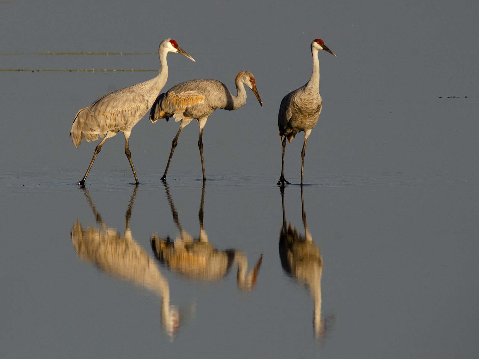
Reply |
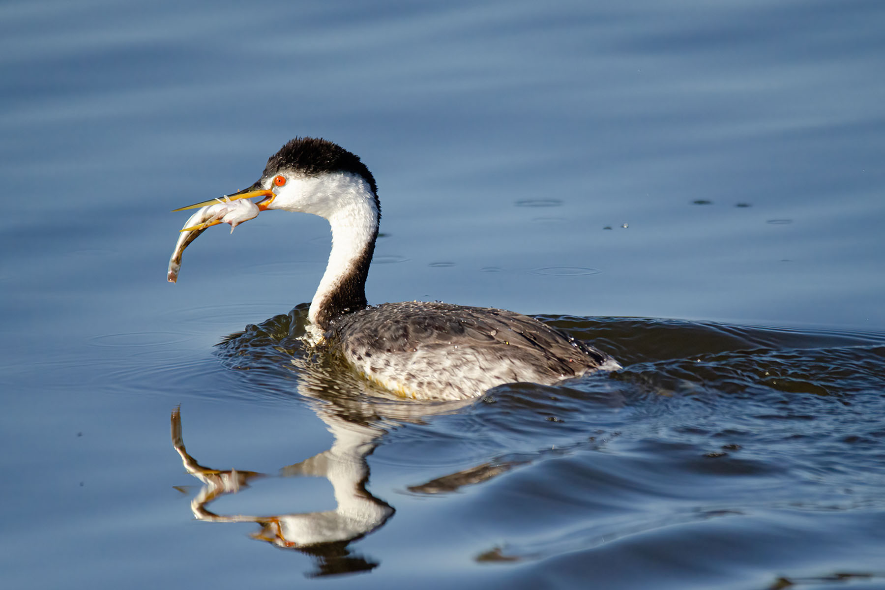
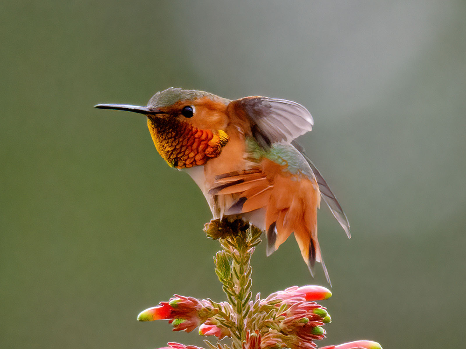
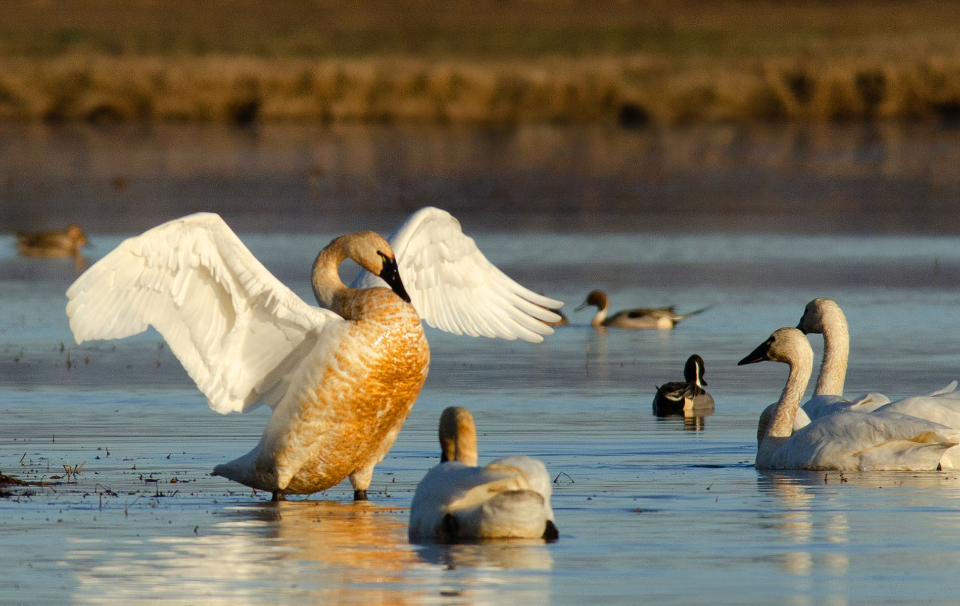
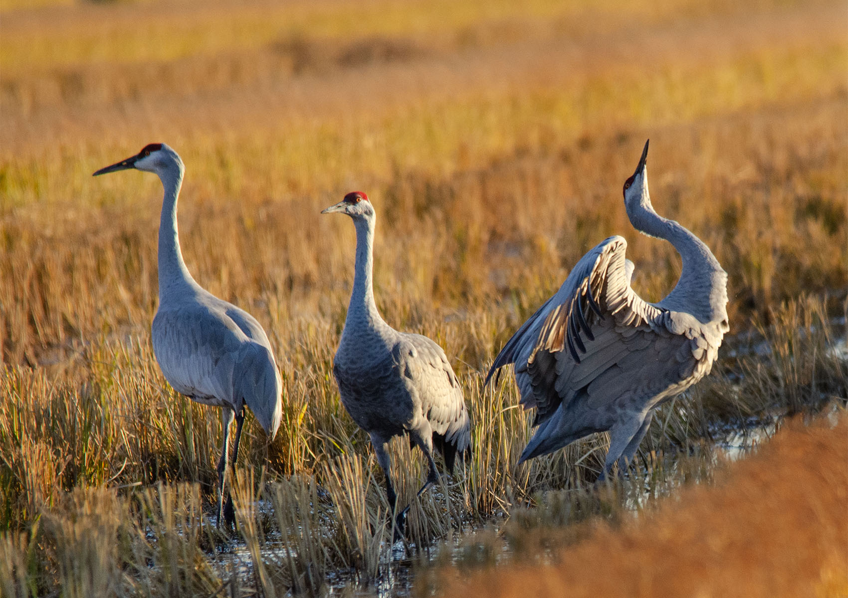
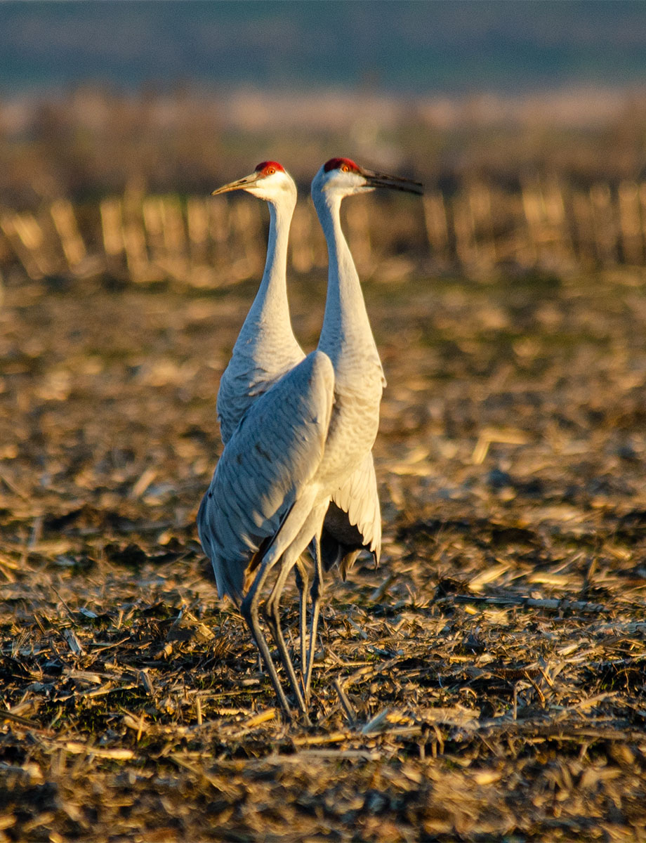
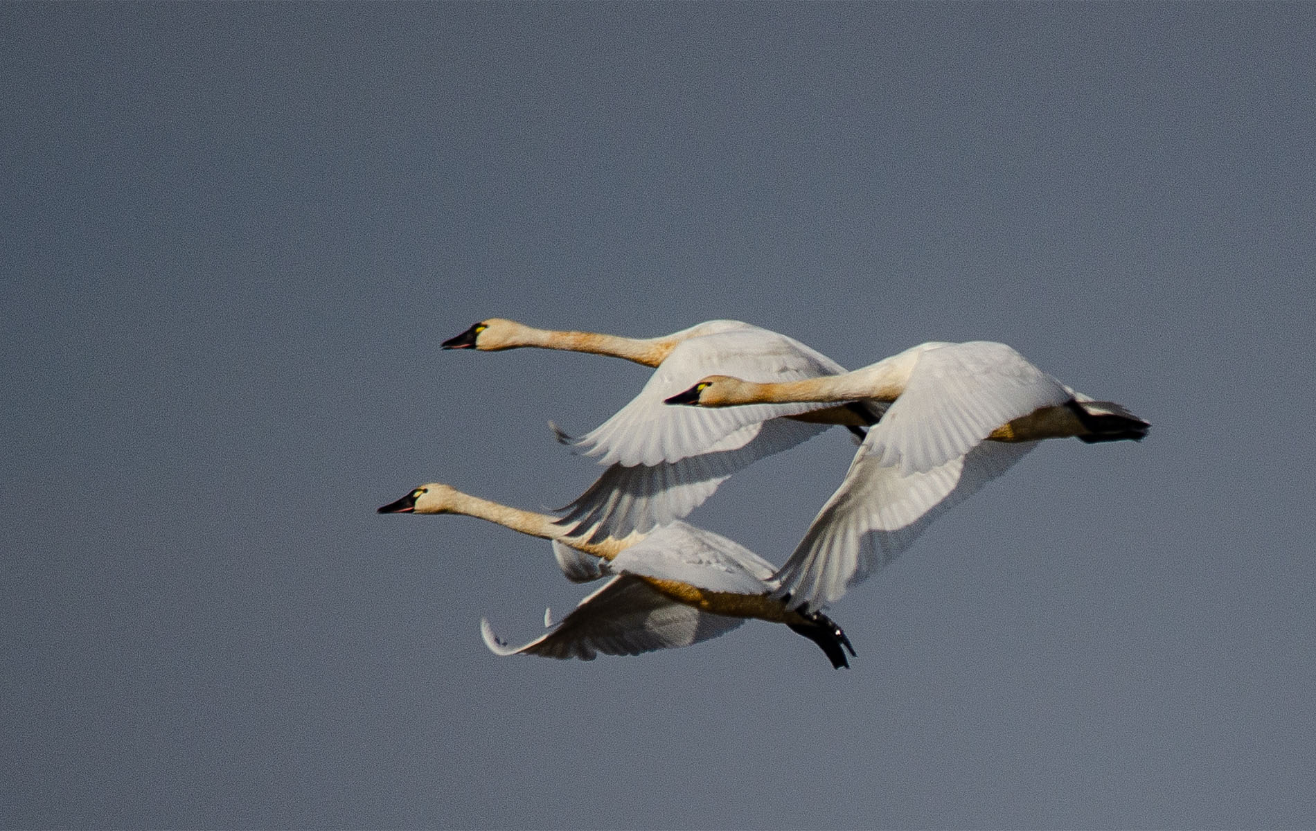
How high an F stop would you recommend ?? I guess I thought since the bird was so far away, 4.5 would be enough. Thank you, much appreciated. |
Feb 13th |
| 10 |
Feb 26 |
Reply |
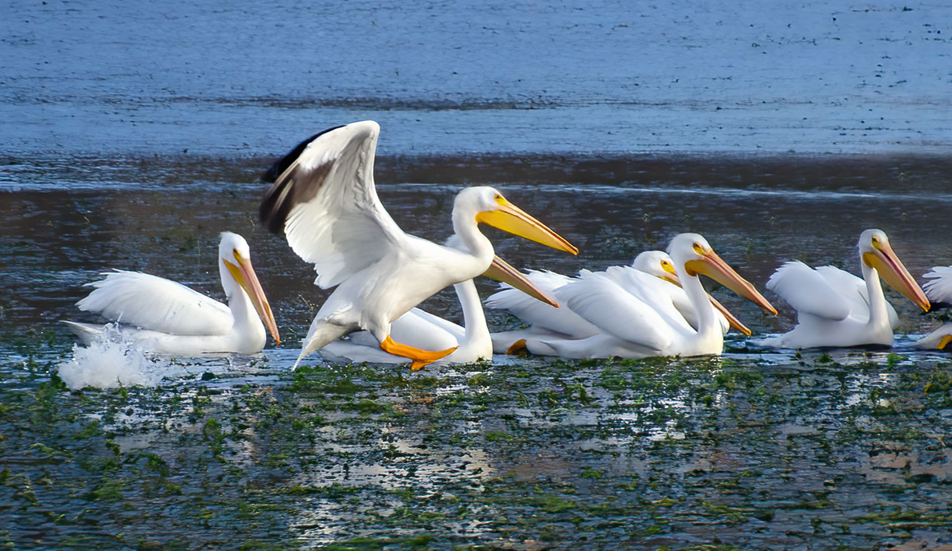
Thanks, Meredith. For some reason when I'm shooting birds that are far away, I was told to use a large aperture so I shot this at 4.5 and thought that would be sufficient. I guess I should try 5.6 or more next time. Yes, I should have done a better job on removing the branch -- or maybe I should have left it there. I remember a friend telling me she blows up her images in PS to 200% to see how they look; I should have done that here.
The picture looks really good when projected, LOL. But I'll work on it some more. Thanks ! |
Feb 13th |
| 10 |
Feb 26 |
Reply |
Yes, I do like that -- how did you do it? Adjustment layer?
Thanks ! |
Feb 13th |
5 comments - 6 replies for Group 10
|
5 comments - 6 replies Total
|