|
| Group |
Round |
C/R |
Comment |
Date |
Image |
| 10 |
Aug 25 |
Reply |
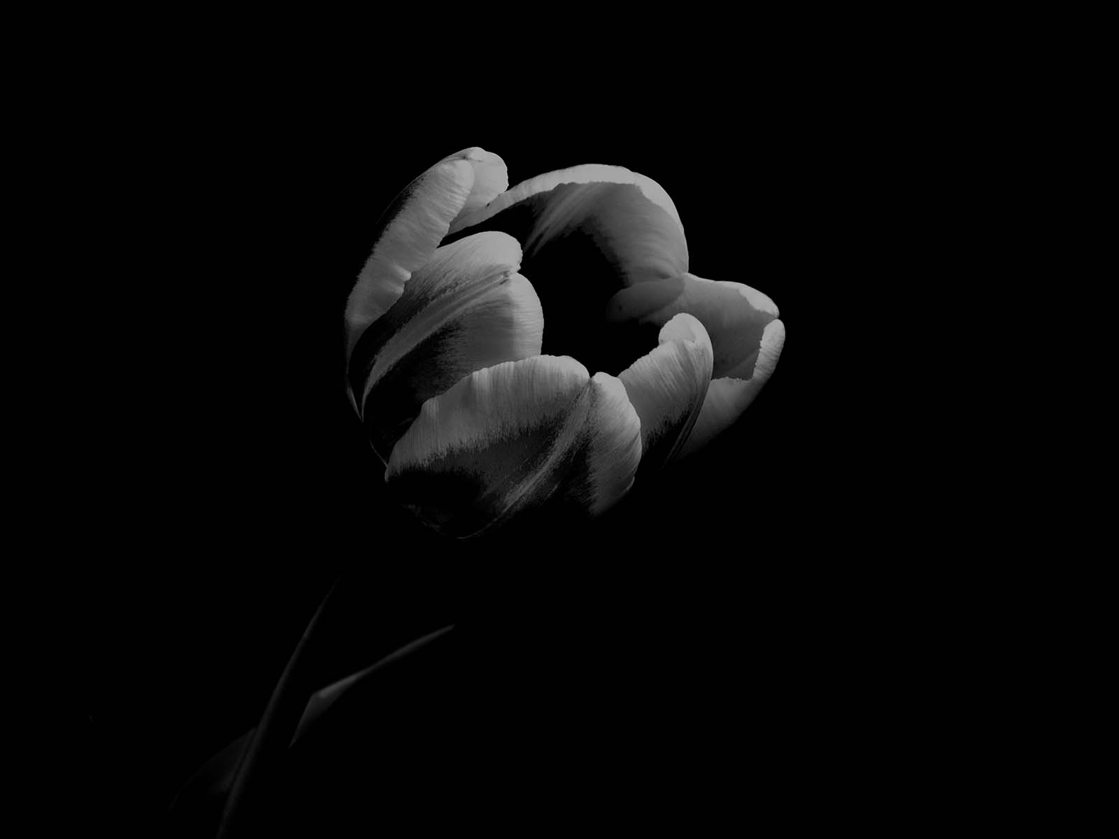
Hi Doug,
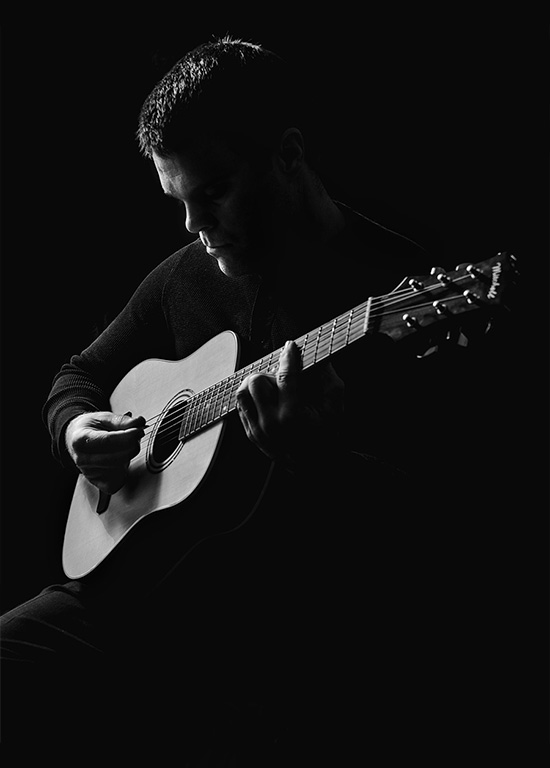
I use the selection brush a lot. But I don't see how you got the center part to appear the way it does. Once you selected the image, what was your next step? Did you use Liquify?
It's so different from the original image. Or did you crop in really tight? When you used the Selection Brush, what color did you put in there? It's very confusing to me. I used Photoshop quite a lot - almost every day. Help, help, help me if you can. Thanks ! |
Aug 18th |
| 10 |
Aug 25 |
Reply |
Oh, Your original explains a lot.
Thank you for sharing it.
When you crop as much as you did, you create digital noise. It just happens. Wow you really cropped in quite a lot.
Then you saturated the colors a lot - again, creating more digital noise.
That's why we are seeing the white halo around the tree branches and the dots in the center (noise). I think using some other program to "denoise" an image would be a good investment -- I use Topaz Denoise AI and it's great. |
Aug 15th |
| 10 |
Aug 25 |
Comment |
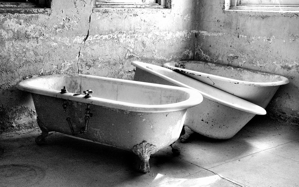
I did this one in black and white (Topaz B & W) and darkened the front grasses a bit, added a little vignette and cropped down from the top and added more room on the right.
Thank you for letting us play !
|
Aug 15th |
 |
| 10 |
Aug 25 |
Reply |
OMG Meredith, this was really interesting !!
Such fun !
I did two versions of your image but I liked the color one the best ! Here's why: the stains on the roof, in the black and white, make the image look over-processed. But in color, one can see that they really are rotted wood, and I just think it's a more quiet, settling image.
In my color version I added a little green to the front grasses (sloppily and quickly), cropped down from the top and added room to the right side of the image (generative expand).
This just shows us all that there are so many different things we can do with just one image. Thank you for sending us the original. Donna
|
Aug 15th |
 |
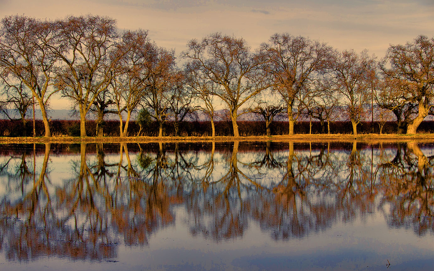
| 10 |
Aug 25 |
Reply |
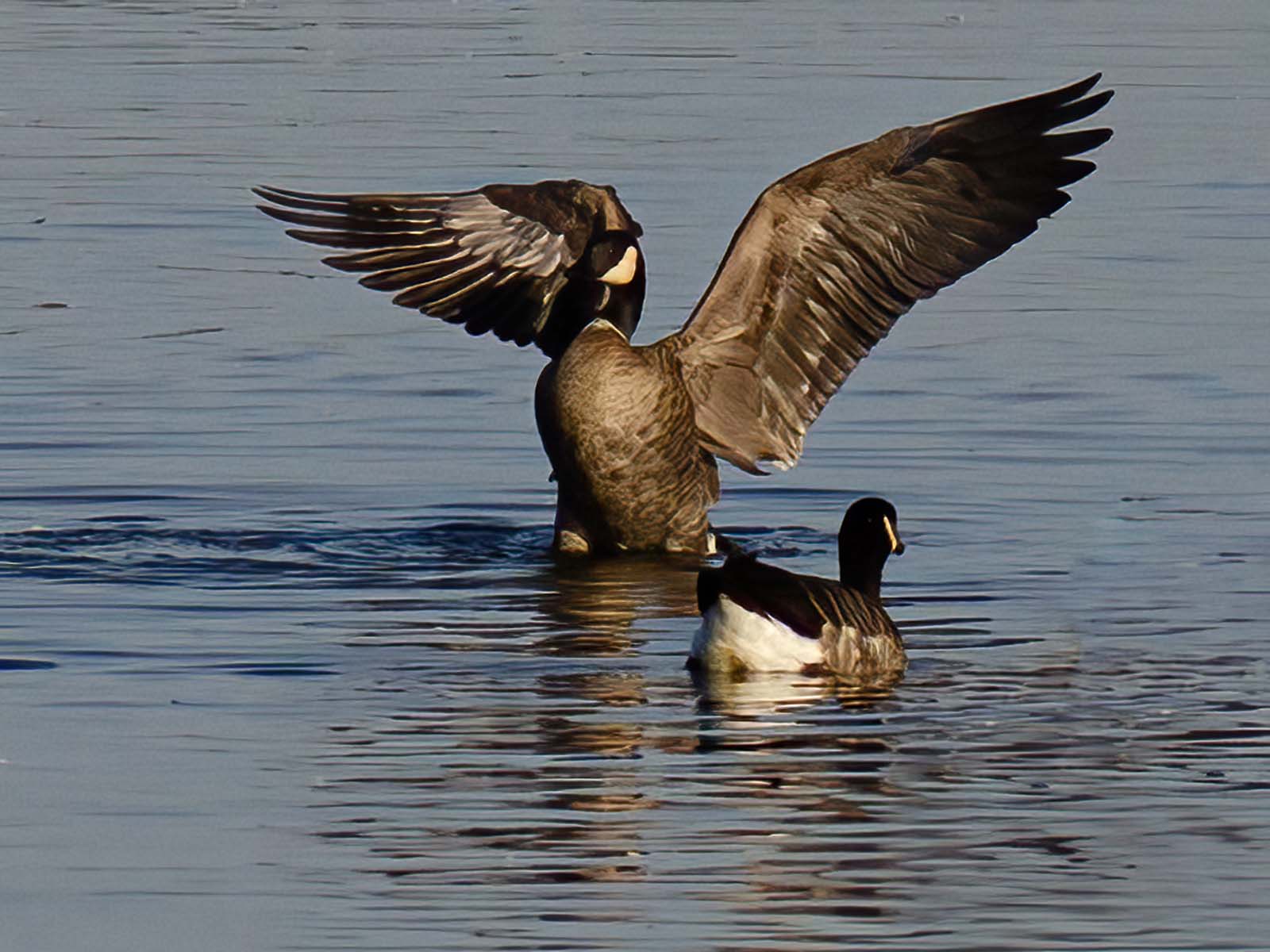
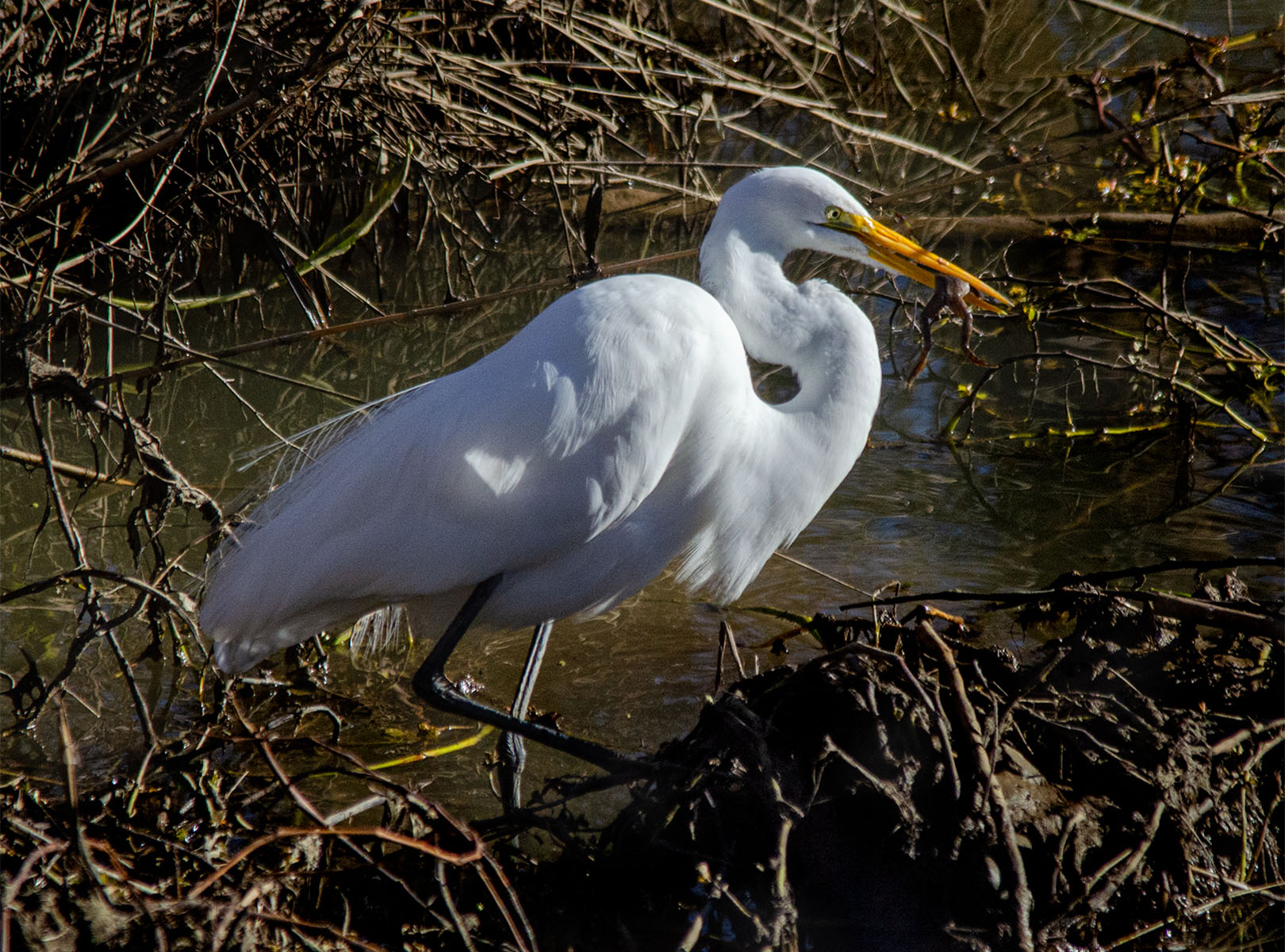
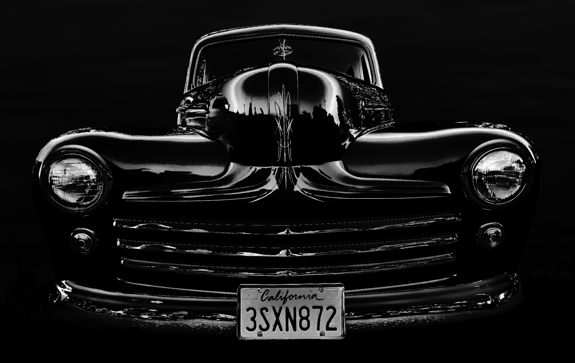
HI Peter,
When I look closely at the image, I see a white "halo" around the tree branches. I wonder if the sky is just over-saturated and the colors got distorted? I'd love to see the original image. |
Aug 14th |
| 10 |
Aug 25 |
Comment |
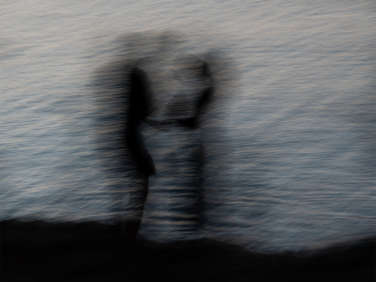
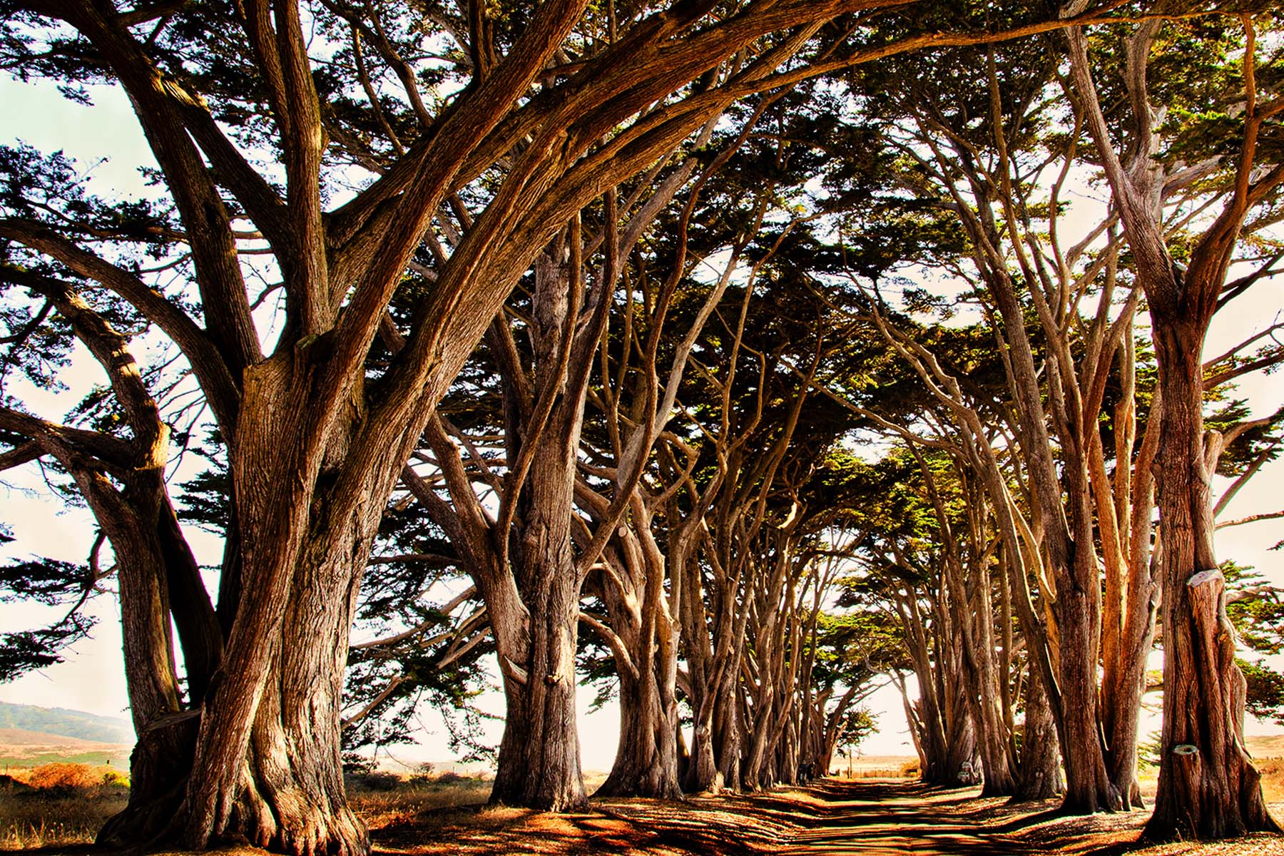
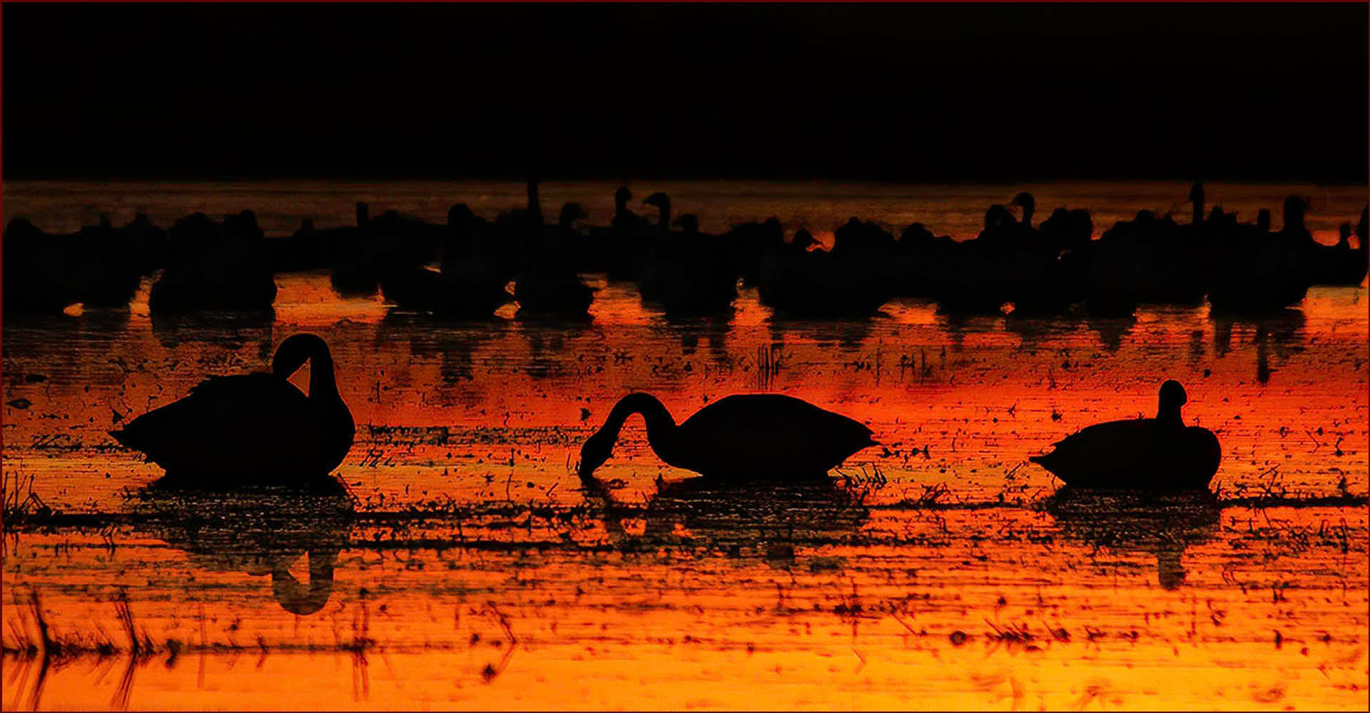
HI Peter, This is a beautiful silhouette image and the colors are quite vivid and lovely.
When I look closely at the image I see a lot of digital noise.
Can you put this through Topaz DeNoise? I'd love to see it without the noise, which is mostly noticeable in the middle of the image. Can you tell us what you did in post-processing? I'm not familiar with DXO.
Thank you, lovely. |
Aug 12th |
| 10 |
Aug 25 |
Comment |
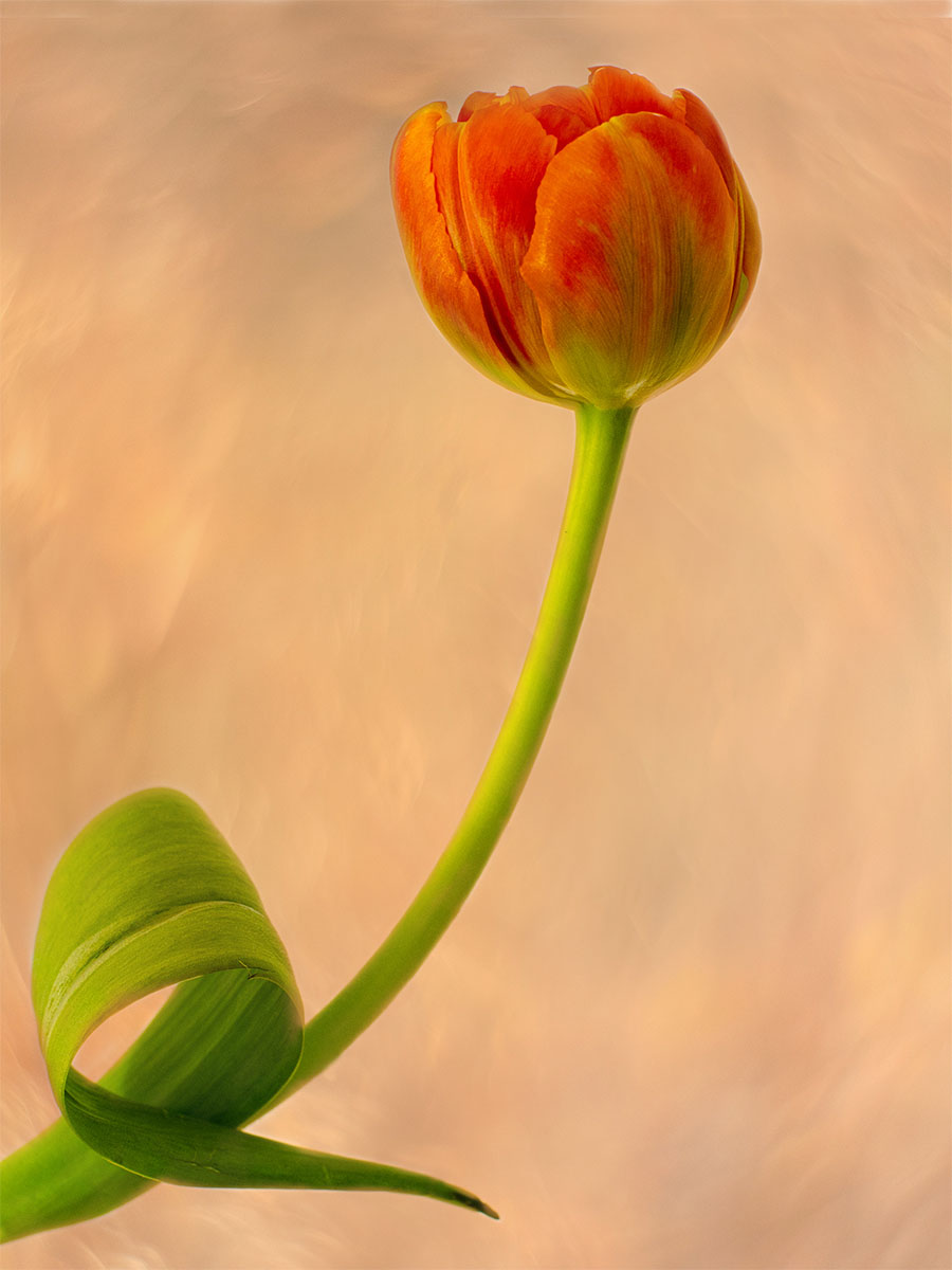
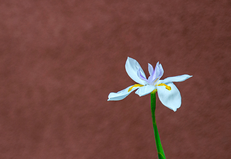
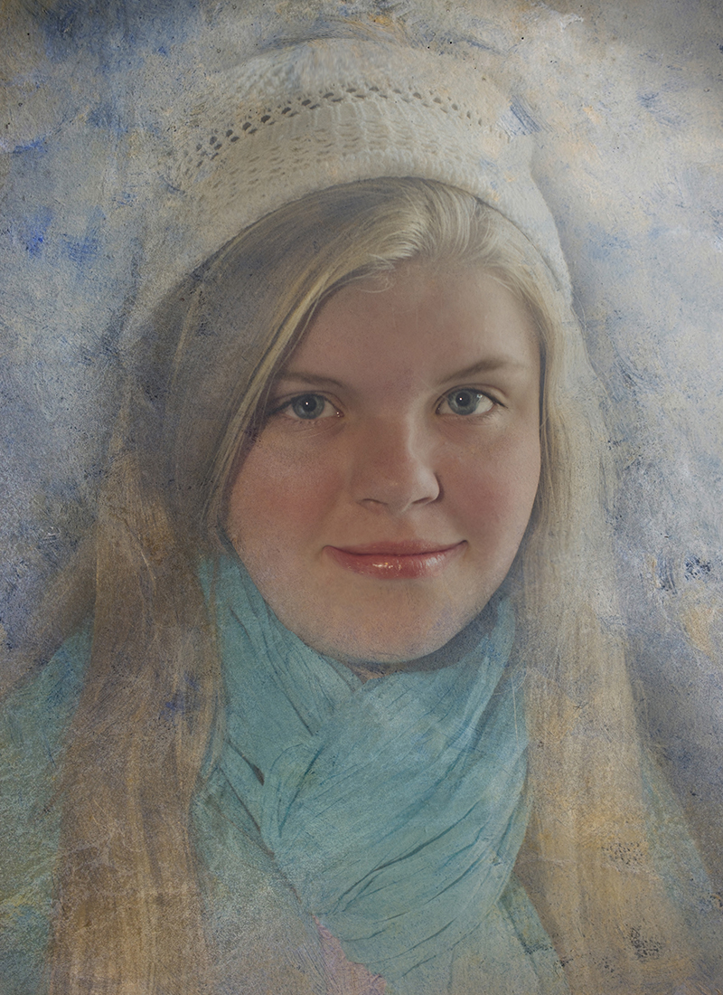
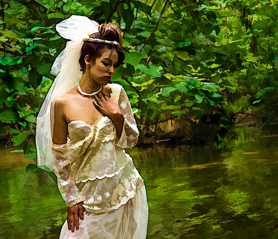
Hi Meredith,
Well I can definitely see why you would want to photograph this place ! I think your image looks very light and sweet, I was drawn to it immediately when you sent it in.
I'd love to see your original. It's hard to say what else you could do in post. The roof on the right structure looks a bit over processed, but without seeing the original it's hard to tell. I think you could crop down from the top a bit.
I definitely am not a good black and white photographer, but I do use Topaz Black and White filter and it has lots of presets and different ways to adjust your image.
I think removal of telephone lines is a good idea! Very nice image. |
Aug 12th |
| 10 |
Aug 25 |
Comment |
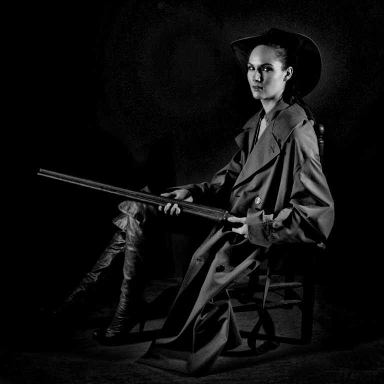
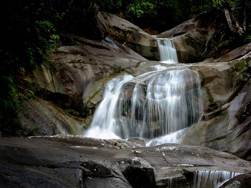
HI, Rich,
Lovely image of a waterfall, it looks so graceful and peaceful.
My only suggestion would be to reduce your exposure, as the whole image is quite bright. Also play around with reducing highlights and adding some contrast. The would give more depth to your image. I played around with your image and this might be a bit too dark around the edges but it might give you an idea of how it could look with some post-processing.
Lovely location, I would love to go there. |
Aug 12th |
 |
| 10 |
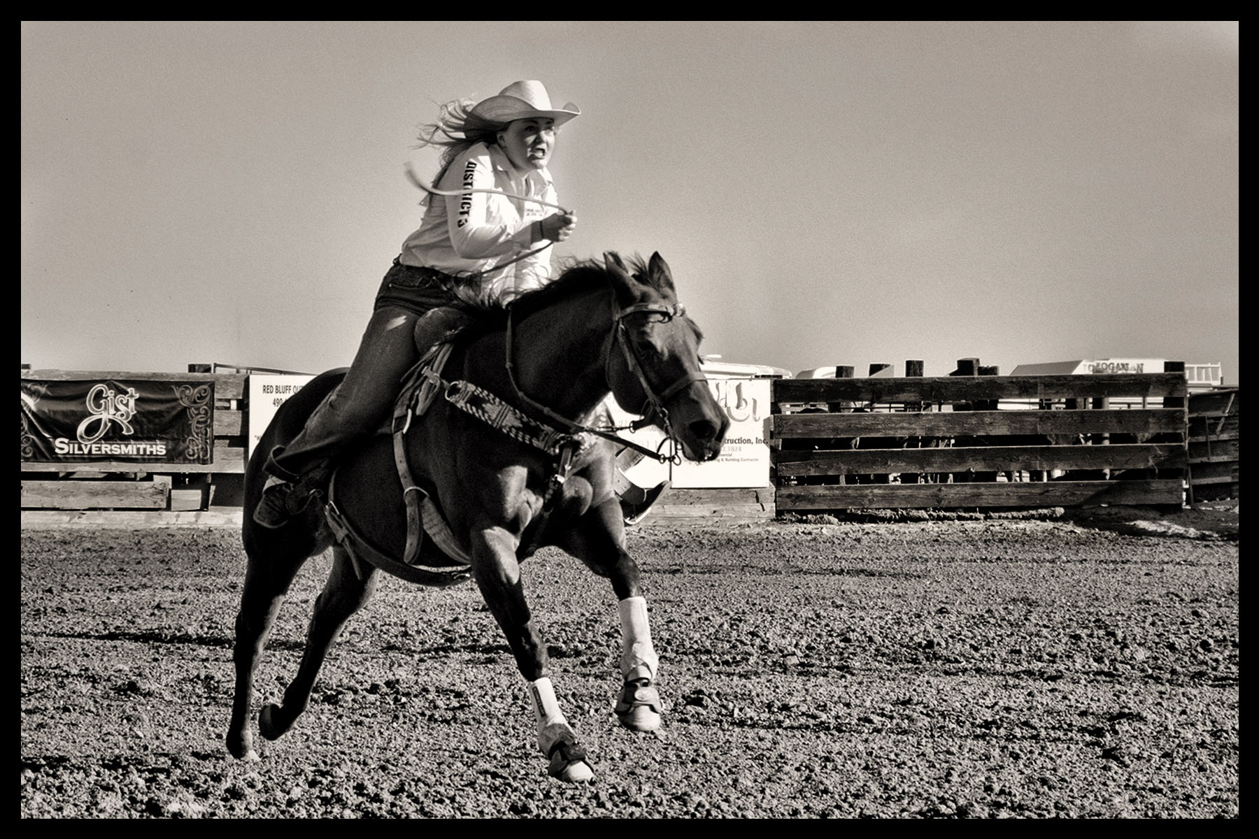
Aug 25 |
Comment |
Hi, Mark,
I love this image ! Nicely done. I love the swirling of the smoke and how cool that you flipped it and made a symmetrical face. Very nice. I love how the background is dark, didn't know that could be done with smoke in Lightroom.
Love it ! |
Aug 12th |
| 10 |
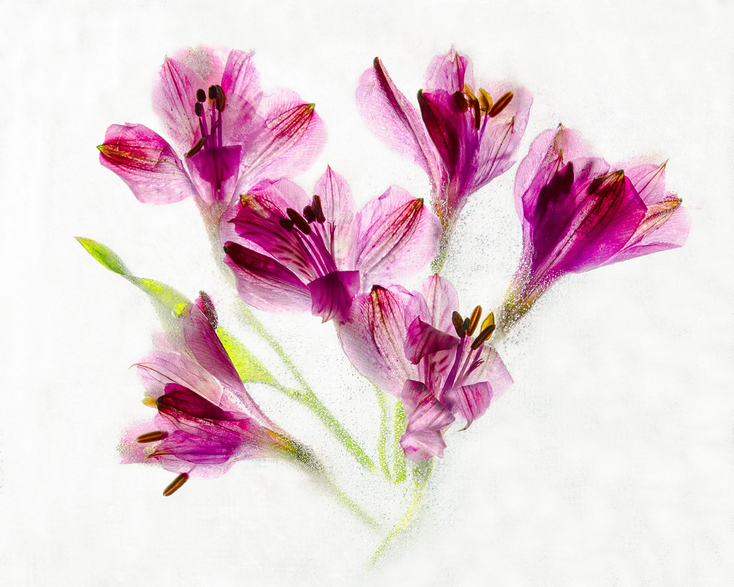
Aug 25 |
Comment |
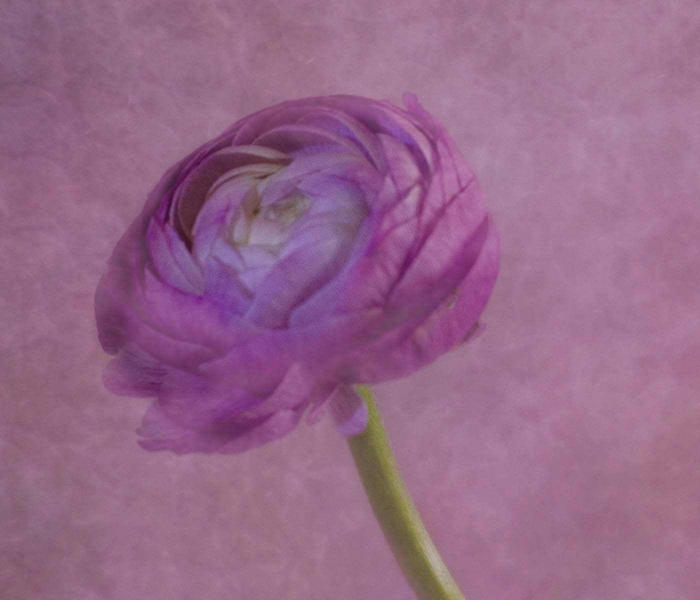
Hi, Doug, This is fascinating. Your image after processing looks so different from your original ! It looks like a metallic flower, very creative, nice job.
I wonder if you could tell us in more detail about how you created this ? What is the Selection Brush tool? How did you get to that tool? How did you get the center to look the way it looks -- like the center of a flower? I'd love to have more detail as to how you got this look. Thank you !! |
Aug 12th |
6 comments - 4 replies for Group 10
|
6 comments - 4 replies Total
|