|
| Group |
Round |
C/R |
Comment |
Date |
Image |
| 10 |
Apr 25 |
Comment |
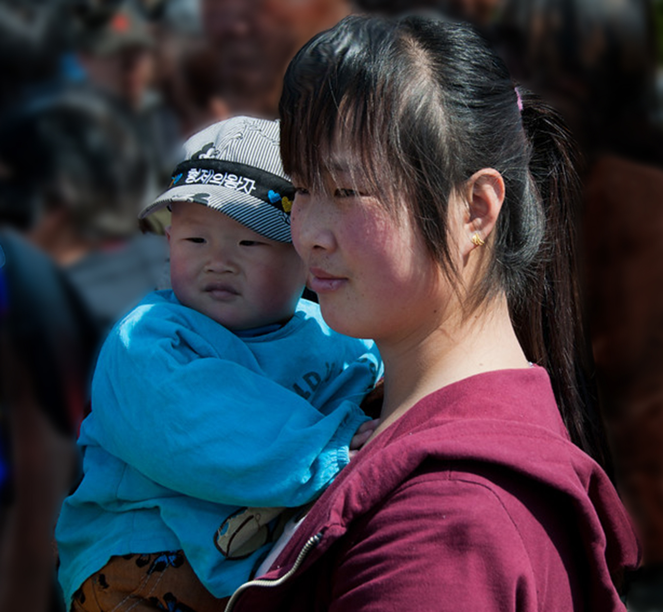
Yes, I agree with Meredith. The man behind the baby is really a distraction and I look at him more than at the woman and baby. There's so much you could do to create a less busy background; then we could concentrate more on the woman and child.
Here's an edit I created; what do you think? |
Apr 17th |
 |
| 10 |
Apr 25 |
Comment |
This is really lovely. The colors of the sunrise are so nice, and I admire anyone who gets up that early to photograph !
It's a very peaceful, calm image. Nicely done ! |
Apr 17th |
| 10 |
Apr 25 |
Comment |
It's a beautiful flower. The background is so bright that it really takes away from the beauty of the flower. I would apply a texture or just darken the background. So many things you could do to create an image that helps the viewer really appreciate the flower. |
Apr 17th |
| 10 |
Apr 25 |
Comment |
Well, Mark, I keep looking at this image and trying to figure out what to say. I admire your nighttime (was it at night?) excursion. What bothers me is that the four leaves are so far apart and I don't know which one to look at. This doesn't strike me as a Macro image. I would concentrate on one of the three leaves and get closer. I like the leaf on the right, because it has the most color and the lighting is perfect. The others, to me, are too bright. The background is really nice. There's a white spot that bothers me between the right leaf and the one to the left of it -- easy to remove. I played with your image and came up with this. |
Apr 17th |
 |
| 10 |
Apr 25 |
Comment |
HI Peter, yes, you have lovely leading lines here. Being from New Jersey myself, I never knew this place existed, and it's lovely.
I do think the image is a little flat and could use some contrast. Also maybe adding some darkening or even some saturation to the sky would help. If you could bring down the highlights on the center walkway, they would get less attention and take the viewer's eye to the structures on left and right. There's a little leaning to the center of the columns and the building, you could straighten those out in Lightroom. Lots of things to consider. But it is a fascinating place, thank you for sharing it with us ! |
Apr 17th |
5 comments - 0 replies for Group 10
|
5 comments - 0 replies Total
|