|
| Group |
Round |
C/R |
Comment |
Date |
Image |
| 10 |
Aug 23 |
Reply |
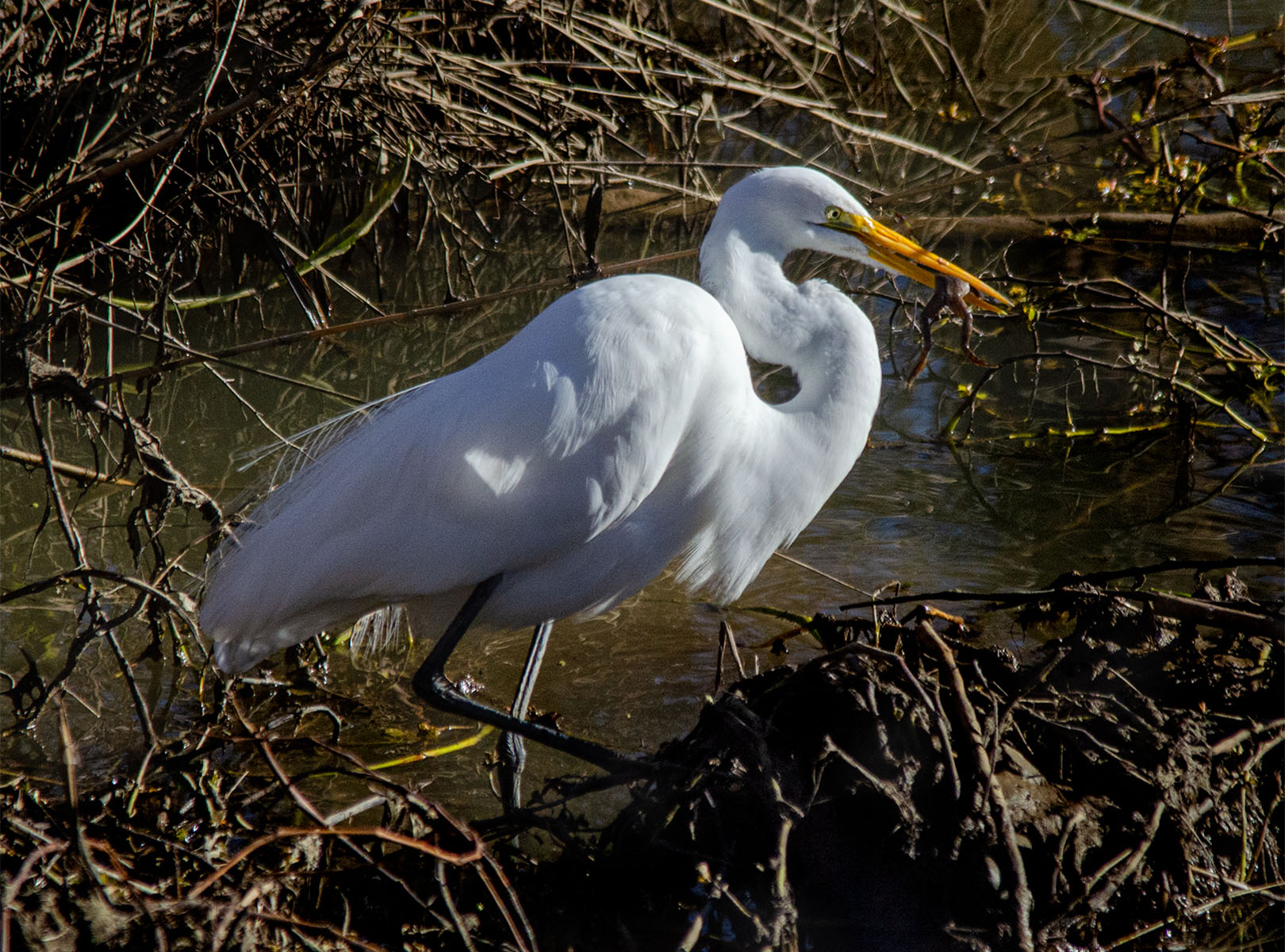
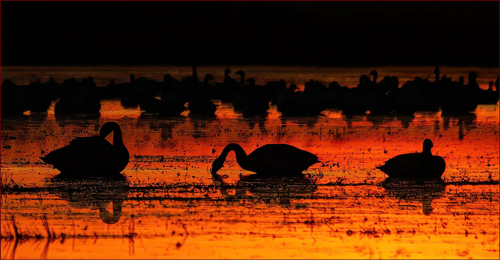
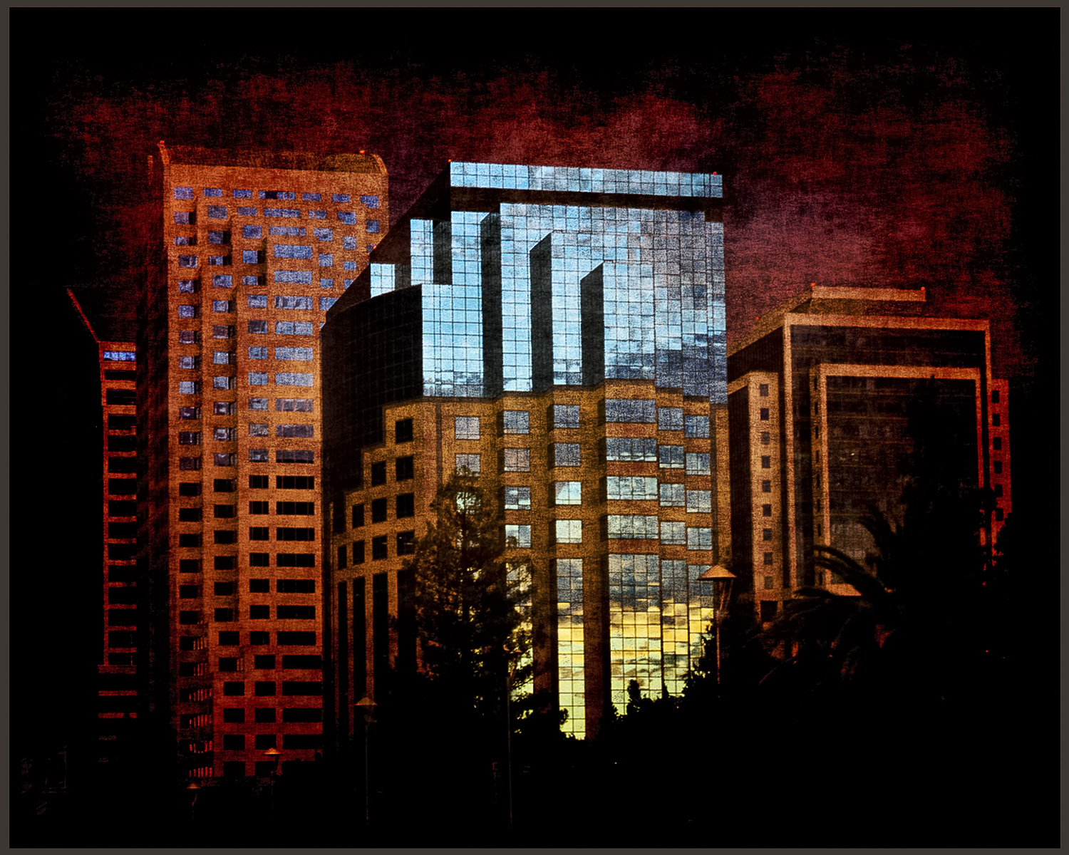
Thanks, Rich. Everyone seems to prefer the color image.
|
Aug 27th |
| 10 |
Aug 23 |
Reply |
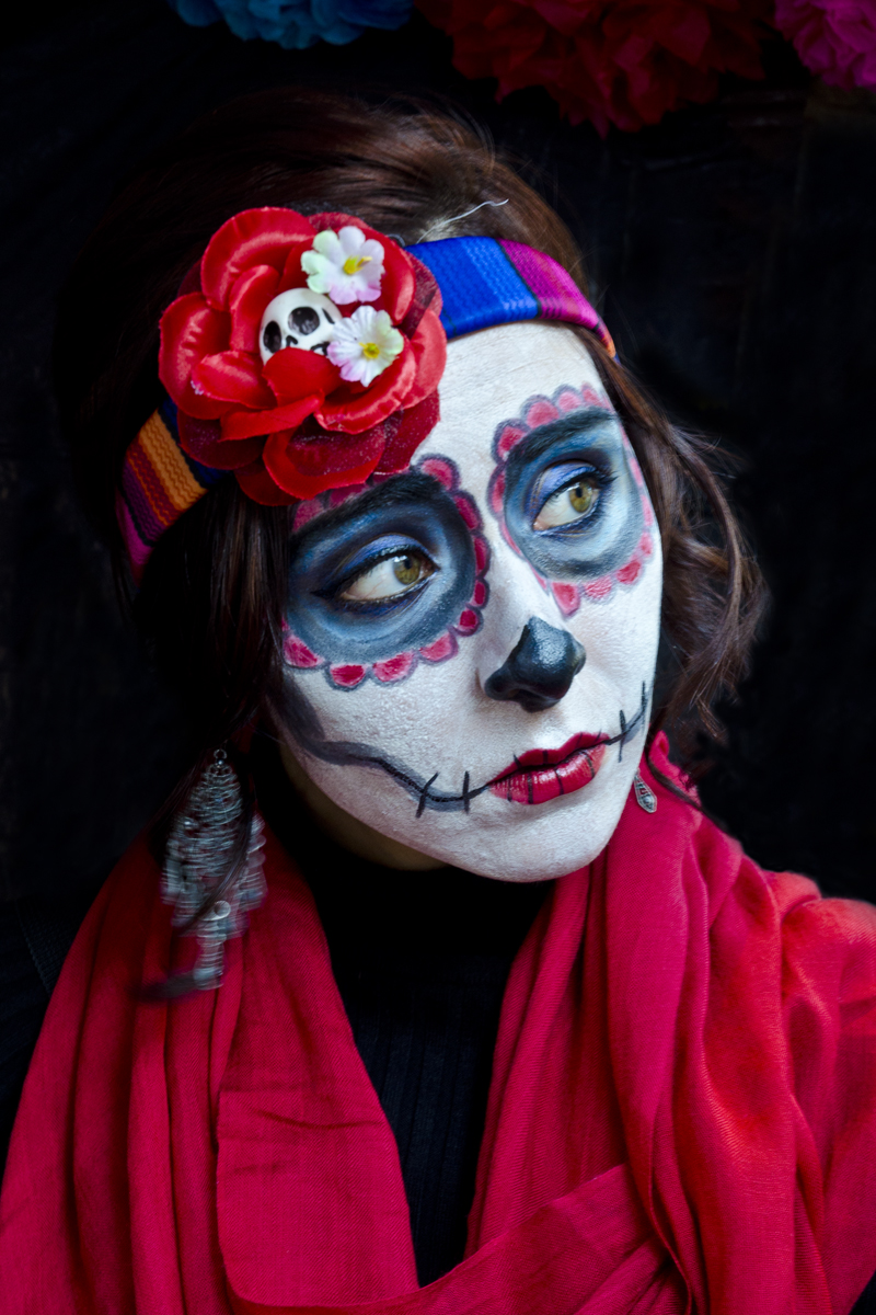
Looks like the color one wins. Thank you !! |
Aug 27th |
| 10 |
Aug 23 |
Reply |
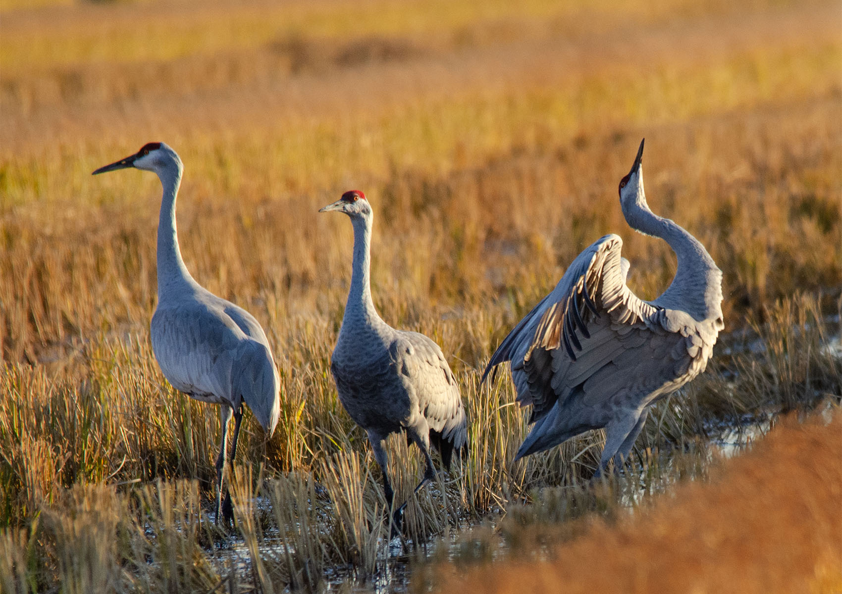
I like your crop ! Thank you for the suggestion. I always want to show too much. |
Aug 21st |
| 10 |
Aug 23 |
Reply |
Can you post the original image? Diana and I want to see it. |
Aug 13th |
| 10 |
Aug 23 |
Comment |
Thank you for your suggestion, perfect !!
I've redone the image and have tried to post it here but PSA says it has 1.43 Mb and that's too big. So I've resized it four times and it's still 1.43 Mb. So I have no idea how to fix that.
Anyway, you're right, and it's very had to go to those shows and not have a lot of stuff in the background that's distracting. I really appreciate your ideas and I'm so glad you joined our group, you will be a great addition ! |
Aug 13th |
| 10 |
Aug 23 |
Comment |
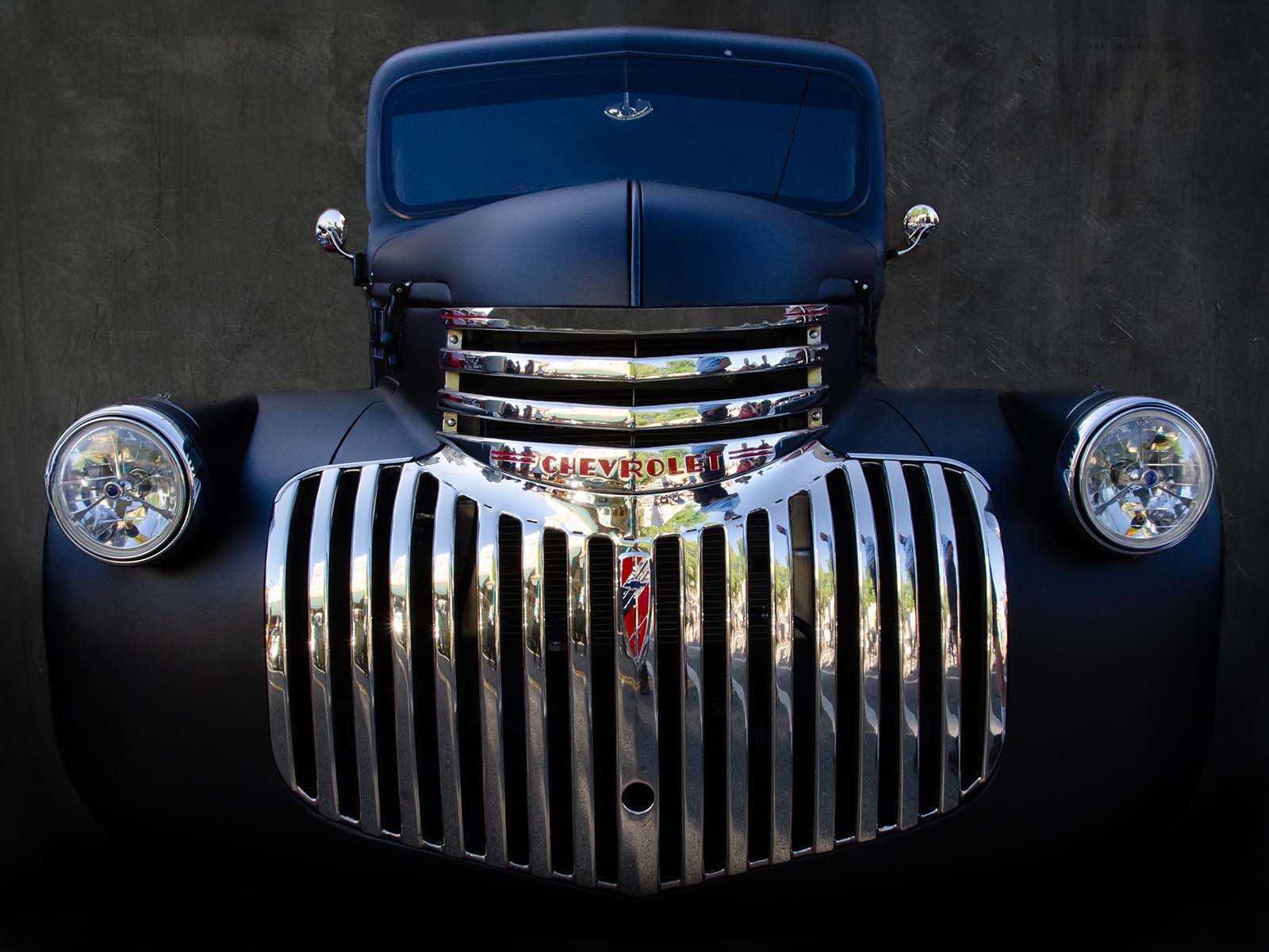
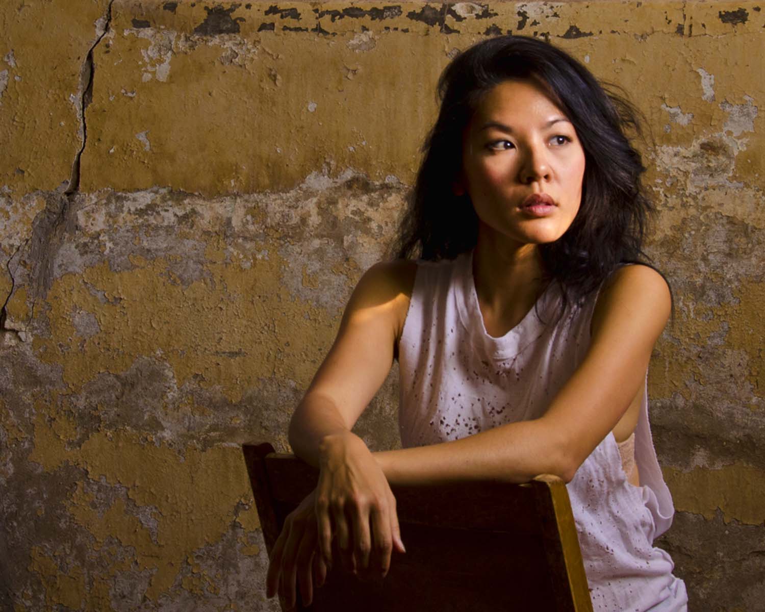
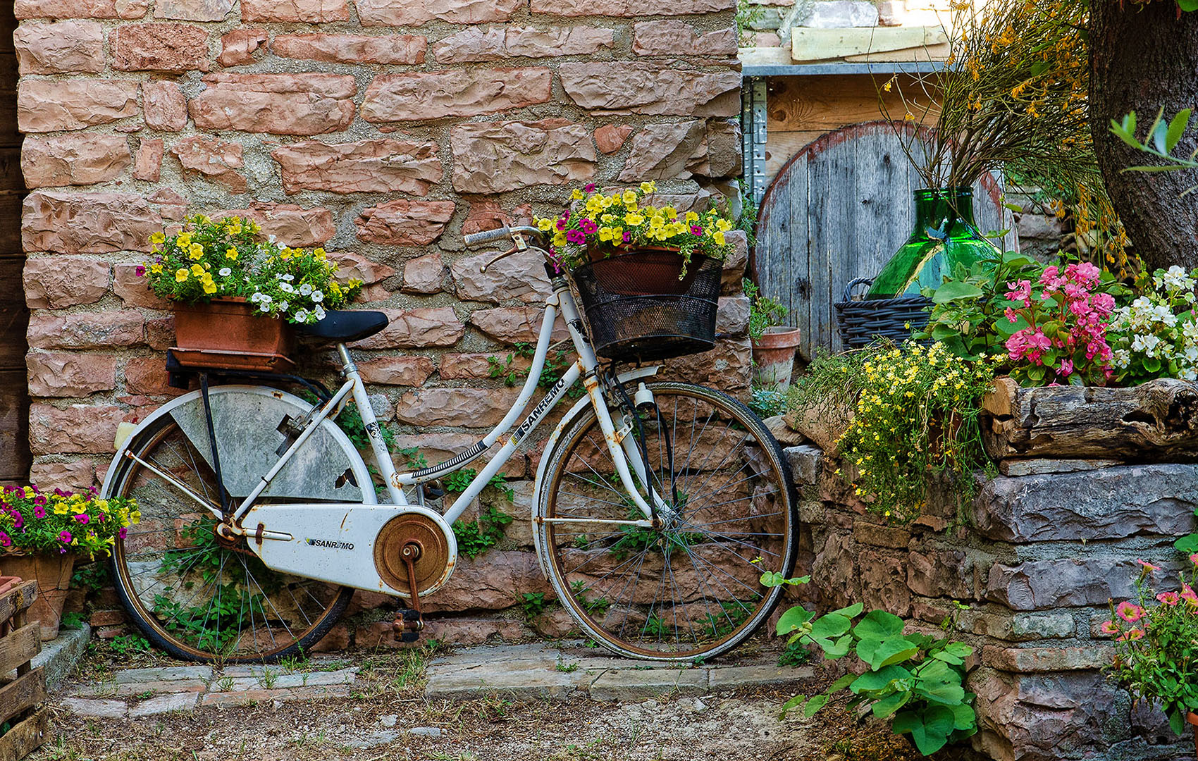
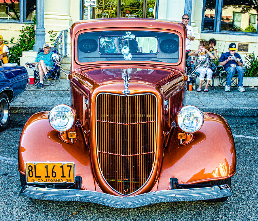
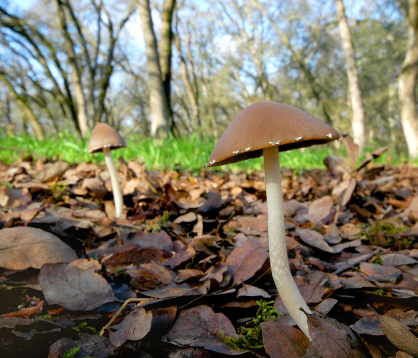
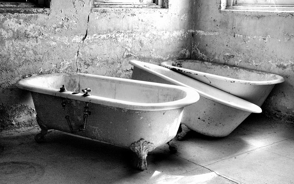
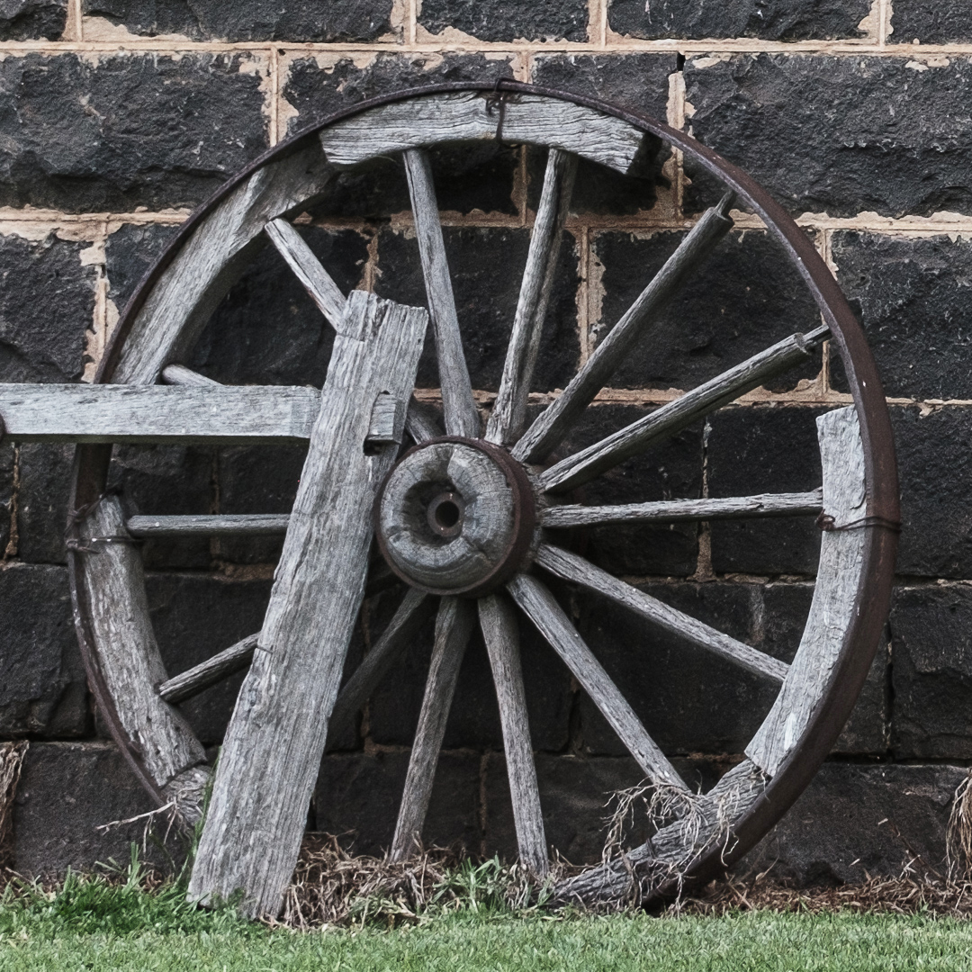
I love photographing old things, also. I love this image. A couple things: on the left, the piece of wood that's parallel to the ground -- could you have shown what is was attached to? Or did it just end somewhere? Maybe you could have shown us a little more there. This is what I was taught to refer to as "border control" -- not to have things that jut into your image from the border. Also, I think bringing a little brightness and contrast to the wheel - just a tad - would make a difference. I hope you're ok that I did an edit to show you what I mean. Maybe you'll like it, maybe not. Hard to tell when they're not side by side. Just an idea. |
Aug 13th |
 |
| 10 |
Aug 23 |
Comment |
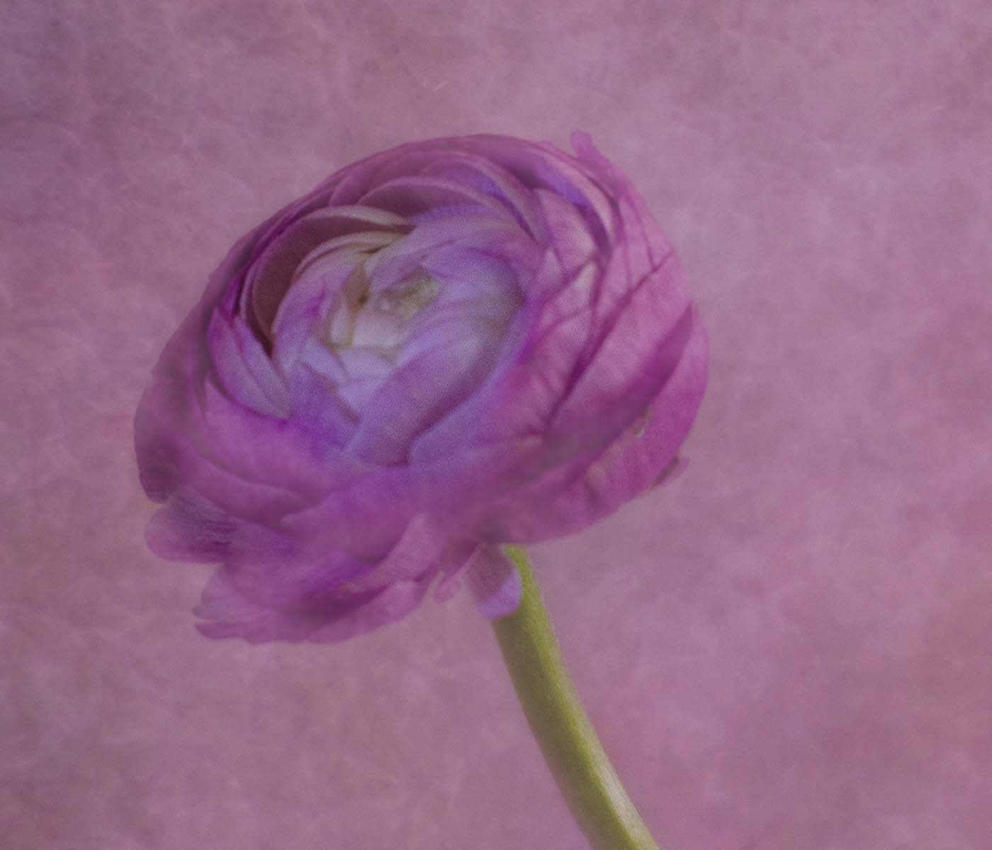
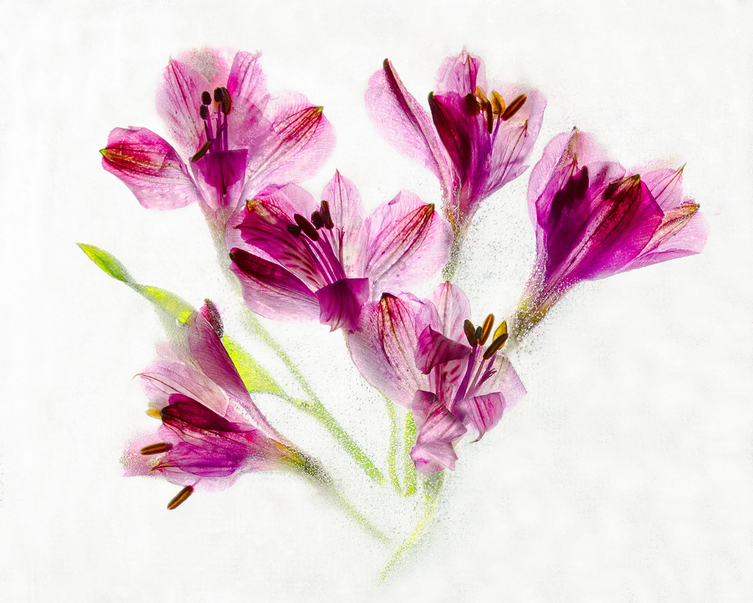
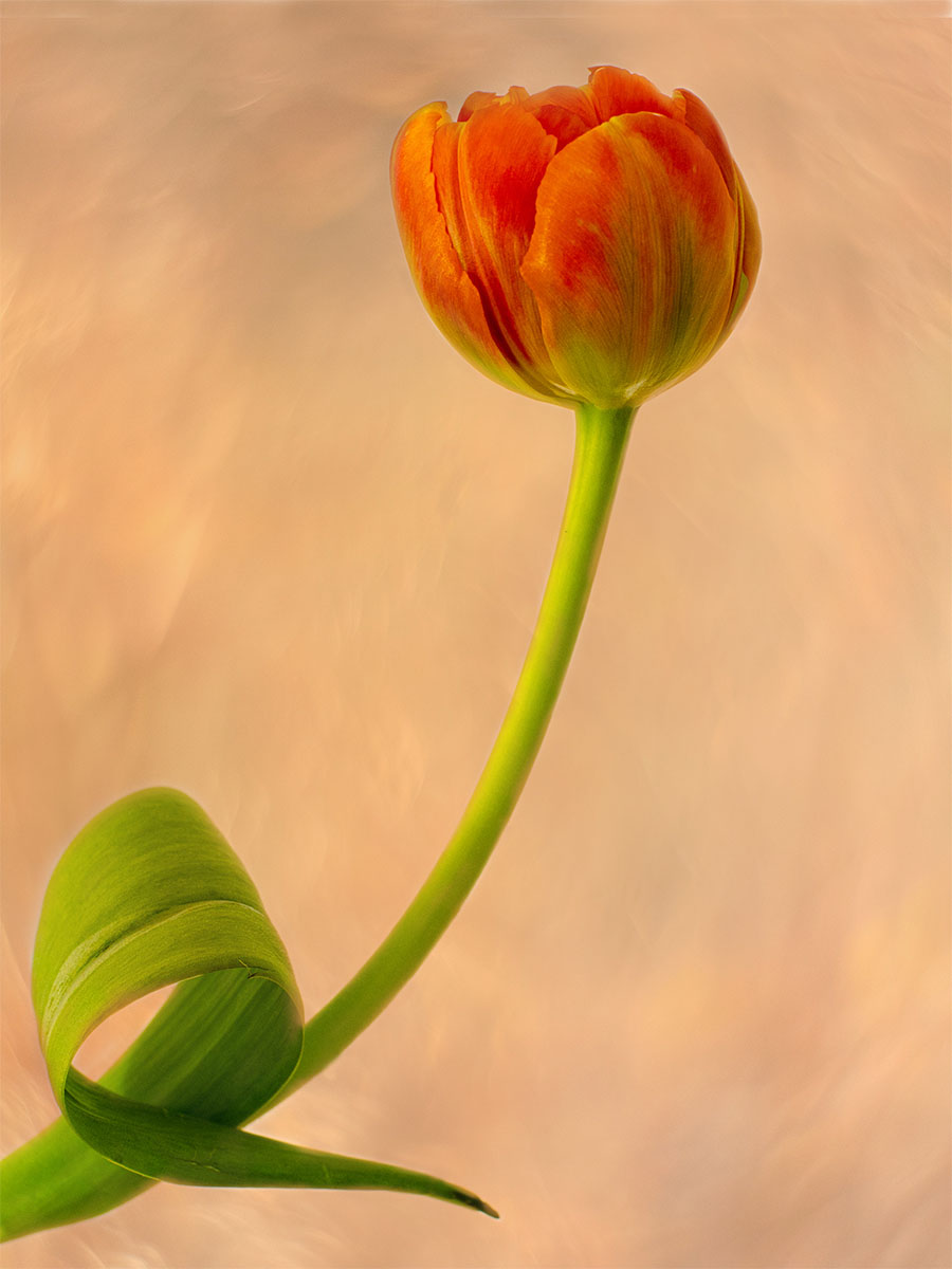
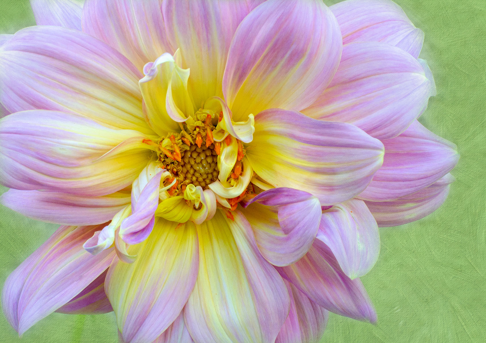
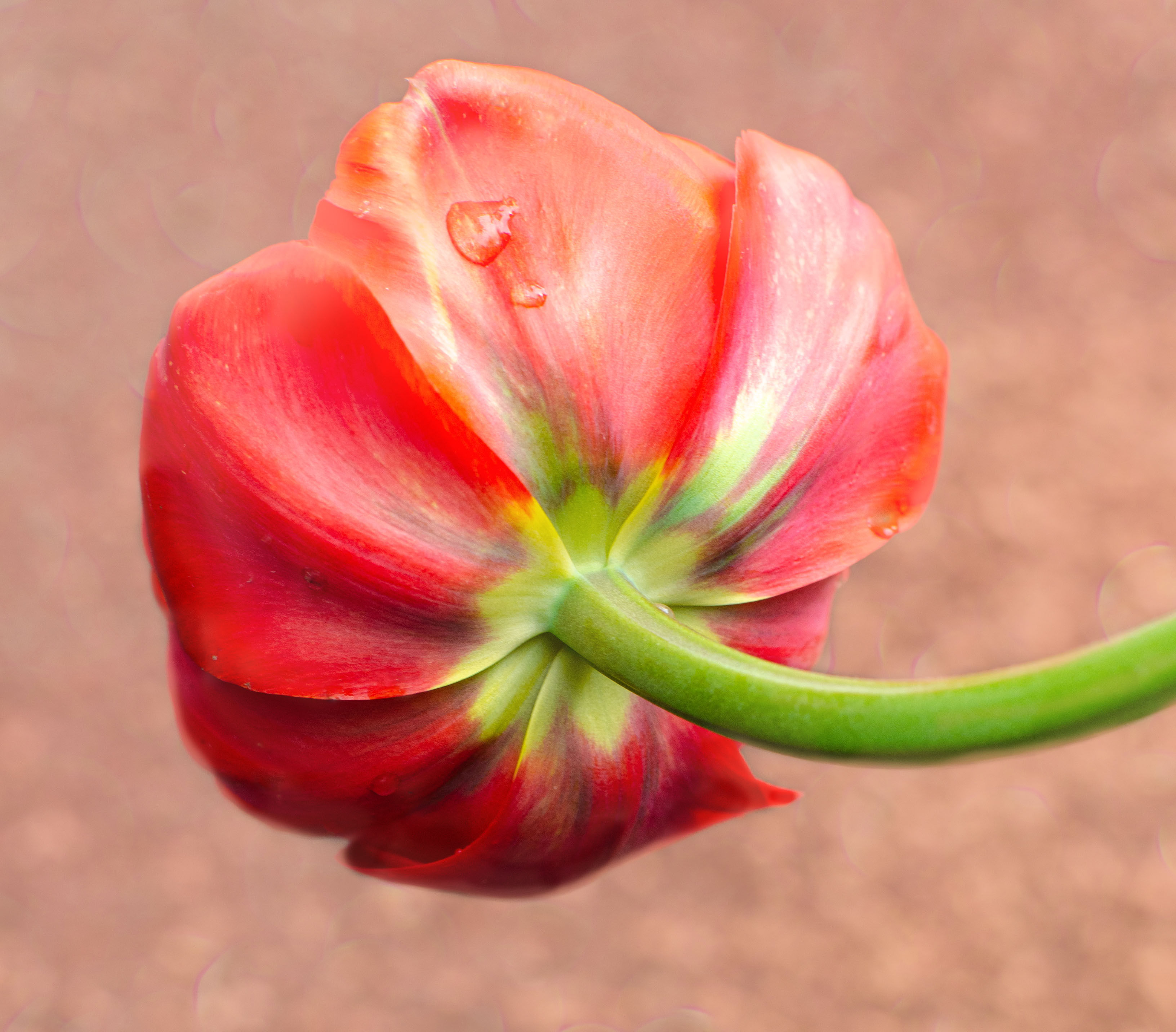
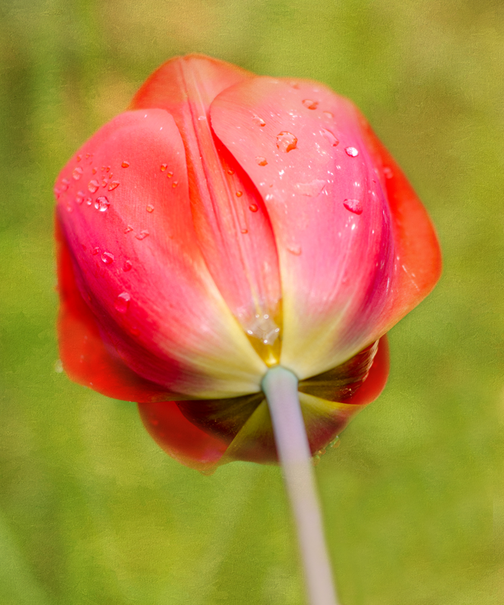
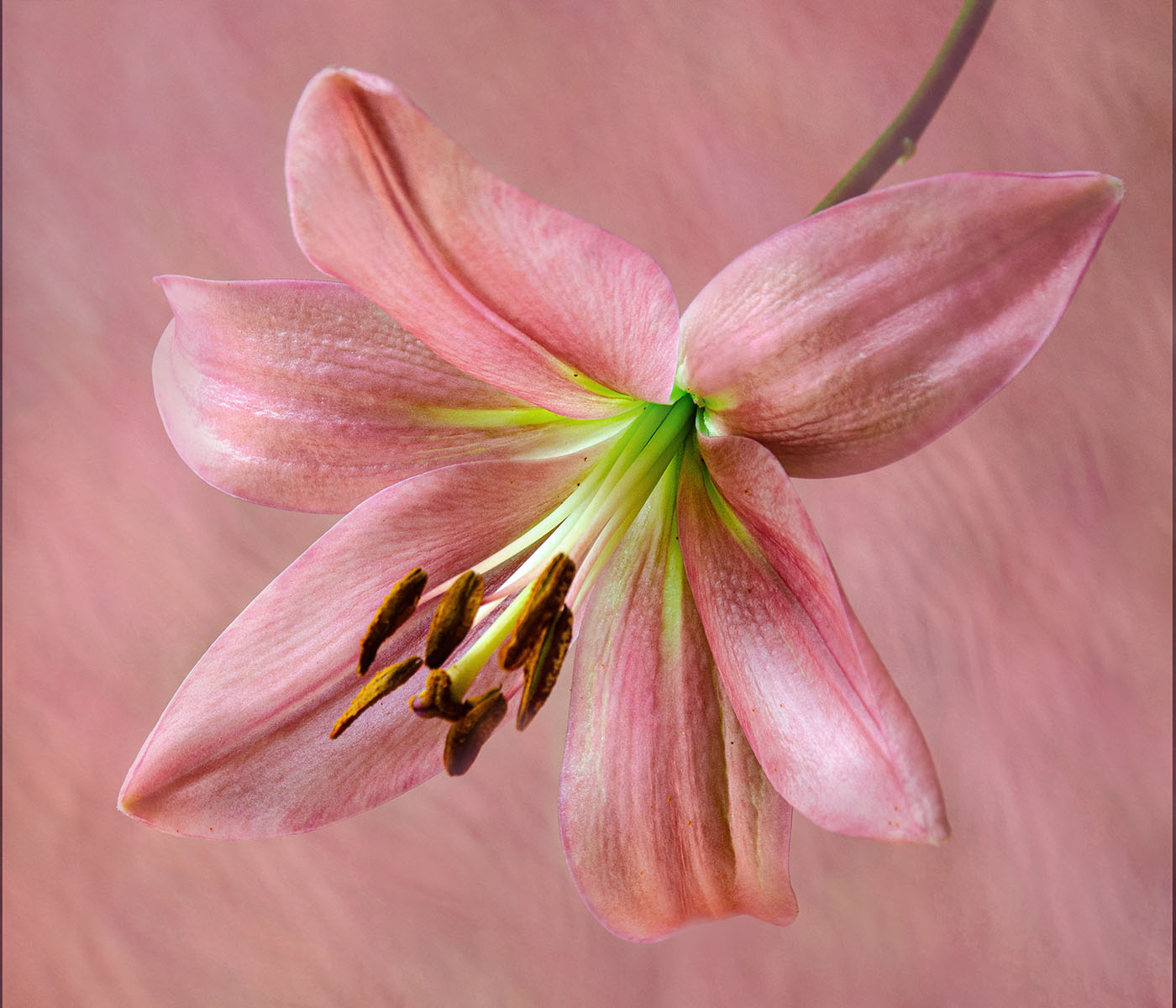
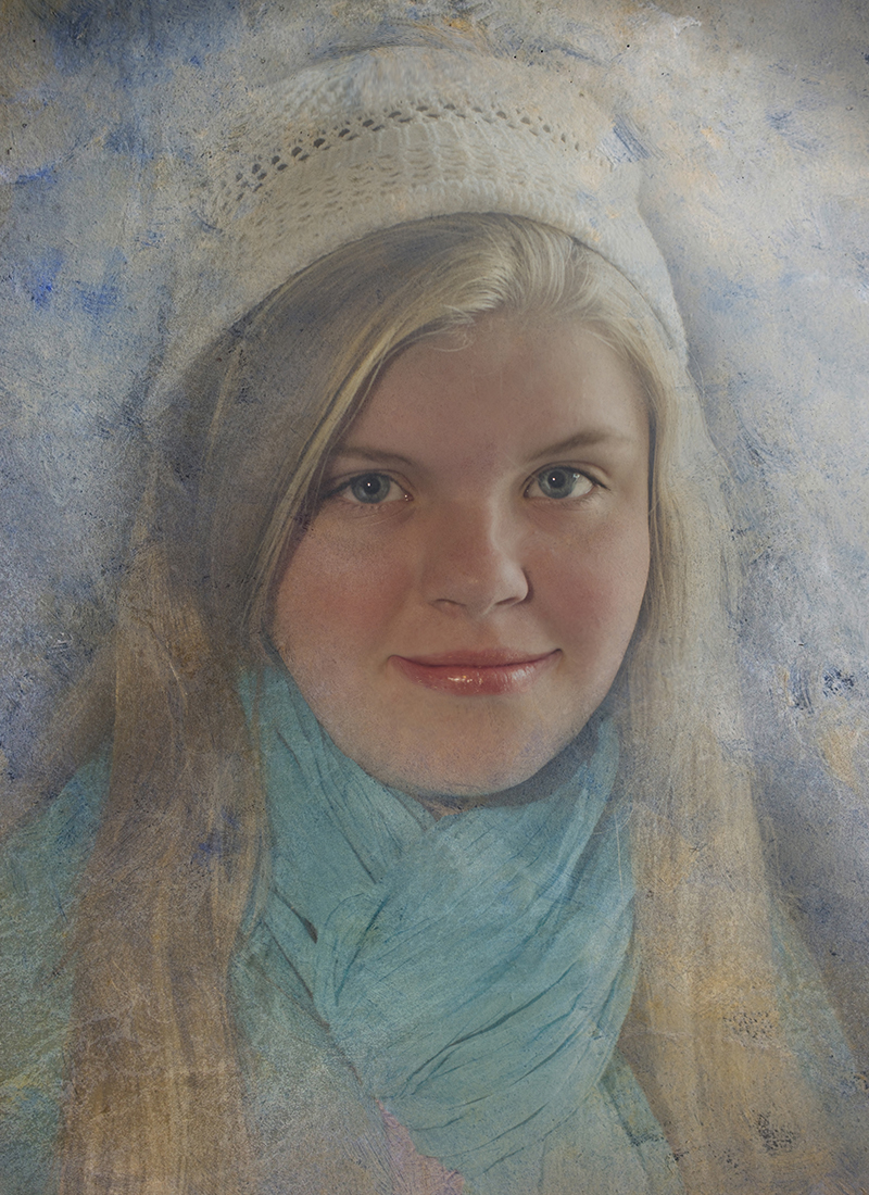
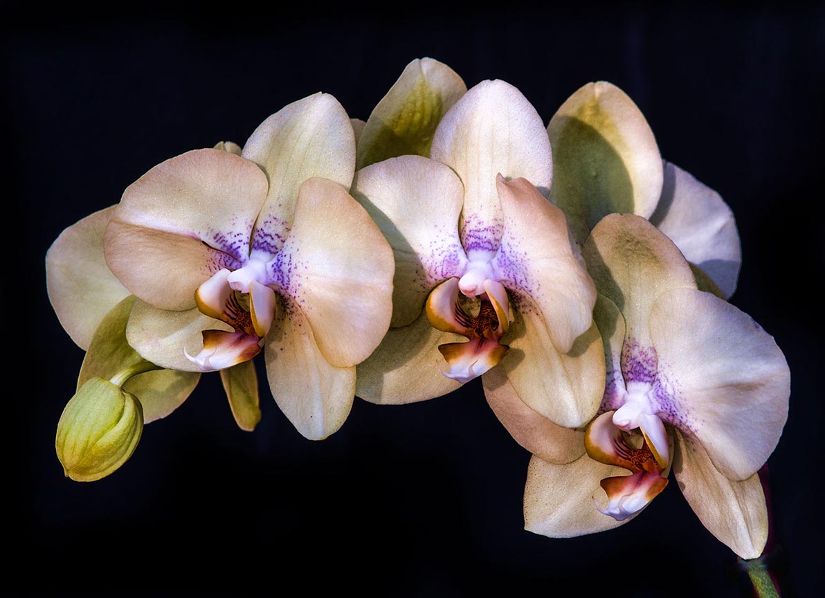
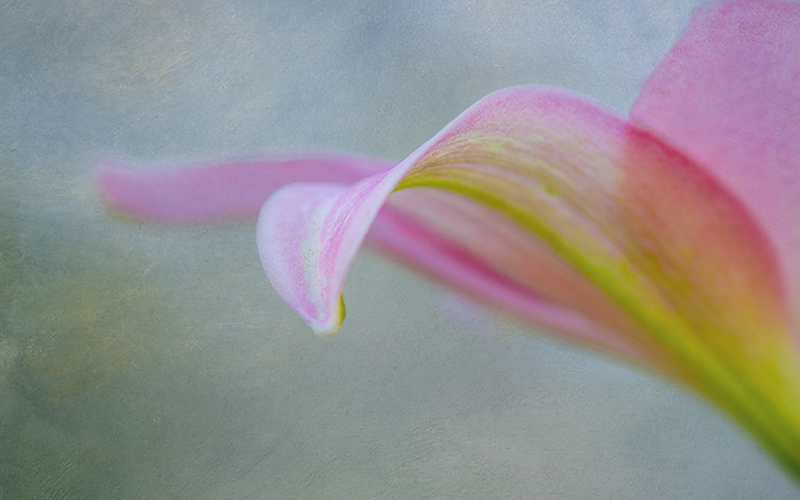
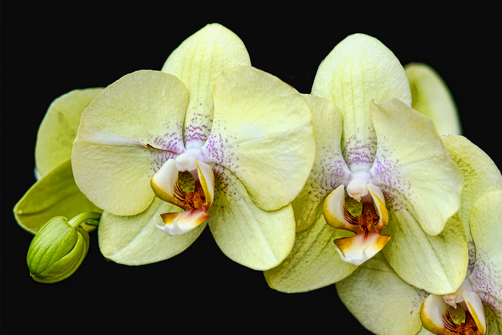
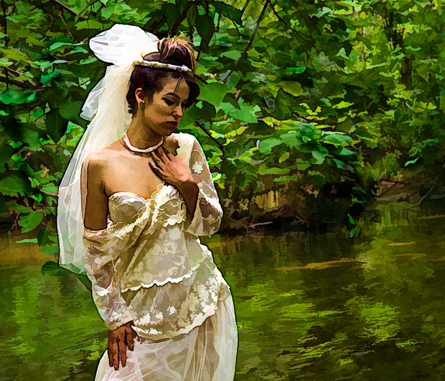
Diana, this is stunning ! I love the colors in the center and how in focus they are, then the gentle softening of the petals as they move outward. I wouldn't have cropped the very center petal on the bottom - can you recrop and let the petal's tip show? I love the background color. I just think this is gorgeous . |
Aug 13th |
| 10 |
Aug 23 |
Comment |
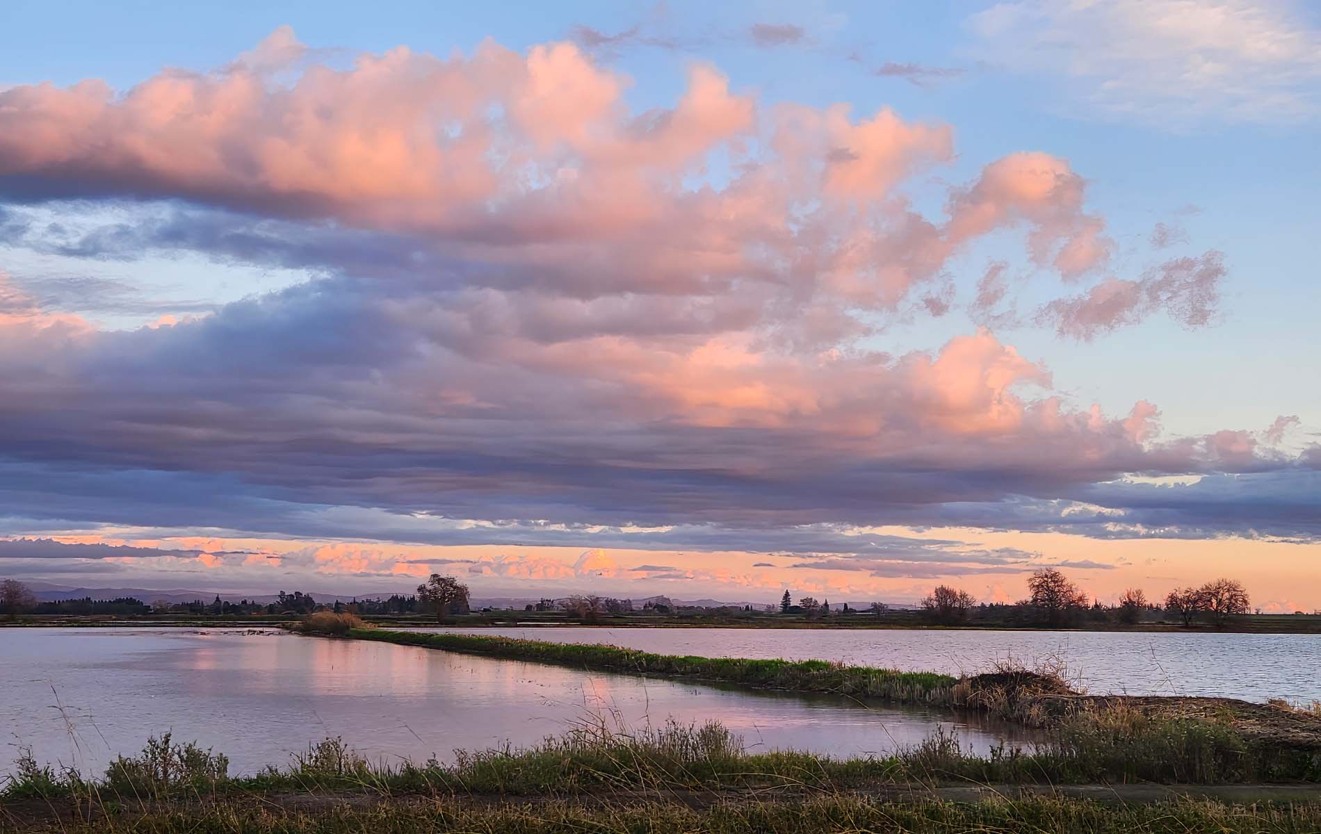
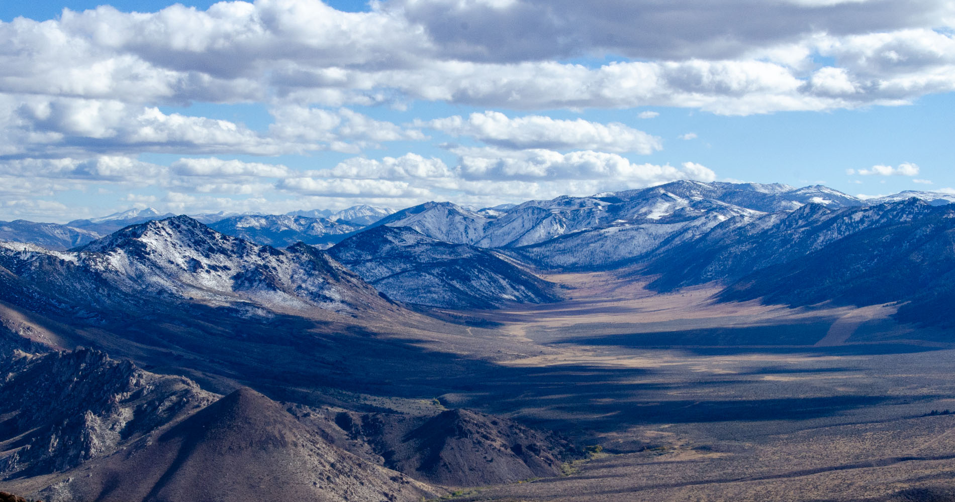
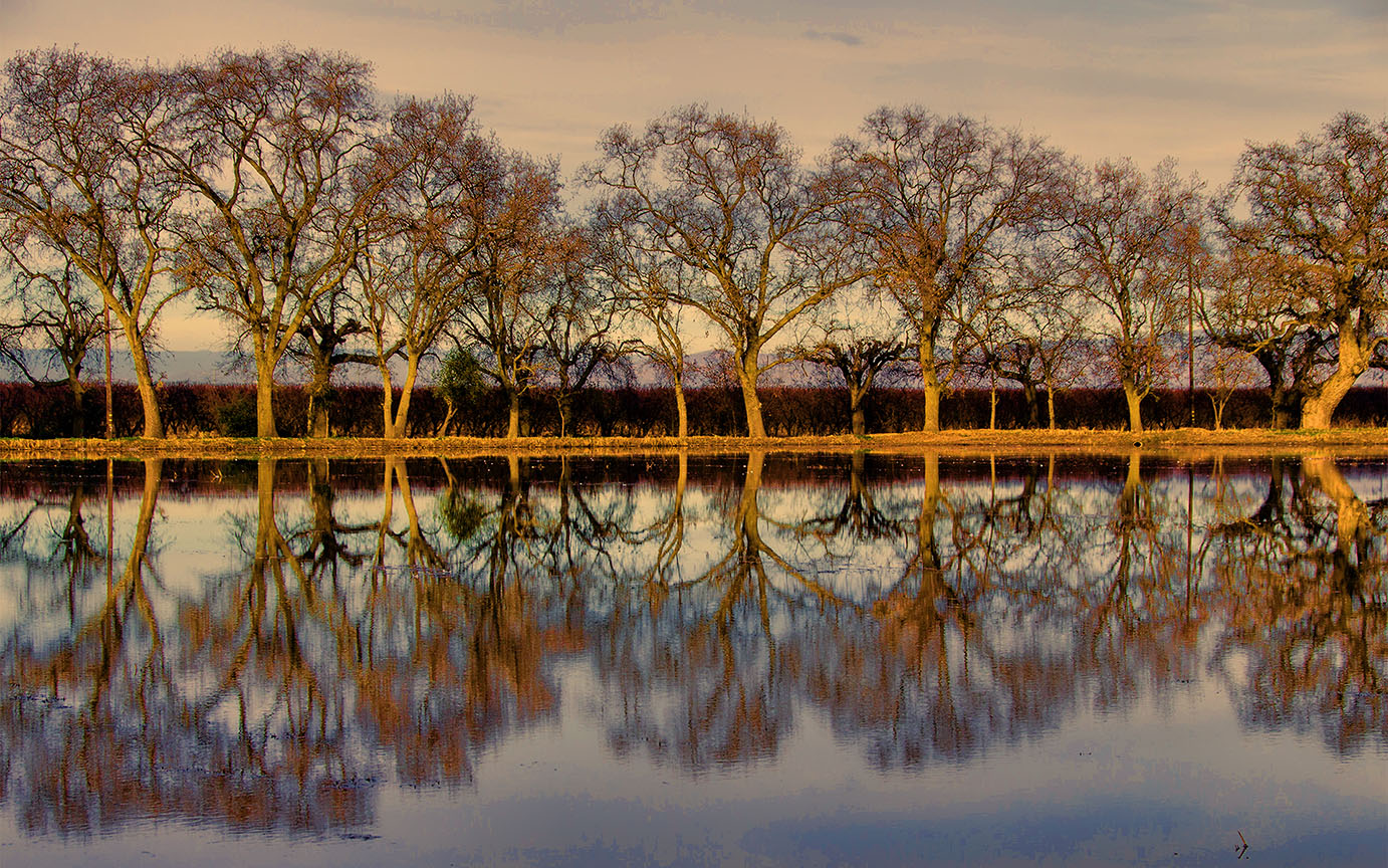
I agree with Meredith, the focus on the rocks looks a bit soft. But your exposure is great and the colors are certainly rich. One of the comments I get from judges in my camera club is to not have the horizon right in the middle of the image, and for that reason I would crop out some of your sky on top -- I don't think you need all of that. Then you would have more of a panorama and the horizon wouldn't be so close to the middle.
You don't mention the length of your lens. Do you know what it was? |
Aug 13th |
| 10 |
Aug 23 |
Comment |
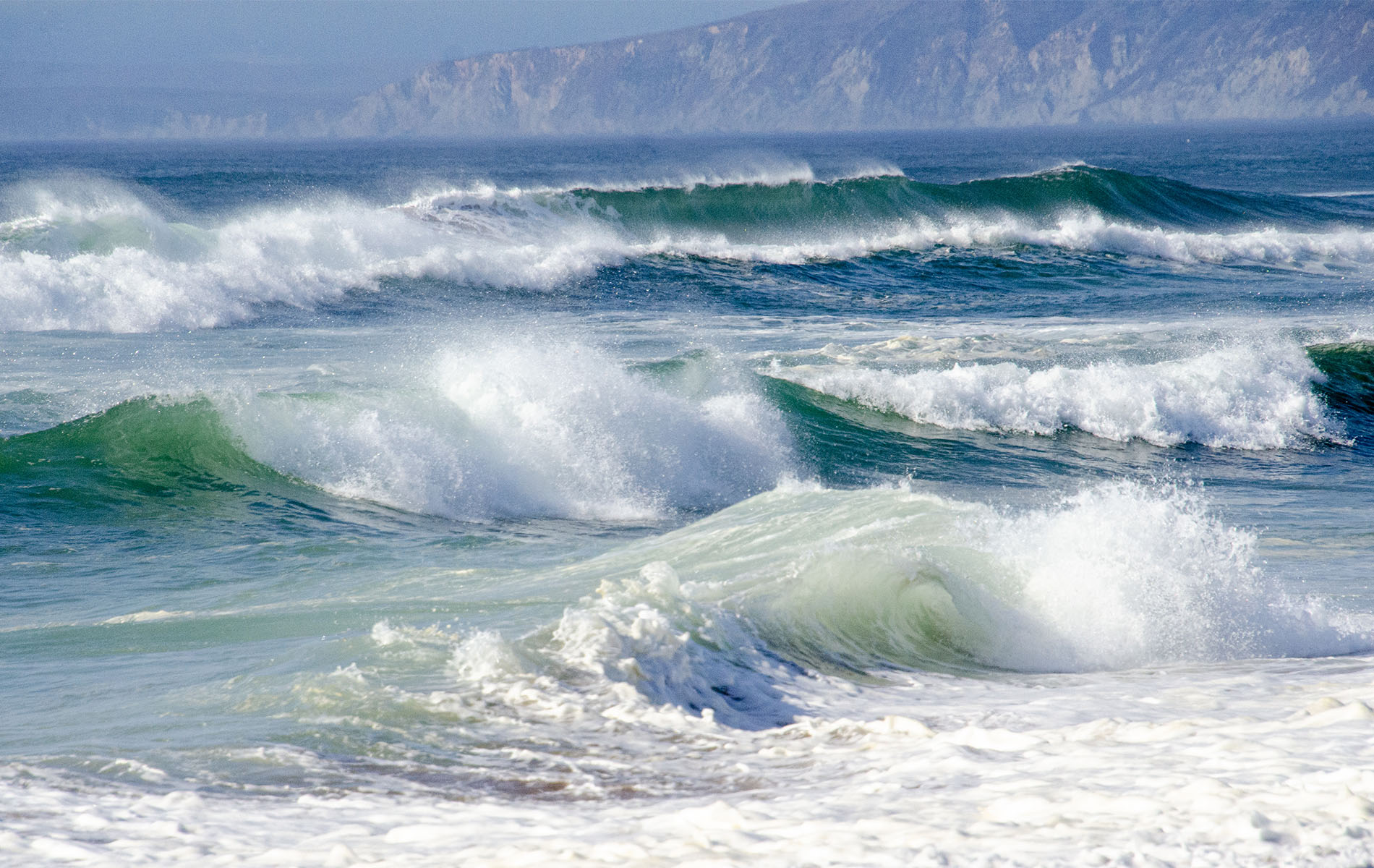
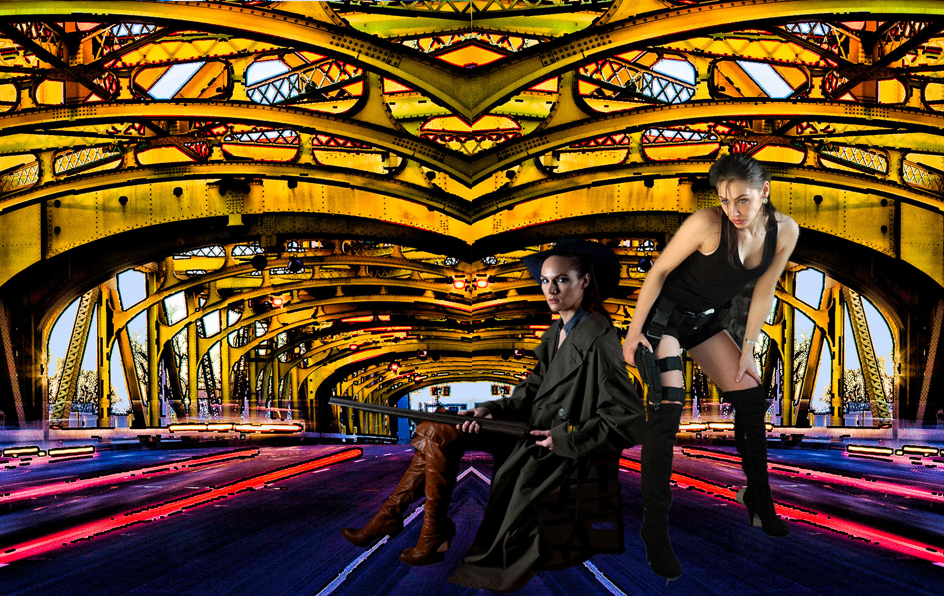
A really interesting abstract ! I looked up the taleidoscope and they are not cheap. Good exposure. I wish the parts of the fountain were a different color than white. You may think I'm gross, but the white thing on the right looks like a body part -- just sayin'. I do like the red stuff that looks to me like fabric. I say, keep on playing with this lens ! |
Aug 13th |
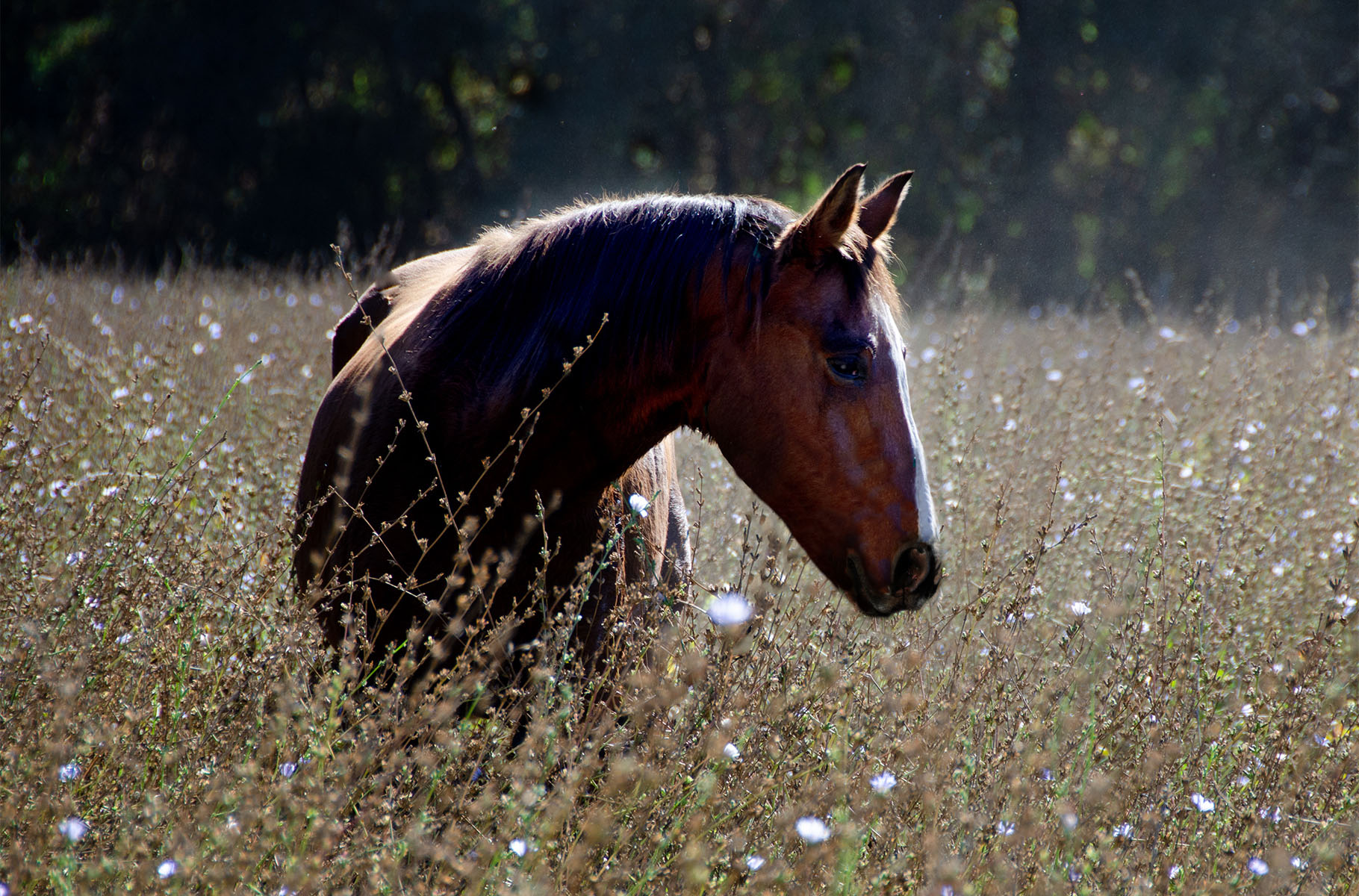
| 10 |
Aug 23 |
Comment |
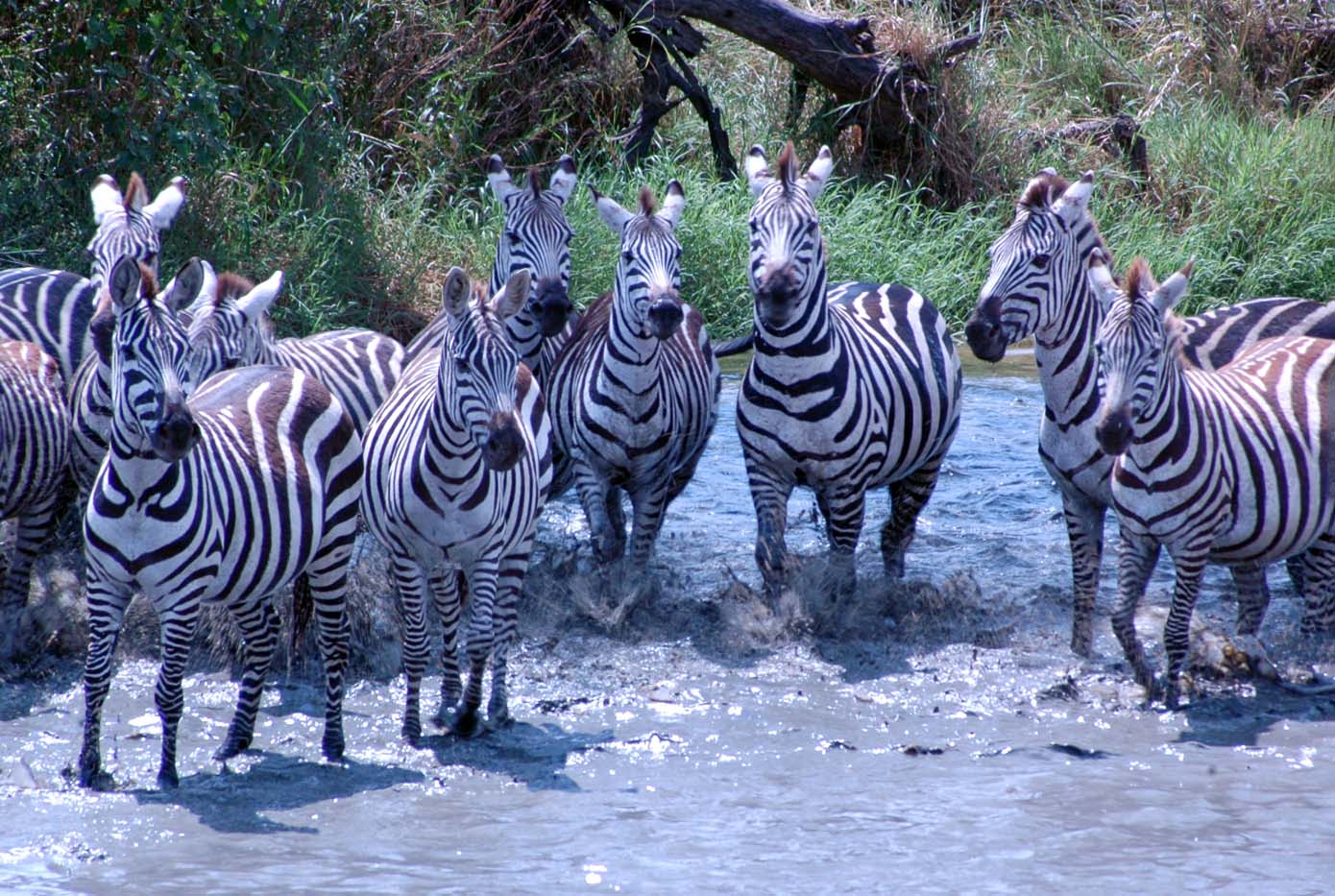
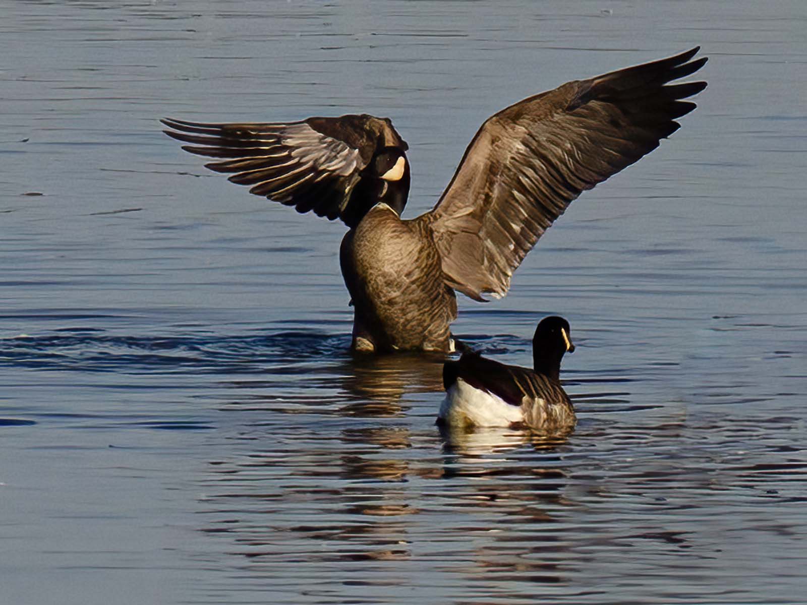
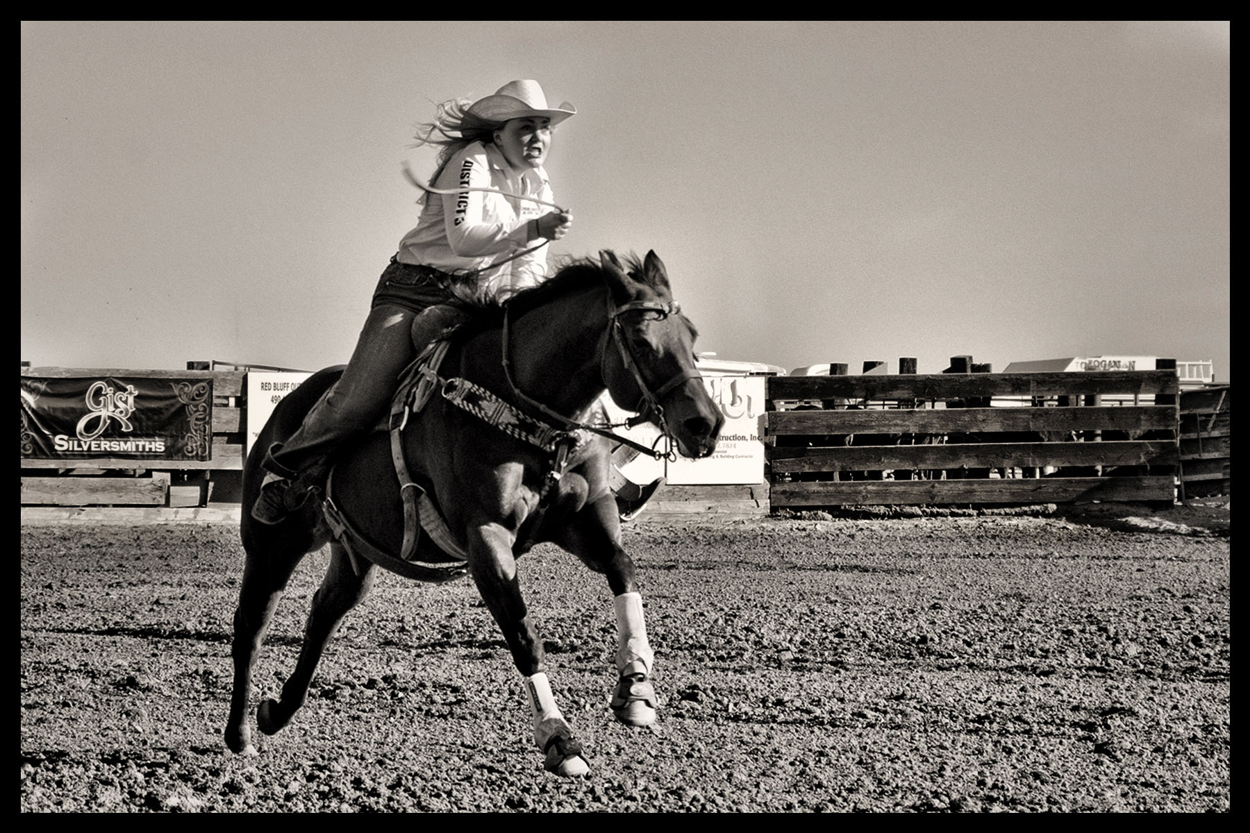
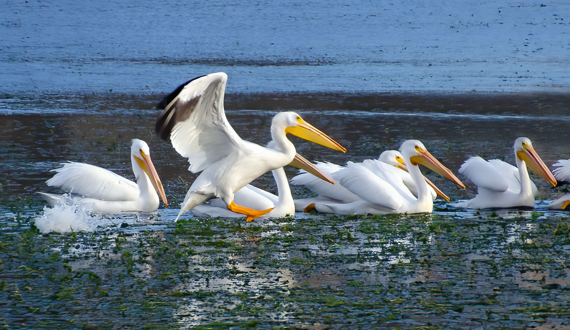
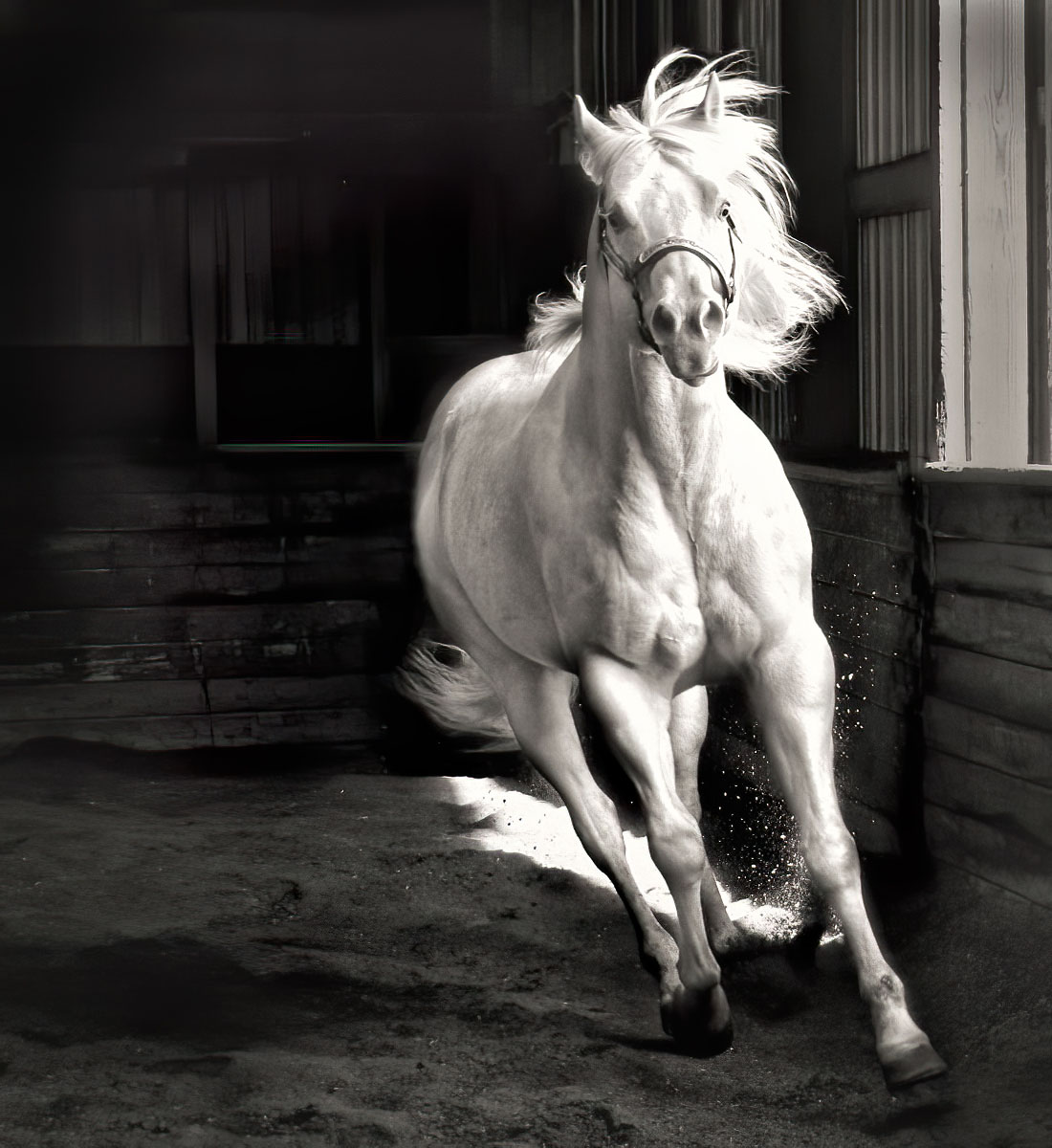
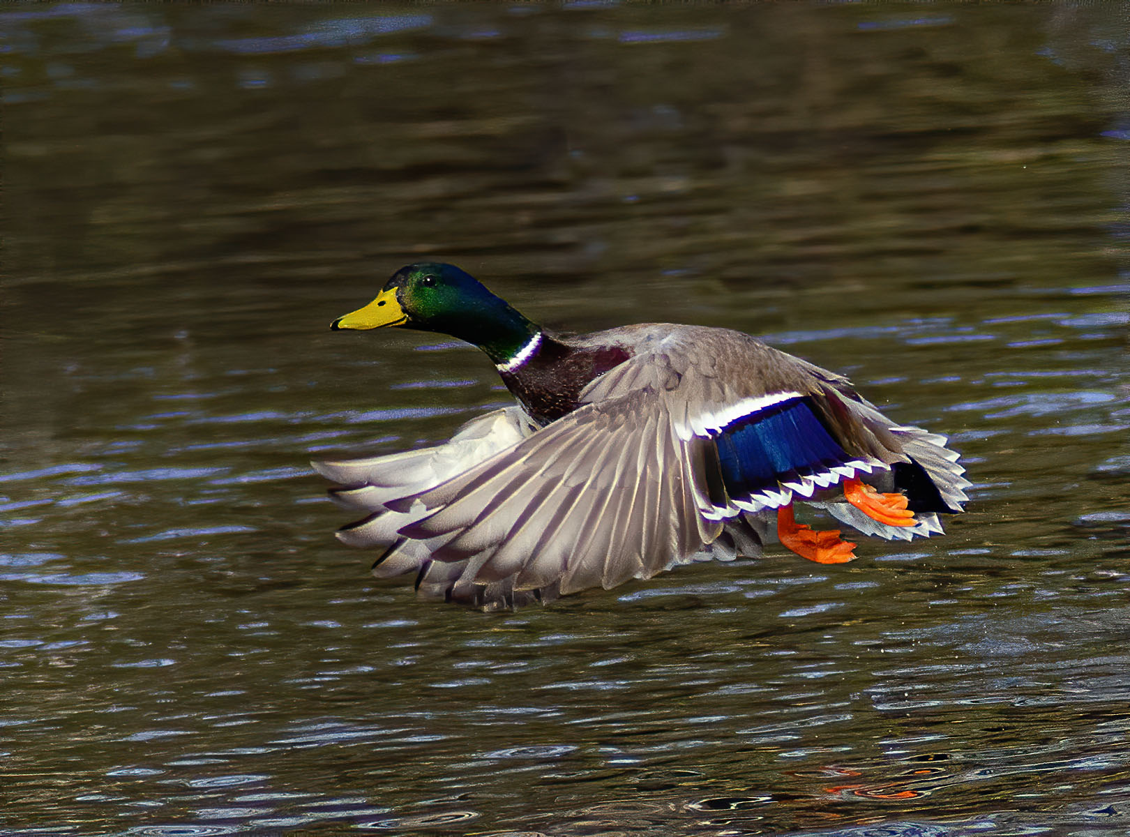
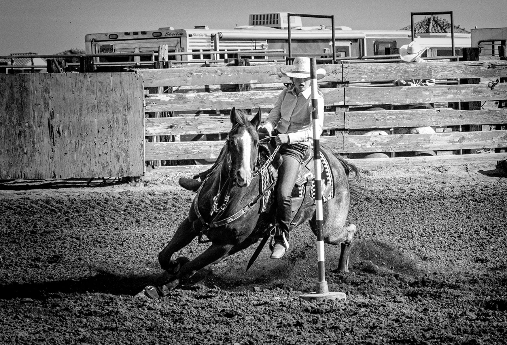
I love this ! It's a great action shot and even one that would work in photojournalism. I love how you blurred the background. Your exposure is great, especially on the horse, as he/she is not overexposed. You got the rider's face--wonderful ! I wish I had taken this picture. Well done !! |
Aug 13th |
6 comments - 4 replies for Group 10
|
| 80 |
Aug 23 |
Comment |
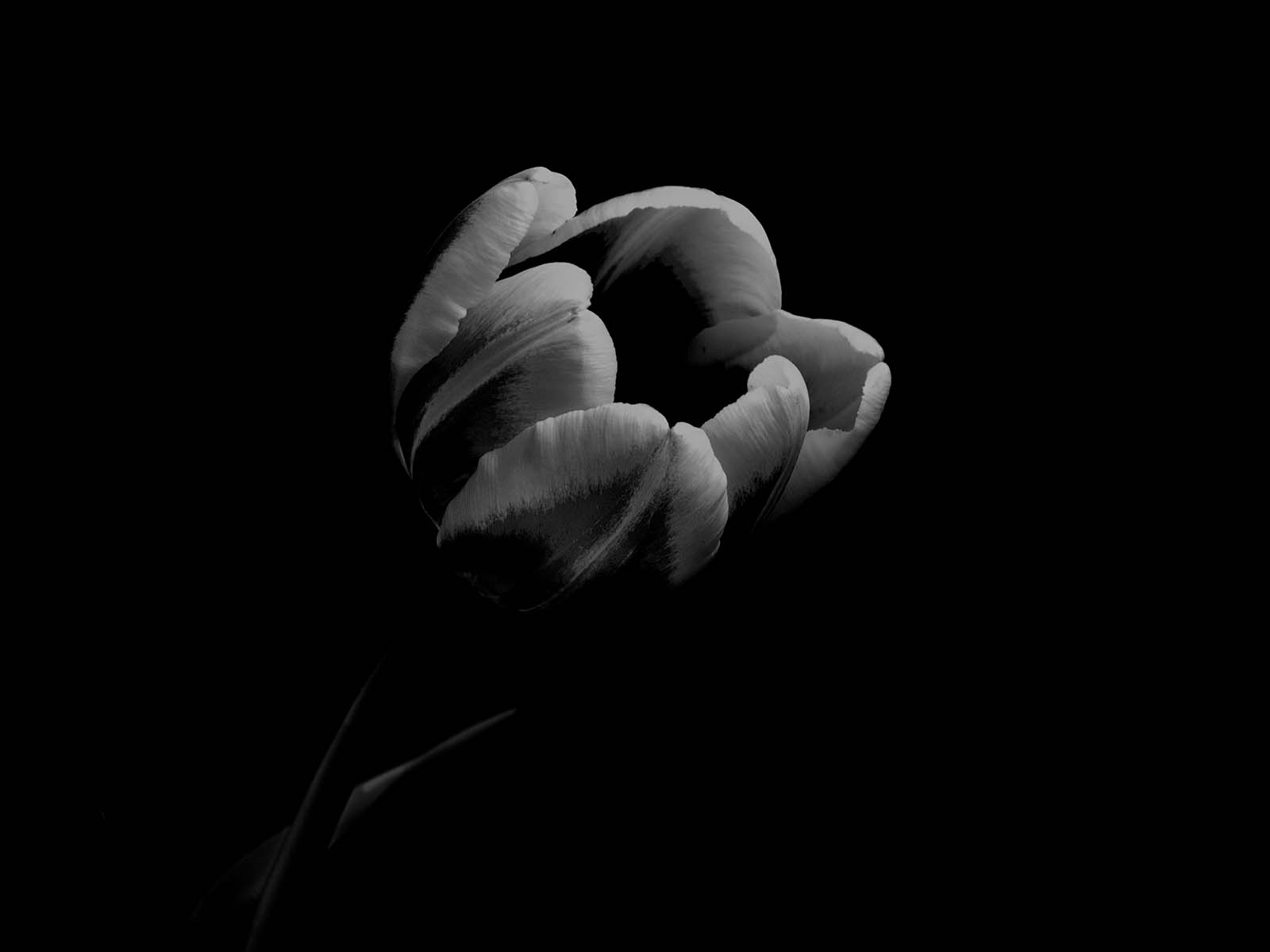
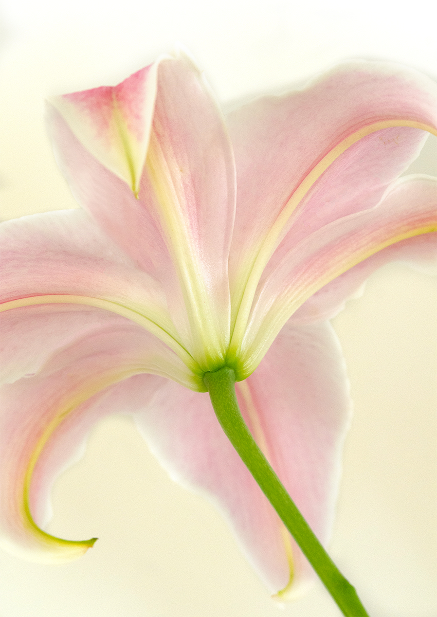
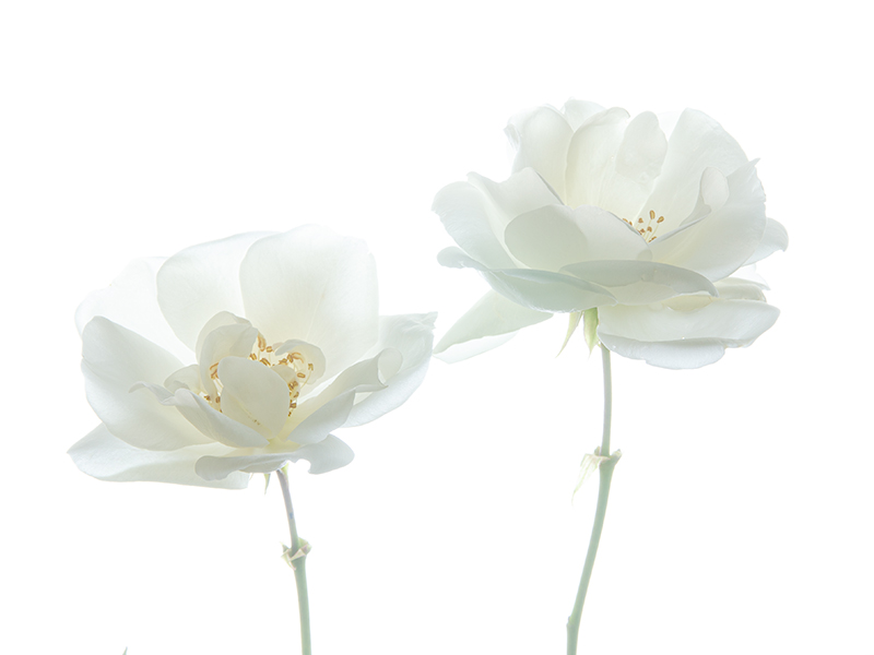
Hi Doug, I like this one much better. The space in the right upper side should be a white that matches the flowers. But this looks very ethereal and dreamy. Nice ! |
Aug 13th |
1 comment - 0 replies for Group 80
|
7 comments - 4 replies Total
|