|
| Group |
Round |
C/R |
Comment |
Date |
Image |
| 10 |
Apr 23 |
Comment |
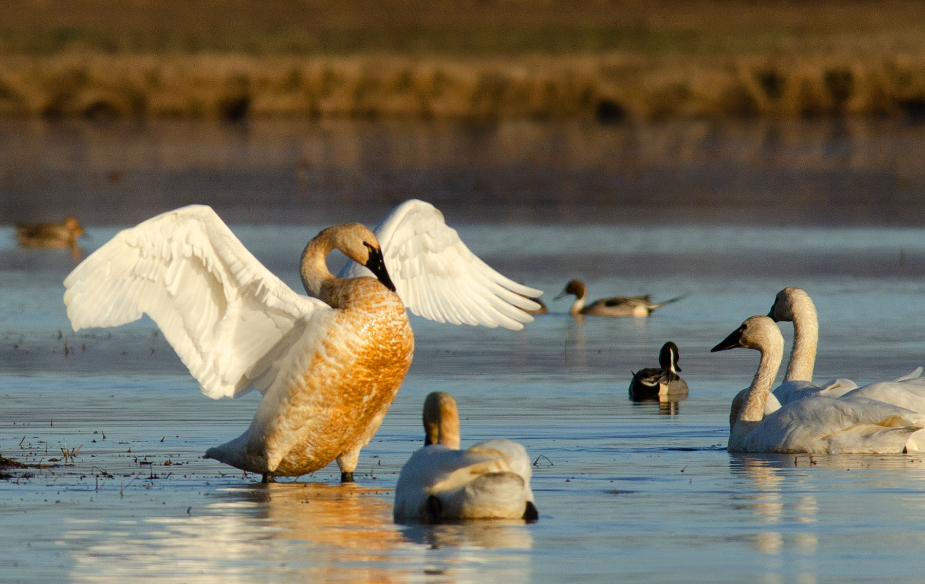
Finally got my Photoshop to work. This is what I was wondering about, if a horizontal might be nice, also. |
Apr 18th |
 |
| 10 |
Apr 23 |
Comment |
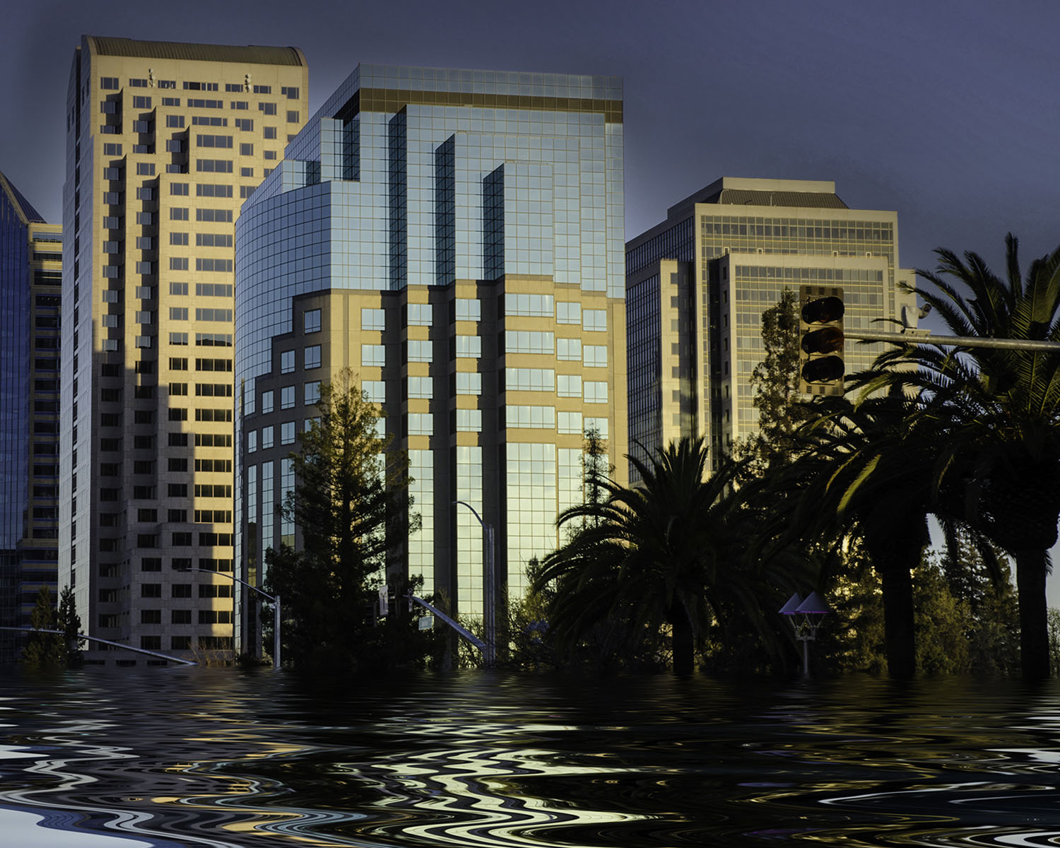
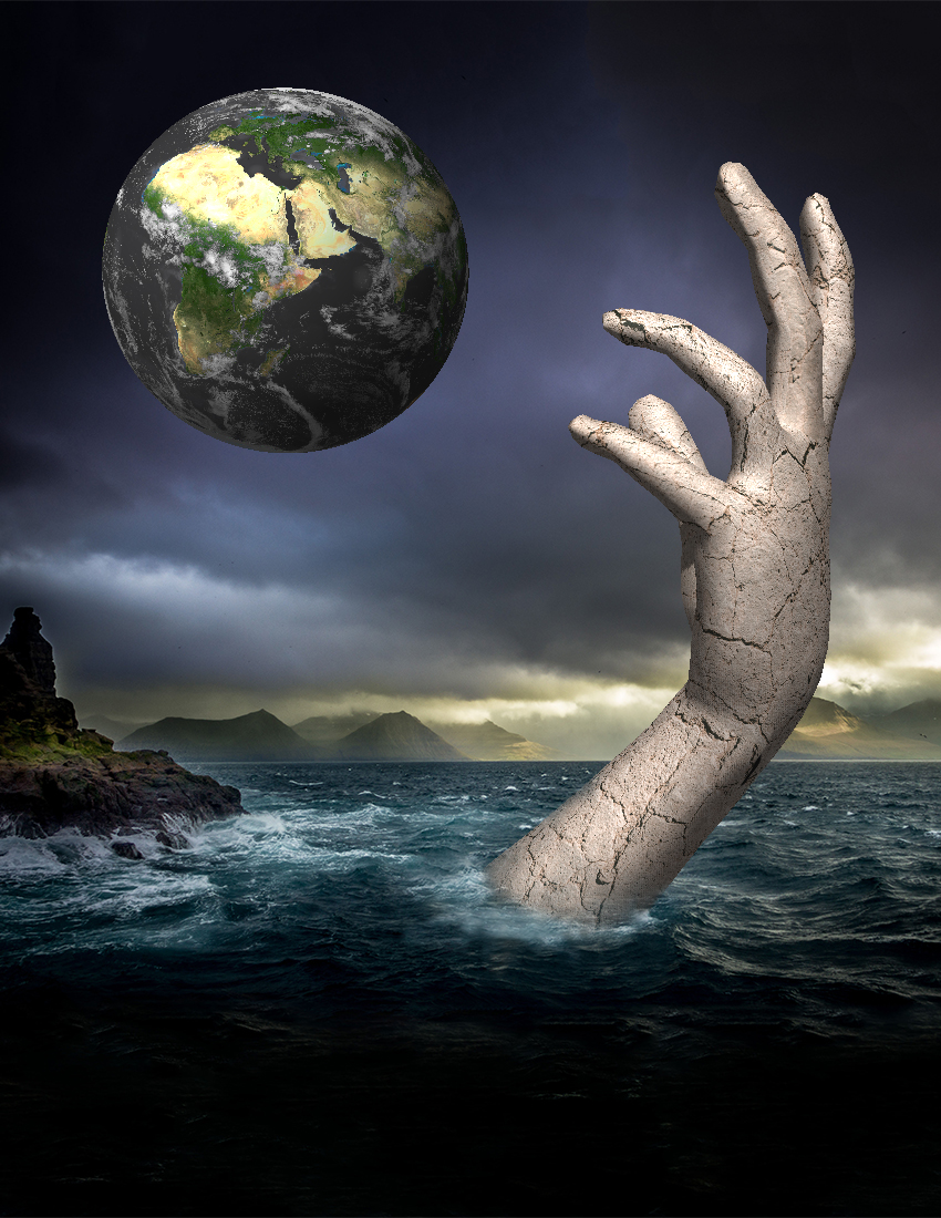
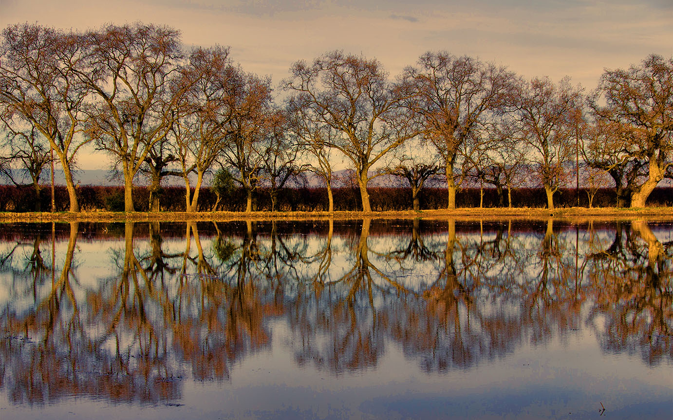
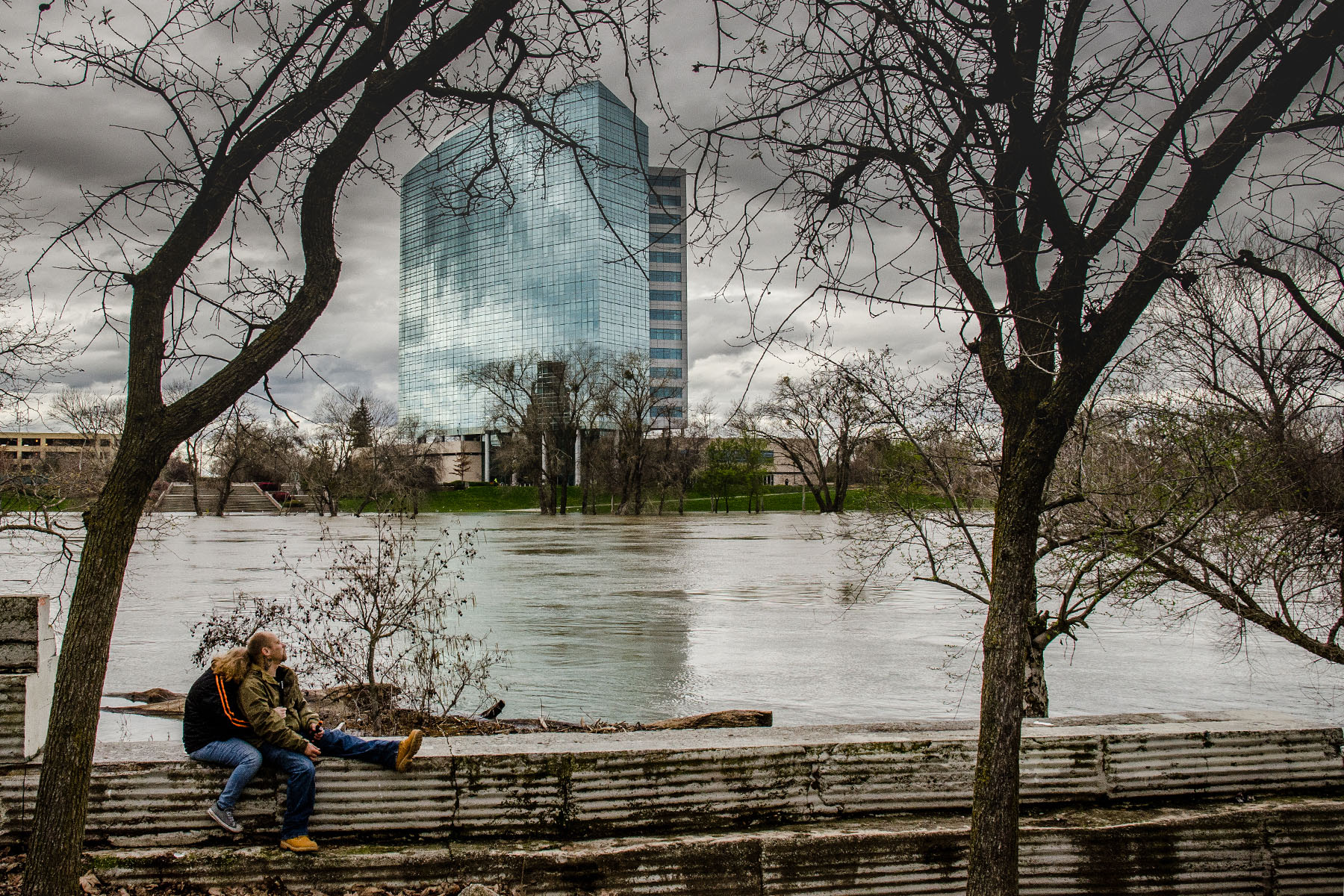
I sent this image to a friend who lives 20 minutes away and she asked me if this was a "fake" image. I was stunned. Of course, it's fake ! LOL. I was just trying out this new app called Flood. During a heavy rainstorm. |
Apr 16th |
| 10 |
Apr 23 |
Reply |
It's an app called flood. I think the manufacturer is Flaming Pear. It's fun to play with. |
Apr 16th |
| 10 |
Apr 23 |
Comment |
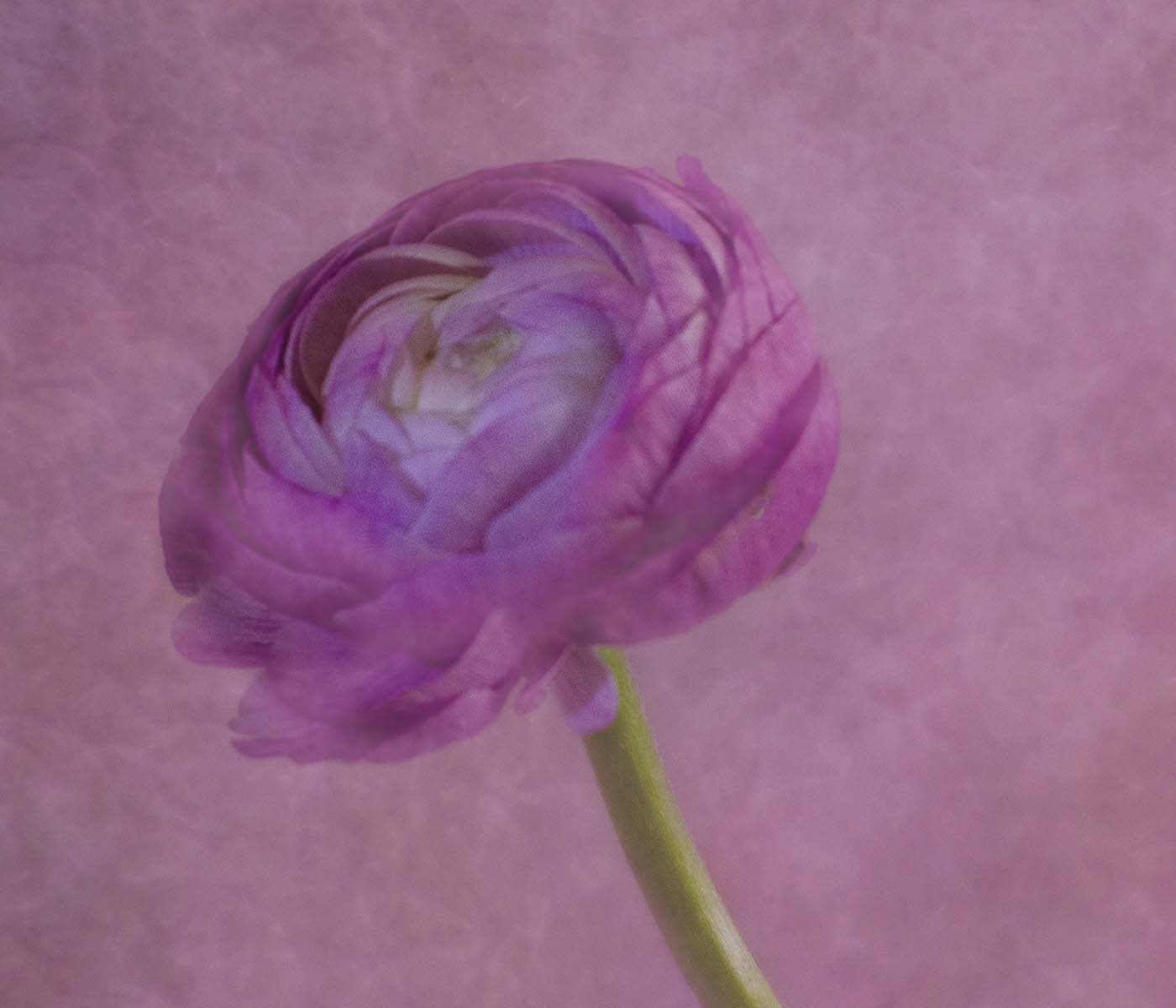
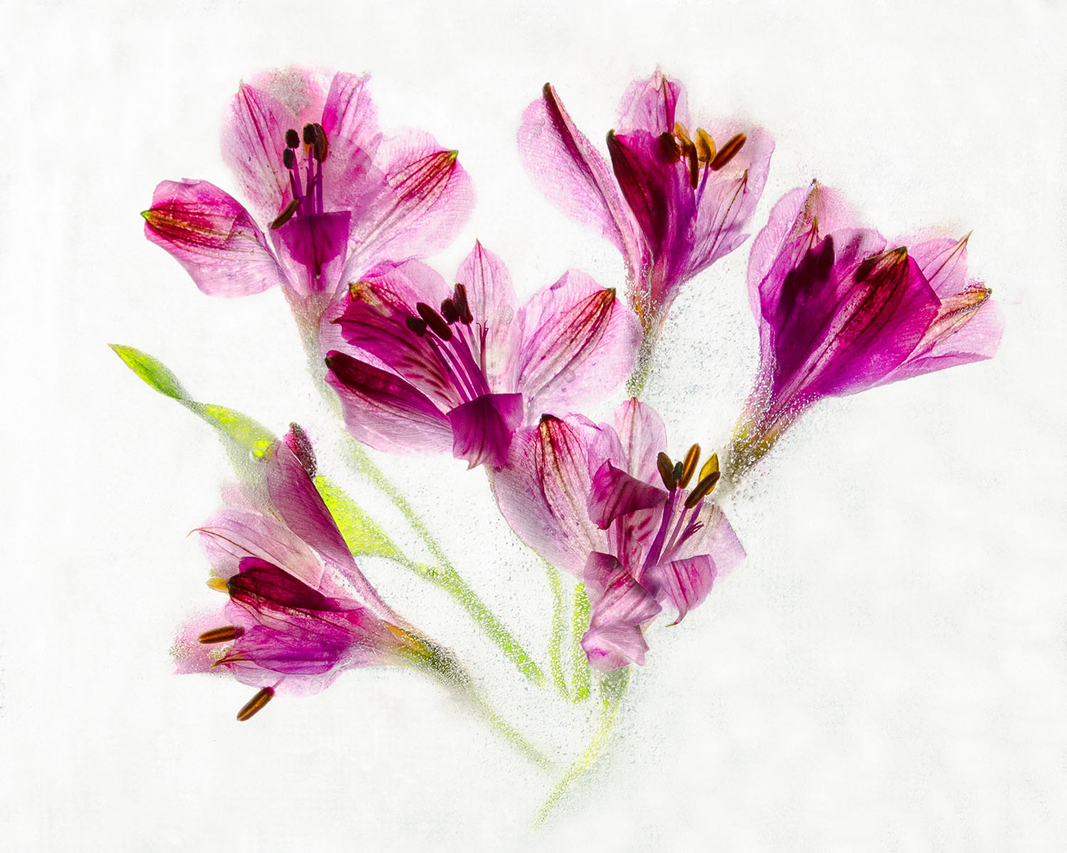
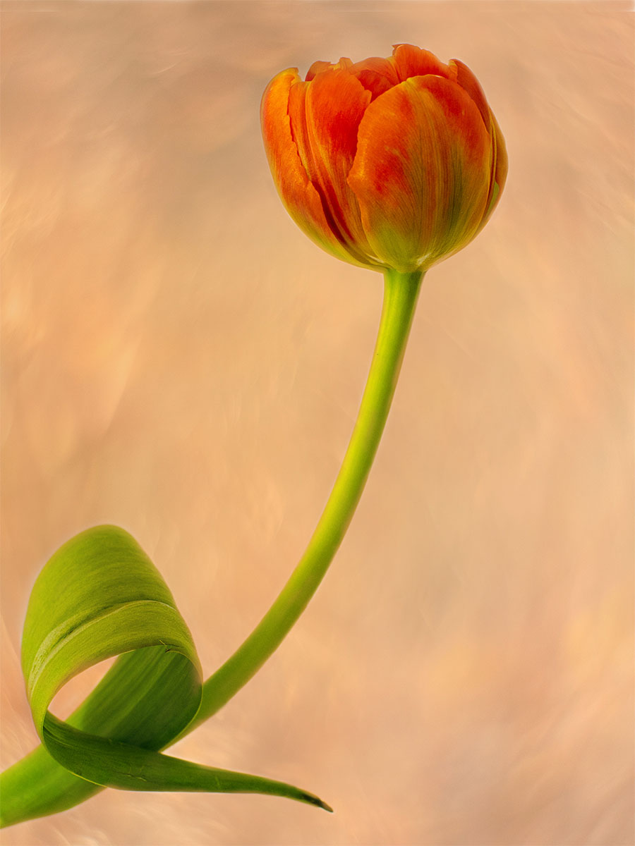
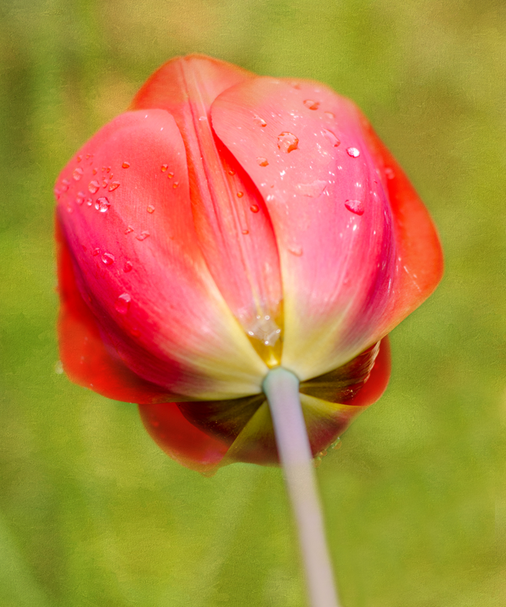
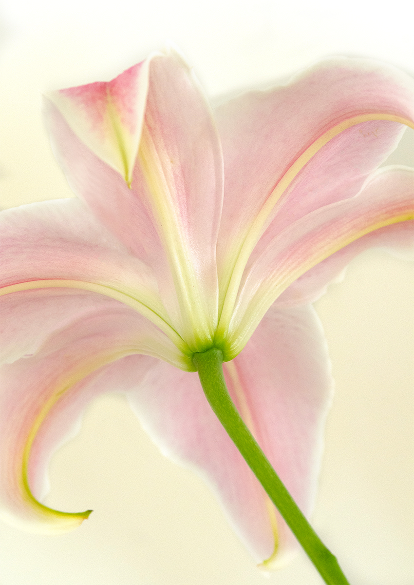
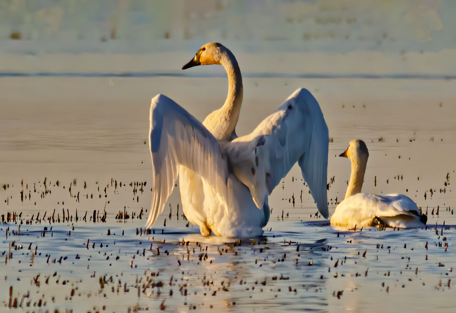
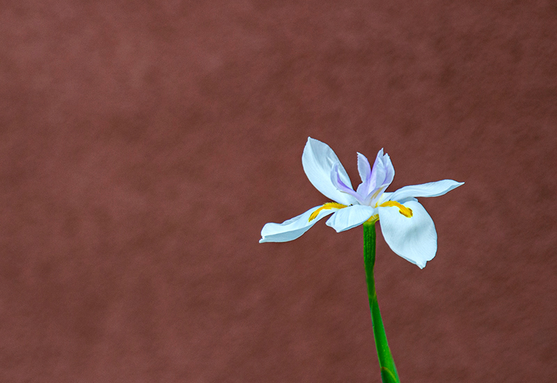
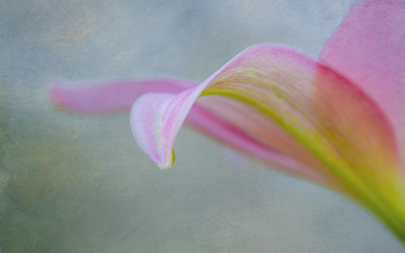
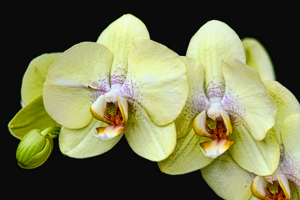
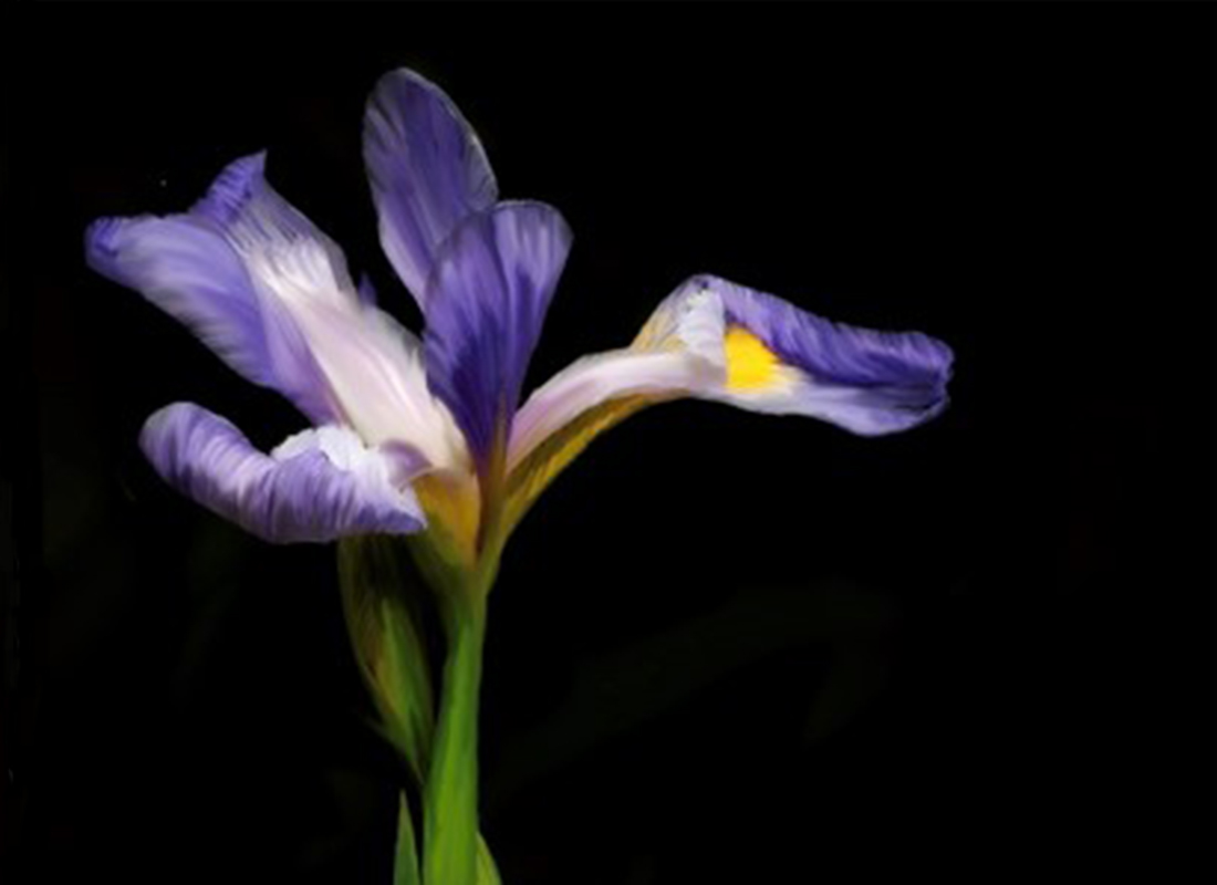
I love the softness of this image and the colors are beautiful. I don't really think you needed to focus stack, because it really is so lovely the way you painted it.
The only thing I don't like is the stem. I think it's too long and the shape is strange.
I wonder what the image would be like if you made it a horizontal, and cropped off about a third or so of the bottom? I think it would look really nice.
I'd do it myself but my Photoshop is mis-behaving. I can't use it. But check it out and see what you think. It's really a lovely image !! |
Apr 16th |
| 10 |
Apr 23 |
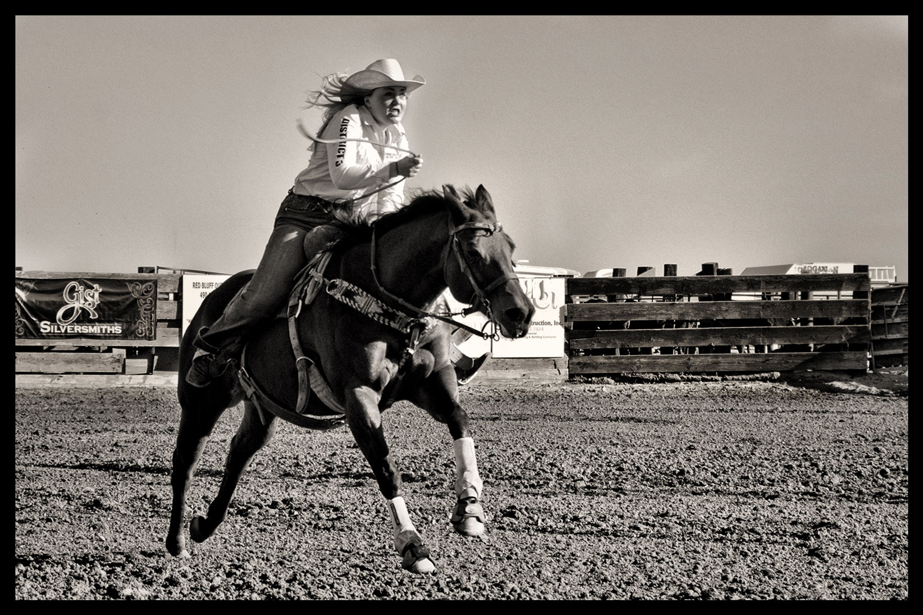
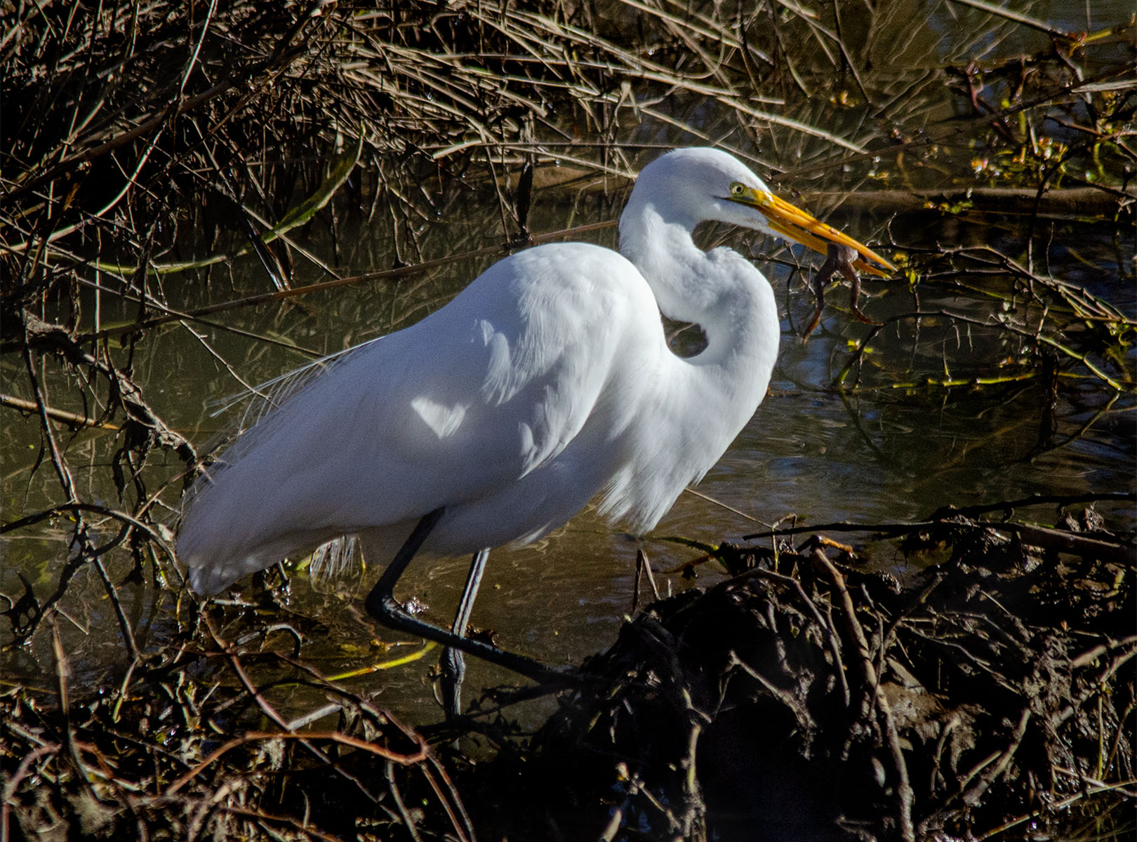
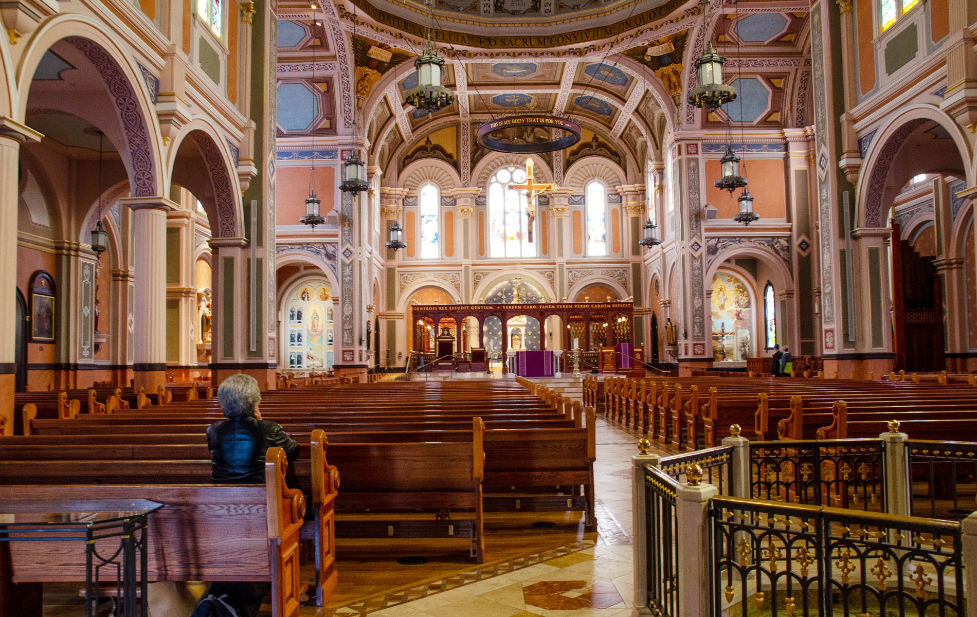
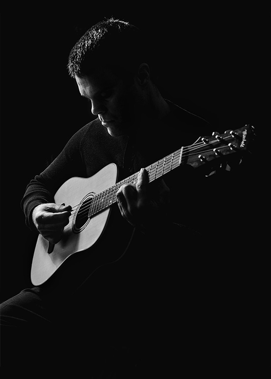
Comment |
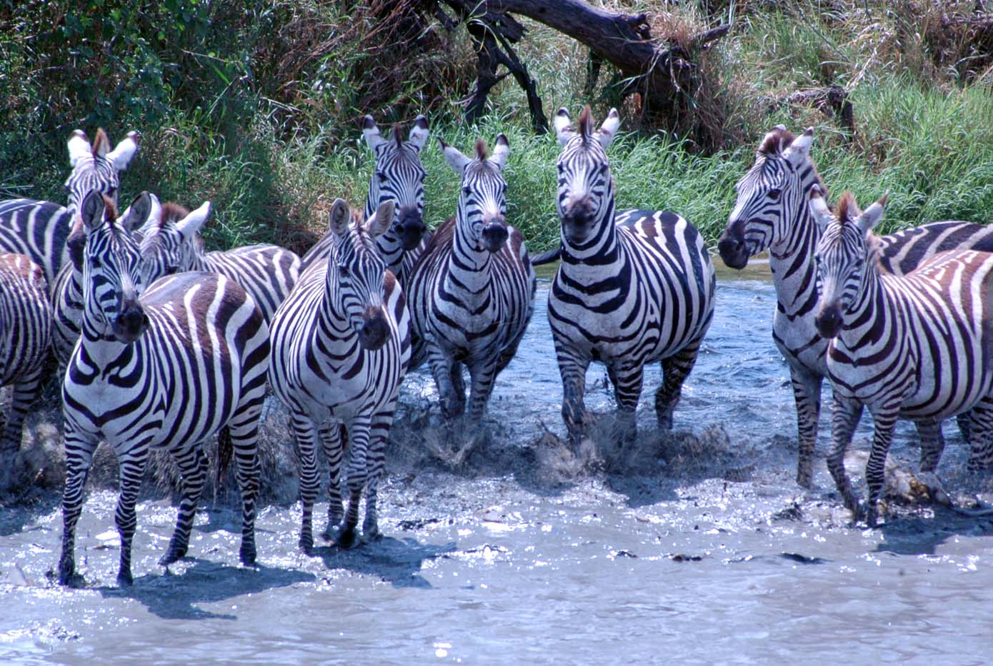
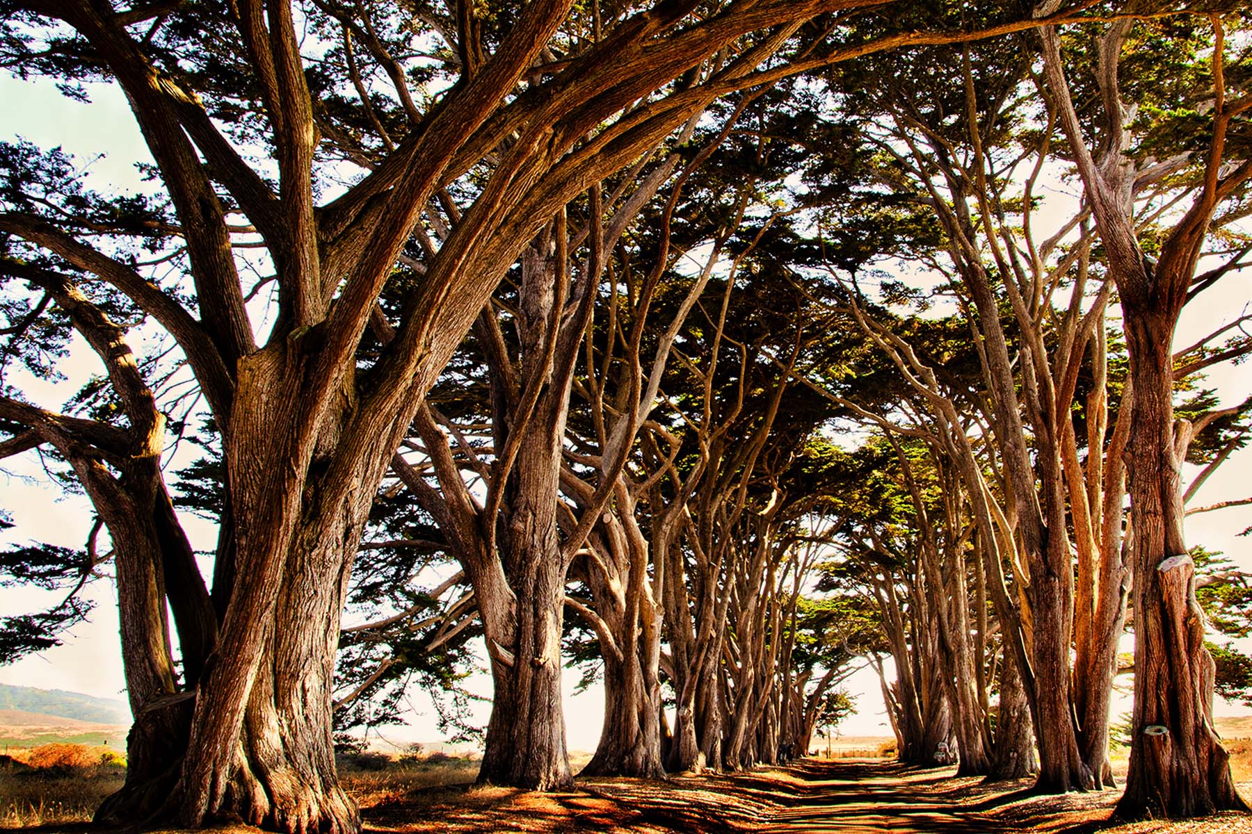
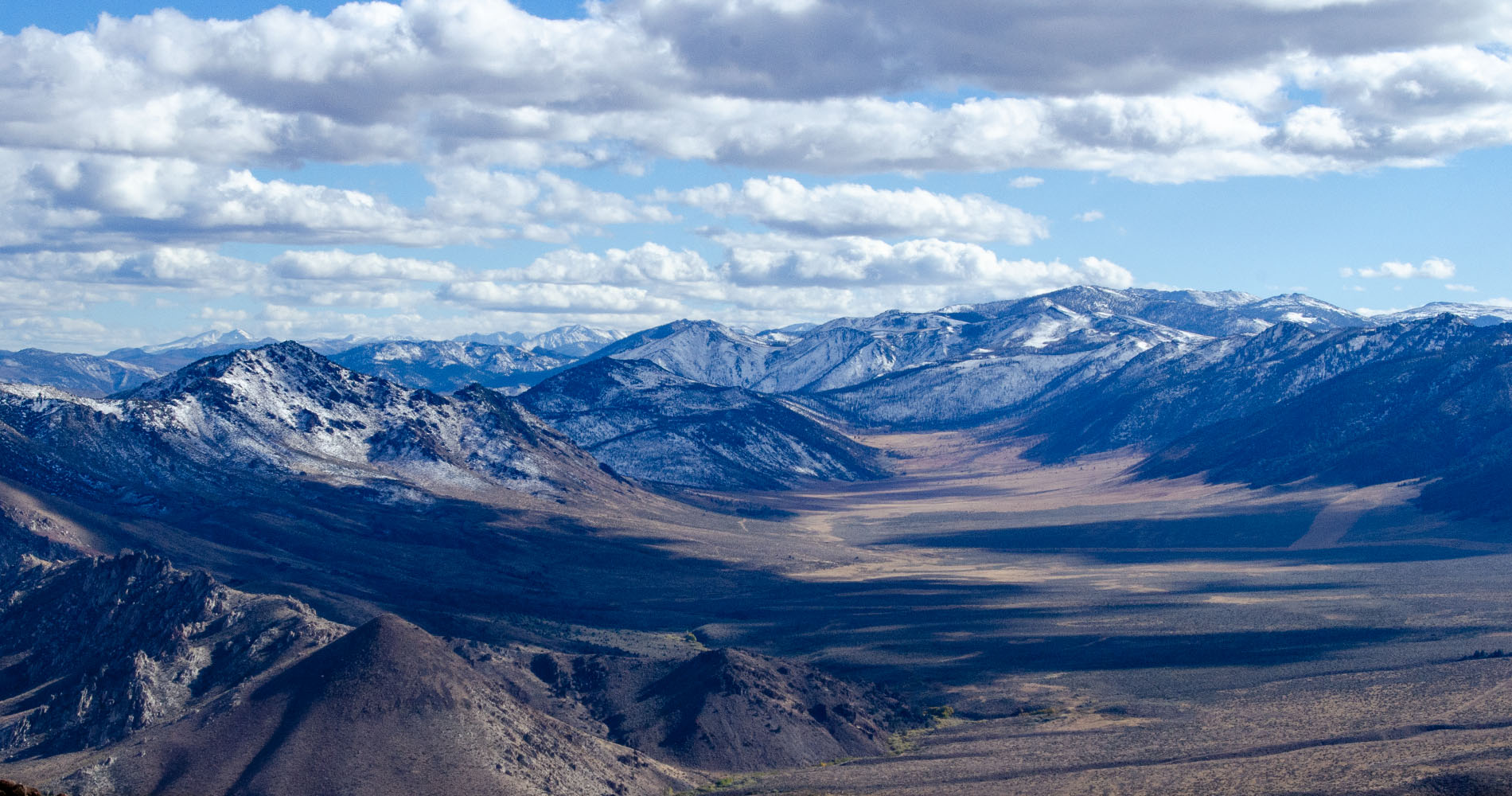
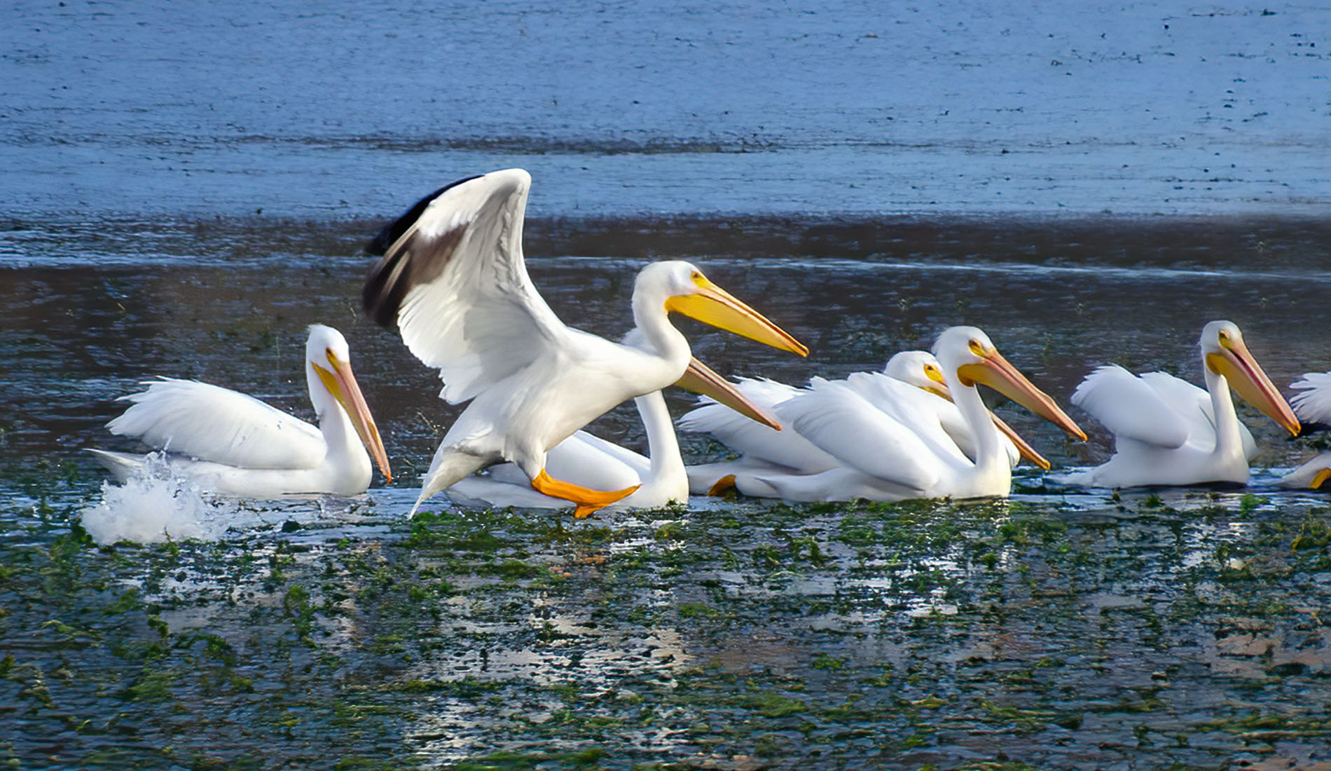
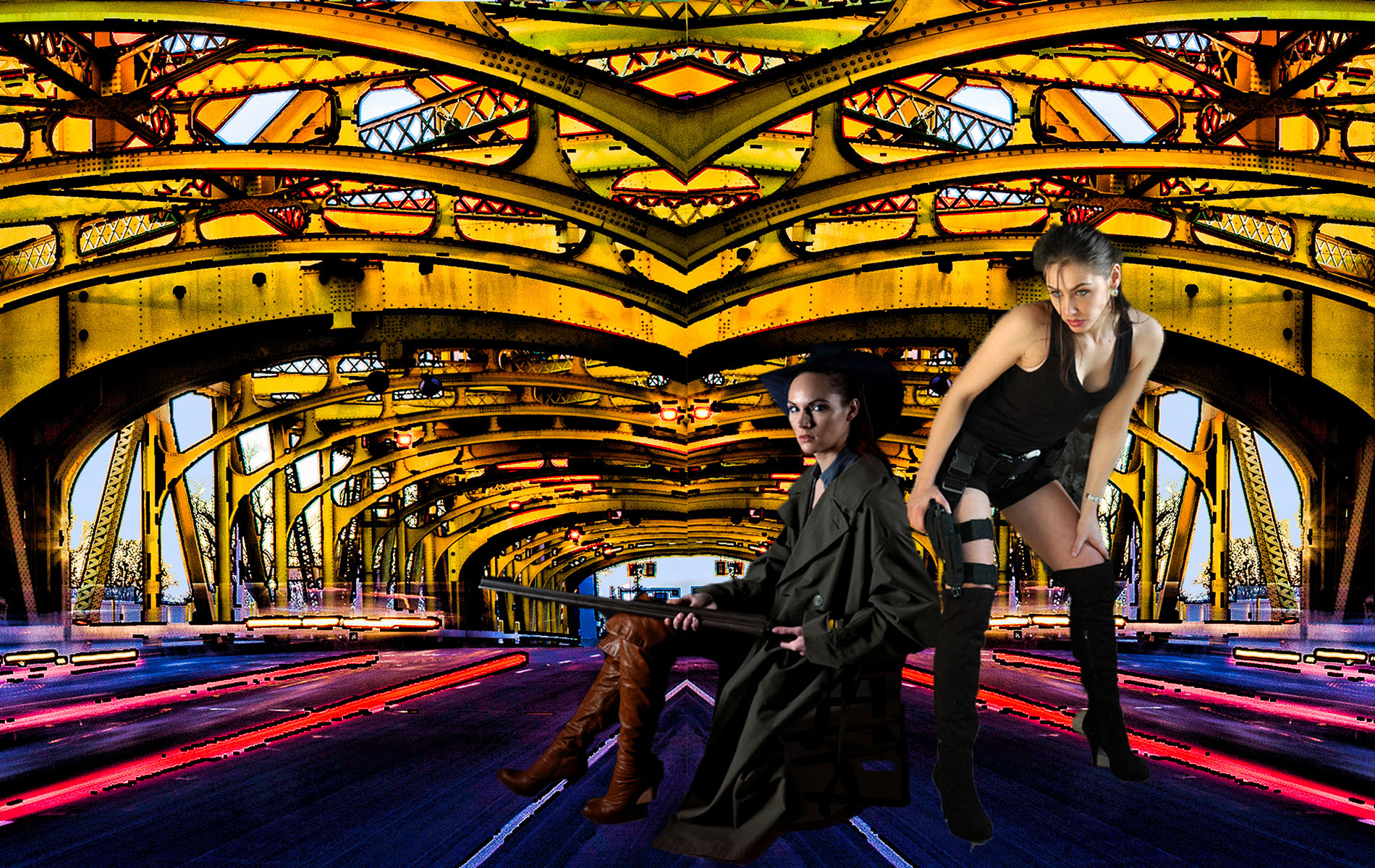
There's so much in this picture, my eyes don't know what to focus on. The bright lights at the top of the bridge are really distracting and I would have burned them in -- it's like they cut the image in half. I think you could have zoomed in closer to any number of different areas in this scene - for example the underneath of the bridge where the graffiti is, and the reflection in the water, and that would have been a nice image. For me, this just has too much. But so fantastic that you were there, it's a fantastic city. |
Apr 16th |
| 10 |
Apr 23 |
Comment |
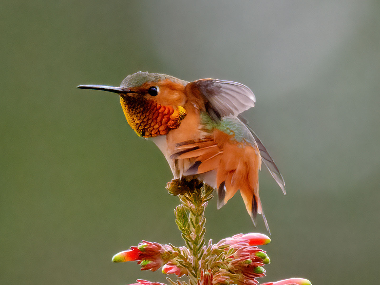
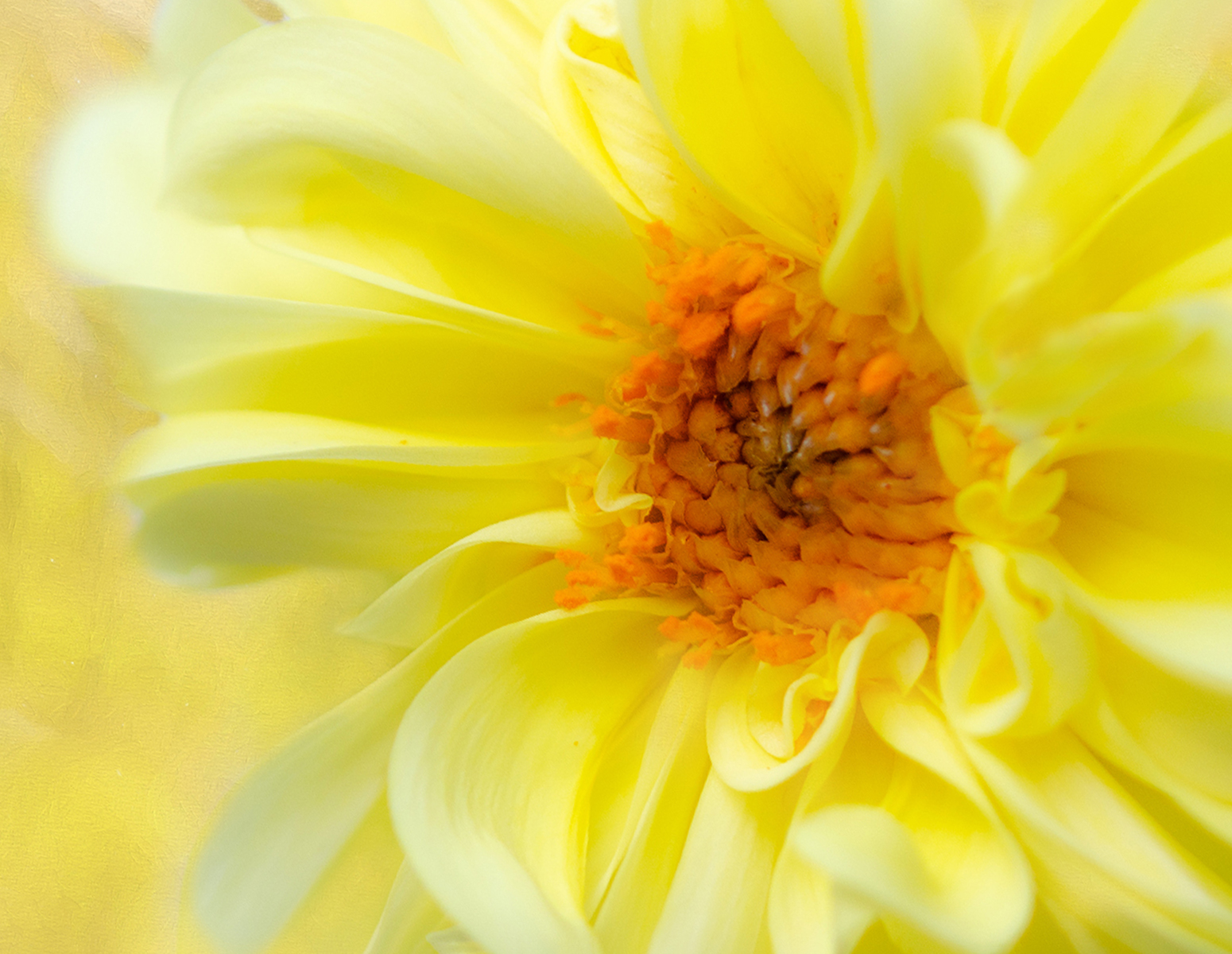
I love the colors and the way the background looks is great. It's a really nice image. Diana, you do so much post-processing !! Wow. That's a lot. No wonder your images turn out so nicely. Focus is great, I can't tell that you used a LensBaby. I guess that's because of the F-stop you used. I like the saturation. Very nice. |
Apr 16th |
| 10 |
Apr 23 |
Comment |
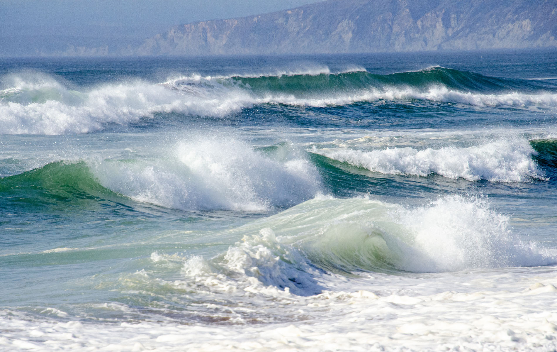
It's a pretty coastline, I like the placement of the rocks to the left. It breaks the picture up. I would saturate the image a bit to bring out more color. I don't think I've ever seen a bad picture of Iceland, it must be so lovely. Thank you for sharing. |
Apr 16th |
| 10 |
Apr 23 |
Comment |
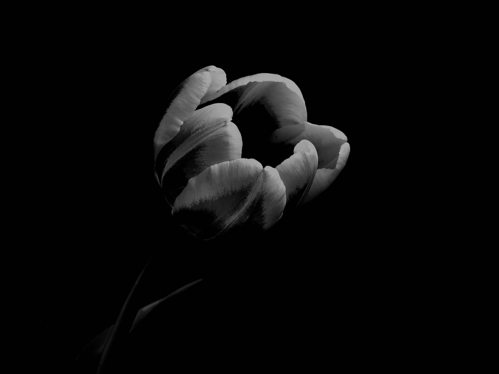
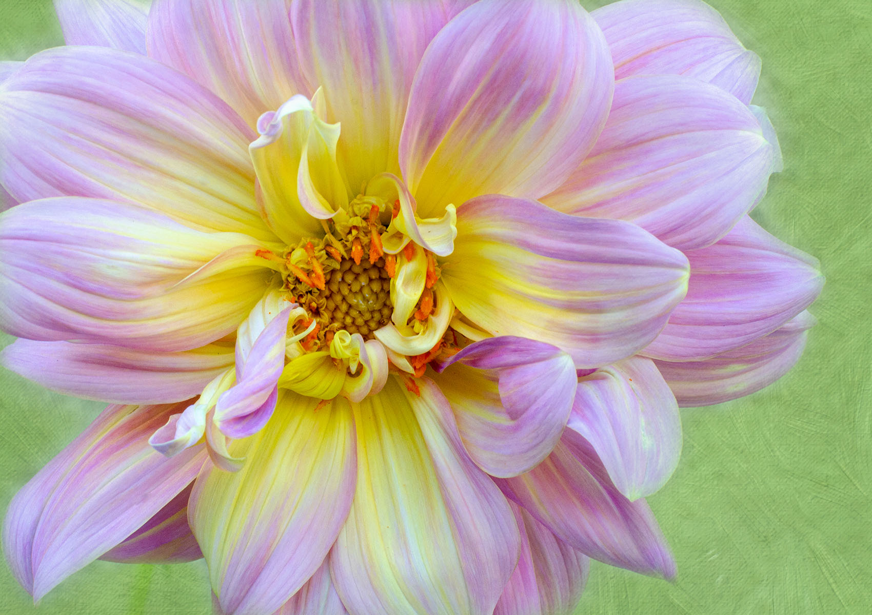
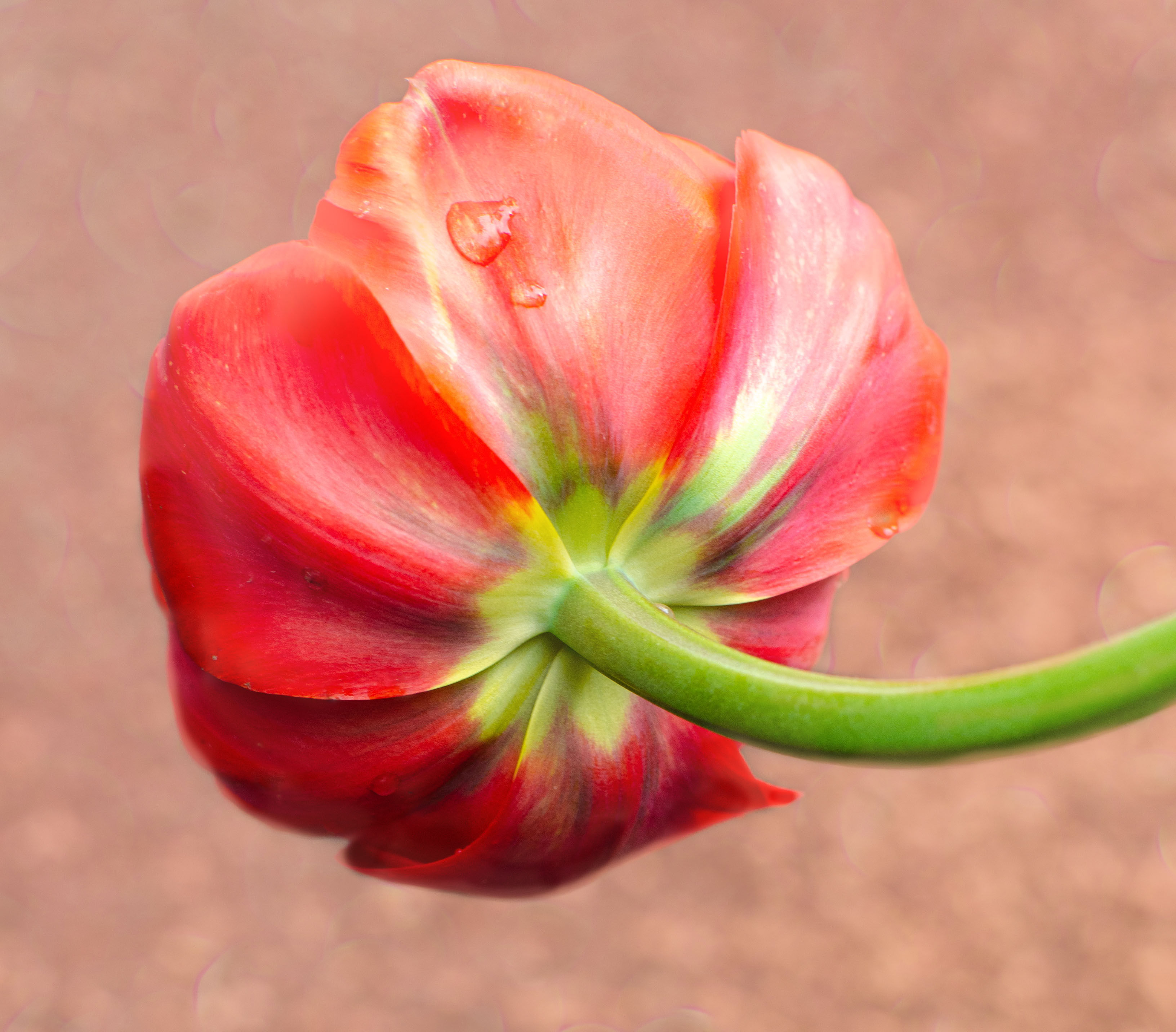
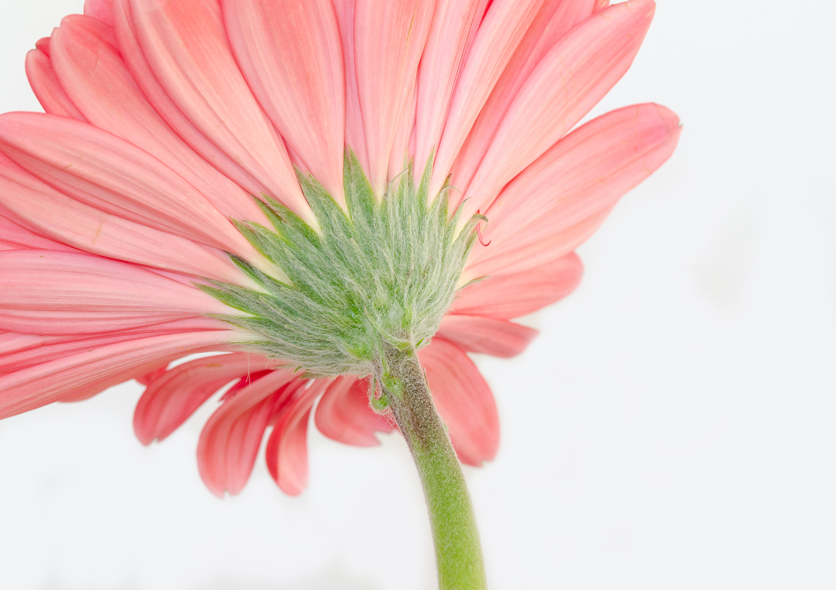
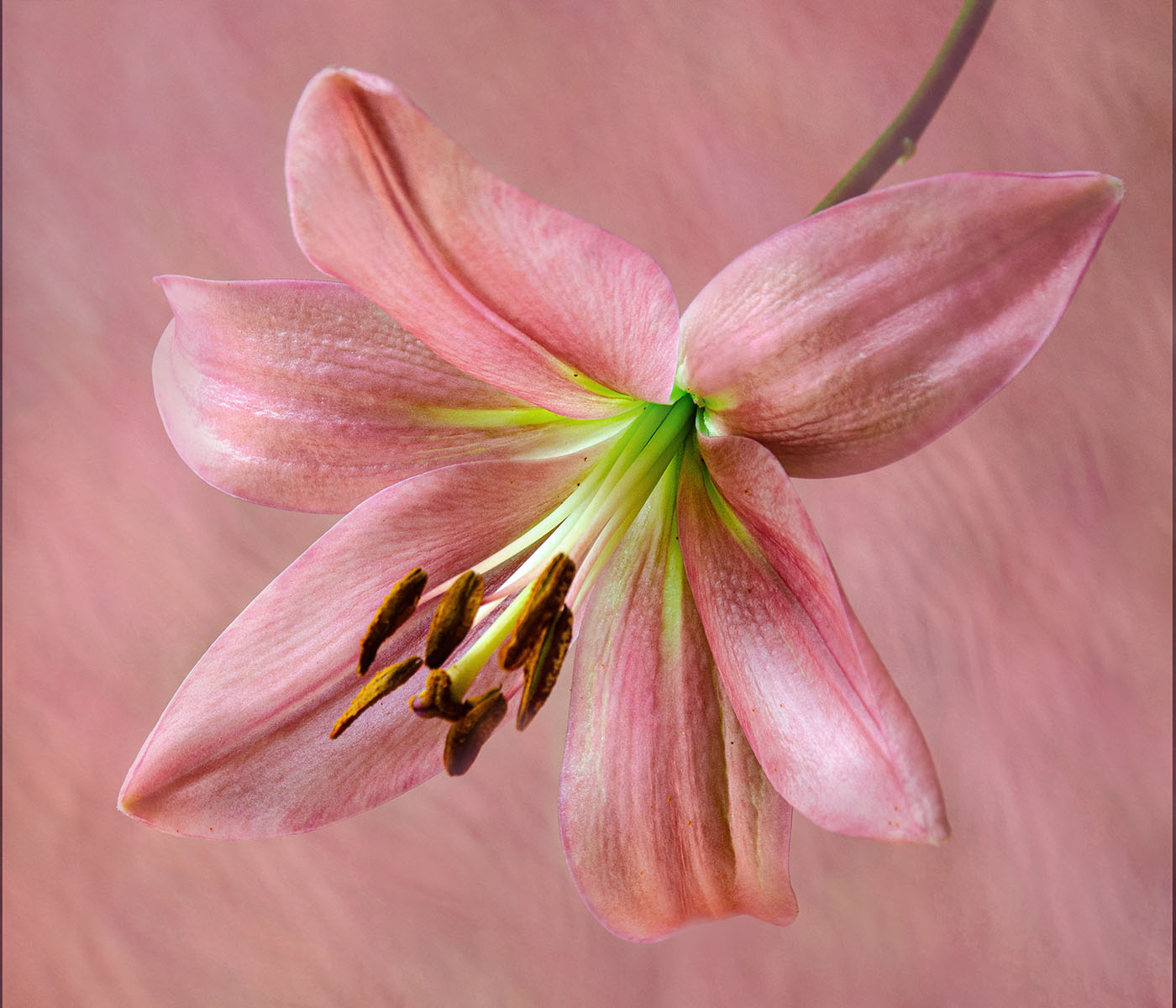
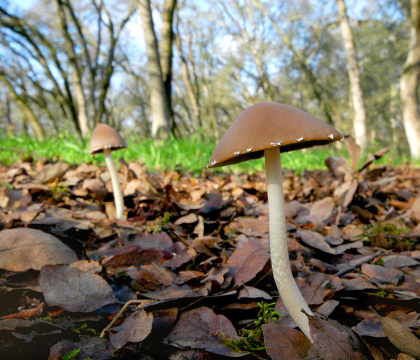
Well, if your main goal was to get sharp focus, you succeeded.
The colors are nice. I'd like to see more of the flower, but that's not what you were aiming for, right? I'd be curious to know what it would have looked like when shot at a smaller aperture/larger number, maybe the petals would be more in focus. |
Apr 16th |
| 10 |
Apr 23 |
Comment |
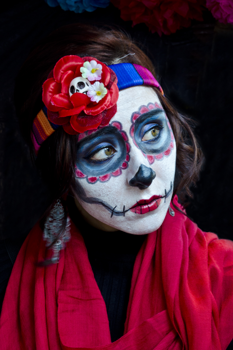
I really like this !! It reminds me of a person who is ageing and their skin is getting crepe-like. It's nice to see the people who are folding the balloon up, so it gives a sense of scale.
I'd like to see a little more contrast and saturation (just a wee bit) but other than that, I really like the picture. Very interesting !! |
Apr 16th |
8 comments - 1 reply for Group 10
|
8 comments - 1 reply Total
|