|
| Group |
Round |
C/R |
Comment |
Date |
Image |
| 10 |
Nov 22 |
Reply |
Yes, I agree. I will work on that, thank you ! Not sure why I didn't notice it ! |
Nov 19th |
| 10 |
Nov 22 |
Reply |
Thanks, Diana. I'm in the middle of Kathleen's class. I don't think I'll ever master her techniques but I'm learning a lot. |
Nov 19th |
| 10 |
Nov 22 |
Reply |
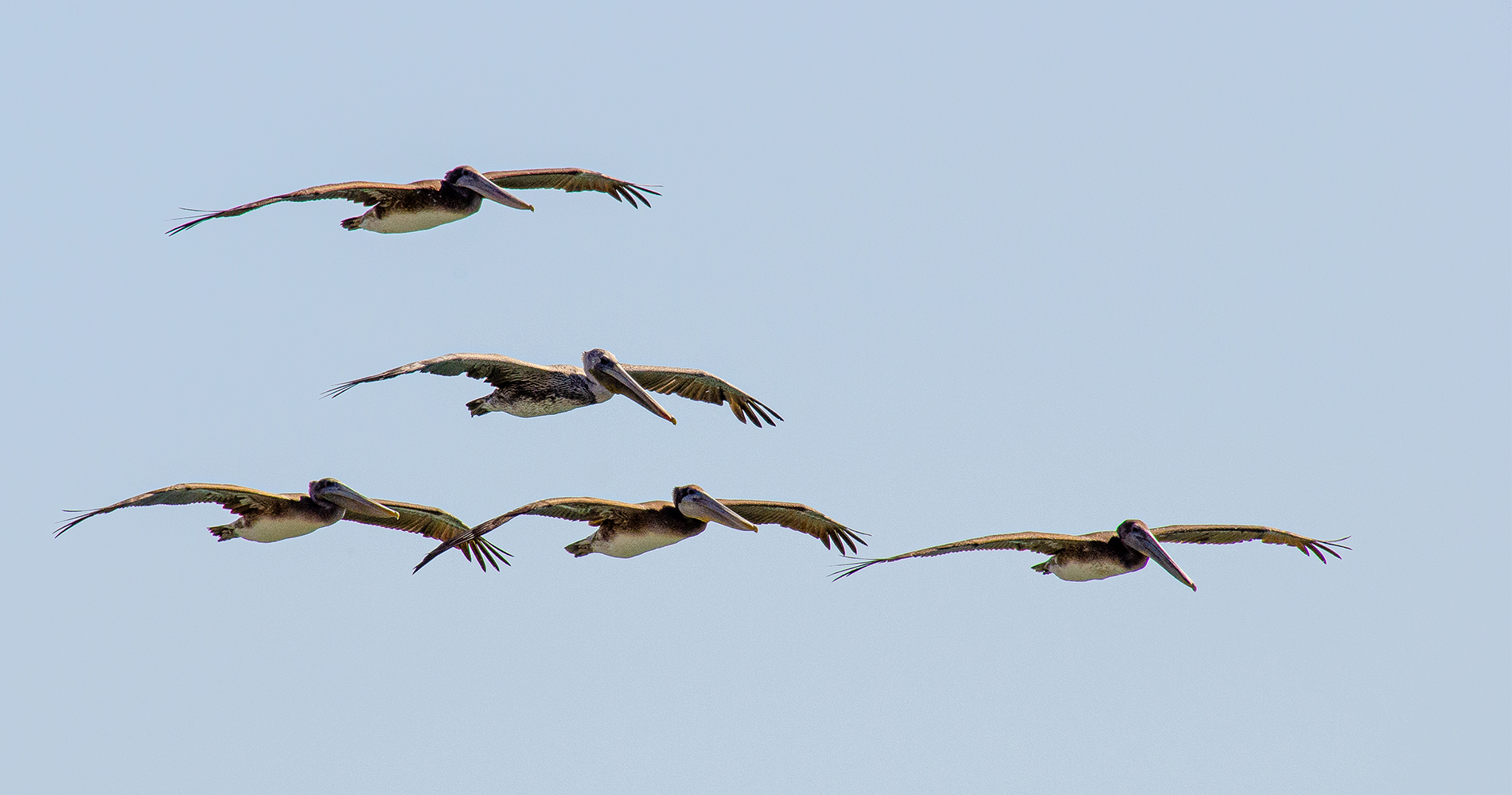
Oh, I totally understand !! Too bad. It looks so pretty there. Is this Rocky Mountain National Park? |
Nov 14th |
| 10 |
Nov 22 |
Reply |
Good idea, Doug ! |
Nov 12th |
| 10 |
Nov 22 |
Reply |
Oh, her favorite and I'm criticizing -- I definitely think Kathleen and I have very different brains ! I'm glad she loved it. I'm working on the same thing, went to the florist today and bought some flowers to photograph ! |
Nov 12th |
| 10 |
Nov 22 |
Reply |
Good idea ! Thanks ! |
Nov 12th |
| 10 |
Nov 22 |
Comment |
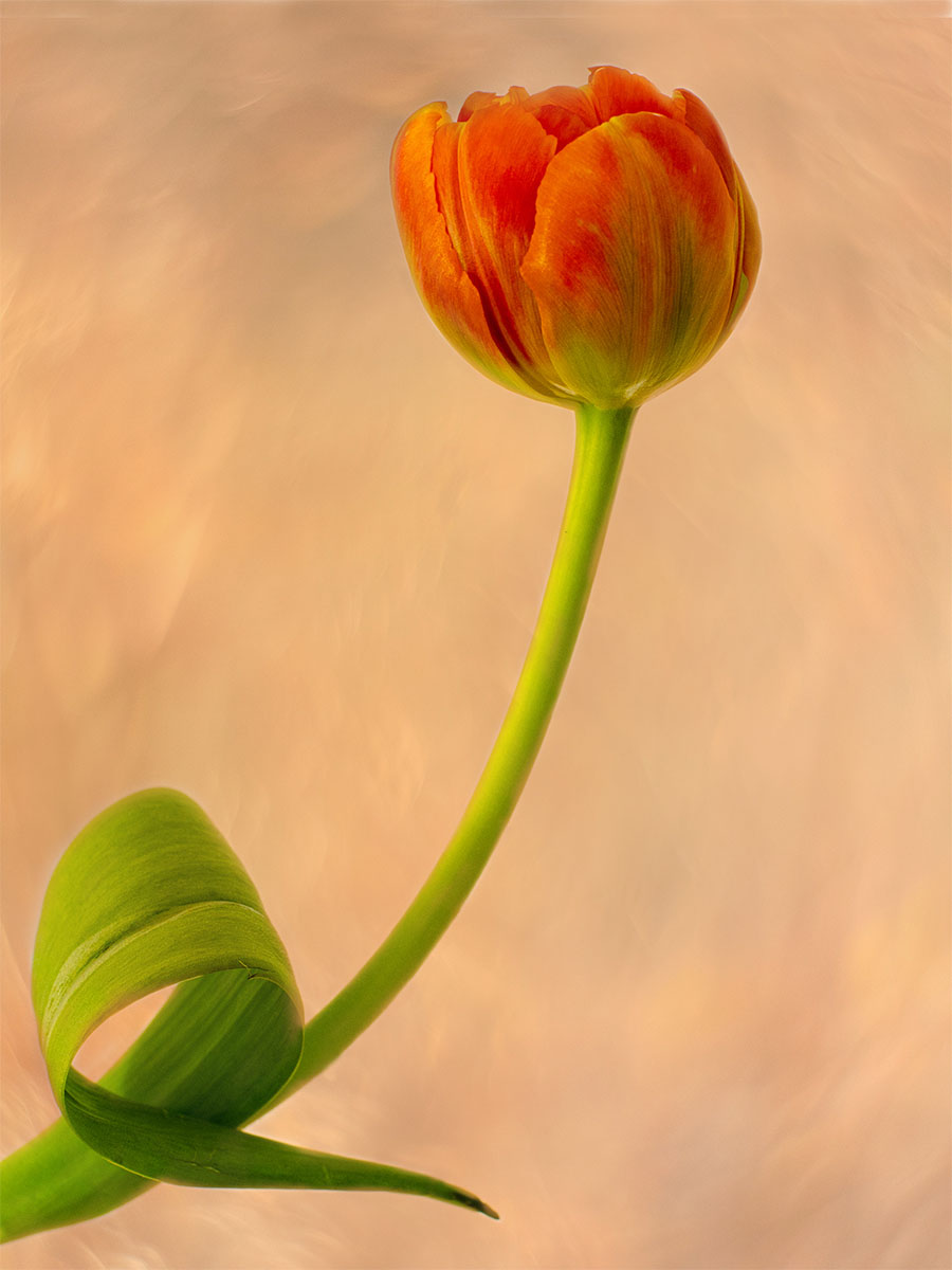
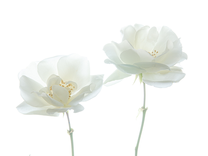
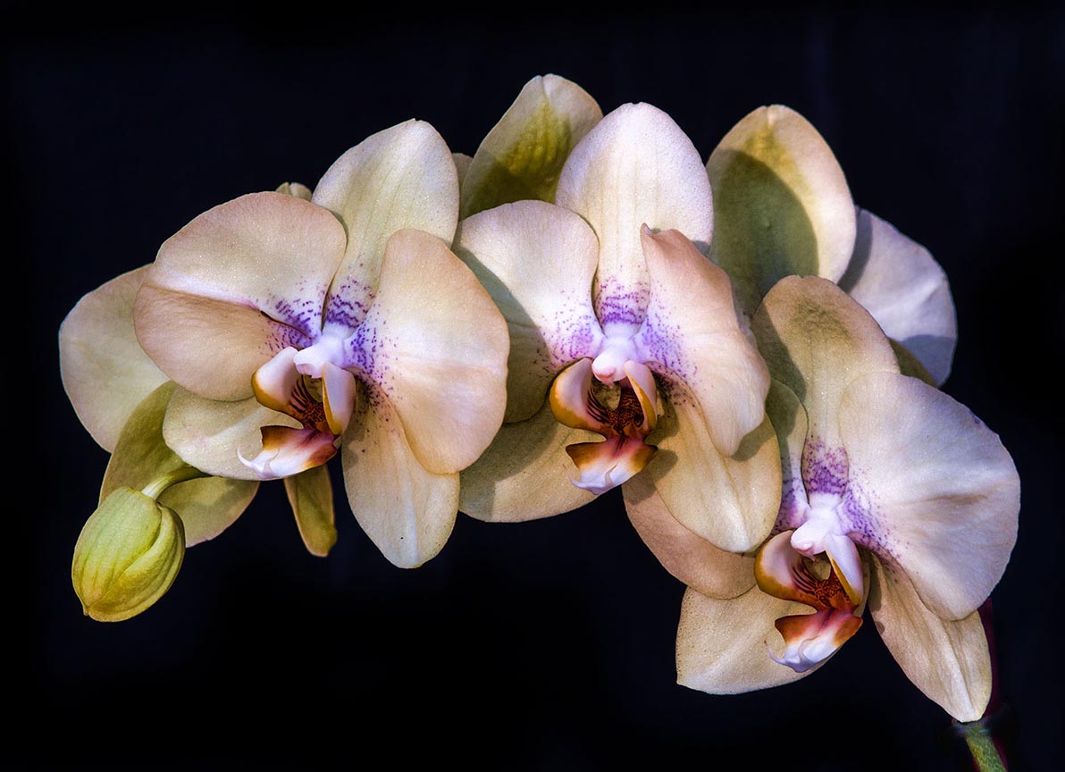
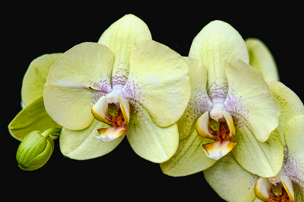
Diana, this is really lovely. I love how the white petals are not blown out, that's hard to do. The background is really nice. I have NO criticism for this image. Keep it up !! |
Nov 11th |
| 10 |
Nov 22 |
Reply |
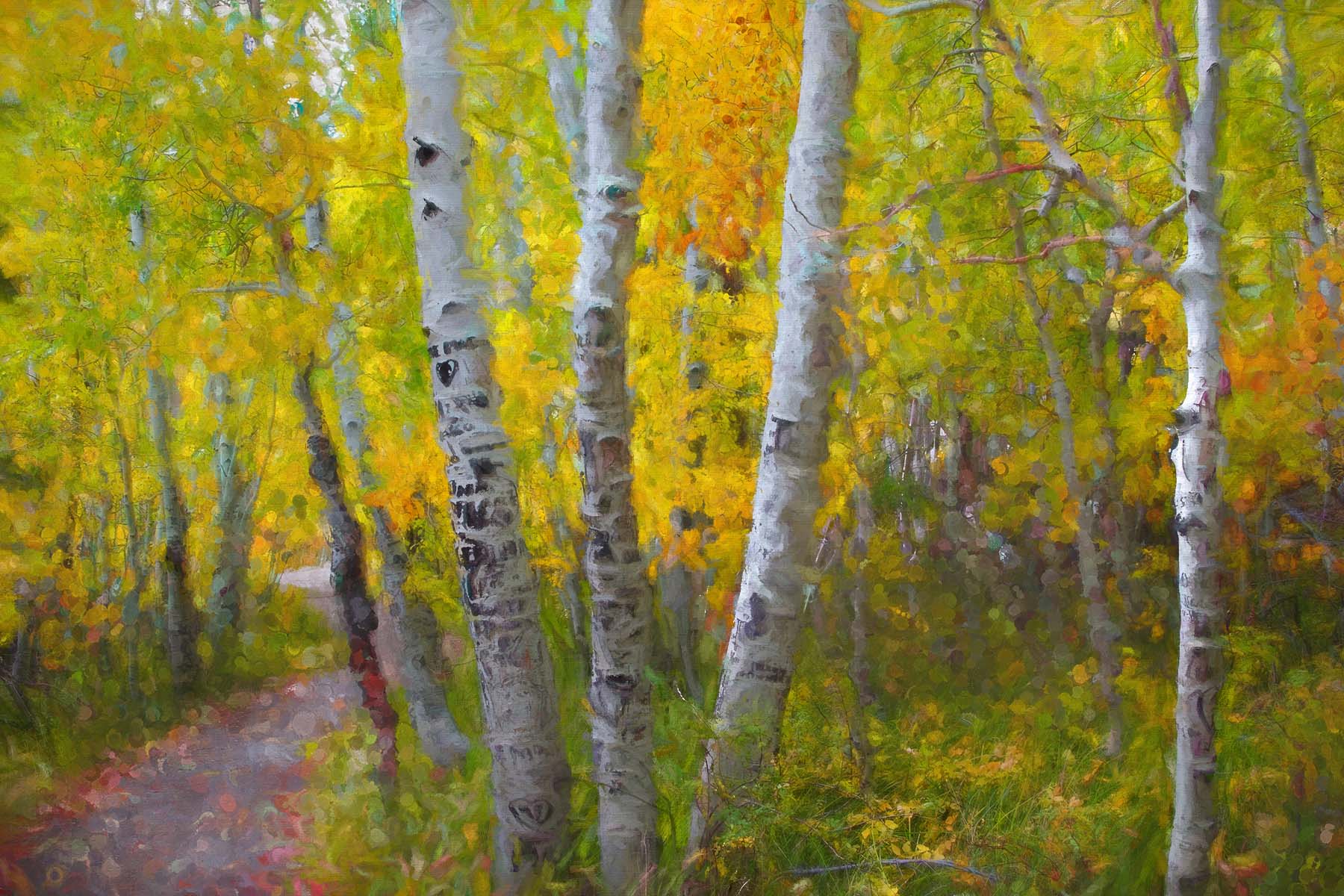
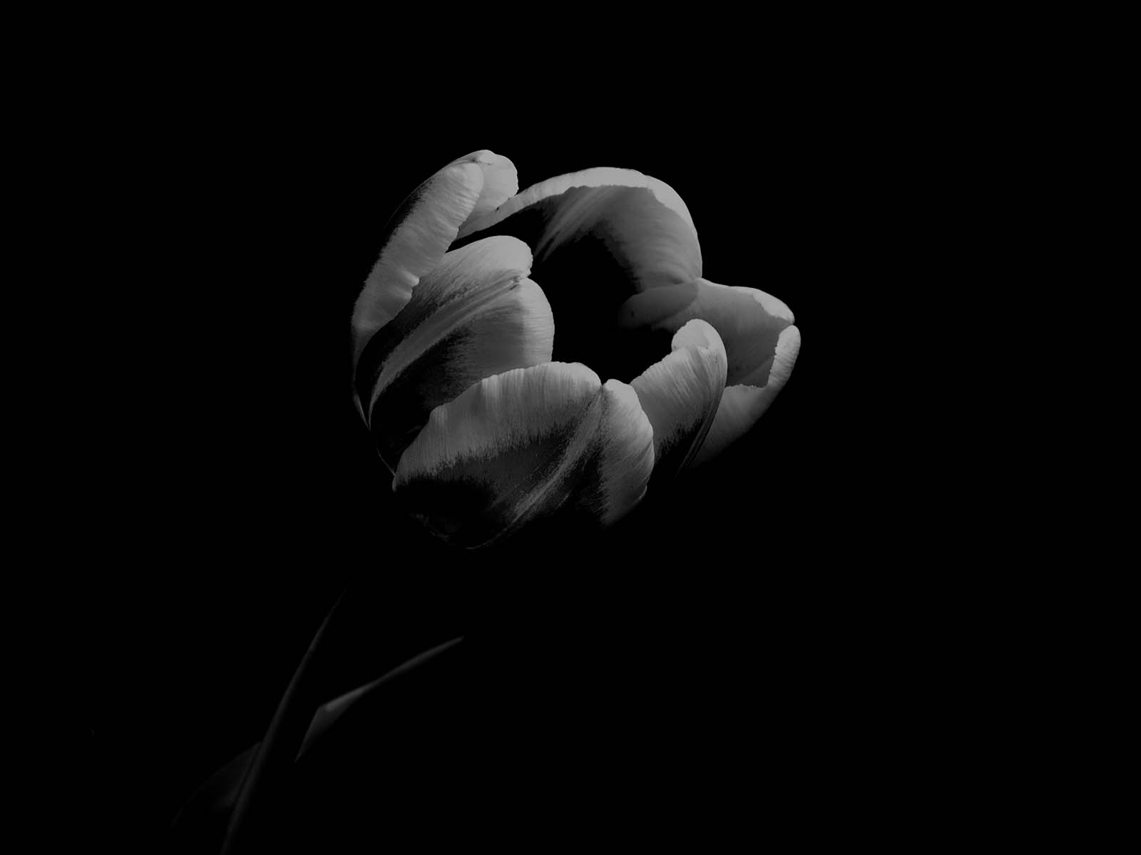
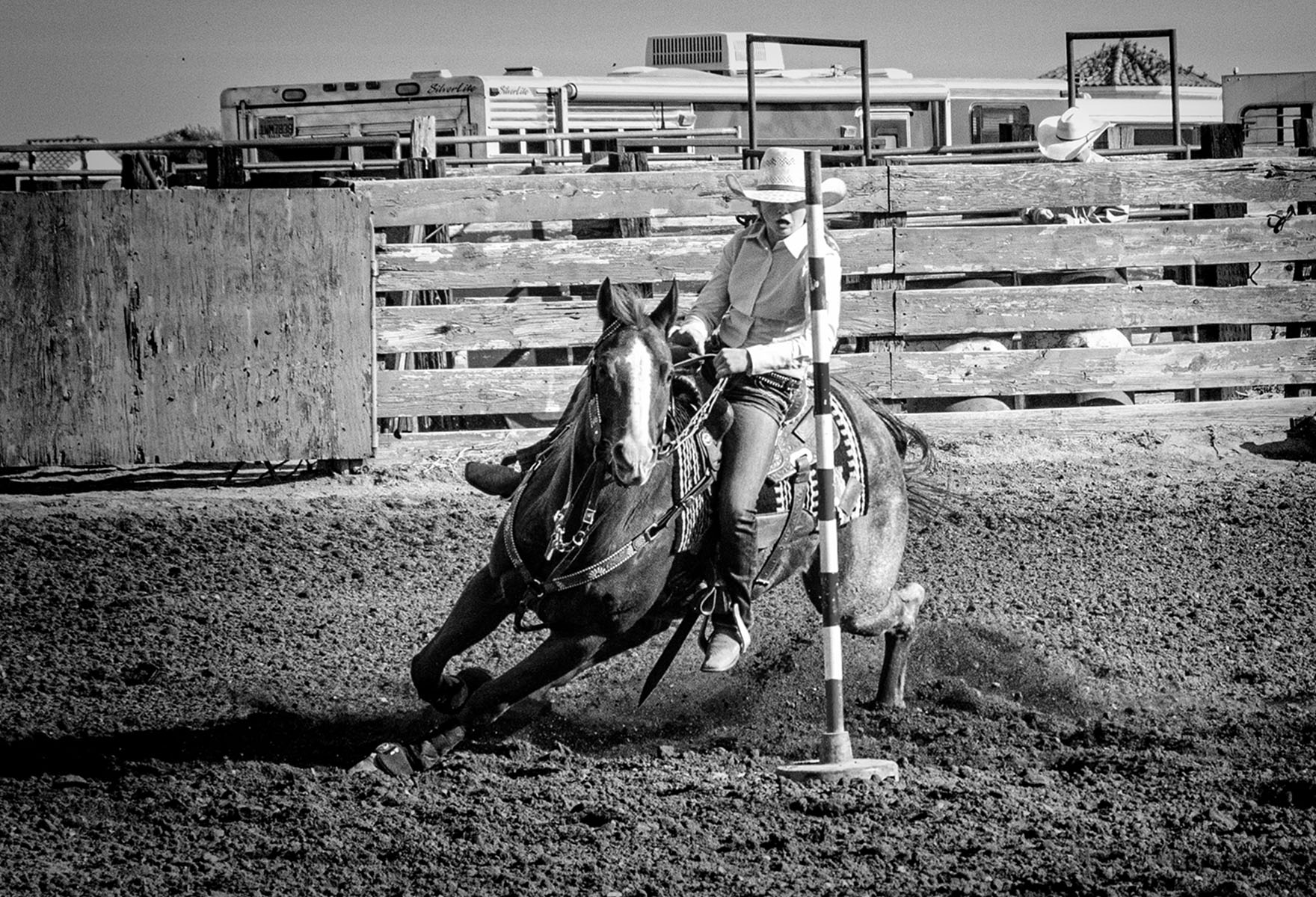
OMG, if this is the original, I love it. I think your post-processing was too much, and this is great. Still, it would make a nice black and white. You could remove some of the "stuff" on the left side in Photoshop, but I love the image as is. |
Nov 11th |
| 10 |
Nov 22 |
Comment |
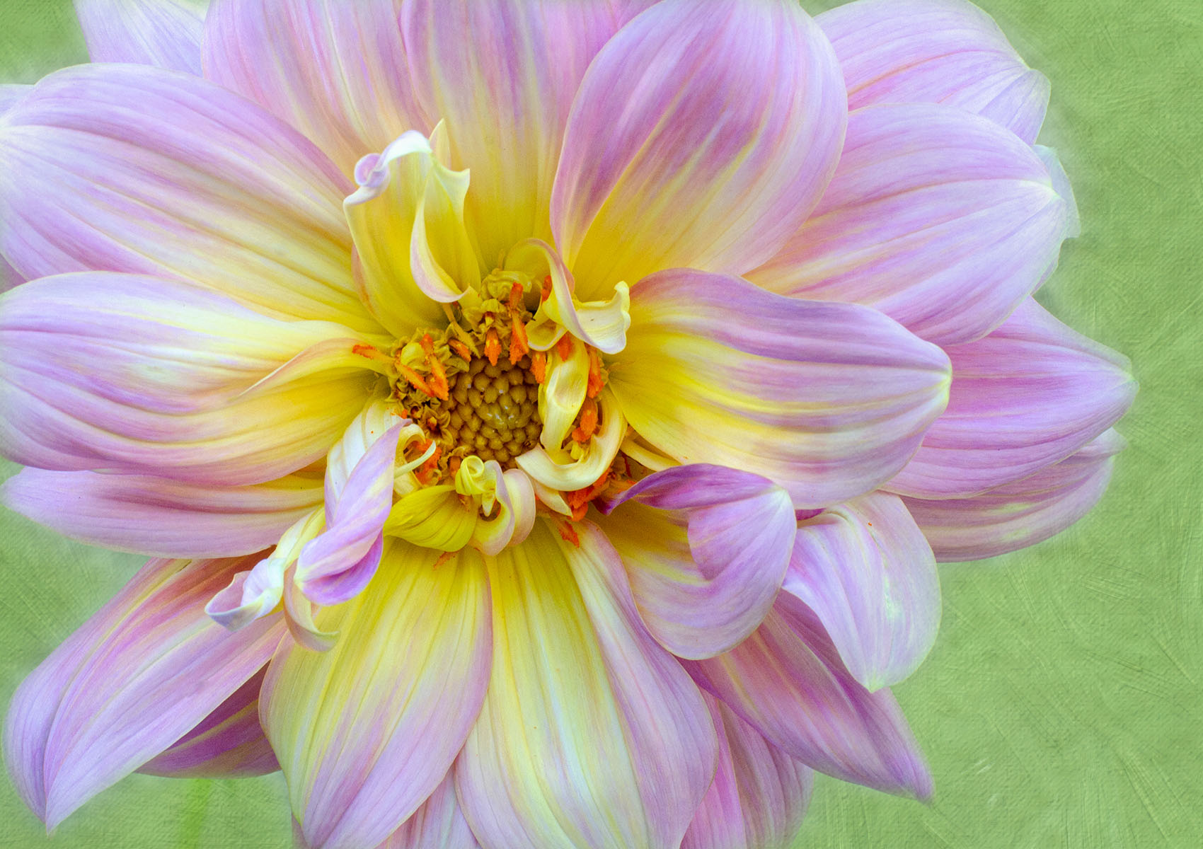
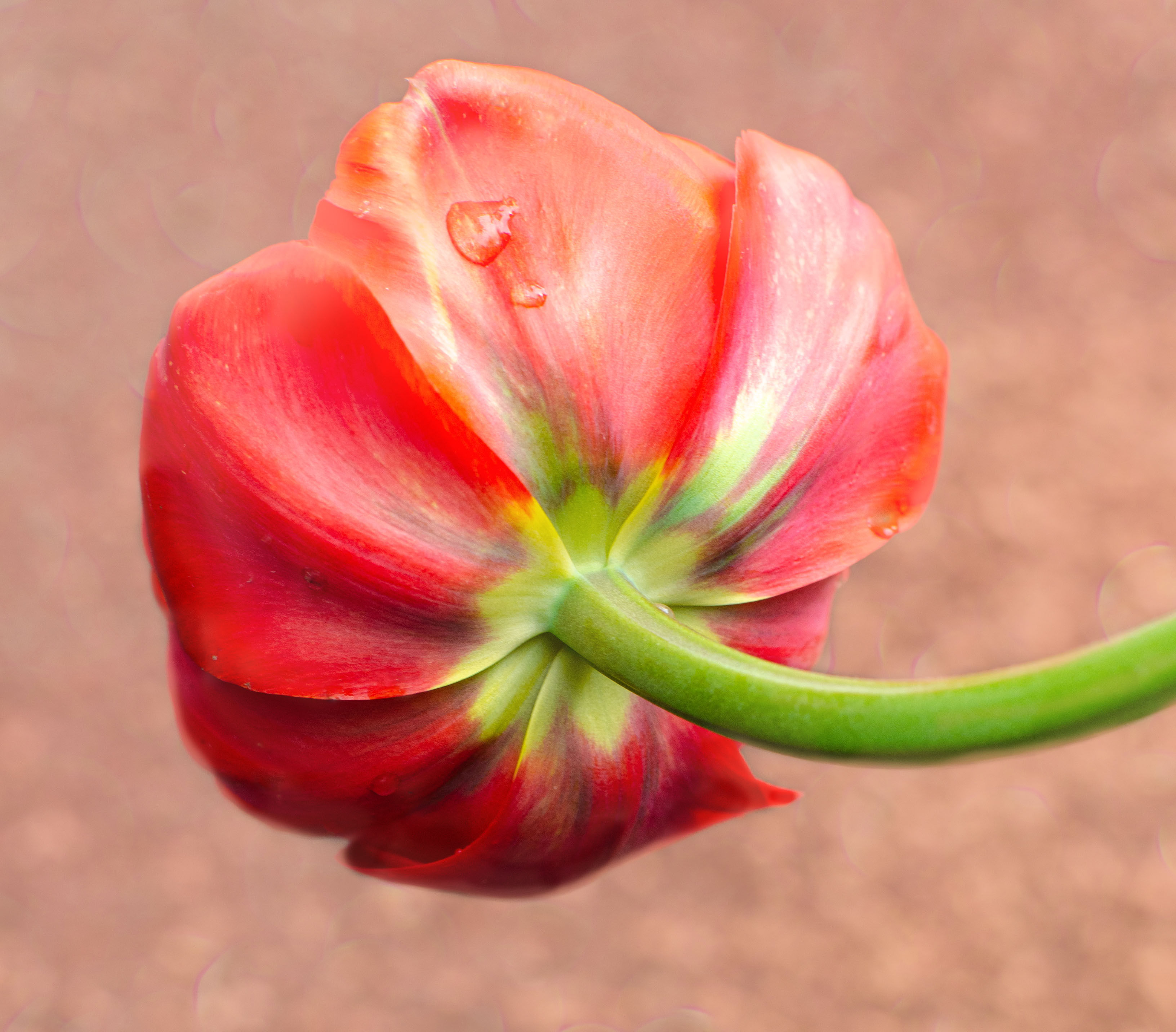
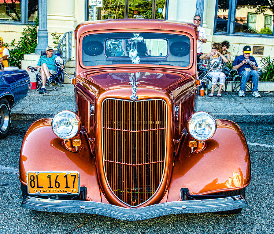
Very pretty. I wish you would remove the white border or make it dark grey, it's really distracting to me. I'd like to see this image more horizontal that square-ish the way it is cropped here. Maybe that wasn't possible.
In any case, it's very pretty.
Not sure why you sent it to me so small. In future, make your height about 1200 px and whatever width you like but less than 1900 px. That will look better. Thanks ! |
Nov 11th |
| 10 |
Nov 22 |
Comment |
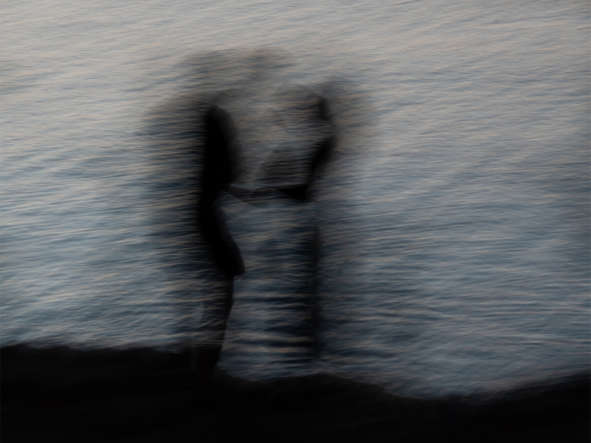
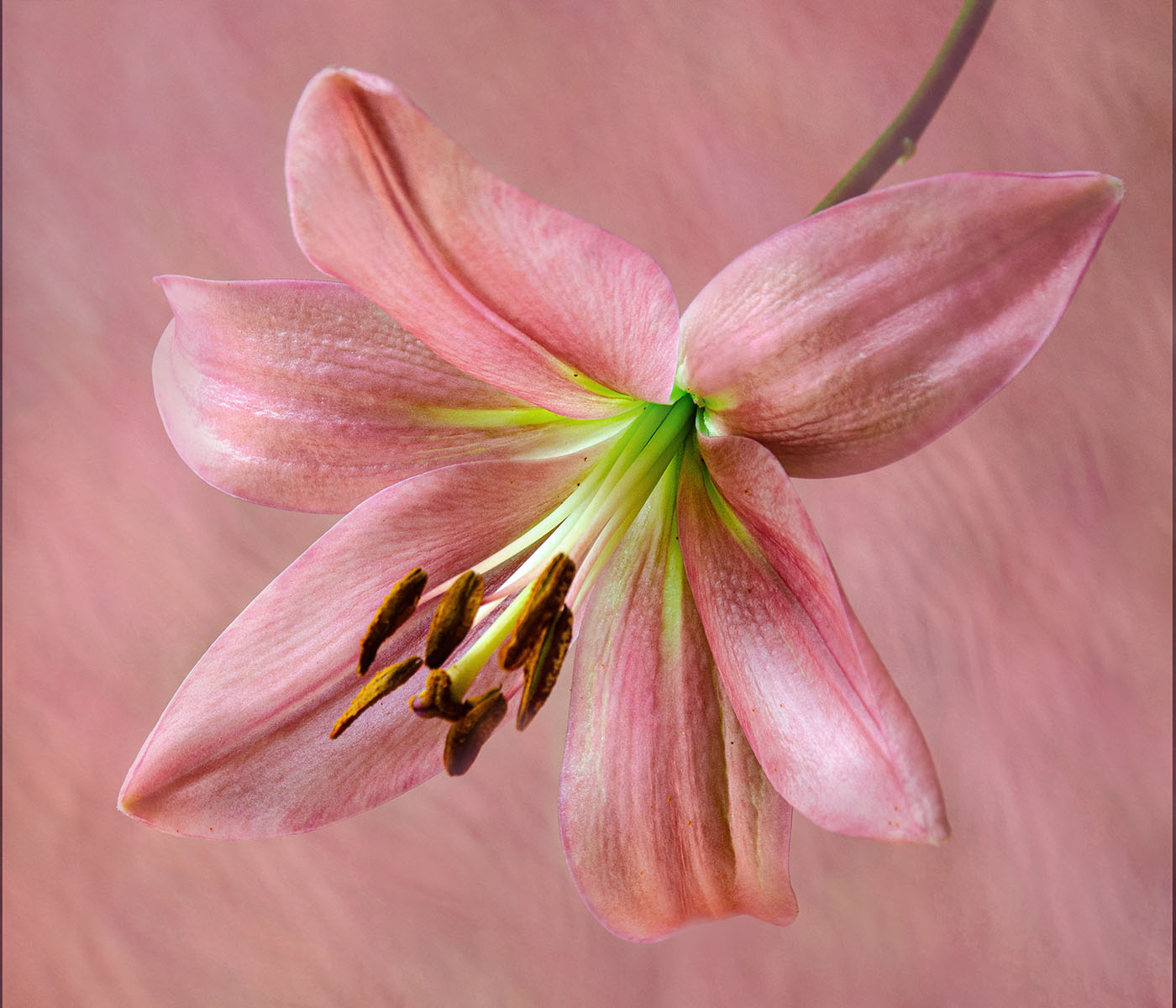
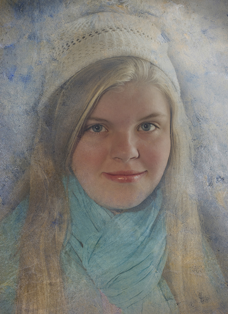
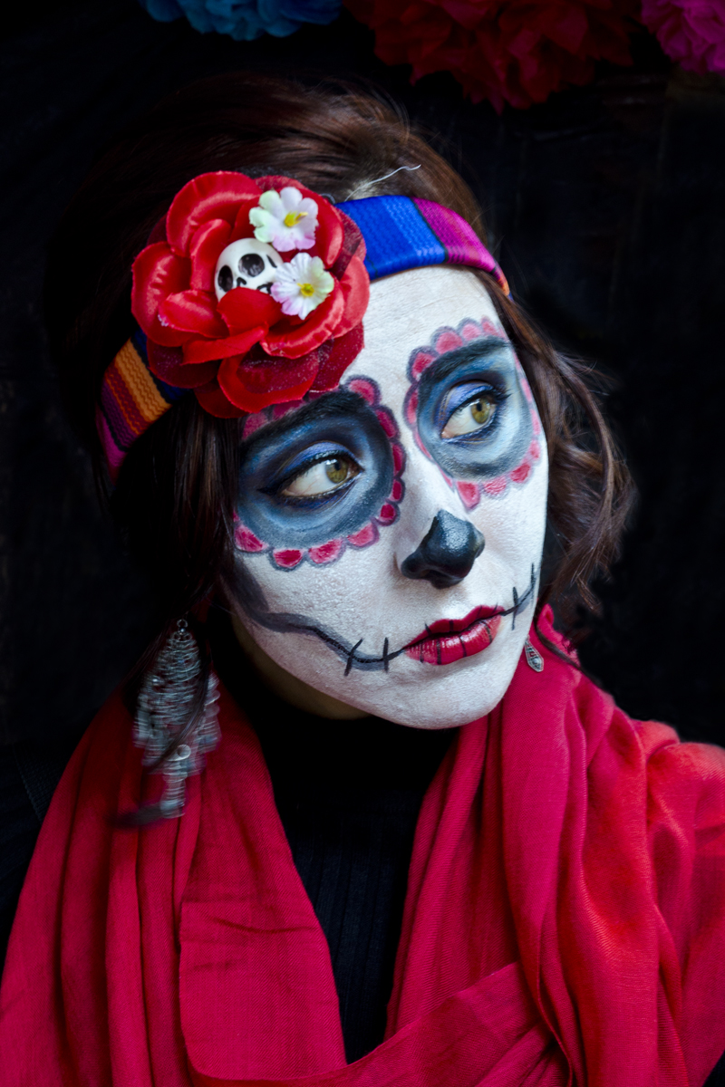
I totally get what you wanted us to feel/see when looking at her. Something about the tone of the color bothers me. Too blue. Could you just make it a black and white, that might work. The areas that are the lightest - like the top of her left forearm - seem too bright. I would tone them down. The whites there are really blown out.
I'd love to see your original image ! |
Nov 11th |
| 10 |
Nov 22 |
Comment |
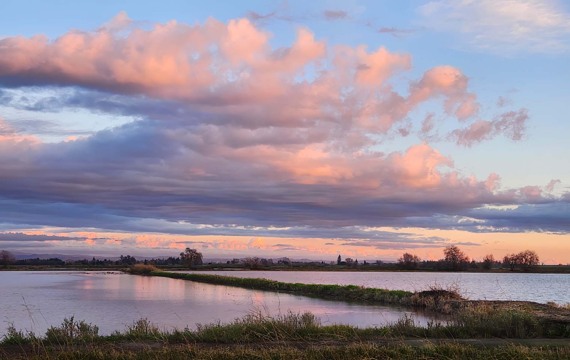
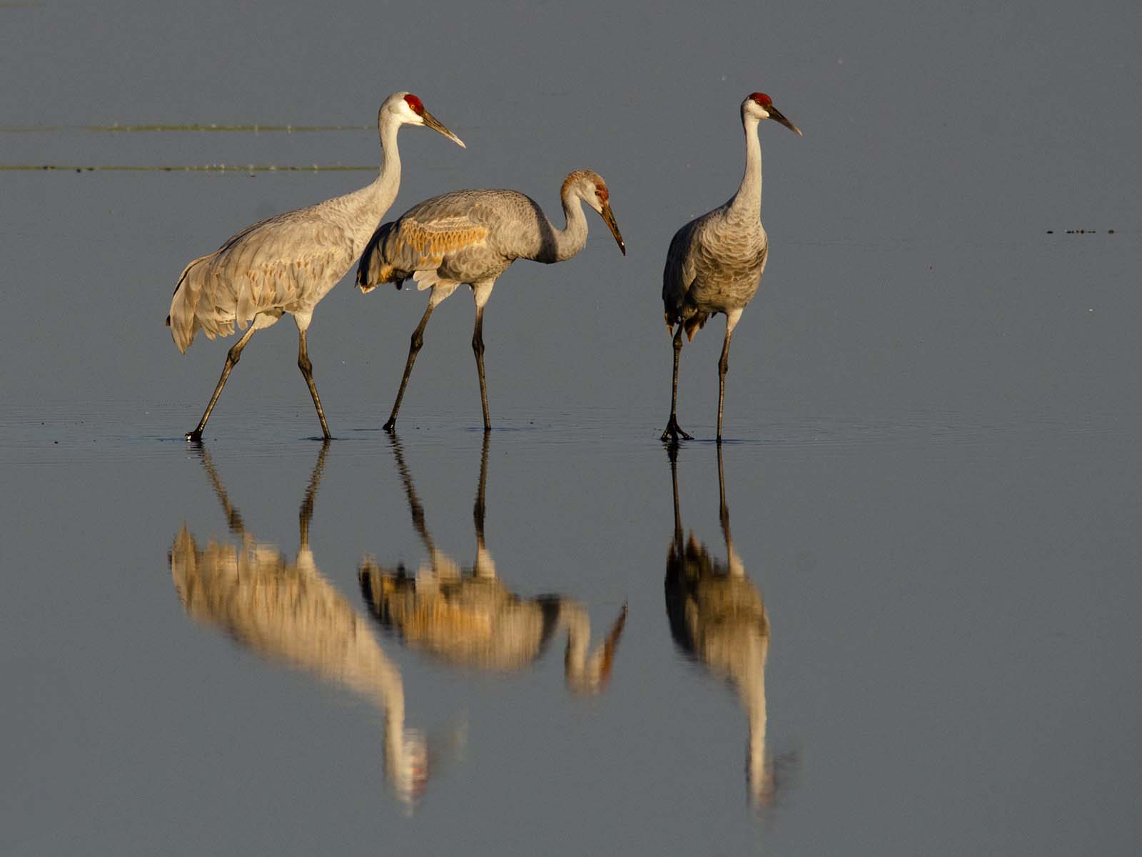
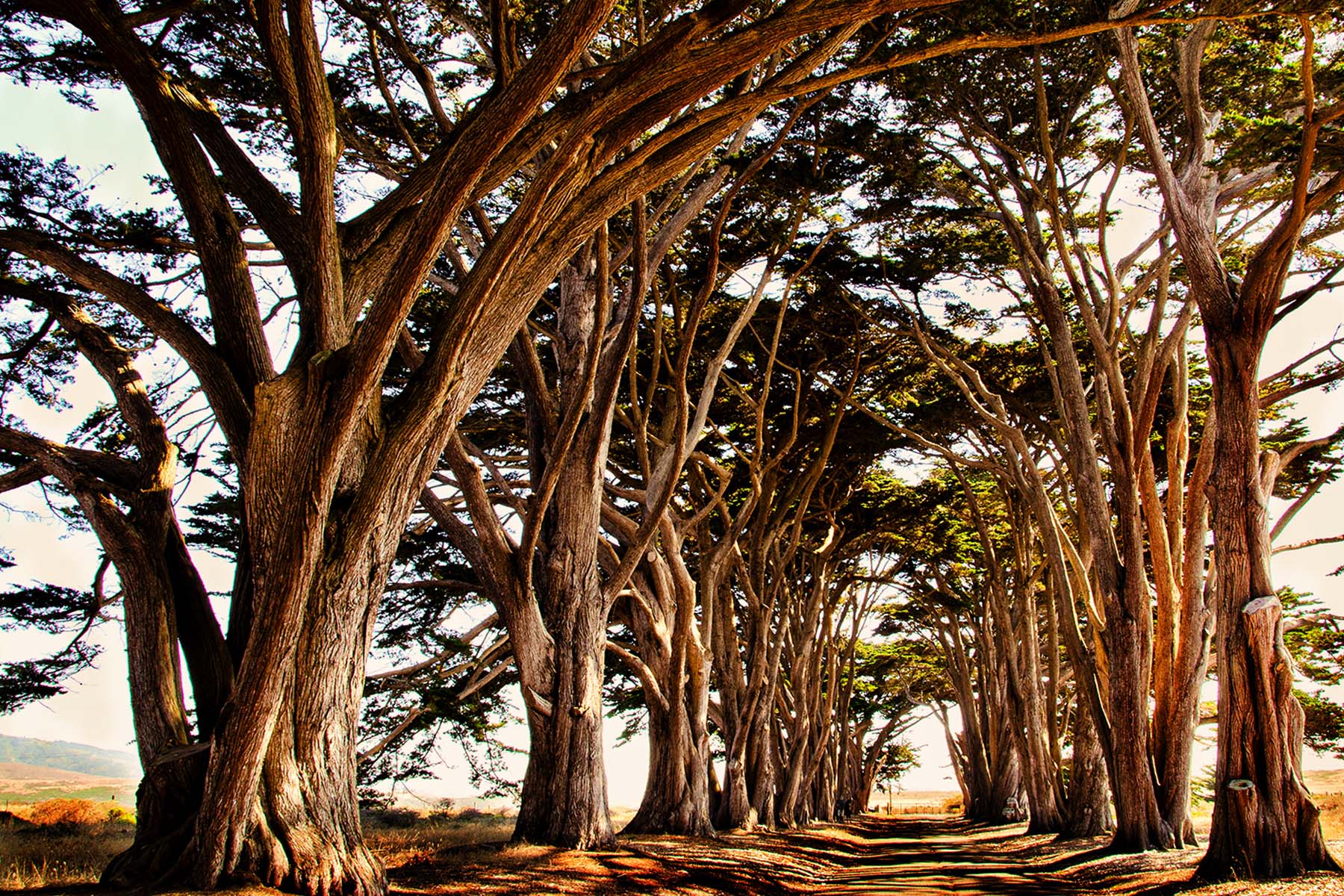
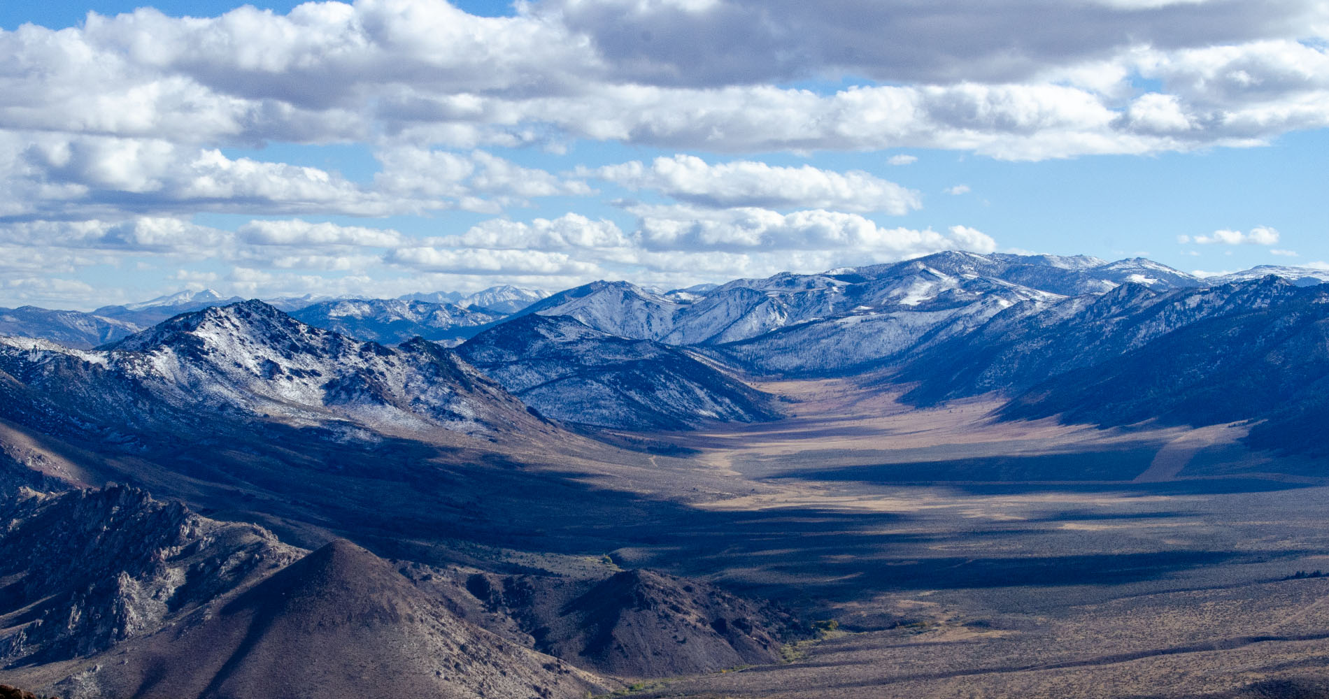
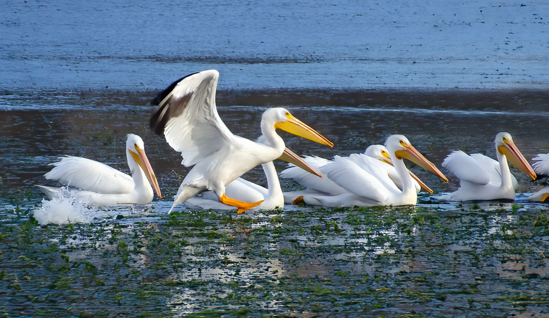
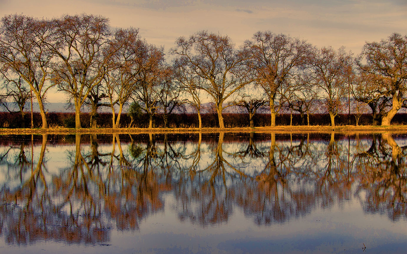
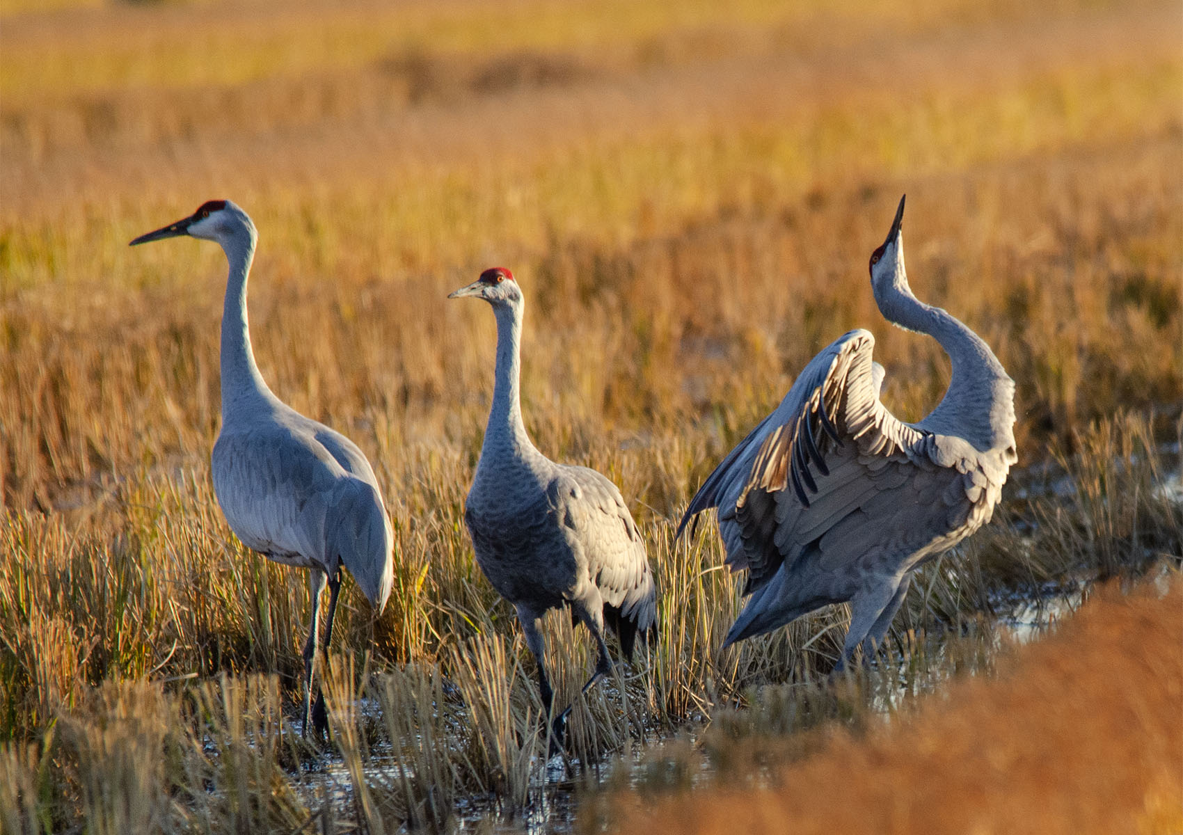
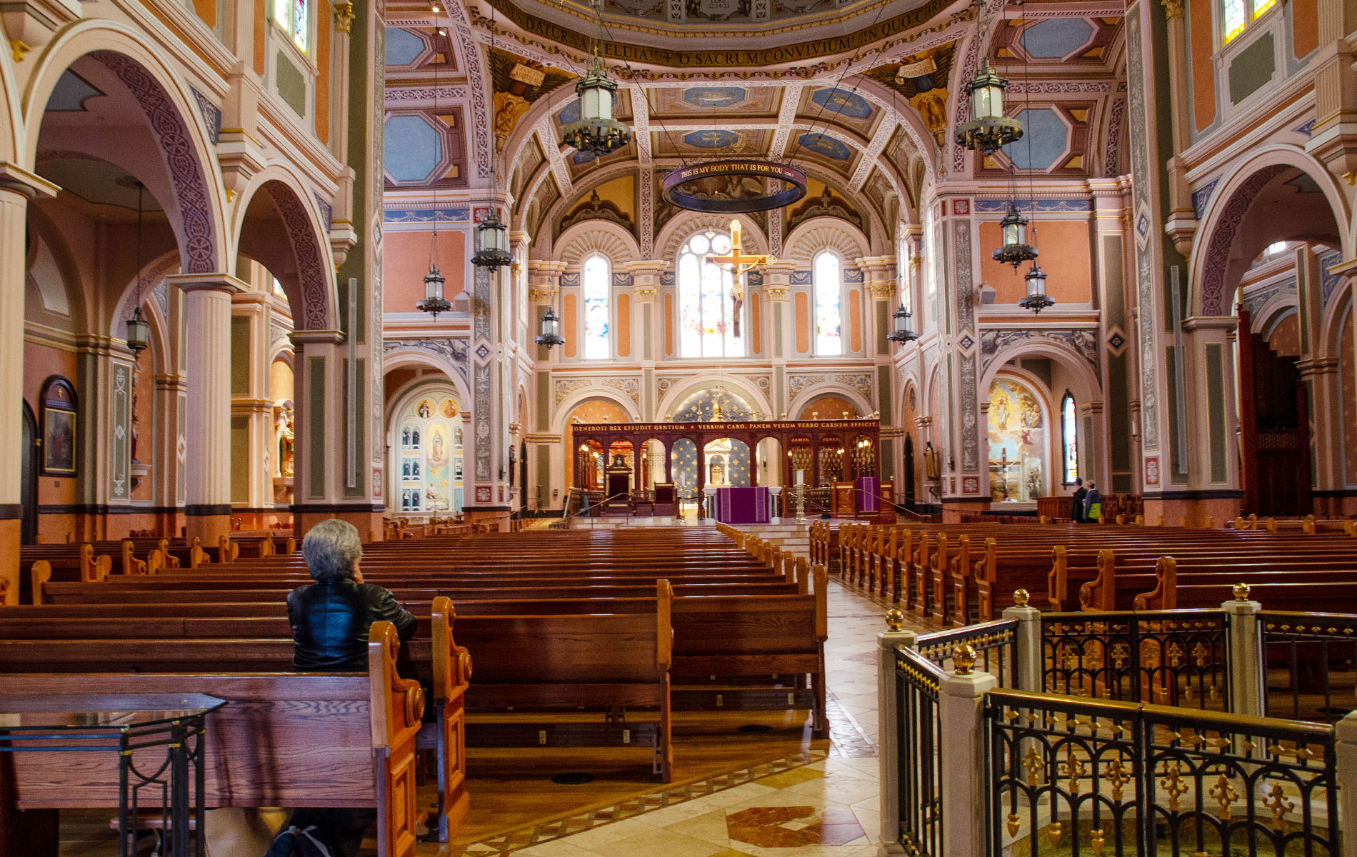
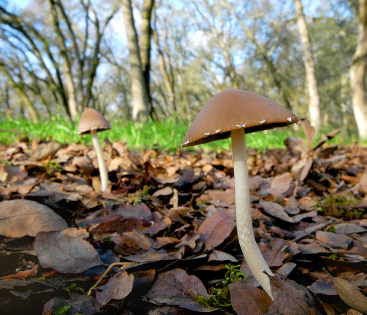
I'm wondering why the clouds look so blue, and over processed. Is this image straight out of the camera? I think I would like to see the leaves of the trees brightened. Also how about a horizontal shot? This is so narrow, I can't get a feel for the area.
RMNP. I don't know what that is. |
Nov 11th |
| 10 |
Nov 22 |
Comment |
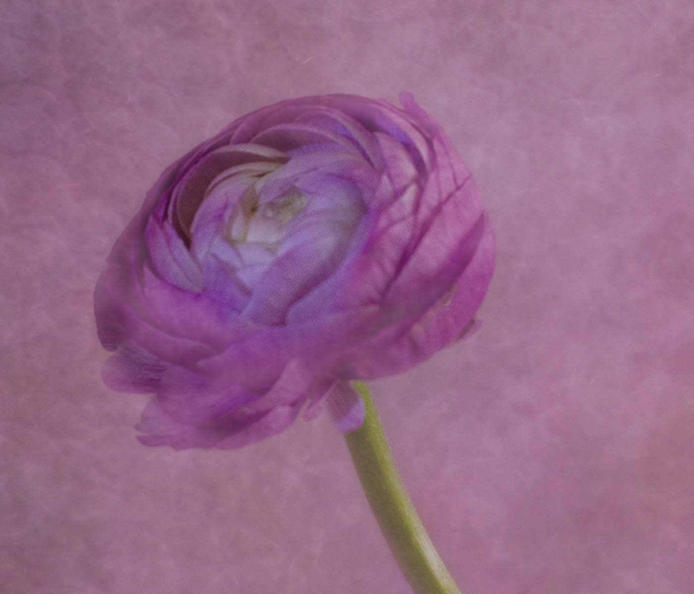
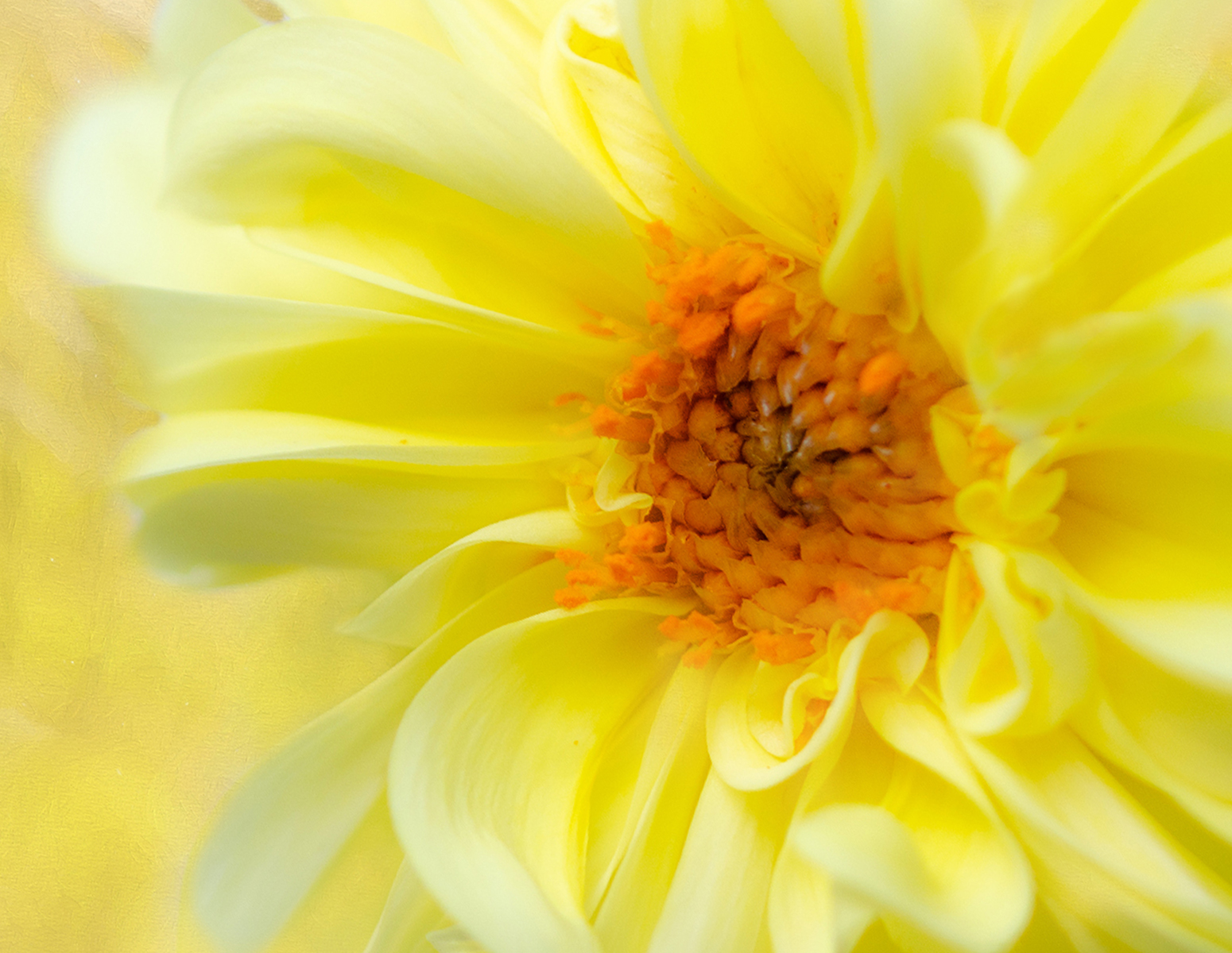
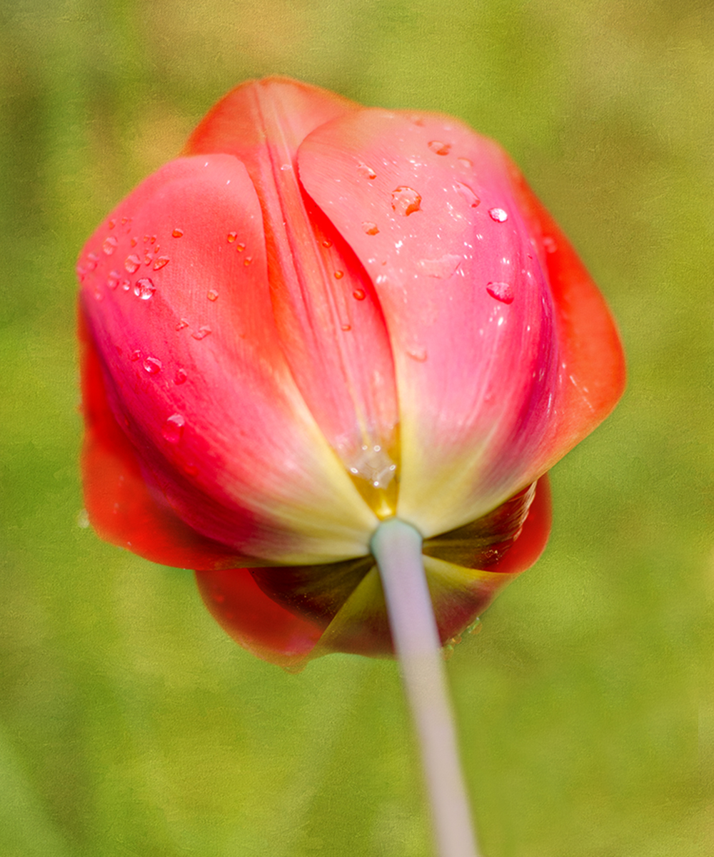
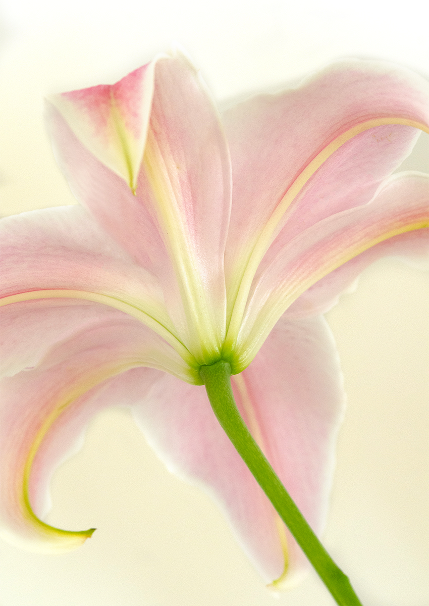
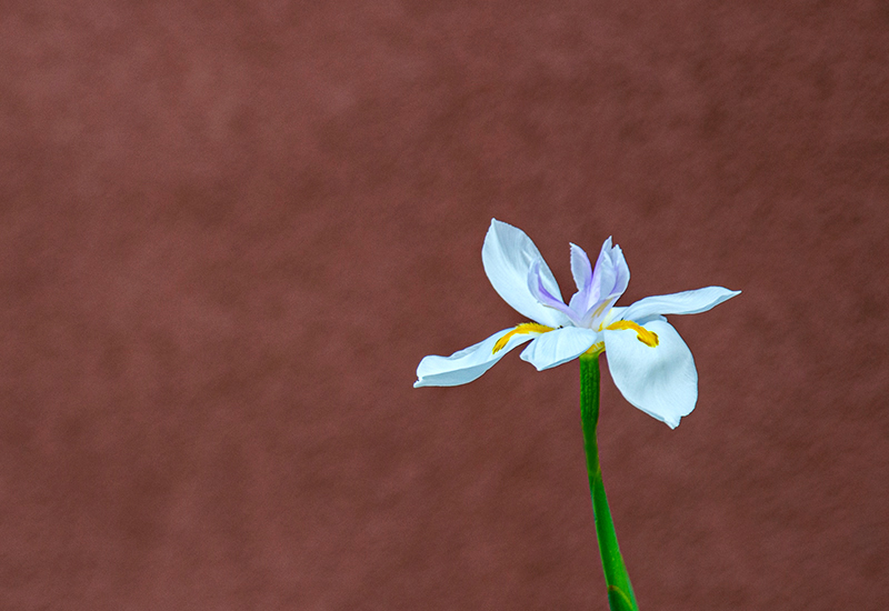
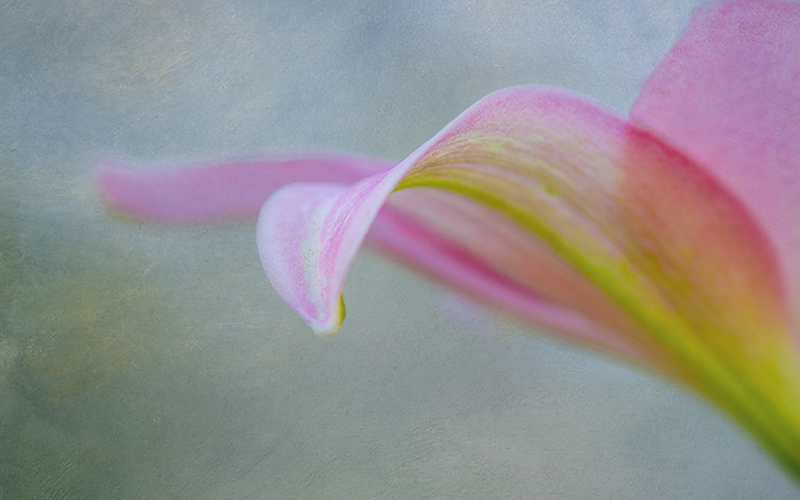
Well, I've taken classes from her also -- taking one right now. I know just what you were aiming for with this picture !!
But it bothers me that so little of the flower is in focus. The white tips are distracting. I would try this with a different flower, and put more of it in focus. The whole picture seems too bright for me. Yeah, I'd really like to see more of this in focus. |
Nov 11th |
| 10 |
Nov 22 |
Comment |
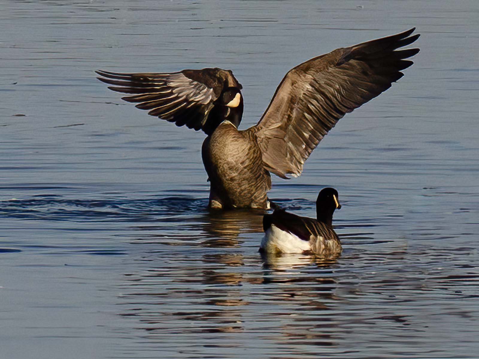
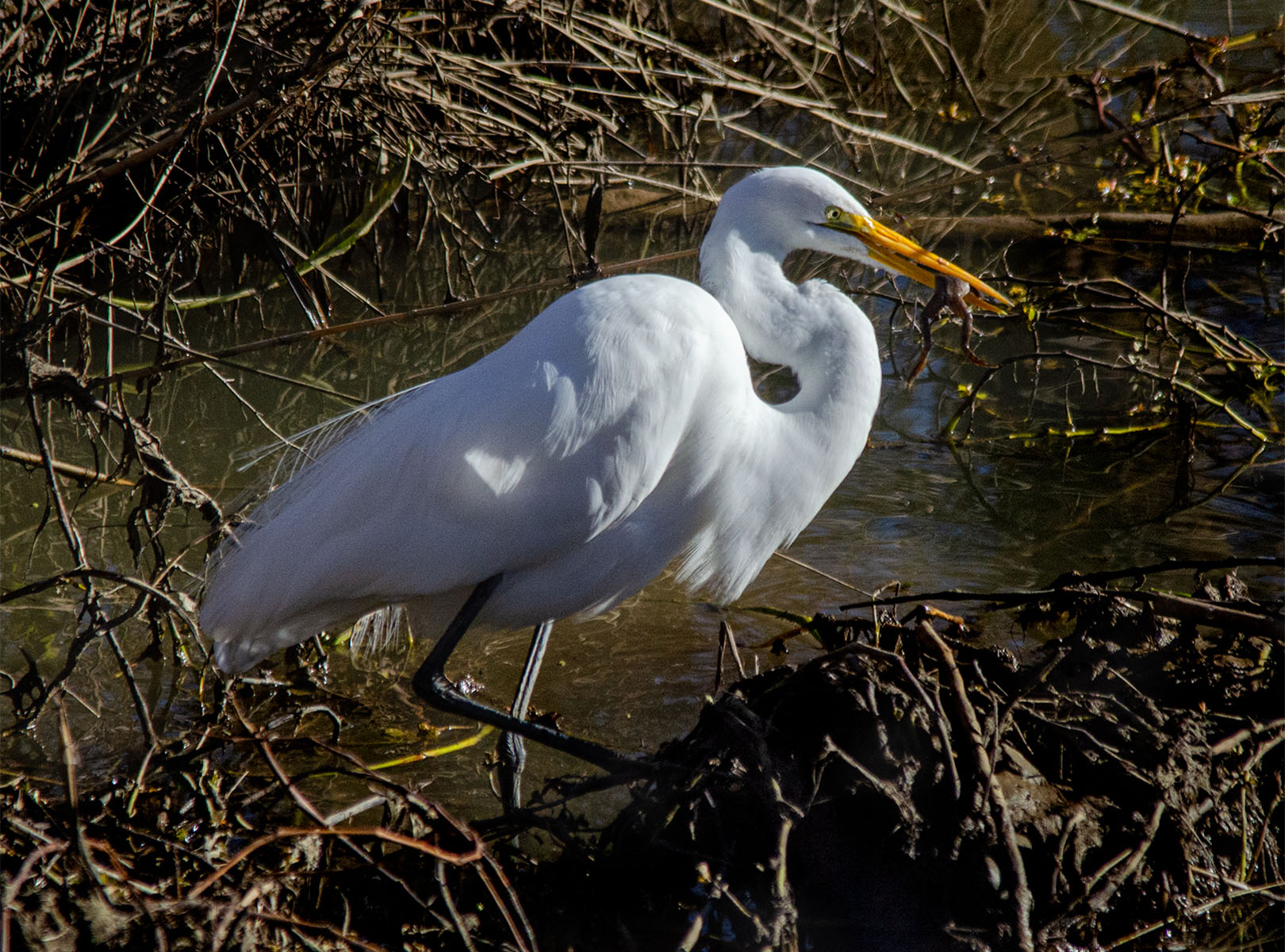
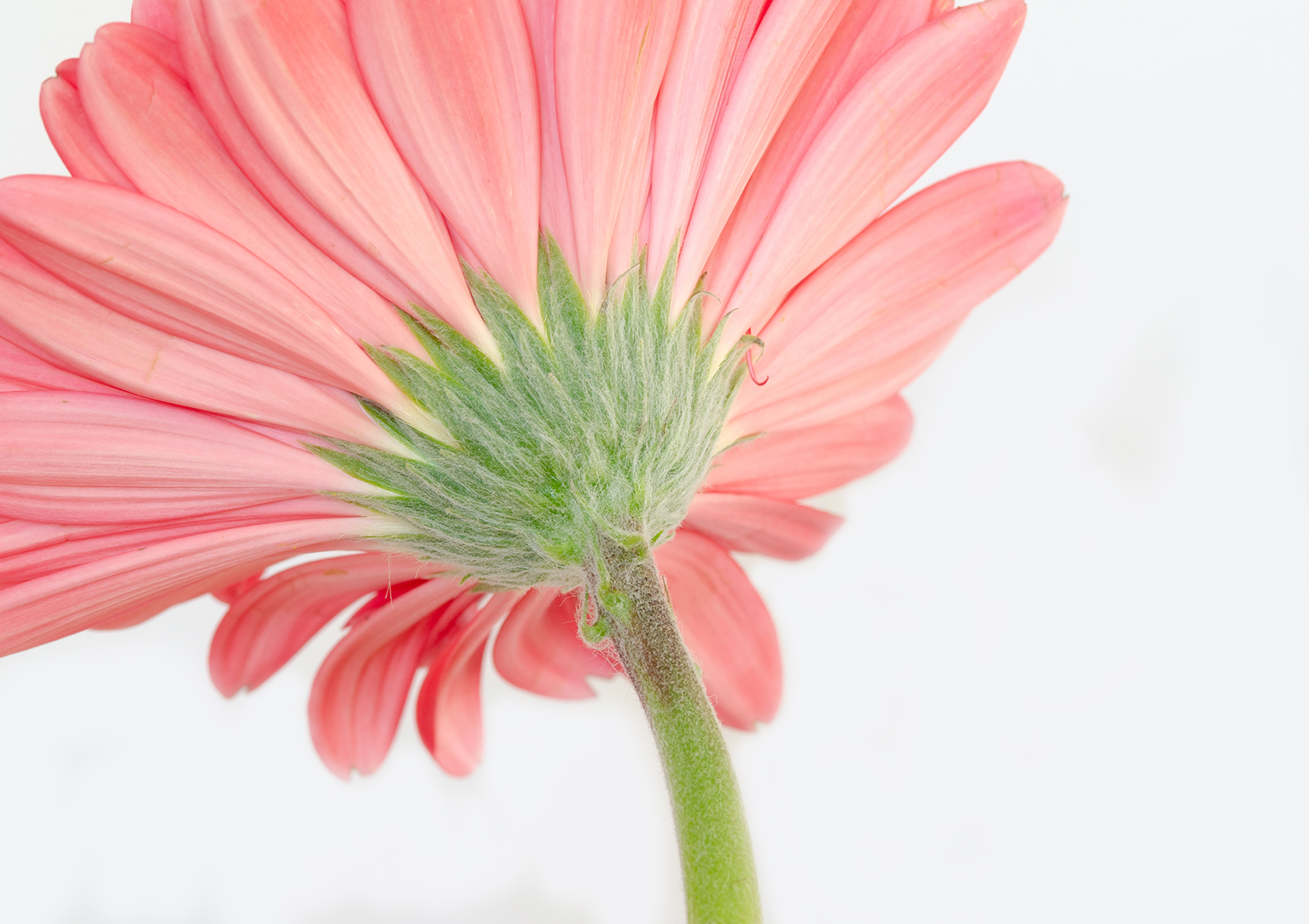
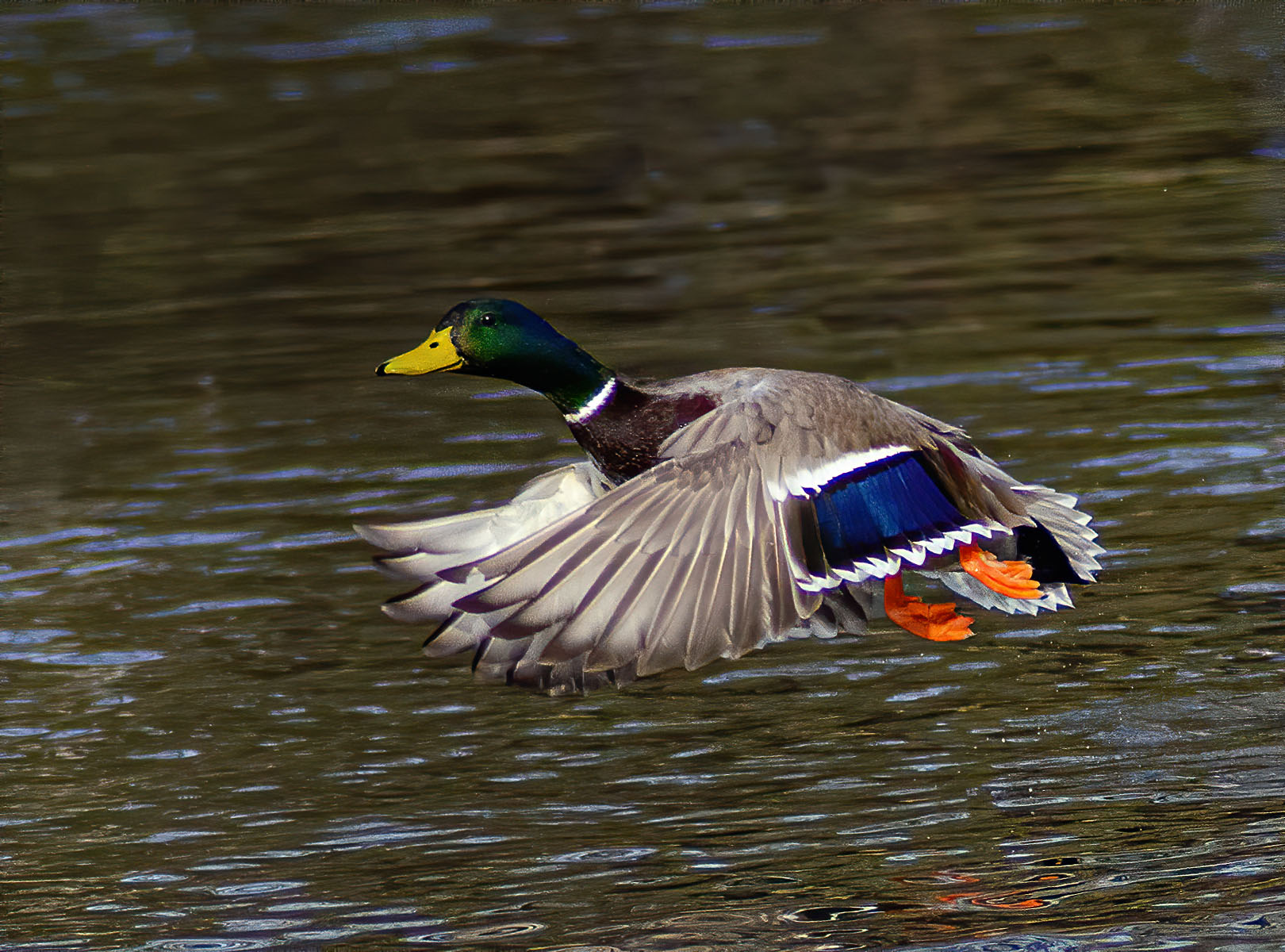
I love the shot of the Dragonfly -- sharp, clear. But the flower distracts me because of the bright spots and it looks over processed. Did you think about cropping some of the flower from the bottom? It might make the Dragonfly stand out more.
The background is perfect !
|
Nov 11th |
6 comments - 7 replies for Group 10
|
6 comments - 7 replies Total
|