|
| Group |
Round |
C/R |
Comment |
Date |
Image |
| 1 |
Feb 22 |
Comment |
I saw your image and thought it was a skier but it's a tree.
I think the road (??) in the foreground should be removed. Move in closer. I think your group-mate, Neal, has great ideas. I love snow, this is a fun image but I'd love to see it again with some editing.
Donna Sturla
Group 10 |
Feb 12th |
| 1 |
Feb 22 |
Comment |
HI I'm in Group 10 and saw your image, very interesting !!
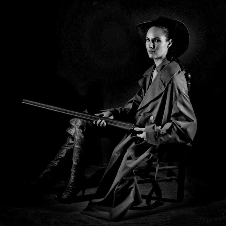
I do agree with Neal that the shadows could be darker, so it wouldn't appear to be floating in space. I think I'd like to see less space on the left and a little more on the right, since that's the way the shadow is falling.
I'd love to have an object like that !! Very cool image. |
Feb 12th |
2 comments - 0 replies for Group 1
|
| 6 |
Feb 22 |
Comment |
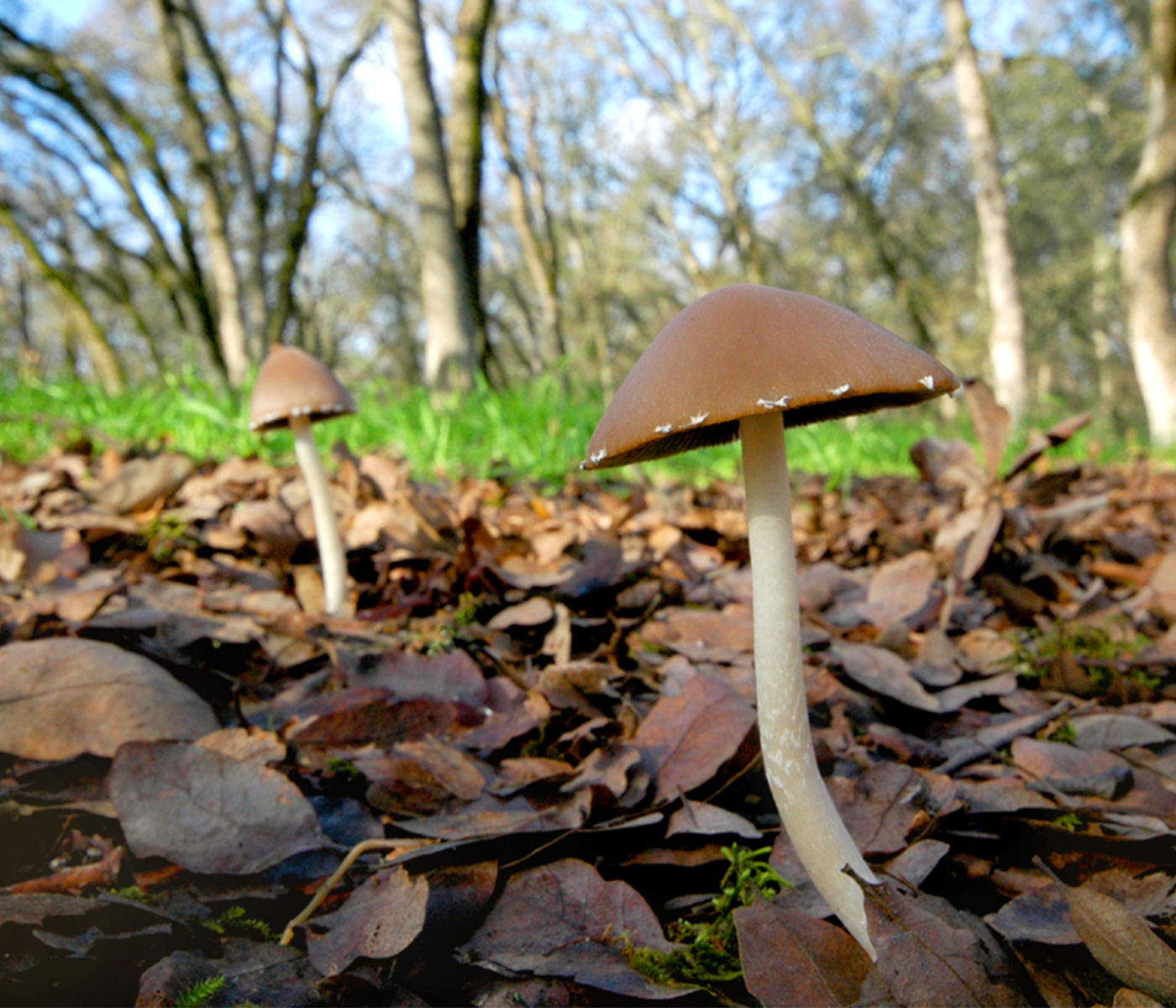
Hi, I'm in Group 10 and I am so jealous that you have Jack In the Pulpit growing in your area ! My Grandma lived in Montclair, NJ and had them in her back yard and they always fascinated me. We don't have them here in Sacramento.
This is a beautiful image, lovely capture. The exposure is great, the color magnificent. I'm not sure I like the leaf in the background, I wish it were further away or more out of focus or just not there. But this is gorgeous. Lucky you ! |
Feb 12th |
1 comment - 0 replies for Group 6
|
| 10 |
Feb 22 |
Comment |
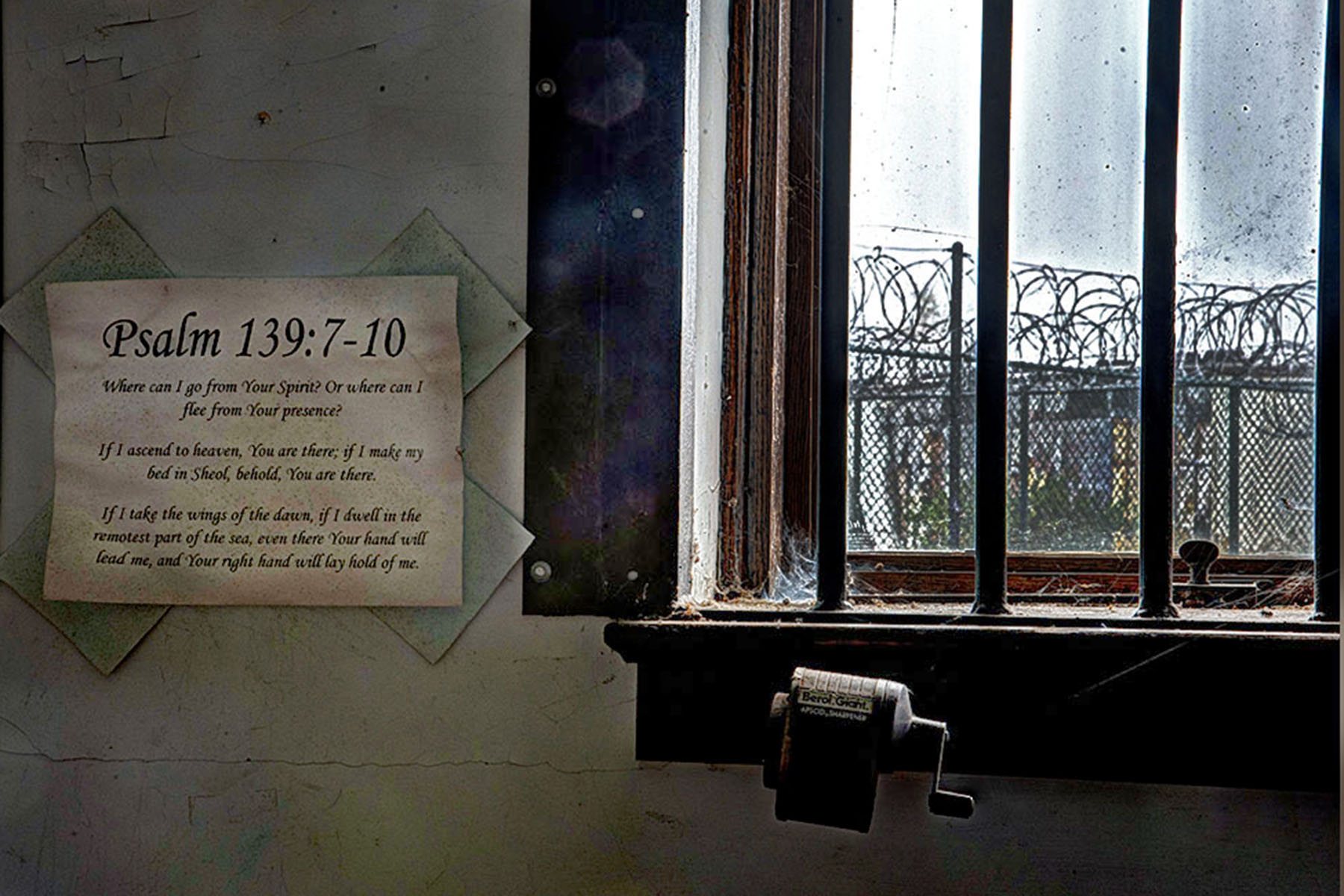
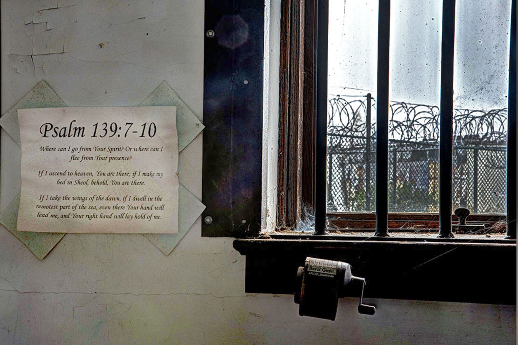
I just edited it again - so much fun - and made the room a little darker. Left the pencil sharpener and wood shingle alone. I think this one is better, moodier. I like Carrie's critique. |
Feb 13th |
 |
| 10 |
Feb 22 |
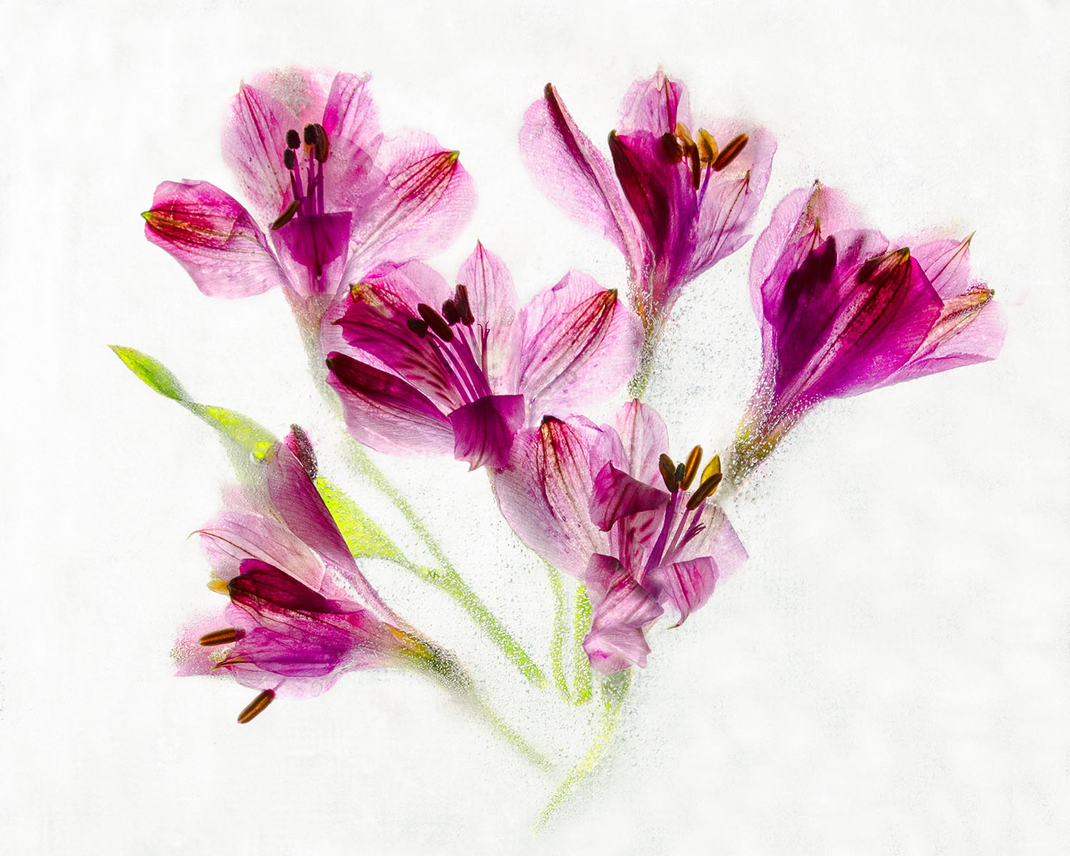
Reply |
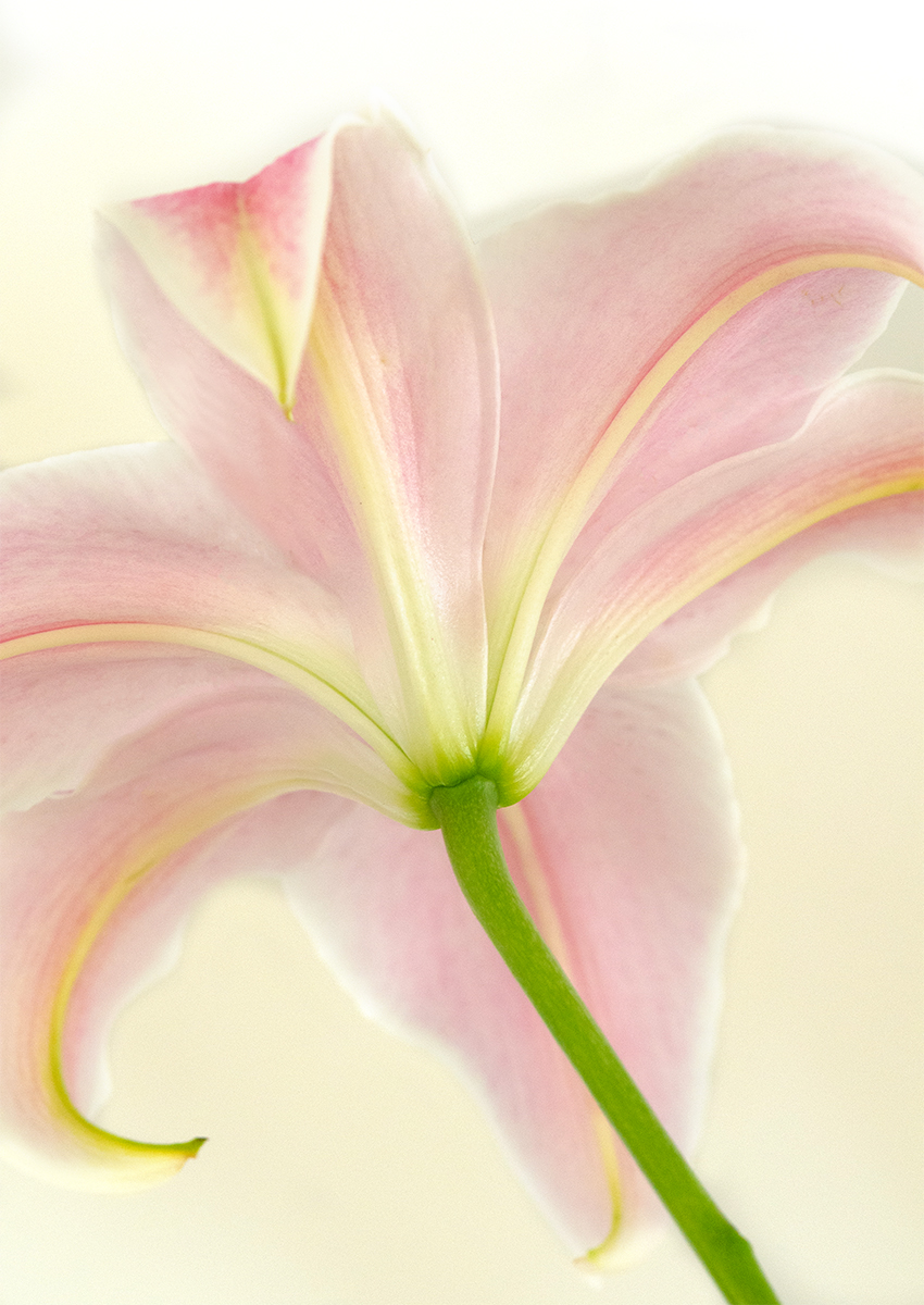
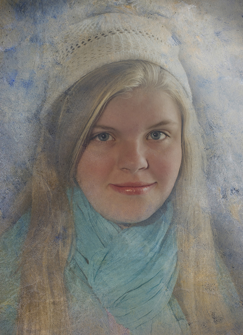
No actually it was from a class I took from Kathleen Clemons. She usually uses white flowers but thinks using red ones can be really interesting so I tried it and liked the effect. |
Feb 13th |
| 10 |
Feb 22 |
Reply |
Thanks Carrie, I like my original also. |
Feb 13th |
| 10 |
Feb 22 |
Comment |
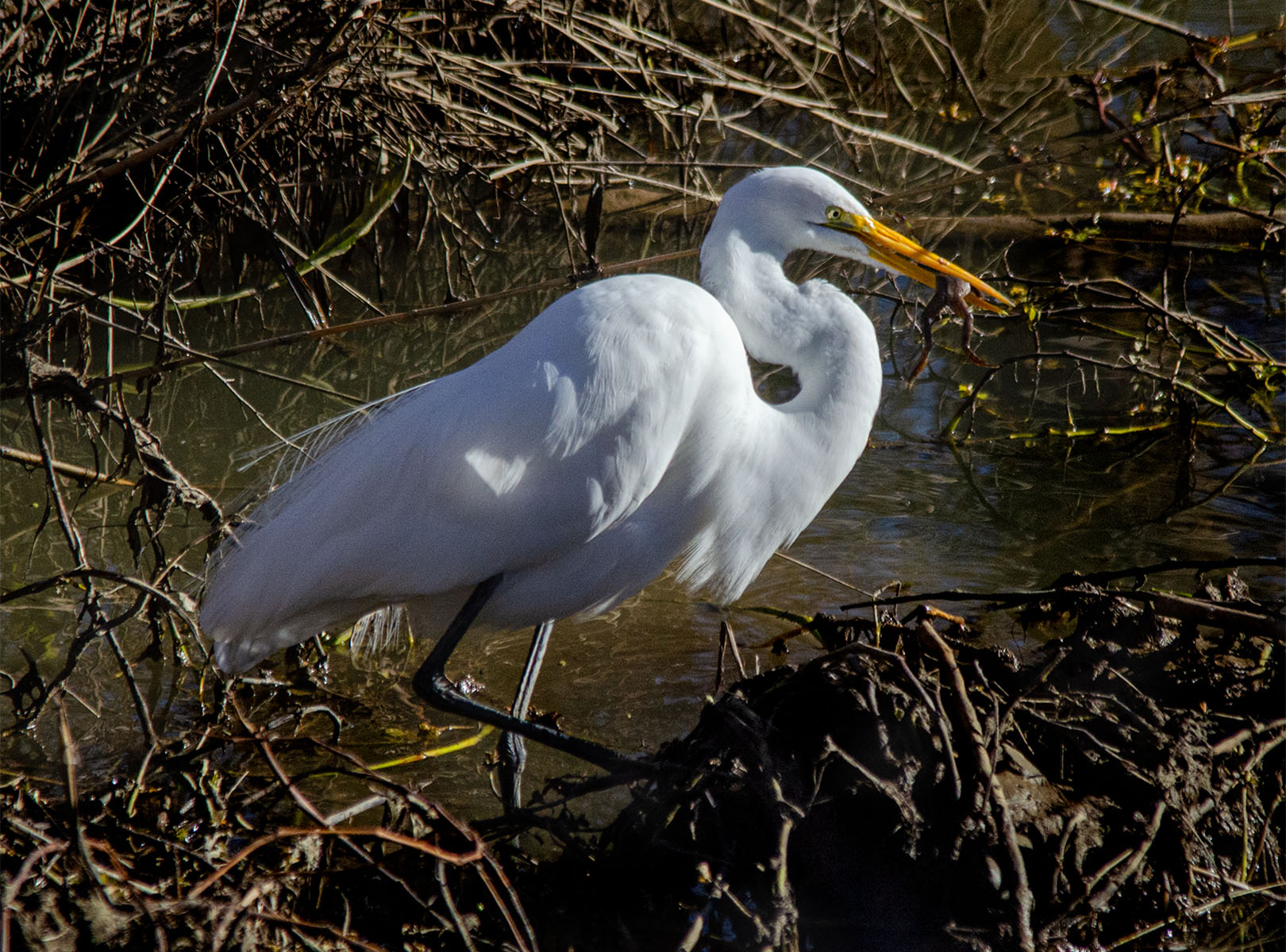
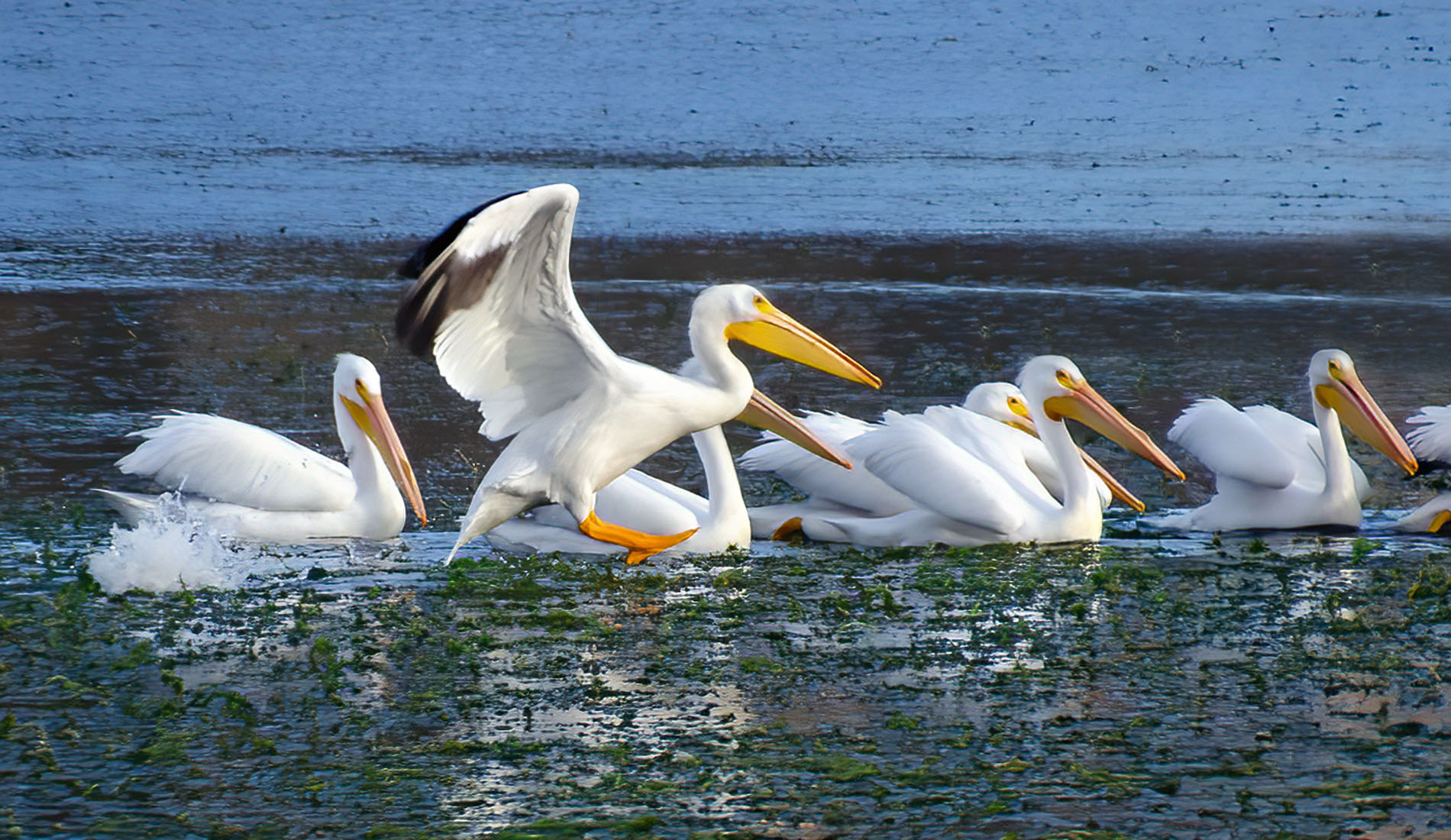
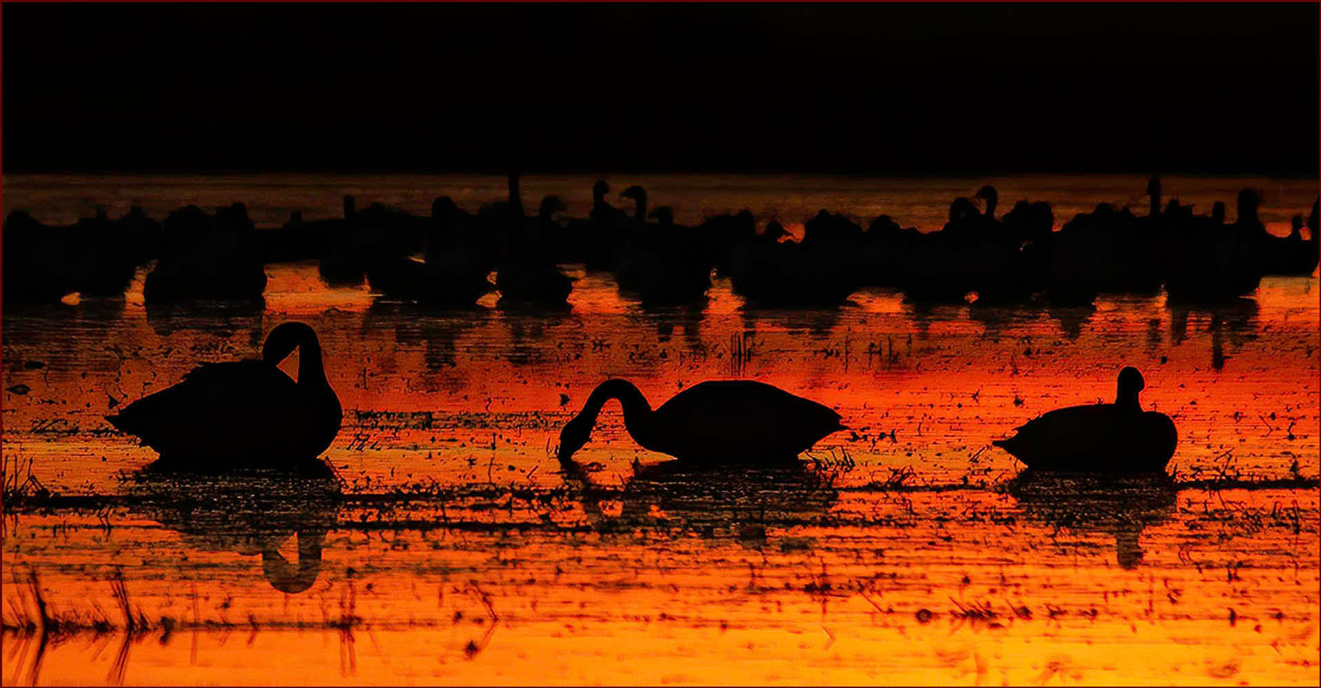
The beautiful Bald Eagle -- what a magnificent bird. Near your home? Wow. Lucky you, I wish we had them here in Sacramento.
I wish you had more contrast in the image, it seems a bit too flat. Or maybe just a tad darker. Not sure, but it's in great focus, thank you for sharing with us !
|
Feb 12th |
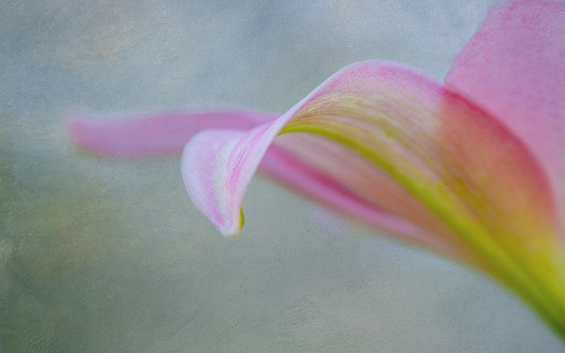
| 10 |
Feb 22 |
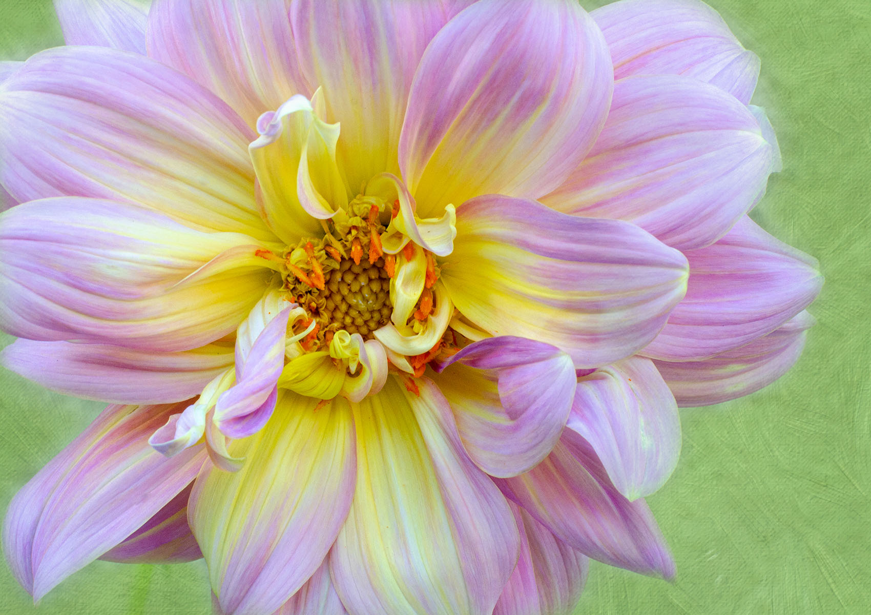
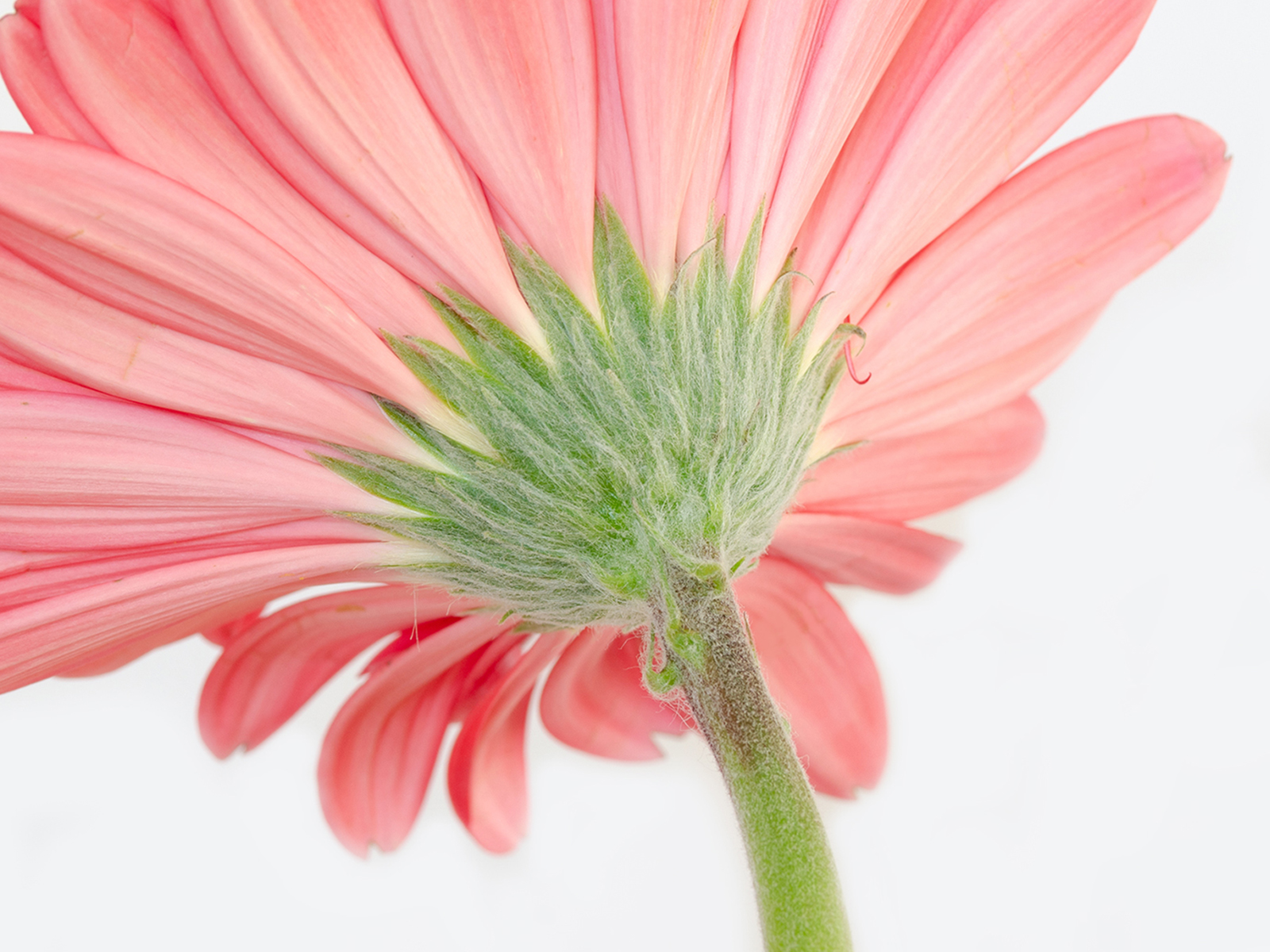
Comment |
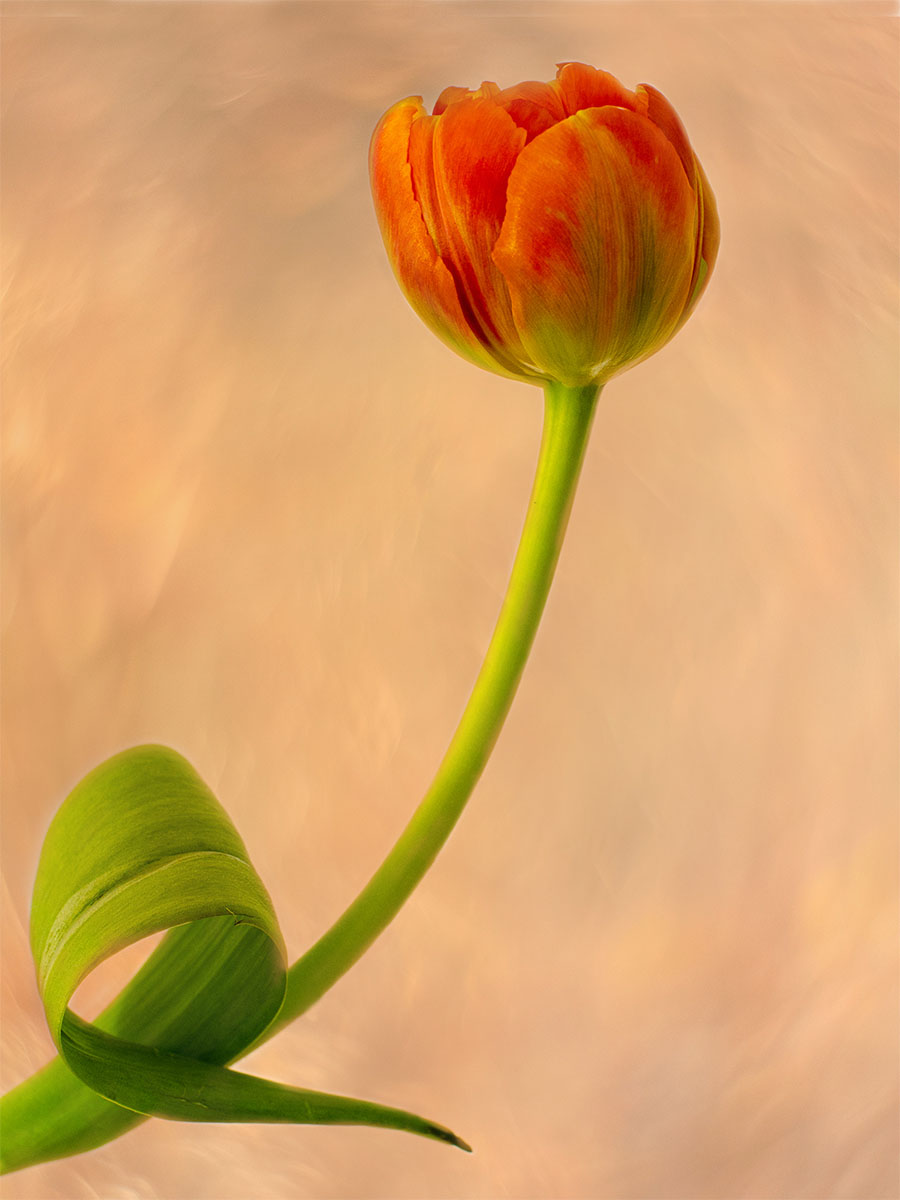
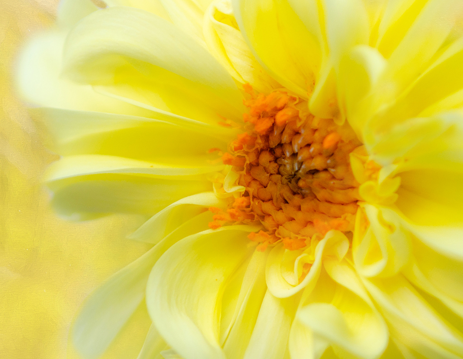
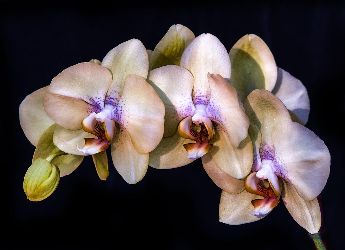
I think the color, exposure, lines, etc., are just beautiful. Well done !
I think I would prefer the center of the rose to not be in the center of the image. Can you crop it or photograph it so your focal point is not in the center? I think it would be a nicer image.
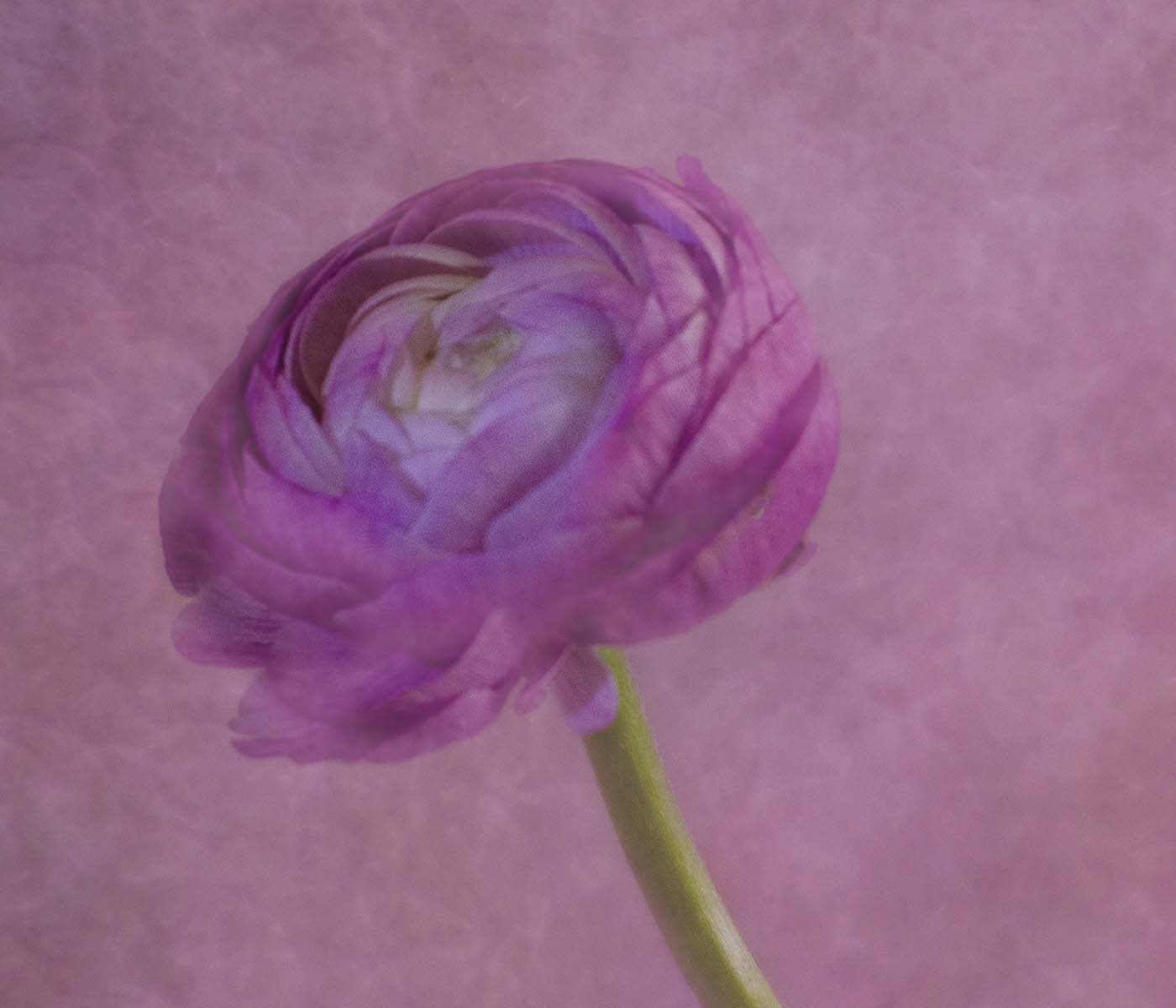
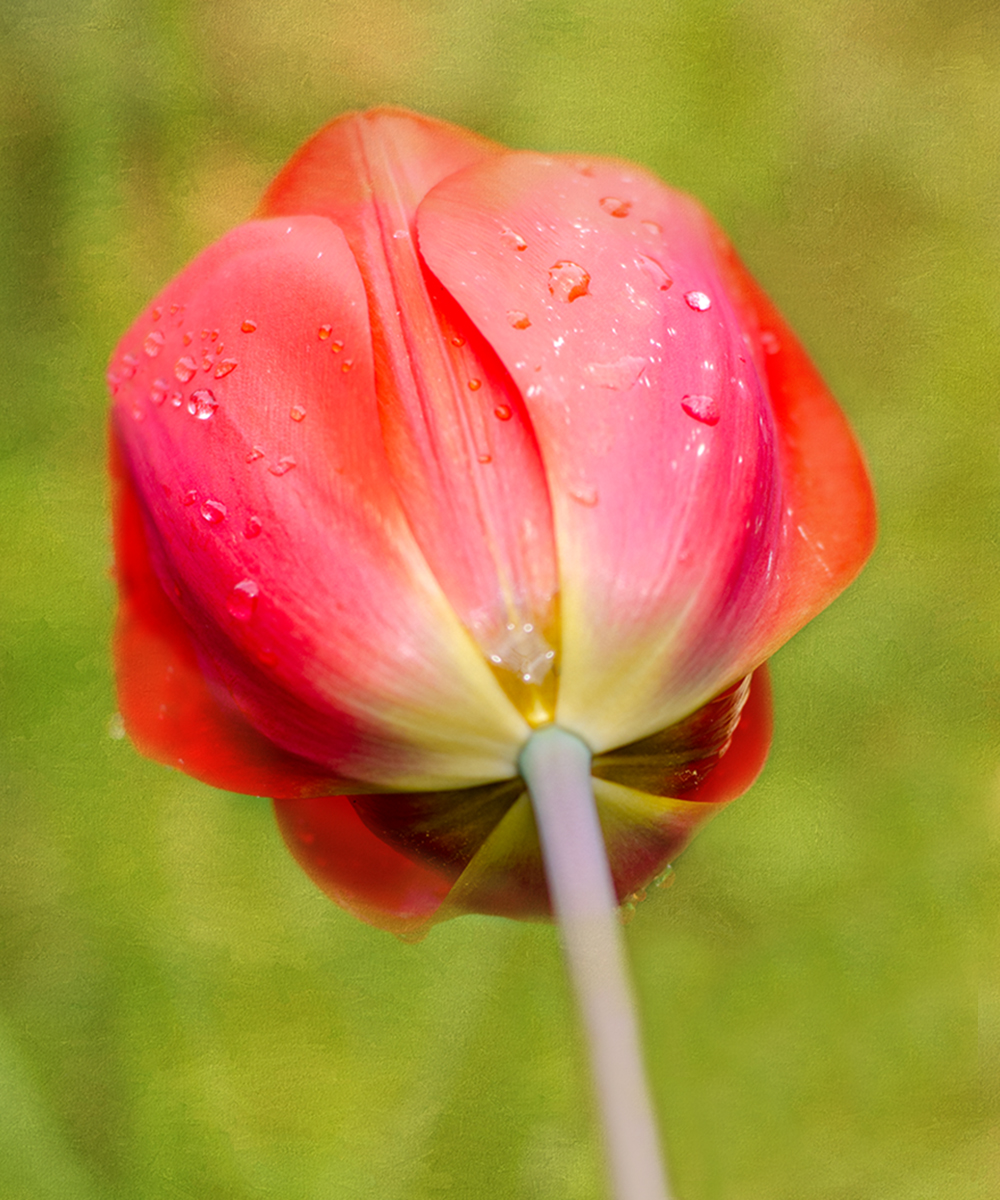
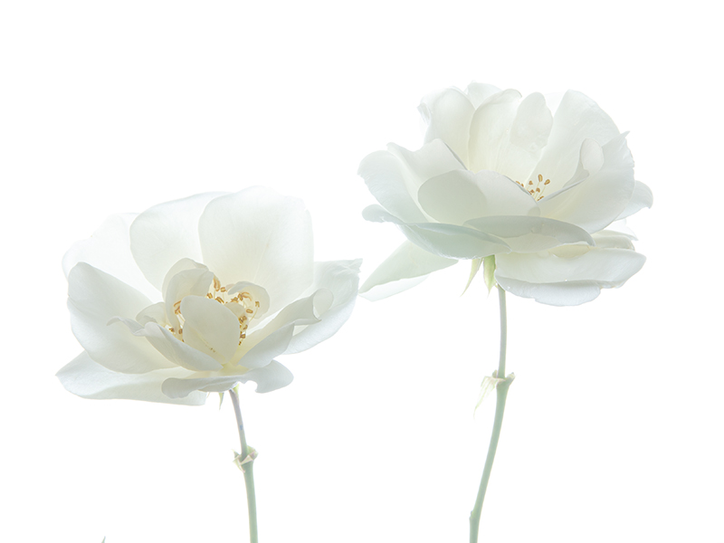
Google "Kathleen Clemons Photography" and look at some of her Lens Baby photography -- it is gorgeous. Often her flower centers are not in the center of the photograph. I'm trying to imitate her but haven't gotten "there" yet. |
Feb 12th |
| 10 |
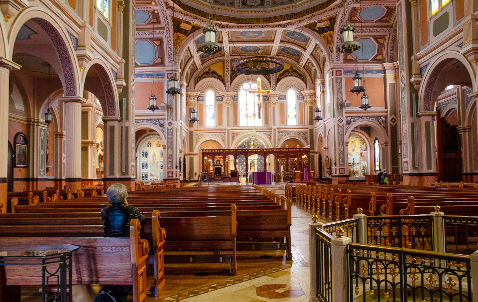
Feb 22 |
Comment |
HI Mark,
I do like the grittiness of the image, and it's an interesting view of the inside of a prison chapel.
I'm not sure what it looked like on your computer, but on mine it was so dark that I had to get really close to the image to see the writing on the parchment (whatever it is). It's so dark that you lost detail in the wood, the pencil sharpener, etc.
I took the liberty of adding a layer mask to your image to brighten up the detail inside, without changing the window light. I also cropped off the wood on the left, it was not adding anything to the image. See what you think, it's just a suggestion. Thanks for sharing with us ! |
Feb 12th |
 |
| 10 |
Feb 22 |
Reply |
HI Lance,
Thank you for your comments, much appreciated.
Actually, this image is just the way I wanted it, and I realize it's not to everyone's taste. That's OK. I will try some different crops but at present, I like it the way it is. Here's one crop but I'll have to think about it !!
Thank you and feel free to critique any time !
Donna |
Feb 5th |
 |
4 comments - 3 replies for Group 10
|
7 comments - 3 replies Total
|