|
| Group |
Round |
C/R |
Comment |
Date |
Image |
| 10 |
Aug 20 |
Reply |
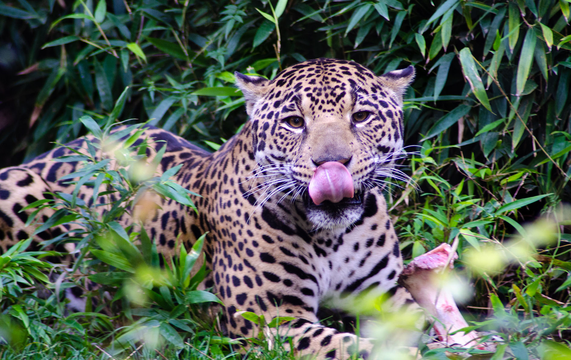
Maybe take some pictures of people and make them tiny, like ornaments in the tree. Or if you have an old picture of Death Valley, put it in the middle of one of the really dry areas and add an exotic animal (like a tiger or something that you took at the zoo).
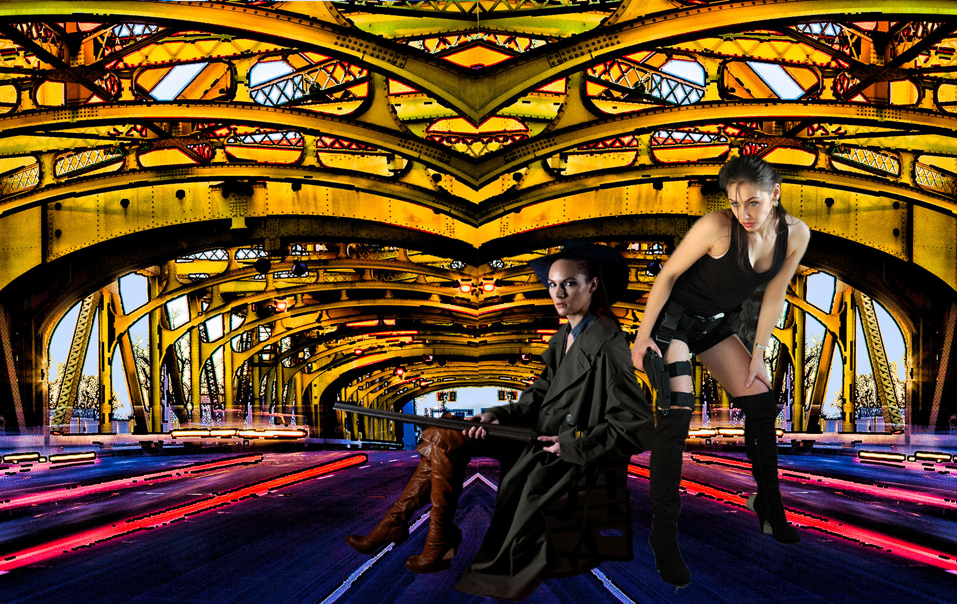
I'm not great at composites; I have one I started and I'm going to post it in Sept. and get ideas from all of you. It's just not complete yet.
|
Aug 27th |
| 10 |
Aug 20 |
Comment |
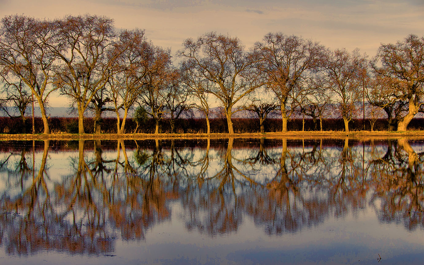
Thanks, Doug. I think maybe I should tone down the tree on the right, as suggested. I can use a layer adjustment.
I usually use Topaz Adjust Color Pop, but this time I may have used a different one; I never really remember. I use them in Photoshop and the History doesn't tell you. I must start taking note of which one I used. I think the picture is better with the blurred water, that's what I liked about it ! Funny how different people react to different things ! |
Aug 27th |
| 10 |
Aug 20 |
Reply |
Thanks Diana ! |
Aug 21st |
| 10 |
Aug 20 |
Reply |
Thank you ! |
Aug 21st |
| 10 |
Aug 20 |
Comment |
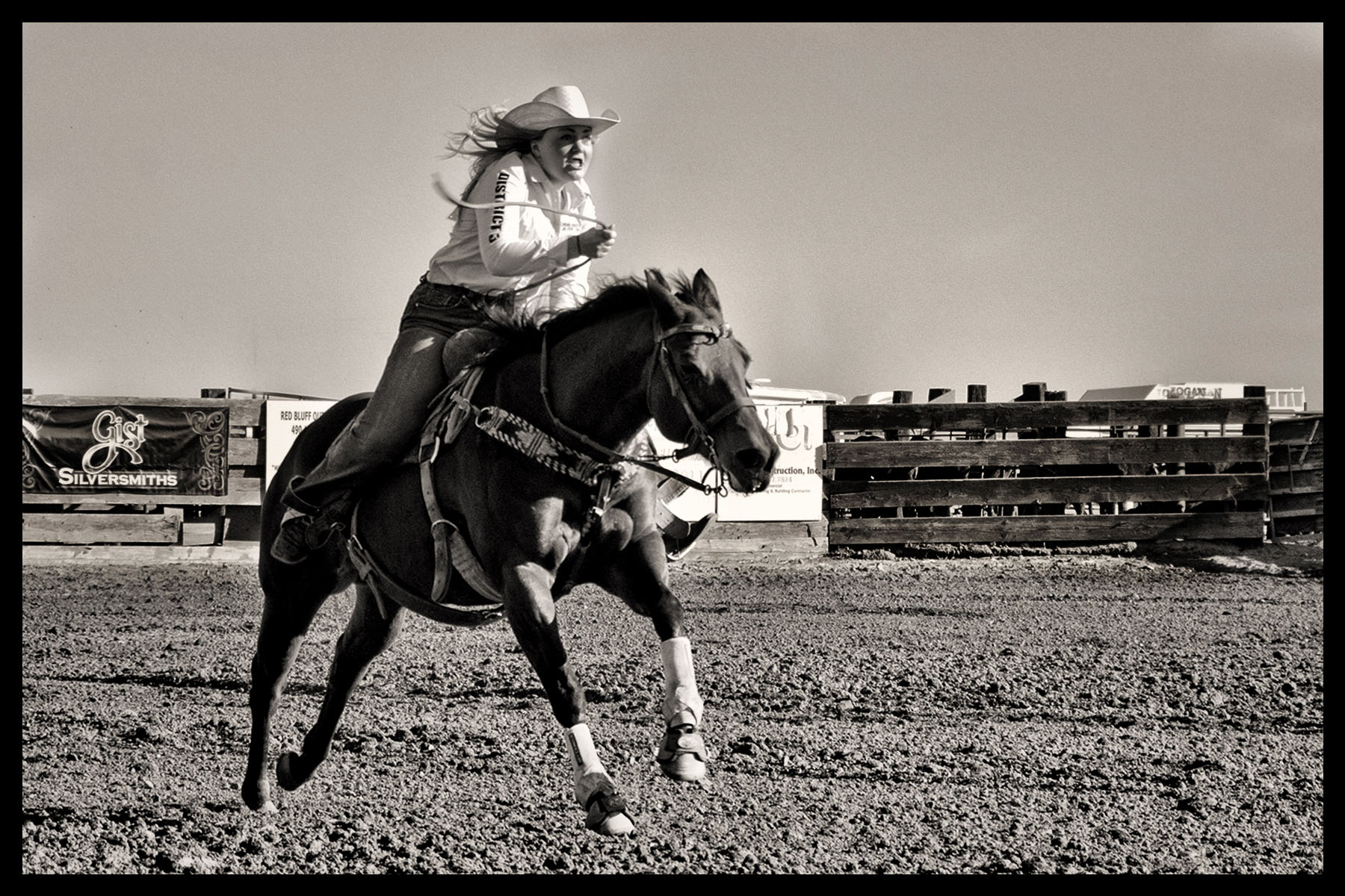
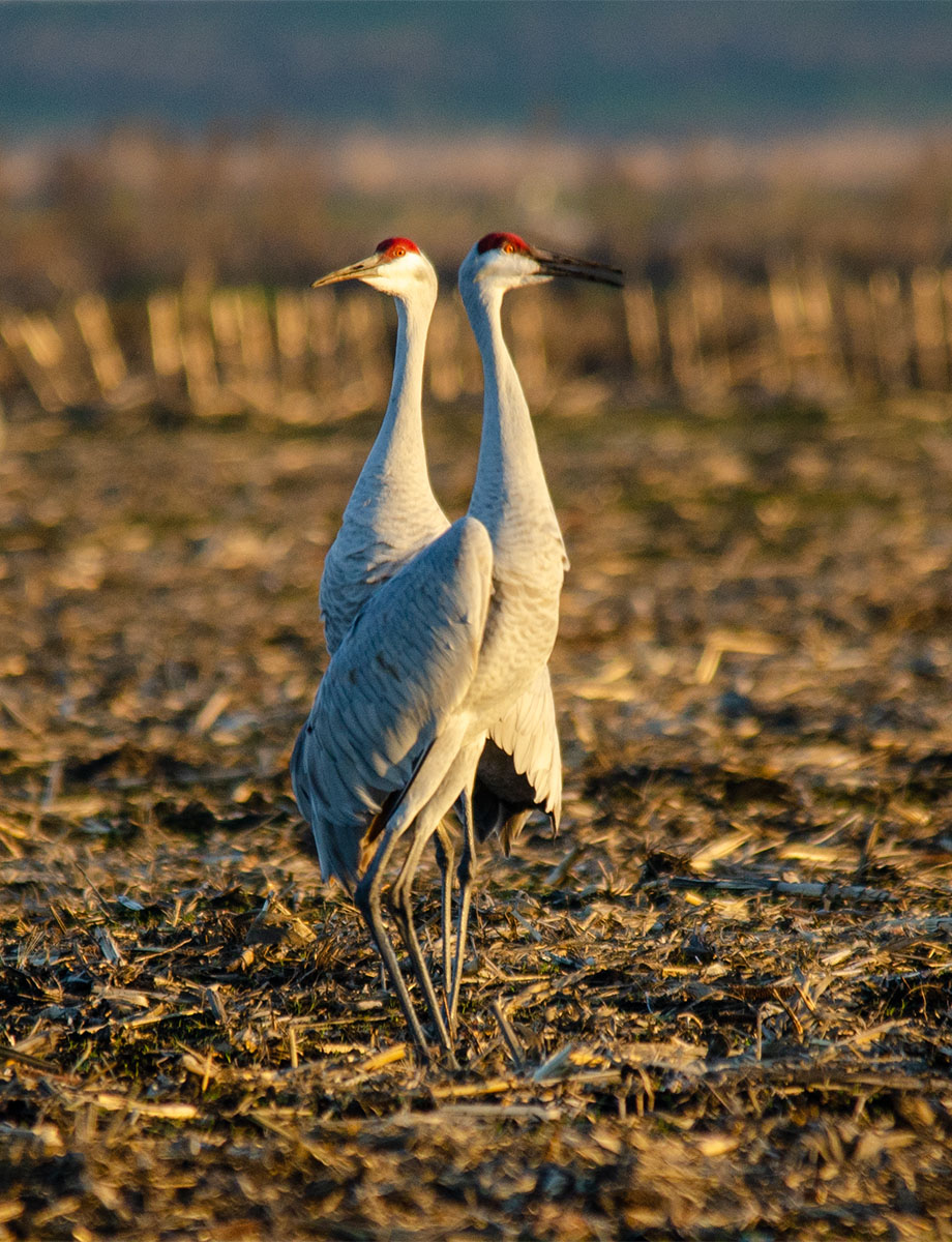
Agree with Rich, it's a crazy house. I think it would have been fun to zoom in on different parts of the house and show us some of the gooey, drippy, blue stuff up close. There's so much to look at !! Maybe crop some off the top and left and right sides, give us a closer look at it. So much fun ! |
Aug 14th |
| 10 |
Aug 20 |
Comment |
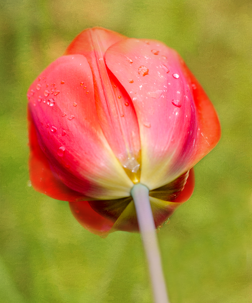
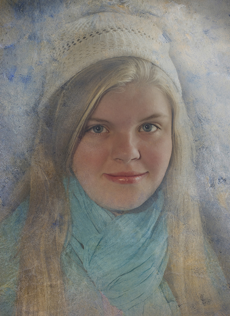
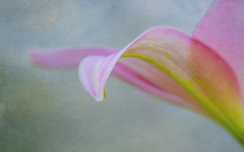
Well, I just think this is LOVELY. I wouldn't change a thing, it's so pretty. I think Rich's comment about a slight crop would be a good thing to try.
Beautiful color, exposure, Wow.
|
Aug 14th |
| 10 |
Aug 20 |
Comment |
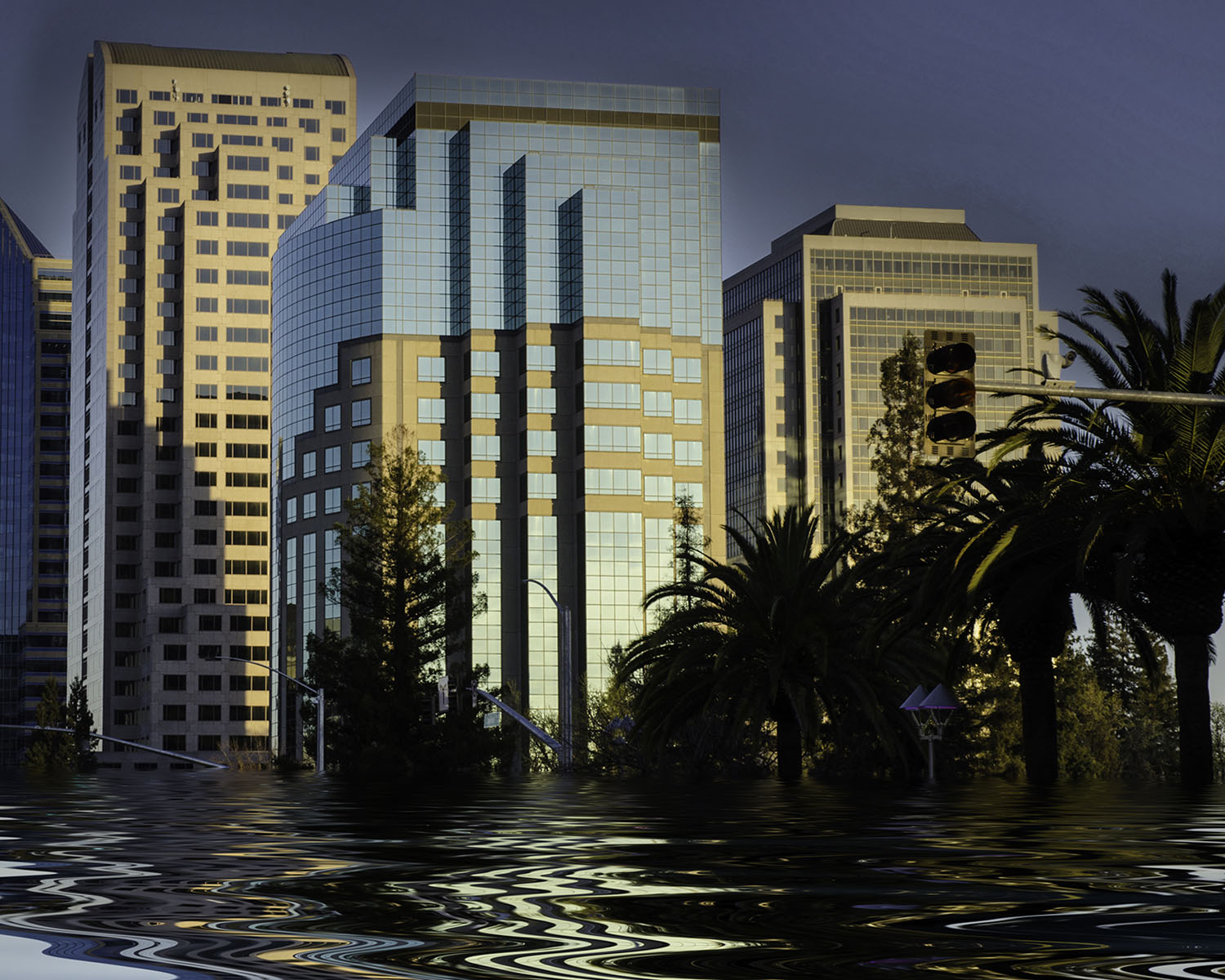
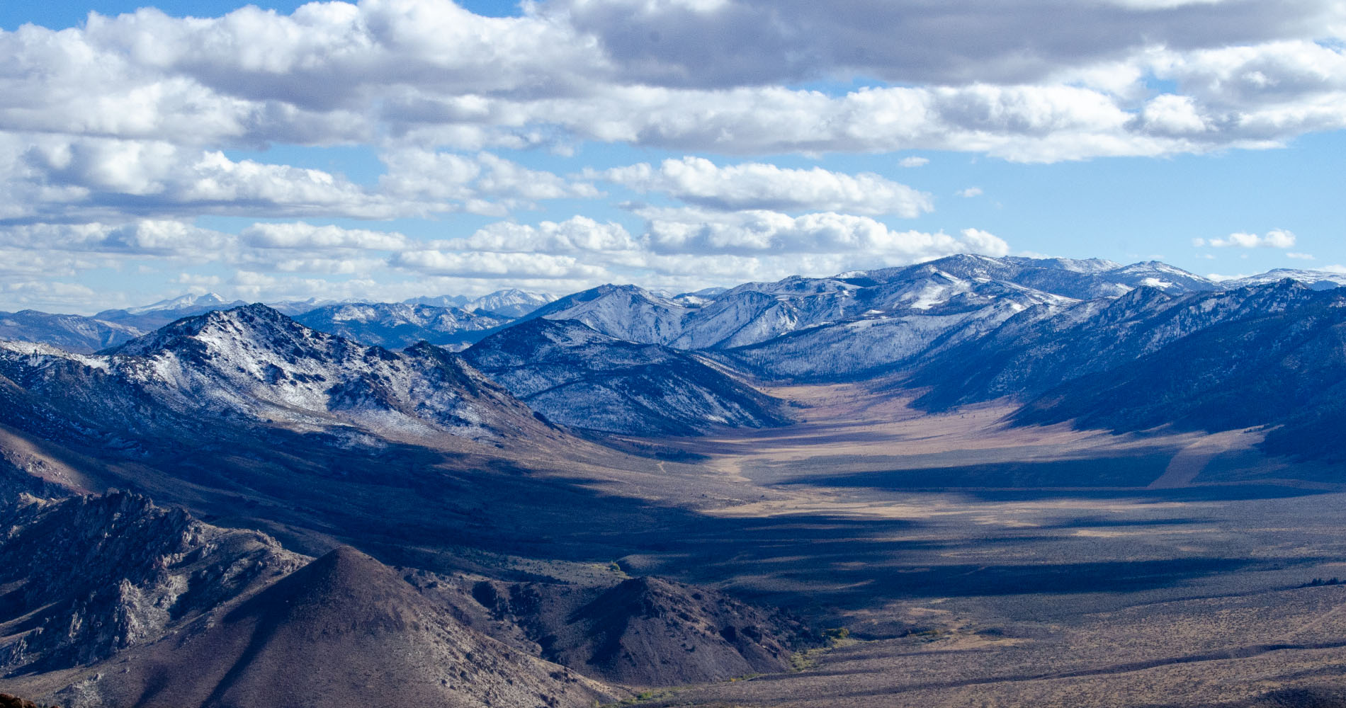
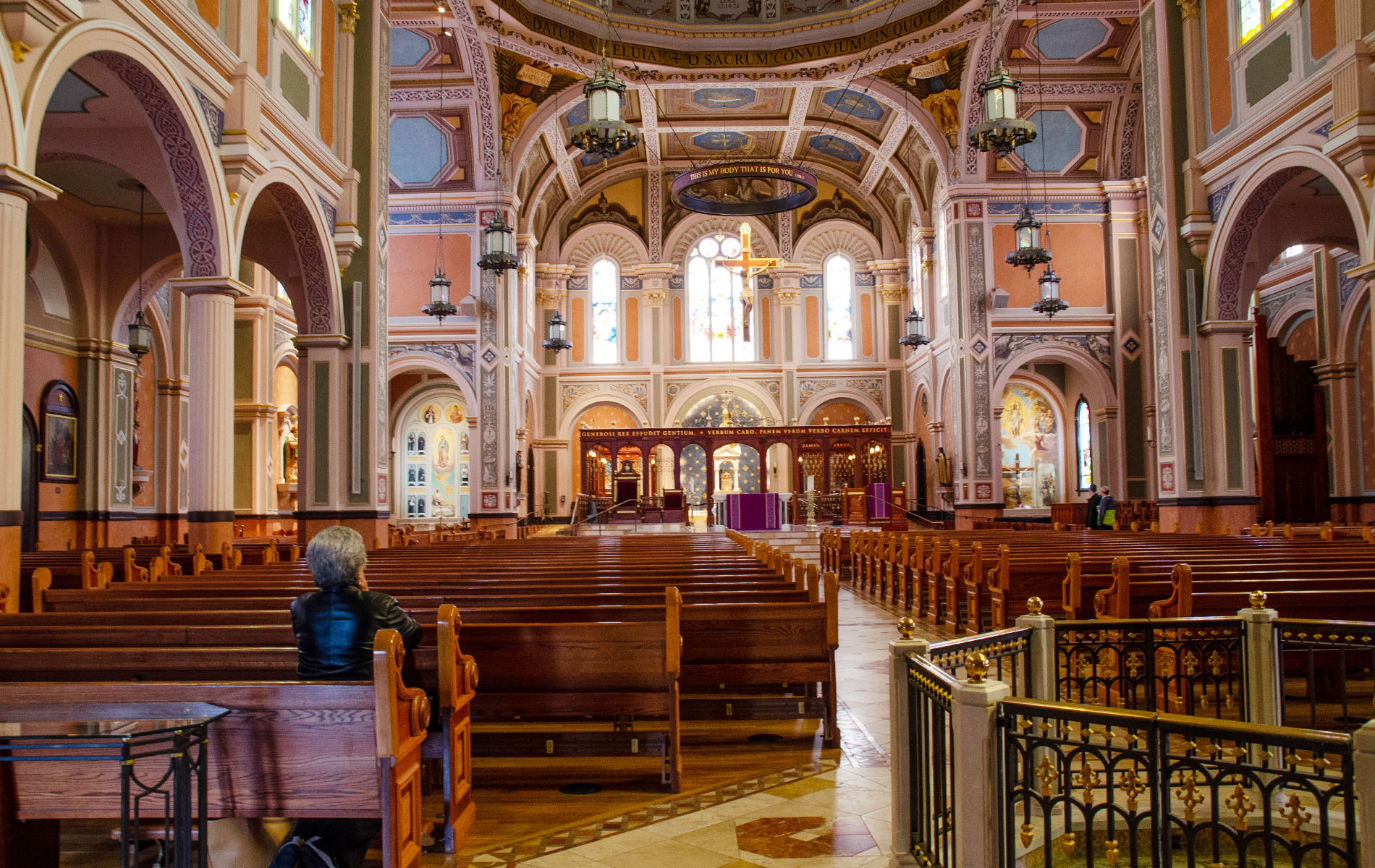
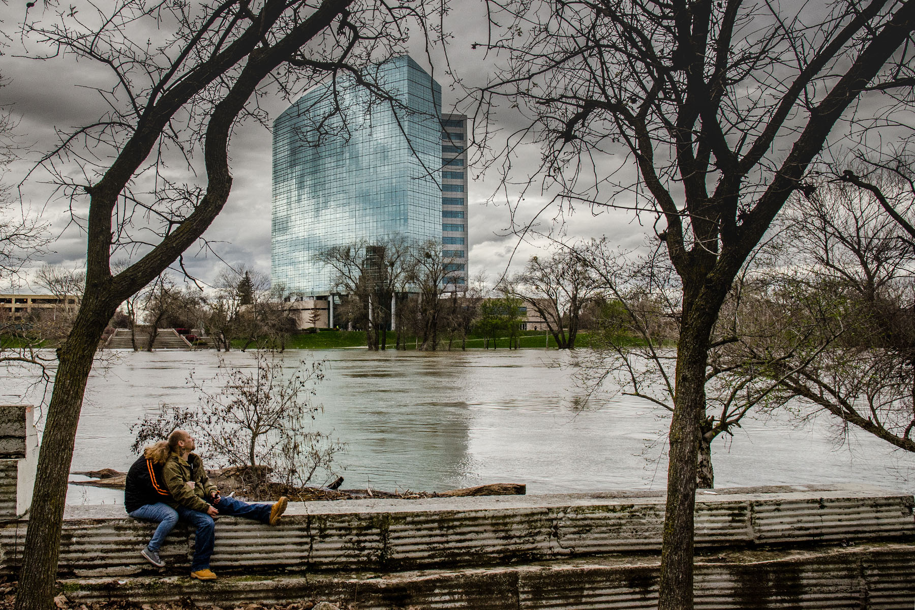
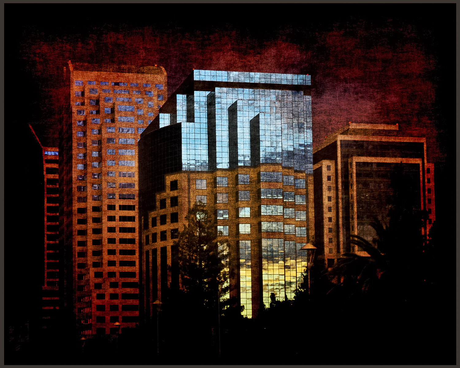
It looks like a wonderful place to visit !! So I would take out some of the sky, not needed, and tone down the city as it was probably taken in bright sunshine, maybe add some yellow tones to make it look closer to sunset. I did a bit of playing in Photoshop and used Topaz Adjust to put in a little yellow hue and changed the crop. I hope you don't mind. But it's a lovely shot, makes me want to go there. |
Aug 14th |
 |
| 10 |
Aug 20 |
Comment |
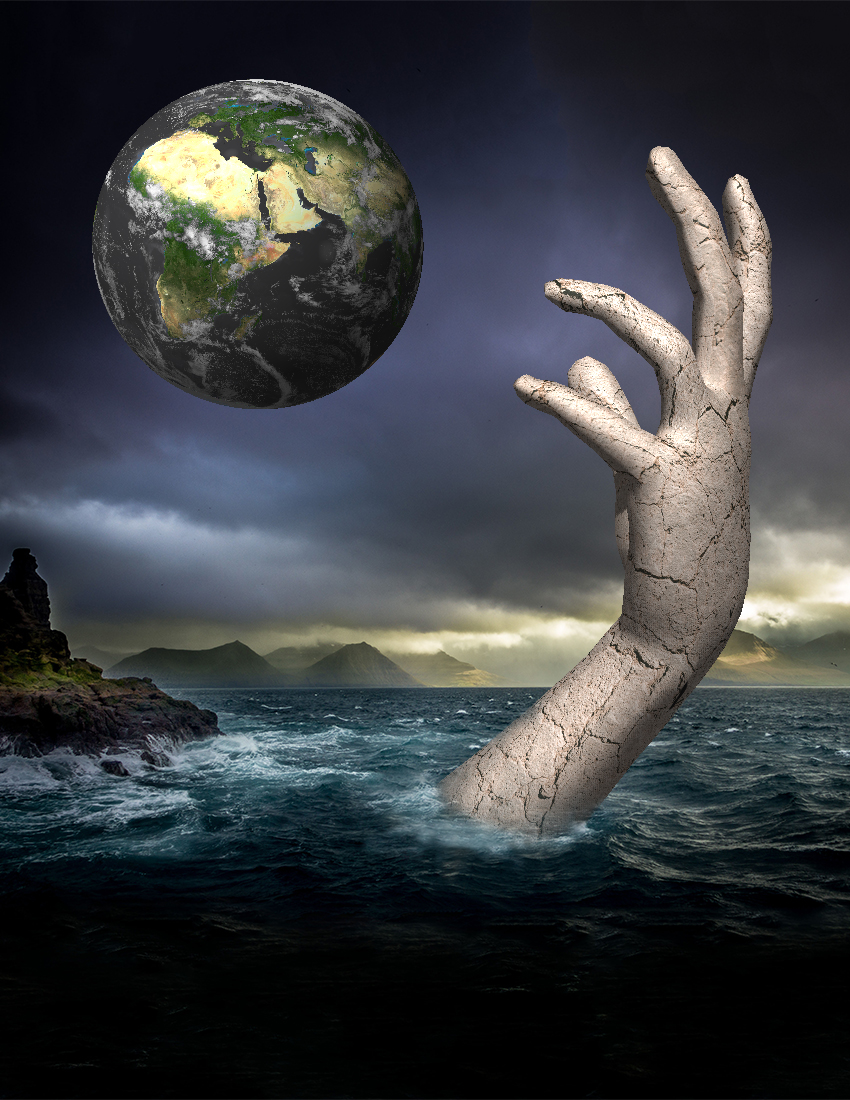
I think it's really interesting and I love how you created it. Stack of 91 ? Wow, that's a lot of images. The colors are great. I'd like to see it in a composite image, where it's part of something else -- that's where I lack creativity. But it's nicely done. Fun, but I find the title on the image distracting. I'd get rid of it. Maybe you can play around with it, put it into something else, because I think it's not enough just by itself. |
Aug 14th |
| 10 |
Aug 20 |
Comment |
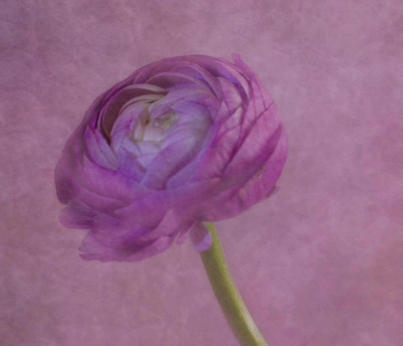
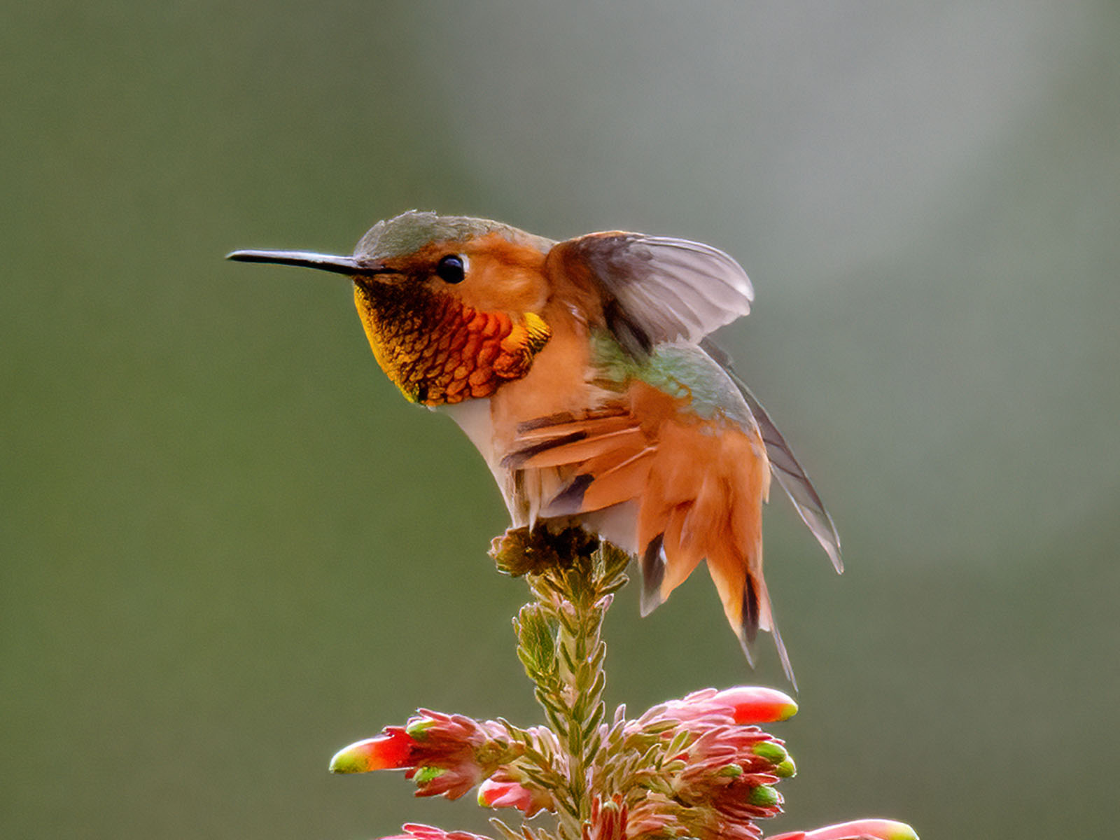
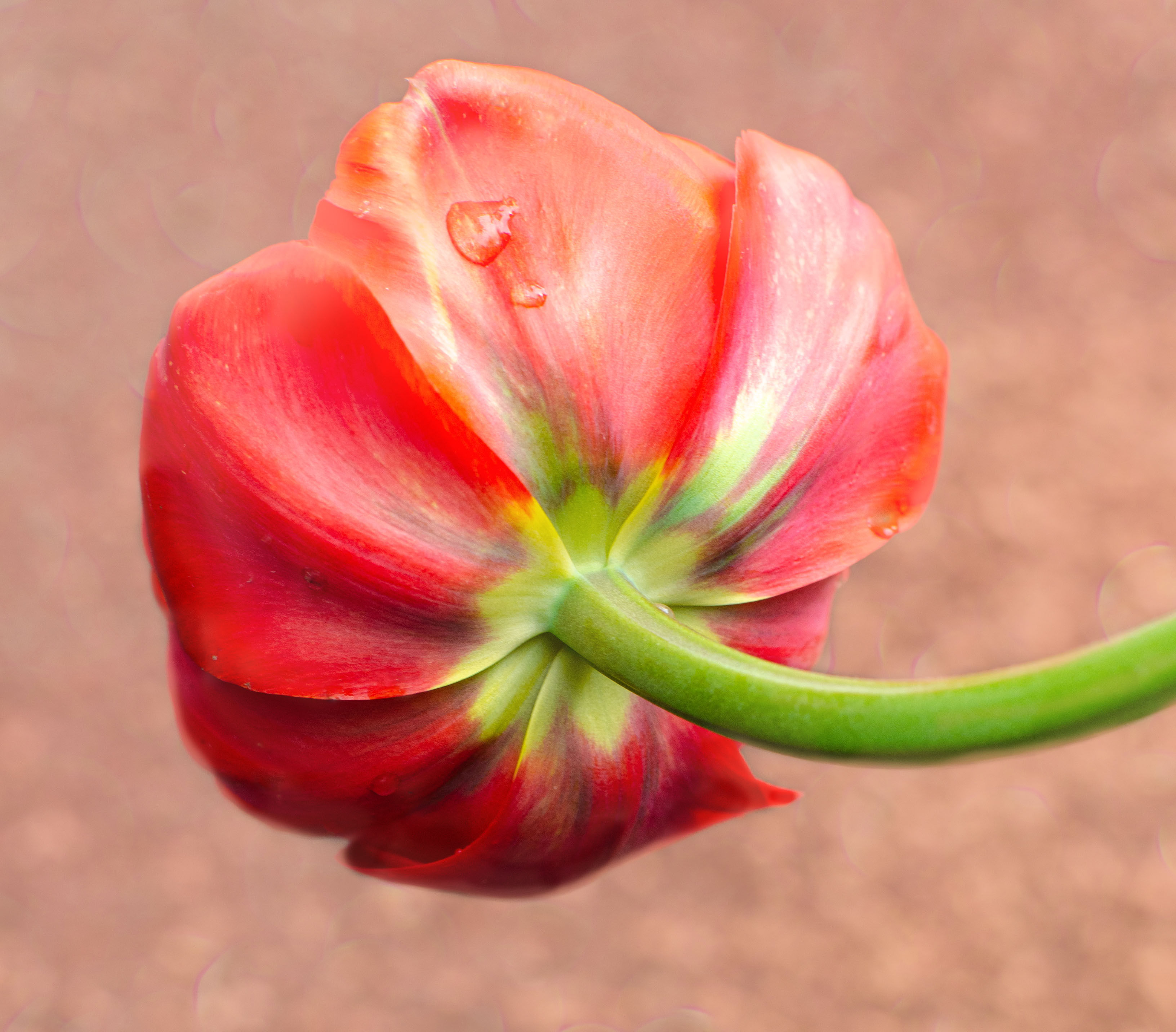
I love the red textured color and wish there were more of it on the left side where it's so bright. I love the idea of the image and what you did to create it; I just would like to see the light at the lower left be darkened.
Great job ! |
Aug 14th |
| 10 |
Aug 20 |
Comment |
I love the red textured color and wish there were more of it on the left side where it's so bright. I love the idea of the image and what you did to create it; I just would like to see the light at the lower left be darkened.
Great job ! |
Aug 14th |
| 10 |
Aug 20 |
Reply |
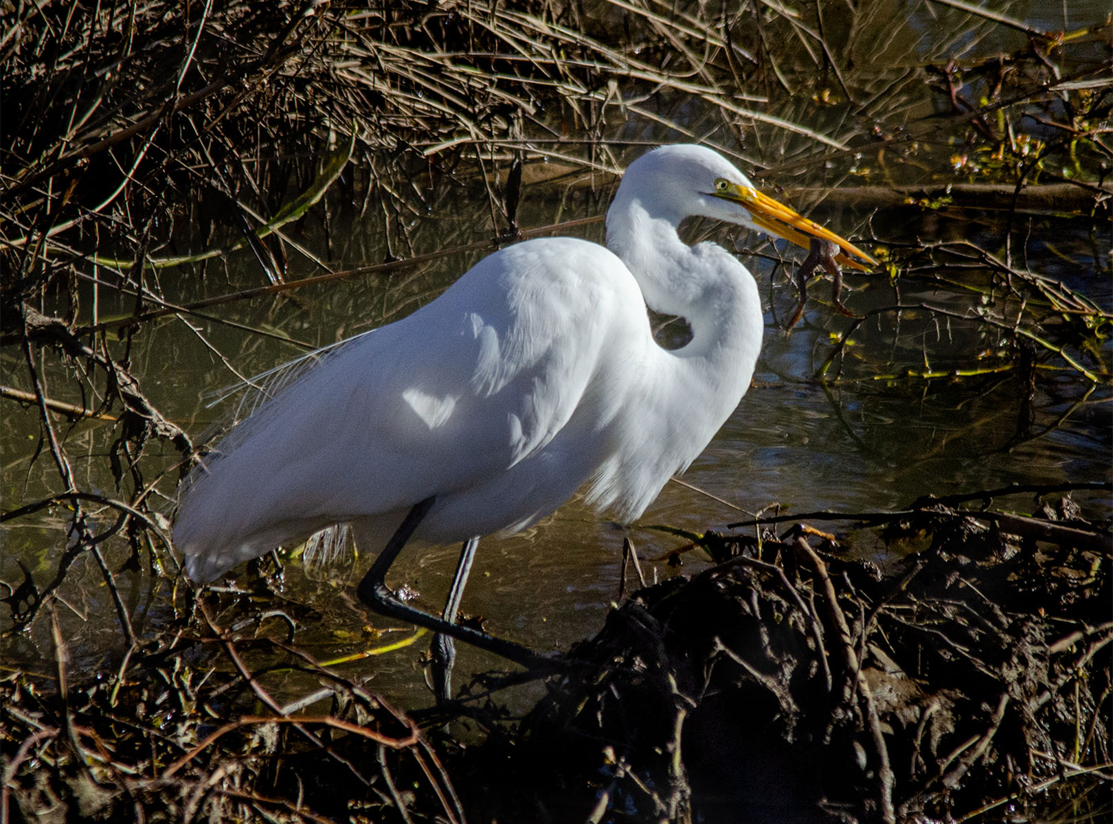
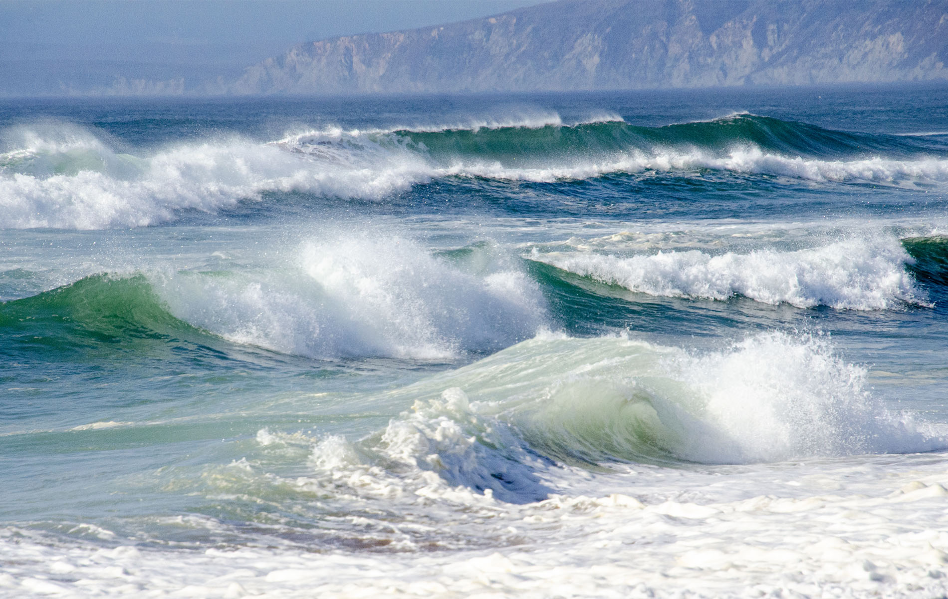
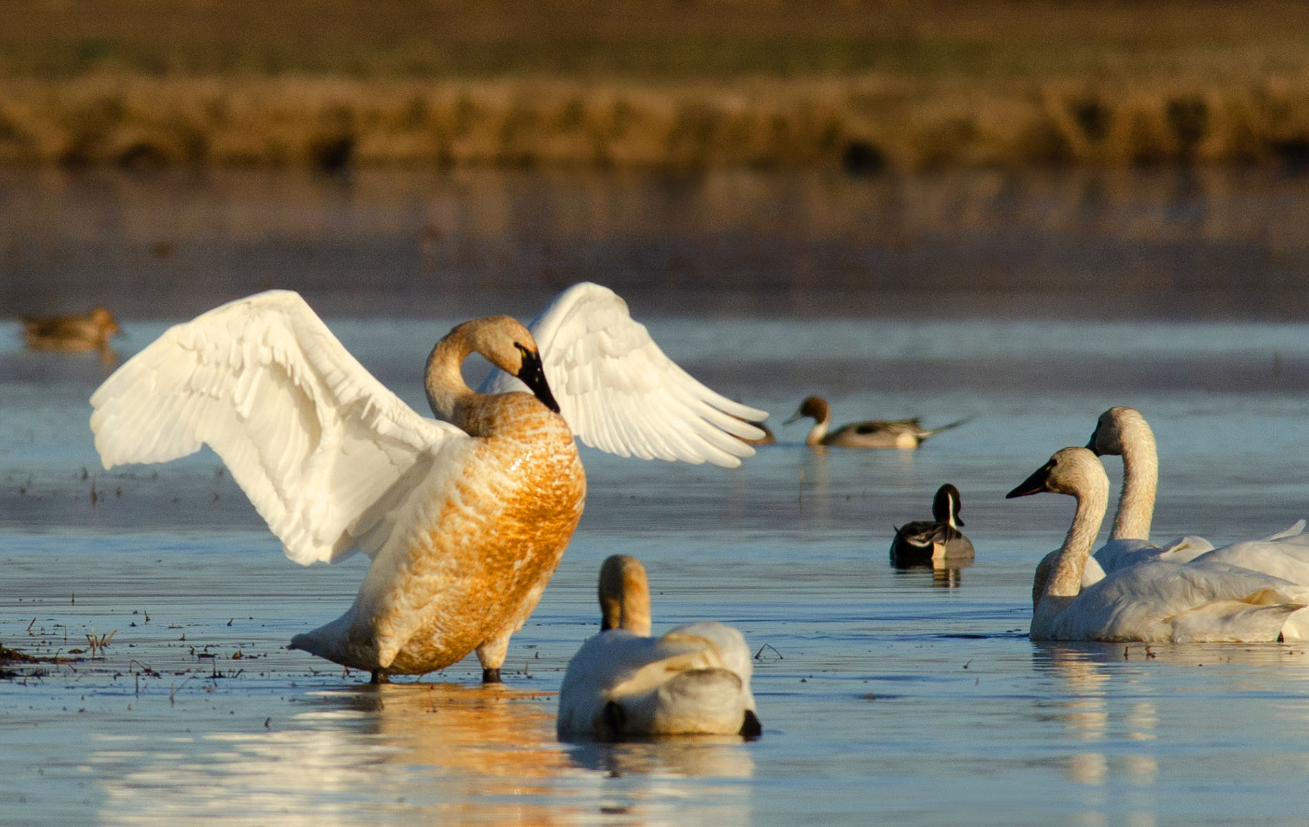
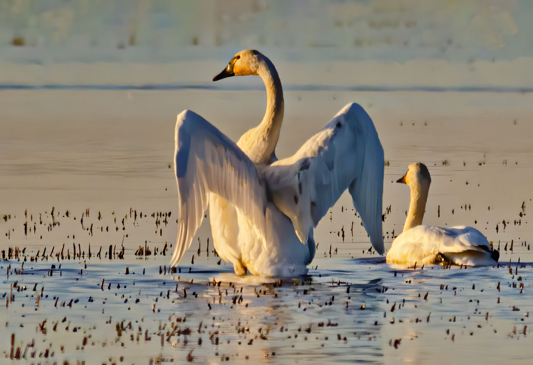
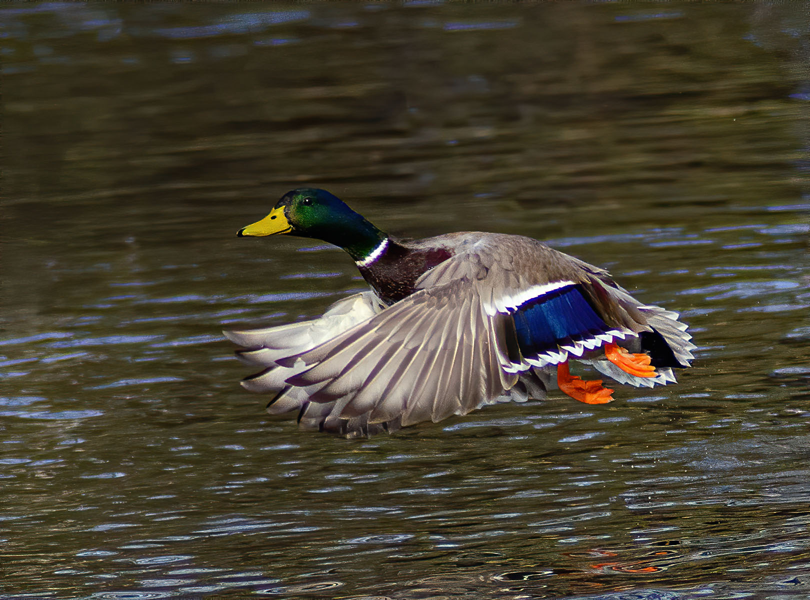
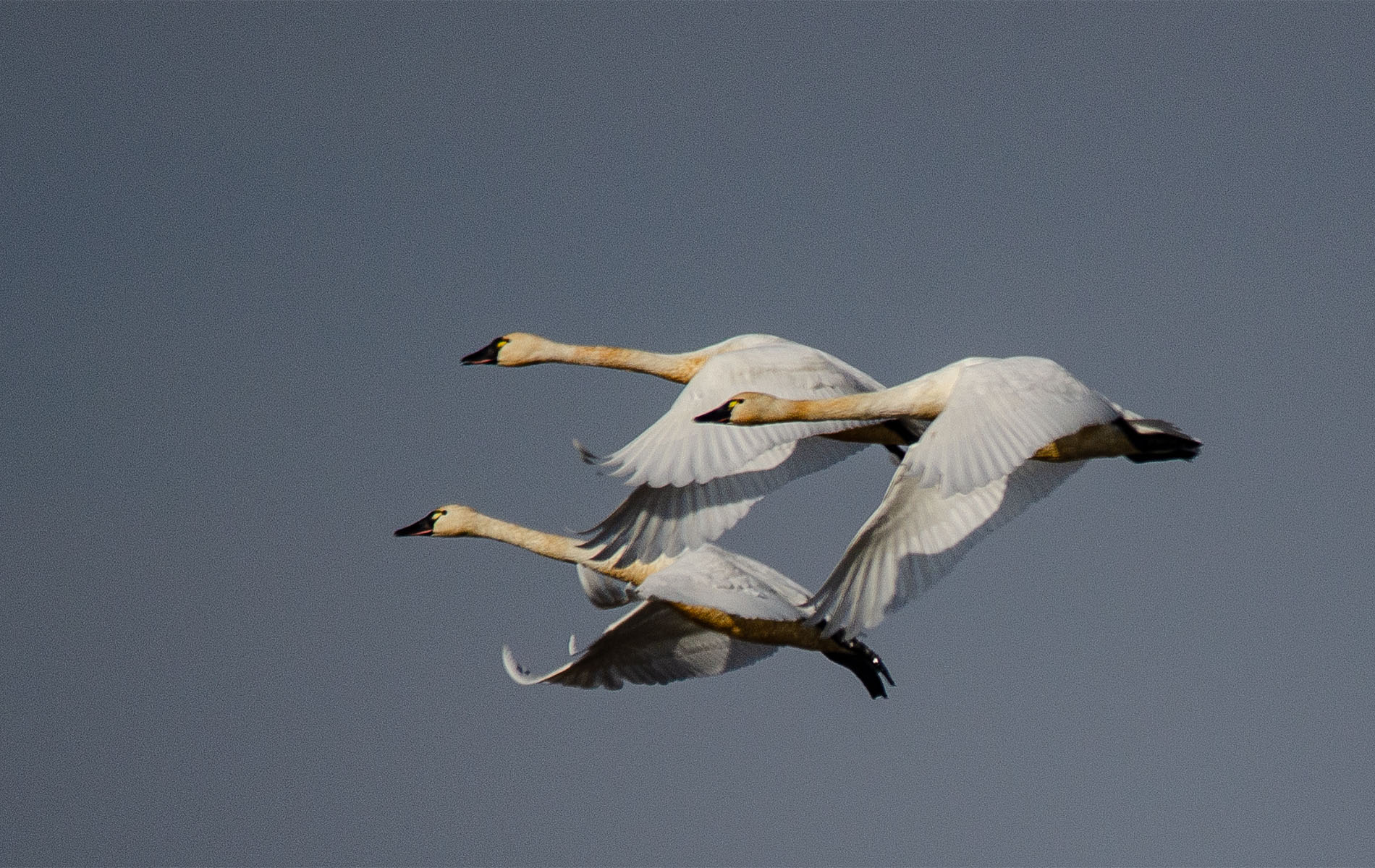
Thanks Rich. I didn't even think about the ripples in the water, I guess I liked them. It's funny the things we notice and the things we don't !
|
Aug 14th |
7 comments - 4 replies for Group 10
|
7 comments - 4 replies Total
|