|
| Group |
Round |
C/R |
Comment |
Date |
Image |
| 4 |
Feb 19 |
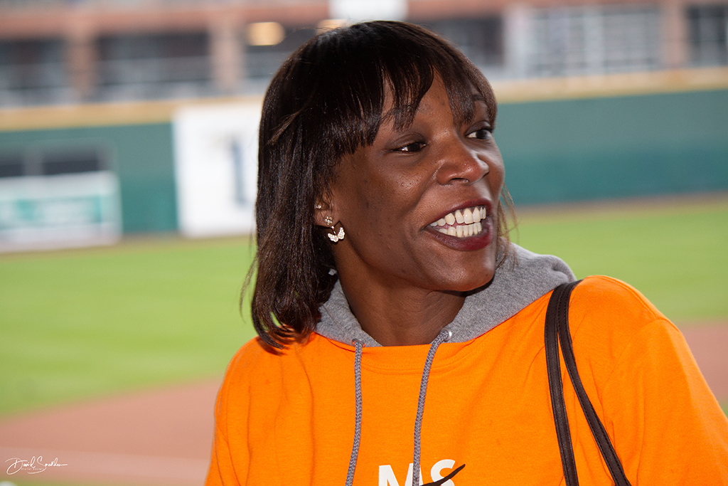
Comment |
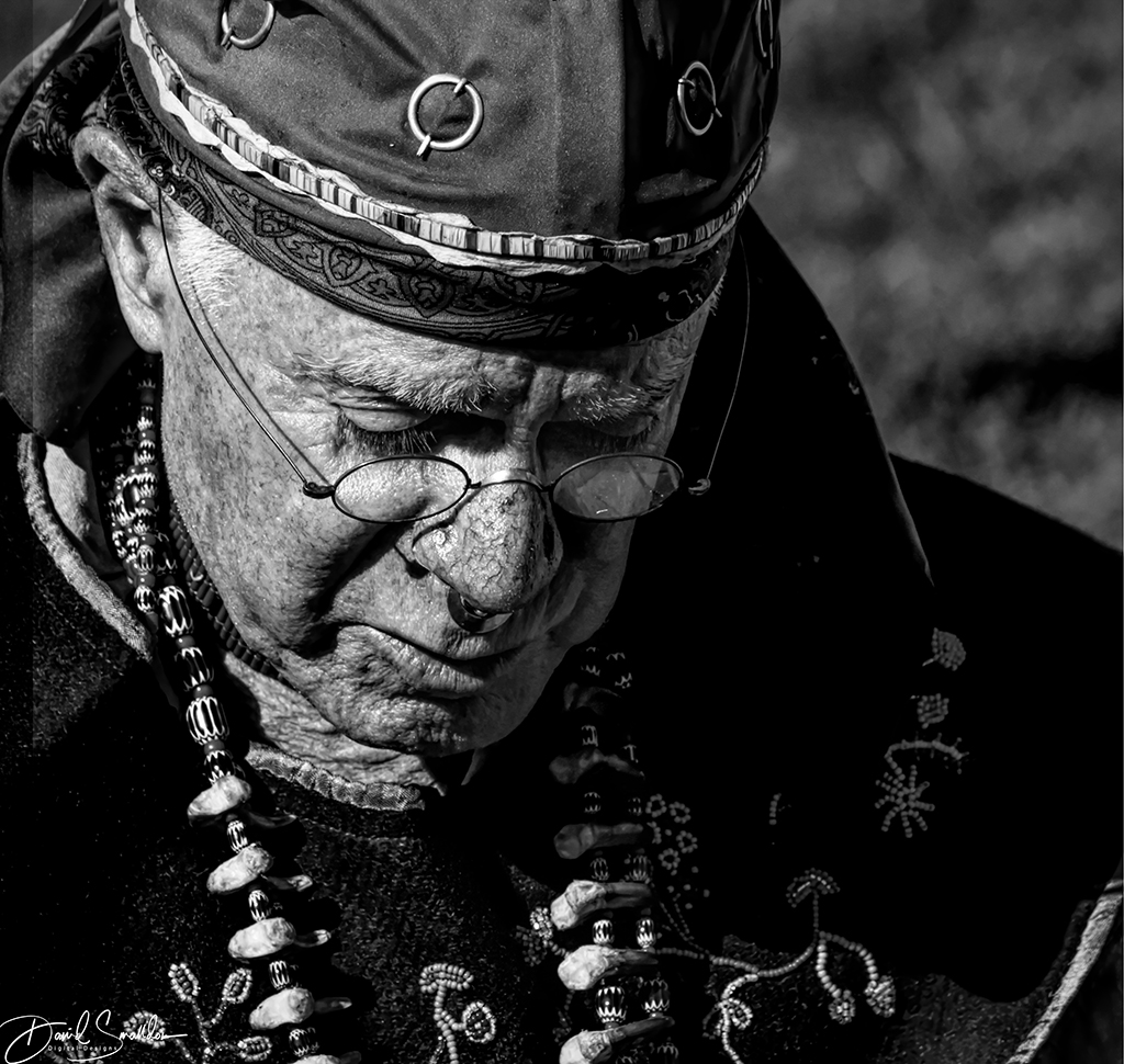
Superb portrait from the pose to the catchlights in the eyes! Masterful shadows in the photo from the lighting as well! I just love the whole atmosphere of the scene. Superb image! |
Feb 23rd |
| 4 |
Feb 19 |
Comment |
I missed the memo this month on "rodeo pictures" but apparently I got the memo on "flower photos". I also agree with how well-timed this photo is and it's a great capture of the frenetic action seen at a rodeo. As for the crop, I like it but I experimented with cropping it even more on the left side to focus just on the rider and the two people on the right side even to the point of cropping out the Homestead pillar too on the left. Excellent work on capturing just the right moment for an amazing shot! |
Feb 15th |
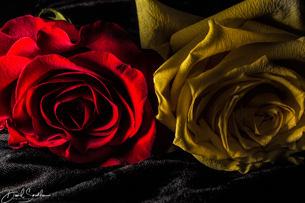
| 4 |
Feb 19 |
Reply |
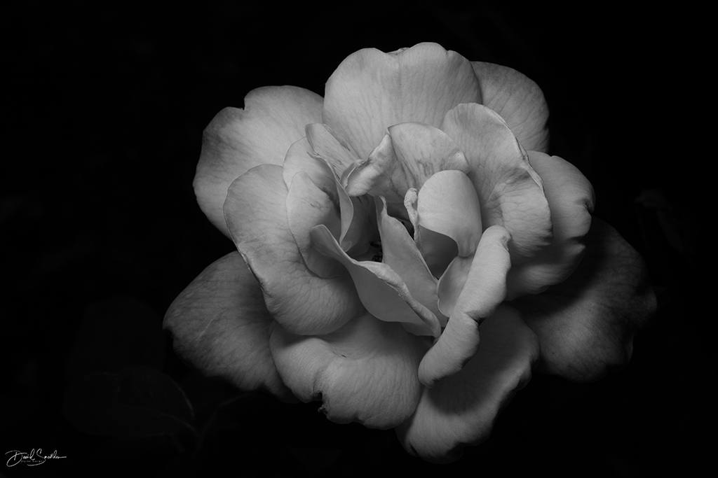
That rose looks brown because of the way I lit it :) It's actually a yellow rose but the shadows are a bit heavy. |
Feb 15th |
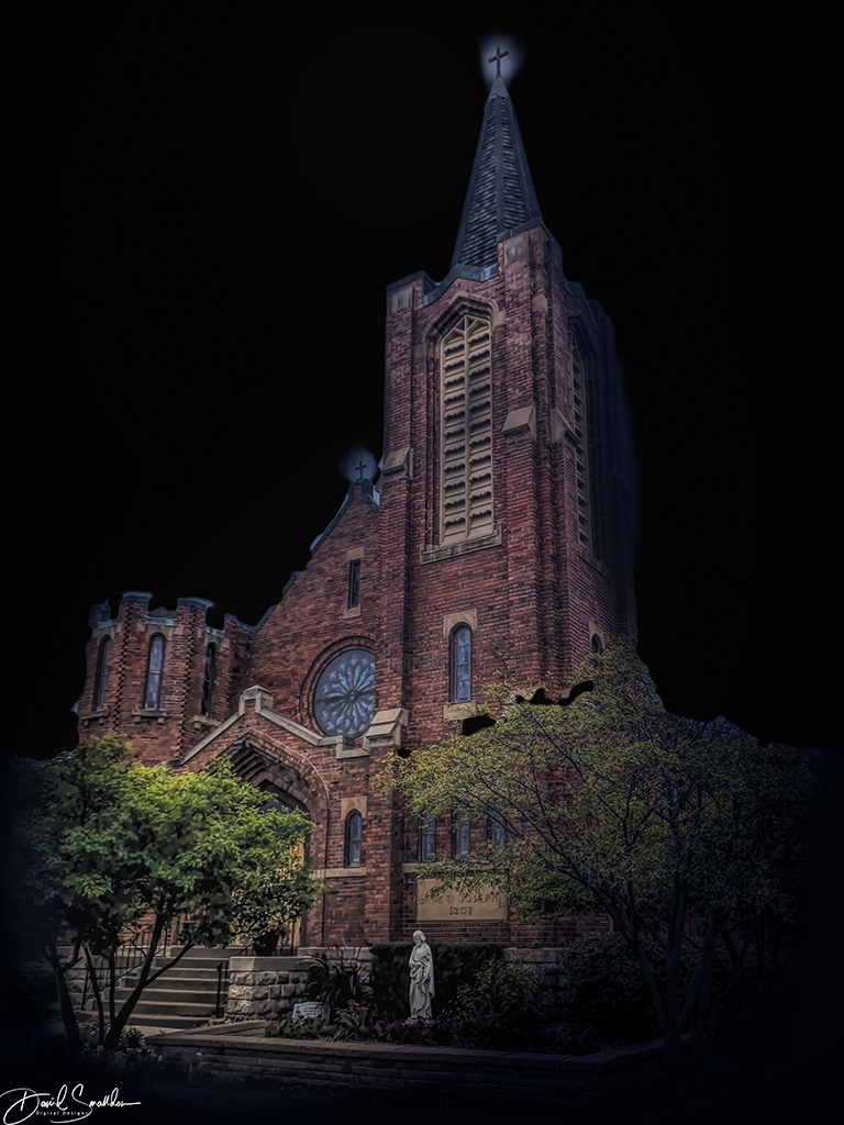
| 4 |
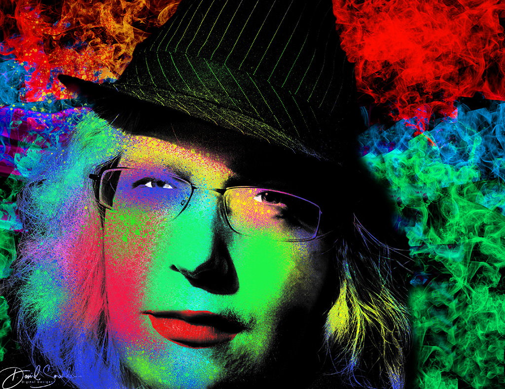
Feb 19 |
Comment |
I really do like your atmospheric night shots that you've been displaying as of late. I love the tonal qualities of the photo. I'm on the fence about the reflections though (especially the light in the right window). The picture looks very well as a black and white. |
Feb 15th |
| 4 |
Feb 19 |
Comment |
Magnificent flower image. Great work on the focus-stacking! It's a very ethereal looking image. I love the off-center composition of the flower as well..it suits the image nicely. |
Feb 15th |
| 4 |
Feb 19 |
Comment |
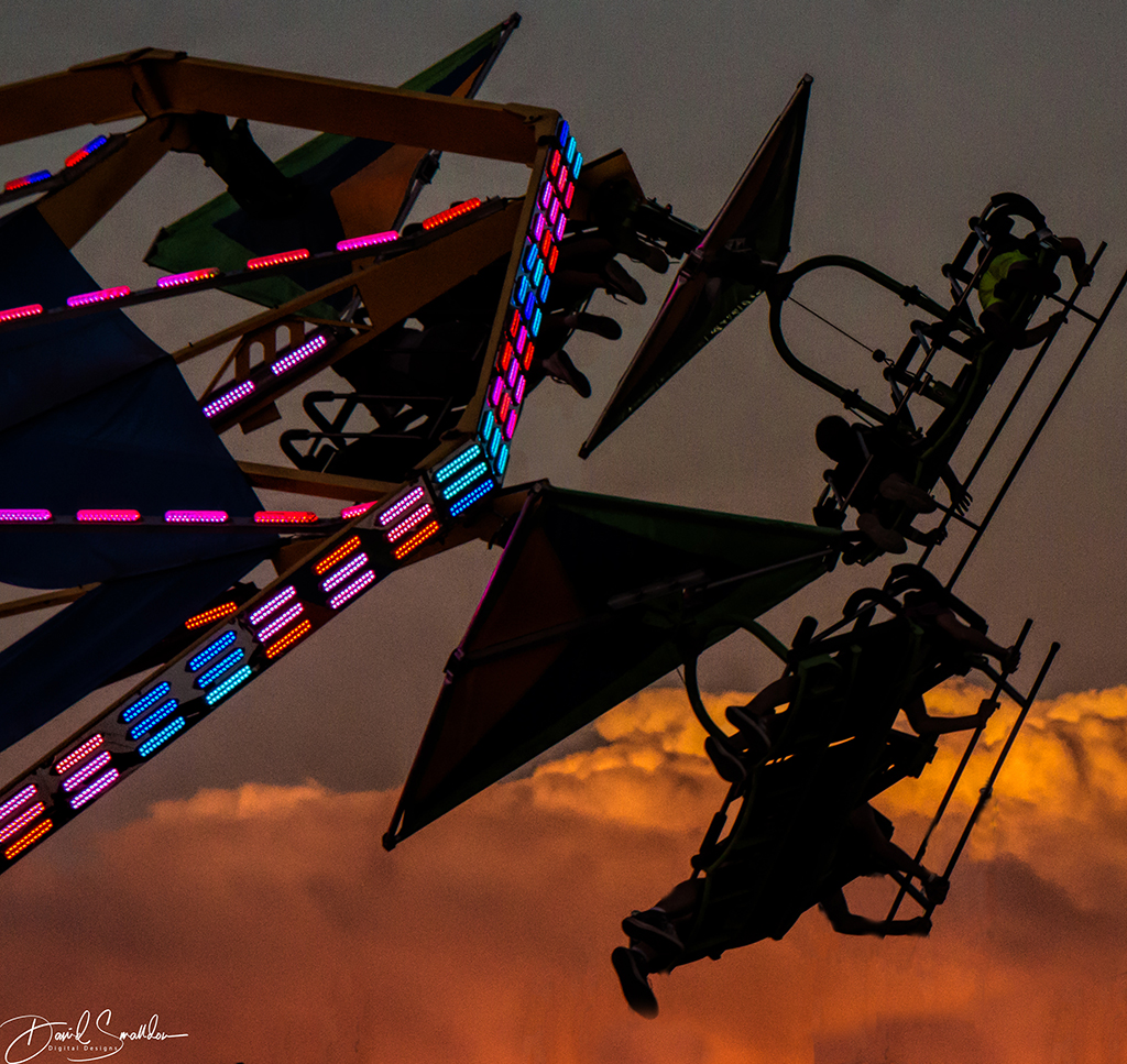
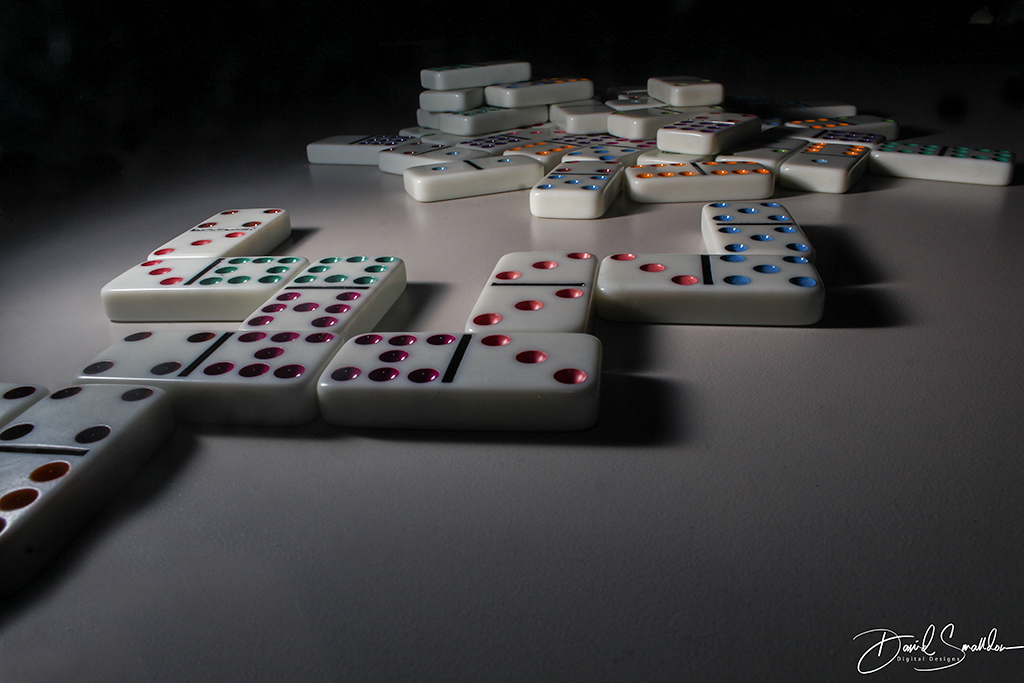
ISO of 8000! Wow! I want a camera like that! This is an amazing image because of all the action that you managed to capture in one small click of a button. From the rope to the rider's face to the horse to the calf, it all has an amazing level of detail! I love the dirt being captured in mid-air as well! The soft background with the people adds to the atmosphere of the overall photo as well. The decision to make it a black and white using the tools you used was a spectacular choice obviously. |
Feb 10th |
| 4 |
Feb 19 |
Reply |
Hey Erik:
Thanks for the comments! As to my new job, I'd like to say that I'm having a great time...that's what I'd like to say! However, I'm well past my prime and learning the overwhelming amount of stuff you need to know in this job tends to be a bit much for me on certain days. Thirty (or even ten) years ago, it might not have been so bad for me.
I've taken to writing everything down in a notebook and there are all sorts of notes/sticky notes/etc. that I refer to in this notebook. Admittedly I am learning some of it through a process of repetition (which is how everybody there eventually learns what they learn) but there are bad days and worse days. My boss still refers to me as "training" on the schedule and will for some months yet I'm sure. I should be grateful that they're "training" me on the job and paying me to learn everything that I need to know. Also I don't have to ask people questions every minute that I'm there (as I used to a few weeks or a month back) and I tend to know what I need to do from minute to minute but this is a job that was created when 4 or 5 other jobs were condensed into this position. It's very chaotic and lots of pressure.
Yes, it is my dream job and it does get me close to the media industry which is what I've always hoped for. Everyday I work there, I go in and just try to do the best that I can but it's always inevitable that you'll make mistakes each day. Working here reminds me of that saying which I hear in my head time and time again. It says, "Be careful what you wish for, it might just come true!" and it has..... |
Feb 9th |
| 4 |
Feb 19 |
Comment |
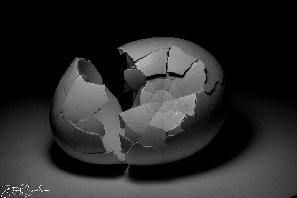
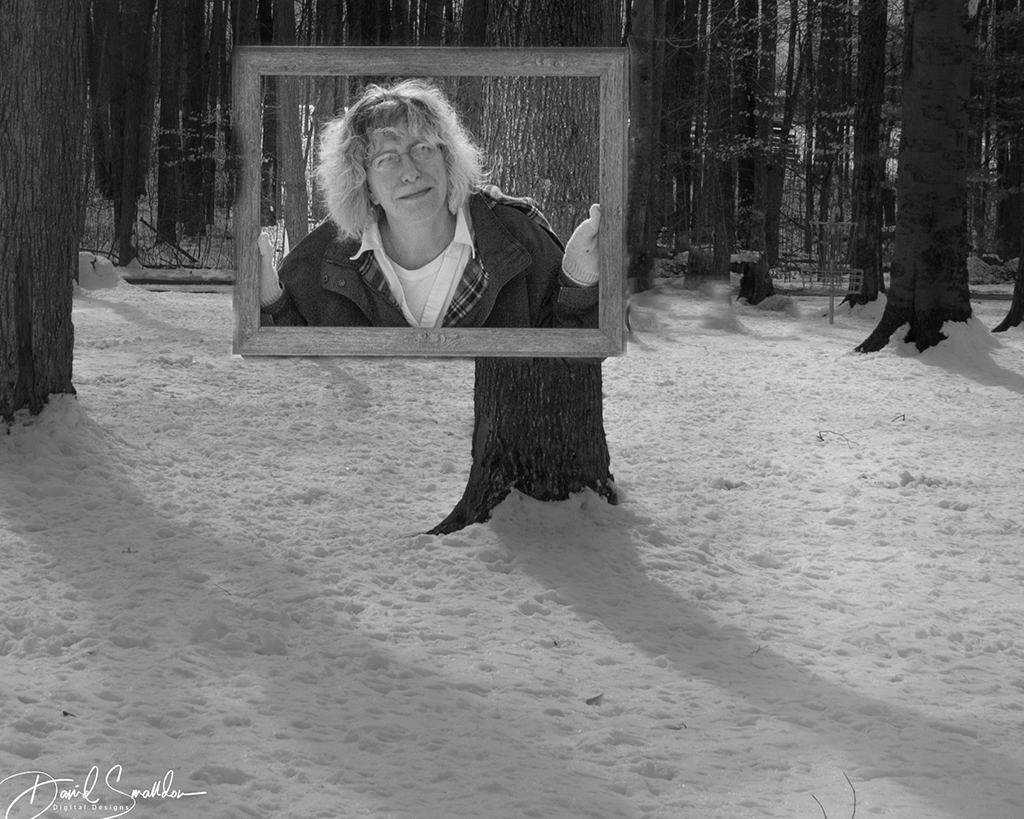
I like the original photo the best but that's just my opinion. I like the color harmonies in this image very much! I love how the crack leads from the side to the central composition of the photo where the window (with the interesting writing) and the man appear. Personally I think the red gives a little "color contrast" to the entire image which I think it needs. |
Feb 8th |
6 comments - 2 replies for Group 4
|
| 74 |
Feb 19 |
Comment |
I love this photo because of all the textures in the image myself! You can lose yourself in the psychedelic designs of the lizard's skin if you look closely enough at it! I did have a little issue with the face of the lizard as it looks a bit "soft" but I believe that may be because of the blown out nature of some parts of the image.
I liked the re-processed image a bit better. I also feel that the bright circular spots in the lower right and the middle in the original image could be tamed a little bit I feel as they may be a bit distracting. |
Feb 23rd |
| 74 |
Feb 19 |
Reply |
I'm upset that you could see the splatters on the white poster board that I used for this shot. Oh well. I have been meaning to get some new poster board backdrops at the dollar store but just haven't had the time lately to do so. Your comment is well-taken though. |
Feb 15th |
| 74 |
Feb 19 |
Reply |
Thanks for your suggestion Arne! One reason that I like invisible black background photos is because of how dark and moody they make everything look. I can make a simple tabletop fork look overly dramatic just using this technique. Since I like the deep, rich shadows that this type of shot creates, I typically do not try to brighten the photo up much (if any) because I feel that it is all part of the mood of that shot. Thanks for the comments! |
Feb 15th |
| 74 |
Feb 19 |
Comment |
Stunning image and it was done very nicely. Leading lines works quite well in this photo. The corridors on the right and left are leaning ever so slightly which might possibly be as a result of a type of "keystoning" effect which could be remedied in post-processing or could be cropped out altogether. I think it's a very stunning image but it's somewhat flat in terms of visual impact and I would have tried adding a bit more "contrast" to the textures on the walls and the floor specifically to help enhance the photo. |
Feb 15th |
| 74 |
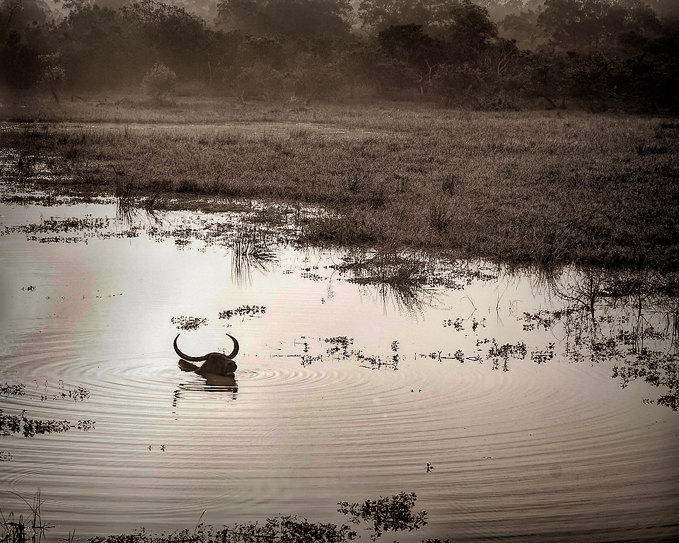
Feb 19 |
Comment |
Well I like the composition with the silhouette of the skull on the water but the contrast needs to be enhanced on it a smidge (yep..that's a technical term) I ran it through Topaz Dramatic HDR and came up with something along the following lines |
Feb 15th |
 |
| 74 |
Feb 19 |
Comment |
I love this picture Bill! It's a great image and it's quite magical given the transformation you made from the original. I also like how you placed the couple slightly off-center which seems to catch the viewer's eye more. The hint of foreground sand is also very appealing! Very nice work! |
Feb 10th |
4 comments - 2 replies for Group 74
|
10 comments - 4 replies Total
|