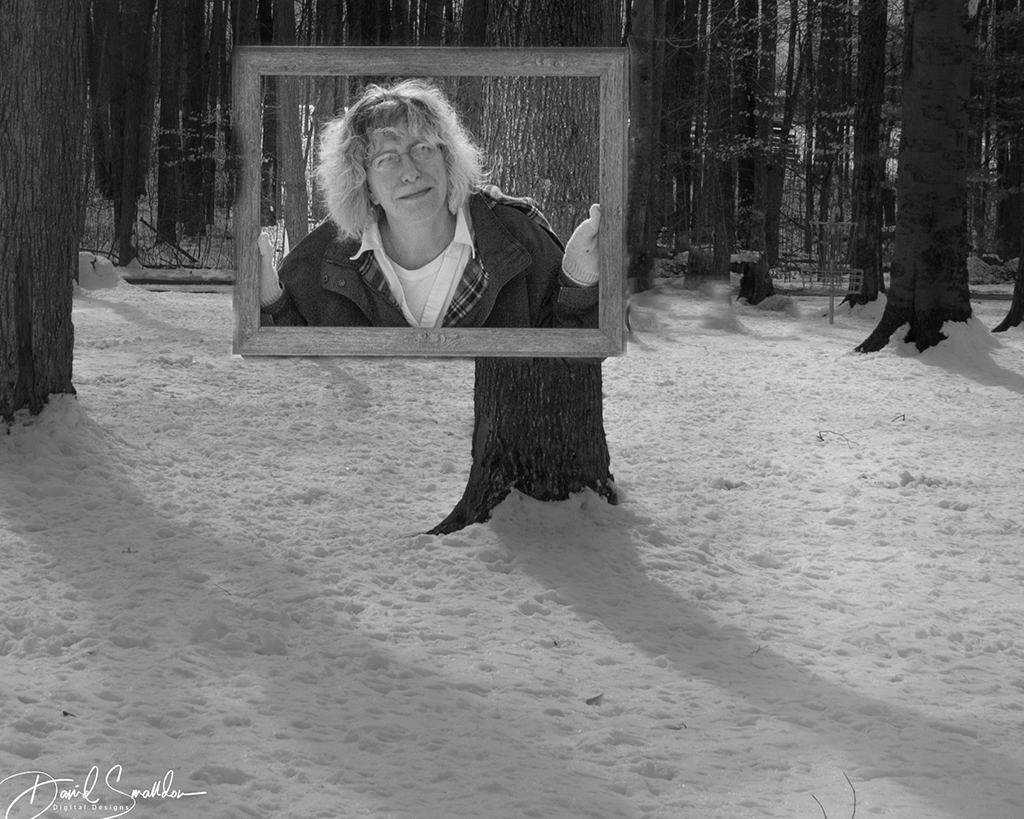
|
| Group |
Round |
C/R |
Comment |
Date |
Image |
| 3 |
May 18 |
Comment |
Ruth, I'm not from group 03 (I reside in group 4) but I really liked your photo! It's such an amazing variety of colors and such inspired creativity with all of the paints blending in together along with the bottles themselves. I just wanted to stop by and say I really like what you did with this picture! Wonderful! |
May 3rd |
1 comment - 0 replies for Group 3
|
| 4 |
May 18 |
Comment |
I'm really quite happy that we have such a diverse group of people that can appreciate all the different facets of photography. I want to thank everybody for their comments and look forward to more in the future! |
May 24th |
| 4 |
May 18 |
Comment |
on a totally unrelated topic...
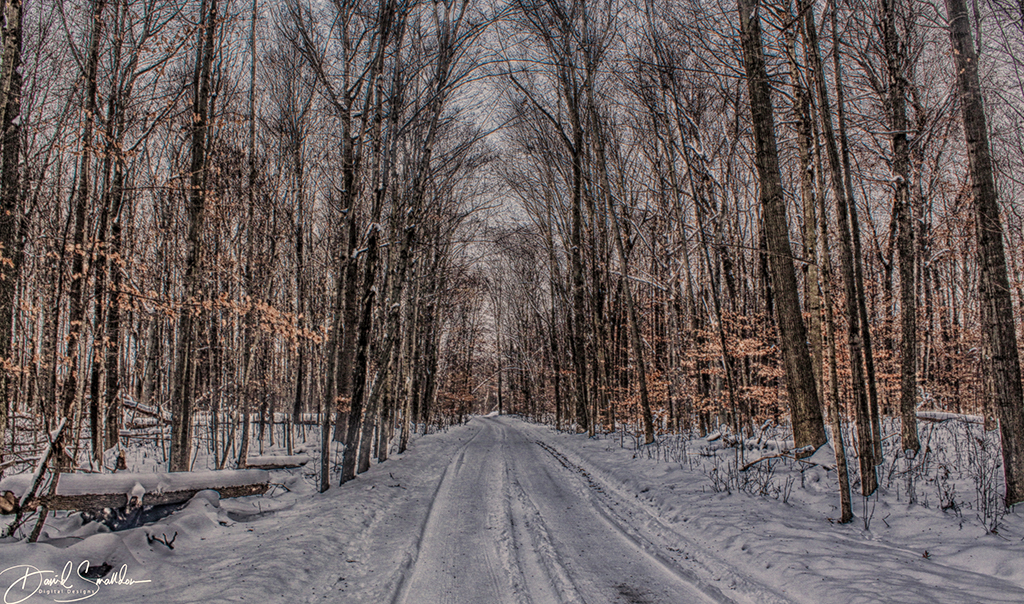
Erik...I just read your comments from last month on your landscape photo and didn't even realize they were there :( I would very much like a copy of your landscape image if you'd like to share as you had mentioned. I think it would look nice in my bedroom. It's a very soothing picture to me :) Not many things sooth me. My email is: ds3793579@gmail.com.
|
May 10th |
| 4 |
May 18 |
Comment |
I like the fun that you had with this photo and thought it was interesting that you made it a clock with birds. So apparently cuckoos aren't the only birds that can tell time. I think it would have been interesting to see a before pic so we could see the transformation but that's just me (always curious). Nice compositing effort too. I like that you had an idea with this "a clock" and decided to work with the photo to match your vision so I congratulate you on your "outside the box" thinking!
As was stated, it's not immediately apparent to us that it's supposed to be a clock. Now would there be a way to make it more apparent that this photo is supposed to represent a clock I wonder? Just a thought is all.. |
May 10th |
| 4 |
May 18 |
Comment |
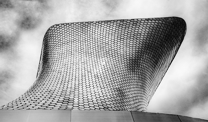
I really really like this image. I think it's very cool that you took the time to clone out the extra building as well. I love all the little lenses all over the building. However I wonder if the color adds or distracts from the main image itself which I feel is the design of the little lenses. I downloaded the photo and quickly came up with something like this using NIK Silver Efex Pro to illustrate a bit of what I was talking about. |
May 9th |
 |
| 4 |
May 18 |
Reply |
I actually like the white more than if it was anything else Ian. I think the "white skin" blends in more with the white background and it might be too distracting if it were anything else. I was only wondering HOW you got it to look like that ...not necessarily WHY . :) |
May 9th |
| 4 |
May 18 |
Reply |
I've been using Topaz Studio a bit more lately because it incorporates all my Topaz packages in one place. Have you ever tried using that? |
May 9th |
| 4 |
May 18 |
Comment |
Congratulations on your exhibition Ian! It is quite well deserved! I am very impressed with the portrait and you have done a fine job composing the subject as well as an even great job with the color toning/composition of the photo itself. I am curious about only one thing, the part below her helmet where her hair drapes is completely white. I find myself wondering if that used to be skin in there or if that's the way it was in the original photo. In essence, I'm wondering how that area that I discussed became pure white.
Again congratulations on your exhibition and it's quite an amazing photo! |
May 9th |
| 4 |
May 18 |
Reply |
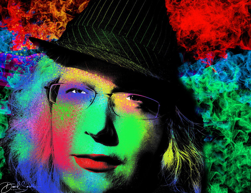
Thanks for the kind comments Isaac! I would invite any of you who want to learn more about this technique which introduces a lot of intriguing new Photoshop concepts which might take too long to discuss here to look at the tutorials which are FREE. Try them out for yourself and see what you think. I didn't follow the tutorial EXACTLY the way they said (where's the creativity in that?) but it gives you a taste of what you can do.
The tutorials can be found in two parts at:
Part 1
https://www.youtube.com/watch?v=p7YTAnPNuIM
Part 2
https://www.youtube.com/watch?v=oX273YlueOw
Personally I like how the shadows clearly show outlines quite clearly in the pop-art designed photo. I also like how the eyes are cut out to provide the "whites" of the eyes.I also tried to give extra time to the lips with their red appearance. |
May 9th |
| 4 |
May 18 |
Comment |
The storytelling aspects of this photo are key to enjoying this picture's composition. I also like the very rich patterns being displayed by the bus which could have probably been made into a portrait all its own. The close-up photos of the bus alone would make some very intriguing photo subjects I'm sure. I like the HDR effect applied and I feel that the bus is very much the star of this photo.
From the moment this photo was posted some days back, I studied it and tried to come to terms with a few things. One is the slight blur at the outside edges of the photograph. Second is the pole (and attached lines) near the middle of the photo which in my own opinion nearly separates the photo into two separate photographs. The pole seems to disrupt the flow of the photo for me breaking it into a BRIDGE OUT sign and a bus on the other side. If the photo perhaps were cut at that point as a left boundary then it I feel it may have been less obtrusive but I understand why it was done since the BRIDGE OUT sign provides an important element to the story.
Despite the subjective issues I discussed, I do greatly admire the time you took trying to capture this subject. 20 minutes is quite an amount of time to take trying to get the shot that you want. That takes a lot of determination and patience and shows you were very serious in creating a captivating photo. This was certainly an interesting photo opportunity and I can't help myself when looking at it because I always chuckle at the story that is being told in this amusing photograph ! |
May 9th |
| 4 |
May 18 |
Comment |
Quite a creative application on this photo Bill and it's very nicely done. It gives a bit of an HDR effect to the photo which is very cool to look at and study. I am particularly entranced by the textures and the designs made by the dry wood in the foreground. The dry wood is the thing that draws me into the photo and allows my eyes the opportunity to explore everything in the picture.
I really love photographers who try to expand their horizons by trying new things or new post-processing techniques to bring new life to their photos and you have really applied some creative ingenuity to this photo making it quite a colorfully creative and richly textured masterpiece. |
May 9th |
| 4 |
May 18 |
Comment |
Really great photo Guy! Simple and to the point! I love that the picture tells a great story and it's good to see that this was explored to its fullest. The picture is both playful and whimsical in its nature and people may be caught thinking, "Gee, I wonder what the penguin is thinking about looking at that art?" as I was. Nice work on focus in the image as well as getting the focus done this well while doing it hand held.
|
May 9th |
8 comments - 3 replies for Group 4
|
| 22 |
May 18 |
Comment |
Hello Joseph. I'm not from your group as I am from group 04 but WOW..what an amazing picture! Great colors and inspired creativity combine to make a most eye-catching image! I always admire people who make images that make people go "wait..what was that?" when they are going through a photo feed and your photo definitely made ME do a second and a third and a fourth take! Great work! |
May 9th |
1 comment - 0 replies for Group 22
|
10 comments - 3 replies Total
|
