|
| Group |
Round |
C/R |
Comment |
Date |
Image |
| 4 |
Mar 18 |
Comment |
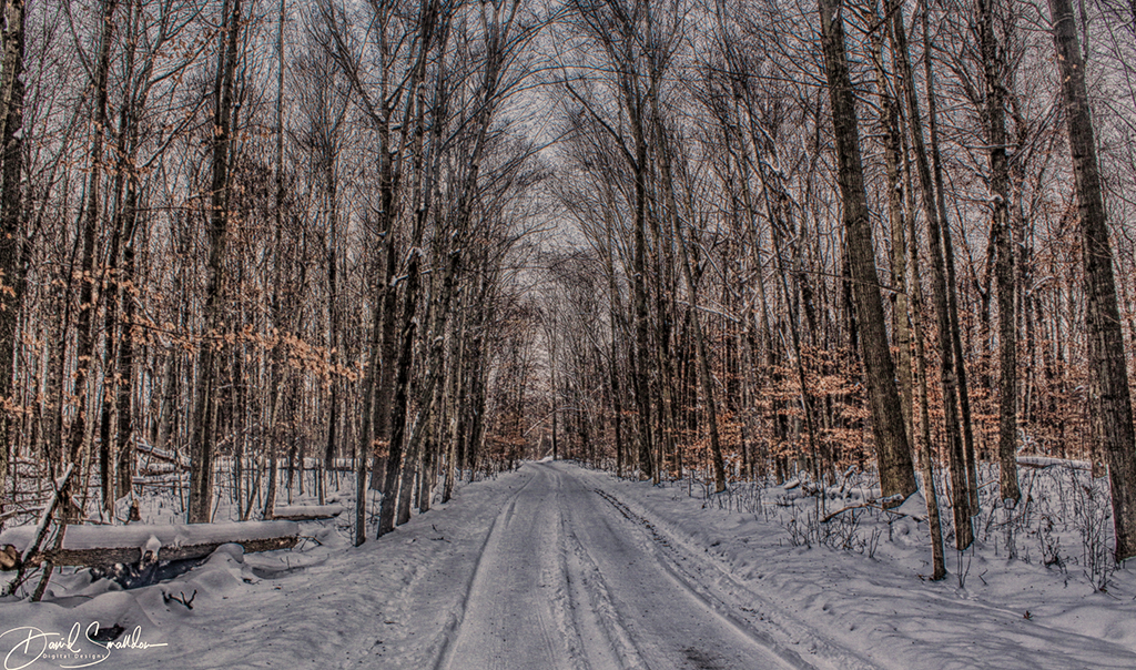
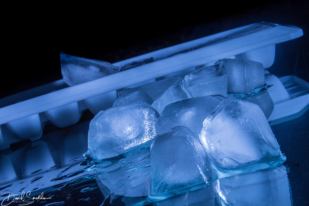
I like the colors in this very much along with the leading lines throughout the photo (very nice S curve). I think that the foreground interest lends a lot to the photo as well. It is a very ethereal looking atmospheric image.
On my monitor, I can see some image "noise" on the left and on the right that may have been because of oversharpening which might be reduced with CLARITY settings. |
Mar 13th |
| 4 |
Mar 18 |
Comment |
Ian: It's a very fine photo and you did a great job with it since I was able to see the original. I truly admire the work that you took in putting the life back into this creature. Really great work and dedication in trying to put the image through its paces to get the result that you thought was the best! |
Mar 13th |
| 4 |
Mar 18 |
Reply |
Thanks for the comments Guy :) It was very appreciated. When you were talking about the "shiny highlights", were you referring to the ice? |
Mar 12th |
| 4 |
Mar 18 |
Comment |
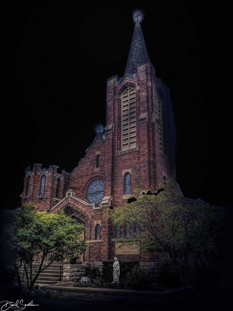
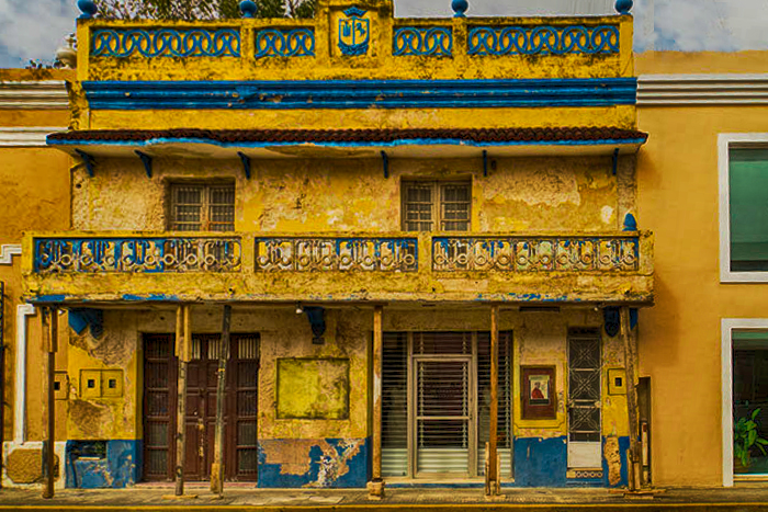
Really great composition Joseph. I love the colors and the textures found throughout the photo. Good crisp focus on the entire scene! Very interesting building!
It would have been interesting if a few photos of the building were taken and merged together to create a panorama of the building perhaps. Also the sky in the upper right corner, as well as the post in the upper right corner, shows some minor aberrations. I took your photo and tried using a clone stamp to move the clouds from the upper left to the upper right. Although my overall post-processing pales in comparison to yours, my aim was simply to try to work on the sky.
|
Mar 9th |
 |
| 4 |
Mar 18 |
Comment |
This is a very painterly image. I like all the colors and am especially fond of how well the reflection turned out in the water below. The exposure was done giving just enough light to make the subject interesting by giving it some atmospheric mood lighting while still capturing the water in a nice blurred motion state. I also feel that the picture has a lot of visual impact because of the way the shot was framed.
I may have tried to dodge the trees to the right of the mill that are a bit in shadow but that's just my personal preference.
Excellent job on creating this image from a scan though! |
Mar 5th |
| 4 |
Mar 18 |
Comment |
By the way, for those of you who want to know more about the canted angle shot (with how I tilted the ice) and how it is used in many classic movies, you can look at the following web page:
http://www.hollywoodlexicon.com/dutchangle.html |
Mar 3rd |
| 4 |
Mar 18 |
Comment |
This reminds me of a painting as it might be done by Thomas Kinkade. I enjoy the scenery and the waterfall is done quite nicely in its blur effect. The visual interest in the foreground works well to attract the attention of the viewer and draw them deeper into the picture. It's interesting to me how the leaves in the trees in the upper center of the screen almost have an HDR effect to them which I actually like. Nothing further to add. |
Mar 2nd |
| 4 |
Mar 18 |
Comment |
Quite an amazing image Isaac! I like the composition as well as the images the way they were shot. The color is well done in the blood moon image and I like the tack sharp images of the moons in all its different phases. I really admire the time that went into creating a photo like this and I have nothing else to add but kudos for such a beautiful image! |
Mar 2nd |
| 4 |
Mar 18 |
Reply |
Thx Isaac! That "shmutz" was actually the outline of a wooden chair in the kitchen which I didn't cover up during the shoot. I process my pictures on a Macbook Pro however the dark on the built-in monitor is deceptive and I'll often find that things I posted have light shadows or objects that you can barely see in the background. I also have an HP monitor that I process photos on but lately I haven't been hooked up to that and have been flying solo on my Macbook Pro. What I've been doing is uploading my pics from my Macbook to Flickr in a PRIVATE status then downloading them onto my ipad and bring them into Lightroom to look at them more closely and finish them off then RE-UPLOAD them to FLICKR again. |
Mar 2nd |
| 4 |
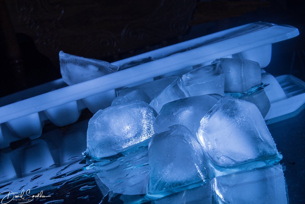
Mar 18 |
Comment |
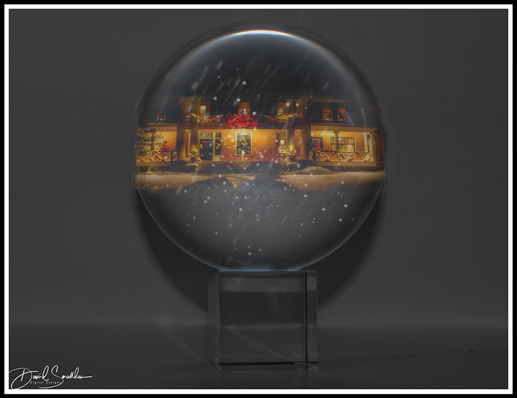
This is a revised ice picture in that I fixed the background a little bit. |
Mar 1st |
 |
8 comments - 2 replies for Group 4
|
| 12 |
Mar 18 |
Comment |
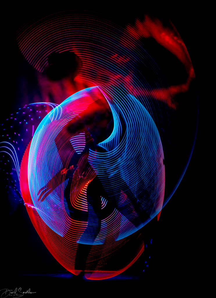
Connie, I happened to check in on the images of various groups this month and I was really impacted by yours.
I really like what you did to it! I love how clean the image looks and all the lines in it! You've done a fine job of making the image look very minimalistic without losing sight of the overall image as well. The choice to make it into a type of black and white really helps focus the person's attention on the shapes themselves. Very nice work! |
Mar 2nd |
1 comment - 0 replies for Group 12
|
| 28 |
Mar 18 |
Comment |
Hello Wanda, my name is David Smalldon and I am from group 04. I was wandering through the groups and was stunned by your image! Fascinating visual effects and colors! I always like seeing new creative ways that people use on their photos! What a truly memorable image! |
Mar 5th |
1 comment - 0 replies for Group 28
|
10 comments - 2 replies Total
|