|
| Group |
Round |
C/R |
Comment |
Date |
Image |
| 4 |
Feb 18 |
Reply |
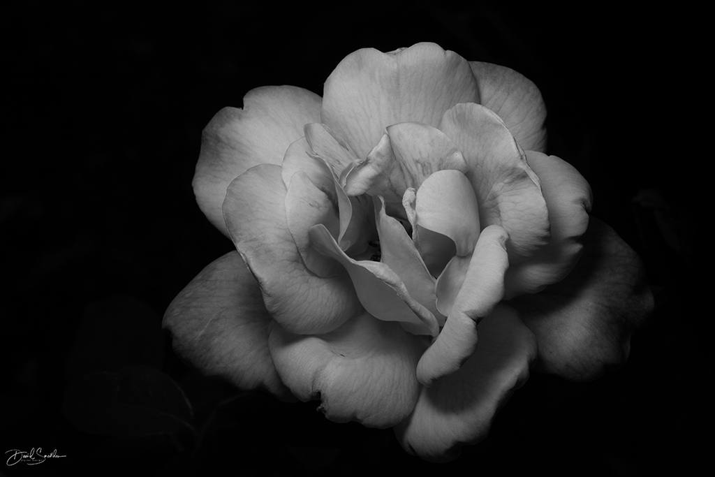
I like the last of the two images. I really like DARK shadows in Rembrandt portraits. I feel that the last portrait really exemplifies what a Rembrandt portrait should be. |
Feb 26th |
| 4 |
Feb 18 |
Reply |
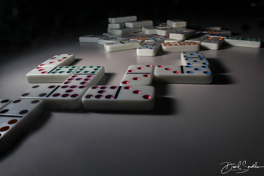
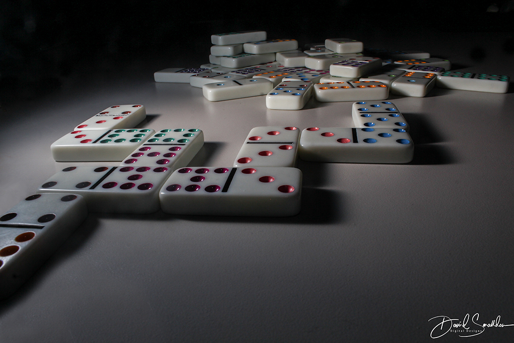
Thanks for the comments Bill. I'm curious though to find out the reasoning of why you would like the lighting brighter on the double 5 domino? I do admit that the lighting is a tad brighter on the 4/3 area because the Speedlite was on that side however you stated that your eyes hit all the major interest points of the portrait which to me denotes a good photo. You enter in through the lower left, hover at the bright area at the upper left and go off towards the right. Does this not then hit all the major interest areas of the photo? If I were to change that light and DODGE that domino to make the double 5 lighter and the other one darker, would the viewer still want to look at the rest of the composition? |
Feb 26th |
| 4 |
Feb 18 |
Reply |
Stunning work Stephen! I have heard of the "rumor" that you can do "invisible black background" with just a window light but have never seen it actually work in practice! I'm really excited by the photos that you put together and wanted to thank you for sharing them with me very much! I'm curious about one thing. You said that you adjusted the contrast to black out the background. Does that mean that you tweaked the aperture and shutter speed or did you actually tweak the contrast in the post-processing state?
Really great work though! I hope that you take some time to explore this technique even further for some of your photos. I'm sure that you will find it's an amazing tool to use when you get the chance to do so.
Once again, thanks for visiting me here in Digital group 04 and thanks for sharing the photos and experimenting with the technique. I've always wondered if this was possible! |
Feb 19th |
| 4 |
Feb 18 |
Comment |
just fyi..my pic has now been posted up to the Digital Dialogue Member Showcase. Mine is 2nd in the queue. It's a picture that hopefully none of you have seen before. |
Feb 16th |
| 4 |
Feb 18 |
Reply |
Thanks for the comments Ian. One of the changes you mentioned I had already tried to reproduce in the image I posted on 2/1 (making the background more uniform) so you can take a look at it if you so desire and let me know what you think of it.
I did get your email and found all the information very interesting to read! Thanks so very much! I actually thought I responded to you but I guess I didn't. I have a bit on my plate plus I've been trying to put together the March Michigan newsletter for the PSA members.
I'll take a look at the email you sent me and send along a reply. |
Feb 15th |
| 4 |
Feb 18 |
Reply |
Thanks Joseph! Recently after seeing the photo that you did and talking about Freeman Patterson, I borrowed his book PHOTOGRAPHY AND THE ART OF SEEING from the library and am reading through the book to see what pieces of wisdom I can get from it. |
Feb 13th |
| 4 |
Feb 18 |
Comment |
So this is what separates the great photographers from the average photographers. The great photographers do whatever they have to do to get the photo they want no matter how silly they look. Some other people might have looked at this location and thought, "I'm not getting down on that floor no matter how nice that shot looks!" so kudos to you Guy for planning out the shot and taking it!
The depth of field is perfect and the symmetry in the spiral leading from the foreground to the background is quite hypnotic. I like the contrast brought out in the texture of the wood and the entire composition does tend to get somewhat disorienting if you stare at it long enough (in a good way!).
I feel that the lights at the top are a little too bright for the composition. I also might have tried to recover some of the lost detail in the wood at the very top of the structure. |
Feb 13th |
| 4 |
Feb 18 |
Comment |
I had no idea what a cenote was either so it was interesting to learn about that although I do know the more insiduous "sinkholes". Hmm..perhaps if we made attractions out of local "sinkholes"!
I like the depth of field showing the expanse of the area in the photo. I also like the figures that were shown to give a proper scale to the photo. The foreground elements also work well in leading the viewer into the central composition. |
Feb 13th |
| 4 |
Feb 18 |
Comment |
It is an amazing shot that you caught here Erik. I really like the detail on the coyote's body fur as well the fur covering the head and ears. The composition is nicely placed in the frame of stalks as well. Focus is done nicely.
In my opinion, I might have considered cropping down the top of the frame a bit more to accentuate the coyote. Also I feel that the photo might be a bit overly bright but that's just me and my eyes. |
Feb 5th |
| 4 |
Feb 18 |
Reply |
Hmmmm...how many months before I get a fun nickname? |
Feb 5th |
| 4 |
Feb 18 |
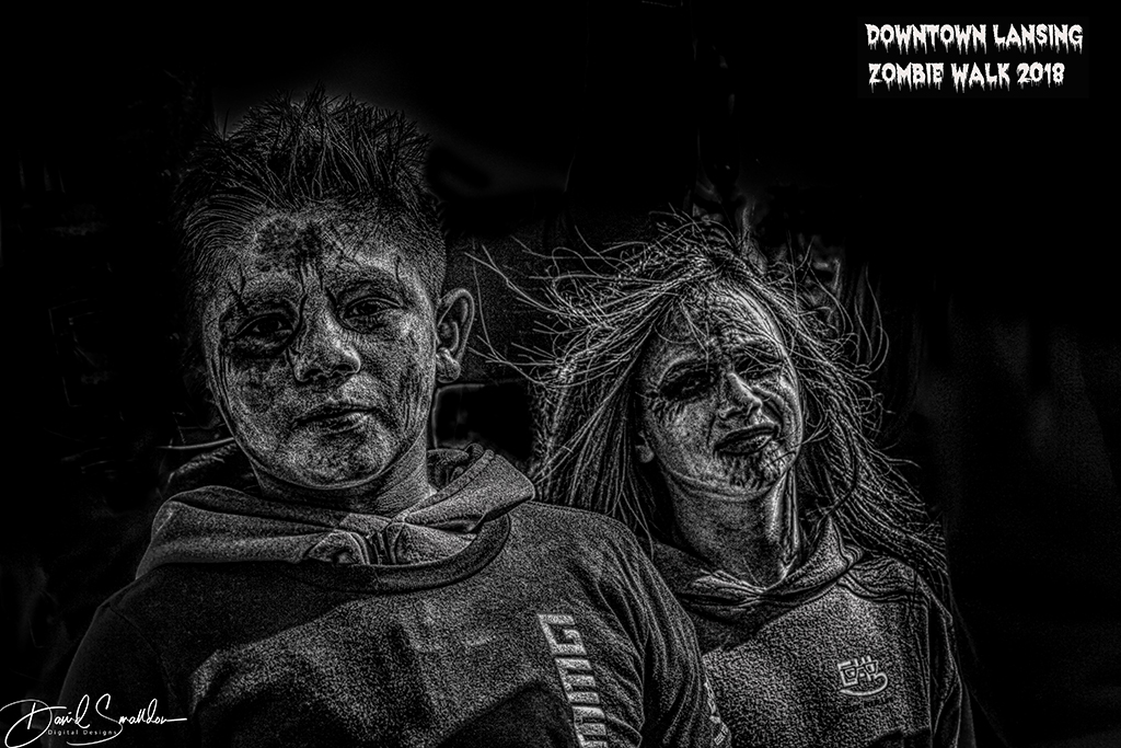
Reply |
Thanks Ian. Your words are most kind! Actually I do photograph some cos players at a local Halloween convention. This was the first "official" year that I was their photographer and it all started because they liked the Zombie Walk photos that I took two years ago and posted on my FLICKR/Facebook accounts. I really have a hard time going up to people and saying things to them though so I really like sitting in the background and just taking candid photos that look good to me. Of course, the other thing we could talk about is "posing" but it seems that everybody has their own favorite "heroic pose" they adopt. I usually have these apps on my iPhone for "posing people" but they NEVER make one for costumed heroes (I think there's a hidden market there!)
I would like to ask a few additional questions if you'll permit me to do so though. Did you have to do much touching up to the person's face? I always end up using Portrait Pro to do my touch-up on "good portraits" and sometimes have a hard time striking a "happy balance".
Also you mentioned using a Rogue Flashbender 2. I have my Canon 600EXii-RT Speedlite and it came with this plastic diffuser that to be honest with you I've never found much reason to remove and it seems to work great in dispersing the light and then I can play around with the position of the flash unit and the direction. My question is whether I should look into getting a Rogue Flashbender 2 to help me further with my light shaping or whether it might not be worthwhile for me in my setup. I'm just curious is all. |
Feb 5th |
| 4 |
Feb 18 |
Comment |
Quite an interesting image Isaac! The colors of the pier are especially well done and the clouds are beautifully showing off the detail along with the little bits of color that show in spots. The texture of the pier is visually interesting. The leading lines of the pier going off into the horizon are sharp and well-focused. Really some amazing colors in this shot and I even was quite amazed at how it looked when I was playing around with it as a black and white image also.
To me, it seems that the brown water loses detail against the rest of the image and it's hard to see what it represents. |
Feb 5th |
| 4 |
Feb 18 |
Comment |
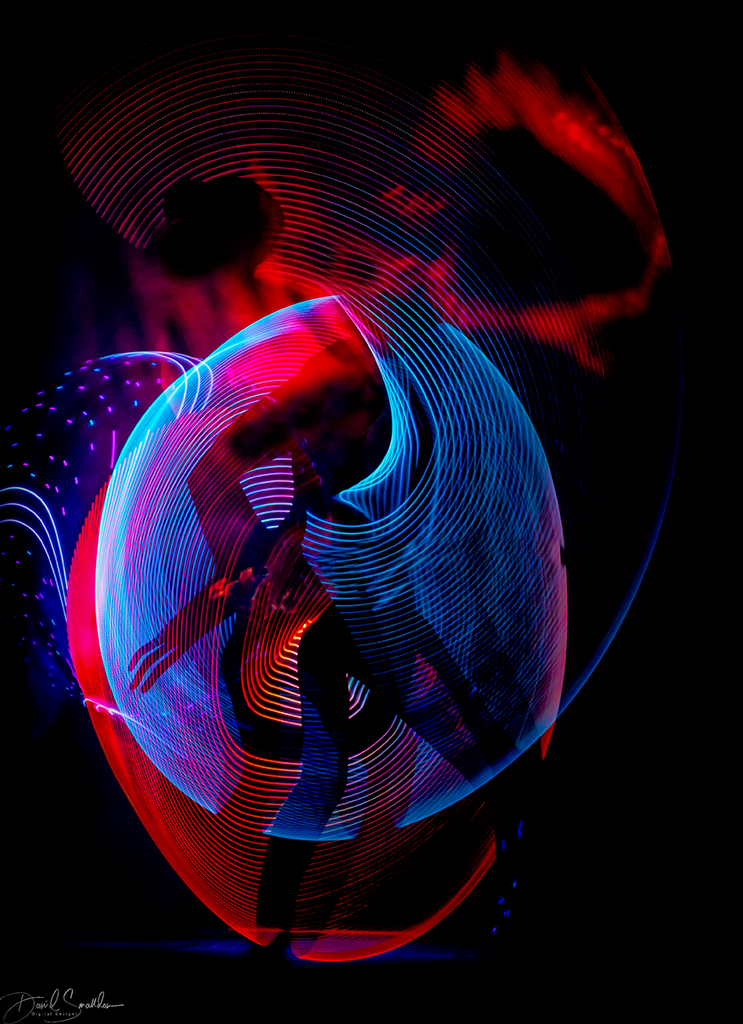
Really a very stunning portrait Ian! The pose is really great and I want to congratulate you on creating that pose to show them off in a rather flattering 3/4 heroic pose. The halo in the back accentuates the person's face and really helps focus the attention. In addition, the red is the thing that unifies the portrait together. Really nice focus and excellent dramatic shadows.
All that being said, the front red glove might be dodged a bit and that gray thing in the upper right doesn't seem to be connected to anything and is kind of hanging in space. |
Feb 5th |
| 4 |
Feb 18 |
Comment |
I like the brilliant colors in the water and the bird and feel that the space on the right is great to allow the bird some "breathing room" to fly into. Also the exposure settings were spot-on so much so that you can individually count ALL THE LITTLE water drops in the photo (VERY NICE!) Really great work on this photo Bill!
As for the bird flying, there is something called the "left to right rule" which states that we like things in motion going from left to right because we read that way and our eyes in North America are pre-determined and a bit "biased" towards photos like that. I'm not sure if it's true or not but that's the theory. |
Feb 4th |
| 4 |
Feb 18 |
Reply |
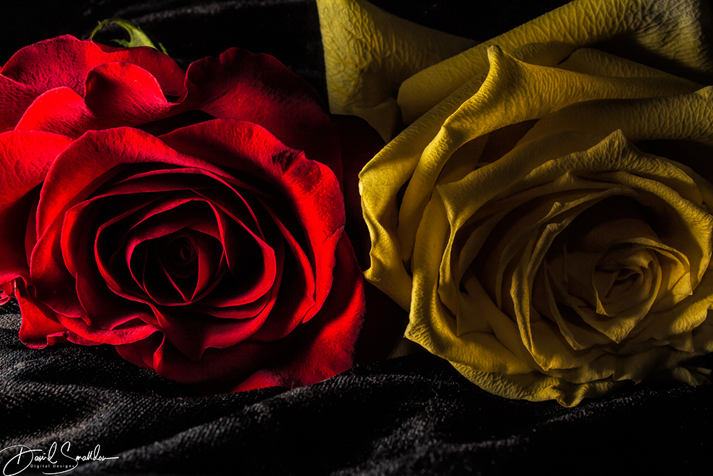
Thanks Isaac :) As for the changes in the revised photo, it shows you how OCD I can be with my photos sometimes. The colors on the dominoes are a bit more saturated and glow a little more. Also I "clone stamped" out the "extra" domino in the lower left corner that you could see the edge of in favor of just having a sole domino leading into the photo and I took out a few really small details you could see in the dark black background if you enlarged the photo. |
Feb 4th |
| 4 |
Feb 18 |
Comment |
Hi there!
How is everybody? By the way, I was notified that I will have an image in the Digital Dialogue Member Showcase for February 2018 so look for that mid-February.
Also I had made a modification to this photo and I am posting it here. Really minor modifications to the photo but perhaps it is a better composition. |
Feb 1st |
 |
8 comments - 8 replies for Group 4
|
| 32 |
Feb 18 |
Comment |
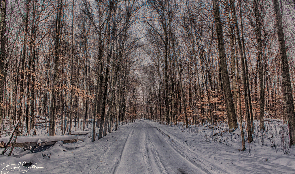
Hi there, my name is David Smalldon and I'm from Digital Group 04. I was browsing the groups and saw your image and I was immediately enthralled by all the diagonal leading lines in your composition focusing your viewer's attention to that corridor in the distance! Also very nice tonality on the image itself! Quite a nice picture overall! |
Feb 1st |
1 comment - 0 replies for Group 32
|
9 comments - 8 replies Total
|