|
| Group |
Round |
C/R |
Comment |
Date |
Image |
| 71 |
Feb 19 |
Reply |
Thanks for the comment, sometimes the author gets blinded with their own work and professional eyes are very helpful to pin point the issues. Appreciated! |
Feb 26th |
| 71 |
Feb 19 |
Reply |
Really appreciated your effort to bring this work alive. I will follow your advise and give a try later. Yours is definitely looks better. |
Feb 26th |
| 71 |
Feb 19 |
Reply |
Maybe I should lower the camera instead. Thanks. |
Feb 8th |
| 71 |
Feb 19 |
Reply |
Good to know. Thanks. |
Feb 8th |
| 71 |
Feb 19 |
Comment |
|
Feb 8th |
 |
| 71 |
Feb 19 |
Comment |
Adjusted versions |
Feb 8th |
 |
| 71 |
Feb 19 |
Comment |
I love the techniques you used for this presentation. I have the same issues with HDR shots for moving targets like tree leaves and ocean waves. How exactly you did that? masked out the moving leaves with clean one? In this scenario, I usually just take one shot and use post processing to adjust highlight and shadow.
2-24 f2.8 is a sharp lens and it's very good for nigh photography. But I don't like the curve image it created. Also I prefer simple presentation. I won't put two trees at front to reduce the impact of grand views unless the tree is the center role. Anyway, it's a great work!
|
Feb 8th |
| 71 |
Feb 19 |
Comment |
It's a beautiful scenery. Love the early morning ocean breeze. I agree with Mike and Theresa, the presentation is much more clean without the bottom left trees. |
Feb 8th |
| 71 |
Feb 19 |
Comment |
It's a beautiful and peaceful presentation. I love the fall color and blue/green water. And the river leads your eye to the far away mountains. The railway track is cool by itself, but it makes presentation busy. I will be happy just with the river. |
Feb 8th |
| 71 |
Feb 19 |
Comment |
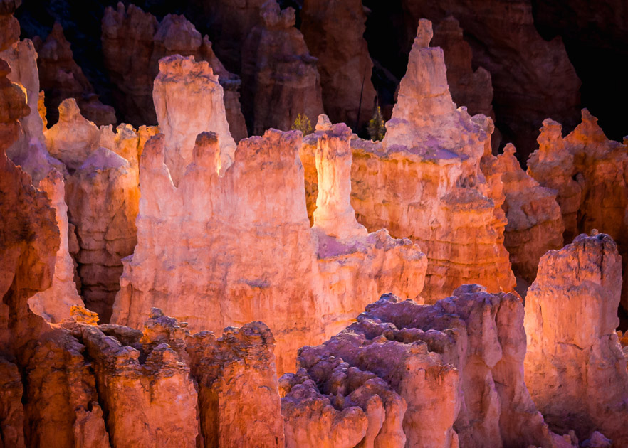
It's a beautiful shot. I love the color and it feels the stone like transparent. The only thing I don't feel comfortable is the square format. Maybe it's just me. |
Feb 8th |
 |
| 71 |
Feb 19 |
Comment |
Good suggestions. I tried to tune the color with good examples on the web, but it's hard to get what I like. I will try to reduce the mauve to see if any better. Thanks. |
Feb 8th |
7 comments - 4 replies for Group 71
|
7 comments - 4 replies Total
|